
1600 sqft 2 story Home, Connecticut (PDF)
1600 sqft 2 story Home, Connecticut (JPEG)
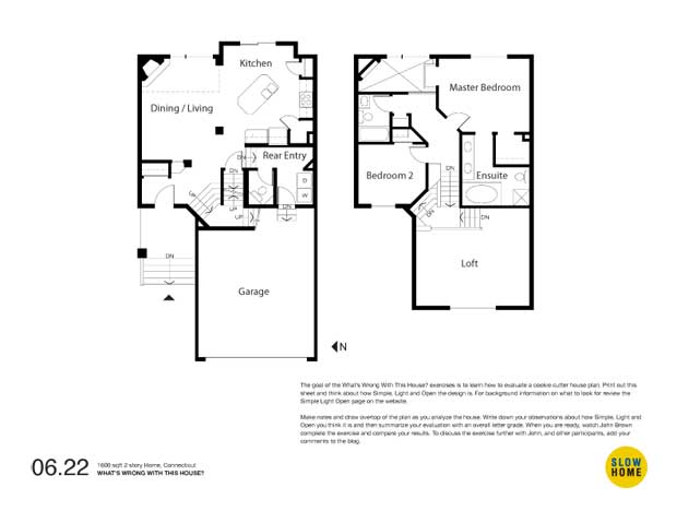
1600 sqft 2 story Home, Connecticut
-
Jim Argeropoulos
-
ersie
-
Doug Roberts
-
Grace
-
James Scott
-
Tim Jones
-
Mark D
-
Doug Roberts
-
Louis Pereira
-
Cat
-
Frances Grant-Feriancek
-
Tina
-
James Scott
-
Sean
-
MichaelG
-
Tony
-
Paul C
-
John Brown


-
Resources
- Workshops
- Bookstore
- Video Library
- Tutorials
-
Other Info
- Frequently Asked Questions
- Terms Of Use
- Privacy Policy
We Accept
- ©2024 Slow Home Studio
