Part 1 – 2000 sqft 3 Bedroom House, Tennessee


Room By Room – Rules Of Thumb (PDF)
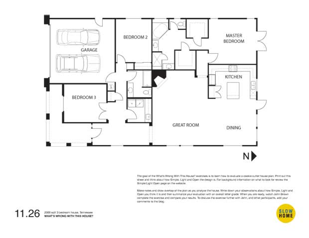
2000 sqft 3 bedroom house, Tennessee (PDF)
2000 sqft 3 bedroom house, Tennessee (JPEG)
[popup url="http://slowhomestudio.com/survey/index.php?sid=61528"]ROOM BY ROOM SURVEY[/popup]

  • John Brown

    Good Morning Everyone!

    As you saw in the video clip, we quickly put together a very rough mock up of the Checklist for you to try out with this house. I am interested in testing how the Checklist works when analyzing a floor plan.

    Click on the Checklist survey button at the bottom of the player and the Checklist that will pop up in its own window (be sure to enable pop-ups if necessary). Record whether you think each of the seven segments we have covered so far are fast or slow and then click submit to compare your results with everyone else’s.

    Unfortunately you can’t see your results after you have done this. We were really limited by the poll software that was available. As a result, you may want to consider including your fast-slow evaluation for each of the rooms in a comment post so that we can have a comparative conversation about the results throughout the day.
    I promise that the final online checklist that we are developing will be much much cooler and more effective.

    You will also see that we have provided a pdf summary of the rules of thumb for each of the segments. Remember that we haven’t had a chance to incorporate any of your comments yet.

    I hope that you find the Checklist helpful. It is not meant to stop all of the great commentary that we typically have in our What’s Wrong With This House sessions.

  • Terri

    I found the checklist a little limiting to use when it came to bedrooms and bathrooms. For example, the main bath seems slow, as per the checklist, but the master ensuite is not. I chose to say the bathrooms were fast, then, since I can’t very well say the ensuite is slow. Similarly with the bedrooms, the master bedroom had enough fast elements such as supersized closets and geometry that creates wasted space to bring this one over to the fast category.

    I’m guessing that a lot of houses might fall into this kind of dichotomy, where part of the element (such as bathrooms) is fast and the other slow. So the checklist will be hard to evaluate in such cases.

  • John Brown

    Terri,
    I know what you mean. It is difficult to make those kind of decisions. On the other hand, I think it is important to have people develop an overall judgment or opinion about a particular set of issues. In the case of the bathrooms I think it comes down to a judgment of which of the two bathrooms is more important and/or does the quality of one offset the problems with the other or not? Dis-aggregating the checklist into even more sections would perhaps make the decision about each room a little easier but then we are left with the even more onerous problem of having too much information to draw an overall conclusion.

    The value of the checklist, I think, is both in framing a process for discussing the quality of the design(as you have done)as well as create a summary record of the analysis.

    Thanks for making comment. At this point it looks like around 20 people have taken the test but you are the only one to venture a post.

    Putting aside the checklist for a minute, what is your critique of the house?

  • Terri

    Hi John,

    Well, my assessment is that this house would be a pain to live in!

    Starting at the front of the house then…The garage is a long way from the kitchen. There’s no great storage closet there, just a token one, which I assume is for guests. The bedroom is right next to the garage door, so whoever uses that room is going to have to listen to the comings and goings of those using the garage. (Hopefully the garage is only a workshop used on the odd Saturday afternoon!) The laundry and family baths have good layouts, but there are no windows.

    The Great Room is terrible. The traffic must go by either side of the room–towards kitchen or master bedroom, which means the furniture is pretty much going to be squished over, unless people enjoy walking in front of the seating. I thought the kitchen wasn’t too bad, as it is open on the one end, has about the right counterspace, though that island creates a conflict with the pantry and dishwasher doors.

    Access to the back yard is through a small door, which at least is a little separate from where the dining table will sit. I expect that Nashville is generally mild, so footwear won’t be an issue?

    The master ensuite is ridiculously large yet the vanities are too small, the shower is also, the tub is just silly….two walk-in closets seems excessive, and the way the hall dissects them ends up wasting space. The entry to the master bedroom, although providing a little privacy from the living area, makes for a wasted space as the “master” makes a hard left to go to the closet and ensuite. Being next to the kitchen is also a noisy location.

    Of course, the orientation is north too, so the living area is going to have limited light. Even the south study will have decreased light due to the large porch roof. The view to the side (east) yard will be a big factor on privacy. Of course, you probably wouldn’t sit over there much anyway since it’s in the main traffic corridor…

    How’s that for a start? :)

  • Jane

    John – I tried to do the test, but ran into the same issues that Terri commented on and therefore did not submit. I have an issue with breaking down the elements into fast vs slow, as its the over all impression of a house not the sum of the components. By using the checklist I found myself blinded from looking at the overall flow of the house and evaluating just that one room.
    Take for example, the kitchen is not bad, but the accessibility to get groceries from the car to the pantry is horrible, so is the kitchen slow or fast???
    Maybe for someone with educated knowledge this works, but I will try not to look at a home this way as it doesn’t work for me.
    One the plus side I love the rules of thumb – that is useful.

  • Terri

    How could I forget to mention the dreaded corner fireplace?

  • Li-Na

    Hrrrrmmm. I found myself wishing for a half-fast, half-slow (medium? hehehe) option on the checklist for the same reasons that Terri mentions. However, I do see where you’re coming from, John.

    I am running really late today but here are some additional thoughts that popped into my head:

    1) May I put a vote in for sticking some human figures into the floorplans in the book? I find it helps me figure out the scale of spaces. I’m not very adept at eyeballing how large a space is from a floorplan even if there is a scale provided. *sheepish look*

    2) “The bedrooms are located in a private area of the house and in close proximity to the family bathroom” might work better if you split it into 2 separate items.
    I.e.
    -Bedrooms are located in a private area of the house
    -Bedrooms are in close proximity to the family bathroom

    OR

    remove the second bit about being in close proximity to the family bathroom as this is mentioned under the bathroom section?

    Covering 2 points in one item would present difficulties if you get a house that has one point but not the other.

    3) I noticed you changed the bathroom icon! The new one is more in line with what I was picturing in my head except I hadn’t thought of a tub at the bottom. :-)

    4) Bathrooms: I *think* it should be “avoids” rather than “avoid” in these items.

    Finally, do you talk about the house as a whole in another section? For example, how the individual rooms are laid out in relation to one another? Is this what’s covered in the “organization” section which we haven’t yet looked at?

    My first thought upon seeing the floorplan was that it would really be a pretty good house if you were stuck living with other people who you didn’t like very much, maybe noisy housemates or folks along those lines. You could then hopefully stick them in the 2 front bedrooms (assuming you had the master) and if you timed things right, you might never need to deal with them very much at all. If they were particularly noisy, you have the advantage of a buffer zone between you and bedroom 2, thanks to the large ensuite and master closets.

    In a different scenario, if you had young children in those rooms, it’s quite a long way away from the master to them. If a kidlet needed something in the middle of the night, it’d be a trek, assuming of course, that you heard said kidlet fussing in the first place.

    Terri has already done an excellent job listing the problems of this house so that’s all I’ll say. :-)

  • jim baer

    [img]09112601.jpg[/img][img]09112602.jpg[/img]

    i have taken a quick look at the results, but not the comments, and i seem to be in the minority. i figured the house to be predominantly fast, most others have voted for slow.

    while not the worst we have looked at, in my opinion it still meets most of the criteria needed to be designated as fast. i.e poor solar orientation, big / front garage, no or distant front entry closet, questionable bedroom privacy, poor living room furniture layout, big walk-in closets, small vanities, and the kitchen island fiasco.

    in the designer’s defense though, the narrow lot and the need for a garage is mostly planning issues. the garage needs street access and some rooms HAVE to look onto the side yard. well…. at least they have windows!

    thanks for recognizing our holiday. having fun so far. looking forward to the turkey!

  • Elizabeth

    Jim, We had the same assessment of the house!

    Also, thinking that the one kitchen bullet should be: “Avoids an excessive number of BUILT-IN appliances.”

    Architect can’t do anything about the proliferation of counter-top devices and simple plug-ins that some peope may choose. This is a “bones” issue when viewing a pre-owned home.

  • John Brown

    Jane,
    I understand the frustration about the circulation issues and other larger design conditions in the house. The remaining 5 sections of the checklist should deal with those. I can see that it is confusing as it now stands. I hope it will be clearer when the whole checklist – in its actual format – is available for use.

  • John Brown

    Jim,
    Your observations relate to Jane’s I believe. If one only looks at the 7 specific rooms we have so far covered on the checklist I think that I would rate it as somewhat slow. However, accounting for orientation, the impact of neighboring uses (side yards windows), shape and size, and overall organization the rating of the house would become much more fast.

    Have fun with the turkey.

  • John Brown

    Li-Na,
    We debated a lot about whether to add another option – fast medium slow to the list – but were afraid that it would be too easy to cop out and just list everything as medium.

    I think it is okay to make a judgment of fast or slow for each of the sections. In the final version of the checklist the result will be a graphic analysis of the results taking into account that some of the sections (location, orientation, and kitchen) have a bigger impact on the quality of the design than the bathrooms and the laundry.

    Based on that visual summary, you then have the ability (responsibility) to give an overall ranking for the house on a sliding scale from fast to slow. The scale has 30 increments so you will be able to make a pretty fine level of interpretation. This should allow you to compensate and adjust for more subtle readings.

  • John Brown

    Terri,
    Your review of the plan is as insightful as your editing of the book. I appreciate the pick up on the corner fireplace.

  • Terri

    Jim,
    Happy Turkey Day! I got a chuckle from your “fatal flaw” comment on the kitchen island and the “oops” on the plan.

  • BradW

    Jim,

    We only disagreed about the kitchen and the island almost tipped the scale…what can I say, I had a moment of weakness.

    John,

    For me, the jury is still out on the checklist. It does provide a framework to support a decision which is very important. When rooms are marginal like so many are in this house, experience and personal taste factor strongly in that final determination – fast or slow. It will be interesting to see if a concensus is reached – I am betting no although Jim, Elizabeth and I are largelt in agreement.

  • Allan

    Hi John

    This house is indeed something else. Or rather it should be something else because it doesn’t remind me of a house so much as a “Lego-collection of rooms”.

    Front Entry
    -MIA closet
    -with the elongated shape and a small window, I suspect it is pretty dark and the light is on much of the time. It makes me think it must resemble a tunnel for anyone coming in the front door, esp with sightline right into the back yard.

    Bed 2
    -size seems OK (about 10×14), with a smallish closet.
    -reasonable window for size of room.
    There’s an odd space just outside the door, but perhaps a vent/chimney or utility chase of some sort.

    Garage entry
    -for me, I’d want to have my kitchen a whole lot closer to the entry point, so the groceries don’t have to visit each public room.
    -small closet
    -hallway too narrow to let more people pass easily
    -at least the front entry window lines up with hallway, but the next house might be obstructing sunlight/sightline.

    Shared bath
    -looks like one of the best rooms in the house

    Great room
    -nice size
    -windows a bit small
    -corner fireplace wins no friends. If it is woodburning, then fuel in/ashes out could mean extra effort for housework.
    -the fp will currently be the focus for the room, but as this appears to be a bungalow, then the TV will likely end up stuck in here somewhere. That’ll create flow problems/layout problems.

    Dining room
    -another reasonable room ~13×13
    -will accommodate a family table
    -there might be a space-use contest with the eating bar at the island.
    -good windows, although on the NE corner, it might not get sunlight very long each day

    Kitchen
    -DW beside sink may not have sufficient handy storage for cleaned items
    -too many steps between sink/fridge/stove
    Master Suite
    -although JB tried to hold back his thoughts on the hallway … yeah, it’s just a dark tunnel.
    -how to furnish? I guess you’ll prob have to use the E wall because the two narrow windows suggest the bed goes on the W wall. The E wall furniture will have to be considered carefully to avoid cutting off circulation/flow coming from the rest of the house.(Does that mean potential gangrene?)

    Ensuite/WIC
    Oh brother! Doors that block hallway, & E sink.
    -I’d want at least one sink a lot closer to the toilet, to make the wash up process a natural flow, rather than extra steps.

    Fast/Slow Rating: pretty zippy.

    I was skeptical of the Indoor/Outdoor Living ROT listing, but found they were more useful here than anticipated.

    Now to read what others thought.

  • Elizabeth

    Another small point: I do “get” why you put the toilet in the ensuite into an enclosed room, but if I’ve put down hard-earned money on a good house, I don’t want to be stuck in a tiny closet in my otherwise pleasant ensuite to use to the toilet every time.

    I thought of this because there’s no door to this ensuite, but it has occurred to me before. I guess this is an individual preference? Are people asking for this? Inquiring minds etc.

  • James Scott

    Though there are the main traps with this house, some of the areas are not soooooo bad. In this particular case the corner fireplace actually functions not too badly. There’s still plenty of room for storage and electronics and the circulation is poor but not horrible.

    The kitchen and dining can be tweaked but again, overall not too bad.

    Possibly a closet could have stolen some space from the laundry and maybe a door could have closed off the hallway but really, what were they thinking? And we know that bdrm 3 is a study, where’s the closet?

    The master bath and closets are quite out of whack. Too much effort put toward cramming in amenities. And of course the Old Dirty looking from his house right into the master bath. I know that often we get so engrossed in our work we miss the most fundamental of items, but where’s the bathroom door? Isn’t there a Punch List?

    Regarding the Rules of Thumb, as is I feel it is useful to the right person, but not everyone. If I were buying a condominium on the 30th floor, I wouldn’t find it of much use since it seems targeted toward a subdivision house.

    Also on the Rules of Thumb list I think that Dining should be incorporated with the Kitchen, maybe re-tagged as Cooking & Eating. Study and Office maybe it’s own. On that note maybe the tags should all be changed to represent function such as Sleeping, Cooking and Eating, Bathing, Storage, Working, Living & Socializing. Let’s think about the function of the space not just the name of the space.

    What I also suggest is a checklist or Residential Matrix that allows the home buyer to follow a path to help develop the list of must haves and do not needs. This would follow the Residential Profile already used for the design project exercises.

    The matrix could provide the buyer with an opportunity to create a “needs list” based upon each member of the residence. Number of bedrooms, recreation space, garden – yes/no, kitchen details. Then for each bedroom, separate bath, closet space, windows, number of occupants (maybe you have twins sharing a room).

    Then to the kitchen, eat-in or no, dining space or no, pantry or no, laundry included or no, double oven or single? Maybe we need the trophy kitchen upstairs and the working kitchen downstairs. What you and I find frivolous some families find downright necessary.

    The study, is it required, if so what amenities are necessary? If it’s for a person who works from home the checks may be slightly different than if it’s just for homework or that ‘away space’ we chatted about last week.

    I like the Rules of Thumb list, of course it needs to be tweaked, but I believe it comes on the heals of two earlier documents, the Residential Profile and the Residential Matrix as I’ve attempted to describe.

    Too expand on my Trophy Kitchen thought, I had a girlfriend who’s family had the Trophy Living Room. Plastic runners on the floor, plastic on the seating and maybe the lamps. Her and her sister vacuumed every morning before they went to school. The parents had certain core values which reflected upon their community, their church, family, etc. Though the space didn’t see many visitors to them this space could very well be considered one of the covenants of a Slow Home.

    For our US friends, thanks for reading my ramblings(Yawn!!!) after all of that turkey and stuffing. Enjoy your gastronomic recovery and Black Friday.

  • Murray

    [img]wwwth1126.jpg[/img]

    Although it is Friday I am submitting this first and then I will go onto Today’s Exercise to see what is what.

    Jim Baer, brilliant! I love red-lining the plans – it makes the interaction with WWWTH so much more dynamic.

    Re: the checklist: some parts of this house seem slow, some fast, some somewhere in-between. Some strong contrasts between livability and environmental footprint (for me) – makes me think the ROTs need some tweaking. Some questions can’t be answered without being on site – though this would not be an issue for the potential home buyer.

  • Terri

    Murray,
    I have to ask how you get your tidy type on these plans–surely you’re not using Paint? The text insert with that program is extremely limited, I find.
    Loved the “bane of John’s existence” on that fireplace.

  • Murray

    Hi Terri,

    Short answer – I use CorelDraw.

    Long answer – please see below.

    I am no computer expert, but here goes (those who are, please don’t laugh too much at my explanation)…

    I use CorelDraw – it is a vector graphic display system. Images are created by layering geometrical coordinates – sort of like building up the layers in a collage. The coordinates are “remembered”, so you can then move objects from one layer to another as you create an image. The manner in which the text is created in a vector system allows it to be fairly clean and crisp. In my recent postings the “bottom” layer is the imported jpeg from Slow Home, and then the “second” layer is the “geometry” of the text, lines, and arrows that I have been using to red-line. The last action I take before posting is to export the CorelDraw file as a jpeg so that can be seen by you and the others on the web. In effect this turns all the layers of “geometry” into one layer of “imagery”.

    I have never used Paint, but a system like Paint or Adobe Photoshop, is an raster display or analog system – the text is only ever a “picture” of text – it exists as a continuum of coloured pixels that make up the indiviudal letters – these exist within the same “layer” as the floorplan. The pixels that make up the text replace the pixels of imagery that existed prior to its creation, rather than sitting on top in another layer. The legibility of the text is subject to the size of the the font, the resolution of the original jpeg, and then all of this is subject to the size of the computer screen on which you view the image – screen resolution is set at 72 dpi (though maybe there is also 96 dpi?).

    Before I wrote this response I tried something on Word hoping to give you a workable option – long story short, it didn’t work.

    Unless you want to drop some big bucks on software like CorelDraw your best bet is printing off the PDFs and using a red pen as you have been so doing. You can buy an awful lot of Sharpie Markers for the cost of a graphic software programme.

    I just checked on line – CorelDraw has a trial version. My version is sooooo old (and I have never updated it) that I have no idea about all the new bells and whistles, but I imagine it would be similar.

    Good luck, Terri. Keep on postin’

    John, sorry to take up blog space for this.

  • John Brown

    Murray,
    What a great review. I too like the “bane of John’s existence” comment. Sadly, for me, it is also quite true.

    It feels good to get back into reviewing plans.

    Thanks also for the taking the time to describe your process. I know that many people are curious about how you, and others, create the markups. We are always on the lookout for a free or almost free piece of software that we could recommend for use on the site. As yet we haven’t found much.

    If anybody has any suggestions let’s have them !

  • John Brown

    Brad,
    I understand your reservations about the checklist. However, if it is used as a road map to guide the evaluation process rather than a rigid framework I think it will be a benefit.

    I think it is interesting that the discussion around this house plan is a little more detailed than many of those we done in the past. I think (hope) that this may be the result of the checklist.

  • John Brown

    Elizabeth,

    In terms of the enclosed toilet room in the ensuite:

    In our practice I would say that 75-80% of our clients request it. I completely appreciate the comment about the claustrophobia of the small room but on the other hand it means that two people can use the bathroom at the same time.

    One of the things I have learned as an architect is that there are a lot of very different, but strongly held, opinions about bathroom privacy.

  • John Brown

    James,

    Thanks for integrating a commentary on the checklist and rules of thumb with today’s exercise. Taking the process out for a “test drive” is really useful.

  • Terri

    Murray,
    Thanks for the lucid explanation of CorelDraw and how the layering it offers differs from Paint. I get the picture (pardon the pun). I’m just getting used to Paint after six months of using it, so I’m not sure if I’m ready to try a new program. Of course, if I ended up getting attached to the software during the free trial…well, that would be a problem. Think I’ll stick with my trusty Sarasa .7 pens!

  • Matt

    I thought the 2nd bedroom had several problems. Everytime someone raises and lowers the garage door, it will wake-up anyone sleeping in the 2nd bedroom (children, babies?). The 2nd bedroom is also located in a fairly public space adjacent to the garage and the front entry. When you walk in, you look into the bedroom, one of the most private rooms in the house.

    As typical in many houses, the garage takes up more than 50% of the house frontage. The entry is shoved to the side of the house and recessed. It is difficult for this entry to appear as the “grand welcome” for the house. You do get a great view through the house from the entry.

    I agree with Matthew the kitchen is 1-2 too many steps between the frig and sink and the island interferes with the walking path. Dodging the island would get old quickly!