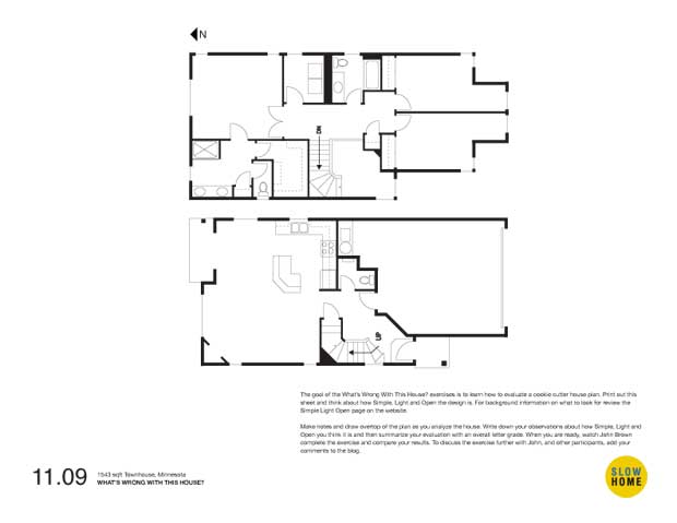
Part 1 – 1543 sqft Townhouse, Minnesota

1543 sqft Townhouse, Minnesota (PDF)
1543 sqft Townhouse, Minnesota (JPEG)

  • James Scott

    Good morning,

    Overall I didn’t find the plan too too bad. But certainly not perfect.

    Front entry is a bit too cramped yet too open to the main and upper floor. In winter once those cold winds whip through the whole house will be chilled. With the open concept entry all of the heating will go to warm the upper floor, the furnace will constantly be on. I didn’t see a front closet either.

    The kitchen is pretty tight even with the island. The sink, stove and fridge are all shoulder to shoulder…not very practical.

    To generalize the plan looks like it was somewhat last minute in concept. “Hey, we could use a guest bath so lets stick one here. And the master bath could use a linen closet, let’s stick one here.” It’s like they forgot to include a few features and stuck them where they would be the least obtrusive.

    The one positive, there are lots of windows throughout the house. It does make me wonder where the townhouses connect.

  • Matt Nolette

    James brings up a good question. Where do these townhouses connect?

    For me, the worst offense is putting primary living areas oriented to the North in Minnesota.

    The bump-out in the bedrooms might have worked as an interesting nook if it were not cut in half. As it is, both sides are too small to use for anything. Maybe some kind of desk below the window but they seem too deep for that.

    When the kitchen must be small, I’d rather it were a galley kitchen so you can avoid all the shoulder rubbing and tripping over open oven doors. There was room for a more generous kitchen here; especially considering it was intended to be eat-in with the raised portion of the island. A couple could make an intimate spot of the area between the island and the patio door but it’s not big enough for anything more than a tiny table by the window.

    There’s a line indicating a step up or down in the foyer and if that’s the case then it’s just awful. The winder laden stair and confusing wall geometry were bad enough (notice how the closets of the 2nd floor cantilever over the space). In 1600sqft they’d have been much better served to use the two-story floor space for added living and better traffic flow.

    I’ve been lurking here for quite a while. Sorry I had to add my two cents in such a long winded way.

    Matt

  • MJ

    [img]slowhome.002.jpg[/img]

    It’s true. Although it is said to be a townhouse, it has windows on all four sides. Sadly the sun from the south is reserved mainly for the garage and the two bedrooms. Here’s what I think is wrong with this house.

    1. The entry is tiny, awkward and has a really bad flow. You land basically right in front of the stairs and, once again, no closet or space to put away shoes, jackets, umbrella, etc.

    2. There shape of the stairs takes up a lot of space in the house. Lots of wasted space (in red), weird angles and clumsy “solutions” to mask problem area (e.g. raised entry)

    3. The garage is huge fore the size of the house. I looks like it’s taking half of the first floor and most of the sunlight from the south. It sad that such prime real estate is given to a car.

    4. I wonder why the bedrooms facing south are shaped like this. The little nook is bizarre. Why not leave it as a simple rectangle and use the available space above the garage?

    5. Lots of wasted space again with the opening on the second floor. I guess it gives the illusion of space on the first floor.

    6. The walk-in closet is poorly designed. It’s not ideal to have to walk to the bathroom to get your clothes. It would have made more sense to place it closer to the laundry room. Anyway the whole left portion of the second floor needs to be reviewed.

    7. Isn’t there supposed to be an angled wall to continue the chimney ?

  • James Scott

    We’ve come across this issue time and time again…the orientation of the house to the available sunlight.

    So how would this house be best laid out if it was on the north side or the south side of the street? How would the entire lot plan look for each situation?

    I have never seen a subdivision (other than in artist’s concepts) where each house takes full advantage of the sunlight.

  • Terri

    1. The orientation of the living space to the north is the worst problem here.
    2. After that is the entry. That garage is not going to hold two cars with that toilet bumping into it and that angle chopping off one corner, so why not use the edge of that space for a better entry so that a bunch of slush doesn’t need to be navigated to get upstairs. A closet is essential in this climate. James already pointed out the problem with that double height entry and cold air.
    3. The kitchen is too cramped. That angled island uses too much space for basically nothing but counter while the other side of the kitchen has everything shoved too closely together (sink, stove, fridge).

    As for upstairs, I don’t mind the alcoves in the front bedrooms–can be fun for kids. And a desk can go either sideways or straight on.
    The master closet configuration and access is too convoluted, requiring a master navigator.

  • Doug Roberts

    The worst thing about this house is that there isn’t a single solitary closet to be found anywhere on the main floor — and we’re talking Minnesota here!

    On the positive side, as others have noted, are all the windows. I like that each bedroom has windows on adjacent walls and that the living/dining/kitchen area has windows on 3 walls, which should compensate somewhat for facing north. I agree with James — short of running all streets on a north-south axis or building a separate street for each row of houses, we simply have to accept that some houses will end up with north-facing back yards.

  • BradW

    Doug – might be a closet/storage under the stairs.
    MJ – the fireplace can directly vent outside so a chimney may no be required.

    Things wrong:
    1. The size of the garage prevents among other things the design of a proper entry.
    2. The two bedrooms above the garage are probably cold because of improper insulation and HVAC construction – just a guess…
    3. The kitchen island – angle bad
    4. The corner fireplace – enough said.
    5. The layout of master bath/closet could be better
    6. The window in the master bath tiolet room – personally, I do not need a view here.
    7. North facing backyard but, as you all know, I share the sentiment expressed earlier that some houses face north. I just would not buy this house based on its orientation.
    8. The step directly inside the entry door. I guess the idea is to keep dirt under control but I think more room is required and this will just trip people up.
    9. The paint colours, wallpaper borders and furniture are simply hideous – again just a guess…

    This is probably not a townhouse but a small detached home.

  • Steve

    [img]sh091109.jpg[/img]

    Obviously many problems here, most oddly the misalignment of the open space with the foyer below. The ceiling from the entry to the living area is a mess (see plan). At the same time, I don’t think the living area is too bad. The kitchen is small but usable and the living room spacious for a small home.

    Sadly, this home has no “street” presence and takes no advantage of its southern exposure. I’m guessing there’s a large gable roof over the garage door, under which are tucked those tiny bedroom nooks — what a waste of sunshine. The tiny front porch and entry are overwhelmed by all that garage and roof.