This is the best I can do on little time. (Soccer Practice)
Millwork, lots of glass instead of walls.
Interesting challenge.
[img]1_shdp18-1demo1.jpg[/img]
Doug Roberts
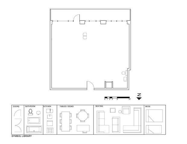
Here’s my attempt. The bathroom is now rectangular and has two doors, one facing the entry area for easy access by guests, and one facing the bedroom area for easy access by Dennis. The bedroom area is separated from the kitchen by a partial wall that stops short of the ceiling and has frosted glass pocket doors at each end that can be left open except when additional privacy is needed. Having this wall stop short of both the ceiling and the window wall should cause it to become a floating object and help the loft feel more open. I put a small bistro table and chairs in front of the window at the far end of the kitchen, as I thought this would be a wonderful place to eat breakfast. I felt it was more important for the living area to be close to the windows, so the dining area ended up next the entry area, separated by a millwork divider.
I found that the biggest challenge with this project was incorporating adequate storage space while trying to keep the space as open and loft-like as possible. I managed to fit in a front hall closet, a small walk-in closet for the bedroom and either a second closet or built-in dresser on the other side of the bathroom door, and would have liked to add more, but could not figure out where to put it. I hope that Dennis is not a packrat!
[img]2_shdp18-1demo1.jpg[/img]
Jim Argeropoulos
Once again, I didn’t finish.
I tried rotating the washer 90 toward tha entrance and hiding it in a closet. It doesn’t feel right.
I’d try to make the south wall of the bathroom of frosted glass to let in more natural light and give it some more modern feel.
Also not liking where the kitchen is going. It cam’t move and I like the way that James put some millwork between it and the door. I was going to try something similar.
[img]KentTryOne.jpg[/img]
Jim Argeropoulos
John,
I find the mixing of don’t know answers with potential answers confusing. Does Dennis not have a TV or are his needs currently met? Is the building heated with coal or Dennis doesn’t care to know?
Minor nit, but after wondering on a few weeks, I thought I should mention it.
MichaelG
Hi All, This is my first attempt after a 2 month linger. So please be gentle.
This was deceptive. At first, you see such a huge open space and see all the possibilities. A great space. But the positioning of the existing plumbing, especially the kitchen sink, makes it quite tough to open up.
A walkthrough of my attempt.
Lots of cupboard space along the corridor at the entrance. I imagine the small one as a shoes closet, with a different flooring marking an entry area/space to take off shoes. Perhaps its too small an area. That can easily be fixed.
The laundry/bathroom remains to the right of the entrance. The south wall should read as a glass doored, large shower, with a sliding door to the toilet room. The bath tub I’m not really happy with (the bottom of the tub goes under the bench) and could easily be removed. A 40 year old single IT professional probably wouldn’t take many baths. Remove that and the space opens up even more though, and may be too big… not sure. And with the shower, I’m making a big assumption that the plumbing can be extended through the new walls over to it. If not, the whole thing needs to be changed…
The bedroom doors are all sliding, floor to ceiling, and can really open up that space when open (the dot is just to give an indication of where the doors will end, its not anything physical). The bed head I image as a ~6ft, kind of floating object, that separates the bed from the closet area behind, making a kind of dressing area. The closets will be custom designed and efficient.
The living/dining/kitchen was tough. The kitchen must be in the center, which is not where anyone would put it given the chance to move that plumbing. So, my compromise is a 6ft millwork on the north and east sides of the northern island. Its the first thing you see when you enter the apartment, and has a many uses. First it blocks the kitchen work area from view of the entrance (a pet peave), and it allows for a decorative object, art, sculpture etc to presented to people as they enter. Being 6ft high. the east side can now hold the fridge, and also acts as the mount for a flat screen TV for the living area, while towards the west side it can be a splash back for the cook top. Imagine an industrial style range above it.
The south island would block the bottom of the center section of the floor to ceiling windows, but would be a nice place to prepare dinner. It extends further to the west of the apartment than the northern island, which is not as symmetrical as I’d like it, but I think it would still work, and having the norht island a little bit shorter opens the dinning area up a lot.
(incidentally, the pre-renovation floor plan has the sink right up against the windows, but in the demo plan its quite a bit removed. I went with the positioning in the pre-renovation plan)
The dining area is also a study area. The wall separating it from the bathroom is built in shelving for books, objects etc, with a desk hanging out for his computer (i’m assuming he has one) for work and play.
The living area is simply a huge, comfy, sink in corner sofa with a flat screen TV.
I have in my mind images of all the important design choices I made. If I can find the time, I’ll have a search on line for some pictures to accompany it.
Thanks!
[img]3_shdp18-1demo1.jpg[/img]
James Scott
I’m resubmitting a portion of my ideas.
I’m trying to visualize walking through the front entry and having a fairly unobtrusive view all the way to the terrace. Glass is key. As is making sure nothing reaches the ceiling that may interfere as the light penetrates to the back of the suite.
This is a real challenge since the goal is to create specific areas without filling the space.
I’m thinking somewhat of the Z-Box by Dan hisel Design.
Wtgrating WayTong A nice looking project. I have same feel that a minimum dimension of about 5 feet by 3 feet is required - cabinetry has to... An In Depth Look At Apt/Lofts In Denver
Kurt Grosse As a former Nevada building engineer and 25-year Realtor, I love Beazer Homes Las Vegas. Their home construction is generally good. Every home will have... 05/04/10 - Dallas/Fort Worth - Single Family
Dale Edmonton I was glad to read that In the first segment of a three-part series on the LG House by Louis Pereira of third stone inc.... LG House by thirdstone inc. [^] Part 1


