Part 1 – Wozney Residence, New York

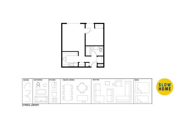
Part 1 – Wozney Residence, New York (PDF)
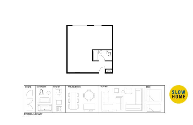
Part 1 – Wozney Residence, New York (JPEG)
Part 1 – Wozney Residence, New York (Demo)
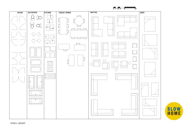
Part 1 – Wozney Residence, New York (Full Symbol Library)

  • MichaelG

    John, it looks like the plans (including the one in the pdf) are for a different project.

  • jim baer

    michaelg

    the design exercise from 3-17-09 has the floor plan, etc…

  • MichaelG

    Nice detective work Jim!
    I wonder whats going on here.

  • jim baer

    michaelg

    with travel, teaching, blogging and running businesses, i am sure john is swamped and exhausted. so he is recycling. no problem! i did not find the site til after this exercise ( and i am sure there are others too ) so this gives us a chance to participate, practice and learn.

    btw, the pdf is now correct.

  • Louis Pereira

    Some vintage Slow Home!

  • Doug Roberts

    [img]wozneydemo.jpg[/img]

    As the client ranked the kitchen higher in importance than the bedroom, I decided to flip the two around, allowing the kitchen to benefit from the second window and the bedroom to have more direct access to the bathroom. Although this will require some changes to the plumbing, it should be possible to tie the kitchen sink into the existing bathroom plumbing without too much difficulty. I would have preferred to use a counter-height table as the island in the kitchen, so that it could do double duty as a dining table, but that would have required integrating both the sink and the stove into the counter along the back wall of the kitchen, and I decided that would have been too much of a tight squeeze, so I put the sink on the island. Maybe the ends of the island could be left open, so that chairs could be placed on the ends, to either accommodate larger dinner parties or for more intimate dining (as sitting side-by-side doesn’t cut it when you want to gaze longingly into each other’s eyes). The living area is not overly well set up for watching TV, but hey, this is NYC, the city that never sleeps, so who would have time to watch TV anyway! I did put a small flat screen TV on the wall between the 2 windows, just in case.

  • Doug Roberts

    [img]wozneymillwork.jpg[/img]

    For additional storage and visual interest, built-in shelving/cupboards/drawers along these lines could be added along the left wall of the unit.

  • jim baer

    [img]091028shdp.jpg[/img]

    I have seen this one before ( i rooting around the site when i first discovered slow home ) so i may be working with other’s ideas or stealing john’s thunder ( without really knowing it )…but here goes.

  • Louis Pereira

    Doug – Great ideas and excellent use of wall space. I especially like the bedroom with the wall parition at the foot of the bed and sliding glass wall.

    —-

    Jim – Nice open plan using similar techniques as John suggested. The frosted glass is particularly helpful in directing some natural light into the bath – whether as a full glass wall or simply a transom window running along the top of wall.

  • Louis Pereira

    [img]091028a.jpg[/img][img]091028b.jpg[/img]

    Since the project was featured back in March, at that time the Slow Home website didn’t have the ability for users to post images so i thought i would share a couple of plans that i submitted to John back then…

    The first is similar in many ways as john’s final layout. John also posted the millwork images that supported the concept of dividing the living room and Bedroom space. http://theslowhome.com/wp-content/uploads/2009/03/millwork-images-from-louis.pdf. The precedents are by Messana O’Rorke Architects.

    The second was a variation which seems comparable to Doug’s plan of having the Kitchen along the exterior wall and Bedroom in the back corner.

  • Doug Roberts

    Jim — Well done! I am not sure how you managed to do it, as I thought I was being pretty space-efficient, but your kitchen and bedroom both appear to be much more spacious than mine, without compromising the living room. I also like the transom windows you added around the tub/shower area to help bring natural light into the bathroom and front entry. I toyed with the idea of replacing the entire tub/shower surround with frosted glass again, but I took a bit of heat for doing it last week so I decided not to go there this time.

  • Louis Pereira

    [img]091028c.jpg[/img]

    Some more precedents to support the kitchen island design on my second floor plan. The first image by Israelian Architect, Pitsou Kedem and the second by Front Studio which i just happened to spot this morning doing some research.

  • Doug Roberts

    Louis — Another two very spacious plans — I am starting to think that maybe I am working on a different scale than everyone else! I particularly like your kitchen design in Option 2, and the way you snuck a separate shower into what used to be a front hall closet.

  • Louis Pereira

    [img]091028d.jpg[/img]

    Thanks for the comments Doug – The kitchen design in Option 2, has similar features with this kitchen layout (attached) that i proposed for a client back in 2007

  • Steve

    I won’t be able to work on a plan today, but – inspired by all of you – I see much more potential than was apparent at first glance! Two opportunities that might bear more attention are incorporating more of the circulation space into the living areas and not crowding the perception of the space at eye-level with tall furniture or built-ins (much as I love them).

    BTW, how do you interpret the client’s desire for “loft-style” living? Openness, studio layout, industial finishes?

  • James Scott

    Great plans, as always each of you make it all look so simple. I like the plans where the living and sleeping are nearer the windows. I think the kitchen and the bathroom spaces offer a buffer to hallway life and noises.

    On the note of small spaces I have a friend who moved to Toronto last spring into a studio (sales spiel for cell) that’s much smaller than this. I’ve been thinking about it for months wondering if we could use her space one day as an exercise?! I’ll ask her for some dimensions and see if John would be interested.

  • jim baer

    doug and louis

    thanks for the good reviews.

    i was assuming that all of the casework stopped short of the ceiling and the glass in the bathroom was transoms.

    i like the kitchen by the window / bedroom in the corner idea in concept, but i have two real world concerns.

    in nyc the vast majority of stoves, esp in older buildings, are gas fired; meaning they usually can’t be moved across the rooms.

    also, bedrooms require a minimum amount of natural light and fresh air; which means they usually require their own windows. bedrooms can be off of living rooms, etc… but then a minimum amount of the separating wall must be open. and it is a big amount… something like 60 sf, which is approximately 8′ x 8′!

  • Frances Grant-Feriancek

    Hello all,

    My plan is amazingly similar to Doug’s, but then again there are only so many options in this small an area.

    Lots of millwork for storage and a murphy bed to give breathing room. The flat screen tv is mounted on a pivoting arm enabling viewing from the living area the bed or even the eating bar.

    Kitchen finishes must coordinate with the style and quality of the living area. The end counter most visable to the living area should have a full height upper cabinet, ceiling to counter.

  • Frances Grant-Feriancek

    [img]1_shdp36demo.jpg[/img]

    Opps,

    Here’s my plan.

    Love the changes to the bathroom, I never thought to make any changes.

    Jim, the transoms would add light to the interior room making it something special.
    Louis, adding the shower! That closet bothered me, too deep for a closet and in this space you don’t want to waste an inch.

  • MichaelG

    [img]shdp36mg.jpg[/img][img]bed05.jpg[/img]

    Retro SlowHome! Like most others I wasnt around to have a go at this the first time around, so I appreciate the decision to dip into the archives, rather than go dark, when time is pressed.
    That said, the plan that was linked to this exercise when it first went up looked more interesting!

    We’ve done a few open+small spaces recently. While it is definitely possible to fit a bedroom in this sized apartment (in Japan, you can get a one bedroom in less than 400) too many walls can make you feel claustrophobic.

    My plan is one large room towards the windows, and utilities towards the back. So I moved the bathroom, which is different to the other plans. Might stretch her budget a bit, but good to explore options. The bathroom is small, but it should be functional, and it is lowest in her priorities. I’m concerned that the walk in closet (sales point alert!) is too tight, but maybe it’ll work.

    For the bed, see attached. I’ve been looking for an opportunity to feature this since I saw it on materialicious.com a few months back.
    http://www.metrofarm.net/beds/?image=0

  • Grace

    I remember this home. I’d opt for all the living space across the windowed front, because it would give a more spacious sight line and feel. I also would want the bedroom closer to the bathroom. Jim Baer brings up the reality of regulations(never my strong point in imagining how I’d like to live in any particular space). There must be creative ways of daytime closings of the bedroom and nighttime openings (especially from the slow home team!).

  • Kitchen design New York

    Hi
    This is really nice article, Thanks for sharing to us.
    We are aggressively Affordable Kitchen design New York New York for organisations and charities.