Part 2 – Biloski Residence, Ohio

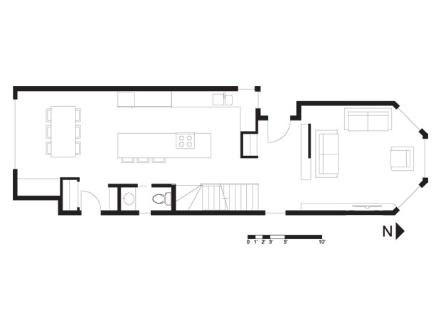
Part 2 – Biloski Residence, Ohio (PDF)
Completed Concept Design – Biloski Residence, Ohio (JPEG)

  • Grace

    Somewhat off topic, perhaps, but I spent yesterday at Philip Johnson’s Glass House–the ultimate in light, open, and simple. I couldn’t help but think about the similarly sized (but urban) case studies of the design school. It might be fun, John, to occasionally analyze such a house–or a Wright Usonian.

  • Jim Argeropoulos

    John
    I like the millwork bench to give the living room some definition.

    Brad
    I liked how you moved the bathroom yesterday, but at the same time it felt like it used a lot of space.

    I struggled with how to make this plan something other than one big long box. I think both of you did a good job of achieving that.

  • Doug Roberts

    Hi John

    I am not sure that your back entry design will work, as I am not sure that there is sufficient room between the side of the house and the edge of the property for a comfortable entry. We don’t have a site plan and therefore don’t know exactly how much room there is on the side, but the original design had both the front and back entries themselves, as well as the access paths to those entries, set in from the sides of the house, and I suspect they did that because without such insets there was simply not enough room for a comfortable entry.

    I also still have concerns about having the bathroom door opening into the dining room and kitchen.

  • ersie

    I have a comment about something that I’ve seen in many design plans now and have wondered about. Namely, the counter at the kitchen island. In a case such as this one, doesn’t it get a little awkward when one of the chairs is occupied and someone wants to get into the loo or needs to move between the front and the back of the house?

    P.S. I’ve had the same thought as Grace. One of my favorite houses is the Pope-Leighey house which I had the opportunity to visit, and it would be great to occasionally analyze something like that here. Maybe even one of the Sears-Roebuck catalog homes!

  • Brad W

    John – Nice plan. I knew your solution would keep the bathroom on the main floor as per the demolition plan but I wanted to try a couple of different ideas. I knew I would take it on the chin for lack of bathroom and closet space but that is what makes the discussion fun and interesting.

  • Doug Roberts

    I think this exercise highlights an important and challenging design issue when dealing with narrow lot homes, particularly those with detached rear garages. These homes require proper front and rear entries with closets and room to accommodate household members, guests and the stuff they bring in and take out with them. However, the front and rear of these homes are also the best places to put living spaces as they have access to light and to outdoor garden spaces. Unfortunately, functional entry spaces and comfortable living spaces do not tend to go together very well and when you try to squeeze both into the front or back of a narrow lot home you pretty much always end up with an unsatisfactory result — one or both spaces are too small and cramped, the entry opens directly into the living space, etc.

    One possible solution, as shown in this exercise, is to put the entry part way down along the side of the house, which allows the entire front of the house to be devoted to living space. However, this is not a perfect solution either, as it ends up making the front living space very separate from the kitchen and dining spaces, which does not work well for casual entertaining or day-to-day family interaction.

    Good solutions to this design issue are sorely needed, as the trend towards narrow lot homes with smaller ecological footprints seems to be growing in NA.

    Any thoughts?

  • Louis Pereira

    John – I really like your solution to the back entry. I wouldn’t have the same concern as Doug’s about insufficient space there. I would venture to guess that the min. side-yard setback is approx. 4′ which is a typical landing size and therefore adequate.

    I did like Doug’s later suggestion to recess the front entries as in this example. This would also provide an opportunity to create a sheltered front entry walkway, whether with a pergola or an overhang off the second floor. Interesting to note that a side entry like this house is not allowed in our neck of the woods in particular mature neighbourhoods (silly i think), but rather the regulations require the front entry door ‘facing the street’.

  • Louis Pereira

    There are some of us who had very similar plans (Terri, Brad and Doug). Brad’s solution for the Main Entry closet was an exact likeness to John’s solution. i think John’s plan is very practical economically, and although we never fully know the exact budget, i wanted to offer an ‘upper-end’ version.

    I won’t go into much detail about the plan, but i hope to follow up with some precedents shortly to support some of the ideas…

    [img]2_09061a.bmp[/img]

  • Terri

    John,

    Moving that back entry makes that dining area much nicer. I’m not completely convinced that it’s important to have a clear view out the front window as one descends the staircase. I feel it may be more important to have the view through from front to back when sitting in either end less impeded by a closet or millwork.

    Also, I noticed that the file on this family said that they don’t use a TV and wouldn’t need one in the living room, so I didn’t put one there.

    I have a question regarding the term “loftlike.” It’s been used a few times since I’ve started these exercises, and whenever I hear it, I think of wide, open spaces with clear views from end to end and little in the way of obstruction. Any obstruction should be absolutely necessary, or at least in a position that makes sense for the general feeling of flow from end to end. Am I off-track with my assumption?

  • Louis Pereira

    Precedents…

    [img]090610_b.bmp[/img]

  • John Brown

    Grace,
    That is an excellent idea for a case study session. I am actually giving a lecture at our offices this Saturday on California Modern Homes from the post was era.

  • John Brown

    This is the completed concept design for the Biloski Residence.

    [img]shWeek16final.jpg[/img]

  • Louis Pereira

    John – I’m certain that lecture would include homes from the Case Study Series (i.e. Koenig, Eichler etc.) Wish i could attend!…

  • James Scott

    I’m sure John has so much time on his hands that one more idea wouldn’t matter. So, wouldn’t it be interesting to be able to occasionally see one of John’s weekend lectures as a web-cast or on-line video.

  • John Brown

    James,
    Good idea but then nobody would come to the seminars :)

    Louis,

    You bet. The plan is to talk about the whole case study program.

  • James Scott

    John, as usual you make a very good point, LOL.

    One day, when I make my cross Canada trek, The Slow Home office will be one of my stops for sure.

  • Paul C

    Better late than never. I like narrow homes. Before getting into the description I took a page out of a previous project and squared off/filled in the rear corner. :-)

    A few things that resonated with me was the fact that is a family of four with two school age children (14&16/young) and value the gathering at meal time. To that end I thought it important that the entry(s) should be large enough and functional enough to accommodate as best as possible all the things that come with that composition. I thought combining the entry into one large space as opposed to two smaller ones would help in that regard. One larger closet that could accommodate the backpacks, mittens, boots, shoes, umbrellas and on and on, well you get the idea. The closet doors would include frosted glazing to permit light to filter in from the corner windows. The bath is close by, the stairs extend at the bottom to create a ledge one could sit on and there is enough space for four people to “get it together” before heading out the door.

    I have shown this type of kitchen before as a way to try something different from the island/eating bar arrangement. It is somewhat contrary to the typical triangle but maybe two sinks would help offset that. I like the possibility of having the kitchen table perform double duty. A working/preparation surface as well dining. The possibility of having a little deeper counter space is also a plus in my mind. The dining space is easily expandable and even though a “study” was not desired, projects on kitchen tables always have to be folded up when the table is to be used for eating and so maybe a project center that has the home computer would be beneficial. I think some thought would need to be given to the floor and ceiling treatments in the kitchen/dining space to offset the long narrow aspect. John, I liked very much the millwork piece you used at your entry, in particular the entry definition it provided as well as the way in which the traffic from the stairs carried into the front living room.

    [img]ohio1.jpg[/img]

  • Doug Roberts

    Hi Paul

    Combining the two separate entries into one large entry for both guests arriving from the front and family members coming in from the rear garage is an interesting idea and could certainly work in this case where that entry is on the side of the house (although I suspect that the family would be inclined to shortcut through the rear patio doors when bringing in the groceries).

    I also like your placement of the powder room, as I much prefer having it open into the entry area instead of directly into the kitchen/dining area.

    Your “country kitchen” approach is also very interesting. Given your desire to also use the table as a work/prep surface would you envision it being counter-height, with backless or low-back stools that could be pushed completely under and out of the way? Also, for the table to be able to do triple duty by also acting as an elegant dining table when entertaining guests, I would think that considerable attention would have to be paid not only to the finishes used on the table and throughout the kitchen, but also to the lighting. In addition to the normal bright kitchen lighting I could see dimmable hooded fixtures hanging over the table that would direct light down almost exclusively onto the table so that the surrounding counters (and the dirty dishes sitting on them) would fade into relative darkness.

  • Paul C

    Doug,
    Thanks for the feedback. Great comments with respect to the lighting possibilities. To be honest I did not take the evolution of the kitchen concept that far except that I saw it as being one larger space that emphasized the overall building width and was as family friendly/casual as possible. Could the table be at counter height, why not? And I agree that lighting can be very effective in transforming the casual into the more refined. Light directed down onto the table would be ideal for task lighting as well.

    Now, exactly what wattage is required to make those dirty dishes disappear? This I would like to know, Lord knows I’ve tried many methods :-)

    Thanks again Doug.

  • Grace

    Paul, I like this very much–a great family home; wonderful kitchen!

  • Paul C

    ^ Thank you Grace.