Step 3 – Kitchen

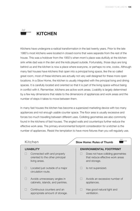
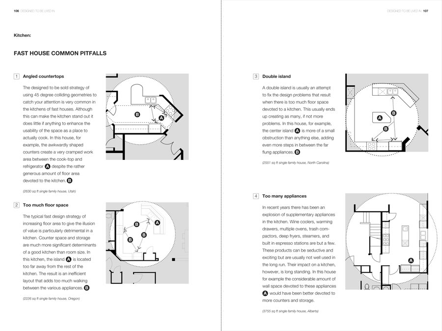
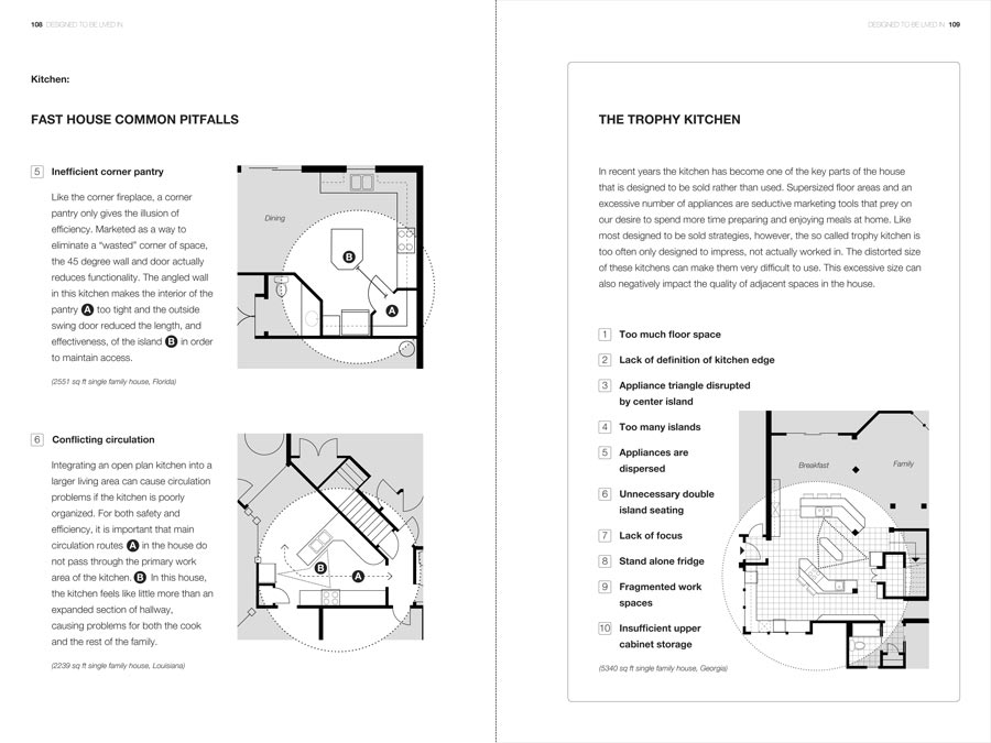
Step 3 – Kitchen (PDF)
Step 3 – Kitchen (Page 1)
Step 3 – Kitchen (Page 2)
Step 3 – Kitchen (Page 3)

  • John Brown

    Note To Readers

    Please review the attached excerpt from our upcoming book and provide comments, suggestions, criticisms, etc.
    The number of pages and basic format are fixed. The audience is non-professional. The goal is to help people learn how to use the Checklist to evaluate houses.

    Some issues to consider are:
    1. Is the introductory paragraph clearly stated?
    2. Are the rules of thumb the best ones (remember we can only have up to four for each side).
    3. Are the rules of thumb clearly worded?
    4. Are the common pitfall categories correct?
    5. Have we missed any critical common pitfalls?
    6. Are the diagram sufficiently clear examples of the common pitfalls?
    7. Is the wording of the common pitfalls clear?
    8. Am I missing something overall?
    9. Is the section clear and helpful?
    10. Is there anything else that would help someone make the determination of whether this particular part of this particular house is fast or slow?

    Thank you for your help.

    John Brown

  • Grace

    Wow! that trophy kitchen is mind-boggling. Ridiculously inefficient. I’ve had small kitchens and big kitchens, and have always found the small to not-so-small U shape to be the best

    don’t have anything to suggest today (wait! can’t help myself–insert hyphens when using ‘designed to be sold’ as an adjective: designed-to-be-sold strategy. “the so called trophy kitchen is too often only designed to impress, not actually TO BE worked in.), but wanted to say how important I found Matt’s comments from yesterday to be.

    You’re a brave person, John, to have opened this up to all of us!

  • jim baer

    [img]09111801.jpg[/img][img]09111802.jpg[/img][img]09111803.jpg[/img][img]09111804.jpg[/img][img]09111805.jpg[/img]

    john

    i guess i had more to say today!

    this section is the best so far. ( in spite of all my mark-ups ) it is focused and clear.

    the trophy kitchen section works better. it is also clearer and more focused than the others and seems less like a pet peeve. its position at the end seems to work better, less plunked down in the middle and more of a wrap up to the section. also, the list of bullet points gives specific things someone can look for and see when touring a prospective house, or even their own home.

    i wonder if readers will walk around their houses, see how bad they are, and fall into deep depression because they now hate what they once loved and can’t afford to move or renovate…. ah the double edged sword of knowledge….. is ignorance bliss???

  • Li-Na

    I really like the sample floorplans you’ve assembled for this section, John. Nearly all of them made me snort (which I have found is my rather un-ladylike response to really bad floorplans) so I think you’ve picked some winners here.

    I think a few hyphens are needed here and there in the text. These are the ones I’ve spotted in order of appearance (plus some other things I spotted):

    Intro first paragraph, add hyphens to:
    *Line 6: so-called
    *Line 7: well-designed

    Intro 2nd paragraph:
    *Line 3: I think “colliding geometries” requires a clearer explanation. Is this covered elsewhere in the book?

    Pitfall 4, add hyphens to:
    *Line 6: built-in
    *Line 8: well-used
    *Line 10: long-standing

    Pitfall 5:
    *Last sentence: The angled wall in this kitchen makes the interior of the pantry (A) too tight and the outside swing door reduceS [not reduced] the length and effectiveness of the island…

    Commentary, add hyphens to:
    *Line 2, 5: designed-to-be-sold
    *Line 5: so-called

    Misc:
    1) This is a style thing. I’m just mentioning it because I only just noticed it. When you use the circled letters in the text (to indicate points in the floorplan), I lean towards putting the circled letter before the period at the end of a sentence.

    For example, in Pitfall 6, “For both safety and efficiency…primary work area of the kitchen (B).” Rather than the way you have it now, “…primary work area of the kitchen. (B)”

    I prefer the period right at the end because it links the letter to the sentence that was referring to it rather than leaving it hanging between two sentences.

    HOWEVER, like I said, this is a style thing, you could do it either way according to your preference (as long as it is consistent). :-)

    2) I am curious about item #2 in the commentary: Lack of definition of kitchen edge. Perhaps you cover this elsewhere in the book? It is not something I remember you mentioning before and I am curious to learn more about it myself.

    Looking back on what I’ve written, it would have been easier to mark up the text in a picture as you suggested. I apologise for using the write-it-all-out method, I did not think that it would end up quite this wordy when I started out today!

  • Jane

    John, Interestingly bad floor plans!! One thing I was looking for was a slow home example. Easy to pick apart the bad ones – (there are lots), we need balance.

  • Jane

    I have had another opportunity to review.

    Point 1 – First page regarding slow home kitchen is integrated into the liveing and dining areas. Your comment about ‘carefully located and orientated’ as well as ‘few key dimensions’ and ‘dimensions of applicances and work areas’. This needs more explanation or an example.
    As a non-professional that has followed your blog, I get the idea, but still not always sure that I could lay out a functional kitchen. I thought I understood this in my home, and tried to get a functional kitchen, but it still has problems. Kitchens are so important, but its hard to get them right.
    Point 2 – ‘environmental footprint consideration’ and ‘number of applicances’. You lost me, are these areally related? and if so how?
    Point 3 in your examples, delete the ‘for example’ comment (example 1, 3, 4).
    Point 4 trophy kitchen – every problem in this example has already been shown in the other examples. Yes its amazing that one kitchen can have so many problems, but I would love to see you use this space for examples of GOOD kitchen layouts.

    John, everyday this is getting more interesting and better, I can’t wait for the next sections…

  • John Brown

    Grace,
    I agree with you about Matt’s comments from yesterday – for those of you who missed them they were actually posted in the Day 1 – Front/Back Entry section.

    I think that at the end of the review of each section we should have a general discussion about his first point – to supplement the plans with 3d images. As I said, the reason we didn’t do this is that it opens up the pandora’s box of style. We really wanted to get beyond, or under, the typical interior design home book and get people to think about house design at a more fundamental level. I think we have achieved this on the site but as Matt says, this may not be as broad an audience as the book is intended to reach.

    I am REALLY interested in talking about how to balance these two needs. My sense is that we should all have the benefit of seeing all of the sections first. Do you agree?

  • John Brown

    Jim,
    Thank you for the markups. This is by far the easiest format for us to use as we start to work through all of the posts.

    You bring up a good question about the reader. My passionate hope is that yes – people will use the Checklist to gauge the quality of the design of their house- and that yest it will motivate them to action. The balance of the book is written to hopefully prevent the deep depression part – I want this to be a book about hope – for the design of a better future. There are too many books, particularly on the environment, that turn you off because they seem hopeless. This is a book about how every individual can take action, on their own terms and in their own way, to make things better. Like slow food, this doesn’t mean a lot of money. It does mean taking more care and thought and making better, smarter decisions.

    When we are finished with the review of the specific checklist sections I hope we can discuss, as a group, the strategies for how this might be done…. I have some ideas.

  • John Brown

    Li-Na,
    Once again, thank you for the thorough review. I hope you can keep up the pace – I know that I am finding it a bit exhausting (even amongst the excitement and enjoyment of the discussions). I think taking Friday off will be a good chance to recharge for another set next week.

  • John Brown

    Jane,
    You make a very good point about the need for more detail about good design. We have decided that we need to incorporate slow home examples into each of the sections. Unfortunately we won’t be able to get this done before you all review the rest of the sections but I promise they will be there.

    However, having you provide specific comments about what those good examples might be is very helpful.

  • Sherry

    Coming from the non-designer perspective, I would find some rule of thumb guidelines for kitchen spacing helpful. For example, what is an appropriate distance between work surfaces in a kitchen – to keep the work triangle relatively tight, yet allow the presence of more than one person in the kitchen? Or, how much space should there be between a counter end and a wall to allow good traffic flow? How much counter work surface is enough for typical meal prep?

    Perhaps if things like this disrupt the flow of the chapter, they could be included in an appendix at the end of the book.

  • John Brown

    Sherry,
    It is great to hear from a non-design reader and I appreciate the need for some more specific information on what to look for rather than what to avoid. The idea of an appendix is very intriguing. This is the fist time that it has been brought up as an idea and it might be a way to provide the information without disrupting the flow of the main body of the book.

    Thanks.

  • Annette Eason C.S.B.A.

    John,
    I now see what meant, those are some truly bad kitchens. The ‘trophy’ kitchen is mind boggling.
    I am not sure how well the Environmental Footprint section is coming across. I would like to address Jane’s question about the relationship of the number of appliances to the environmental footprint. Of all the rooms in a home, the kitchen has the greatest effect on the environmental footprint. It has the largest concentration of energy and water use. The more appliances( and excessive lighting) the more energy used and a larger environmental footprint .

  • Ruth Hasell

    [img]k1.jpg[/img][img]k2.jpg[/img][img]k3.jpg[/img]

    Hi John,

    Hope these mark-ups come through and are helpful.

    And generally, I think that this section is doing a good job of describing what is a bad kitchen – and a less good job of describing how a truly good kitchen can transform a home. Perhaps this is the result of focusing entirely on pitfalls at the expense of possibilities?

  • Cat

    Although you touched on fixtures and finishes when you discussed appliances like expresso stations and wine coolers, developers and flippers really put an effort in the fixtures and finishes in the kitchen, hoping that potential buyers will be seduced into saying, “Look, honey, it has granite countertops and stainless steel appliances. Let’s buy it!” Not long ago it was black appliances and solid surface countertops, or even longer ago it was avocado green/harvest gold appliances and formica countertops.

    Most of what we discuss on the site is designing the bones of a house to be simple, light, and open. When buying/selling a house it too often is all about the finishes, or at least it appears to be all about the finishes if you watch HGTV for more than five minutes.

    The kitchen and bathrooms are rooms where the finishes seem to be really important, but of course it happens in other rooms also. The shag carpeting in the living room or the strange paint color in the bedroom are more noticeable than the windows.

    I am not sure where I am going with this. The book, so far, seems to be doing a good job of showing us how important the design of the bones of a house is, and what to look for. But if this book is intended for consumers rather than designers, I think this issue of “finishes vs bones” (for lack of better words) needs to be addressed more directly.

  • Jim X

    [img]p106kitchen.jpg[/img]

    Hi John

    I like the Kitchen section especially the Trophy Kitchen page. The explanation of how the push to sell over-rides good design is thought-provoding and clear.

    I have attached the page with Rules of Thumb where I tried to change the language from negative to positive.
    I also tried to explain ‘colliding gemoetries’ in one sentence without success so I left it out.

    In the Common Pitfalls page under Appliances I think there should be some way to identify all of the gadgets using the circled letters method used elsewhere on the page. The “A” on the floor plan doesn’ make sense.

    One major criticism: No mention about an eating area in the kitchen, or the connection between the kitchen and the dining room. Some of the plans in Common Pitfalls show a peninsula or space for chairs on the island but it doesn’t really come up.

    Sherry’s suggestion of an appendix is a good one. As she suggests it could be used to list the space needed around furniture, appliances, tables etc. to make the room liveable, without being cramped

    Jim X

  • John Brown

    Annette,
    Thanks for clarifying Jane’s question about the relationship between environmental footprint and kitchen appliances. I couldn’t have said it better myself.

    You are also correct that we need to do some work making the environmental footprint argument clearer.

  • John Brown

    Cat,
    I like the distinction you have made “bones” and “finishes”. As you say, with a book intended for a general audience we have to make a special point of clarifying that this book is about the design underlying the house and not the surfaces that float on top of it. We should have a discussion about how best to do this after we have completed the checklist review.

  • Grace

    John—I don’t think that 3-D images are necessary. What I took from Matt’s suggestion was his emphasis on dramatically showing how poor function results from fast (and thoughtless) design. Can you add some stick figures bunched up in a tiny foyer while the snow whips into the living room? or an old man with a cane sprawled out on the floor tangled up with backpacks? or am I degrading the slow home vision with cartoons? I don’t mean to. I would be sparing with this device if it were used pictorially. Maybe you can do it just as well verbally: We don’t want our guests bunched up in a tiny foyer while the snow whips into the living room. We wouldn’t want grandpa arriving for a visit only to end up sprawled on the floor, feet tangled up with backpacks.

    I do agree with you that we need to go through all the sections before regrouping to discuss overall impressions.

    I think that Matt’s 3rd point is very important–to reinforce the central point of each section with an image or emotion that will not be forgotten. Here again, I think that once we’ve gone through all the sections, those of us who are interested in doing so, could review them with the idea of making sure that this has been achieved.

    Did you every expect so much help?! Maybe you need more than Friday off?

  • John Brown

    Ruth,
    Thanks for the detailed markups. They are really useful. I take your point about the need for some good examples, particularly for kitchens.

  • jim baer

    john

    i like cat’s bones and finishes comment. if this is coupled with 3-d drawings instead of photos you might be able to show the same design in more that one “style” to indicate that even if the surface is different, the underlying design is the same.

    does this make sense??

  • John Brown

    Jim,
    As a result of this review experience we have been rethinking the tone of the language in the rules of thumb section. Thanks for taking the time to give us some concrete suggestions.

    You also bring up a good point about in kitchen eating. Tomorrow’s section is on dining and I think that we overlooked it there as well – Oh well, I guess we have to give you something to talk about right?

    I will record your vote for the appendix of good design ideas.

  • Terri

    [img]slowhomep107.jpg[/img]

    John,
    I went a little crazy this time and ended up editing the section’s Introduction quite extensively. As always, these are only my suggestions. I was responding to both Jim Baer’s and Sherry’s comments made above (he noted the “colliding geometries” terminology, and she wanted to understand the work triangle dimensions) while I edited.

    I haven’t marked up the other pages as yet. I might just concentrate on text. I’d like to tackle the Trophy Kitchen paragraph and hope to get it posted later today.

  • Elizabeth

    [img]kitchen1.jpg[/img][img]kitchen2.jpg[/img][img]trophykitchen.jpg[/img]

    John,
    I’m really enjoying this process! More detailed edit in pictures, but a few questions about this section:

    There is so much to say about kitchens but the section seems a little light on content. The examples allude to the kitchen “work triangle” but it isn’t discussed here. Is it discussed elsewhere in this book? Maybe you think it’s been amply covered in other publications.

    I think we could use some guidelines about the triangle? (i.e. approx. length of a side, ideally isn’t just a straight line, 3 sides should add up to less than X). Because without some touchstones, it’s easy to buy the marketing hype.

    Maybe you could discuss proportion somewhere: the “bowling alley” living room is long and narrow, but what is ideal? What is OK? Can a room be square? Is a rectangular room where the L x W ratio is 1 x 1.5 slower than a room that’s 1 x 2? I think you want to help the reader to develop a designer’s eye and be able to judge rooms within their own context, but a few concrete guidelines could go a long way.

    I liked Grace’s idea of illustrating some of the drawbacks, with no detail on the “style” just the substance. Photos go out of date too quickly.

    Scanner won’t spit out Pitfalls 5 and 6. They’ll follow if I get it to work.

  • BradW

    John,

    In the rules of thumb, I suggest that the Livability angles comment is duplicated by the Environmental Factors colliding geometries comment. I also think the intended audience might have trouble understanding what colliding geometries are.

    I have only seen one kitchen that comes close to the trophy kitchen in layout and size. I know they exist. More often the real tragedy I see is a poorly designed kitchen with very expensive fixtures and fittings.

  • Steve

    Very sentence, Rule, and Pitfall is on target. Well done! Three quick comments:

    1. Work triangle. You refer often to the “work area” and in the sidebar to the “appliance triangle”. I think “work triangle” is the commonly used phrase and does not sound like jargon when described. Here are the rules of thumb from ergonomics.about.com to avoid a work triangle that is too big or too small:
    * Each leg of the triangle should be between 4 and 9 feet.
    * The total of all three legs should be between 12 and 26 feet.
    * No obstructions (cabinets, islands, etc.) should intersect a leg of the work triangle.
    * Household traffic should not flow through the work triangle.

    2. Rule 1 states that a Slow Home kitchen is “connected with and properly oriented to other principal living areas.” Since the open kitchen is now de rigueur, I assume the issue here is “proper” orientation. What’s the difference between proper and improper connection and orientation (aside from the corridor kitchen in Pitfall 6)?

    3. Similarly, the sidebar states that a trophy kitchen has an ill-defined edge and lack of focus. I’m not sure what these look like in a kitchen, either good or bad. Descriptions would be helpful.

    Otherwise, this section is great! And I’m diggin’ the logos!

  • John Brown

    Terri,
    You are amazing. Thank you for the professional touch.

  • John Brown

    Elizabeth,
    I appreciate your comments regarding the meaning and specifics of the “work triangle”. It is all too easy to get caught up in professional jargon and forget that it is not familiar to everyone. I also really appreciate Steve answering the question.

    I think we will need to consider the appendix idea that was previous suggested as a way to include more detailed information without breaking up the flow of the book.

  • John Brown

    Steve,
    Thank you for clarifying the work triangle question and bringing up the need to clarify the proper orientation comment. I am glad you like the logos – so do we.

  • Katrin

    [img]1_kitchen.jpg[/img]

    Hi John — I’ve been enjoying the slow home for months and have learned a great deal from it, but I have a problem with your blanket dislike of 45 degree angles. Admittedly your examples support your point. But when I bought a new home and redesigned the 9×12 kitchen 7 years ago, the space didn’t work until I moved the sink into the corner, as shown in the attached picture. That gave me two good-sized work areas on either side of the sink, plus some great ‘storage’ for the coffee grinder, detergent, etc., in what would otherwise have been wasted space.

    The other thing that I think is essential for any kitchen that is going to be used a lot is that it have a window. I refused to buy a lot of otherwise not too bad homes because the kitchen was dark and miserable and way too far away from any natural light, so I would like to see you add Light to your kitchen checklist.

  • John Brown

    Katrin,
    I suppose it is always the exception that proves the rule !
    From the photo it looks like the small scale corner sink works well. My problem has more to do with the large scale collision of geometries that occurs when designers add 45 degree angled walls into a floor plan. In fact we have devoted a whole section of chapter 2 in our book to this problem.

    Thanks for the suggestion about including natural light in the kitchen rules of thumb.

  • Grace

    John–hoping you got my response to your question earlier today–Grace

  • John Brown

    Grace,
    Thanks for the reminder. Your post got lost in the shuffle – sorry.

    I like the idea of giving some “life” to the commentary but I am always concerned about making a chapter too long. This particular section of the book is preceded by a chapter that tells the real life story of a young couple who came to my office because they didn’t like their house. We go through the analysis of their house and the commentary is similar to the way you were describing. That may be enough. – Something to discuss a little later in the process I think.

    With that said, however, the idea of having some sort of central point or emotional message for each section is really important if they are to be memorable to readers.

  • Matt

    A bit off topic. Is there any place in the book that you talk about design that is “too busy” or incoherent(for lack of a better terms)? Rooms with too many angles, too many different materials, too many different heights, too many broken lines, too many colors, etc, that makes a room look haphazard and poorly designed?

    Any discussion of repetition of a theme, material or other design element to help pull rooms together?

    The reason I ask is there appears to be a number of common themes (for obvious reasons) in the rules of thumb – Do you discuss any of the higher-order design priciples that lead to these rules or is it out of your scope for this book? (You need to draw the line somewhere…)

  • John Brown

    Matt,
    Good question and the answer is yes. We have a chaptethat discusses the various design strategies that are used to catch our attention and entice us to buy while at the same time creating a chaotic environment that is difficult to live in.

    At some point, however, as you say we had to make the difficult decision of where to end this particular book.

  • Murray

    [img]01kitchenintrocomments.jpg[/img][img]02kitchenpitfall01comments.jpg[/img][img]03kitchentrophycomments.jpg[/img]

    Hello,

    Wednesday is a busy day for me so I am posting this Thurs AM.

    I think this section is fairly successful, and I found myself being a text editor more than anything else though my jpeg notes are not exclusive to text.

    A general comment on the introductory paragraphs to the sections (so far):

    The two paragraph format sets up a compare/contrast scenario. In the front/back entry and the indoor/outdoor sections one would naturally divide the two paragraphs between the two entities. Within the paragraphs, however, I think there should be a consistency within the layout of the argument. That is, the first part of the paragraph should set up the potential problems associated with fast living, while the latter part of the paragraph provides alternatives to consider for the slow lane.

    Similarly with a single entity, such as the kitchen, devote the first paragraph to areas of concern and consideration, and leave the second paragraph for your strongest arguments about a slow home kitchen.

    Apparently-many-of-us-prefer-to-use-far-more-hyphens-than-does-the-original-author!

  • Terri

    [img]slowhomep108.jpg[/img]

    John,
    I didn’t get to this page until much later and then the power went out…Anyway, for what it’s worth, I’m posting my suggestions on the last two pages of this section.(Unfortunately my scanner program offers no page orientation changes.)

    The Common Pitfall examples all work for me, though possibly the #4 Too many appliances could include dotted lines from bullet A to each shaded appliance. This visual representation would reinforce just how busy that kitchen is with appliances.

    On the subject of visual representation (the 3D discussion), perhaps instead of photos (I agree that they can become dated because of style issues), perhaps a 3D drawing using a CAD program. I’m not sure how effective it might be, since putting the person into the space is really what is needed. Possibly language is the best way to get the perception of space across. Big surprise–me saying that!