Remodelling Single Family Homes In Philadelphia

This is Day 162 of the Slow Home Project and we need you to join us in our quest to evaluate the design quality of houses in nine North American cities in nine months. Today we have a Design Project featuring a single family home in Philly.

Welcome to the Wednesday edition of Slow Home and today we are doing another Design Project! We need your help to re-design a single family house that we found from the Philadelphia area and this will one is guaranteed to be a challenge!

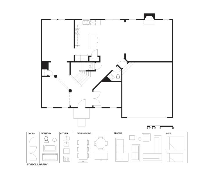
We have chosen a plan called the “Empress” and it is a 2,708 sq ft, 2 storey home located in the Stables community of Worcester Township – about 25 minutes from central Philadelphia.

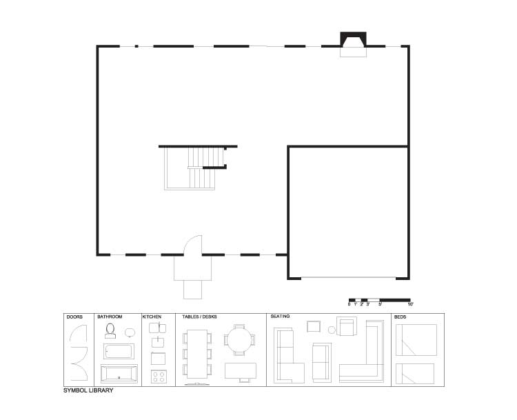
The “Empress” has some serious design flaws that we need you to address and turn it from a fast house into a Slow Home. It has a terrible 45 degree angled geometry that ruins many of the interior spaces and makes them very difficult to furnish. It also has an awkward entry into the house from the garage and a really average kitchen layout. For the demolition plan, we are removing most of the walls, but leaving the garage, the fireplace and we have re-configured the stairs into a more functional design. If you like, and for bonus points, you can leave the HVAC build out on the left side yard wall.

Here is the program for today’s project:

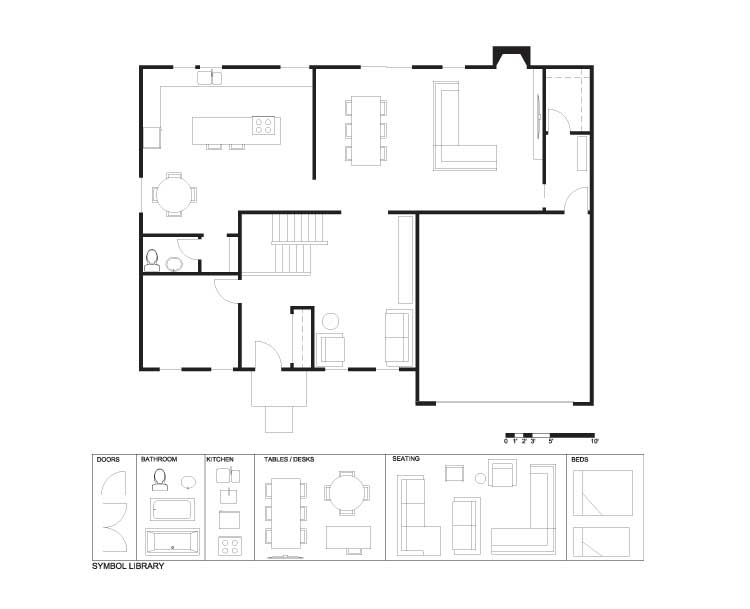
  1. Add a new front entry space with a coat closet.
  2. Make a functional back entry from the garage with a coat closet.
  3. Put back a kitchen that is appropriate for the size of this plan.
  4. Add a formal and an informal dining space.
  5. Add a formal and an informal living space and/ or a study. You will get bonus points if you can creatively combine the spaces without creating wasted space. Remember, the living spaces should also have a good connection to the outdoors.
  6. Add a properly located guest bath.
  7. A main floor laundry is not required.
  8. Make proper use of the fact that the new star is open towards the front door.

Day 162 – PDF
Day 162 – Existing
Day 162 – Demo
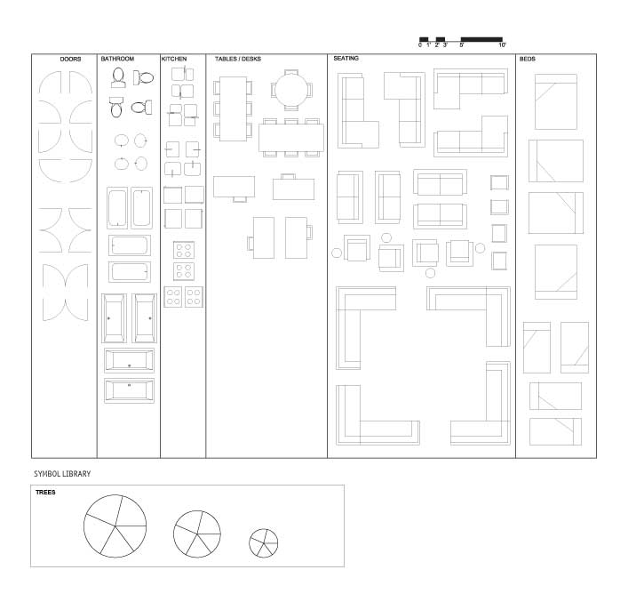
Day 162 – Full Symbol Library

Good luck! We are looking forward to seeing your designs. When you are ready, click on the player below to see how John has designed this space.

See John’s Final Design

Join us tomorrow for our “In Detail” segment where we will be reviewing kitchen design in single family houses!

  • Terri

    [img]philhse1.jpg[/img]

    This is my first sketch for this design project. I didn’t like the way the central entry divided the space at the front, so I moved it over by one window. I don’t know if the asymmetrical entry will jive with the elevation, but I’m hoping it’ll work. ;)

    Now the three windows in the formal living space makes this much more open than before, making the room more usable. I chose to put a piano here, but another fireplace could be installed along the end wall.

    The study is tucked into the back corner, away from most traffic but near to the kitchen for tea/coffee breaks.

    Formal dining is not that formal, next to family rm. I plan on doing another version of this plan later, where the dining will be placed elsewhere…

    Finally, the millwork ties the family/dining/kitchen together, continuous along that back wall.
    (Also, notice–HVAC incorporation!)

  • Neogi

    [img]demolition.jpg[/img]

    , I wanted to really open up the space. In my plan the back of the house is completely open from the dining space at one end to the living space on the other. And with the use of a linear style for the kitchen it helps to make it a true open concept. Similar to other homes on the market the unit featured dual living and dinning spaces, however I decided to make larger single space units, I find this to be more efficient and functional. I changed the entry doors to give the home a grander feel as you walk into the space. The study is directly off of the foyer and the desk is essentially built-in to the wall with lots of shelving units and cabinets for storage and books. The double glass sliding doors make the room physically separate from the foyer however it still allows light to penetrate through. On the other side of the study is the entry closet and as you go around the corner you will find a shallow closet for storing cleaning supplies etc. The design purpose of that closet is to obstruct the view of the garage door as much as possible, and to create another foyer area for the entry from the garage. My goal was to make a large entry for the garage, because it is the space where many people forget to put enough effort into, even though this will the entry and exit that they will be using most often. Additionally the garage entry and main entry are still connected and are part of the larger foyer space. I feel the powder room is in a good location with lots of light and can be easily accessible form any of the public spaces.

    In order to make up for a dual living I wanted to make the family as large as possible with lots of seating to accommodate many people. The center ottomans can be pulled aside and made into extra seating if required. The focal point of the room is the fireplace and I tried to balance the space with that in mind. The kitchen is large and open, however my goal was to have a tight work triangle. With the linear design I was able to place the sink in the island allowing me to achieve my desired shape. The island also features a raised potion of the counter to accommodate the breakfast bar with ample amounts for seating. The dinning room is centered on the two rear facing windows, and the proximity to the kitchen is close enough that this space can be used daily. When doing the rough sketches for the design of this house, I knew this would an entertaining house, thus I implemented numerous seating around the kitchen and I also included a wet bar in the alcove where the block is situated. The wet bar is a great addition to the dinning space and is extremely efficient due to its proximity to the kitchen. I think it makes good use of the alcove and can also be used as a buffet counter. Also with the open concept design light can travel from the back of the house to the center making them brighter.

  • nicole

    [img]5_pp1.jpg[/img]

    Kitchen area has a pantry, location for recycle, storage, a ‘recharge station’ for electronics, + a family computer.
    Informal dining is located at the kitchen island.
    Mudroom / walk in closet / storage located near the garage.

  • Mid America Mom

    [img]phillysingle3.jpg[/img]

    This felt quite traditional originally so I ran with that and hopefully made it better.

    More open plan may come later. Interested in what everyone else has posted.

    Mid America Mom

  • Steve

    Afternoon Slow Homers’

    Just uploaded some new pics from John and Matthew’s time checking out Arapahoe Acres in Colorado.

    Visit our facebook page to check them out!

    http://www.facebook.com/slowhome

  • MarisaM

    [img]1_marisam.jpg[/img]

    My home’s major design concept is to have living areas as a large open area. I wanted to make a strong connection to the outdoors and maximize the amount of light from the windows. The dining area and kitchen are next to each other to minimize circulation and flow between the similar areas. I removed the front living room and replaced it with a study. I felt the front living room was too small and most likely unused. Therefore the study replaced the living room and focused the circulation to the stairs into the main living area.

  • PeterB

    [img]1_peterb.jpg[/img]

    I took into account the large amount of space. The front entry of the existing floorplan had flaws in terms of the front entry. I decided to break this up by installing a front closet on the left side. This not only gives the living room a bit more privacy, I feel it gives a better sense of a separated entrance into the house. The entrance off the garage is also separated by an extended wall off the kitchen. Aside from the entryways, I also focused on the kitchen, as the old kitchen wasn’t doing it in my eyes. Turning it to face the back door allows a small table to be placed by the wall as a breakfast area.

  • Kyle

    [img]kylephiladelphia.jpg[/img]

    The floor plan had most of the proper elements of the floor plan in roughly the right areas. The dining room was adjacent to the kitchen and the family room was also close by. I find that a good home design places the family room and the dining room close to the kitchen therefore I decided to keep the dining room and the family room in the same place as they were before. I decided to change the location of the bathroom as I found that there was wasted space between the bathroom and the study. I relocated it to the opposite side of the house near the side entrance and the mudroom. The thinking behind this relocation was to relocate the bathroom to a place that was easily accessible to the dining room, kitchen, and side entrance. Another change I made was to change the locations of the study and the living room.

  • Grace Coulter

    [img].designprojectsinglefamilyphilagraceforjohn.jpg[/img]

    Here is my plan for the week. Near the front of the house I located a study which I think has nice daylight access. On the Adjacent side I put the formal sitting room which is small and hastily layout out in terms of furniture but I tried to make it appear larger by putting in a half wall between it and the entry. The half wall will obstruct some of the view and set up a cleaner entry space. I think I have added a lot of additional storage in the plan. There is a front entry closet, the office closet, the garage entry closet and a linen/household closet near the powder room.
    The biggest challenge I had was creating a separation between the bathroom entry and the eating spaces. I placed a breakfast/informal table along the back wall and put in bench seating for this. I really like the new family room in this space and think it works well.

    Looks like there are a lot of good plans out there to browse already.
    Cheers, everyone.

  • Jessica

    [img]1_jessica.jpg[/img]

    I added closets to both the front and garage entry ways, swapped the kitchen and dining spaces to create a better sense of connection between the spaces and also swapped the study and living spaces do to size constraints caused by the relocation of the bathroom. The home has lots of natural light, minimal circulation and little wasted space which is what I hoped to achieve

  • Grace Coulter

    [img]grace.jpg[/img]

  • Grace Coulter

    [img]1_grace.jpg[/img]

    Sorry here is the plan.

  • D.Eng

    [img]1_deng.jpg[/img]

    I challenged myself to keep one living room and dining room and the results are mixed feelings. I had to include a living room because there was too much space. Instead of adding a dining room, a guest bedroom was included in the new design as space was available when a new entry for the garage was drawn. I have mixed feelings because I do not like how the guest bedroom entry opens to the garage entry although it is not directly visible from the rest of the house.

  • JPHH

    [img]1_jphh.jpg[/img]

    I wanted to open up the floor. The whole back of the house is free of interior walls from exterior wall to exterior wall. The one issue I have with this is that the dinning space feels a little large. Another thing that I wanted to change was the entrances. For the front I wanted to add a closet for coats and shoes, I find this a requirement for the climate. The garage entry I wanted to bring it in closer to the front
    entry so that you are not entering into the living space. So now the front and garage entrances are in a common space. A feature that I didn’t like in the original plan was the ‘v’ shaped hallway from the entrance. Instead I created a ‘u’ shaped circulation path. In the front corner I placed a study/reading area, then the entrance and the bathroom and storage leading into the living space.

    Thanks!

  • autobrad

    [img]autobradphilihouse2.jpg[/img]

    My design was particularly focused on fixing several design problems with the original such as too many angled walls that created poor circulation. As well fixed the poor living room design at angles. My design also made better use of door to the garage by minimizing the space and not having it open directly into a living space.

  • Cnick

    [img]cnickfinalexampic1.jpg[/img]

    This was a large single-family home with over-sized rooms and many unnecessary ones such as a large living room and dining room with a small room connecting the two that was a complete waste of space. My design eliminated this formal “wing” of the house and instead created an office that opened up with double french doors from the entrance way. This way the entrance would still receive some light from the office windows through the glass doors and would feel very open and not closed off.

    Overall, I kept the plan very open and airy with plenty of room in the principle rooms such as the kitchen, dining and family room. This was possible due to eliminating unneeded rooms and instead creating more practical principle spaces.

  • Bell604

    [img]1_bell604.jpg[/img]

    The first change that occurred to this plan was the stairway. There was a lot of space that was heavily divided into awkward sizes by the central staircase. By placing the study area next to the entry, adding a closet, and a transition mud room from the garage, the space can be divided into a more functional space. A formal dinning room was placed to the other side of the entry due to its private location, and proximity to large amounts of natural light. By keeping the living room next to the fireplace, and moving the powder room into a geometrically proper space, the flow of the home has been increased.

  • Athena

    [img]athenaphiladelphiaredesign.jpg[/img]

    Here’s my attempt at the design project!

  • Hilda

    [img]1_hilda.jpg[/img]

    My redesign floor plan focuses majorly on preventing a direct view of the living quarters while not costing the flow of the house. A study room is placed next to the front door, making use of the somewhat awkward space left behind due to the placement of the stairway. The extra space left by the door is turned into a coat closet, while the space on the front entrances right side is used as a formal living room. The space left by the stairway and the study room is where the washroom is placed.

  • Kadoman

    [img]kadomanphillyredesign.jpg[/img]

    In my re-design of the Philadelphia home I tried to maintain an open floor plan. The only separation in the home comes in the way of a front/back split. At the front of the house you have a more quiet space. This serves very well for the study/den/library area inserted on the left side of the home. On the right side of the front of the home, you will find two more private areas. One is the powder room which is in a convenient area for those either at the front or rear of the home to find. Yet, the door was oriented toward the stairs to maintain a more private atmosphere. The laundry room was designed to have enough space to be a self contained and private area. While the laundry is in the quiet half of the house, it is placed opposite the stairs from the study in order to minimize noise pollution.
    The back half of the home is where all of the action happens. The large entertaining style kitchen features plenty of storage and a compact work space with an efficient work triangle. Opposite the kitchen is a large pantry and a bar style casual eating space. To the right of the kitchen is a telephone desk backed onto a display case millwork. This helps to separate the kitchen from the more formal dining area without introducing unnecessary walls. The idea in minimizing wall separation was to keep light at a maximum and have interaction through all entertaining focused areas of the home. To the right of the dining area you will find another millwork piece that houses a display case on the dining room side, and an Entertainment Cabinet on the Living room side. Again, this millwork is meant to achieve a light, open and outgoing environment.

  • AllieG

    [img]alliegfloorplanfinal1.jpg[/img]

    The biggest difficulty was to open the rooms without dedicating excessive space to circulation.

    The original house design had many significant issues in the original floor plan. Firstly, the powder room was much too tight with a very odd location, the living room was also oddly shaped, and there was no significant entrance.

    In the redesign of the floor plan, it seemed important to create a suitable entrance space. To do so, the study was switched to the other side which allowed better light and quiet (not right up against the garage), the addition of closet space, and a half wall was inserted to create definition of the space and create a division between the entrance and the foyer.

    The dining room was also moved in order to allow a better atmosphere, close to the fireplace and multiple windows and not quite so secluded as it was in the original floor plan. The nook was designed in order to give a very pleasant atmosphere in front of the dining room. A half wall was also inserted between the kitchen and the dining room/nook to create a clear division. A cut-out wall was also inserted between the kitchen and the living room to allow better communication and to open up the corner room so it wasn’t so boxed in. Finally, the bathroom was relocated to the middle of the house where it is not quite so visible from the kitchen and dining room, and is in a more private location with more space.

  • Terri

    [img]philhouse.jpg[/img]

    My second plan, which doesn’t change the front door location. HVAC unit moved to be adjacent to garage, along with a large storage closet.

  • jim baer

    [img]100630slowdesign.jpg[/img]

    greetings all

    attached are my thoughts…..

  • BradW

    [img]shdp711.jpg[/img]

    Stairs in a dimensionally awkward spot. Thought John had a very creative solution…Like most here I located a large closet and bathroom between the front entry and the garage. The garage entry is opposite the basement stairs for easy access. Rooms at the back redone but in the same locations.

  • BradW

    [img]shdp712.jpg[/img]

    option 2 – alternate kitchen concept

  • Tiffany

    [img]designprojectsinglefamilyphilastudentforjohn1.jpg[/img]

    Tried to create a formal/informal connection to the plan. The small eating table, kitchen and family room are grouped, with a more secluded Living and dining area.

  • Mid America Mom

    [img]phillysingle1.jpg[/img]

    UUGH. It was hard to decide where to put the formal dining room. Where it was, in front .. if so where?

    I went with a two way fireplace in the formal area. This one I plan on placing the face of the box OFF the floor, more contemporary. Showing a pocket door to the dining.

    Tried out my floating central kitchen. Wall near the garage door and behind the fridge. Designed to have NO uppers.

    As for the study I thought of closing it off but then thought since so far in front that it would probably be private enough. I also made sure that if seated at the desk you could look over to the fireplace.

    Tough.

    Mid America Mom

  • Jessica

    [img]designprojectsinglefamilyphilajcullenforjohn.jpg[/img]

    The location of the staircase in the centre of the plan was both (initially at least) an annoyance, but once I considered them part of the entrance / living space experience I became more fond of them.

    It helped to imagine the twenty-first century, suburban version of the van Traap family’s children singing on the staircase as they bid adieu (to you and you and you) seated in the formal living space.

  • Jessica

    Previous post submitted by JessicaC

  • Tara

    [img]phillysinglefam.jpg[/img]

    Here’s my design submission for the week. I tried to keep the plan as open as possible. I kept the rooms in relatively the same places as they made sense with the size of the rooms and placement of windows, etc.

  • Murray

    [img]phillyhouse01.jpg[/img]

    I tried for quite a while yesterday, but kept getting hung up on the staircase – the fact that it was open beneath. I immediately flashed back to my high school- maybe that was what froze my creativity!

    This open space could be very attractive, but, ultimately a waste of space, IMHO. Whenever I put a room over on the left front side the focal point became the space under the stairs.

    So, today, I decided I had to flip the stairs – for “slow” reasons I hope. The made the left front more useable and the wasted space under the stairs, at the cost of aesthetic interest got relegated over on the right which is mainly for circulation, and aids in creating a sense of openess as guests enter the house and move towards the public spaces.

    Overall I found the footprint too large.

    Now, on to view John’s plan and those of all the SlowHomers.

    Happy Canada Day, Canadians! Happy Independence Day, Americans! Happy Happy Day, all others.!

  • Andrew

    [img]1_designprojectsinglefamilyphilamcconnell.jpg[/img]

    This plan was a challenge trying to effectively use up all the space without any wastage. I obviously did away with the ‘baseball diamond’ plan in favour of something more orthogonal. I felt that there was a little too much closet space overall in the original plan so I removed some of it and added a pantry, which is connected to the kitchen, and I also added a study at the front of the house.

  • DJS

    [img]1_djs.jpg[/img]

    I was forced to have two entries because of the location of the back of the garage. I put the laundry in the left portion of the house parallel with the bathroom and in front of the study because it seemed like a private location for both the study and laundry. The kitchen is quite large with a table and island; it also has a wall which blocks the view from the dining room and family room of the kitchen. I decided that the area between the front entry and back entry was the perfect spot for a sitting area, there are some nice sized windows which let in light and a good view. The family/living room is my favorite part of the house because it has great seating and is the perfect sized space for the furniture arrangement. The family/living room also has a great connection outdoors through a sliding door and several windows. I decided not to wall off the dining room because I felt that the large couch provided enough distinction between rooms.

  • https://www.schoenhomes.net Agent Schoen

    Players are not displaying at this post please sure it possible for us.