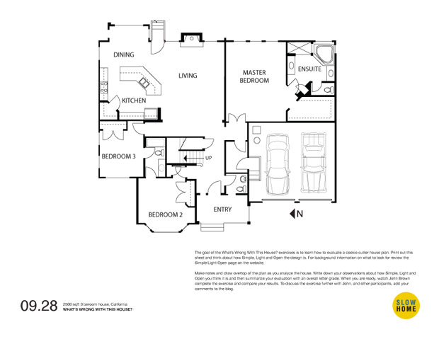
Part 1 – 2500 sqft, 3 bedroom House, California

2500 sqft, 3 Bedroom House, California (PDF)
2500 sqft, 3 Bedroom House, California (JPEG)

  • Elizabeth

    I guess it’s the proportion that feels funniest in this house.

    There’s a lot of wasted space in the centre of the ensuite bathroom, plus an odd corner cupboard or something in there.

    The tiny single door to the backyard delivers almost no outdoor access.

    Bedroom3 occupant sure gets a tiny room compared to the rest of the floor.

    Angled island in kitchen seems to put sink at a great distance from the rest of the kitchen’s work areas.

    I have a personal dislike of fireplaces flanked by windows (cozy/not cozy), but this doesn’t bother most people.

  • James Scott

    Here we go,

    A) Bedroom #3, where do you put the bed, mattress in the middle of the floor I suppose.

    B) You have to love all the extra space as you enter the master bedroom, great for photo ops as you admire the four poster.

    C) For such a large home circulation around the bedrooms, entries, front loo, etc. seems to be a real mess.

    D) Cheesy entry to the back yard, not much to see I suppose.

    This seems like a two person home that sleeps four.

  • Terri

    [img]wwwth321.jpg[/img]

    1. The bedrooms all share walls with “busy” spaces: kitchen, entry or garage.

    2.Living room gets short shrift with the ends used by traffic and fireplace in the view wall.

    3. Master bedroom too large in every way (larger than living room!)

    The orientation of this house isn’t too bad considering it’s hot in San Diego and a lot of south exposure can be a problem; however, the kitchen area could use a north window whereas that third bedroom has too many windows. As James says, where does the bed go?

    I decided to play around a bit and put the bedrooms all on one side. I also decided to allow more access to the back yard. I forgot to put the couple of stairs next to the doors. I think it’d be best to get the house as close to ground level as possible so that only one step is needed to access the yard.

    This plan isn’t a renovation so much as a rethink. Assuming I were assigned the footprint and asked for the same elements in the plan, then possibly this is what I’d do (first time, anyway).

  • Terri

    [img]1_wwwth321.jpg[/img]

    Ooops! A wall got erased at the garage wall–revised now.

  • JimG

    The kitchen is way too far from the entry, by the time the weeks groceries are in the kitchen and put away whoever brings them in is going to be in need of a nap.
    There is next to no natural light in the living room.
    The entrys are way too congested, and then putting the laundry in that tiny little room off the garage? Where would the ironing board go, to say nothing of a flat surface for folding?

  • JimG

    I like your plan Terri!
    I would still like windows on two sides in the bedrooms, and move the small window in the dining room closer to the centre of the wall to even the light out.

    Could we combine the toilet and laundryroom together to make one larger room rather than two tiny ones?

  • jim baer

    [img]090928wwwth.jpg[/img]

    my two cents

    terri – a good first redo. my initial instinct also is to reverse the kitchen and master bedroom. it puts the kitchen closer to the garage / family entrance and is better for the public on one side and the private on the other.

    now if we rotate the plan 90 degrees to the right, the bedrooms all have morning light and the living spaces all have south light! (though i guess all the outdoor living is now in the side yard…..oops…)

  • Anonymous

    Great job, Jim B, with the critique. I love all the question marks — What were they thinking here?!

    The plan appears to be almost four-square. The four sections pivot around a structural post sticking into the living room (a centre with no weight). There’s a matching structural member (?) on the refrigerator wall and two more on the east elevation, all sticking out from the walls.

    Aside from the long south wall of the entry/living room, I don’t think a single wall in this plan aligns with another.

    The NE corner of the dining area is very awkward. The window nook was necessary to allow for a table (due to the out-sized kitchen island), but it puts the table outside the main living space. The window to the north is also unhelpful.

    The pantry is a problem. Corners are difficult in kitchens, but this solution divides rather than connects.

    Add to these the odd window placments (per James and Jim B), the little 45-degree walls, and the placement of the master suite (with double doors) beside the service entrance (!).

    In sum, the parts don’t feel integrated. It’s a 2500 sf puzzle — all the pieces are there, but what’s this a picture of?

    To end on a positive: They resisted the urge of tacking-on a third stall to the garage. Small miracle!

  • Steve

    Didn’t mean that to be “Anonymous”. The snarkiness was mine.

  • James Scott

    Steve – Snarkiness is OK! Could imagine the emotion exuded if you actually lived in this place. The real estate lawyer could also act as a divorce attorney when the time finally comes. I could just hear any of the Monty Python troop now…

    ‘Ok, so here we go. This is the agreement of purchase and sale confirming property details, the price, deposits, disbursements, etc. Please sign here, here and initial here. And this is to say you received the keys, sign here, date here, thank you. And here is the last document, the divorce agreement. And as an added bonus for being such good sports we tossed in both the alimony and child support options as well. And if you use the coupon within the next 5 months you get a 10% reduction. Sign here, here and here. That’s great, thank you very much!

    Well that’s it, congratulations, enjoy your new home. We look forward to seeing you again soon.’

  • Amy

    What’s wrong with this house:

    1. There is a large amount of wasted space on the hall end of the living room. Since it will be necessary for circulation, you can’t use it for furniture or anything more useful.

    2. It’s quite a hike from the garage to the kitchen.

    3. The peek-a-boo window from the powder room toilet to the front porch is problematic.

    4. I really don’t like walking through laundry rooms from the garage especially one like this without room for a “family closet” or cubbies.

    5. The dining space seems awkward. There is absolutely no where to put any dining room furniture except for a table and chairs.

    6. The master bedroom is disproportionally large. I suppose all that extra space can be used for a sitting area or a home office (since there doesn’t seem to be anywhere else for a computer or desk), but wouldn’t it be nicer if those areas were separated from the sleeping area a bit better?

    7. The funky entry to bedroom 2 really bothers me…maybe it’s the odd door swings.

    The things that don’t bother me that seem to bother some of the rest of you are the master bath and the kitchen and really the lonely door to the rear doesn’t bother me too bad either since there are plenty of windows across the back.

    I actually like the size of the master bathroom. I think that some of you on this site are obsessed with not making the bathroom spacious to the point that sometimes your renderings would be difficult for two people to use at the same time. If you give each person an imaginary 2 foot box to stand in then it looks like there would only be 2 to 2.5 feet in between two people simultaneously standing at their sink in this bathroom. Being one who flits around the bathroom trying to get ready at the same time as my husband (because we car pool!!!) I can appreciate a few extra feet.

    The kitchen doesn’t really bother me either. Steve said he doesn’t like the corner pantry and while I’ve never had one, I do know that on several kitchen forums I visit, they love corner pantries. There’s landing space for all the major appliances and ample uninterrupted counter to work on.

  • Bennett

    My initial thoughts on the plan:

    1. Kitchen needs to be closer to garage.
    2. Entry through Laundry (not indicated but the only place for it) is not ideal. Plus, Laundry in that place cannot be vented directly outside.
    3. Foyer is awkward. The Powder room right next to the front door is not desirable. The stair placement and the storage closet blocks a potential opening up of the Foyer to the Living space.
    4. Looks like the coat closet is in the Bedroom 2.
    5. Reach-in closets in a 3 bedroom, 2500 square foot house equates to bad planning of space.
    6. Dining mislabeled. There is only space for a breakfast nook. Since the Living Room is so large, I would expect a homeowner to place their Dining table there, close to the stairs, except that the entry to the Bedroom 3 would then be awkward.
    7. Fireplace on exterior wall not efficient, but it is in a southern climate, so not so terrible. But it does take up some valuable wall space for possible windows.
    8. Kitchen not too bad, but island placement creates large congregation area in the middle of the Kitchen. Corner pantry is better than no pantry.
    9. Angle walls in Master Bath are unnecessary design feature. It wastes space. Some do not like having to leave the Bathing area to get to the closet. A simple rework could fix that. Not a big fan of corner tubs, either.
    10. North windows on Bedroom 3 eliminates only bed wall.
    11. No Rear Porch!

    Things I like:
    Open Kichen/Living/Dining arrangement.
    Kitchen hidden from Foyer entry view.
    Master Suite size a good selling point to most.
    Shared bath with personal entries.
    Garage is recessed from the Front Elevation, giving more prominence to the Entry.
    Master Bath has all the amenities. Two lavatories, water closet, separate shower, large tub, linen closet.

  • BradW

    Why is it that the kitchen, living and dining are the same size as the master bed/bath?

    Enough said…

  • Grace

    BradW–good question!

    Terri–excellent revision!