Good morning, Matthew,
Are there any height restrictions on the loft space we are renovating? Are we talking 10 or 12 foot ceilings? If it is unknown can I take liberties with the height? Also, in general what is the tallest ceiling you are aware of for loft space? I’d like to be within a realistic measurement if I’m allowed to play around.
Paulina
Comment:
Project Name: Twenty Five Broadway: The Republic – Suite 2D+D
Comment: Walkscore: 75/100
Organization is just rotten. A LEED Certified building. Kitchen location is not good, organization of work area is strange, peninsula is barely deep enough for the sink! Dining lacks orientation, breakfast table is silly. Bathrooms, I don’t like the corner shower, but it wasn’t enough to overthrow the point.
Comment: den is a windowless space! master bathroom is tight, and there is no bathroom for use by guests without walking through a bedroom! walkscore was a 62.
Project Name: Kilgour Estate – The Fairmont (Unit 28G)
Comment: This is the worst one I could find. First, the location is a no (which seems to be rare for apt/lofts). There is no suggestion of environmentally sensitive systems (which in my mind there is no excuse since it’s easy to spec low energy use appliances and low flow fixtures at the very least!). The dining area is no area at all, since you couldn’t fit a table in there and sit at it. Bed 2 is really a study since it’s too small and has no closet space! Bathrooms are insufficient since what’s there is not enough space for use by 2 roommates (oh and the laundry is crammed in there to boot!).
Comment: Living room is a bad shape to fit furniture well thanks to the jog. The dining room is kind of ridiculous since the breakfast table is right next to it! As well, the terrace is not easy to use since if you have a breakfast table, you will likely have trouble moving around it to get out onto the balcony. The kitchen is cut off from the main living space for some reason? The one bedroom is way too tight, the master is not big enough to fit a group of furniture as well as the bed and thus has wasted space, and both bedrooms have closets that are way too small. There is no study at all. And lastly, the organization creates a lot of circulation/hallway space making the walk from the entry (which is actually well-designed) a long one to the living room.
Good Day Matthew! Can we also move the front door in this plan?
MollyK your height questions – I forget about that with lofts- great question.
Matthew North
Molly K – the ceiling height in this unit is 10 feet. This provides some design opportunity for some of the walls to not go full height to the ceiling. Good Luck!
Matthew North
Mid America Mom – Good morning! Try to leave the front door where it is. However, John Brown gets mad at me if I am too restrictive, so if you have a VERY compelling reason to move it……..make it happen. I am looking forward to seeing your designs!
Mid America Mom
Comment: Architects: James KM Cheng architects and Young and Wright Architects
Here is a project downtown that is a combination hotel and residence. We have at least one more of these under development with four seasons. Here they went more wide then long on many units. Two beds are not split in plans but together.
This is a one bedroom to start with. To get to the plan you need to go to residences and 02.
I really like this plan. Here we see those angled window walls. See how they are dealing with it? Still placing the furniture as normal and not angled as well. In the living space that is helped with a furniture grouped around fireplace- yes a fireplace… what a feature! This space also handles a dining table and stools from the breakfast bar.
Starting at the entry we enter a compact but not too tight space with its own closet and pocket door to a shared bath with the master. The bath vanity is spacious and the shower and bath are divided by another pocket door.
The master bedroom has the dressing at the top and around a corner, as well as the bath second entry so really you cannot see these things from the bed.
The kitchen is a U shape with high end appliances. Too many appliances with a built in wall oven and microwave. The Washer Dryer is in a closet with no basket landing space :( This plan has plenty of light but no access to the outdoors via a balcony.
Comment: LEED Certification pending. It’s the orientation and circulation are the biggest/only issues with this one. Walking around the kitchen and through the living room to get to your bed isn’t very nice. Otherwise, it’s a pretty nice unit, I think.
Comment: The entry is a hallway, and that hallway is long and narrow to get to the living room. The study is a windowless room that would not be nice to work in if you wanted some quiet (ie. when you shut the door).
Project Name: Corktown District – 510 King – Unit 23
Comment: Hi- Moving to another unit at Shangri-La. Here is one of the wide 2 bed units I was eluding to earlier.
This is large at 1360 feet but this has so much to offer. The angles of the walls are not extreme and I think add to the feeling of spaciousness subtly. 2.5 baths- one has a shower and bathtub, a real laundry room with side by side units and space on the floor, comfortable sized kitchen with island seating for 4, master bedroom that is larger than 12 by 10 but not supersized. In the living space you can place a larger coffee table and the fireplace and balcony are here.
We have a wall oven and microwave in the kitchen but then this has enough space to handle them. You can see right into the master bath from the bed. Though with a little more work on the floorplan that could be alleviated. In the end I said NO to environment and bedrooms.
Comment: Both bedrooms have a column making getting around the bed really hard to do. I don’t think that the location of the bathroom is very useful, and I don’t think it’s enough for 2 roommates to use.
Comment: Here is a condo at the Distillery area, east of the city near the waterfront. The area is walkable but not as much as though we have seen elsewhere. This internet site handles three developments there- http://liveatthedistillery.com/. This condo, clear spirit, just received its LEED rating in December.
There is little to like of this plan. OK maybe the entry closet, the balcony, dining area?
The bedroom closets are odd. The hallbath shared with a bedroom… you would have bruises from a door hitting you. The bedroom doors are frosted glass sliders, that look to be at least four feet. Why glass? They have one wall of glass already in the room- looking outside! This living-dining- kitchen space has a great size but does not work. The plan even fails the single wall galley kitchen, which is not desirable, as it could be longer. Oh and please do not ask me to clean the dust bunnies behind the pillar in the corner.
Why it has a higher score than it should – location, I marked YES for the non existent study and unknown parking, orientation, and LEED rating.
Comment: This one has an 88 walkscore, and LEED Certification (pending since it’s not yet built of course). The wacky shape of the living space leads to a lot of waste, and you’d have to bbq standing on the door threshold on that balcony!
Project Name: West Side Lofts: The Curve – Loft 13
Comment: Check out the column in bedroom #2. I wondered as well how your roommate is supposed to have a shower in the powder room – it’s not like they can just waltz through the master while you’re sleeping there. The kitchen is a half-galley, which besides being hard to use (especially while trying to talk to your roommate who’s sitting in the living room), has little counter space to work at and opens dumbly onto the dining table. Or maybe that’s a good thing if you like to open the fridge door to grab the ketchup without getting up from your seat at the table. And the worst part of all about this is that it was designed by architects. Surely you’d expect better, which is really too bad, I think. Or maybe the architects were there to dress up the lobby and facade, but not to touch the suites? I dunno…
***Issues with the PIN colors on the map? I see two green though there are more than that on the list below the map.
orangeopolis
Comment: Oh, and while I was at it, Eunice, you’ve been One-upped (or is it One-downed). Although we’re looking for Slow Homes, I couldn’t resist the temptation to post this one in all its 6/20 glory. Seriously bad. It’s saved by the location of the building, underground parking, and having a usable entry and standard bathroom (although it’s location is questionable – so far from the bedroom).
Here we have one bedroom in 1100 sq feet! They said NO to the ever popular “AND DEN” we see with many developments.
This is the other hotel and residence development going on in town. Located in the TIFF (toronto film festival) celebrity hangout of Yorkville. It has a great walkable location, access to two subway lines, a grocery across the street, and designer stores. The builder did not make a commitment to green but maybe getting more green out of your pocket ;)
There are two towers in this development – east and west. If I had a choice I would pick EAST views on the WEST building and SOUTH on the East building. It looks to a courtyard at the back and then the low but not unpleasing to the eye library and firehousenearby. This is the smallest unit I think and it suffers being North and east on the east tower – looking right at other condos. I wonder how much light this unit would get.
What is there to like? Balcony access from living and bedroom spaces. The baths are not too big, bedroom spacious, corner living/ kitchen /dining space with wrap around windows. Halls are very minimal.
What they could have done better? The Laundry has no place for a basket. The kitchen is horrible for this plan. Single wall galley when they could have put in another more comfortable and functional shape.
Comment: A condo conversion of a 1950′s era apartment building. The area is mainly expensive single family residential and is a desirable area by many families. This is not very walkable.
This building is not green focused but they are reusing an existing building. The one bed unit I choose faces south and west.
Not good- Tight entry, small vanity in bath, strange table or is that an square island in the kitchen? Why does the door to the laundry open into the dining space? The dining space is a walkway to the bedroom too.
What I do like is the L shape of the kitchen , the bedroom closet and floorspace, the W/D I can put a basket down.
Comment: Here is another one bed from courtyards of forest hill. This one has a nice dining and living space. The laundry has room on the side of the closet. Bedroom plenty for room for bed and clothes.
The kitchen is almost there but for some reason did not extend them to the outside wall.. The entry looks to be to a 3 foot hallway. BAth looks small with that vanity. Strange linen closet in the center of the unit.
Comment: Very odd layout, it is so long and narrow with all these windows. I have been playing with reorganizing this space since I have seen it.
I do like the laundry area and the balcony.
Circulation nightmare with the entry at the end. Too many baths. The Den is way too small and has laundry closet there. The kitchen counter has this angle. Living room is cramped and entry not really defined. The bedroom should have a larger window – did they run out of money to put windows on that one wall. You also look right into the bathroom.
FYI Matthew I will get to the floorplan later tonight!
Frances Grant-Feriancek
[img]shweek52demo.jpg[/img]
Hi all,
My fourteen year old is a hockey goalie, I’ve heard the comment on his style as “playing big”, he is a small kid covering a big net.
On that note I’ve tried to “play big” in a small footprint.
Custom, dual pieces of furniture are key to making a small apartment or loft work.
A console table behind the couch can be a study area and then pushed up to the counter to provide a larger dining space when required.
The laundry has a stacking washer, dryer with upper and lower cabinets beside it. I see a roll out ironing board in a drawer and a small countertop here.
The living room and bedroom share a millwork storage piece.
MollyK
[img]shtorontoloftr1.jpg[/img]
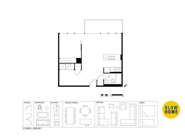
Was disappointed the ceilings weren’t higher than 10 ft…that blew my plans for an elevated loft bed with storage and desk underneath.
Still had a good time with plan. Decided to put a “twist” on the dining area and attached the table to the island for a modern ‘T’. I consider it bar height since I think that’s more loft-like but it could be a standard height dining table if you like. Did not give a separate ‘room’ for a study but feel the desk is placed out of the way but still part of the open loft atmosphere. Tried to open up bedroom without over-exposing it to the living area. You could tuck a small screen in those open areas connecting the bedroom to living and move them as needed. They could be considered artwork if they were decorated nicely.
MollyK
Frances
I actually played around with a similar idea with the dining room table “combination”. But never quite liked what kept coming to mind. It’s great to see such creative use of furniture layout, especially when space is at a premium.
Manolo
Comment:
Project Name: Discovery @ Concord Park Place: Building B, Suite 01
I took a little liberty in repositioning the front door. :-)
Would someone tradeoff a standalone dining table if the living space was the beneficiary? The “study” space has been replaced with a built in desk incorporated alongside the entry closet. Both being behind sliding doors. With wireless tech. and laptops, the notion of a study maybe comes into question. Translucent glazing walls in the bedroom and behind the vanity permit light to filter into those spaces.
orangeopolis
Comment: It’s a renovated church!!
I gave the Enviro-point because the project is an adaptive reuse, one of the most ‘sustainable’ things you can do in building. This unit is on the top floor, beneath the rafters of the original congregational space. Lots of things wrong with this one, my least favorite kitchen – excommunicated from the rest of the space, doomed to an cramped dark corner.
Comment: Bedrooms don’t get the light they want. Awkward access to bedrooms, a jammed entry / hallway, one big empty room for the rest of it. LEED Certification pending. The dining table gets to just float smack in the middle of a big open space. Even if the “optional third bedroom” was used as a study, it’s too close to the living area to get the quiet it needs.
Funny you should mention, but I was also playing with a “T” running off the island. I never thought to extent it to seating for six, a luxury in a small unit.
Claudette N.
Comment: I thought that this one would be really good, considering that it was also designed by an architect. The master bedroom faces west, which would be really hot and I can’t imagine trying to sleep there in a Toronto summer. I don’t really get the angles – while on the outside they make a building that stands out, on the inside they just lead to wasted space. Is this an example of the architecture being a selling feature as much as the appliances and square footage??? hmm…
Comment: Here the bedrooms get hot west light, while the living space faces north and east. Why wouldn’t the bedrooms be over on the side that gets east light instead? I thought that the dining room was just in the way, undermined by and blocking the way you’d get to the living room. I just imagine a party and how the first thing you bumped into after arriving is the table with all of those little weiners on it. Nice if you’re guests just came from their soccer match (Toronto FC anyone?)
Project Name: Five Hundred Wellington West, Residence 2
HI Alejandro in Toronto I think west and south is fine. As long as you can block the sun on those rare really hot days in TO in the summer I think it is ok. Or course those windows should be LOW E.
Alejandro
Comment: Also a Core Architects + Freed Developers Project (same as my last post).
Project Name: Fashion House: King Building – Unit 10
Hi Mid America Mom, I’m not sure though. In my apartment, even though I put the shade down on my living room windows (west facing) I find that a lot of heat still gets in. I think this is because the shading is on the inside of the window – once solar heat gain gets in, it doesn’t so easily leave. This is why, I think, you can reflect a lot of sunlight with blinds, but it still seems to get hot in spite of this. Alternatively, South windows are okay to me because in more southern places, the sun is up so high that light doesn’t enter directly in through the window. To me, west facing is troublesome, and I like to avoid it. If the design takes steps to put low-e, argon filled or fritted glass on the west facade, then I think I would consider my judgement more carefully.
Paulina
Comment:
Project Name: City Place: Harbour View Estates, Suite 10
Comment: Seeing as how there’s a lot of posts still going on from monday’s holiday, I though I’d submit one I found, and maybe later tonight I’ll try out the design project!
Comment: Hello all! Just thought I’d post one. I’ve been following the project for the last week, and I didn’t have time to post anything, but I found some time today to find one to help the cause!
Paul C.,
My design traded the dining table for an “island” table also. I’m not real keen on your placement of the desk. However, having said that, I love the glazed walls (wish I’d thought of that) and the walk-through bath (what a great idea and functional for both the occupant and guests). I thought your plan was very nice. I love getting ideas from others and I’ll definitely remember yours.
Mid America Mom
HI folks- I have ignored the rest of suggested loft revision plans today (I want a free mind but it is not working out so well , you will see LOL).
I will post mine soon and then take a peek.
Jenny
[img]jcsh.jpg[/img]
Hi Slowhomers,
Go easy on me. This is my first time submitting a design project. Ijust hand drew over the templates. I am not overly happy with my study, it might be a bit dark. There is also a little excess space in the middle. I could tweak this a little further I think but I do have a paying job to do so will leave it at this for now. I’ll be keen to see what John’s done.
Paul C
Molly K
Thanks for the feedback. I like posting before watching John’s version or perusing the contributors. It was a neat surprise to see that both you and Frances’ had run with the idea of incorporating the table into the island as well and to hear John’s take on the study. A bit spooky even. :-) Agree with you take on the built in desk. A bit strange as a desk but maybe a good spot for the printer et al. I do like how in your plan, one seems to arrive at the “heart of the space” from the front door sooner. I also like how you took full advantage of the units width/glazing by not placing cabinets along the sidewall.
Frances,
Looks like you got a “shut out” there. The spaces look very good along with a separate laundry room. Nice feature.
Jenny,
Welcome. I think you are being a little modest for that is a terrific first go. I don’t mind the study location so much, maybe if it were incorporated into a singular millwork piece that served the living/entry/bedroom. Running with John’s idea a bit. All the same, great first design project post.
Leo
Jenny
Great design. Is that really scanned from a napkin? If so, you get extra points for authenticity.
Mid America Mom
[img]toloft2.jpg[/img]
Not quite comfortable with it. The kitchen is causing me issues.
I have another I am working on, maybe tomorrow I will post.
A snow day yesterday, so I used the time to work on a plan. I still not convinced, but here it is.
Eunice
Comment: Well, in spite of the fact that we’re on to the reviews of the three Slow ones, I thought that I’d add these (this one and the three above) to the list of houses analyzed. The two Essence ones are pretty bad, Parc Nuvo is just out of running to be in the Slow category, and the Sherway unit is not as good, but still better than the Essence units.
Comment: An example of a unit up-scored by the building. Avoid this plan! If you love this building, choosing a different plan is the only way to go. This is perhaps one of the worst plans I’ve seen. Organization is…arrrggghhhh, living – where does the furniture go pray tell? kitchen is tiny, marooned, dark, dining – where does a table go at all? What’s up with bed 2??? Bathrooms have bad angles to make space cramped. Too many bad design decisions – take a look for yourself.
Comment: One E facing bedroom doesn’t overshadow the hot W light entering into the master and the living room. Access to bedrooms is abrupt, not nice, and walk from bed 2 to bathroom is awkward (unless you like that sort of thing in the middle of the night).
Comment: That one bedroom is really unforgivable, since it pushes this unit into the next price bracket – you get 2 good, usable bedrooms, only you pay the price for three. Instead, that bad bedroom could be a decent study…
Comment: There seems to be a trend arising in Toronto – using high-end design (or the suggestion of fashionable design) as a selling feature. It ranges from the naming of units, like in this building, to the sculpturalization (new word alert!) of the building massing. In either case, it doesn’t necessarily lead to a better place to live – in most cases it’s a fancy wrapping for a crappy unit.
Comment: North facing unit will be dim and cold. Entry? what entry? It’s a door into the “den”. The den is just an enlarged entry: dark and stuffy. Bedroom is windowless! Balcony is one of those Parisian “Juliette” balconies that don’t even have enough room to stand out on. Bad unit overall. Great location though.
Comment: walking score: 85/100
HVAC is a nuisance in the space, undermines dining and bed 2. Bed 2 has weird jogged walls above and beyond the HVAC issue. Bad door swing in the master bedroom – opening directly onto the bed. Questionable privacy for the study given the “low wall”, access to light becomes an issue if “low wall” is changed to full height.
Comment: Bathrooms got a 0 because the standard layout, which is no issue to just plop into the plans and requires little thought, has a harsh but inexcusable doorswing problem. I don’t like the location of the laundry being right there in the entry and without room to work or leave a laundry basket. The windowless study is not good.
Comment: orangeopolis – in regards to your comment earlier, I think this one fits your bill as a ‘sculpturalized’ building! The curvy shape of building makes for this specimen of wasted space. I was generous to the “absolute world green features” because although the list of such features is short, there is really no reason not to put in water and electricity saving features to the building, and there are plenty of buildings that don’t even have this much. The worst part of this plan is bedroom 2.
Washer dryer location was intrusive, changed that into a tv room and moved the washer/dryer to a stack next to washroom – also reducing bedroom noise. Also oriented spaces around focal points and defined space.
Wtgrating WayTong A nice looking project. I have same feel that a minimum dimension of about 5 feet by 3 feet is required - cabinetry has to... An In Depth Look At Apt/Lofts In Denver
Kurt Grosse As a former Nevada building engineer and 25-year Realtor, I love Beazer Homes Las Vegas. Their home construction is generally good. Every home will have... 05/04/10 - Dallas/Fort Worth - Single Family
Dale Edmonton I was glad to read that In the first segment of a three-part series on the LG House by Louis Pereira of third stone inc.... LG House by thirdstone inc. [^] Part 1


