Remodelling Townhomes In Miami

This is Day 134 of the Slow Home Project and we need you to join us in our quest to evaluate the design quality of houses in nine North American cities in nine months. This week we are analyzing townhomes in Miami and today we will be redesigning the main floor of a 2017 sq ft townhome.

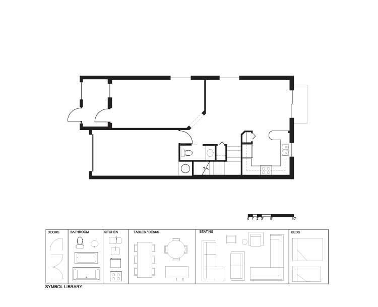
It’s time for another Design Project! Today, we will be re-working the main floor of a 2,017 sq ft town house in Miami, Florida. This unit is called the “Spoleto” and is located in the Umbria at the Vineyards development in Homestead, Florida. The current design has several major problems which need to addressed. These include:

  1. The proportion of the living/ dining space at the front of the unit is difficult to furnish considering one whole side needs to be used as circulation.
  2. The “U” shaped kitchen has an eating bar that is too short and too much floor space in the center.
  3. There is a unnecessary duplication of spaces given the front formal living/ dining space and the back family room.
  4. There is an unnecessary 45 degree angle in the transition between the formal living space and the family room.

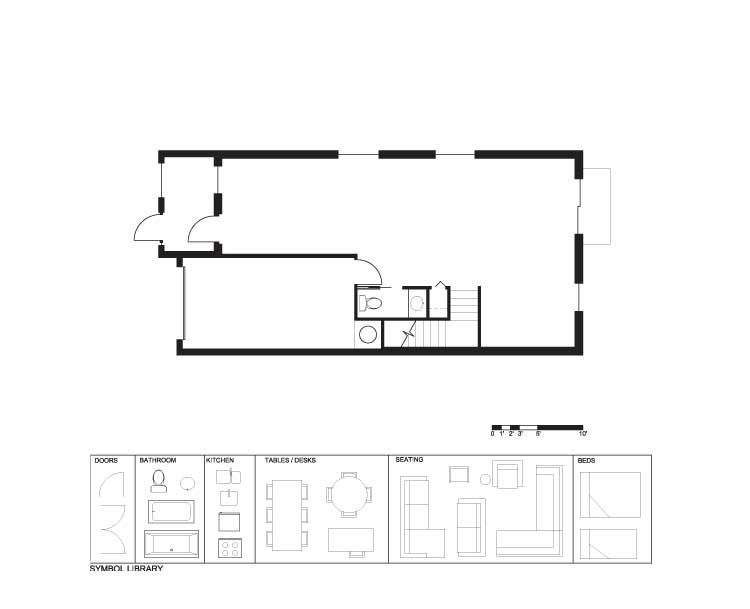
The demolition plan removes the kitchen, living, dining and family room spaces. We need you to re-design this unit to include the following:

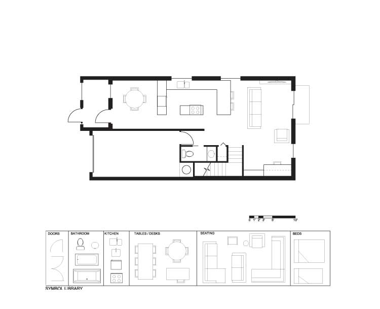
  1. Better kitchen design with a relationship to all the principal spaces.
  2. One effective living/ dining space.
  3. A proper entry space with a closet.
  4. Use any additional space for an additional function like a study or a TV watching space.

Remodelling Townhomes In Miami (PDF)
Remodelling Townhomes In Miami (Existing)
Remodelling Townhomes In Miami (Demo)
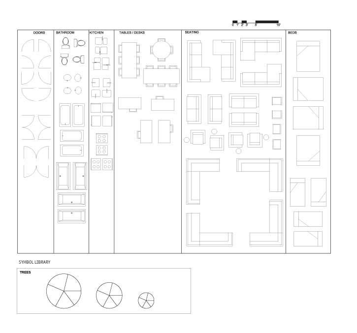
Remodelling Townhomes In Miami (Full Symbol Library)

When you are ready, click on the player below to see how John re-designed this floor plan.

See John’s final design

We look forward to seeing your designs!

Join us tomorrow where we will be doing an “In Detail” episode focusing on Dining Spaces in town house plans.

  • nicole

    [img]2_pp2.jpg[/img]

    Both proposed planning options have the powder room rotated to allow the hot water tank to be relocated to the interior space (not the garage). This also provides space for a storage closet (or pantry for the kitchen). A barn door can be added to close this area off from the kitchen.

    By shifting the front entry, the circulation corridor is also moved down to be directly against the wall (minimized). This provides more space in the very awkward left over area for the living or kitchen and allows a closet within the entry porch.

    By placing the study near the front doors, a ‘transitional entry space’ is created (instead of entering directly into a living or dining area.)

  • Eric S.

    Just a reminder to try and upload only JPEG files that are 72dpi. Any larger may cause the images to display incorrectly in the comments.

    Regards,
    Eric S.

  • Allie G

    [img]1_floorplan3.jpg[/img]

    Here’s my floor plan… I realize the living room is a bit tight for the massive couch, but a person could also decorate with a smaller couch and side tables.

    I really love your office in your floor plan, Nicole. I wasn’t quite ambitious enough to try to make a whole room out of it, but yours worked out nicely.

  • Neogi

    [img]1_townhouseredesign1.jpg[/img]

    In my design i pushed the kitchen to the back of the house to take advantage of the sliding doors. Also i really wanted the entry to be a little bit more defined to by including a half wall it allows the space to look and feel big visually and at the same time really defining the foyer and the study space in the front of the home. I also like having the house open of the living space rather than the dinning. This is why i moved the dinning to the back of the house making more private. The kitchen has a open shelving up to the counters that allows the space to feel separated but it still keeps it open and light. I decided to go with an island that was pretty large to really ground the kitchen and the entire house, since everything is open and airy.

  • Terri

    [img]miamith1.jpg[/img]
    I rotated the powder room to allow a little more depth for the family room and more privacy for powder rm. The front space is configured two different ways: one with banquette breakfast seating and the other with a small study space.

    If I find time, I’m going to try something else later.

  • Terri

    Forgot to say that there are many walls that do not go full height–behind closet and kitchen fridge wall; a half wall separates kitchen and dining and the bottom of the staircase has been opened up.

  • Terri

    Nicole,
    I see you rotated the powder room too, only you changed to a narrow sink to shrink the length–good idea! I also like your plan to put the closet in the porch. This should work in Miami, I’d think. I think I prefer the first one–seems like a nice open living space.

  • Terri

    Allie G,
    Yours and mine are very similar except for my moving the powder room.

    Neogi,
    I like your entry, but I don’t see your closet.

  • Terri

    John,
    I see you moved the kitchen to the middle as I did. I found the living space crowded when I wanted to configure it next to the sliding doors, but the way you put the couch works better. I like your addition of the small wall for privacy to the powder room. I had thought you might be putting a closet near there when you didn’t put one at the front door, but it appears you didn’t address that element (#3 on checklist–tsk,tsk!).

  • MollyK

    [img]shmiamith.r1jpage002.jpg[/img]

    Relocations are pretty clear.
    Added a closet at the front entry.
    Extended the wall at the garage entry to block view of powder room from kitchen. (Hope BradW would approve.)
    Almost elimated bar seating because I didn’t want to reduce the living space. But I worked them into the kitchen with minimal use of space.

    Narrow areas are so hard to work with…conceptually certain arrangements work well. BUT when you have to account for the minimal dimensions things suddenly don’t fit.

  • Cnick

    [img]2_plan.jpg[/img]

    I used the closet as a divider between the dining and entry area. In the corner I added a desk, it could also be a den area with a built in desk for computers or homework station for kids.

  • Bell604

    [img]gnstfloorplan3.jpg[/img]

    I chose to relocate the kitchen to the middle area of the plan, and place the dinning at the very front entrance. I moved the powder room to act as a divide between the garage door, which in turn also allows a break from the kitchen. I changed the stairs from the L shape to a straight and placed a small desk space at the end of it. This freed up a bit of space for the living quarters. I couldn’t find a good graphic for a bookshelf, so just imagine some type of book shelf space where the blank spot between the end of the stairs and sofa’s are.
    I wanted to keep things open feeling, and still allow for circulation space. I made sure each room as good access to natural light through either windows or doors. One of the main problems I saw with the original was the powder room’s entry. So in moving it to where I placed it, it is more private. My plan does increase the circulation space a little, but overall I believe it is better.

  • Tara

    [img]miamitownhouse.jpg[/img]

    Here’s what I came up with. I found the long space very hard to work with. I’m not content with the amount of space dedicated to ciruclation but I’m not sure there is an alternate solution considering the length and narrowness of the design.
    I found the double entry space at the front to be excessive and not useful. I got rid of it which freed up more light to penetrate directly into the study/library space. I created a pass-through kitchen in the middle of the plan which I think works well in the narrow space.

  • Athena

    [img]mymiamitownouse.jpg[/img]

    I decided to make the kitchen in the center of the townhouse instead of backed into a corner, which allowed me to add a dining space at the front and create at living space towards the backside of the house.

  • JessicaD

    [img]jessicadesignproj3.jpg[/img]

    I struggled with making these spaces connect without wasting space. The kitchen is probably still a little big, but I think it has a better connection to the other spaces this way. I wanted to make the office/study a private area while still having a connection with the rest of the room and by putting it at the front it takes advantage of the natural light from the window. Great work everyone! I really like the use of floating kitchens in many of the plans.

  • JessicaD

    [img]desing3.jpg[/img]

    Oops! I uploaded an incomplete draft in place of my re-design. Here it is sorry!

  • Deng

    [img]townhouse.jpg[/img]

    I had trouble with my living room, I think it could be bigger but I wanted the wall with the stairs to align with the wall between living room and kitchen (where it says ARCH).
    I increase the size of the entry way and added closet space.
    I also tried really hard to place the kitchen at the entrance of the home but I struggle with that as well. I ended up locating it in the middle of the home.
    I do have quite a bit of space allocated to circulation but I don’t think that can be helped due to the narrowness of townhomes.

  • Tiffany

    [img]designprojecttownhomemiami.jpg[/img]

    Here is my plan, fairly similar to a lot of the others. I created a more clearly defined entracne with a stub wall to seperate the dining. The living area could likley be a bit bigger, though I am sure that with a better furniture layout it would work.
    It is to bad I did not think about screening the bathroom in some way.

  • Tiffany

    Oops stub wall did not show up, you will just have to imagine that it is dividing the entry and the dining space. Sorry!

  • Frances Grant-Feriancek

    [img]1_shdp66demo.jpg[/img]

    Hello all,

    This week the most difficult area to design was the living room. It is not large but I think it works.

    Is it too hot to sit outside in Miami? We haven’t seen many outdoor spaces, so I thought I would include one. In a climate where you can be outside all year long I think it would make sense to take advantage of that space.

  • Kadoman

    [img]kariredesign.jpg[/img]

    I played around a little and found I wanted the main living rooms in the back of the home, and with a front entry closet there was enough room for a small study space.

  • Kadoman

    And I forgot the cupboards again, oh well, I’ll leave it as is.

    I dig the open design Athena. Especially the kitchen.

  • Kadoman

    [img]1_kariredesign.jpg[/img]

    Forgot the stools too, so I am uploading another one.

  • Mid America Mom

    [img]miamitown4.jpg[/img]

    Good afternoon! I have two townhouse plans for Miami and this is the first.

    Additional assumptions: Cannot modify anything beyond the demo plan due to cost and homeowner association rules (HOA) on the exterior. 4 foot work aisle in kitchen.

    The entry now has a 4 foot closet and space for at least a 4 foot desk, a chair for reading, and a 3 legged table with lamp.

    The kitchen moved to the middle of the plan. Walls were placed between the L kitchen with peninsula and the hallway. They are next to the stove and next to and behind the refrigerator. A dishwasher is included but can be placed on the right of the sink or on the back wall – homeowner chooses. The aisle is 5 feet :)

    The center of the plan has more function, allows us to add a 3 foot closet, and places the circulation in the center of the plan.

    The back is a great room. The dining space is in front of the slider door. 5 feet is between the table and breakfast bar giving plenty of room for people to move in and out and circulate. The living is to the left and a great place for a sectional and a wall mounted tv in the middle.

    Mid America Mom

  • Frances Grant-Feriancek

    [img]3_shdp66demo.jpg[/img]

    Just a few tweaks, added millwork at the dining room end of the kitchen counter and moved the island to the right to improve circulation.

    Was a larger front closet part of the redesign? I thought it was but I see by John’s Design it may not have been necessary.

  • Frances Grant-Feriancek

    Nicole,

    What a simple solution to the entry closet! Wish I had thought of that an hour earlier.

  • PeterB

    [img]1_peter.jpg[/img]

    So, I decided the kitchen was the main thing wrong with the first version of this townhome so i immediately attacked that first and now i believe my large expanded kitchen works a lot nicer than what was previous.

    I had mind boggling trouble when working with the front area so decided a small study with a desk and chair with double doors would be the way i go. I also closed off the area with the washer/dryer and the garage as i feel those are just eye sores to look at.

  • MollyK

    [img]shmiamith.r2jpage002.jpg[/img]

    Just having a little fun with the outdoor spaces at the front and back of the townhome.

  • MarisaM

    [img]2_gnst301.jpg[/img]

    So I found this lay out to be stupid hard to figure out and make better. Maybe it’s just a bad day. BUT here it is!

    I want to point out that I changed the staircase to open it up a little more for flow and light. Enjoy!

  • Mid America Mom

    [img]miamitown2.jpg[/img]

    Second plan.

    Entry has a 3 foot closet and here is a chair and table and built in desk (that you can pull the chair to).

    Center of the plan is a dining table, centered to the window, and breakfast bar for at least 3. The bar to table is 4 feet here due to the table configuration. I extended the wall of the garage to block the view to the powder room from this space. I also flipped the toilet and sink so if there is a glimpse it would be to a more desirable sink view :)

    The kitchen is in back. The aisle is 4 feet wide. The slider can be accessed directly from the kitchen or via a corner of the living room. A pantry cabinet resides next to the door. The peninsula houses the sink and dishwasher. You could think of adding a wrap around counter for one more bar stool with the back facing the stair… The refrigerator backs to a 5 foot wall that divides the space from the living room.

    The living room is on the left of the plan and is about 10 by 14. The tv can be placed on the kitchen wall or the back wall of the home.

    Mid America Mom

  • MollyK

    Welcome back MAM,

    Hope your va-cay (as Terri calls it) was relaxing. Missed you and Terri and BradW alot.

    Glad you mentioned the exterior of the townhouse. I was about to demolish that inside wall with second door but something told me to check the renderings on the website. Sure enough, a covered patio. And I figured since all the exteriors are the same on the townhouse row that changing mine wouldn’t fly. So I reluctantly did the redesign without that extra space. It would have made a nicer entry without everything else feeling cramped. But that’s the breaks.

  • Mid America Mom

    ANyone else wish we had at least one more foot on the front of the plan?? That 10 wide space along the garage was hard to deal with when you have to account for a 3 foot walkway.

    NICOLE- I like the slider for that desk space in front.

    FRANCES I like the table in front and a built in desk space. They do spend time outside…. probably not so much this time of year.

    BELL604- Moving the bathroom was a nice way to deal with the view problem.

    TERRI- Great place for a booth!

    MOLLYK- I thought that space for a table was ideal and happy to see it worked out.

    Mid America Mom

  • Mid America Mom

    Thank you MollyK! I missed being on the site. Did not know it was such a popular time to vacation. Did you take some time as well? I thought of you as we passed through the Carolina’s. Stayed in Asheville on the way down and Winston Salem on the way back.

    :) Though there were two computers in our condo I did not get on past the redesign project two weeks ago. I needed a vacation from it! And now I need a vacation from my vacation as were were on the go go go.

    *******

    I wondered where BradW’s design was. I though to myself where he would put dining with these narrow dimensions? Yes I pay attention to John… but since we are not in the business I look to our old timers to see what they lean to as fellow lay people.

    As for the patio- though that space would be nice to use – I like seeing built in patio space. I wonder if we saw that in single family… I have yet to go back and see the contents from Miami.

  • MollyK

    MAM,
    Glad you enjoyed your stops in North Carolina. And I know what you mean about needing a vacation from your vacation.;)

    I needed 3 more feet…I ALWAYS need 3 more feet. I am cursed with what I call the “3-foot syndrome”. Everything is better if I have 3 more feet (which I don’t have).

    As for BradW…last week he came on the site (I think it was late Thursday night) and said to me that someone had made a comment on the site using his call name. Then John logged on and apologized for the problem. BradW told me he was going off the site for a while because of it but would be looking on periodically. Well, I almost came undone…I really enjoy his contributions (as I do yours, and would feel the same way if you too went away). So I try to reference him in some way when I’m on the site so, in case he’s reading, he’ll know I’m missing him.

  • Terri

    Wow, a lot happened last week while I was away. Hope that BradW does return. He’s been around longer than me…can’t imagine Slow Home without his input! Glad to see you back, M.A.M. Seems like it was a long time you were away–hope your recovery goes well!

  • Hawerchuk#10

    [img]wallaceredesign.jpg[/img]

    Hey everyone, some really good designs have been posted. Some placements I wish I would have thought of when laying out my floor plan, but nevertheless onto the description of my design.
    So about my layout design, having the study off the entry adds an office and functional room. About the entry I like the outdoor porch, but I would enclose it and add a couple chairs for sitting. So I left the entry unchanged and added a closet off to the left.
    The kitchen works I think with the island in front of the patio doors for outside light exposure. I moved the window to over the sink for more outside light.
    The television room or family room off the back is equipped with double french doors for light exposure and a connectivity with the kitchen and the whole floor.
    I like the flow for circulation of this design. So overall I think this design works. Let me know your thoughts.

  • MollyK

    Hey Terri,
    Read you were on a va-cay too. Glad to hear somebody can get away.;)

    Yeah, it sure was a blow to read BradW’s comment. I don’t have a clue as to how to get him to resume normal communications. Let’s just hope he comes to his senses…after all, what will we do without our “staunch defender of luxury and excess.” :(

  • Terri

    MollyK,
    It was a quick holiday, but nice nonetheless. I missed rainy weather at home. I can’t imagine BradW being happy not putting out his plans here. He was always so prolific…I agree–let’s hope he reconsiders.

  • Terri

    [img]miamith3.jpg[/img]

    A plan without so many changes as my first attempt. However, I still moved the front door across the way. This could not be done as a reno, obviously, but only as a design BEFORE construction, as if I were hired by the developer. As if! :)

  • Terri

    Oh, I forgot to mention, I couldn’t avoid floating objects again. :)
    So…the living/dining are separated by a floating built-in with buffet facing dining and a narrow bookcase facing living with a flat screen mounted on the back of the buffet’s wall.

  • bbhorner

    [img]4_bbhorner.jpg[/img]

    I found this a really challenging remodel do to the narrow and long layout. I attempted to make the back area more spacious by removing the bend in the stairs. I think this was an easy fix. It may affect the flow of the house but it creates a more live able area on the main floor. At the entire a included a computer area office that is connected to the kitchen. I have seen this in design magazines and i really like it. The computer area is used more because it is integrated in to the rest of the house and not stuffed in a cold dark room. I also added closest to both the garage and main entry.

  • Hilda

    [img]1_week3finaldesign.jpg[/img]

    Hey All!

    Here’s my attempt of redesign. Not as creative as others, but it works…hopefully. Really like some of the other redesign others have posted, some got ideas I wish I had thought of…

    Anyways, back to the topic, the major changes I did with mine is the second entrence from the front is changed to an arch while the window next to it is opened up more to bring more light into the Dining room. For the Kitchen, I want it to sort of block it off from the front window to give it some privacy. But had an window open in the space next to the fridge to maintain the dining room connection. (That was inspired by my grandmother’s place, it still seem cool to me now.) At first I tried making living room space the kitchen, but then it would feel as if I’m disrupting the flowing of the house. Hat off to anyone that managed to pull it off!
    Finally, the little nook beside the stair way, opened up the window a bit more to bring in more light. (Miami got the weather, might as well enjoy it!:)) As an avid reader, made that space into a cozy reading spot. It can also funtion as a very causal study if the need arises. Blocking it off briefly comes to mind, but the stairs took care of that, so I just left it open.
    It’s not as challenging as the apartment project last week, but the long shape of it required some serious thinking as well. At least there is more room to work with in this project!
    Cheers :)

  • Hilda

    A quick question to everyone:
    Is is okay to change the Front door location? Like move it to the right or left. Just curious since being a former townhome resident, it was discovered that there are really strict rules as to how the exterior of the house can look, up here in Canada anyways. What about in the US?
    Cheers!

  • Mid America Mom

    Hi Hilda- my experience in the US is the same- no exterior changes.

    ****

    Love to stay but GO HAWKS GO! As a native Chicagolander?- required to watch the hockey game ;)

    Mid America Mom

  • Alison G

    [img]miamitownhouseredesign.jpg[/img]

    Here is my attempt for this week. I ended up placing the living room in the centre of the plan, which only works because this is an end unit with side windows. The narrow footprint was definitely a challenge, I ended up leaving the front study open to maximize the space and allow activities to slow into the entry circulation area if necessary.

  • autobrad

    [img]autobradmiami.jpg[/img]

    Hi

    Here is my design. I had Harold and Cathy in mind with this project. They like to entertain and cook so I focused on a large seating area and a large dining table to entertain. I still had trouble with the circulation, but thought to try and leave some open space near the kitchen to keep it from feeling so narrow. Time to open the Chianti.

  • autobrad

    Wow! Very interesting design John! It is good to know that you cab be so flexible and that the open entry is best into a kitchen. Great to lesson to learn how to think outside the box. (sorry for the pseudo pun)

  • Frances Grant-Feriancek

    MAM

    I concur. Break the tie Blackhawks!

    Where is Murray this week? Another one on vaction?

  • Manolo

    [img]mytry2.jpg[/img]

    Hi all,
    I was a little busy with the Blackhawks and couldn’t post ’til now. MollyK inspired me to think a bit more about the outdoor space – after all, it is Florida! There have been some very good plans thus far, overcoming the troubling front of the house. I didn’t really consider the costs involved in my renovation, just trying to make the best plan I could. I combined the two sideyard windows into one big window, underneath which I put the study. To give privacy when required, there are a pair of sliding partitions, which tuck away neatly when they aren’t needed. I moved the back entry to combine it with the front, leaving more room for the kitchen island.

  • JPHH

    [img]new.jpg[/img]

    So I wanted to bring the kitchen into the middle of the plan and add some counter space. I also added a study to the front of the house. I kept all the living and dining at the back to capture as much natural light as possible.

  • Terri

    Manolo,
    Love your “super cool tropical garden” note! Nice idea to combine entries too!

    To you Blackhawk Fans;
    Just have to say that we in this house are actually rooting for the Philly Flyers because we learned to hate the Blackhawks during the semis–as sore-losing Canucks fans! Yay, Flyers!
    Besides, we Slow Homers are travelling to Philadelphia next, so it seems appropriate to cheer for their team. :)

  • Grace Coulter

    [img]designprojecttownhomemiamigraceforjohn.jpg[/img]

    So I left my plan a bit bare of furniture this week but here it is. I wanted to add a closet in the front but looking at it now I should have moved the door over a little to give it some extra room. I made a little study nook in the front becuase i thought it might have good light and there is not much space for more. The kitchen is central to the house and the living dining spaces occupy the back. This way they both have access to outside views and light in the backyard. The dining table fits if you keep it small and I think there is enough room. The living room feels a bit tight though, I am not sure how that happened. Maybe I should make the kitchen wall behind the couch a half wall.

  • Hawerchuk#10

    Ok, some of our slow home posters have weighed in the NHL playoffs and I can’t help myself but forgoing a submission of my thoughts.
    It was a good game tonight, got to listen to it while at work tonight. So I would say that Chris Pronger is the difference for the Flyers and finally the secondary guys are helping out the Flyers in this series. Guys,like Hartnell, Giroux and Leino are bringing some jump to the line and that should help the Richards-Carter-Gagne line.
    For the Hawks fans, good to see Kane breaking out. Now Toews needs to get on the scoresheet. #19 is doing everything else (and I love this kid, next NHL superstar… reminds me of Joe Sakic) and should break out in the next game.
    I just hope the series goes 7 to see some more fabulous hockey before the four month hiatus of the summer.
    Keep up the hockey banter. Love it.

  • SangeetaG

    [img]redesigntownhome.jpg[/img]

    Here is my proposed redesign of the town home.

    I attempted to fulfill the key requirements by reducing circulation, making kitchen well connected with the main areas and allocating a designated space for entry, dining and study. I placed the kitchen centrally so that it can get enough light as well as be directly connected to the living room. I kept the dining table small since I provided a long bar counter for seating four.

    The little office/study area was inspired by John and Matthew office/computer desk design they presented in today’s online session. I thought it really worked well in the small front space. I added seating for two, great for reading with good access to light. Generally, this home has a good number of windows for natural light.

    John and Matthew, great live session today! The photographs helped me understand how things really turn out after they are designed, not just in plan. Thanks for taking the time :)

  • Andrew

    [img]designprojecttownhomemiamimcconnell.jpg[/img]

    Here I added a study at the entrance as well as closet space and I changed the garage entry slightly so that the closet space could be shared by both entrances. I also configured the kitchen so that the eating bar was larger and I put the living space next to the kitchen with a focus on the back patio. In addition, I placed the dining space near the middle of the plan and I enlarged the bathroom on this floor. Plus, I moved the water heater from the garage to the inside.

  • Jessica

    [img]1_designprojecttownhomemiamicullen2forjohn2.jpg[/img]

    Having some issues plotting appropriate files–just posted the small display file.

    In any event, I made an earnest attempt–this go ’round–to resist maintain an open plan. This was challenging given the odd proportions of spaces.

  • Jessica

    What I’d meant to say there, before proofing my comments, was that I’d wanted to maintain an open plan… just to clarify. Busy day–brain on shut down.

  • Murray

    [img]miamith.jpg[/img]

    Late to it, but I see others are still posting.

    Very, very challenging to deal with the 10 foot width at the front of the unit and allow for a circulation corridor.

    I am not convinced that you can successfully encorporate an island into the width allotted unless you start compromising on viable working floor space and/or circulation – many plans have just 2 feet between counters which is impossible, and I think 3 feet is too narrow to allow appliance doors to open in a practical manner.

    I chose to get around this by creating a 3 ft high, 1 foot deep set of cupboards with an 18″ top. I don’t know that it is any better, but a least there is room to manoeuvre safely and efficiently.

    I was surprised at John’s solution of having the dining right at the front door, with no closet! I think the cooktop on the island is impractical and just plain dangerous.

    I think we have to make a lot of compromises on these narrow townhouses. I think it all hinges on the garage, and we have had this discussion before.

  • Mid America Mom

    Hi Murray!

    I was looking for your submission regarding kitchen. You have a great points.

    I contend island cooktops can work. We have friends that had one in the past and it worked quite well but they had plenty of clearances ALL around and proper venting. I also shun 3 foot aisles and aim for at least 4 due to same – but I call it the BUTT test :)

    I do think the dining area in your plan is a wee tight to handle the sideboard. The use of a pantry type wall is smart. Loved that you used the window for the sink.

    Mid America Mom

  • frazer

    [img]frazermiamitown.jpg[/img]

    It’s a little late but here’s my take on the project. I tried to keep adjacent areas very connected both through visual and ciculation connections. It is as open as I could get it while maintaining some privacy where needed such as the study area behind the front entry closets and the living room TV area. It was hard not to enter right into a main area and I’m wondering if the entrance feels right. There is a larger amount of space at the centre of the plan to accomodate all the circulation meeting up there.

  • DJS

    [img]redesign3.jpg[/img]

    I thought putting the dining room in the top corner would be a good idea since it is somewhat private seeing as there is a long halway through the house. doing this allowed for a bigger kitchen and a more practical space for the living room. I threw in a small study to occupy the bottom right space, but it could probably be a storage area instead. I put a half wall on the side of the kitchen so a fridge and pantry could be placed against it.