12/03/10 – Toronto – Large Single Family >2500 sqft

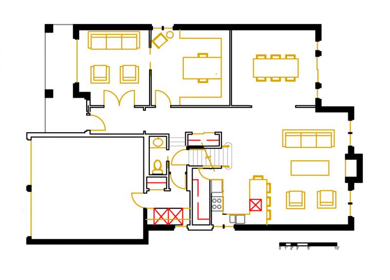
Design Project submission by Molly K
Design Project submission by Jodi J
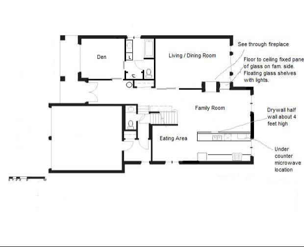
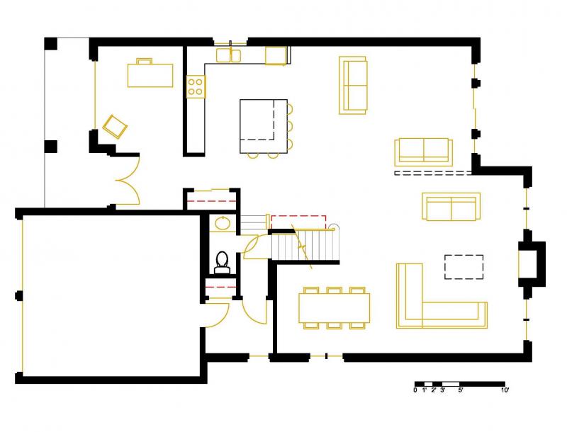
Design Project submission by Murray
Design Project submission by Mid America Mom
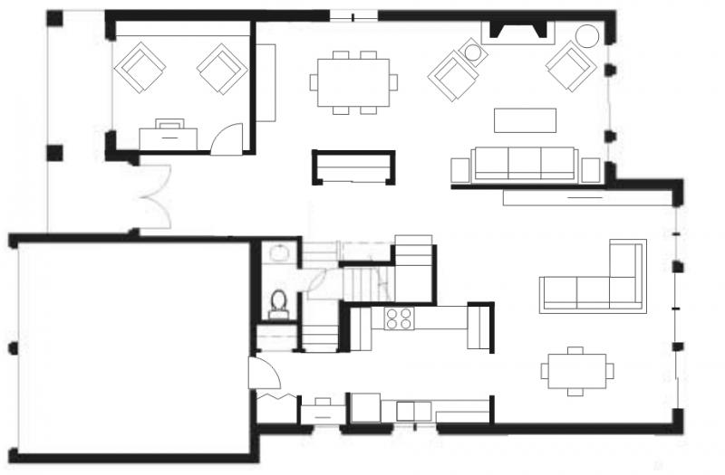
Design Project submission by Wayne
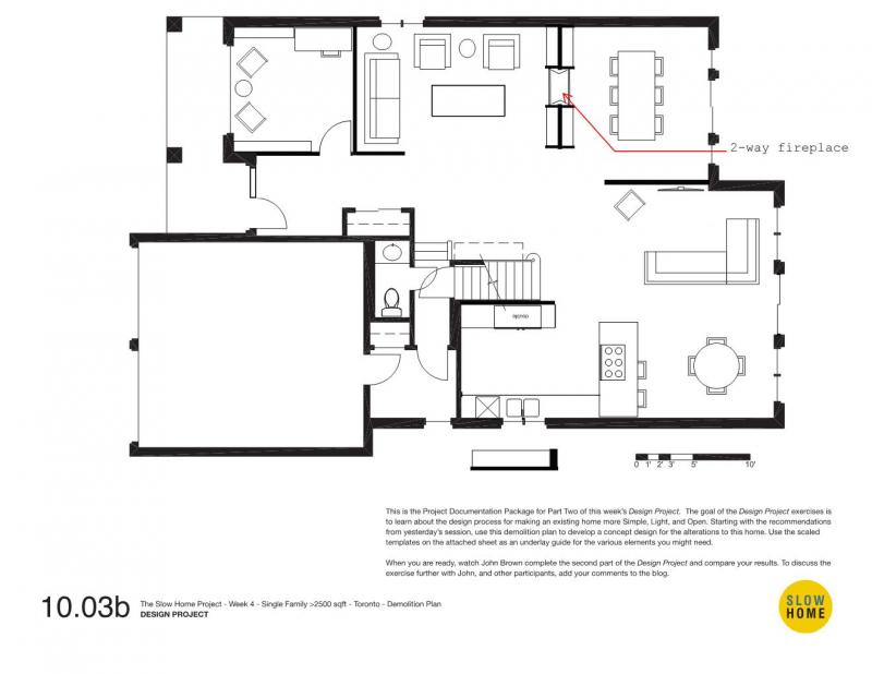
  • MollyK

    Good Morning everyone,
    I agree that we should take a week off from scoring homes in Dallas. Frankly, I’m getting burned out and need something fresh. So, John and Matthew have my vote for an alternative schedule next week.
    Since there are several possibilities for discussion today I’ll post my comments periodically so as not to ramble on in one long submission.
    The results of the data collection do not surprise me. Speaking strictly about the test itself, I believe the SlowHome test is more sensitive to urban developments and therefore, we find more “slow” homes in the loft/condo category. I believe we need an alternate test form for the larger homes which has a broader view of “Location.” In addition, we should re-think the criteria in the Environmental Performance category. I’ve discussed this with several local contractors and my consensus is that, although we want to see homes with LOTS of green technology, the most realistic use of environmentally-friendly products in new (and renovated) homes is Energy-Star appliances and energy-efficient water heaters and HVAC systems. Perhaps we need to be more realistic when scoring the Environmental category by giving credit where credit is due…if a home specifies the inclusion of an energy-efficient appliance then it should be given the points. Such appliances are usually more expensive so when they are introduced in a home you know the builder/designer feels they are important. To illustrate the uphill battle we have with going “green” I’m re-posting an article from earlier this week which I think addresses issues in the Environmental Performance category.
    http://money.cnn.com/2010/03/10/real_estate/green_homes_redlight/index.htm?hpt=T2

  • James Murray Scott

    Over 1000 homes, what an accomplishment, to the all participants, kudos.

    One mixed bag of thoughts that has been on my mind this week is what factors are really behind the development of today’s homes, and communities. The Greater Toronto Area (GTA) has been under tremendous pressure to expand during the past 2 or 3 generations. Towns like Richmond Hill, Aurora and Newmarket to the North or Mississauga, Oakville and Burlington to the west are really one big tract of development. Even Toronto itself recently (1990′s)amalgamated eliminating Etobicoke, North York and other local governments. (The latter driven by potential savings by reducing overlapping and inefficient provision of services such as transit and waste removal.)

    Gone are the days when we built one house to add to the stock. Now we build “Communities” and “Lifestyles”. It’s almost assumed that these new spaces will be somewhat different (better) than the rest of the established community.

    Now to look at the growth in the GTA it is important to see where the new residents were coming from. Is the growth based upon changes in family or are there other trends? Instead of parents, grand parents and 6 kids in one house you now have parents and 1 child occupying the same space.

    On that note much of the growth of the GTA’s population in the 80′s and 90′s was due to immigration. Brampton as an example has a large East Indian community. That being said many new Canadians tend to migrate to larger cities and communities that offer the support that they need to adapt to their new country.

    Looking at the larger 2500+ sq ft homes as an example many of the buyers are first and second generation Canadians that brought with them the resources to buy such a home. But what they want is a large home, palatial feel, all of the amenities that make them look successful to their family and peers back home. Properties that were simply not available in pre-IT India and Hong Kong were not in question here. The Indian caste system had little bearing on Canadian purchase power.

    These are just ramblings, but basically it is important to see why we have the homes being built that we see today. There are so many other factors, marketing pressure, keeping up with the Jones’, availability of credit to purchase a home, low interest rates, changing work environment from manufacturing jobs to services and knowledge based careers, etc.

    I see tremendous value in analyzing the data compiled over the past two months but all of these factors have to be assembled to look at the trend to see where the market is going and how the Slow Home philosophy can best to adapted.

  • BradW

    Anyone who has read this blog knows that I have periodically discussed the bias and philosophy underlying the inclusion and weight of “The House in the World” criteria. Frankly, while I have a wider view, I accept that the Slowest home must be located within an easy walk of an urban community, a downtown or a vibrant street, it must have public transit access to minimize commuting and car use. The Slow home should be and efficient user of energy typically exceeding normal performance by a significant margin. And, of course, it must oriented correctly, well organized and correctly designed. That is the ideal so it is no surprise that new detached single family homes regardless of size really have no chance. And what about rural property? Surely, the family farm epitomizes slow. Sorry. And, of course, regardless of type only a small percentage of spaces are correctly oriented for maximum solar gain. Pity the poor soul who buys a inefficient home with no sun in the backyard or the hip urban professional who does everything right only to discover another building is planned which will block his view and light. And what about our kids? I guess they are destined to grow up in the suburban nightmare where, at least, someone has had the courtesy to plan some grass. Get to the point, you say. My point is simply that any criteria beyond simply improving design is personal, political, philosophical and, therefore, pointless.

  • BradW

    And while I am on a roll let’s talk a little about single family houses. In older neighbourhoods, for example Elbow Park in Calgary or River Heights in Winnipeg, the streetscape includes lane ways. The houses, some very modest, some very grand, face the street and garages face the lanes. Beautiful. So I ask you, why is this practice not commonplace? It has nothing to do with house design. It has to do with money. High land cost. High development costs. More housing equals more taxes. More density equals less cost for services. Etc… The reason detached single family homes largely fail has little to do with architecture and everything to do with urban planning.

  • MollyK

    BradW.,
    Do you think the SlowHome site should return to a format of more design exercises/WWWTH and less discussion about things we can’t change like…urban planning?

  • Terri

    I also like the idea of a change this week. Frankly, I was burnt out long ago. I’ve conserved energy by looking only at plans with scores of 14 or more. And over the last couple of weeks they have been few and far between.

    That said, what do we do this week? It seems like we are scratching at the lid of a Pandora’s Box. The new-home market os each place seems to reflect the social strata there–something that is invisible to anyone who does not live in that market. For example, James points the different societies found in different communities of the GTA; information I had no knowledge of. It’s also information that really goes beyond a home design platform, yet obviously explains what we found as we looked for Slow homes (especially in the single-family home segment).

    I think we all know that what we’d like to see and what we do see are two different things. As I said yesterday, we might find homes that are environmentally sensitive and/or within a favourable walkscore but not necessarily well-designed. If we analyze the data, what can we reasonably conclude? There are factors beyond the developer, and we will only dig deeper into social or economic issues, which, as BradW says, is less architecture and more urban planning.

    I guess I don’t know what we can do with the data we collect without having to get into a lot of issues that are beyond the scope of analyzing individual homes.

  • BradW

    For me, I enjoy the design exercises, the case studies, the interviews with other architects. I enjoy seeing John and Matthew. The enjoy the design discussions on the blog particularly when John or Matthew chimes in. However, the focus on the Slow Home test is wearing me out. In LA, it was fun looking at different houses and areas. In Toronto, because I know the place, the adventure and fun was gone. Further, it is getting to the point where I can take one look at a space and give it a score. Only if I find something good to exceptional will I post it. I also like it if the development has a compelling back story or architect. For example, the Don Lands development in Toronto represents the next big opportunity to build near downtown TO plus the Pan Am games athlete village will be here in 2015. Another example, would be the redevelopment of Regent Park which was a 1960s planning attempt at affordable housing gone bad. I still believe in the Slow Home concept particularly when it comes to design. I wobble a bit when the discussion broadens to the larger philosophical topics best discussed in a pub after a few.

  • MollyK

    O.K.
    I’ve got a suggestion for next week. I think the redesign submissions have been really good and informative. I enjoy looking at everyone’s and getting ideas. I also like having Matthew’s constraints because it provides a challenge just as in the real world. I’d like to do some redesigns with specific constraints…maybe something Matthew has dealt with in the HouseBrand remodels. We don’t have to redesign an entire floor…maybe just a section that a homeowner wanted more functional or needed a door added but encountered problems.
    So what if we can’t solve the problem of suburban sprawl or urban planning let’s get back to some basics of SlowHome design…at least for a while.

  • Terri

    Yes, I second MollyK’s motion.

  • BradW

    While we may buy into the Slow Home “House in the World” ideals, are they really practical or even achievable? Certainly not everyone can live in an urban setting…or can they? Of all the places I have been Tokyo comes close. Seemingly endless humanity. I loved it there but I wonder about the quality of life long term. The other image I have of this urban ideal is from Blade Runner…

  • MollyK

    BradW.,
    I think you’ve made some progress today. Now don’t you feel better?
    Actually, I feel better too. I did not find the website until the SlowHome test was developed and then off we went to LA on the first leg of the Project. I perused the archives on my own and silently wished I could have participated in the WWWTH segment. So I feel your pain, and my gut tells me others may be feeling it too.

  • MollyK

    I have a confession…when I hopped that plane to Dallas I actually went screaming into the night to catch it. After I saw the scores from the Toronto houses <2500 square feet I was disillusioned, BUT still hopeful. However, when the same scores started to surface for houses over 2500 square feet I thought to myself "Check Please." Then I asked myself…"Do I really want to go to Dallas?" Being a glutton for punishment I decided the change would do me good. I'm so glad we're not going there next week. I've been and believe me…it ain't a pretty sight, at least for single family homes.

  • John Brown

    MollyK, BradW, Terri,James,

    Thank you for the thoughtful reflections.

    I have a couple of things to add to the discussion and will break them up into different posts in order to keep the length more reasonable.

    With respect to the location and environmental performance issues, I agree that they feel a bit off the mark in the way the Slow Home Project is unfolding. It is hard to give them as good a review as we do the interiors.

    I am going to spend some time this weekend doing a quick analysis of the results if we take those issues out. It would be interesting to see what the results are when we look at organization and room by room only.

    However, despite the shortcomings we are discussing with the “house in the world” categories, I don’t think we can eliminate them from the Test. Location, orientation, and env. performance are critical issues and we risk making the test less relevant in the broader context if we only concentrate on internal design.

    This is particularly true when you consider the broader goal of slow home which is to have people use the test in the real world to evaluate their own home or are making a real estate choice. In this case, location, orientation, and env. performance will be readily analyzable.

    Can I suggest that we should recognize, annotate, and then accept the shortcomings of the ‘house in the world’ categories when working on the Slow Home Project?

  • John Brown

    My second thought has to do with the data…..

    When I downloaded the data that we have collected into a spreadsheet and started to look at it as a whole I realized that we are doing something quite remarkable. I don’t think anybody has ever done this kind of work before. While some of the results may feel obvious to those of us who have been working on the project, my sense after spending a career researching in this area is that they are going to be a big shock to the average person.

    I think that most people who are interested in residential design have an intuitive sense that there are fundamental problems with North American production housing. But this is the first comprehensive review of design that provides more than anecdotal results. This information, gathered in a mass collaboration process with a standardized questionnaire that eliminates style and price is going to catch people’s attention. If we can continue to the end of this marathon (and I agree with everyone’s sense of fatique) and if we can analyze the results a put it into an easy to understand format – we can rock the housebuilding industry and get some real media attention that could actually result in some real change.

  • BradW

    John, can you clarify your suggestion? Perhaps by example…

  • BradW

    Also, it would be nice to see the LA video…

  • MollyK

    John,
    I have no plans to abandon ship but I appreciate the opportunity to go ashore for a few days!!!
    I agree that you can’t remove location, organization, and env. performance from the test. They are “weighted” heavily and for good reason.
    I promise to post as many houses as I can during this journey as long as BradW promises to post some really cool stuff as a nice distraction!!!

  • John Brown

    One last thought….

    I agree that the old format of design projects and what’ wrong with this house exercises was fun. At the end of last year, however, I had the sense that it was becoming too repetitive. There were also a lot of comments questioning why we were doing the same thing over and over and what the bigger reasons were. There were a couple of people who suggested that given all of the problems with mass produced housing, slow home should be about more than just having fun drawing on floor plans. In the context of the housing crisis, climate change, and all of that bad design we talked about each week, I took these criticisms to heart. The stakes are too high to not get more involved.

    I decided to take Slow Home in a slightly different direction by contextualizing the original exercises into a more activist framework. It seems that if I am going to ask all of you to put your precious time and energy into something I want to make sure that I am honoring your efforts by having all of our individual acts coalesce into something that is bigger than all of us, something that can perhaps actually make a difference.

    I have spent the morning going through the posts for the apt/lofts in Toronto. Looking at the analysis and comparing the plans is fascinating. There are relationships, trends, themes emerging that are really interesting. All of the hard work from the group is making all of this visible.

    What we are doing here is important. That it is happening in a mass collaboration effort is remarkable and I deeply respect all of you who are working on this.

    I guess that is enough of a “rant” for now.

  • John Brown

    BradW

    We are working on the LA video as quickly as we can. There are hours of raw video and we are editing it down in between the daily shooting schedule. We have not forgotten about it!

  • John Brown

    BradW,

    I think the examples will emerge in next week’s analysis. I am working on it over the weekend.

  • James Murray Scott

    One of the comments I made as the 9 Cities in 9 Months challenge began was to also allow members to post homes or gems from other cities and towns in North America that would jump off the scale. Today I read some disappointment or disillusion from some of the posters that there is too much bad out there, not enough good, and how on the grander scale (urban panning) there may not be a whole lot that can be done to drive the process in the right direction.

    An opportunity like this could allow us to compare the values of ideal scenarios to the averages that we’ve seen to date. From this maybe we can see and be inspired by the possibilities.

    One example I think of is the Waterloo Green Home built approx. 15 years ago in Waterloo, Ontario. Though the house was really neat and seemed to be quite livable for today’s family the surrounding development trumped and gains. Here’s a link:

    http://www.architecture.uwaterloo.ca/faculty_projects/terri/sustain_casestudies/greenhome_gallery.html

    Possibly with some modifications and replication throughout the development this could have been a much bigger success than it was.

  • BradW

    MollyK – As a staunch defender of luxury and excess, I am sure I will come up with something…

  • MollyK

    Why, BradW, I would expect nothing less from you. And by the way did you check out the luxury “green” home I posted late last Friday? You’re not the only one with good(?) taste.

  • MollyK

    James Murray Scott,
    While searching for LEED and green homes/developments for scoring purposes I came across some inspirations but never posted them. I will not miss that opportunity again. Thanks for reminding me to share my findings. I’m going to check out your contribution right now.

  • MollyK

    John,
    Perhaps sharing those trends next week would help us in the field see the bigger picture. Please do not despair…I firmly believe that us SlowHomers understood your plan from the beginning and we willingly accept the task we are charged with. But today was necessary…even cathartic for some of us. I’m sure after a week’s vacation we will be rarin’ to tackle Dallas. Get along lil’ doggy!

  • Rodney

    I started following this site after reading about John Brown and the slow-home movement in DWELL magazine. I could not agree with his philosophy more! This blog has the potential of not only raising awareness but actually initiating change and improving quality of life. It takes time and great effort, but anything worth doing does.
    From following this I now realize that the choices out there are dismal. I suspected as much. That said I am sure that this group will find the exception in the coming months, a model so to speak that should be applauded and followed. Next week everyone could weigh in with what their criteria would be for an ideal slow-home. For example I believe any new housing construction needs to include a geo thermal system and/or solar technologies along with passive orientation to receive any points for environmental performance. Also as I understand that location in a walkable neighborhood makes sense, I think that it is only in theory that people use their cars less. For me no slow-home would have a two car garage. I do find that rethinking floor plans is important and productive. Nothing should be taken for granted in the space we call home.

  • Murray

    I have been thinking about this quite a lot today, and have reviewed the discussion thus far. I am not sure that I have much more to offer, and I am still ruminating, but thought I should get down what I have so far, to allow for more profundity to flood my synapses.

    First off, we are preaching to the choir. Other than Jenny who has shared her secret identity with us, I am not aware of any other property developers, etc who actively participate in the site. Maybe there are silent watchers out there who are taking notes and planning to overthrow the status quo, but who knows?

    I guess the word needs to get out, and there are many options for so doing.

    Analysis of the data so far can provide a basis for a reasoned discussion of what is not working in today’s homes (particularly in Central Canada, apparently). But this discussion needs to be made available to a broader audience than SlowHomers.

    Options might include articles in trade periodicals – there will be national and regional builders’ association journals and websites. Or letters To The Editor of these publications.

    I was first made aware of this site last spring when Lisa Rochon profiled SlowHome in the Globe & Mail. Perhaps she would be interested in a follow-up article on how the site has developed over the past year.

    Those SlowHomers who are in the professions can take the analyzed data and present it to their colleagues and professional associations.

    A more dramatic option would a published manifesto!

    One other practical action would be for the inner workings of this website to contain more significant keywords that would allow search engines to readily identify SlowHome as a site to visit when a consumer is on the net searching for a good house to buy. A bit of tinkering with the design could emphasize the fundamental information that the newcomer would most likely be searching for.

    Basically, if the analysis of the data can prove something of significance to the both those in the business and the uninitiated then the choir will get that much larger and may include some of the big guns who can actually influence change at the level of urban planning and development.

    On another tack – one of MollyK’s entries this past week led me to comment on the SlowHome library that existed on the old site. A modification of this might be a “library” of links to information provided by SlowHomers such as MAM’s link to the Better Homes and Gardens survey and MollyK’s link to the CNNMoney article about green technology vs. greenbacks.

  • Tom E

    I would like to 2nd Murray’s request for the return of the “ultimate library” and the addition of a link page to great reference sites. I didn’t make notes on all the books I wanted to buy before it disappeared. The first book you recommended was Cradle to Cradle by William McDonough and Michael Braungart. http://www.mcdonough.com/cradle_to_cradle.htm Lots of interesting reading on this site. Further, my second most favourite site after Slow Home is http://www.ted.com A good video from this site http://www.ted.com/talks/lang/eng/william_mcdonough_on_cradle_to_cradle_design.html John, I think this would be a great site, for you to promote the Slow Home movement, I would love to see a lecture by John Brown on this site, it would be very fitting, “Ideas Worth Spreading”
    I enjoy the conversation this week, on why the general public is attracted to the conservative exterior facade on a house and are a little more adventurous with the interior. I personally wish that the general public would be more adventurous with the exterior, especially in Toronto. Some interesting reading along this line but a little off in a tangent, product related, not housing related. Emotional Design, Why we love (or hate) everyday things, by Donald A. Norman http://www.jnd.org/books.html

    As for suggestions for next week, I would also like the second the motion to hear more about the House Brand projects, particularly, the major reno’s of 60’s – 70’s modest single family homes. Since this right in line with my very slow home project.

    Ok, enough rambling, drywall and painting completed on the home office / library, gotta go install the baseboard and build a bookshelf, today.
    Cheers

  • Terri

    I too came here after the Globe and Mail article by Lisa Rochon last April 2009 (has it been almost a year already?!) And I have enjoyed the metamorphosis the site has made since then,so I’m not hoping to go back to the old program forever. I just thought that for this week, we could do an Old (Slow) Home week, trying a couple of the old exercises, only maybe with a twist, but what that would be…I don’t know.

    I’ll be watching closely on Monday, John, to see how you decide to present this data you’re assessing. I’m sure that it’ll be interesting.

  • Carol

    I have been an interested follower of slow home for a few months and have appreciated the tremendous effort people have put into their posts on the city tour. I have a couple of comments to make. The point has been made that there are an awful lot of fast homes out there! I think that perhaps the active searchers would happy to not have to report on the bad homes and I would be thrilled if the homes I was looking at had high scores. If the really fast ones didn’t even get past the reviewer then we could look at the nominees with a more critical eye.
    I also feel that when looking at the detached single family homes we are inevitably draqged into urban planning concerns. Planning is of course crucial. However I don’t think that the slow home test takes this into account in a fair way. New houses, if they are not an infill are automatically deducted 3 to 6 points before we even start. A whole separate search could be made for well designed new subdivisions.
    A second concern is the walkability score. We seem to be relying on it too heavily. When I scored my own home it was had 50 points. This is depite my having an express bus service within a 5 minute walk and just a few of the amenities found within 15 minutes are 2 grocery stores, deli, liquor store, banks, drugstores, doctor and dentist, library, bookstore, parks and playgrounds and 3 schools. Schools don’t even seem to factor into the walkability test so far as I could determine.
    A third comment then I will stop. The slow home concerns do need to get out to the wider community. There are two major audiences, to my mind, professionals (developers,architects, planners etc.) and consumers. They will have to be approached differently. I feel like going to the new development home shows this spring and giving slow home tests to the hundreds of people who come out.
    Oops, I said I was done but have to pass this along. Several months ago my husband and I went to the on site sales office of planned condo development in a terrific location. None of the 2 bedroom 2 bathroom units had a walk-in shower. There were two other couples in the office at the same time and when we mentioned this they all said they hadn’t noticed and agreed that they would prefer a good shower over a second tub. The saleswoman said no-one had mentioned this before and that she would pass our comments on. We went back today to see if construction had started and when we looked the plans again 2 of the units now had walk-in showers in the en-suite! Coincidence—mmm?

  • Mid America Mom

    HI Carol! Thank you for the comments. Love to hear from fellow slow homers.

    -About the walk score. It is wonderful you have such access close by. I am thankful there is something out there even if not perfect for those of us out of town. Some builders are also starting to list area amenities on their site or brochures.

    Makes you wonder about the criteria/data though. Here in Toronto the transit system is NOT included in the score as the data is not “open”. I also was under the impression not every store near me was listed (which are numerous).

    - I am also a few months new to the project and brought up planning last week. I agree that there needs to be some kind of different approach to single family (outside urban core). What that looks like? Not sure. We have elements taken from new urbanism and the suburban, where the majority of Americans live, is penalized. It probably is not this way everywhere but where I live sure folks would like to live in “a deee-luxe apartment in the sky (ah dear George and Louise)” but the cost compared to the suburbs is for many too much to bear. I hope John and Matthew can come up with something that still fits with SLOW. Maybe define a slow suburban style? Maybe green building with community green space, close at least by car to the schools- grocery – restaurant. When I think close for walking I think 5-15 min walk. I would also love that for car. My parents place is about 5/10 min away by car to tons of amenities (I am struggling to think what is NOT right there) and that is fantastic. They also could walk it but it would take longer.

    - That is great you mentioned the condo development. Some do listen. We found that the builder of one of our homes incorporated into their next community some of those popular requests from a previous one. One that I can recall is raising the counter height for the master bath vanity.

  • Anonymous

    [img]tolargehousestats.jpg[/img]

    Wasting time again …

    I was thinking about the reliability of the statistics – that is one person’s 4 may be another person’s 5.

    This becomes significant at those boundary scores between the categories of fast-mod.fast-mod.slow-slow or 7/8, 13/14, 17/18.
    I only looked at the scores for the >2500 sq.ft. Toronto houses, but attached are the stats plotted a couple of different ways.
    The graph on the right is the simply the scores plotted vs the number of times scored – 134 houses in total, by the way.

    The bar graphs show what happens if all the boundary numbers shift up (e.g. – the 7s become 8s, the 13s 14s, and the 17s 18s) or if they shift down (e.g. 8s become 7s, 24s 13s, and 18s 17s). In this last possibility there are no slow homes.

    One exercise might be to have all participants score the same house, given the same background information on the house (location, orientation, eco-friendliness, walkability, etc). This might more closely mirror a real-life scenario where the house-hunter is actually on site and knows all the background of the house and know wants to know what it looks like inside.

    I would be curious to know if we all came up with the same score, or not.

    Any statisticians out there?

  • Mid America Mom

    Thank You John and Matthew- I’m flattered!

    It is late and here are random thoughts.
    -Looking forward to a break. As a relative new slow homer who has been trying to catch up but think I never will, the old? is new to me.

    - A report is a good idea! Something that can be shared with the world, maybe in the book, a base for a survey that you may wish to administer. Murray has good ideas once you have more in hand. Oh why not book a space at the next International Builder Show- January in Orlando, Florida. Much warmer than Calgary!

    -I would like to look at our single family stock since we do not have resolution in this city. Concerned if we throw out a designs to the group for consideration? Though we are trying to be objective – the subjective does creep in (I love U kitchens (as long as a leg of the triangle does not have some interloper like and island and MollyK does not care as much for that layout so we could differ on that room by room). I am not into stats but I am thinking if you have enough responses the mean should be close. Of course there are group dynamics that can lead to interesting places as you probably have experienced already over the course of this project. Having said that you may want to think about closing comments, WITH WARNING and a POST AS SUCH in the comments before you do so, for the evaluation time. Hopefully your web folks can set up the test to react to being unseen by members but not to administrators. Then when you unveil hopefully comments will come in.

    - Throwing this out there. I assume we will see a walk through in LA of at least one of the winners or something like it.

    What I would love to see is how the test fairs in real life on a place we did not look on paper first. A builder puts up a few models and people run through them. With existing housing people do not have a plan but the walk through. This would differ as I would like to follow a person in the walkthough as they do the test- with camera (I would love something like the american football cameras. What they see- we see). Share what they think and feel, see, and score. Maybe there would be discussions on reno, wish for modifications, and design comments. I look at the home shows on Hgtv and to get that flavor.

    -If you have not seen the NAHB recent paper on 2010 preferences – http://www.nahb.org/generic.aspx?sectionID=137&genericContentID=133039

    -And for the trivial. Matthew I noticed you have a liking for either black, dark gray or is it navy blue? shirts and such. Wednesday is St. Patrick’s Day and a wonderful excuse to go GREEN :)

    Whew.
    Mid America Mom

  • Braden

    A study/second bedroom without a window! The kitchen chamfers were attributed to the organization (which is poor). Dining and living are good, but the bedroom door opens directly into the living room – not nice.

  • Braden

    Only slightly better than the other one. The concept clearly comes before livability: “oh wouldn’t it be cool to use a wall of millwork to separate the private space from the public space?” Trying to make the move in the narrow lot condition leads to a) an absent dining space, b) a windowless bedroom, and c) a strange layout for the master bathroom. Also, I know it seems convenient to put the w/d in the main closet, but where do you do your ironing or folding or hang your wet clothes to dry???

  • Braden

    Loads of wasted space here. The dining table is fit for a board room!! The bedrooms are a bit silly, with the one “friends” room facing the main public corridor, but especially the master which has a bed many miles from a window. The super sized kitchen is also ridiculous and it buries the cooktop, forcing the cook to work facing the dark corner. OH I couldn’t forget to mention the column in the master bathroom could I???

  • John Brown & Matthew North

    Denver, CO test

  • Alejandro

    Circulation is a problem here. Kitchen is not very good, no room is left for dining! The master bathroom opens onto the toilet and is very small (especially compared to the master closet).

  • Mid America Mom

    Green – Leed building in Denver near the river. The location looks to be industrial via mapquest views and the walkscore is high 60′s. It will have retail below and a restaurant at the top. Near proposed future rail transportation. Looking at the building concept I suspect these units face North east or southwest (I pick southwest as this is a cold climate).

    Amenities look to be quite nice. Besides the see through fireplace between terrace and living room, pet day care and park and then a pool and hot tub are in the building.

    This is a straightforward plan. I like the entry with closet and access to the guest bath and laundry closet. At this size the one bedroom is spacious over all. The kitchen I suspect has uppers on the breakfast bar side and assume open below. Only issue I find is that we do not know the size of the terrace from the floor or keyplan.

    Mid America Mom

  • Mid America Mom

    Another from the LEED project- beleza.

    One of those longer entry halls. This plan could have been done better. The use of odd angles on the pantry and utility closet, kitchen counter, and bedroom wall is that – odd.

    They must like double galley kitchens for these smaller plans. The living has two good walls (one is window) and then another wall has that see through fireplace to the terrace of unknown size. The dining room is out of the circulation which is wonderful. That utility closet confuses me… is that a pillar in there and so I cannot put a basket inside? Biggest faux pas of this plan- a bedroom WITHOUT ANY CLOSET (it is in the unattached bath I guess). Yep you are going paying over 400k US for an almost 1000 sq foot unit without a closet.

    Mid America Mom

  • Mid America Mom

    Spire is a LEED project with a fantastic location! I picked one of their smaller one bedroom plans.

    Like: The dual access bath, desk space near dining, the bedroom is not on the windows but has glass to the living space to help bring in that light(creative).
    Dislike: The utility closet area in the dining space, then most of the rooms are tight or too small…bedroom 8 by 10 (2 off the foot of the bed) which is way too small, kitchen aisle is too tight (only 3 wide), living area is really 7 by 13.

    Mid America Mom

  • Catherine Taney

    This building is smack in the middle of the Belmar Center (a new shopping and entertainment district in the heart of Lakewood, CO – a suburb of Denver). Although the orientation is good, there will be some overlooking issues with the unit next door looking into bedroom 2. The entry lacks a closet, conflicts with the laundry (where do you hang things to dry?), and is really just a long hallway that leads to the main living spaces. It’s a bit wasteful. Master door swings strangely into the room and would have been better without the 45 degree angle. Otherwise, things look pretty good. Balcony will be nicely shaded in hottest part of the day, the living space is efficiently laid out and connects to balcony.

  • Catherine Taney

    North orientation means it’s going to be chilly and dark. I think the master bedroom is too long – also, given its length, opening up that side wall against the balcony as windows would have been a good idea. I don’t like the entry as it is open to the kitchen like that. Also, the dining room is right in the middle of the main circulation zone for the whole unit – meaning you won’t be able to fit a table without feeling like it’s always in the way.

  • Alejandro

    Walkscore 17/100. The most frustrating part about this one is that the kitchen is angled for no reason at all and creates all kinds of problems. The kitchen itself is well laid out, and relates well to the rest of the space in terms of view and connection. The biggest problems caused by the 45 degree angles are wasted space and tight space. On the one hand, the “great room” ends up having all of that leftover floor area, while the closets and bathrooms end up being cramped and hard to use.

  • Alejandro

    One bedroom with a study. The dining room consists of a table pushed against the wall – how college dorm of them. I don’t like the door into the master bedroom, nor do I like the entry closet. The living room is nice, it shares a wall with the study (which might be loud for the person in the study but it’s much much nicer than the windowless studies at the back of the unit like we normally see). Good kitchen. I considered one of the south facing ones shown on the site plan.

  • Mid America Mom

    Another from spire. They seem to have issues with scale of furniture in this development. Using my trick of the dishwasher or tub – the couch is only 2 deep which is not real (more like 3).

    DisLikes: The second bedroom and closet is too small (9*10 and 3 feet) for a 1600 foot unit! No study or dedicated space when we have such a small second bedroom and two living areas, tight aisle in the kitchen.

    Like: Faces mainly south, outdoor living well two balconies, bathrooms are reasonable. Nice living space.

    *The family space is really too small for that function so I would do a small four seat or banquette and then two groupings in the living area.

    Mid America Mom

  • John and Matthew

    Watch the April 19/10 video for our assessment.

  • Catherine Taney

    No site plan available. Bad parts: entry and dining fight for space, entry has no closet and dining is just a bistro table; bathroom is an odd layout as you open onto the w/d closet like that, looking at the toilet. Good parts: kitchen is nicely equipped, living looks good, balcony is well connected, and the bedroom works in spite of that jog in the wall caused by the column.

  • Catherine Taney

    Dark and depressing dining/den, too much circulation space (especially in the bedrooms), the balcony is a silly little spit, the laundry room is a closet off the dining/den shared by the mechanical unit. I do like the kitchen, I think that it’s pretty good (maybe a bit far from decent light). Notice how the great room letters cover up the wasted space in the living room? Funny. Also, the bed in bedroom 2 looks like it’s been shrunk in the drawing to trick you into thinking that the room would fit a dresser too! For shame!

  • Paulina

    The worst part of this unit is the entry. The door opens right into the living room and the closet interferes with the size of the dining area. The corner fireplace will make furnishing the room difficult. The kitchen works but is really too small. The laundry is in a closet that is too small. The rest of the unit is okay but not great.

  • Paulina

    The Liberty is very similar to the Madison – but with more bedrooms. All of the original problems remain with the entry, living and dining spaces. The kitchen is slightly larger and much better. The laundry space now works. The additional bathroom and bedrooms are good.

  • Braden

    Strange layout. It’s not exactly a Guernica of a floorplan (in the virtuostic, emotionally moving sense). Unnecessary angles strike again!

  • Braden

    An expanded, corner lot version of “Picasso” – notice that the one set of angles is gone, and (poof!) it’s associated problems are gone too. There is door swing competition in the second bath. Better kitchen layout, but the dining room is still dreary being at the back of the unit. The walkscore for both was 51/100 and I gave the point mostly due to the fact that it’s a transit adjacent project (Daytona St LRT is “yards away”).

  • Aaron

    Hi everyone, thought I’d give this a try! Okay, so the biggest problems with this apartment are with the entry, the dining room and the guest bath. There is no entry space – you just walk right into the kitchen. This isn’t very nice. The space called “dining” is too small to be useful and the guest bathroom door opens right into the table. This is unpleasant. Secondary concerns are with the size of the second bedroom and whether there is enough space to move around the bed and whether the width of the living room is too wide for a good furniture layout. The balcony is too narrow and the master bathroom is verging on being supersized.

  • Aaron

    Try #2. Sorry for the blank one (looks like I have to get the hang of this).

  • Aaron

    This unit has an interesting proportion – long and narrow. This means that all of the rooms will have good daylighting. The entry should not have opened onto the kitchen counter and the sink. A small wall would have made a world of difference. The kitchen has a small square island. This is awkward. The dining room also feels like it might be too small although it still got the point for dining. The long narrow configuration of the plan seems to have left some wasted space in between the living and dining area although this may be more the result of a bad furniture layout on the plan. The worst issue, howevever, is the guest bathroom which is located right off the main living room.

  • Manolo

    KPMB Architects designed this very nicely laid out unit. East facing, which is not the best orientation… The only problem I can see is that the bedroom has nowhere to put a dresser or television. With the whole wall sliding, assuming that you would likely never open it all the way up (why would you want to?) it might work to put a t.v. or dresser against it, but it just feels weird being a sliding door. Nitpicking I suppose. And since I’m at it, I would have to switch the swing to the powder room so as not to have to move all the shoes when your friends over for dinner want to use the washroom.

  • Manolo

    The only problem here is that the bedrooms are split up, creating privacy issues with bedroom doors opening directly onto public spaces, and requiring extra circulation space (just like today’s unit!). The balcony has some excess space over to the right side, which would like be a good place to put your plants to get some sun.

  • Terri

    M.A.M. posted from Spire first, but there are many units here to choose from.
    This one ended up with almost a perfect score. As M.A.M. noted, the building is going for LEED certification and it’s located downtown. It’ll have a grocery store on the ninth floor–how handy is that?

    I marked down for Organization because of circulation–long walk from front door to the kitchen and bedrooms. I didn’t mark down for the two small weaknesses–the laundry and second bedroom closet–for logical reasons. The laundry is a stacked unit in a private location, but there’s no room for baskets left on the floor. However, it is so close to either bedroom that it would take no effort for a person to just put any basket back in the bedroom (both have sizable entry space for this). Although the second bedroom closet is only about three feet wide (four ft. is usually minimum), other bedroom elements are well done so I didn’t take a mark away.

  • Catherine Taney

    Weird geometry, entry into the kitchen, no space to dine, triangular balcony, laundry beside the bed. Enough said.

  • Catherine Taney

    Much bigger and a little better than the Mosaic — but too much circulation space by the kitchen, an absurdly long walk-in closet, too much wasted circulation space in the master bedroom, another triangular balcony, and a too small closet in the second master. Great location for this project, but dismal unit layouts.

  • Anonymous

    I appreciate that the bathroom is shared. The dark study space is sucky. The hallway into the unit isn’t so great, nor is the space conflict between the dining and bedroom. Good sized terrace, but I have no idea which way it faces (there’s no site plan or north arrow) to say if it’d be very usable most of the year.

  • Scott

    The few things going for this one are its location, a decent sized and proportioned living space and bedroom. Among its many faults are a kitchen that is very cramped and too open to the entry, a dark and stuffy dining room, a bowling-alley bathroom that is inaccessible to guests and has only a giant whirlpool tub to bathe in, and finally a patio/balcony made too small by a mechanical space that also reduces the size of the only window letting light into the main part of the unit.

  • Scott

    I dislike how everything is chopped up and separate in this unit. Media room my eye! Also, the patio is a joke. Bedrooms: get on your own sides, no touching, don’t even look at eachother. Good. Stay there.

  • Preston

    2 major problems: No room for a dining room table, and the eating bar has a weird curve so that you can’t really eat there either so at the couch I guess it is. Bathroom is too big given the unit: it’s as big as the kitchen!

  • Preston

    The master closet is a bit awkward. Have to check that measurement on the second bedroom due to the jog in the wall. Dining table location blocks access to the deck. Mostly a good unit though.

  • Paulina

    Entry is abrupt and has no closet. The dining room is undermined by the cupboard door swing and limited length of the room. I think the overall organization is good, with the two bedrooms and bathroom separated off with a small alcove. No laundry at all though? It’s not the best equipped unit, but it is pretty efficient I’d say.

  • Matilde

    This unit has a lot of good things going for it. It is a good proportion and well organized with the master bedroom, den, and living room all with windows. The utility spaces – bathrooms, laundry, and closets are also well placed at the back of the unit. They are also well organized. The biggest problems are with the entry and dining space. The door opens directly into the dining room. While this may be acceptable, the room is actually too big and the table
    feels lost in the room. This makes the front entry problem more noticeable.

  • Anonymous

    This is a big unit – 1749 sq.ft. and it feel like there is too much space. There is a lot of wasted space in the living area behind the kitchen. The furniture layout around the fireplace is big to begin with and there is still 30% of the room left empty. The same problem exists in the master bedroom with the corner sitting area. With all of that space it is unfortunate that the kitchen is so small. It looks like the kitchen in a 600 square foot unit. It is also too bad that the den is an enclosed room with no light. Particularly when there is so much well lit wasted space.

  • Matilde

    This is an awkward residence. It is really big, over 2,000 square feet but there is so much wasted space. At the same time the second bedroom doesn’t have a door and has an almost unusable closet stuffed into the corner. The kitchen is too small for a unit this size and the big study is an enclosed room with no natural light. The master bedroom has an awkwardly proportioned sitting area in the back that is difficult to furnish because of the door to the bathroom. Finally the front entry is too tight and the hallway to long and big. Overall, this is not a very well designed unit.

  • Matilde

    The worst thing wrong with the design of this residence is the wasted space beside the windows in the dining area. The entry is the next worst space. It is too narrow and long. The laundry looks good at first but the angled wall will make it difficult to use. The same can be said for the bathroom in the second bedroom. Almost impossible I would think. The kitchen is also too small for a unit of this size. The balcony and living space, however, are great.

  • Mid America Mom

    Lost this test somehere and I got to do this quick. This is in a LEED building in an up and coming area. Proposed rail transit is right there. Great amenities.

    This is a pretty standard narrow unit with bedroom space on one side and living on the other.

    What I really like is the placement of a half bath, laundry, and closet right in the back entry area. See through fireplace is WONDERFUL! The sizes are good as it has over 1000 sq feet. bedroom suite could stand to be shrunken. We do not know the size of the terrace so I had to say NO. I also said NO to siting since the area is not that great (industrial) yet.

    Mid America Mom

  • Preston

    Missing the environmental considerations, and the orientation isn’t great. Don’t really love the powder room’s layout either. Everything else looks good – the deck is a tiny bit narrow but passable. Well proportioned main living space (kitchen-living-dining). Nice entry too!

  • Preston

    Oh man, I really really don’t like the picturesque curving hallway! Although there are 2 outdoor living spaces, neither seem deep enough to fit furniture and let you get by. The powder room is unusable – how do you shut the door once you go in??? The office is equally unusable thanks to the column and the complete lack of light. Awful. Stupid curve ends up carving into the kitchen island, leaving less room to work. Finally, separating the bedrooms like that makes for too much circulation.

  • Vickie

    Looking at the first floor plan of 1bdr. Although they are all quite similar (and would probably score the same)

    The dining space is limited, but for a unit like this (size) it’s possible to define with furniture.
    They have handicap accessible units available.
    It’s a spanking new building and no mention of environmental performance?!

  • Alejandro

    No environmental features here, but the orientation is west, and in Denver that’s good. The best: dining, kitchen and entry. The worst: bedrooms (one is dark and another has an awful jogged wall and a closet + toilet to boot!), living room – where???, and overall circulation. Seriously. That’s one atrocious living space.

  • Alejandro

    The best: efficient bathrooms and a decent layout for the living + dining room. The worst: bedrooms!!!
    The not AS bad but still bad: laundry in the entry, a kitchen open to everything where the cook faces the wall, and a terrace that, while they tried with the sliding glass door, is not wide enough to put furniture.

  • Alejandro

    The good: The location and orientation, kitchen – living – dining space in spite of some wasted space due to the bay window. The bad: Circulation route into the living space, a lack of environmental considerations. The ugly: The closet space! A windowless bedroom! The worst laundry room!

  • Vickie Melanson

    Walk score of 60%
    West facing windows

  • Vickie

    Walk score of 91%!
    On the current Google map, there is a large empty lot across the street from the Riverfront park apartments. Difficult to judge the siting although there is green space on one side and a plaza on the other – so good for the time being.

  • Claudette N.

    This is a small unit – only 714 square feet. It is also well designed. I particularly like the way the one bathroom works as both a guest bath and master bath. The laundry closet in the bathroom is also a good idea because it removes the laundry from the main space. The kitchen is small but acceptable and the living area is quite good. The terrace is too small to be useful. My only concern is with its siting because if you look on the site plan, the unit shares a bedroom wall with the stairwell and elevator shaft. I think this would make for a lot of noise where you’re trying to sleep. Otherwise, this is a very good unit.

  • Claudette N.

    This is a big unit and it uses all of the space to create generous rooms that are pretty well designed. There is a very good entry and living, dining spaces. The kitchen is verging on being too big, however, with a lot of floor area in the center of the space. The biggest problem is the study space. It has no natural light and is too small to be very useful.

  • Scott

    Pretty good. I took the overall square footage into consideration looking at the door to the bedroom where it is, and the amount of space given to the dining area. Nice kitchen. The Juliet balcony is not enough. Good south facing orientation. Great location.

  • Scott

    A loft conversion in the existing 1920s building incorporated into the project. South facing. The problem with this unit is its proportion – the back half of the unit will see no light at all. This makes the so-called study which is actually supposed to be a second bedroom (because who would really buy a 1623 sq ft one bedroom?) a windowless space. The computer room is equally crummy since it too has no light, but also has to share space with the mechanical and laundry areas. The master bathroom is way too big. I think that the island in the kitchen is strange turned like that and without a spot to sit, but it’ll fly. There’s also no reason why the master bedroom has to be accessed like that right off of the living room in this much floor area. No reason at all.

  • Jennifer

    My first try. I think that this is a very sensibly designed apartment. Everything from the organization down just makes sense. Well done.

  • Jennifer

    The entry into this loft is not very good and I am worried about the location of the dining area. It feels like the table will obstruct circulation. The interior and exterior living spaces are good. The master bathroom is ridiculously big.

  • Tiff

    Walkscore was 100/100! There are a lot of front hall closets in this apartment. There is also a really long corridor to get to the main living space. The kitchen is quite small and I don’t like the way it opens into the hallway. Where is the laundry?

  • Tiff

    This is a bad design. There are almost no windows. The bathroom is too big, the kitchen too small, the bedroom is an odd shape, the bedroom closet is unusable, and the living room dining room will be dark and difficult to furnish. The only points are for the perfect walkscore and the study since there wasn’t one.

  • orangeopolis

    This unit is huge – over 2400 square feet and there seems to be a lot of wasted space. The front entry is oversized but has no closet. The hallway to the main living spaces is oversized. The master bathroom and closet is also wasteful. The living and dining rooms are good and the kitchen is great. The study feels undefined. How does it work with the door to the bedroom?

  • orangeopolis

    This unit is less wasteful than the MCA unit that I also analyzed. However there are still some big problems. The entry is way too big but still doesn’t seem to have a closet. The great room is an odd shape and the second bedroom doesn’t have a window. At least it has a double wide opening that faces the window. The master bathroom and closet are more reasonable in this unit as well.

  • Matilde

    This is an analysis of the first plan (top left). There is a bad adjacency with the exit stair and bedroom – depending on how much that stair gets used there could be a noise problem. The biggest issue, however, is that you enter right into the kitchen AND the kitchen has only one counter. Although this makes the living space feel bigger it won’t work very well. There is also no defined space for a dining table. Other than that the unit is okay.

  • Matilde

    This analysis is for the plan on the top right of the page. It has a better entry and kitchen than the unit on the top left and doesn’t have the siting problem with the stair. However, the long angled hallway is very awkward. The angle also negatively impacts the second bedroom and its closet. I like the alcove for the dining table and the living and kitchen are good. The door to the bathroom is unfortunately lined up with the toilet.

  • Matilde

    This analysis is for the plan on the bottom of the page. It has a better entry and kitchen than the unit on the top left and doesn’t have the siting problem with the stair. Although there is still a lot of circulation it is not awkwardly angled like the plan on the top right. The bathroom is bigger but the small vanity is bad. I also don’t like the way the bedrooms door open into the side of the closet. The big open space is nice but I am not sure where the dining table would go. I think this is the best of the three units on the page.

  • Mid America Mom

    On this site they are proud of the developer and architect. BUT at this development I tried to find the worst offenders as there were not really any good ones.

    This corner unit suffers from angleitis, wasted space, too big of space ..the entry hallway is HUGE, tight space at the entry door, and not a good use of space (laundry in closet and no desk area which is amazing when we have all this wasted space). The dining space well we have that one wall but then all this wasted space all over so not sure where the table should go. YES on: I reluctantly gave them YES on the double alley kitchen (it is OK). The outdoor space looks nice. Siting and walkscore.

  • Mid America Mom

    Another from One Lindoln. Horrible left side of the unit. A bedroom with angles and without a wall that opens to this huge undefined space (maybe a dance floor?). The master bath has 3 sinks (really?). The living room is huge and they put a fireplace in the corner :( The Den is a large windowless cave. I did say no to the dining space. At least they could have centered the window! Kitchen, outdoor, and laundry were a yes.

  • Mid America Mom

    Picked a condo – they also offer leases, in the master planned community of stapleton (the former airport). The entire development meets energy star standards.

    I picked a south facing unit with a patio. Worst thing is the bedroom and den do not have ANY windows and are at the rear of the unit. It also features a rare eat in kitchen (L shape) by the way of a wrap around island breakfast bar that has access to the patio. The living space is plenty of room, light, and its own access to the patio. But the outdoor doors swing out so where would you put furniture and be able to circulate?

    Mid America Mom

  • Wayne

    This condo has a walkability score of 88, which we have come to expect in the downtown core of most cities. The 45 degree angles make this unit a bit awkward, but I found that I quite liked the use of the angle in the dining space at the end of the table. It is too bad the living room did not use the space to the advantage of creating a focal point because a view the deck furniture is not a focal point. Overall this is one of the better angled plans I have seen throughout the Slow Homes I have looked at.

  • Mid America Mom

    Back to Moda for the best plan I could find… slight angles but not too extreme to cause issues. Walk score is 78. It faces south. This plan also has an L kitchen with a wrap around breakfast bar for its sole dining area (no to dining as with over 900 sq feet you think you could have a table- I would place one in the living area personally). The deck is not deep enough to place anything and the two access points with out swinging doors make it impossible to really use it. The bedroom, bath, and living room work. I like the entry door swing direction. Not much circulation. The laundry is a NO since you would not be able to place a basket there.

  • Wayne

    There is no entry in this unit and the kitchen island does not have a strong connection to the rest of the kitchen. The island positioned where a wall should have been but the put an island instead to keep and open kitchen. The problem is that the position of the island makes it impossible to create a dinning space. The other interesting thing to note is that this is the first condo I have seen where the mechanical room is on the deck. All I can ask is why?

  • Wayne

    In keeping with my habit of looking at the smallest unit and the largest unit in the same building I have looked at two units in the Broadstone Vesta. The Rome unit is almost twice the size as the first unit and has some elements which work better. Notably there is an entry, unfortunately the extra space created extra bedrooms and the number of doors and openings into the main living space means that there really is no living room or dining room. The angle of the kitchen tile in the plan also seems a bit awkward, a straight line of tile just past the kitchen island would create much more defined kitchen space.

  • Mid America Mom

    A 1890′s era building renovation near coors field (and maybe a train line and old warehouses). The last unit is a penthouse. It is having a loft crisis- should I be a hard or soft loft? Issues are with the bedroom on the first floor that is tucked under the stair when we have plenty of light in the front of the unit that would work well. The master bath and closet is supersized. The Den I think is on the first floor where the bedroom should be… Indoor and outdoor living looks wonderful and here is a G shaped kitchen. Mid America Mom

  • Wayne

    This ones for John, because I know he loves to talk about the useless space angles can create. Note that the only rooms in this apartment which actually work are square!

  • Wayne

    Assuming that there is a window missing from between the bedroom and the patio, this is actually a very functional compact space. There are no wasted moves between spaces and the flow between spaces appears to work very well.

  • Wayne

    Flashy rendered floorplan but not info on the specific square footage of the space. Overall, this apartment worked well as long as the windows are not facing directly south or west.

  • Joti Singh

    This is a very nicely designed apartment. It is well proportioned and all of the rooms have good access to natural light. It takes good advantage of its corner location. Looking at the overall floor plan reveals that the exit stair is beside the living room. This may be a bit noisy but shouldn’t be a big deal.

  • j

    This unit has some problems. The biggest issue is that the bedroom has no windows but the study does. This doesn’t make a lot of sense to me. The entry is bad. It is too narrow, has no closet, and opens into the kitchen. There is also no dining room. Jamming the table onto the back of the kitchen counter is not a good idea. The indoor living space is good but the outdoor terrace is too narrow to be very useful.

  • Joti Singh

    This unit has some problems. The biggest issue is that the bedroom has no windows but the study does. This doesn’t make a lot of sense to me. The entry is bad. It is too narrow, has no closet, and opens into the kitchen. There is also no dining room. Jamming the table onto the back of the kitchen counter is not a good idea. The indoor living space is good but the outdoor terrace is too narrow to be very useful.

  • Jennifer

    A long hallway by any other name is still a long hallway. The “gallery” in this unit must be 20 feet long. I do appreciate that there is an adequate entry space at one end, however. In terms of overall organization, the access into the bedrooms is awkward and I think it will be difficult to have a dining table where it is marked on the plan. The door swings from the hall and the balcony make it almost impossible to place a bed in bedroom 3. I also think that the location of the family bathroom is a problem. It is too far away from the bedrooms.

  • Jennifer

    Unit C is more successfully designed than Unit B. The organization is clearer and there isn’t as much wasted space. There is also a clear dining space. The second bedroom is still an awkward shape – and for no good reason. It is a little awkward that the aisle of the kitchen faces the living area and I think the family bathroom is poorly situated and an awkward shape.

  • Matilde

    This is an analysis of the first plan (top left). The entry is really awkward. There is hardly enough space to open the door. No closet and a long hallway that looks into the side of the fridge. The location of the bathroom is also awkward. I don’t think it would be nice to have to walk from the bedroom to the entry every morning and night.

  • Anonymous

    This is an analysis of the second plan in from the left. The entry is much better than the first unit although there is still no closet. There also seems to be too much space in front of the bathroom. The relationship of the bedroom and bathroom is also much better. The bedroom is a little too long and narrow and I really don’t like the way the bedroom door opens onto the side of the closet.

  • Manolo

    Aside from the crazy entry hallway this is a really well designed unit. I like the way all of the rooms are organized and they will all get lots of natural light.

  • Manolo

    This loft has a difficult entry. The overall layout of the building creates a long narrow hallway and a slight angled entry into the living areas. Other than that the loft is pretty nice. My one big concern is a location for the dining table. The square living space with a window on one side and terrace on the other does not seem to lend itself to a living/dining furniture combination.

  • Manolo

    The second bedroom in this loft has no windows. I think this is bad. Other than that the unit is pretty good. It certainly has a better entrance than the other two floor plans I analyzed in this project. I have to say I also like the so called “pocket study”. At least it isn’t trying to pretend to be more than it is. I also like the configuration of the bathroom.

  • Alejandro

    This is a big corner unit. The entry is good although I don’t like the fact that you look down the aisle of the kitchen when you turn the corner in the hallway. The living spaces are big and open and the dining area is good. The kitchen seems too small for the size of the unit. There seems to be some wasted space to the right of the kitchen beside the lower bedroom. The ensuite for the upper bedroom has too much floor area and not enough counter space. Building has a walkscore of 91/100 and no Environmental Performance features.

  • Alejandro

    This is a small unit that is mostly well designed. My biggest concern is that the bedroom doesn’t have a door. I think this is because then guests would have to go through the bedroom to get to the bathroom. The reality is that they have to do it anyway. This is a big flaw with the design. Otherwise it is a pretty decent 938 square foot unit. Building has a walkscore of 91/100 and no Environmental Performance features.

  • Alejandro

    I made a mistake with the other M7 one – it’s supposed to be for the T17 floorplan (1789 sqft). This is a two storey unit with 1 bedroom and 1.5 baths. It is well designed and very efficient. One key to its success is the proportions. The unit is shallow and has lots of windows. The overhead bedroom floor does a good job defining the space for the dining table. My only two concerns are the entry – directly into the living space (although there is a closet beside the stair) and the guest bathroom opening directly into the kitchen. Building has a walkscore of 91/100 and no Environmental Performance features.

  • Scott

    Why do walls get chamfered off? Is it supposed to help you to move around the corner quickly without hitting your hip? The master bathroom’s sinks are separate from the toilet and tub which is weird. The living room looks big, but then you have to imagine the clutter at the front door, the circulation space to the bedrooms and to the patio, and then the corner fireplace. What was a big looking space is actually quite tiny! The dining room is basically for a breakfast table only, since you couldn’t fit a table for 6 in there.

  • Scott

    Same struggles with the circulation conflict and corner fireplace in the living room. Dining is awful. Poor walkscore (this one and the last) and no site plan, but hey, there are some environmental features (no kidding?).

  • Matthew North

    See my review of this unit in the Which House Should I Buy? analysis.

  • John Brown

    See my review of this unit in the Which House Should I Buy? analysis.

  • Manolo

    KPMB Architects. Hard to find much fault in this unit in terms of the Slow Home Test. Surely it will be a very very expensive place, but that said, you’re getting a very very nice condo. They handled the split bedrooms well, putting the circulation space at the back of the living space. If there is a complaint, it’d be about the laundry room sharing with the mechanical unit (less room to hang your drying clothes. Maybe the access to the master could be a bit more private too…

  • Catherine Taney

    Well organized unit mostly. The major issues are an unusable balcony, some wasted space in the kitchen/living/dining room, the master bedroom’s proportions, and the laundry room being in the front entry. As well, the den might have problems with the mechanical space being right next door.

  • Aaron

    Poor location, no green considerations. Siting is not that good since there are a bunch of different units facing different ways and at least 4 per floor are right in the corner with overlooking issues from neighboring units. The entry leaves something to be desired. Although I don’t like the angled corners, the circulation space is limited and the unit is divided well to get spaces that need light near the windows (also the unit’s proportions help with this). I like the main space in spite of the kitchen’s strangely misshapen island. Good job getting efficient services and bathrooms in the back part of the unit – my only reservation is with the laundry facing into the hall like that leaving no room to work.

  • Aaron

    The main issue with this unit comes from the massive amount of circulation space. Seriously. There is easily a bedroom’s worth of wasted space adjacent to the powder room and kitchen! The master suite is absurdly oversized, and the so-called optional door is cause for a laugh. And then on top of all of this waste, you get a den without a window and shared with the entry, mechanical and laundry spaces. The two stupid balconies are just for show. This all just completely overshadows the fact that the kitchen living dining and bathrooms are all well proportioned, high quality spaces.

  • Braden

    My biggest concern here is the fact that the two bedrooms are on opposite ends of the unit, and the living kitchen and dining space are just fit in as a kind of widened corridor that connects the two bedrooms (or the master to the entry if you prefer to look at it that way). So the living room is undercut by the circulation route, and the kitchen is marooned is the dark corner. The second bathroom is off too since the shape of the room means you can’t close the door once you get in! Nice dining room though. And the entry is good too.

  • Paulina

    Considering that it’s only 440 sq ft, this unit isn’t horrible. However, the bedroom lacks a sense of enclosure, there isn’t a proper space to put a dining table, nor is there even a balcony either (I hope the window is operable!). The door swing on the bathroom would most definitely have to change, and the entry is right into a kitchen that is way too open. The only storage is for clothes next to the bed, and I don’t think that’s enough. Oh and there’s no laundry. Hmm…

  • Mid America Mom

    Expensive downtown property at 1,281,000
    Wow- walk score is 100! The property faces east, next to a drive and two story commercial lowrise, and nothing on GREEN. The plan is good except the study has no window and there is some dead space near the master bedroom door (No to Organization).

  • Mid America Mom

    Another from Northcreek. This unit will cost you $1,710,000 and it is FAST.

    Issues: long angle on the outside wall causes problems all over. The living angle with the fireplace makes for odd placement. The dining is squeezed between the kitchen and a pillar. The balcony has no room as it is a triangle. The master is huge and with a weird angle on the closet. The second bath shower door looks to be an issue with size and swing. There is no defined entry. What passed was walk score (100), parking, laundry, kitchen. Mid America Mom

  • Mid America Mom

    The Museum Residences of Denver is right next to the newest addition at the Denver Art Museum. This unit has all the feel and angles too! Most of the living space and one bedroom look toward the addition. Great walk score.

    So many issues. The entry is large with angles and no closet to speak of. Wasted space near the kitchen and in the entry. The second bedroom would be hard to place a bed,the closet sticks out, and you have a small amount of window light. The master room I cannot tell exactly where the bed is to go and either way looks too narrow. Where to put the living and dining furniture would be hard as we have no focus or help to determine. The laundry is in a small closet (and this is over 2000 sq feet sorry NO). The kitchen is OK though they need to ditch the angles on that island. Surprisingly we have baths that are not supersized. Mid America Mom

  • Mid America Mom

    Another angled unit from Museum Residences across from the Denver Art Museum. This is FAST. The unit looks south but that is over a street and to a surface parking lot. The entry is to the too small kitchen. The master has a tiny window in the corner and the space is HUGE. It’s toilet space in the bath is a bit large. The second bedroom suffers from the angles. The living and dining space is LONG and I wonder how much light will get back into the unit. The living and dining space has an elephant in the room- a horribly placed structural (I assume) pillar. Where do you put everthing with that? I would not suggest anyone buy this unit or entertain one from this building. Mid America Mom

  • Jennifer

    I have to be objective on this project and follow the Slow Home Test, but I don’t like this project even though it scores really well. I’m not a fan of angular architecture that doesn’t seem to be about anything other than an architect’s whim – in this case the angles don’t seem to serve a purpose, but all the room by room points get full marks. My only real design critiques are that the coat closet shared with the pantry space is annoying and I worry about the lack of windows in the living and dining space. Also, the master walk in closet has too much floor space, otherwise things seem to be working well.

  • Jennifer

    OK – this is where things start to fall apart. The first unit in this building that I looked at was well designed in spite of the angled walls. This unit is completely damaged by the odd geometries. Most of the interior spaces are severely compromised to the point of being unlivable. The biggest issues are organization – just look at the relative proportions of the spaces – there is no hierarchy. Some questions I would ask the architect to explain include: why is the water closet in the master bedroom so big? Where would you place the bed in the master bedroom and then what would you do with the rest of the space? Why is the kitchen so small? Where do you put the dining room table? Why is the master closet bigger than the kitchen? And most importantly, why is there a giant column in the center of the living room? This unit is a mess.

  • Jennifer

    Mixed results in this unit. The organization is poor – the access to the master bedroom/ bathroom is odd. The biggest problems in this unit are the laundry machines located in the entry closet (with all the guest coats!), the “study” space is nothing but a closet, there is no dining room and the proportion of the segmented bathroom with the huge toilet area is very strange. Overall, this is disappointing work from such a well known architect (Daniel Libeskind).

  • Alejandro

    Not a bad plan. This unit is well organized, I wish the entry was larger and this could have easily been done if the overly generous kitchen was just a bit smaller. The dining space is too small and this is really evident with the furniture layout shown on the marketing plan. The only other major problem is the washing machine in the front closet-this seems to be a common thing in Denver and is really not a great idea to have the laundry machines with your guest coats.

  • Alejandro

    I scored it the points for organization as the circulation is quite well done even though I feel the proportion of the spaces is not right-the bedroom spaces are as large as the living/dining spaces and I think this is too bad. The only other major problem is that the kitchen is too small for the size of the unit-the Antero unit from the same building has a much better and well proportioned kitchen even though the unit is smaller. The laundry in the front entry closet also loses a point.

  • BradW

    Residences 5, 11, 17 overlook Commons Park to the northwest.

    Located in Riverfront Park, The Park | ONE Riverfront offers 18 stunning new loft residences overlooking either Commons Park or Downtown Denver. The city views will be preserved indefinitely as this development lies directly in the Union Station ‘view corridor’. From this location, it’s an easy walk to the Plaza and retail shops, or across the street to Glass House and the new Riverfront Athletic Club, only accessible to Riverfont Park residents.

    Out the front door is Commons Park with miles of walking & biking trails along the Platte River and over the Millenium pedestrian bridge is historic Lower Downtown Denver (LoDo), with its endless array of restaurants, pubs, museums and cultural performances.

    Designed by 4240 Architecture, the building exterior features and abundance of glass, ultra modern design, and it’s own private outdoor park.

  • BradW

    Residences 3,9,15 overlook a private park and on towards downtown Denver to the southeast.

    Located in Riverfront Park, The Park | ONE Riverfront offers 18 stunning new loft residences overlooking either Commons Park or Downtown Denver. The city views will be preserved indefinitely as this development lies directly in the Union Station ‘view corridor’. From this location, it’s an easy walk to the Plaza and retail shops, or across the street to Glass House and the new Riverfront Athletic Club, only accessible to Riverfont Park residents.

    Out the front door is Commons Park with miles of walking & biking trails along the Platte River and over the Millenium pedestrian bridge is historic Lower Downtown Denver (LoDo), with its endless array of restaurants, pubs, museums and cultural performances.

    Designed by 4240 Architecture, the building exterior features and abundance of glass, ultra modern design, and it’s own private outdoor park.

  • orangeopolis

    Another good plan with a dining space that is too small. Too bad about the HVAC build out in the corner of the dining room – that is very problematic.

  • Anonymous

    Nice plan with a great outdoor space – my only complaint is the dining space is too small.

  • orangeopolis

    Hmm…Very similar to the Unit D from the Which House Should I Buy? segment yesterday. Save for the lack of environmental performance (and this is only because I couldn’t seem to find any info on features). Also, the orientation of the balcony is south facing. Great unit, I would love to see some interior views.

  • Braden

    Awkwardly shaped with terrible organization, this plan has a bad kitchen and an almost useless dining space that is really just circulation.

  • Braden

    I took off points for the bedrooms because the master walk in closet is so badly designed – it will look like a mess from the bedroom at all times without a door. The dining table is also really obstructionist where it is located.

  • Claudette N.

    Not much to say here, the plan is not “bad” but it really leaves me feeing empty – it all seems sort of average.

  • Claudette N.

    The entry, kitchen and dining spaces are the real issues here. The kitchen is too tight, the dining room is just circulation (no wonder they don’t show furniture) and the entry is well, just a door!

  • Preston

    A fairly good plan – I only worry about the door swing to the deck – I feel it would make the dining space awkward with a table. I also couldn’t give the siting point(s) because without a site plan, it’s impossible to tell where this unit is in the building and which direction it faces.

  • Preston

    A good “U” shaped corner unit with an inset deck space. The only real issue is the “study” space which is by the front door and laundry area – that is not great.

  • Preston

    This unit is really quite terrible. It is the curse of being a middle unit. The architect is trying to do something interesting but this falls short and the result is a bunch of spaces that don’t work at all. The deck is too small to be used, the kitchen island is really useless, the dining space can only fit a really small table and the bedroom has no window and a terrible angled wall that makes the bed placement awkward. The study is a notch in the wall – it looks too small to even hold a lap top!

  • Preston

    This is a fairly rambling corner unit with a lot of wasted space. I would put the dining room where the family room is. The entry is too small given the size of the unit. The seating area next to the kitchen is just silly. Overall, the major room by room points are OK. The private spaces in this unit will suffer from their proximity to the main elevator shaft thanks to all the noise.

  • Aaron

    Only missing the environmental component.

  • Rita H.

    The biggest problem with this unit is the organization. The use of the 45 degree wall to “open up” the space in the center of the plan just messes it all up. Case in point is the view of the toilet from the kitchen, The kitchen feels too far back from the main space. The laundry at the front door is also a problem. The individual rooms are well done – they just need to be better organized.

  • Rita H.

    This unit is really hampered by the introduction of the 45 degree angled wall into the plan caused by the unit’s awkward location in the building. This is a corner unit that should easily be able to accommodate the program of two bedroom and two baths without the need for the odd angles. The outdoor living space is too small for any function and the master bath and walk in closet are both really cramped.

  • Matilde

    Things get off course right at the entry in this plan. I feel the kitchen is too large for the size of the unit and the island is oddly far too small. The entry right into the kitchen is a bad detail.

  • Matilde

    A big unit with some supersized features. The kitchen really suffers in its location and has to work around a very unfortunate structural column. The dining room is a joke – are those some sort of “faux” columns to define the space?

  • Claudette N.

    The unit is not that small to have so many “small space” problems: single sided kitchen, bedroom without any window, laundry that opens into the living room and the list goes on.

  • orangeopolis

    Both of the bathrooms in this unit are ensuites. This means that guests have to walk through one of the bedrooms. Not very nice! Also the terrace is too small to bother with.

  • Catherine Taney

    This seems like a reasonable plan. All the spaces seem to make sense. I am not a fan of the angled wall at the entry, but it seems to be a minor point in the overall organization. Only thing missing was the enviro-features.

  • Catherine Taney

    This is the first plan that I have reviewed with a 45 degree angle that I actually think works OK. Bedroom number three is the only one that really suffers in this plan.

  • BradW

    Interesting architecture, nothing mentioned regarding eco-features, unit has west and north exposure. A flex space could be dining/study/bedroom. The minimal entry is a problem but otherwise not bad…

  • Joti Singh

    Good room by room unit

  • Joti Singh

    The rotunda shaped living room will have a lot of wasted space and the diagonal entry into the unit creates awkwardly shaped bathrooms and limits the functionality of the guest bedroom.

  • Richard J

    unfortunate column, no outdoor space, no site plan, no env. info, good location.

  • Alejandro

    A very large unit with some really exuberant curves – I don’t like the plan – but it scores well on the Slow Home Test. The organization is weak as there are a lot of halls given the massive size.

  • Alejandro

    Major organizational problems here. The long hall at the entry is a real problem as is the location of the main bath right next to the kitchen. The rooms are not bad, but the overall design is flawed.

  • Joti Singh

    Pretty good unit.

  • Joti Singh

    Missing enviro point, kitchen and entry also no gos.

  • Richard J

    100/100 walkscore!

  • Mid America Mom

    Blue Sky in Erie CO Walkscore was 9 LOL. This is a non split two bedroom plan that is wide. Bedroom closet in one is quite large and the other needs help with its angle. The laundry is in a closet in the bedroom hall near bedroom doors. The master bath vanity and tub are too large. The dining is too small. The larger patio cannot fit much with that door there. The fireplace and TV area was a nice thing and the kitchen is passable. Mid America Mom

  • Mid America Mom

    The other plan at Blue sky makes me feel blue. Angled kitchen. The living space is hard to understand and has circulation all over. Dining is again too small and bathrooms a bit too much. The laundry has its own room which is about one of the best parts of this plan. Mid America Mom

  • Mid America Mom

    Same builder as Blue Sky. oh they have a commitment to providing entry level homes at a good price. Problem is delivering a good design. They did give us one bath in a 2 bed unit and though it is a bit large I am giving them the point for trying. Laundry is almost in the kitchen :( Mid America Mom

  • Mid America Mom

    Another more reasonable priced plan that is fast. They are playing up the green and location. However it is not walkable.

  • Mid America Mom

    WOW outside the downtown area of Denver this had a 69 so I gave them Yes for walk. No mention of green and no site plan.

    This is a wide plan that has much to offer. Kitchen in the dark back and living toward the front. The master bedroom you cannot see into the bath from the bed though I wish they flipped the door on the closet or moved it toward the entry. Kitchen is a U and space to move. Balcony can handle a few chairs! The dining is too tight with the breakfast bar there. The laundry is in the bathroom and no place to put a basket down. The entry suffers from the entrance to the kitchen. Mid America Mom

  • Mid America Mom

    A three bedroom and two bath unit in the Dry Creek Crossing development outside of Denver. The dining space suffers form being in the hallway. The second bedrooms are a bit small and that hall may have been worked a little different for a better result? The master bedroom layout needs organization help. Mid America Mom

  • Mid America Mom

    The 9300 East Florida development in Aurora CO has a 3 bed condo with attached parking. Nothing provided on the site, site plans, green features… It is not walkable.

    I thought the plan worked but the organization could have been better. I would not take all the extras on the entry hall and make that area dining and the other living. The front entry was poor and the back decent. I like how they incorporated the closets in the smaller bedrooms. We also see a utility room with laundry. Here is an L kitchen with an island I said no to that however. That refrigerator should have been placed better (maybe where the pantry is?). Mid America Mom