24/03/10 – Dallas/Fort Worth – Apt/Lofts

Day 64 Design Project – Part 2 ( video )

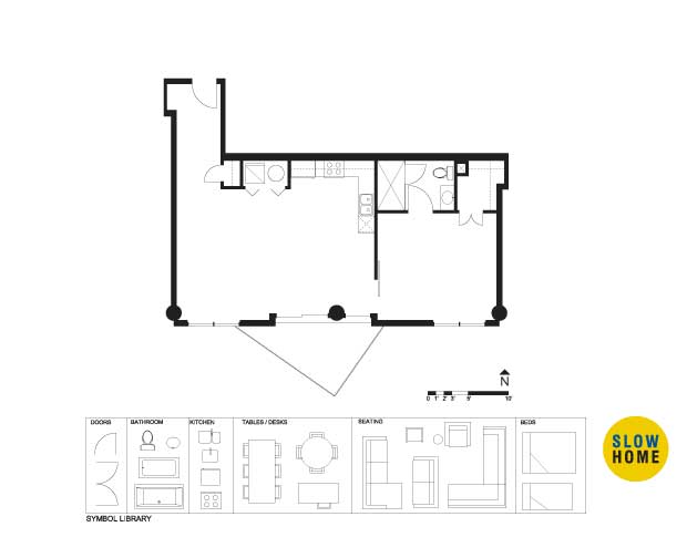
24/03/10 – Dallas/Fort Worth – Apt/Lofts (JPG)
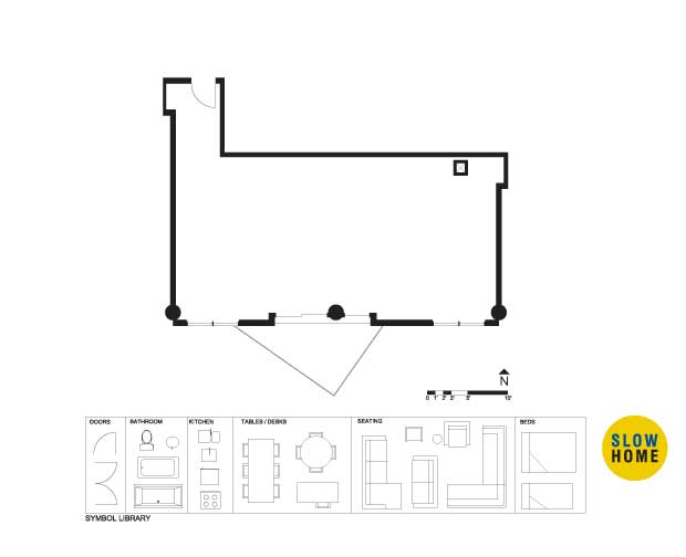
24/03/10 – Dallas/Fort Worth – Apt/Lofts (Demo)
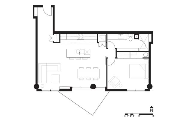
24/03/10 – Dallas/Fort Worth – Apt/Lofts (Final)
24/03/10 – Dallas/Fort Worth – Apt/Lofts (PDF)
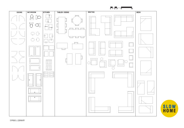
24/03/10 – Dallas/Fort Worth – Apt/Lofts (Full Symbol Library)

  • BradW

    Matthew’s solution is shown when the site is loaded. You might want to change that…

  • BradW

    Since we are designing today, here is another clip from Objectified. This time Dieter Rams comments on design. http://www.youtube.com/watch?v=HGPIqGi7MWY
    In case you missed my late post on Monday (shame on you), here is Karim Rashid also from the documentary Objectified – http://www.youtube.com/watch?v=vK6nyp8fPrg&NR=1

  • MollyK

    BradW,
    Hey! Just finished watching your web offerings. They were great…I actually got on the PBS website to learn more about IndependentLens.
    So I have two points to throw out there: 1. comfort and 2. price.
    Karim Rashid uses the “chair” as his example of moving forward in design, thus you are shown pictures of sleek, modern chairs. My first question is are they comfortable? Honestly, I’ve never sat in one designed like that so I don’t know…they don’t look like something I would want to lounge in while watching a good movie…they don’t look comfortable. Brad, have you sat in these modern chairs? What do they feel like? Are some more comfortable than others?
    Now onto the price…what do these “designer” chairs cost? If you want to bring the masses into the modern world merchandise has to be affordable.
    I’m not bashing modern design…in fact, I’ve grown to like it. I’m just playing alittle devil’s advocate because I think in the real world comfort and price are part of good design.
    BradW, I’m volleying it back to you since you put this information on the website. Or maybe someone else can answer my questions, please feel free.

  • MollyK

    John,
    I think Matthew’s design pretty much sums up today’s exercise since it’s inadvertently on the screen when you come on the website. It’s o.k. I’m under the weather so I’m not real motivated to re-design. I will say it looks like the floorplan didn’t need much “tweeking” to provide a more livable space with better circulation. It’s a good example of how just a little change can make the difference…wonder why the original architect chose such an unlivable design to begin with.

  • BradW

    [img]shdp561.jpg[/img]

    Here is an alternative to Matthew’s design…Tankless water heaters are hidden in both the kitchen and bathroom. The circulation is kept to the back of the unit.

  • BradW

    MollyK – Karim asks “Why do we feel we need to keep revisiting the archetype over and over again?” In his work and by his own admission he attempts to revisit the chair archetype to make a difference – for comfort and for the technological context in which we live.
    To answer your question about the comfort of modern chairs is difficult because it is personal. For me, some are exceedingly comfortable and some are not. Also, I view furniture, in particular, chairs as an art form. It adds interest and conversation to a room when an unusual chair is present. With regard to affordability, most designer chairs are not simply because they are produced in limited numbers.

  • MollyK

    BradW,
    Do you need two tankless water heaters? Or are you showing two options for housing the water heater. I have a tankless water heater for my home and one is plenty since it gives hot water on demand to any location in the house.
    Also, I’m having difficulty seeing the design elements between the kitchen and the hallway leading to the entry. Can you tell me about that area…I think you have a frig. but I don’t know what else.
    I like that you kept the circulation along the back of the unit. I also notice the absence of an island which many would not like. But I must say that in these small units you can’t always have every design element…I think a table is fine if it is made of similar material as that in the kitchen.
    As for our discussion on the modern chairs, they would seem to be the easiest (most versatile?) piece of furniture to use as an art form. I guess just as with any furniture you have to sit on it to decide its comfort. Thanks.

  • MollyK

    Here is the EPA’s 2nd annual ranking of US metropolitan areas with the largest number of buildings receiving Energy Star labels in 2009. Not surprising who is #1.
    http://www.jetsongreen.com/2010/03/top-25-energy-star-cities-epa-2009.html
    All the US cities on our tour made the list.

  • Mid America Mom

    Hi. This plan seems familiar. Brad I like the kitchen movement though you threw in that Toronto galley. I was happy to leave that behind.

    JOHN/Matthew-
    Is this on the top floor- can I imagine it is? How high is the ceiling?
    thanks!
    Mid America Mom

  • Matthew North

    M.A.M. The ceilings are 9 feet tall. The unit is above the fifth floor of the building.

  • BradW

    MollyK – The entry is defined by a bench at the door and a rectangular block of cabinets at the end of the hall. On the entry side these cabinets house the A/C, a closet and storage space. On the kitchen side there is a pantry and a fridge. Regarding two small tankless water heaters, the kitchen and the bath are on opposite sides of the home and I don’t like to wait :)
    MAM – If you have seen any of my designs on Slow Home you will know that I have a strong preference for a linear kitchen with an island. Here, that would have resulted in a copy of Matthew’s design which was inadvertently displayed on the site this morning. So I quickly designed an alternative. I am sorry that you do not appreciate great design…:)

  • Paul C

    [img]dallasscaled.jpg[/img]

    Mathew,
    In the spirit of a constructive critique I offer the following with respect to your concept:

    The proposed location of the laundry in some ways is akin to the pseudo studies wherein on laundry day the kitchen might be overrun here. An alternative might be to place the laundry in the master closet, accessible from the bathroom and relocate the hot water tank elsewhere for additionally, combining the hot water tank within the clothes closet could be problematic. I like the bedroom/bathroom hall. The large shower is great however not having a tub might be of concern to some, though that is an easy fix.

    There appears to be underutilized space between the entry, the sofa and to the left of the island and after placing the scale provided to the concept (posted image) the actual living space appears small and the space provided from the island to the outside wall also seems a little tight if within that space one must provide room for island seating, dining table/seating and circulation through to the bedroom. I think this is a good example of when the notion of tradeoffs comes into play. For example, an oversized island which doubles as the dining table (this concept has been depicted before) might free up some space that could be used in the living or maybe in more overall storage for the home. So would someone tradeoff having a separate dining table over maybe a better sized living space and possibly more storage? And lastly, it is unfortunate that the geometry of the home is such that there appears to be a little excess space in the entry then what is needed. Having some of that space available for other parts of the home would be nice.

  • MollyK

    BradW,
    I had forgotten about the time lapse for the water heaters. Mine is right beside my bathroom so I don’t have to wait…but my kitchen is on the other side of the house (need I say more). You have once again made me laugh at the reality of it all!!!
    I do like your cabinets very much…and I also have a strong preference for linear kitchen with an island. But if we didn’t have M.A.M and her love of the U kitchen our discussions would be less than engaging.

  • MollyK

    To celebrate Re-design day I’m posting another article from Jetsongreen.com. It is a design contest sponsored by FreeGreen and the public gets to vote on the winner! We’ve had so much discussion about single-family homes in Toronto that I thought this article would give us some perspective on efficient designs under 1800 square feet. Yes, the designs are very modern which may turn some people off but they are much more than their exteriors. Finally, I’m proud to say that 4 of the 12 finalists are from my home state of North Carolina. Take a look and vote if you like. http://www.jetsongreen.com/2010/03/whos-next-in-green-home-design.html

  • Matthew North

    Paul C – thanks for the commentary on the re-design – this type of “panhandle” unit always has some under utilized space in the entry area. My sense is that the proportion of the living and dining spaces with respect to the furniture layout would work, but it would be nice to have a little more room in the living area. I really struggled with the HWT location. That was my “give” in this design – I admit it. I would be excited to see if anyone else can take your suggestions and re-do my design and make it better still.

  • Mid America Mom

    BradW and MollyK
    Hear the chant now ” YES, YES, Say Yes to U! ” ;)

    I have been waiting to talk about studios so I could post another new kitchen design- the revolving circular kitchen. YEP here you are: http://www.compact-concepts.com/englisch/index.html

    Now what about that?

  • Mid America Mom

    Oh I forgot to post this from apartment therapy. Look at this built in. SO WANT!!!! Of course my present apartment could not handle it. Maybe I can put this in my redesign today….

    http://www.unplggd.com/unplggd/look/stefan-boublils-surround-sound-and-sight-redesign-097943

    Mid America Mom

  • MollyK

    M.A.M.
    The revolving kitchen…yeah, well, it might run into some problems in the US since electrical codes on providing power to kitchen appliances are different from other parts of the world. It would be hard to just plop it into any space and power it. Then decide to move, take it with you, and plop it down somewhere else. But I can’t deny that it is on the cutting edge of technology.
    As for the built in…it is very nice and very large! It would require its own dedicated space…maybe its own zip code! But I like it anyway.

  • Terri

    [img]dalloft.jpg[/img]

    I started out by thinking I’d try to revise Matthew’s plan, as he suggested someone might do, but I found myself wanting to make quite a different laundry setup. So…totally different.

    I reconfigured this kitchen about five times: tried banquette, tried the closed galley, the galley running east/west, and finally settled with this design mostly because I wanted the living area to be able to use the complete width, which meant putting the flat screen on the back wall. And that meant that I needed to make the galley run north/south so that you didn’t look straight at the kitchen sink.

    I envision that wall of cabinetry as being continuous with shelving at the window end and enclosing the fridge at the north end. The bar is table height with plush dining chairs.

  • Mid America Mom

    JOHN/ Matthew. The scale. Looks like jpeg label has 12? Just clarifying. If about 800 and using it as 10, the rough is about 20 by 40.

    I feel the need to add a Den or something….

    thanks!
    Mid America Mom

  • Corey

    [img]dallaswk1desprojmodel.jpg[/img]

    Well I had trouble orienting the living room so that you’re not walking in on the back of the couch. I did that by including a bookshelf off the entry. Just watched matthews design and I think mine turned out similar to his. Mind you I liked your design of the bathroom better and where you located the dividing wall between public and private spaces makes more sense than mine matthew. Tricky entry though… seems like a lot of wasted space still.

  • Corey

    Terri, just a quick observation. You left the dining space out of your plan. Was that intentional?

  • Margo

    [img]margodallaswk1desprojforeric1.jpg[/img]

    This is much better I think, though there is quite a lot of excess space in the bedroom.

  • Matt KB

    [img]loftplan.jpg[/img]

    this is my attempt

  • BradW

    MattKB – Nice. You have more room to lengthen the kitchen…

  • Terri

    Corey,
    Yes, I nixed the little dining table I had inserted in the corner and went for a U-eating bar instead.

  • Terri

    Margo,
    I like your plan, but I think you don’t have enough space between the opposing counters in the kitchen.
    I see that both you and MattKB made the bedroom less wide which allowed for a much nicer living/dining area. I followed Matthew’s lead and left the bedroom its original width, which may not have been the best plan, I figure, now that I see what you guys came up with.

  • Sarah W

    [img]dallasloft.jpg[/img]

    Here is my attempt; I found it tricky to place the entrance to the bathroom and not have it face directly onto a living space/kitchen. As a result, the bedroom doesn’t have a door (true “loft” style, I suppose!). Looking back on it now (unfortunately I don’t have time to redo it at the moment), I think I would push the bedroom/bathroom wall back and put a door on the bedroom (or at least a privacy wall of some kind). Oh well. Feel free to critique/revise! =)

    Sarah

  • Vickie

    [img]dallasloftforjohn1.jpg[/img]

    Matthew,
    It was nice to watch your video and see the development of the layout and the process of which you thought through – separating the spaces, creating spaces in between closets… and understand which considerations took importance. Very helpful for me.

    As for my design, I wanted to have the kitchen sink close to a window, or facing the window – so when doing dishes, you can look out onto a view and be flooded by natural light. Although I’m not sure the kitchen works with the living room – maybe a little crammed?

  • Dominique

    [img]dallaslofts.jpg[/img]

    My attempt to reno this unit.

    ~Dom.

  • Mid America Mom

    [img]dallasco3.jpg[/img]

    HI.
    See comments in the plan.

    This will be a warm unit since faces south that was a concern. Added built ins, different walls. The breakfast bar is different as well. I personally think we need to have seating not shoulder to shoulder for conversation purposes and saving your neck! Go for curved/angled or wrap around(YES I know people are reading in horror :) ) breakfast bars. So for this plan a diner can look into or out of the kitchen, part of the bar is off a full height wall. Reworked the bath so we could put the Hot Water heater in. Also room for a washer AND a dryer or stacked unit if want …or move the AC in.

    *The special walls. See this for specs and what it looks like – http://www.maximizedesign.ie/pdfs/web_MYS_PRODUCT_INFO.pdf

    Mid America Mom

  • Mid America Mom

    [img]dallasco4.jpg[/img]

    Slight changes. Bathroom now has tub. In the living/dining space switched the groupings.

  • Jodi J

    [img]week9desprojtostudents.jpg[/img]

    a few comments on the redesign:
    - niche in entry fitted with a built in display cabinet/place for keys/mirror, etc
    - built-in cabinet also fitted in dining room to take advantage of wall space created from the bedroom
    - tried to maintain circulation axis to exterior space between living and dining spaces, as well as a straight circulation axis from entry to bedroom/bathroom
    - walk-in pantry added to kitchen
    - bathroom had room for linen tower next to tub for extra storage
    - laundry/hot water room fitted with lanudry sink