
Completed Design – Part 2 ( video )
The Teal
25/02/10 – Toronto – Townhomes (PDF)
25/02/10 – Toronto – Townhomes (JPEG)
25/02/10 – Toronto – Townhomes (Demo)
Thank you for voting.
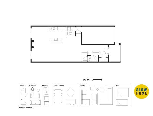
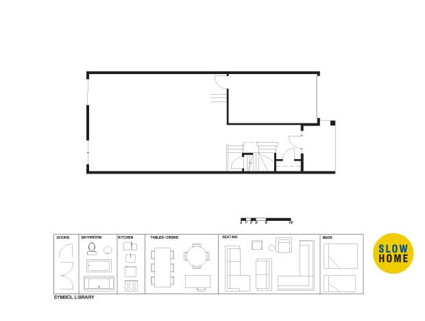
Six 50 King West – Unit TH02
968 Queen West – Unit 04
Avonshire Parkside – Unit 3E


