Comparing Townhomes In Atlanta

This is Day 196 of the Slow Home Project and we need you to join us in our quest to evaluate the design quality of houses in nine North American cities in nine months.


Welcome to the Slow Home site for this Tuesday, August 3, 2010! In today’s “Which House Should I Buy?” episode, we are comparing 3 townhouse properties for our clients David, Margaret and their teenage son, Sean. David and Margaret both work in North Atlanta and they are looking for a modestly sized 2 bedroom townhouse in a walkable neighborhood. Sean will be living with them for 2 more years until he goes to college, which means they will be empty nesters soon and they do not want to buy a larger single family
home.

They have narrowed their search down to three units in the “Gramercy Townhouse” project in “Perimeter Place” which is a 44 acre mixed use development in North Atlanta.
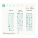
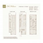
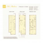
All three plans are 1,380 sq ft and have 2 bedrooms and 2.5 baths. The garage level and upper levels of all three plans are identical, so the focus for today’s discussion is the main floor layout.

We need you to analyze these floor plans and leave a comment as to which townhouse you think is the best choice for David, Margaret and Sean. Let’s have a discussion!

When you are ready, you can click on the player below to see which unit John and Matthew have chosen and why.

See you tomorrow for our Design Project where we need you to re-design the floor plan of a townhouse and transform it into a Slow Home!

  • Franco

    My vote is for the Brooklyn. After viewing the plans, the Brooklyn has a few key features which make it superior to the Madison and the Hudson. Although all the plans have great circulation, I found the layout of the Brooklyn to be the most natural and least obstructive. Having the kitchen in the middle really helps to divide the living and dining space. In the Brooklyn room sizes were proportionate and properly located (I really like the kitchen island and dining in the front). The last component which was a huge seller for me, is the location of the powder room in the Brooklyn; having it tucked away behind the kitchen works well. It’s a significantly better location than in the other 2 plans.

  • BradW

    The Brooklyn – While I like the separate dining space to gain some privacy from the otherwise open plan, the main reason is the discrete design of main floor entry closet and washroom.

    On a side note, is it just me or does anybody know what the heck the people are talking about on the What’s being said about Slow Home tweeter sidebar?

  • Mid America Mom

    Ah… after my heart on this one. To me the living space is the most important space.

    the dining space in all three were good.

    Madison- wasted space between living and dining. Kitchen has a great view to the bath?! I wonder where the entry is supposed to end near the living space.

    Hudson- kitchen is a bit too open in the middle. Living view to bath?! Entry is on a stair landing which is not the best.

    Brooklyn- K is a good layout. Smart placement in the plan for it and the bath (the darkest part of the home). Living has two walls we can use for furniture placement. I can see in this plan where the entry is with walls and other building objects. To the stairs over to the kitchen and down to the dining.

    Brooklyn is the more ideal plan though you sacrifice an open dining area.

    Mid America Mom

  • Mid America Mom

    Oops forgot to say I thought the madison living room felt cramped.

  • bstone52

    My vote if for the Brooklyn. I like where the kitchen is in the center of the main floor and the breakfast nook/dining area is placed next to natural light and windows. I will say that I think the garage design of all 3 designs is ridiculous, but then again – we are looking for a walkable neighborhood I suppose, perhaps this will discourage the use of the vehicles?

  • Tayler

    My vote is for The Brooklyn.

    I cannot believe the placement of the bathroom in the other two. In the Hudson, the bathroom door basically opens into the living room! I really dislike that! The Madison does it a little better, with the bathroom placement near the kitchen. I still do not like the separation of the living room, kitchen area. I like my living area closer to the kitchen.

    The Brooklyn places the washroom in a more private area.

    Also, just want to comment on that garage design– so impractical. “Honey, can you move your car!? NEVERMIND, I’ll just take yours… no wait I need mine, I have that stuff in the trunk you wanted me to drop off. Okay, fine I’ll move it.”

  • Andrew

    Each of these townhomes have pretty much the same feel and similar qualities within the site plan, so it’s down to the interior layout in order to decide which place would be best for David, Margaret and Sean. And within the envelope, it looks like it’s pretty much just the entry level that has significant differences between the 3 townhouses. Each entry level has it’s flaws but I think I would have to choose The Brooklyn. There is not as much wasted space on this floor in the Brooklyn as there is in the others and while the location of the bathroom is not ideal, I think it’s the much better than having it open right into the kitchen or having the living room focused on the bathroom entrance. Also, in the Brooklyn you can imagine a TV being placed across from the furniture in the living space while this space feels a bit crammed and without focus in the other 2 plans. And I think the kitchen works best in the Brooklyn, especially its island.

  • Grace Coulter

    Hi everyone, back from a short vacation in NYC, looks like I missed some interesting stuff last week. David, Margret and Sean are in the position of a lot of baby boomer households right now.

    Not to be a sheep but I am going to pick the Brooklyn.
    I think both the Brooklyn and the Hudson were stronger designs than the Madison but in the end I really dislike the washroom leading into the family space in the Hudson. The dining space in B was great and i agree with MAM’s comment that placing the washroom in a dark place was wise in a townhouse.
    Tayler – lol, great comment.

  • sdokter

    My choice out of the three townhome floor plans would be the Brooklyn. All three layouts had the same top floor bahtroom and bedroom set up, but the main floor utilzed the space more efficietnly. Having the living room adjacent to the outdoor terrace is a much better option than having the kitchen placed there. I enjoy the Brooklyn layout and think that David, Margaret, and Sean would like it as well.

  • Frances GF

    It has to be the Brooklyn. It is the only unit with a front door closet and most importantly, you aren’t forced to look directly into the power room from a main living space.
    The Madison has the powder room in the kitchen! The unfortunate Hudson plan has the living area centred on the powder room door.
    It would be irresponsible NOT to recommend the Brooklyn to Margaret & David, over the other two plans.

  • ReneP

    No sleep ’till Brooklyn!
    The guest bath is in the best position in this plan (I don’t know who in their right mind would pick the Hudson configuration with the living area centered on the powder room door) and its layout is much better than the long-narrow-spacewasting guest baths in the other two options. Also, the kitchen in the center I like a lot – the hub of the home with breakfast counter and no wasted space. Having the living room open to the deck is better than the kitchen doing so (e.g. Madison), and the dining room is also creating a good link with the outdoors – nice light. Additionally, I was thinking that the secluded nature of the dining room could double as a fine study for the teenager – or the parents when they have to sit down to plan their finances for their son’s college education.

  • Terri

    Another vote for Brooklyn. Actually, I don’t see why they don’t do all the units as Brooklyn and scratch the other two, they’re so awful!

    BradW,
    I find the Twitter stuff kind of annoying too. It seems that “slowhome” is the tweet name for a slower pace of life, used by a select group of people, with no ties to “the slow home” here. I ignore that window unless I notice the real slowhome duo linking to an article.

  • JPod

    Yet another vote for the Brooklyn. I think it has good organization and a nice living space.

  • Joshua

    I’m going to make this simple, I picked the Brooklyn, solely because of the powder room or main floor bathroom. I felt while most of the rest of the rooms ranked equally for me, the negative effects of the long and skinny bathrooms brings, and the positives from an accessible and private bathroom that the Brooklyn has.

  • BradW

    Terri,

    Thanks for confirming my thoughts. BTW, I thought your assessment of last weeks condos was correct. No design stand outs, maybe one interesting history lesson – I did not vote.

    If I am crankier than normal today or over the next few days it is because my new MacBook Pro keeps freezing. Under the guidance of the crack (smoking) Mac tech support team and as we speak, I am currently reinstalling the Mac OS on my freshly erased hard disk. I think I’ll have another Scotch…

  • Jamie L

    I would choose Brooklyn. Simply, because the powder room. The other two layouts have bad oraganization with the powder room and the entries. Madison has the powder near the kitchen which is bad, and Hudson has the powder room near the living room, it was ok but the entry is straight to the living room which seems just awkward to watching the wall of the bathroom while sitting on the couch.

  • Dan M

    Nothing says “location, location” and “walkable” like a SUPER TARGET, SUPER WALMART (close enough to access), ROSS, OUTBACK STEAKHOUSE (inset chain store name here), etc. in a family oriented ‘mixed use’ community. Oh well think of all the free expanses of surface parking at night (and the streetlights keeping it nice and brightly lit)!… Good concept to incorporate retail and residential, bad execution in making it residential and big box strip mall…
    I guess that is for another discussion…
    Onto the house…
    I will have to choose the Brooklyn as well, although I’m not too terribly keen on the bathroom placement, but the floorplan works the best of the trio… Personally I’d tell them to keep looking, I’m sure a little more of a search and truly figuring out what they need would lead to a better location and floorplan then found here.

  • frazer

    The Brooklyn gets my vote as well. It has a decent powder room that doesn’t open up into a primary living space. It’s clear circulation and organization make it a strong design. The dining room is more formal which is not necessary however it is situated so it has a window.

  • Tara

    I chose the Brooklyn through a process of elimination based on elements I hated in the other plan.
    The Hudson was my least favourite. The kitchen has too much floorspace and is just plain weird. The living room’s focal point is the bathroom door rather than somewhere one could place a TV. I thought the dining space was also too large and ill defined.
    I also disliked the living and kitchen spaces in the Madison. The living room is very cramped as it is unable to utalize the full width of the unit. This creates a small living area and wasted space directly in front of the door. The kitchen is large, not overly functional, and has a powder room as one of its main features.
    I thought the Brooklyn was quite well designed. I love the layout and placement of the kitchen within the plan, as well as how they have handled the powder room and closet nook. I like how the living room was handled, as it was given the most space within the plan, and the dining room is still functional and a little more private than in the others.

  • Kyle B

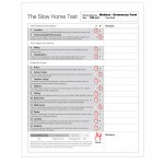
    From the relavant points on the slow home test I scored:
    1. Brooklyn
    2. Madison
    3. Hudson

    My final choice would have to be the Hudson. For me, the only major issue is how far the dining room is away from the kitchen. As frustrating as that would be, it is minor compared to some problems with the other designs…

    The Madison has far too much wasted floor space. The kitchen has awful counter space. The dining table is placed right in the middle of the house giving it but a lack of natural light and subjecting it to all the transit to and from the kitchen/stairs.

    The Hudson seems to have gone wrong in every way. The living room looks direction into the bathroom. Again, the dining table is in the middle of the house. The kitchen has a lot of wasted floor space.

    The final problem I wish to point out is the strange bathroom design in both the Hudson and Madison. It reminds me of a hallway.

    In conclusion, I choose the Brooklyn.