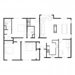
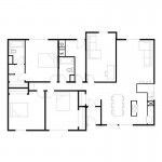
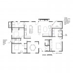
Denver Design Challenge

This is Day 114 of the Slow Home Project and we need you to join us in our quest to evaluate the design quality of houses in nine North American cities in nine months. This week we are reviewing the results of our work in Denver and today we are discussing the submissions to our design challenge.

We are almost finished our month in Denver. As we tally up the results from the past three days of voting for the Slowest Homes in Denver it is time to review the submissions to the first ever Slow Home Design Challenge. 18 proposals were submitted, and we think it was a great success. Some people submitted revisions of their schemes and we haven’t posted the originals – hopefully we didn’t omit the wrong ones. If so, let us know and we will make the correction.

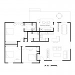
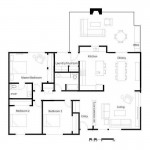
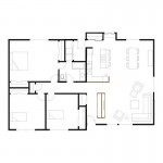
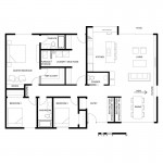
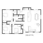
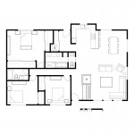
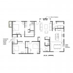
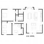
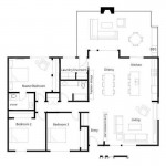
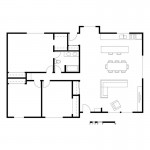
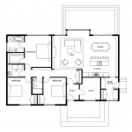
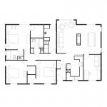
Today we want to have a general discussion about all of the work and we have posted all of the proposals along with the brief rationale provided by the author. To help structure the discussion we have organized the submissions into three broad categories based on the location of the kitchen. In many situations, the decision of where to place the kitchen is one of the first and more critical design choices to make. The plans are not placed in any particular order.

Remember, that the kitchen location is just the first of many other design choices and we hope that the discussion today will cover all aspects of the design. You can talk about one plan, compare two plans or discuss how several plans deal with the same problem in different ways. Feel free to download one of the plans, mark it up, and repost it to the site in order to illustrate your thoughts.

Tomorrow we will announce our pick for the best design as well as the results from the past three days of voting!

Group One – Kitchen In Original Position
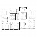

Murray

Jessica

Brad W

Frances

Nicole

Tiffany

Tara

Group Two – Kitchen in Top Right of Plan
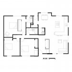

Terri

Molly K

Grace

Brad W

Andy

Group Three – Kitchen in center and front
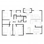

Terri

Paul C

Mid America Mom

Mid America Mom

Mid America Mom

Molly K
  • MollyK

    I’m going to start with Paul C,

    I like his design very much. The question about the “back” entry…it’s really a “side” entry and the room itself is great. The issue with that entry is the location of the detached garage. If the garage sits behind the house the “back” entry (IMO) would be too far away, even if you had a covered walkway. HOWEVER, if the garage is to the right of the house then the “back” entry would be work well.

  • MollyK

    Murray,
    What a great plan. I noticed the solar tubes right away…don’t think many people know about them. Grand idea. The circulation throughout the house is nice. Both entries are thoughtful…I like the openness of the front entry, yet it has its own space. The bedrooms and baths are well proportioned. I like the kitchen (I know why you use the wall). It wouldn’t appeal to some…but it still feels open with good circulation to any location.
    I appreciate your use of the fireplace and the floating closet.

  • MollyK

    BradW,
    My only criticism comes from the plan with the kitchen in its original position. On the one hand, I like the double sink at the window. On the other hand, I think the circulation path from the mudroom could be compromised if someone is at the sink. I think I might be leaning toward the kitchen on the right for that reason…but, I really like the new look of the “original” kitchen. It’s not something I often see in your redesigns.

  • MollyK

    Jessica,
    I think the mudroom area is unique and versatile for a homeowner…I would recommend some type of door system to close off the laundry area when not in use. Kudos on the proximity of tankless water heater. However, I don’t understand how that space makes “lighter” living if you must traverse its entire length, then make a U-turn to go into the kitchen? Tell me more about that concept.

    That brings me to my other concern…the kitchen. When you look at the main living area (K/L/D), the kitchen feels cramped and hidden away. The L-island is floating alone. Perhaps, with some reconfiguring of the Master suite/family bath, the kitchen could open up some.

  • MollyK

    Nicole,
    I love your mudroom concept. My only criticism is the long walk to the kitchen. (That is a recurring theme with me, but one I think is legitimate for whoever totes the groceries.) And yet it provides quicker access to the bedrooms. Sounds like a trade off.
    The space in the bedrooms is reconfigured well…nothing wasted or too large. And the main living area (K/L/D) feels slow.

  • BradW

    MollyK – the concept behind the kitchen in the original position was not to mess with the exterior wall and to change as little plumbing as possible – the problem is that it “elongates” the kitchen too much so what you end up with is a kitchen with two zones – a clean up/prep zone by the window and a cooking zone in the L which includes oven, pantry, fridge, secondary sink and the island – I do not think traffic is a problem because there are two routes and the width between counters and island is ~4′ – I like being able to enter the house from the detached garage and place groceries directly into the kitchen

  • MollyK

    BradW,
    Personally, I’m fine with the 2 circulation routes. Circulation is such a big issue with Slow Home that I thought there would be criticism of both paths since someone could be standing in either one. (I foresee criticism about having traffic flow through the cooking zone while the cook is hard at work, even with the ~4′ width.) I think the kitchen has 2 highly functional areas…and you know how I like functionality.:)
    Frankly, I think a clean-up zone and cooking zone is the way to go…a feature I’m planning for my personal kitchen reno in the future. Also, I couldn’t agree more about the groceries. In my current home I’m experiencing the displeasure of a long trek with groceries…believe me, it ain’t SLOW.

  • BradW

    [img]murray1rev.jpg[/img]

    I have commented on the past on being careful with dimensions. Here is an example where a little bit more attention to dimension could make all the difference. There is a lot to like about Murray’s plan but the kitchen area is not one of them simply because there is not enough space to move into and out of it. I would suggest cabinets along the one wall and a big island as an alternative.

  • BradW

    One other general comment – I realize this is only a design exercise but for fun look at your design and think about everything that needs to be changed in order to build it. Would you still design it the same way?

  • Murray

    [img]denverhousekitchwithmeasurements.jpg[/img]

    It is great to see all the variations – lots of good ideas that I will have to spend more time. I like the way some extended the concept of the house to deal with outdoor living.

    MollyK and BradW thank you for your comments. MollyK you are being generous taking the time to comment on all the plans.

    BradW, conceptually I totally agree with your points about space to move in, and I am not 100% satistifed with what I submitted.

    I am not getting defensive, however one thing you would not realize is that I actually scale up the original jpeg to correspond with a file on my computer in which I have images of all the furniture, etc along with a set of squares for 1 – 12 sq ft. My starting point with each project is my 10′ square. I then enlarge the jpeg so that its scale matches my own. This means that the scale you superimposed on my plan is actually a bit small – by approx. 4%.

    I try to be very conscious about measurements and allowing for a reasonable amount of space in which to negotiate (this is based on my dissatisfaction with my own house). I have included a detail of my kitchen with measurements along with a section of the scale showing, as an example, that the counters are 24″. I don’t feel that my kitchen is too small [of course I don't ;],but I know there is room for improvement.

    On a less pedantic note – I was again thinking about kitchens, islands, etc. Besides wanting to separate the kitchen somewhat from formal dining, walls allow for upper cabinetry where more open kitchens may limit the amount of storage options. This is not a criticism, merely an observation. I suppose a pantry would help.

    I always feel that my kitchen designs are so prosaic compared to most others submitted, but having lived with enough bad kitchens in my life I am trying to figure out what works best for me.

  • Frances Grant-Feriancek

    [img]1_shweek52demo.jpg[/img][img]1_tara1.jpg[/img]

    Hello Slow Homers,

    I wokeup at 5 am Wednesday and realized I had left too much space in the master bedroom. It was all I could do not to turn on my computer and measure the master bedroom!

    So please indulge me as I post a reworking of my plan. I like the larger window seat and the pantry. I really hated my original bathroom.

    There is much talk of kitchens but I found bathrooms the greatest challange in the plan. Fist off Murray’s addition of solar tubes or even a skylight to an interior room is a must. Try as I might I just could fit a second bath into the plan, as many others did.

    Tara, I reworked your bathroom a bit. I like the concept of the segmented bath to work as both the ensuite and the guest bathroom. I think it can be better. Anyone else up to trying?

  • Frances Grant-Feriancek

    [img]1_shdp63demo.jpg[/img]

    Oops,

    Ignore the first image, this is what I meant to post.

  • nicole

    [img]20100511option2.jpg[/img]

    Molly – thanks for your comments – good point; however, the trade off is having a powder room for that plan option – otherwise, the door could be accessed from the kitchen.
    Attached is a revision that addresses your comment – Design is a process!

    Molly’s plan –
    _like the front entry closet + powder room layout. It allows for a decent size front entry.
    _also like how the back mud room is laid out (might add a bit of space between the washing machine and the closet.) It would be a good location for family lockers / bench combo (instead of a closet). But I feel that it takes away from the back yard view, which I like in Paul’s plan – like how he put the rear entry at the front because it clears up the view to the back

    Murray –
    _maybe the kitchen could be rotated to be against the wall of the laundry to eliminate a second corridor, and open up the space to the rest of the house
    _the fireplace is a good idea, but it becomes a bit challenging – what is the focal point in the room?

  • MollyK

    BradW,
    I prefer to live in my design with the kitchen on the left moreso than the one with the kitchen on the right. I think the overall proportions are better. However, the mudroom is tight so I would re-distribute some space from the dining area and pull the 2 bedroom/bath area forward. I hope that might provide more “elbow room” to the mudroom. Also, I like the computer/study area to the right of the family room. It has access to the back yard and can be integrated into the family room by opening the Shoji screen. I think in its location it would get used more. However, I understand that some would say the family room may be too noisy next to the study.

  • Terri

    I am impressed with all the variations! I’ll go back over the designs now and choose some to comment on.

    BradW makes a good statement above, where he says to imagine actually tearing down and rebuilding the home. Which walls are lined up? Which are major reconstructions? Is there going to be a lot longer plumbing line to be installed?

    These are the kinds of thoughts that I had while reworking the plan (too many thoughts!), but it was this line in the Challenge announcement got me on that track:
    “Consideration should be given to the extent of the work being proposed in relation to the benefits created.”

  • BradW

    Murray, I realized you scaled up your drawing and I approximated my measurement bars accordingly. When I initially looked at your drawing I used your counters as (assumed 2′ in width) visual references to other spaces which appeared very narrow. Thanks for providing the true dimensions and rationale for the kitchen design. Cheers :)

  • MollyK

    Grace,
    What jumps out at me on your plan is the front entry. Yes, it is now a separate space, but it is more or less a hallway. An easy fix would be to take some space from your family room (which is large) and create some width across the front entry area…add a side light to the right of the front door to allow natural light to filter into the foyer. Put a bench or console against the right-hand wall and you have an inviting “area” not a hallway. :)

  • BradW

    MollyK – it was NOT me that commented on your design – that task was handled by nicole – please direct your wrath accordingly

  • Terri

    Nicole,
    I just saw your post that came on while I was typing…I really like your revision. I liked your original too. Putting the main bath between the two bedrooms is a great idea.

    I think your revision would be even more perfect if you could insert another pocket door in the powder room so that access to both the laundry and back door might go through there. I know it’s unconventional, but it’s only a powder room afterall!

  • BradW

    Frances – adding the spa tub in the living space does create an interesting focal point in Tara’s design ! :)

  • Murray

    BradW,

    I don’t know what happened to a subsequent comment I made – somewhere out there in the ether, I guess – at any rate I later realized that you had indeed used an accurate scale. You simply had a gut reaction that the space was too small, which is OK. I tried to rationalize with measurements.

    You saw the forest, I saw the trees.

  • Murray

    Nicole,

    Your revision is good (now I don’t have to criticize the original powder room. I was really intrigued by your back entry space, and your revision also addresses a more functional access to the kitchen.

    I like your idea about rotating my kitchen – who know I may even put in an island!

  • MollyK

    Terri,
    Got some feedback for your plan in Group 2. I like the floating closet concept in the Master bedroom, but it pains me to think I could enter the room with my 9-year old daughter at my heels and there stands my husband undressing in the closet area. (Gee, I hope he doesn’t read this.) Why not flip the closet to the outer wall…Now it is longer (more storage) and the niche for the chair is an obvious circulation path (of course you want to keep it open at both ends). At that point you might have some extra space to incorporate in the ensuite.

    That’s all I can do right now…this is addicting. I must get in my yard before the heat gets bad. I’ll review some more later.

  • MollyK

    BradW,
    I’ll except your apology later. I was replying to YOUR theoretical question (@ 7:16am)–would I design my plan the same way?

  • Murray

    MollyK,

    Re: your plan with kitchen at the right (west). There is a lot to like, but I was wondering if the additional small closet is necessary. In its current position it adds a bit of a circulation hurdle to the main hallway. Could it be rotated 90 degrees clockwise and line up with the rest of the hallway? – this would make a small wall into the living room area.

  • BradW

    [img]1_paulc.jpg[/img]

    PaulC – One of my favorite designs in the challenge. I have four observations 1) the proximity of the main hall closet to the living room is not ideal; 2) the side entry is very well done but is located a long way from the detached rear garage; 3) from a green point of view, the front double entry or vestibule is a nice idea; and 4) the house has been extensively modified. Having said that, the design and drawing quality is as always exemplary. Nice to see you back on the site! :)

  • Murray

    Nicole,

    I tried rotating the kitchen – big circulation problem from the back entry, through the nook, around the dining room, past the fireplace, then finally into the hallway.

  • BradW

    MollyK – That was not clear from your response. Sorry.

  • Terri

    [img]denverchallenge1.jpg[/img]

    MollyK,
    You’re my first victim–just randomly chose your two plans. I’ve written thoughts on them. First one is the one without the master bedroom moved across the house.

  • Terri

    [img]denverchallenge2.jpg[/img]

    Molly,
    Here is the second one. I must say, you really were ambitious with this one. I do like the way it works though–can’t argue with that. Great work! (Of course, I see you have a bias against bathtubs!)

  • Terri

    Correction: against bathtubs in the master ensuite. You’re still dreaming of the perfect shower, I see! ;)

  • Terri

    Hi MollyK,
    I just looked at those plans I put up to make sure they’re legible and saw that I forgot to address the thought I’d had originally about that second plan with the open back…It’s unfortunate that the second (or third?) bedroom ends up with a side window. Put the naughty kid there, maybe? :)

  • Paul C

    Fantastic submissions! Clearly a testament to what this site/community fosters.

    With respect to my “rule breaking” second entry. Yikes, I did not know there were rules :-). Seriously though the rationale was to provide a family entry and space for the utilities of life (vacuum/brooms, place for backpacks, freezer, etc.) Distance to garage is one consideration however not all users may be coming from the garage all the time. Maybe the children would be coming from the front street off the bus or the store is within walking distance, who knows. Thank you Molly K and Brad W for the feedback.

    One item which was rather unusual was the fact that there are no stairs to address. A hat tip to those designs which addressed the realities of providing space for mechanical equipment. Molly K, I particularly liked your idea of splitting up the bedrooms. Dedicating a quadrant to the kids could open up lots of fun design possibilities.

    If I could make one suggestions to our judges. Going forward if you could provide a little write-up on the homeowners and solar orientation that would be great. I think those tidbits were part of design exercises in the past.

  • Terri

    [img]denverchall22.jpg[/img]

    MollyK,
    Good point about the master closet in that second design. That plan was thrown together at the last minute as an attempt to redo the space with the minimum of changes. There are several problems with it, and I hope no one else bothers to look at it!

    I spent more time on the first plan (kitchen on side), but the day after submitting came up with a solution for what I perceive as the worst problem with it (laundry door), so I’ll post the solution here today.

  • Terri

    Frances,
    I couldn’t open your redo of Nicole’s central bathroom/powder room plan, so I’ll just say what my thoughts are instead. How about the toilet and sink in the first compartment at the right, no shower in middle with washer and dryer recessed on one side, and then the left side as is?

  • Paul C

    Brad W,
    I prefer you second concept. Specifically the manner in which only modest remodeling would be required to achieve, great connection between the indoor and outdoor kitchen(s) and that the living/dining/kitchen space is almost half of total square footage and is open to both the front and rear walls.

  • Terri

    [img]1_denverchallenge1.jpg[/img][img]1_denverchallenge2.jpg[/img]

    BradW,
    You’re my second victim.
    I like your approach–to minimize the costs–very good thinking! I wrote more on plan 1 than plan 2 since 2 is unchanged from 1 in the bedroom end.
    I tried to post at the same time, but I exceeded the space. Hoping the first plan is still there. The second will follow in my next post.

  • Terri

    Hey, it worked! Now on to another…

  • Mid America Mom

    [img]denversinglespec4.jpg[/img]

    HI everyone. WOW we put lots of work into this.

    “I realize this is only a design exercise but for fun look at your design and think about everything that needs to be changed in order to build it. Would you still design it the same way?” BradW.

    I am happy you asked that. I can tell your first? plan kept almost everything same- helped the master and then the kitchen area. Did pretty good with that kitchen -smart- without prep sink it would have been too spread. I think the bakers or cooks would LOVE that counter space. My first plan was if we could do whatever we wanted with unlimited budget. My last made change with more minimal impact..I attached that here.

    Goals:

    I know John and Matthew commented on kitchen and what that did. What drove all my designs was to get the living to the SOUTH toward hopefully a decent patio and yard and route back entry traffic AWAY from the living space on the right side of the plan.

    Confine myself to the DEMO. I did not change the exterior walls, windows, or doors in anyway. Left interior walls, doors, closets same MINUS closing the gap from old mud area to master bedroom.

    Leave kitchen walls in same location. (Closed the passthrough and the entry to the mudroom area).

    Place the family bath in the same general area and place washer nearby.

    Add a bath to the master.

    Try to get a dresser or TV across from the bed.

    ***
    When I did this I realized we had an extra room to play with and decided to run with the new found space. So the debate was fourth bedroom or den. I resisted placing a two way fireplace in it. Though if this is GAS cooking- I would place the fireplace in the same spot as the stove so we would not have to move that line.

    In the kitchen I placed the refrigerator and the sink on the same wall due to water lines. I would switch the stove to electric so not to have a gas line.

    I really liked the idea of airlock for main entry so there we are.

    Mid America Mom

  • Terri

    [img]2_denverchallenge1.jpg[/img]

    Nicole,
    I put comments on your first plan. I noticed that one of the bedrooms got a little too small when you put the main bathroom between them. I do like your central access to the laundry room. It just seems a little far from the back door to the kitchen. I’ve indicated where a door might go. It would involve reconfiguring the kitchen, and possibly losing your desk under the window. :(

    I couldn’t write on the second plan as it’s in a format my computer can’t handle.

  • BradW

    Terri, good comments – thanks – my design reference are all those mid-century bungalows which have the living room at the front but you are right when you ask does the dining room deserve the must coveted space in the house?

  • Terri

    [img]3_denverchallenge1.jpg[/img]

    Frances,
    I see in your revision that you improved the layout of the master bedroom and the main bathroom, but you lost that great little pass-through window for the laundry. :( Since you still have a closet at the end of the kitchen, could part of that long closet behind the main bath be allocated for a door to allow access to the laundry from the bathroom. I know I’m beginning to sound like a broken record regarding the laundry access (at least to ME I am!), but this is something I spent a lot of time thinking about with this project. :)

    My other observations are on the above image. Thanks.

  • Alison G

    Some highlights for me from all the plans…

    Paul C: laundry room location, central to the bedrooms and biggest producers of laundry. I never understand why laundry areas tend to be located so far away from the bedrooms.

    Nicole: Mud room/bathroom/laundry reorganization: everything is well integrated. Although, I do think the plan is improved by removing the kitchen powder room and providing a shorter circulation route from the back entrance to the kitchen. I also dislike carrying groceries through a house.

    Murray: Organization of kitchen/living/dining room area, I like the use of the fireplace and closet to delineate spaces within the larger living area. I’d prefer if the walls around the kitchen were removed, integrating the kitchen area into the entire living space.

    Good work everyone!

  • Terri

    BradW,
    Yeah, I asked myself the same thing with my “quicky” plan. It seems natural to put the dining nearer to the kitchen though, so I see why this happens. For people who watch a lot of TV, it might not matter if they’re not taking in the view. Maybe a nice settee near the window would be enough…hey, am I talking banquette again? We do get our fixations, don’t we? :)

  • Frances Grant-Feriancek

    Brad W
    Anything for a laugh. This is what happens when you don’t save your changes prior to posting!

    Terri
    Thanks for the input. It’s Tara’s plan, which did initially have the sink/toilet on the far right. I thought this was too close to the kitchen.
    I do always love the laundry near the bedrooms. This is where the laundry both originates and goes to.

  • Terri

    MAM
    I looked at your first three plans. It was very interesting to watch your brain working! :) Your progression through the three gave me lots to ponder. I think the last one is the one I’d choose, but you’ll see I couldn’t help tinkering with it. I do hope you don’t mind. Not sure if all three will fit here…we’ll see! I think I killed the system…it’s not responding…

  • Terri

    [img]denverchallenge1001.jpg[/img][img]2_denverchallenge2.jpg[/img][img]denverchallenge3.jpg[/img]

    Okay, think this worked…

  • Terri

    Speaking of laundry…I need to get to that task next while the sun’s coming round to the line. Then it’s my paid job. So to the handful of you contributors that I haven’t gotten to yet, I’ll try to do so later.

    I hope that all of you whose plans I commented on are okay with my red ink. In no way do I think I’m some kind of expert here…just thought I could keep track better by having the actual copies here on my desk to look at. Thanks for allowing me the pleasure to peruse your designs!

  • MollyK

    Murray,
    Yes! to your suggestion about the extra closet. It was originally supposed to block the view from kitchen down the hallway. But later I added the computer desk and simply didn’t “revisit” the closet location. Thanks.

    Terri,
    I’m honored to be your first victim. Responses to kitchen on the right: You are right about the tight area in front of the W/D. I’m ashamed I let that get by…perhaps putting in a shelf with pegs would be a better solution. I agree with your other observations too. Personally, I would never have a tv over the fireplace…the visual field is too high (not ergonomically correct on the neck), but I wanted as much light as possible in the living area. Perhaps I could use the same tv/fireplace combo from my other design and still keep the small side windows.
    As for the kitchen on the left…why didn’t I think about the Shoji screens for the dining area. Honestly, that room gave me a fit! I still think it is a bit on the large side. That’s probably why I put up the walls with the cabinets…perceptual cheating. ;)

  • Mid America Mom

    Hi- went through almost all the plans and have one thing I like and one I think could be better! Maybe to help with revisions or food for thought?

    This is for group 1 (others will be in subsequent posts).

    Tara – the entry piece with fireplace, built in an closet was a great idea. I assume you are missing a door in the master to the bathroom.

    Tiffany- I like the separation in the bath. I see lots of doors but looks like enough space to deal with them. The Front entry needs more definition.

    Nicole – I like you placed the living at the back- where it faces south. The secondary bedrooms felt a little small.

    Frances – I liked that front entry piece. Loved the window seat but wished that back closet was a bit smaller and used as pantry and move the closet to the mud area.

    Jessica – The tucked behind the door closet is something I like to do too. The master bath vanity feels tight for two bowls.

    Murray- The kitchen staying about the same area and still a U is nice. Thanks for the dimensions of that table in the bump out but I do feel it is a wee bit small. You may want to try something MollyK and I like- seating near the action. I can see a really nice window seat or two chairs with a table there… a bistro set.

    BradW – Like the minimal impact in the kitchen. Just wish we could figure out a way to put a tv or small dresser across from the bed.

  • Mid America Mom

    GROUP 2 – One thing I like and one I think could be better!

    Andy- The front entry needs more definition. Centering the dining table to the side window was a nice touch.

    Grace- I like the ideas of the chairs at the bump out. The master bedroom feels large and like it needs more closet or a bath.

    MollyK – Great play on the ensuite space.. not going through one to get to the other but split by a linen closet. That front entry seems a bit long.

    Terri- Master bathroom with a window and larger width shower is appreciated. I think the dining space is tight though… maybe turn the kitchen table?

  • Mid America Mom

    Last group on something I liked and one that maybe needs work.

    MollyK – Maybe eliminate the walls to the dining room , the side near the kitchen. Using a bath to separate the two bedrooms creates more privacy.

    PaulC I love the windows you placed in the back. The second bedroom closets feel a bit small (under 5 feet?)

    Terri – Like the bench and closet and what is that shoe space? at the back entry. The dining room looks to be less than 10 feet deep and maybe a bit cramped.

    Thanks for reading!

    Mid America Mom

  • Murray

    Any and all – where do you suppose the laundry was in the original plan? Also the furnace and hot water?

    Long post, so just look for your name below …

    Jessica – I like your plan. I like the sunroom concept, properly ventilated it can work as a greenhouse and laundry area. I think the closet in the one bedroom is compromised, so I would rethink the window and move the closet to the other wall, this would also give a sound buffer for the neighbouring bedroom.

    Brad W – I like both your plans, but I prefer your plan with the kitchen near the back entry. I was impressed by your conceptualization of the integration of both indoor and outdoor living – very SlowHome-ish. Regarding peeing and hockey games, maybe the ensuite toilet and shower could switch positions.

    Frances – your revision – elegant in its economy. Well done, IMO. I really like the back entry. The only thing I would do would be to redo the millwork near the front door to make the entry corridor a bit wider as well as the entry into the living room.

    Nicole – Again, I really like your revision. Terri had a good idea about another door into the powder room from the back of the house. I am curious about your feature near the front door, and feel that the front entry is over-generous in its size. You point to the “view” – this may or may not be a good thing.

    Tiffany – Your central bathroom concept is well considered. Is that laundry at the end of the hall? – that seems good. The bedrooms, as we inherited them were too large IMO, so I wonder if you could downsize the master and upsize the WIC. I am also wondering about the front entry as being a bit open (back too) and maybe not so workable in a cold Colorado winter.

    Tara – There is a lot to like. But I am not crazy about the powder room. Is it necessary? A smaller tub and shower might allow you to get a doorway off the hallway but still enclose the toilet.

    Terri – I was easily swayed by your closet/headboard – I have seen that before and it is high on my list of “cool” – it also takes advantage of the large room. MollyK makes a good point about flipping the orientation. I do wonder about the laundry, though. I can’t see one (but my vision is not so good right now, so maybe I am missing something). Your second plan is really considered, but I am not a fan of the powder room.

    MollyK – I do like both your plans. I commented earlier on the first. The split bedroom area is intriguing in the second and I am quite drawn to the dining room (I feel a séance coming on). The entry hall is generous – could that space be used in the master bedroom? Why the specificity of the red and blue shoji screens? A propos of not much, does Feng Shui have a role in Slow Home design?

    Grace – I like the feel of the large open area, and the seating off the dining room. I see how one could use one bedroom as a study though that might have to wait til the kids leave. I think today’s homeowner would demand more closet space in the master bedroom. I would widen the front hallway and I don’t think this would interfere with your living room design.

    Andy – yours is a minimal intervention, and it is an improvement from the original. The added door in the bathroom of the master is well considered, though the double sink may not work so easily on a daily basis. Your conceptual corridor from front to back seems to take up a fair percentage of the overall plan, and when something like laundry is missing I would want to reconsider how the space is best used.

    PaulC – very considered, as always. I am not sure about the isolated study, but it would be a good place to focus on the task at hand. I do think the two bedroom closets are a bit small and wonder if the laundry and hall bath could change places to allow for slightly bigger closets.

    MAM – interesting to note the changes across your plan. Overall my vote is for the middle of the three. I like the way your reworked the master suite, and the traditional closets in the other two bedrooms are more useful. I like the back entry in the 1st option. In the 3rd I think the study is much too large, though maybe it functions as a family/TV room, too. Not a fan of the open kitchen – go back to your “U”s &“G”s. I did like the double “L” in yesterday’s Denver house vote.

  • BradW

    Murray – I am glad you enjoyed yesterday’s rant and especially the part about powder room locations. It seems climbing the stairs is to inconvenient for most of us these days so designers are forced to locate bathrooms directly off main living spaces. I prefer a little more quiet when I read. :)

  • Terri

    I’m back. The joys of working from home…taking breaks whenever.:)

    Paul C.,
    I saw that yours was the other plan from the last bunch that I didn’t get to, but instead of taking the time to do all that downloading, etc., I’ll just make a couple of points.

    Your side entry first. It’s a good space, and could be used by a family on a daily basis fairly easily. My only concern is the way we must go through the kitchen after arrival (great for groceries, but I’m thinking backpacks). Your front entry with the wide approach looks like it’s for guest, or possibly clients, (the position of the study leads me to this comment) only. Nice segmenting for that purpose.

    I like that living space. You know, if you’d just left that back door in there, you wouldn’t have cheated on the exercise! ;)

    On to the other rooms. The bathroom between the secondary bedrooms is nicely placed. I notice that it looks smaller than the laundry room–not sure if that’s so good, especially since it’s also functioning as the everyday bathroom for family and guests alike. The laundry is great, though! I tried putting one at the end of the hall too, but then I remembered my plan for hanging out laundry and moved it closer to the door.

    Your master suite looks like a reasonable size. I pointed out with others that there’s a bit of a traffic conflict to get from closet to bathroom when they did the room similarly.

    All in all, a nice clean-looking plan.

  • Terri

    Murray,
    It looks like you thought of everything, even a furnace and h/w tank! I like your plan. I think the kitchen position is good, as it facilitates getting to the laundry without too much circulation through living spaces. I think I’d put a half wall along the stove side, just to be more open, especially since it’s the dining room over there, and it’s nice to be able to converse with guests while still in kitchen. If it were a living room, the privacy might be more necessary. As I said to Brad, I wonder if we should be putting our dining area in the best part of the house. Just wondering…

    Your entries are both well sized and placed.
    I think the extra nook in the kitchen works because you’ve closed off the dining side from the kitchen; however, I’d bet that because there’s such a good-sized table here, that dining room wouldn’t get used much because that nook table is so convenient to the kitchen. Maybe one of those computer desks like Nicole and I inserted here would work?
    The bedrooms look reasonably sized to me, as well as the bathrooms. Your main bathroom is calling me to segment it off by shortening the vanity and inserting a pocket door after the first segment. Of course, this would make it less approachable as a guest bathroom, which this also functions as…

  • Terri

    Jessica,
    Your indoor drying room is a nice idea. It seems a little convoluted to get to the laundry from the bedrooms though. I think it’d also be nice to allow more of that sunlight into the kitchen somehow…
    I think the kitchen could be tweaked slightly by putting the fridge on the south wall at the end, thus allowing the western edge to be more open to the breakfast bar. There’s a bit of wasted space behind that breakfast bar though.

    I think you have a good front entry and living room.
    Your first secondary bedroom seems a little tight, but the other bedrooms and bathrooms look well-sized. Maybe you’re right that the master is a little large…perhaps that space could have been used by the kitchen if everything just shifted left a bit. Well, enough of me and my ideas.

  • Terri

    I’m getting sick of hearing myself type, so I’m quitting again.
    But first…

    Tara,
    Good plan! The only thing I’d change in your plan is moving the powder room to the right and flipping the door to face the wall where it is now. This would make it stand alone, but if it were lined up with the front closet, it might just work. This position would also add a sense of privacy to the space and facilitate movement to the laundry without going through the living spaces.

  • Terri

    MAM,
    To answer your question before I go again, yes, that’s a shoe cupboard (yeah, I thought of it myself, LOL). I thought it could also have shelves for baskets for mitts, scarves, toques, etc. or hooks for hats, or what have you.

  • BradW

    Terri – my laundry is located by the back door to facilitate drying clothes on a line…OMG I am turning green :) BTW GBTW

  • BradW

    To inspire your future design efforts here is a TED Talk by Bjarke Ingels – http://www.youtube.com/watch?v=4AYE3w5TWHs (at 18 minutes it is long – if you want the short mind blowing version skip to 10:30 and go from there)

  • Tara

    Molly K:

    I really appreciate your redesign. I think you took a lot of risks that paid off. I hadn’t thought of splitting up the bedrooms like you did but I like how it works in your plan. Having the living areas in the centre of the house makes it seem much more spacious to me. There are many innovations that you incorperated that I think make it a really unique idea and space.

    I’m quite impressed at all of the different vesions of the plan – I don’t think any two plans are overly similar which shows how creative we all are! It’s a shame that the developers couldn’t come up with anything else that would make this space more livable.

  • Frances Grant-Feriancek

    Hello all,

    This is a bungalow furnaces, waterheaters and even laundry are usually in the basement.

    Terri, love the red ink…so much easier than reading.

    The front enrty millwork in my design is not meant to allow direct entry into the living room, just light and air. I left this opening at a mere two feet, this allows a glimpse into the living as you enter.

    MAM, your suggestions…moving the back closet, making that space into a pantry, enlarging the window seat are all things I did in my revision! Weird

  • BradW

    [img]1_mollyk2rev.jpg[/img]

    MollyK – another of my favourite plans mainly because I really see you stepping up here – lot of great ideas, overall layout, dining room, study, large master shower w/skylight – minor criticisms include 1) no closet at the back; and 2) side yard exposure in third bedroom – I made a couple of other changes on your plan to open views into the back yard – not convinced the fridge is in the right position – overall, terrific work MollyK!

  • Jessica

    Two plans, among many, that have captured my interest are Nicole’s and Brad W’s.

    Nicole: I’m intrigued, as others are, by the centralized back entry space. Though cloistered, I think it’s a location (as Alison has stated) that has excellent proximity to bedrooms and thus is sensitive to the needs of those doing the laundry. That said, this does blur the boundary between private and semi-private (we’ve had this conversation before… not sure how to identify the kitchen/living/dining area. Semi-private? Semi-public?). Is this too private of a location for outdoor access? Can circulation be redirected from bedroom quarters?

    Nonetheless, I quite like the resolution of the remainder of the home (with the exception of the rather small secondary bedrooms) and particularly admire the linearity of the feature running the length of the west wall. Very clean.

    Brad: you had me at outdoor fireplace. Nicely resolved spaces. I just want to pull the counter space (with fridge) a little further West. Small moves with clarity, and (I think) a little drama.

    Murray: yes that’s precisely the intent of the sunroom vestibule: laundry & greenhouse (as explained in my design intent).

    Terri: agreed, the kitchen is far too tight. As far as the convoluted path (which should be addressed), solar exposure took precedence over proximity to the bedrooms. And yes, I was troubled too by the wasted space behind the breakfast bar. But? Does every space need to be occupied?

    Molly K: “lighter living”=to tread lightly, smaller footprint etc. Essentially, the vestibule space is ‘hotboxed’ during the day (due to Southern exposure), enabling occupants to dry their clothes naturally via built-in drying racks which are concealed when not in use by a rolling door over the laundry area.

  • Terri

    BradW,
    I watched the last part of Bjarke Ingels’s TED talk. Wow! I know the word “amazing” is thrown around a lot these days, but that apartment building in Copenhagen is truly amazing. And the seven mountains rebuilt on an island is mind-blowing. Fantasy Island exists!

    Thanks for the inspiration. I’ve been running low on the creativity meter this week, using the analytical side of my brain too much. This was just the right antidote.

  • Andrew

    Thanks for the feedback, Murry. Yes, the lack of a laundry space was certainly an oversight and I think with more time I could have arranged the other spaces more efficiently. Jessica, I really like your plan including the sun room / vestibule, but I’m not sure if this is the best place for laundry equipment. Also, your kitchen and dining spaces are nicely designed but the interior might feel like a bit of a maze when trying to walk from the front entry to the back entry.

  • Grace Coulter

    Sorry for the late comment, its been a very busy day! Thanks for the feedback Murray, MAM and MollyK, I definitely agree with the comments about the front entry. I got a little hung up on trying to line things up which was sucessful in the end and did create a pretty bad entryway. I am going to take a better look at everyone’s stuff tomorrow but the conversation thus far seems pretty extensive and great, good work everyone!