Evaluating Apt/Lofts In Atlanta

This is Day 188 of the Slow Home Project and we need you to join us in our quest to evaluate the design quality of houses in nine North American cities in nine months.

Welcome to the Slow Home site this Monday, July 26, 2010. Today, we have moved on from Vancouver to our 8th city on the “Slow Home Project” – Atlanta, Georgia!

What do you think we will see in Atlanta? Will it be at the top of our nine city survey of housing design quality or at the bottom? If there are any Slow Home viewers watching from Atlanta, we would love for you to post comments to our site giving us any background information about this city as we study the housing here!

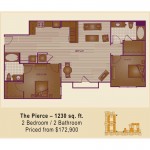
This week, we are focusing on apartment/ loft projects. For our “What’s Wrong With This House?” project, we need you to analyze the “Pierce”, which is a 1,230 sq ft, 2 bedroom unit in “The Lofts @ 5300″ located in Chamblee, North Atlanta. Study the floor plan and post your Slow Home Test score as
well as what you think are the 2 worst things about this unit to the blog and let’s have a discussion!

When you are ready, click on the player below to watch John and Matthew’s tutorial and analysis of the “Pierce”.

To provide a little bit more background information on this city, we will be posting a series of informational videos from the Atlanta Regional Commission (ARC). Here is the first in the series.

Make sure to join us tomorrow for our “Which House Should I Buy?” episode where we will be comparing two apartment/ loft projects in Atlanta to see which would be the better real estate purchase.

  • Kyle B

    1. Location = 3
    2. Environmental Performance = 0
    3. Siting = 0
    4. Organization = 0
    5. Entry = 1
    6. Indoor Living = 0
    7. Outdoor Living = 1
    8. Kitchen = 0
    9. Dining = 1
    10. Bedrooms = 0
    11. Bathrooms = 0
    12. Study = 1
    13. Laundry = 1
    14. Parking = 1

    Total Score = 9

    I feel that the most major issue with this apartment is there is far too much wasted floor space. There feels like there is no division between the entry, kitchen, living room, and dining room. This, as a result, ruins the atmosphere of both the dining room and living room.

    In addition, the bathrooms have far more floor space than needed. This lends itself to another outstanding issue for me. The closet for the right-most bedroom is accessible through the closet. In my opinion, this is a major inconvenience. This problem could be easily avoided if the bathroom floorspace were reduced and the bedroom made larger in order to make room for the closet door swing.

  • MollyK

    My score was an 8. Exactly like John & Matthew’s score with one exception…I gave dining a point. I disregarded the haphazard furniture placement and looked carefully at the space beside the kitchen. I believe it qualifies under the dining criteria. It’s not the best location, but it does have a view of the windows facing outside.

    In general, there is nothing wrong with splitting the sleeping areas. But the overall organization of this plan is the main problem IMO. And secondly, the kitchen is not user-friendly to put it nicely.

    Matthew,
    I think this plan would be a good one for the redesign segment this week. I’d like to see some SlowHomers tackle this (even with the poor siting.) :)

  • Mid America Mom

    The project site is: http://www.loftsat5300.com/

    Loc 0 Walk score was 66 my thought it should be at least 70/75.
    Enviro 0
    Siting 0
    Org 0
    Entry 1 best part of unit.
    living 0 It should be by the outside and this space has an interior window? What do you put on that wall?
    Outdoor 0 You can do nothing with that outdoor space but stand.
    Kitchen 0 Note to anyone reading this Refrigerators in the middle of the action are NOT ideal. Placed at an end where the door swing does not go into the middle of the triangle is best.
    Dining 0 Ok I would put this where the sofa is but that looks to be 7 wide on the wall. If placed correctly you would have chairs taking up the circulation that you need to the bathroom.
    Bed 0 A bedroom closet access from the guest bath only? HUH? This room would not be considered a bedroom in some places as it has no closet in the room.
    Bath 0 An OUTSWING door on the master bath and this is new construction 1200 sq foot unit? They could have done better on that bath beyond that.
    Study 1
    Laundry 1
    Parking 0 Not a given.

    3
    Worst two things. The wraparound of the unit into a corner forcing a bedroom window into the corner. Wasted space from the entry to the start of the dining/living area.

  • GlenP

    My Score was a 7 as well. Like Molly I gave dining the point but took a point away for location. While I will take John and Matthew’s word that the neighbourhood is walkable, I would debate the quality of that walk.

    It looks to be in the middle of an industrial park, hemmed in by rail track on the south-east, not to mention the local airport that would appear to fly right over the property. The nearest park is at least 2km (1.2mile) away, or about a 25min walk. Walkable greenspace is vitally important in this case given the embarrassing amount outdoor space provided by the Pierce.

  • sdokter

    1. Location = 3/3
    2. Environmental Performance = 0/3
    3. Siting = 2/3
    4. Organization 1/2 – I like the separation of the two rooms on each side of the loft/apartment. However, I dislike the wasted space past the kitchen and living room.
    5. Entry = 1/1 – Has a large closet and is very spacious.
    6. Indoor Living = 1/1 – the addition of two en-suite bathroom and bedrooms provides good indoor living
    7. Outdoor Living = 0/1 – Limited outdoor space
    8. Kitchen = 0/1 – No utilization of the triangle rule.
    9. Dining = 0/1
    10. Bedrooms = 1/1 – like the en-suite feature for the master bedroom
    11. Bathrooms = 1/1 – I like the layout of each en-suite bathroom.
    12. Study = 0/1 – no study
    13. Laundry = 0/1
    14. Parking = 0/1

    Total Score = 10/20

    The bad qualities I recognized were the lack of space utilization in the apartment/loft. There is so much extra space that could be turned into a larger dining room or extended living room.

  • Franco

    1. Location = 3
    2. Environmental Performance = 0
    3. Siting = 0
    4. Organization = 0
    5. Entry = 1
    6. Indoor Living = 0 It’s near the back of the suite, too dark and poorly organized
    7. Outdoor Living = 0 Non-existent
    8. Kitchen = 0 Poor layout and organization
    9. Dining = 0 poor location and not functional
    10. Bedrooms = 1
    11. Bathrooms = 0 The closet access off the the main bath is a NO NO, it’s a silly location. I have the same comment as M.A.M in regards to the outward swinging ensuite door in the master-come on!
    12. Study = 0
    13. Laundry = 0 I have to agree with Matthew, I really don’t like the way the door swings, as well the location of the laundry is questionable
    14. Parking = 0 Not given

    Total Score = 5

    I was tough on this plan, but as John mentioned it’s a shame that for modern construction and the price point the plan is so poorly designed. My two issues with the plan are:
    A) Siting. I think it’s ridiculous that nearly all the options for siting of this unit are facing into a courtyard. To me this doesn’t seem like logical nor practical construction for the least. Moreover, the problem with courtyard exposure is the limited amount of natural light this unit is going to get. I can’t help but feel that this unit is going to be DARK!!!!
    B) Poorly organized and designed living space. I could live with the locations of the bedrooms and bathrooms, but having the separated and pseudo-compartmentalized living (kitchen, dining & living) space would drive me nuts.

  • Ashley P

    Location 3
    Environmental Performance 0
    Siting 0
    Organization 0
    Entry 1
    Indoor Living 0
    Poor placement at the back of the house with no natural light
    Outdoor Living 0
    Kitchen 0 Poor layout and organization
    No triangle of appliances, poorly organized
    Dining 0

    10. Bedrooms = 1
    11. Bathrooms = 0 The closet access off the the main bath is a NO NO, it’s a silly location. I have the same comment as M.A.M in regards to the outward swinging ensuite door in the master-come on!
    12. Study = 0
    13. Laundry = 0 I have to agree with Matthew, I really don’t like the way the door swings, as well the location of the laundry is questionable
    14. Parking = 0

  • Ashley P

    I agreed with Franco’s points 10-14. I think that the dining room is not functional at all and that the door to the ‘outside living area’ should be sliding rather than on a hindge as this greatly takes away from the space. I would also question why the second closet opens into the bathroom rather than the bedroom. There seems to be a lot of unused space due to the organization of the floor plan which is such a waste in an apartment.

  • Terri

    First, thank you, M.A.M., for posting the direct link to this project. You are always so helpful with those links.

    I haven’t watched John and Matthew (as they suggest), but here goes anyway. I give this place 7/20. The only marks were for Location (though that’s debatable–I’ll explain), dining, bedrooms, bathrooms and study (by default only).

    1) 3 (walkscore 75) With all that parking lot around this building, it’s obvious that walking was not high on the priority list with this project. There are most amenities nearby but lots of highway type of traffic too.
    2) 0
    3) 0 (The siting looks awful to me–parking lot, buildings and no trees to speak of. Just one street away I saw another apartment with no parking lot, a blvd with trees, a central courtyard with swimming pool–looks better from a siting POV.)
    4)0 The side entry directly into work areas causes the Organization to be off, IMHO.
    5)0 Entry is too big with too small of closet (though I realize heavy coats aren’t necessary here).
    6)0 The living area at the back is awful–it could be closer to those balcony doors, it seems. Why hasn’t it been drawn that way? Is there a traffic issue?
    7) 0 Smoking space only.
    8) 0 Fridge is weirdly located, stove too far from dining, and there’s wasted space.
    9) Dining I think there’s room for a bigger table by the balcony, but I think it’d be better where the couches are shown.
    10) 1 Good-sized bedrooms, though I don’t like the one’s windows facing the balcony
    11) 1 Bathrooms are okay.
    12) 1 by default
    13) Laundry (conflicts with entry)
    14) Parking (The parking isn’t underground and surrounds the building on three sides, detracting the aesthetics and creating a car-centered culture.)

  • Andrew

    Total 6/20

    1. 3/3 – solid walkability
    2. 0/3 – couldn’t find any mention of environmental features
    3. 0/2 – almost looks like rings of apartments with everyone’s views pointing towards each other
    4. 0/2 – space in this apartment is not used very efficiently, especially in the kitchen and at the entrance
    5. 0/1 – for it’s size, the entry closet is far too small and not accessible enough
    6. 0/1 – the indoor living space is a bit too long a narrow and it is cut right in half by the circulation. again, another example of a non-efficient use of space
    7. 0/1 – the balcony is only large enough to step onto
    8. 1/1 lots of wasted space but this kitchen would work
    9. 0/1 – not a good dining space, only fits a small table and it doesn’t feel like a principal space
    10. 1/1 – decent bedrooms, although getting to the the walk-in-closet for the rear bedroom is very awkward
    11. 1/1 – bathrooms are spacious and functional
    12. 0/1 – no study
    13. 0/1 – with this much space wasted in the apartment, surely a better location for the laundry could have been utilized
    14. 0/1 – no parking for you

    As mentioned in my points, the biggest problem I find with this apartment is the shear amount of wasted space. Usually apartment organization is about figuring out how to efficiently use such a small amount of floor area and with this apartment too much space is ineffectively used. Just the path of circulation from the entry to the rear bedroom takes up an enormous amount of space!

  • Terri

    Looks like I missed that lousy closet off the bathroom and not bedroom, so I revise to 6/20.

    Courtyard living doesn’t have to be dark–it depends on the height of the buildings, the height of the windows and the exposure to sun. In some southern places where it’s hot a lot, shade is often wanted. It does make the house dark, but there’s lots of light when one goes outside to counterbalance the shade indoors.

  • Terri

    Okay, I just watched John and Matthew’s lively discussion, and I want to agree with Matthew regarding the Organization as Number 1 problem. That closet in 2nd bdrm is 2nd.

    Re: Organization– Usually shallow and wide apartment spaces are better, but obviously it depends on where the entry is located. Having the entry at one end like this cause way too much traffic through and makes it hard to plan the living spaces accordingly. I agree with Molly K–this would be a tough redesign assignment.

    I might also add that if the space were planned better, the furniture layout might have been drawn better too. It’s as if this was created by piecemeal: one person threw the structure together and said “Okay, doors to the apartments go here and here,” and then another came and said, “Okay, throw in a couple of bedrooms, bathrooms and a kitchen–this is a loft afterall, no need for more.” Then a third said, “Great, now I have to furnish this mess?” So this person drew in those cute little toilet paper rolls and towel bar, but threw his/her hands in the air at figuring out the living room furniture. You can only laugh.

    (BTW, I may have been mislead by Google maps and got the wrong building, so maybe it’s not surrounded by parking lots like I thought.)

  • Anonymous

    Being very unfamiliar with Atlanta, ARC video was great. It give you an idea of the variety of housing types, community styles, local vegetation etc. LCI sounds like a promising initiative.

    Location 1.5/3 -66 is okay. Half points
    Enviro performance 0/3
    Siting – ½ sometimes courtyards can be quite fantastic. I am thinking Europe. The other options also seem fine so I am going to give it half points here
    Organization 0
    Entry-1 this is fine
    Indoor living 0- tight space, tucked in the back of the house. It doesn’t make sense here
    Outdoor living – 0 I don’t think i would even fit on the balcony
    Kitchen –0 very long space, brutal work triangle
    Dining – 0 two tables pushed up at the front seem like they are floating.
    Bedrooms 1 – weird access to the one closet but overall good bedrooms.
    Bathrooms – 1 these are fine
    Study- 0 default point
    Laundry – 0 this is in the main space infront of everything
    Parking -1
    6.5

    For me the worst spaces are the living and the outdoor space. This could easily have been much more functional! More the door to one side, change the swing and make it sliding. Why bother with a balcony that you can barely walk out onto? Outdoor space is critical for my in condos so this needs to change and be enlarged

  • Grace Coulter

    Being very unfamiliar with Atlanta, ARC video was great. It give you an idea of the variety of housing types, community styles, local vegetation etc. LCI sounds like a promising initiative.

    Location 1.5/3 -66 is okay. Half points
    Enviro performance 0/3
    Siting – ½ sometimes courtyards can be quite fantastic. I am thinking Europe. The other options also seem fine so I am going to give it half points here
    Organization 0
    Entry-1 this is fine
    Indoor living 0- tight space, tucked in the back of the house. It doesn’t make sense here
    Outdoor living – 0 I don’t think i would even fit on the balcony
    Kitchen –0 very long space, brutal work triangle
    Dining – 0 two tables pushed up at the front seem like they are floating.
    Bedrooms 1 – weird access to the one closet but overall good bedrooms.
    Bathrooms – 1 these are fine
    Study- 0 default point
    Laundry – 0 this is in the main space infront of everything
    Parking -1
    6.5

    For me the worst spaces are the living and the outdoor space. This could easily have been much more functional! More the door to one side, change the swing and make it sliding. Why bother with a balcony that you can barely walk out onto? Outdoor space is critical for my in condos so this needs to change and be enlarged

  • Tayler

    1. Location = 3
    2. Environmental Performance = 0 Couldn’t find anything… Hmmm
    3. Siting = 0 It seems like the whole floor good have utilized the space better…
    4. Organization = 0 Very spread out, but not necessarily in a good way.
    5. Entry = 1 Large area for the entry!
    6. Indoor Living = 0 Why would they put the living area in that nook. Seems like it would make more sense to put a desk or dining table. Put the living area near the windows!
    7. Outdoor Living = 0 The balcony is so small! You couldn’t fit anything.
    8. Kitchen = 0 Terrible organization of the appliances!/ Location in general
    9. Dining = 0
    10. Bedrooms = 1 Good space, good closet space.
    11. Bathrooms = 0 There is so much wasted space in the full bathroom… why!?
    12. Study = 0 They could have at least shown the potential for a desk. There seems to be plenty of wasted space.
    13. Laundry = 0 I’m also going to agree with Matthew and everyone else, why would the laundry door swing that way? Also, they probably could have put it in a better spot…
    14. Parking = 0 I can’t find anything…

    Total Score = 5/20

    I don’t understand why there is so much open space. I understand the idea of open concept but this doesn’t make any sense… Also the two bathrooms seem unnecessary.

    On another note…

    However, I’d just like to comment on the price of this condo as compared to the ones we just looked at in Vancouver. This is so cheap! I’m excited to look at Atlanta.

    Thanks for posting the video on Atlanta!

  • Mid America Mom

    Like our Thursday “In detail” posts?

    If you are interested, over at the 100khouse blog (the folks in Philly that gave us the 2 point 5 house, skinny house, and other projects), their most post is… what is your ideal master bedroom?

    http://www.100khouse.com/2010/07/22/where-we-sleep-the-master-bedroom-question/

    Mid America Mom

  • Mid America Mom

    most recent post (OOPS cannot edit).

  • Joshua

    1. Location – I still think that partial points should be given here, so In my opinion it gets a 1/3. While 66/100 walk score is not terrible, I have to agree that the type of walking space is not of high quality, and secondly I believe that Apartments should be scoring well with walk scores since in a lot of ways you are accepting certain inconveniences (Noise, building access, less windows, ect) in order to get a high quality location. So to me 66 walk score might be good for a single-family home, it is low for an apartment.

    2.Environment- 0/3 did not find anything that would constitute the points.

    3. Siting – 0/2 looks into a courtyard that may have nothing worth looking at, and most likely just a great view of neighbors windows. Also forces for the mast bedroom to have a small and badly sited window.

    4. Organization: 0/2 Worst part of the plan.
    5. Entry – 1/1 Ample space to enter, closet might be big enough.
    6. Living room – 0/1 Cut in half by circulation into the bedroom
    7. Outdoor living – Looks as though it was made more for an exterior access, to the courtyard, not for an actual balcony.
    8. Kitchen – 0/1 I really wanted to give it a point but I can’t because of the fridge and what that does to a work triangle. As well as for the space it uses, seems like a lack of both counter top and storage.
    9. Dining – 0/1 not adequate size (as drawn)
    10. Bedroom – 0/1 I take points away for closets through bathrooms on en-suites, never did I think I would see a closet through a main bath. Can’t imagine walking across the hall to get to my clothes.
    11. Bathrooms – 1/1 Nice size as well as layout. Accessible and private.
    12. Study – 1/1 doesn’t claim to have one, however with large bedrooms there may be space for a desk if needed.
    13. Laundry – 0/1Dislike the access to the laundry
    14. Parking – 1/1 Good.

    Scores a 5/20 with the current design and furniture locations. I couldn’t help but think however that minor changes could make a huge difference to the slow home score. Moving doors: The entrance to the closet from the room rather than the bath, from the middle of (what should be the living room) to either side and expanding the balcony slightly (leaving the room large enough for a living room with out the circulation problem) and the laundry door switched so it doesn’t swing in front on the bedroom. The living room should be where the dining table is drawn, and with the door move it would be a descent living. The dining then being placed where the living is, I think is a good enough location. So if furniture was moved and they made these slight adjustments, it could be a 9/20 (living +1, Dining +1, Bedroom +1 and Laundry +1) which is still not good, but is far superior to the 5/20 I gave it as is. I think this just goes to show how a little bit of thought into the planning can make a huge difference.

  • JPod

    I gave this floor plan a total of 6/20. The worst part for me is that you have to go into the bathroom from the second bedroom to get to the closet. I find that really odd. Also, the amount of wasted space in this loft is huge. This is a big problem. There is way too much circulation space; it would be difficult to place furniture without looking awkward.

  • Tara

    Location: 3
    Environmental Preformance: 0
    Siting: 0 – I don’t like the location of any of the units as they face courtyards or parking lots rather than the street
    Organization: 0 – Lots of wasted circulation space
    Entry: 1 – Ok entry – has a closet and space to take of shoes. Could have been a bit more defined but has its own space
    Indoor Living: 0 – Ciruclation limits the placement of furniture and the shape of the space is a bit awkward as well.
    Outdoor Living:
    Kitchen: 0 – Awkward shape and work triangle, lots of wasted space. Not well designed for the space. Also will not recieve natural light.
    Dining: 1 – (if dining space is considered as the area next to the kitchen) – has a defined space and will have decent light access from the living room. Ciruclation does not interupt.
    Bedrooms: 0 – entry of the walk in closet from the sepeperate bathroom rather than into the bedroom itself is just dumb. Bedrooms themselves are a good size.
    Bathrooms: 1 – Pretty good
    Study: 1
    Laundry: 1
    Parking: 1

    8/20.
    Hate the kitchen and the wasted space dedicated to ciruclation.
    Their interpretation of where the living and dining spaces are, and the way they have “furnished” these spaces is dumb.

  • Tara

    Ah, forgot to rate outdoor living. It gets a big, fat zero. Useless balcony.

  • Jamie L

    1. Location = 2
    2. Environmental Performance = 0
    3. Siting = 0
    4. Organization = 0
    5. Entry = 1
    6. Indoor Living = 0
    7. Outdoor Living = 0
    8. Kitchen = 0
    9. Dining = 0
    10. Bedrooms = 2
    11. Bathrooms = 2
    12. Study = 1
    13. Laundry = 0
    14. Parking = 1

    Total Score = 9

    organization- lot of unused spance, circulation is not good. you always have to go through the kitchen
    entry-big.good
    living space- odd furniture layout
    outdoor living- too small patio
    kitchen-too much unused space
    dining-right beside to the bathroom
    bedroom-good except the closet is in the bathroom
    laundry-the door is not on the right side

  • nicole

    Score of 6
    1- Location 3
    2- Environmental Performance 0
    3- Siting 0
    4- Organization 0
    5- Entry 0
    6- Indoor Living 0 (NO WINDOWS?
    7- Outdoor Living 0
    8- Kitchen 0
    9- Dining 0 – should be where the sofa is located, but still no points would be awarded
    10- Bedrooms 0 – closet opens to the bathroom and not the bedroom?
    11- Bathrooms 1
    12- Study 1
    13- Laundry 0
    14- Parking 1
    What a terrible plan. YIKES! My house is less square footage, but functions a lot better than that!

  • nicole

    I’m with M.A.M. when she suggests that the walkscore should be a min of 70 in order to get any points.

  • ReneP

    Loc- 3
    Env- 0
    Siting- 0
    Org- 0
    Entry- 1 Best part of the apartment
    Int. Liv- 0 No connection to the outside really
    Out. Liv- 0 Standing room only
    Kit- 0 No work space – triangle has fridge in the middle
    Din- 0 2 chairs and a table – no defined space for dining
    Bed- 0 although the sizes are good – the far right bedroom without closet lost point (closet accessible through bathroom?)
    Bath – 1 simple, functional, ok
    Study- 0 – no Study area I could find
    Laundry- 1 ok, yes the door swings the wrong way and blocks the bedroom door, but at least it is close to the bedroom.
    Park- 0 none mentioned
    6/20

    What I thought was the worst parts of this apartment were the living and kitchen – kitchen really didn’t appeal to me and I could see it hard to work in; as for the living area- well, I think it was very poorly thought out – sitting on the couch, the tv is almost 20 ft away…

  • Mid America Mom

    Anyone busy posting plans to the slow home project?

    Atlanta new construction condos are surprising me. I am finding INTERIOR BEDROOMS with NO windows! Some with no closet or door. Even at the most high end of product. They seem to shun the word study/den for these spaces (and those spaces would not be slow even if they were labeled that way).

    Insert the MOM voice here: Atlanta I expected better than this from you.

    Mid America Mom

  • Amanda

    1. Location = 3
    2. Environmental Performance = 0
    3. Siting = 0
    4. Organization = 0
    5. Entry = 1
    6. Indoor Living = 0
    7. Outdoor Living = 0
    8. Kitchen = 0
    9. Dining = 1
    10. Bedrooms = 0
    11. Bathrooms = 1
    12. Study = 1
    13. Laundry = 0
    14. Parking = 1

    Total Score = 8

    I can’t really single out one worst aspect for this plan because there are so many poorly designed areas. Overall the organization sucks. There is too much circulation space and the kitchen is poorly designed. Also the living and dining area make no sense. The closet is in the bathroom, why? I wasn’t sure where to take the points off for the closet. Do I take points off for the bedroom or for the bathroom or both? And the deck is way too small and the door needs to be relocated because it creates circulation right into the center of the plan. The only decent part of the plan is the front entrance, the master bedroom and the bathrooms.

  • Daniela M

    1. Location = 3
    2. Environmental Performance = 0
    3. Siting = 0
    4. Organization = 0
    5. Entry = 1
    6. Indoor Living = 0
    7. Outdoor Living = 0
    8. Kitchen = 0
    9. Dining = 0
    10. Bedrooms = 0
    11. Bathrooms = 0
    12. Study = 1
    13. Laundry = 0
    14. Parking = 1

    Total score: 6/20

    The two worst design features I’d identify are:

    1. The kitchen. In my opinion, for a 1,230 square foot plan, the kitchen has very poor functionality. As mentioned, the refrigerator is in a terrible position, and as well the kitchen should incorporate an island, possibly with bar stools, to allow more counter space and more area for eating. Especially considering the kitchen is so close to the entry and should be a feature of the house, it’s clearly lacking in these designs.

    2. The living area. I found the organization in this area to be especially poor, especially since it’s compromised by the door to the outside living area which doesn’t add any benefit. By interjecting the room with this door, the area lacks functionality and will likely serve solely a decorative purpose considering its proximity to the entrance way. In my opinion, this area was compromised by the addition of this door and would be far superior if not for this intrusion.

    The two

  • Mid America Mom

    Amanda I would look at the bedroom question.

    From John’s and Matthew’s “What’s wrong with this house?” book a rule of thumb for bedrooms is: have sufficient closet space without being supersized.

    I laughed when John commented on that closet.

    Hope this helps,
    Mid America Mom

  • Dan M

    Wow… what a messed up organizational structure to this plan must have been drafted on a Friday before the guys vacation… I gave it a 6, like John and Matthew’s but gave only 1 point for location (I also agree that the walkscore is a little low) and added one point for siting, as some arrangements within the building are better than others so I felt that partial marks should be given.

    As I said the organization is completely bizarre, like a monkey choosing placement using coloured darts on an apartment shaped board…
    the kitchen layout is just non-sense and there are other little issues that pop out at you as you go through the space.
    The closet being accessed from the bathroom rather than the room, not really logical, but maybe it is just a really big linen closet…

  • frazer

    total score: 7/20

    gave points for location, dining, bathrooms, study and parking.

    I found that although the entry was large enough it entered into the kitchen, looked right through the entire unit and has a very uneven wall condition where the closet and laundry are situated.

    The two worst things are the kitchen layout and the lack of attention given to details like the laundry/entry and bedroom closet.

    Plans like these make me wonder if the unit will actually be constructed exactly as pictured here. Perhaps and hopefully….substantial changes will be made to the plans to make it “livable”.

  • Tiffany

    I agree with Mathew that the organization is the big problem. the whole apartment just becomes about circulation and causes all the spaces to become unusable. If they were to fix the organization a lot of the other problems would fix themselves.