Evaluating Apt/Lofts In Chicago

This is Day 209 of the Slow Home Project and we need you to join us in our quest to evaluate the design quality of houses in nine North American cities in nine months.


Welcome to our final stop on the Slow Home Project: Chicago! It’s hard to believe that in three short weeks, the Slow Home Project will be complete and we will have analyzed 5,000 floor plans in nine North American cities over the past nine months! We want to thank everyone who has participated and followed along with us on this journey and we want to encourage anyone who has been watching from the sidelines to step up and either evaluate a floor plan or post a comment over the next three weeks. We need your continued support as we move to the finish line!
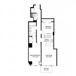
For today’s “What’s Wrong With This House?” episode we are analyzing a 936 sq ft apartment unit in the “Van Buren“, a proposed residential tower in central Chicago.

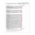
We need you to use the Slow Home Test and evaluate this unit and then post your scores and comments about what you think is the largest problem with it. We look forward to the discussion!

When you are ready, you can click on the player below to watch John and Matthew’s analysis of the “Van Buren”.

Join us tomorrow for our “Which House Should I Buy?” episode where we will be comparing two different apartment/ loft projects in Chicago to see which would be the better real estate choice.

  • Kyle B

    1. Location = 3 (Walk score of 100! Wow!)
    2. Environmental Performance = 3
    3. Siting = 2
    4. Organization = 0
    5. Entry = 1
    6. Indoor Living = 0
    7. Outdoor Living = 1
    8. Kitchen = 0
    9. Dining = 0
    10. Bedrooms = 0
    11. Bathrooms = 1
    12. Study = 1
    13. Laundry = 0
    14. Parking = 1

    Total Score = 13

    I think the worst feature about this apartment is the organization. The long hallway from the entry to the kitchen just lends itself to problems. All transit is through the kitchen. Infact, the door swing of the fridge is right in the way of this transit! There is no defined dining space, not sure how this would be organized. The laundry room is squashed next to the entry, poor location and not enough space. Finally, there is a partial height wall between bedroom 2 and the kitchen? Does that mean you can see into bedroom 2 from the kitchen? What a terrible idea.

  • Mid America Mom

    AH- Sweet home Chicago ( http://www.youtube.com/watch?v=Tlou_2lMLAc )!

    I am curious what you offer in Condo’s these days – will we find bowling alley units? Dark dens? 8 by 10 ft bedrooms? or something more sweet(slow) ?

    Mid America Mom

  • BradW

    [img]209fp2.jpg[/img]

    For fun, I quickly reworked the unit…

  • BradW

    I added a small window in the second bedroom – was not sure if code in Chicago requires all bedrooms to have access to outside light (otherwise why have the bedroom open to the kitchen in the original plan) – it is what it is – a work around to allow, in this case, a 2 bedroom unit.

  • Matthew North

    Brad W – I love that you re-did this plan! The circulation is way better. I wonder if you could shift the bedroom door down in plan so it opens onto the closet area to avoid the dining room/ bathroom adjacency?

  • Matthew North

    M.A.M. – we are excited to be finishing up in Chicago and we are also looking to you for some insider knowledge to guide us through the next three weeks!

  • Andrew

    Total 11/20

    1. 3/3 – can’t get much better
    2. 0/3 – I can’t find any eco-friendly features on their site. Kyle B, I’m interested to read why you gave points for this category.
    3. 2/2 – balcony is separated from the neighbours giving a bit of privacy
    4. 0/2 – circulation would likely interfere with several of the spaces here
    5. 1/1 – long entry but it works
    6. 1/1 – living space occupied the best portion of the apartment
    7. 1/1 – decent sized balcony
    8. 1/1 – other than the glaring circulation issue, this kitchen is ok
    9. 0/1 – no dedicated dining space
    10. 0/1 – not sure if the second bedroom receives any natural light/ventelation at all!
    11. 1/1
    12. 0/1 – no study
    13. 0/1 – a poor laundry space, not very functional
    14. 1/1 – parking garage in building

    I think the biggest issues with this apartment is the tight circulation and how it interferes with some of the spaces, particularly in the kitchet at the fridge (as pointed out by Kyle). The door-swing here is an obvious problem. In addition, the laundry space would also clearly conflict with circulation at the entrance. Also, I don’t really know if there is a wall separating the kitchen and the second bedroom but if there is some unusual arrangment there that would allow sunlight into the bedroom then there might be a privacy issue there.

  • Terri

    I came up with 10 for this apt, with the same scores as John and Matthew except for kitchen (I gave a point since the traffic issue is covered with Organization, IMO); bathroom (I removed a point for putting two sinks in the vanity thus removing storage space) and the laundry (I still feel it blocks the hall, and although we’ve come to see this as a necessary spot in many plans, I still took off a point).

    BradW,
    Interesting redo–separating the zones as you did. Maybe a window to the hall would allow light into that second bedroom? And I agree with Matthew regarding the bathroom/dining conflict. I was surprised to see you–of all people!–putting the bathroom there. Are you feeling mellow today? ;)

  • BradW

    Matthew – note that the master bedroom entry is adjacent to the window wall and that the door you reference actually provides public access to the bathroom – yes the location of the door is garbage and maybe something else can be done – I’ll see if I have any rabbits left in my hat….

  • BradW

    [img]209fp3.jpg[/img]

    Revision 2…Lost ensuite but improved sight line from dining, kitchen a little bigger, restored HVAC at window from the original plan.

  • sk

    Dear Webmaster Eric:
    Thanks for your help so far. I did download paintbrush and then with both the full symbol library windown open and a blank screen of paintbrush open I tried (and my partner tried) to drag the full symbol library to the paintbrush page. Didn’t work. Tried copy and paste. Nothing. Tried putting a box around a couch and dragging it to paintbrush. Nada. Am I destined not to fully participate in slowhome? The people that are participating are not hand drawing designs – they have figured out how to do it quickly. Sigh.

  • Steve in Van

    [img]kitchen.bmp[/img]

    Here’s the kind of thing they’re planning for the kitchen — there’s about 3′ over the cabinets allowing light and air to the back bedroom.

    This plan has an obvious circulation problem, but we’ve seen interior rooms before — the “flex space” with no natural light at all. Here at least it’s an adequate size for a bedroom with a good closet and some light. Let’s raise the floor 2.5′, call it a bedroom loft, and give them the extra points. :)

  • Steve in Van

    [img]4_kitchen.jpg[/img]

    … and the image (hopefully just one of them).

  • Grace Coulter

    Steve,
    thanks for the picture. This makes it alot more clear what was invisioned.

  • Tara

    1. Location 3 – obviously ideal
    2. Environmental Performance 0 – some mention on the website about insulating windows but nothing other than that, not even energy efficient appliances mentioned.
    3. Siting 0 – balconies have no privacy from other units and some are very close together.
    4. Circulation 0 – limits of the long, narrow unit.
    5. Entry 1 – nice closet space, enough room to come in and unload.
    6. Indoor living 1 – nice living space. its a simple shape and is not interupted by any door ways.
    7. Outdoor living 0 – decent size for the unit, but when looking at the floorplans together, the balconies of all the units are quite close together without privacy. I do love how the balconies from the different units define the outside of the building, but the architect was clearly thinking about exterior aesthetics rather than functional spaces when he designed these.
    8. Kitchen 1 – I don’t feel that the ciruclation jog would be a substantial issue to the functionality of the kitchen
    9. Dining 0 – there is an eating bar, and you could squeeze a small table between the kitchen and living room but there is no defined space
    10. Bedrooms 1 – Thanks to Steve in Van’s posting of the image, I have come around to the second bedroom. I think the partial wall strategy is an innovative way to increase air and some light ciruclation in a long unit that does not have the luxury of much window frontage
    11. Bathrooms 0 – bathroom would have been okay without the double sink – this really limits the storage options for the bathroom.
    12. Study 1
    13. Laundry 1
    14. Parking 1

    10/20

  • nicole

    Score of 10
    1- Location 3
    2- Environmental Performance 0
    3- Siting 0
    4- Organization 0
    5- Entry 1
    6- Indoor Living 1
    7- Outdoor Living 1
    8- Kitchen 1
    9- Dining 0
    10- Bedrooms 0
    11- Bathrooms 1
    12- Study 1
    13- Laundry 0
    14- Parking 1
    _lots of corridor space (wasted)
    _2nd bedroom should be a den (+ place glass to the top of the wall- to still allow light)
    _kitchen has awkward circulation thru it

  • Matthew North

    Brad W – your second scheme looks great! I am wondering if that “lightless” back bedroom should have frosted glass sliding doors that open on the corner – like the condos we have seen in Vancouver – thoughts?

  • Franco

    1- Location 3
    2- Environmental Performance 0
    3- Siting 2 generally I think the location and site is fine, as John said it’s a high enough building the interchange shouldn’t pose a concern
    4- Organization 0 As we saw, the kitchen has become a high traffic area and will cause congestion. I also don’t like the shift of midline midway through the plan
    5- Entry 1
    6- Indoor Living 1
    7- Outdoor Living 0 I think the patio is a bit small for both the space and to be functionally used, it would have been nice to see a slightly larger patio area.
    8- Kitchen 0 The kitchen shape and appliance triangle works well, however I don’t like the openness of the kitchen into the second bedroom (even if it is used as an office or flex area), hence the loss of a point. I do agree with Terri that the congestion here fits better into the organization category.
    9- Dining 0
    10- Bedrooms 0
    11- Bathrooms 1
    12- Study 1
    13- Laundry 1
    14- Parking 1

    Score: 11

    IMO the biggest concern with the plan is that poor organization/circulation throughout. It makes the space hard to live in and also adds the additional complication of oddly shaped and proportioned rooms, causing numerous spaces (bedroom, kitchen, dining) to be dysfunctional.

    Brad W’s rework really improved the flow of the space (I love it). I also like Matthew’s idea of the frosted glass sliding door, it would improve the amount of light the space got!

  • BradW

    [img]209fp4.jpg[/img]

    Matthew,

    I added retractable glass panel wall to the bedroom. This might help with the light but I think the greater value is the flexibility of being able to open up the space.

  • Grace Coulter

    BradW, try 3 looks great.

    Location 3- great
    Enviro -0
    Siting -2
    Organization -0
    Entry -1
    Indoor living-1
    Outdoor living -1
    Kitchen -1 (based on the condition as seen in the picture)
    Dining -0
    Bedrooms -0
    Study-1
    Laundry-1
    Parking -1
    Total-11

  • Joshua

    Marks are lost on Environmental, and organization (Which is IMO the worst part of the design). I also took points off for dining and bedroom. Which gives it a score of 13/20. I do however want to talk about that, Looking at this unit I find that when each individual space is looked at, it can receive a mid ranged score, however when you look at the unit as a whole, it feels much worse. I’m drawn to believe that the organization seems so bad, that it is in effect ruining a lot of the well placed rooms.

    A comment about the outdoor living, I was wondering if we are also supposed to be considering what the balcony looks out onto. If so, is an interchange a major down side? or does the attempted green space compensate?

    Cheers,
    Josh

  • Joshua

    I had a couple of quick question for Matthew or John.

    I know when we are giving points to a home with out a study that we award the point for not having a study, but also not badly labeling a study where there is none. When it comes to apartments that lack, direct room access to outdoor space, but have that type of space in the building, do we award out door living points?

    Similarly when there is no laundry in the unit, does that mean no point or an automatic point?

    Just a couple of issues that have come up for me today.

  • Matthew North

    Hi Joshua – yes, if the building has a high quality outdoor space that is a communal area that any of the residents can use, it would make sense to award the outdoor living point. The Merchandise Building in Toronto (MAM can attest to this!) comes to mind for me as the individual units do not have outdoor living spaces but there is a spectacular (and very large) roof top garden. I think you will find this quite a lot in loft conversion projects.

    Laundry – again – I think an argument could be made in a conversion project if there is a good communal laundry facility. More often than not, lack of in-suite laundry can be a deal breaker for a lot of condo purchasers.

    Good questions!

  • Jamie L

    1. Location = 3
    2. Environmental Performance = 0
    3. Siting = 2
    4. Organization = 0
    5. Entry = 1
    6. Indoor Living = 0
    7. Outdoor Living = 1
    8. Kitchen = 0
    9. Dining = 0
    10. Bedrooms = 0
    11. Bathrooms = 1
    12. Study = 1
    13. Laundry = 1
    14. Parking = 1

    Total Score = 11

    I’ve never seen an apartment with this kind of organization, I mean that the location of the 2nd bedroom looks even worse because there’s no wall that divide if from the kitchen. And it seems to me that circulation would likely interfere. ALso there is no defined dining space.

  • sdokter

    Location 3/3 – The walking score is 100
    Environment Performance 0/3
    Siting 1/2
    Organization 2/2
    Entry 1/1 – Very Spacious
    Interior Living 1/1
    Outdoor Living 0/1
    Kitchen 0/1 – Not using triangular efect
    Dining 0/1
    Bedrooms 1/1 – Large Bedrooms and excellent en-suite
    Bathroom 1/1 – His/Her sinks are a nice addition
    Study 0/1
    Laundry 0/1
    Parking 1/1

    Total 11/20

  • Ashley P

    1. Location 3
    2. Environmental Performance 0
    3. Siting 2
    4. Organization 0
    5. Entry 1
    6. Indoor Living 1
    7. Outdoor Living 1
    8. Kitchen 1
    9. Dining 0
    10. Bedrooms 0
    11. Bathrooms 1
    12. Study 1
    13. Laundry 1
    14. Parking 1

    Walk Score: 100
    I was fairly lenient on the scoring of this place. With a walk score of 100 the unit got three points right of the bat for location. I couldn’t find anything about environmental performance so I didn’t award any points for that. I think the weakest point to this unit is the poor organization which creates extremely awkward circulation. All traffic must go through the kitchen and the odd ‘notch’ in the floor plan in front of the kitchen makes for a weakly segregated dining room. The second bedroom in this unit lack natural light and seems to have a cut out that opens onto the kitchen? Very strange. Although there is a strong entry and laundry room they lead down an extremely long hallway which is a poor design choice. I do think that both the indoor and outdoor living spaces are adequate and even though the kitchen is not ideal it does have a strong triangle of appliances. This plan only scored a 13 (and I was super fair) which I expected right away after seeing the long narrow space provided.

  • Ashley P

    Brad W. and Matthew – Loving the redo! I didn’t think this long and narrow place was salvageable but you managed to do a great job!

  • Anonymous

    Location = 3
    Environmental Performance = 0
    Siting = 2
    Organization = 0
    Entry = 1
    Indoor Living = 0
    Outdoor Living = 0
    Kitchen = 0
    Dining = 0
    Bedrooms = 0
    Bathrooms = 1
    Study = 1
    Laundry = 1
    Parking = 1

    Total Score = 10

    Worst part is the lang narrow hallway dedicated to circulation

  • U. Guler

    [img]209fpugurguler1.jpg[/img]

    why not something unconventional!?

  • Mid America Mom

    Matthew et all.

    From the rubble of our great Chicago fire in 1871 came all this new… First skyscraper in the world. There is an architectural style called “Chicago School” ( http://en.wikipedia.org/wiki/Chicago_school_%28architecture%29 ). On the Southside of the city we have a good old fashioned remnant of a company town – yep a planned live/work community. They used to make railroad coaches in Pullman – http://tallskinny.com/pullman/ . You can even find forefathers to today’s modular homes. Homes built from kits! Lustron and Sears Catalog…

    Today-
    Our mayor is BIG into green. Leed for public buildings. Downtown park that is a green roof. If you visit do go to the top of some of the tallest buildings in the world. The observation decks of the hancock building or willis tower (aka sears tower) allow you to see a number of green roofs. This fall they will host the international greenbuild conference and expo-
    http://www.greenbuildexpo.org/Destination/City.aspx

    **********
    At the end of the month we are moving… most likely back to Chicagoland (the city AND suburbs are lovingly called that). I hope to participate when I can.

    Mid America Mom

  • U. Guler

    [img]209fpugurguler2.jpg[/img]

    something unconventional, part 2…

  • JPod

    LOCATION: 3 – a walk score of 100 is amazing! You’d never need to even think about using your car on a daily basis
    ENVIRONMENTAL PERFORMANCE: 0 no mention at all of any kind of environmental performance or use of “green” technologies anywhere on the development website
    SITING: 1 /2 – Not great, but not bad either.
    ORGANIZATION: 0 – I agree with Franco, the kitchen is a problem when it comes to the organization of the apartment.
    ENTRY: 1 – Workable
    LIVING: 1 – Nice natural light, comfortable space and size
    OUTDOOR LIVING: Balcony that is a decent size, workable possibly with some outdoor furniture
    KITCHEN: 0.5 – It’s not bad, it does interfere with the circulation, causing some congestion, however it isn’t bad.
    DINING: 0 – no dining space, I suppose you could fit a small table between the kitchen and living space, but it would be really tight
    BEDROOMS: 0 – the one bedroom is OK, but the second bedroom doesn’t even have windows! That’s crazy.
    BATHROOMS: 1 – Fine
    STUDY: 0 – no study, but that second bedroom would be a better study than a bedroom
    LAUNDRY: 0 – terrible laundry space
    PARKING: 1 – parking in the building, not that you will need a car with a walk score like that
    TOTAL = 8.5/20
    Wow, compared to everyone else, I guess I was pretty critical of this space! There’s just something about it that turns me off of it. I really want to know if there is anything environmental that this developer is doing to make it more “green”. I find it interesting that any developer now wouldn’t include that as a selling point.

  • Matthew North

    U. Guler – thank you for your post and re-design – the unconventional may be required to salvage this space and your design ideas have me thinking – I really appreciate the inclusion of the images to communicate your concepts – we hope to hear from you more on the site!

  • Amanda

    Location = 3
    Environmental Performance = 0
    Siting = 2
    Organization = 0
    Entry = 1
    Indoor Living = 1
    Outdoor Living = 0
    Kitchen = 0
    Dining = 0
    Bedrooms = 0
    Bathrooms = 1
    Study = 1
    Laundry = 1
    Parking = 1

    Total Score = 11

    Worst part of the condo was the long narrow hallway used only for circulation

  • Tayler

    1. Location = 3 Great walkscore!
    2. Environmental Performance = 0
    3. Siting = 2
    4. Organization = 0 Wow. This is just awful.
    5. Entry = 1
    6. Indoor Living = 0
    7. Outdoor Living = 1
    8. Kitchen = 0
    9. Dining = 0
    10. Bedrooms = 0
    11. Bathrooms = 0
    12. Study = 1
    13. Laundry = 0
    14. Parking = 1

    Total Score = 9

    This has to be one of the worst design for circulation and organization I have seen so far. The hallway is there only to circulate traffic around the apartment and there are so many doors I am a little confused looking at the design. I don’t like how cut off it is and how it isn’t open.

    Also, U. Guler designs are really innovative!

  • Terri

    U. Guler,
    I like the angled approach to your redesign. I think the dining table doesn’t need to be angled though. Hope you continue to contribute your ideas here!

  • Daniela M

    1. Location = 3
    2. Environmental Performance = 0
    3. Siting = 2
    4. Organization = 0
    5. Entry = 1
    6. Indoor Living = 0
    7. Outdoor Living = 0
    8. Kitchen = 0
    9. Dining = 0
    10. Bedrooms = 0
    11. Bathrooms = 1
    12. Study = 1
    13. Laundry = 1
    14. Parking = 1

    Total Score = 10

    In my opinion, he two worst design aspects of this floor plan are:

    1. Bedroom #2. The fact that the kitchen looks into the bedroom is absurd and makes both rooms much less functional. Although I understand the desire to have natural light in the bedroom, I feel this greatly compromised the quality of both spaces and would be a complete deal breaker if I were interested in this property.

    2. The dining space. Although the kitchen is functional for preparing food (disregarding the issue that it looks into Bedroom #2), it certainly does not have enough room for bar stools or a small eating area. As a result, the eating area would be pushed into the living room, which eliminates any functional living space as that space simply is not designed to accommodate both a living and a dining space. In my opinion, this would give the entire home a very cramped atmosphere which would not make it a functional home, neither for relaxing nor for entertaining.

    However, I did like the Master Bedroom considering the very narrow, space constrained apartment. I feel that extending the window beyond the structure could open the bedroom more and even opens up space to potentially accommodate a window seat, which would be a nice feature for the bedroom (especially considering the lack of space to relax elsewhere in the apartment) and really emphasizes the natural light.

  • Joseph Askins

    MAM pointed me toward this site earlier this week after finding our website (YoChicago.com), and I’ve been watching with great interest as everyone chimes in on our city’s floor plans.

    I did want to chime in with a couple of corrections/clarifications about 235 Van Buren, since it’s a building we’re quite familiar with, both through our own editorial coverage and through our current advertising partnership with the development.

    First, 235 is hardly a “proposed” building at this point — closings began in the building in June 2009. It’s very much a finished building.

    Second (and this has been addressed briefly already, but is worth reiterating), partial height walls like the one between the kitchen and bedroom are indeed mandated by code for bedrooms without other sources of natural light, and are quite common throughout the city. A lot of people associate them with true timber or concrete lofts, but you can find them in many new-construction developments, especially ones that feature “soft loft” design elements. (I wouldn’t call 235′s condos “soft lofts,” but many of the units do feature exposed concrete on the ceilings and some walls.)

    We’ve posted more than 1,550 videos of Chicago homes on our YouTube channel, 19 of which are from 235 Van Buren. You can see those through a playlist at http://www.youtube.com/view_play_list?p=53C700EBAF67BF61.