Evaluating Apt/Lofts in Philadelphia

This is Day 146 of the Slow Home Project and we need you to join us in our quest to evaluate the design quality of houses in nine North American cities in nine months. This week we start our work in Philadelphia and today we’ll be looking at an apartment in our What’s Wrong With This House Segment.

It’s Monday and it is a great day on the Slow Home site because we are moving to a new city – Philadelphia! This week, we are starting out by analyzing apartment/ loft projects and from the looks of things already, we
think that Philly will have some really great projects that represent the Slow Home philosophy.

One of the most interesting things about the apartment/ loft projects in Philadelphia is that there are a huge number of historical buildings that are being converted into condominiums. This classic type of re-use is very “Slow”, however, for today’s “What’s Wrong With This House?” design exercise, the project we are analyzing has numerous problems. It proves that in the hands of an unskilled designer, a potentially great place to live can turn into a disaster! The project is 1,572 sq ft and is called the “Louvre”. It is a re-use of an historical building named the “Arts Condominiums” in downtown Philadelphia.

We need you to analyze this project using the Slow Home Test and post your results in the comments section. As well, please tell us as what you think are the best and worst design elements in this project so we can have a discussion.

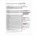
When you are ready, you can watch John and Matthew’s tutorial in the player below as well as see how they scored the project with the Slow Home Test.

Make sure to join us tomorrow where we will be doing a “Which House Should I Buy?” exercise, where we will need you to choose between two apartment/ loft projects in Philadelphia and determine which would be the better real estate purchase.

  • SangeetaG

    My score – 9/20, Walk score of 100/100!!! It’s a Walker’s Paradise!

    There are some poorly designed elements in this plan. The entry space opens into a tunnel that is too narrow and has too much circulation before getting into the main spaces. In addition, the number of doors crowded between the two bedrooms (about 4) are a total disaster.

    But by far the WORST design element in the plan is the isolated, prison Kitchen. Yes. It has hardly any counter space and is too small to have more than 2 people at one time

    The BEST design element that got this unit sold out was probably the access to natural light into all the principle spaces. This is an end unit and would give exceptional views to the outdoors. Reduces the use of artificial lighting as well. This definitely makes up for the closed in kitchen.

  • SangeetaG

    I take back the exceptional views comment seeing that there are practically no appealing views on the outside. Well at least there’s light!

  • autobrad

    I scored it a 10 out of 20.

    The walkability is fantastic and it looks to be one of those “location, location, location” designs where it is all about where you are and not about the space you live in.

    I agree with Sangeeta, the kitchen is horrific! No counters, no move space and the ‘triangle’ doesn’t work. There is a lot of wasted space along the wall of the kitchen. I thought the entryway was a waste of space, the ‘T’ that makes up the entry and just beyond- too much space used in relation to the rest of the apt.

    The first bedroom is awkward for a bed as the only place is under a window or too close to the closet door.

    I liked the living/dining space as there is a lot of room for furniture placement.

    I liked the generous amount of natural light throughout.

    I thought the door between bedrooms was a little odd. As well, I don’t like how guests will have to access the bathroom by going into the bedroom.

    The two closets off the entry way, with the one being accessed by two doors, one through the living room seemed bizarre. It appears this designer has a door fetish as there are 11 doors inside the apartment.

    All in all, a strange design with little or no logic.

  • Allie G

    I couldn’t agree more with Sangeeta and Brad. Obviously the appealing features are the walkability score and the good access to light (even if it’s not an exceptional view).

    It was quite funny, on looking at the floor plan at first, I actually had to take a minute or two to find the kitchen — which is a BAD indication. I’m not a huge cooking person, but I would never buy a house with a dingy little room dedicated to the kitchen like that.

    And just like Brad said, the doors are all placed wrong, and the T intersection could have been done differently to maximize the space potential.

    Overall, I gave it a 9/20. This is a rather bleak start for Philadelphia!

  • MollyK

    John & Matthew,
    I can’t seem to locate a link to your test score for the Louvre…

    My score was 10/10

    This floorplan is awful. So far it seems the kitchen is the winner of the worst part of the design. I thought the circulation area involving the doors was a close second. Autobrad called it correctly…a door fetish. I hate to say it but it looks like whoever designed the floorplan was high at the time. The closet configurations are bizarre.

    The two best features are the walkscore and the numerous windows throughout the condo.

  • MollyK

    Did anyone else look at the other plans in the Art Condos?…

    Most of them don’t indicate a frig.
    I’ve never seen a plan in any of the past cities that didn’t include a frig in the drawing. What exactly does that mean? Are we talking efficiency apartments where the tenant supplies a small “college” frig?

    I hope this isn’t the picture of things to come in Philly.

  • BradW

    [img]day146fp.jpg[/img]

    I take off points for organization, kitchen, bath, laundry, outdoor living. Feels like it should be a 12…

    Anyway, I redesigned the unit keeping the plumbing in place. I hope you hard markers like this better.

  • nicole

    There are other condos in phili that do a much better design job. Must say that for what I have seen so far, it is a lot better than Miami.

    The Louvre – score of 7 (and feel that that is being generous)

    1- Location 3 Walkscore of 100
    2- Environmental Performance 0 (exception of bldg reuse)
    3- Siting 0,
    4- Organization 0 Lots of wasted space
    5- Entry 0 long corridor (closet could be better planned)
    6- Indoor Living 1
    7- Outdoor Living 0
    8- Kitchen 0 too small for that sq footage
    9- Dining 0- wasted space
    10- Bedrooms 0- wasted space + small closets
    11- Bathrooms 1- no storage
    12- Study 1 – no study
    13- Laundry 0 not too sure where the laundry is
    14- Parking 1

    Overall lots of wasted space

  • MollyK

    BradW,
    From what you indicated I get a 14 for your score. Did you take off for anything else that wasn’t mentioned? I’m just curious…

    I think your plan is MUCH better. I’m not found of the laundry location. However, given that the laundry facilities are somewhere else in the building I’d make due with your location just for shear convenience.

    Nice to hear from you. :)

  • Tara

    I stared at the plan for quite a few seconds trying to find the kitchen. When I finally found it, I was horrified. I have never seen a kitchen anything like this one. It makes some of the other kitchens we have seen in dark corners of other plans look fine. wow. So that is obviously the worst part of the plan. I also am not fond of the long, narrow entry or the substantial closet space off of the living and dining room which I don’t see a purpose for. The one closet is acctually larger than the kitchen closet!

    I do like the way that the unit is able to make great use of light because of the three walls full of windows. The bedroom and bathroom layouts make sense, the bedrooms could be a bit shorter and there should be an entrance for one of the bathrooms for guests so they would not have to walk through one of the bedrooms to access it.

  • Paul C

    It may be helpful to better understand the premise behind the “Arts Condominiums”. What I mean by that is, by design they appear as though they are almost “hotel” like. Some of the unit sizes are rather small (300 sq.ft. range) and according to their website this project is sold out. What gives?

    Is there may be more to this story than simply an atypical condominium?

  • Terri

    Paul C may be on to something with his hotel comment. However, why would there be so much closet space if this was designed for temporary inhabitants? The only explanation for a practically non-existent kitchen is that there’s a huge number of good, reasonably priced restaurants very nearby.

    Aside from the kitchen problem, I think the lack of an outdoor space is a major flaw. I know it’s pretty much impossible, though, to alter a heritage building to allow balconies. Have we ever seen such a reno?

    I got a score of 9, allowing the 2 points for siting since it’s obviously an end unit and mustn’t impinge on neighbours or vice versa.

  • Terri

    Brad W, Your redo is much improved from the original–my only fix to your fix would be to extend the second bedroom closet along the bathroom wall, and allow a little more storage in that bathroom. My head feels much better, looking at your plan.

  • Grace Coulter

    3 Location- This is a great location. Walkability is brilliant, the area looks pretty cool from the website.
    1.5 Enviro performance- I am going to give half marks for this because the reuse of a building is great but nothing else was said
    2 Siting- I am going to give siting points because this is a reno and the context is set. I think the building on one side shading a lot of the units is less desirable but then again density is a positive thing in my mind. We need more density and privacy can be created at the expense of views but not at the expense of daylight.
    1 Organization this gets half points because the connection to the outdoors everywhere is great while the circulation is poor
    1 Entry- It is a small space but a space and it has a nearby closet (and I took away a point for organization already for the badly designed hallway after the initial entry)
    1 Indoor living- I was shocked when I realized there were this many windows in this old building. What a fantastic benefit. You might be next to a building on one wall but you have a couple other walls of windows to make up for this!
    1 Outdoor living- I am giving it the point because there is none (like you give the point even when there is no study)
    0! Kitchen Lol this is actually funny. I thought this was a closet. I am extremely confused why there is a walk in closet in the living room but then the kitchen is in a pantry?
    1 dining I think a reasonable dining space could easily be set up
    1 bedrooms seem fine to me, good light
    0 bathrooms. The lack of access to the bathrooms for the public is a serious issue for me. I would not want guests coming into my bedroom in order to gain access to the washroom. Big problem here but with a simple fix.
    1 Study. The first bedroom could easily be a bedroom
    0 Laundry there is none?
    1 Parking-i am giving it the default point because who needs parking when you live in a 100 percent walk able area!!

    14.5/20 was my slow home score which would set this up as moderately slow. I actually think this house would be relatively easy to re-renovate (although substantial costs the enrivoment could have been mitigated by doing it right the first time).

    The worst thing for me with this house was the ridiculous kitchen. I understand it is a small space but you have a massive hallway, some space could easily be turned over to the kitchen. I want to add that the bathroom design is a close runner up for me.

    The best thing going on in this place is the windows for sure. I love the access to natural light. Close seconds include the area. How fantastic to not need a car ever! And the renovation of this old building. Its very funky while eco conscious.

  • Grace Coulter

    Wow after reading some comments posted by others I think i was pretty easy on the design. I think because it is a reno some allowances need to be made because that in itself is a fanastic thing to see. The deisgners would have to work with some pretty old structural stuff as well as plumbing etc. I am guessing. I like what BradW has done by showing how easily this could be a great living space. i think compraed to Miami, Phillie is actaully off to a pretty good start in my mind. Much better that ripping down the building and putting something up that is equally poor in design plus wastes tons of material and energy….

  • Terri

    Good discussion, John and Matthew. It looks like I should revise my score for the test to 7, since there are obvious problems with neighbouring buildings that may affect siting. However, I’m still not clear exactly where the Louvre you’re scoring is located in the building.

  • MarisaM

    I rated this apartment as a 13/20. It is a step in the right direction from Miami. I like how they decided to refurbish a building rather than a tear down, I have the up most respect for the builders in that sense. I know its difficult to create a suitable home working with older plumbing too. Yet when I finally found the kitchen I thought it was a joke. There are so many options with the kitchen area the designers could have laid it out ten times better. The living space in the apartment is great I like the shape of the room with the windows all the way around the apartment floor plan.

    I think the front entrance cannot be avoided but the hallway between the living space and bedrooms is too big. The hallways is really just creating wasted space. Plus I would not want a guest of mine have to enter my bedroom to use the bathroom all the time…Poor choice.

    Lastly, does anyone have a theory to why there is a door between the bedrooms, I mean this is not a hotel?

    Thanks BradW for your new floorplan, I think it looks great. Goes to show simple changes can improve a floorplan that much more!

  • Grace Coulter

    I had another thought after looking at John and Matthews Test score. In an area with 100 percent walkability, to give the project negative points for not having parking seems hypocritical. I mean throughout this exploration we have been faulting homes for having too much parking and now a project has none but really i don’t think needs any. If people need to take a car somewhere you could carshar, rent for the day or have it stored elsewhere offsite (or perhaps next door in the giant parking lot?). I don’t think a project with 100 percent walkability needs parking.

  • JessicaD

    I gave it a 10/20. The location is great and being situated at the end of the building is perfect for natural light. The entry is poorly designed and the kitchen is probably the worst I’ve seen so far. The bedrooms are a little big and is it really a good use of space to have two bathtubs? As others have noted this place is all about location at the expense of good design.

  • JPHH

    I scored this with 10 points. It seems that the kitchen is the worst part (I thought there wasn’t one a few minutes) of this condo and everyone agrees. I think the kitchen is the smallest room of the condo except for the one closet. I also didn’t like how you have to enter the bedroom to get to the second bathroom. The best part of this unit is the walkability hands down.

  • bbhorner

    The kitchen is tiny, there is to much space designated to hallway, the bedrooms have an awkward connecting door, the bathrooms are only accessible form the bedrooms. However this place has potential, windows on three sides, historical building, 100% walkability, with just a few minor changes like BradW made and this place could be amazing. I scored it 12/20.

  • Jessica

    Excited to be in Philadelphia!!

    My ‘slow’ assessment of the ‘Louvre’ is as follows:
    1. Location. 3 (‘walker’s paradise’ apparently)
    2. Environmental Performance. 2 (not specified, but it is a conversion)
    3. Siting. 2 (daylighting)
    4. Organization. 1
    5. Entry. 0 (long corridor)
    6. Indoor living. 0 (spaces are compartments)
    7. Outdoor living. 0 (no engagement except to views)
    8. Kitchen. 0 (sequestered, deplorable layout)
    9. Dining. 0
    10. BR. 0 (very little closet space)
    11. Bath. 1 (sufficient)
    12. Study. 0
    13. Laundry. 0 (out of suite)
    14. Parking. 0 (not specified)

    SCORE=9

    This score does not reflect this suite’s potential, and I feel that it has significant potential with some adjustments to the plan.

  • Jessica

    Just perusing comments post-post… and I think I agree with Grace’s assertion that to deduct points for lacking parking is contrary to ‘slow’ ideology. Would it be outlandish to assume that a Philly Arts Condominium lifestyle even involves car ownership? This is, after all, one of the benefits of an intensely urban living situation.

  • MollyK

    Hey everyone,

    Just a couple of clarifications…

    Of course there is parking. There is a very ugly (desparately needs painting) parking deck directly across from the main entrance on Locust Street. There is also a parking deck directly behind the building on Latimer Street which can be accessed from South Watts Street to the right of the main entrance.

    There is also laundry for the units. The website says (and I quote) “onsite laundry facility”. Now whether or not the scorer thinks that’s slow is another story…it would certainly be a discretionary factor.

    Also, I question whether John & Matthew can state with certainty that no elevator or stairwell is adjacent to the unit. My bet is the elevator is centrally located in the interior of the building but I can’t be sure of that.

  • BradW

    Grace and MarisaM I like your thinking…

    I want to offer a thought or two on location.

    Clearly, with a high walkscore, people are going to check off location and move on. It is not as simple as that. To illustrate my point watch the Slow Home video from LA of the Cherokee Studios project – one of the first shots of the project shows a disheveled Matthew and John standing at street level yelling at the camera while 6 lanes of traffic roar past. The studios have a walk score of 94 so the neighborhood has amenities but it could have been so much nicer if the project was located a block away from Fairfax. Probably anything you will find in downtown will score on walkability but are all these locations good? What if nothing else existed but downtown? How would we score location then?
    More than anything else, the thing that gets me about location is when we use the same criteria to compare urban, suburban and country properties. We say, “The walk score is crap so the location must be crap”. Anything other than an urban location is just not going to get points. Well, I am not drinking that koolade. One, we should be comparing apples to apples and, two, if the car was environmentally neutral, how many of you would prefer downtown? Welcome to the dark side.

  • Athena

    Good location! Total score I got from the test was 10/20. Really dislike the organization, especially the wasted space and circulation of the entry way. The two closets on the left are a tad bit confusing I suppose you could make one a laundry room.
    There’s no outdoor living.
    Kitchen is pretty much a closet!
    Dining was fine I thought.
    Bedrooms were ok as well minus the tiny closets!
    Bathrooms ZERO counter space.
    Not great Philly but good job on reusing an old building!

  • Cnick

    Location-3. Great location! No negative NIMBY buildings nearby that I could find from some googling.
    Environmental Performance-3-revamping of old building. Not construction on a greenfield site which means it deserves points just for that.
    Siting-0
    Organization-0
    Entry-0
    Indoor living-1
    Outdoor living-0
    Kitchen-0 WORST KITCHEN EVER.
    Dining-1
    Bedrooms-1
    Bathrooms-0
    Study-0
    laundry-1
    parking-0

    This plan makes many of the ones in Miami look expertly planned. Terrible wasted space in entrance area. Kitchen is way to small and disconnected from the rest of the apartment.

  • PeterB

    This place is a big of a mess. I agree with other who couldn’t pinpoint a kitchen. At first I thought it was kitchenless all together, boy was i mistaken when i saw the kitchen closet. As well, way way too much circulation. Hopefully Philly improves from here.

  • MollyK

    BradW,
    I’ve been agreeing with your “apples and oranges” since we started this journey. The walkscore is great, but I might add that surrounding areas (the street view) are critical too. The street view of the Art Condos leaves alot to be desired. I wonder how many of the occupants leave the building with their heads down to avoid making eye contact with the awful parking deck across the street. In most cases, the websites don’t give you the “real” view of what is around a building. It makes the phrase “buyer beware” even more meaningful.

  • Mid America Mom

    Loc 3 Excellent
    Enviro 3 Reuse
    Siting. 2
    Organization. NO – where do guests go to the bathroom and that front entry runs FOREVER

    Entry 0
    Living 1 Corner with light everywhere and decent sized. next best thing this unit offers (besides location).

    Outdoor space 1 I am giving them the point – this is a reuse and adding outdoor space maybe difficult.

    Kitchen. 0 WORST space in the unit.
    Dine either living or dining is tight so I 0 on dine.
    Bedroom. 0 NO closet space
    Bath 1 Passable- barely
    Study Not necessary for a condo so 1
    Laundry 0 Must be in building or out.
    Parking not provided 0

    12/20

    Mid America Mom

  • Mid America Mom

    Hard to think this is 1500 square feet. The closets look to be 2/3 feet.

    In my present unit (more than 1/2 the size of this) the kitchen is similar to this. It is HORRIBLE.

    What I find interesting is that the general area of where things is good. They just failed to continue the thought process.

    Mid America Mom

  • Hilda

    Hey All!

    I gave the unit a 7/10, while the location is wonderful, the organization and design of the space simply made my head spin. How can anyone design the space like this?? That kitchen should not be built at all in the first place! Nor do I think enclosing both bathrooms in the bedroom is a good idea. The windows are pretty good, lots of light in the unit, but the front entry is deprived of that…pity…
    BradW, really like how you redesigned the unit! The space feels much more opened now.
    Cheers!

  • BradW

    MollyK – my scoring of 12 was similar to Grace…like Grace I am not afraid to give a part mark in the big categories

    Terri – I agree the closet in the 2nd bedroom could be improved as per your suggestion…I was not sure how big everything was and, of course, any changes are really speculative until you actually see the space…

  • Grace Coulter

    Brad W.,

    “Anything other than an urban location is just not going to get points. Well, I am not drinking that koolade. One, we should be comparing apples to apples and, two, if the car was environmentally neutral, how many of you would prefer downtown? Welcome to the dark side.”

    I think this is an interesting comment. First off I agree completely that depending on a walk score is not sufficient especially when we can all use google earth and do little walk through in most areas. Second of all I disagree that anything that isn’t in an urban location is not going to get points, i wanted to direct you to Vauban Germany… check out this link you might find it interesting.

    http://www.greenprophet.com/2009/05/12/8918/vauban-carless-german-suburb/

    Vauban is a walkable, transit Oriented Development where cars are banned and the pedestrian comes first. Its a pretty interesting place to read up on.

    Also I think people want to live in compact areas for more reasons other than not depending on their cars thus walkability goes beyond car dependency. Cars are expensive to maintain carbon neutral or no, they take up space, require tons of infrastructure. areas that are compact can be more safe, convient if amenities are planned properly etc. Personally I grew up in the country, lived in the suburbs and now have transitioned into a beltline community and I would always prefer to live in a dense area as opposed to a suburb.

    As for having standards for each area, perhaps the walkability needs to be defined better and i think thats something slowhomers should discuss, but remember part of the problem is that so often standards of design in the ‘burbs’ slip down low enough, they should be held accountable to a higher standard. ie. Vauban
    cheers,
    (also nice to see someone else handing out partial points)

  • D.Eng

    Slow Home Score of 10/20
    I think there are obvious traits of this apartment that received no marks and you can tell from reading other posts.
    The kitchen-Small and isolated; no stoarge space
    Bathroom- No guest washroom
    Entry- too long and wasted space on criculation
    Closet- too many in the entry way and could be bigger in bedrooms

    I like how many windows are in this plan and the location but everything else, horrible!

  • BradW

    Grace,

    Thanks for the link and I applaud Vauban and similar efforts.

    I agree cars are a big expense beyond the environmental impacts but the reality is we have a transportation infrastructure that is not going away anytime soon. It make more sense to find ways to use it more efficiently and sustainably.

    As for suburban design being inferior to urban design I disagree. As proof, I would like to see John compare the numbers excluding location and environmental performance (the two single family home killers). I will concede that an urban multi-unit project presents an opportunity to do something more creative architecturally simply because the market is less conservative.

  • Matthew North

    Brad W – I love your re-design of the “Louvre”. You have proven the point that it is possible to design a well considered, thoughtful plan to convert an existing space – I appreciate this contribution and it sets the stage perfectly for tomorrow’s design exercise!

  • John Brown

    I agree wholeheartedly with Matthew’s comments about BradW’s design. However, we will all have to wait until Wednesday for the next design project.

  • Terri

    Grace,
    Thank you for posting the link to the article about Vauban. The Europeans always seem to be ahead of us in North America when it comes to being more energy conscious.

    I would love to live in a place where not only do most of my neighbours walk or cycle, but cars are forbidden to drive down the streets. (My city experienced this once when a freak snowstorm caused almost all transportation links to be closed down for a couple of days. The peace was perfect, and many people actually met their neighbours for the first time while skiing or hiking down the street to the store.)

    When BradW talked about the noise in LA and how that affects walkability, my thought was, LA is one of the most car-centric cultures in America. Can that change? Maybe not, but if electric vehicles became the norm, it wouldn’t be such an obnoxious reality.

  • Terri

    Correction: Europeans seem more “green” conscious, not just energy conscious. It does start with paying more for fuel, as they do, and so transportation and other energy needs must be dealt with more efficiently. This sets up a whole different mindset where Green living becomes much more the norm instead of a difficult goal.

  • Andrew

    10/20

    1. 3 – close proximity to so many services, doesn’t get much better
    2. 1 – no environmental considerations specified and even though it’s a reuse of an existing building there is no mention trying to improve efficiencies. but a reuse is at least worth something
    3. 1 – responds to and integrates with the existing building
    4. 1 – organization a little disappointing but at least all principal spaces have a good connection with the outdoors
    5. 0 – entry quite long and with no closet space! there is so much closet space elsewhere in this apartment but none to be found at the entrance
    6. 1 – plenty of windows in the living space, potential for great views. although I’m not sure where this apartment is situated within the building because there is an ugly parkade right across the street
    7. 0 – no outdoor living
    8. 0 – awful kitchen, this is a perfect example (along with the closets) where space was not allotted effectively
    9. 1 – plenty of space here, good access to windows
    10. 1 – appropriately sized bedrooms and good access to windows, even though the closet size is a bit restrictive
    11. 1 – decent bathrooms, but no storage
    12. 0
    13. 0
    14. 0

    It’s great to see the reuse of a historical building but also unfortunate to see the design of this apartment so poorly executed. It’s a bit too compartmentalized, like at the entrance and the kitchen, and some of the space is not efficiently allocated, like with the numerous closets. Sometimes “location, location, location” is not quite enough for a home, but I’m looking forward to see what the rest of Philly has to offer!

  • Kadoman

    The Louvre, not quite.

    I was very astonished by this floorplan. In fact, I was stumped when trying to score it. I honestly didn’t want to give points to anything really, but I was torn, cause surely that can’t be right.

    From the miniature (door entry) kitchen, weird doorway between bedrooms, the no bathroom entrance except a bedroom, large storage closet in the middle of the plan, strange bedroom closets to the massive entrance, I hated it. The only benefits were factors that really had nothing to do with the unit itself, besides the windows.

    I eventually broke down and watched John and Matthews video to make sure I hadn’t gone off my rocker. Very strange indeed.

  • Bell604

    There really isn’t much more to comment on with this plan. The kitchen is terrible, the bathrooms are not connected to the living space, and there are strange doors connecting rooms to each other.
    I was wondering if anyone knows what this building was prior to the transition to a residence. Knowing that could help to explain some of the strange design flaws, and could also shed light onto why people would or wouldn’t like to live there. If the building has a good historic purpose I can see more people wanting to live there.

  • Dan M

    I gave it an 11.
    I really like the natural light,and the reuse of an older building. However, the entry is too long and the kitchen is horrendous! I surfed about and looked at pictures of the suites and they look rather cramped once you get furniture into them, the ‘professionally designed gym’, is an open space in the basement with some exercise machines strewn about, that said, the lobby is nice though. The design is suffering, so much more could have been done, it is a shame how the space was allocated, this would make a good open space loft. I agree with the others that other than location and the light there is not much going for this condo. I think this is another case of large (national) developers looking to make a quick buck off an old property in a good location.

  • Tiffany

    When I first saw the building I was very excited about the fact that it was a heritage redesign, but once I saw the plan I was so disappointed. I truly believe that the best way to be sustainable is to reuse our built environment, but this is absolutely horrible. I ended up giving it a 12 (Location, Enviro, Siting, Indoor, Study (default), laundry (on-site), parking (next door)), but this was a surprise to me as I feel it deserves so much less. The problems have all been brought up previously, so I will not go over them again. I will hold out hope that Philly will have some other good environmentally sustainable buildings that actually have good designs.

  • frazer

    A total of 9 points. Definitely not a great layout, the place feels like a giant corridor which opens up into a bunch of separate compartments. The large amount of windows is great and some people might not even mind being able to view other peoples’ windows. The kitchen makes me wonder who the target market for this particular floorplan is. Perhaps the walkability encourages people to eat out or would their terrible kitchen do the same? This brings up the question once again whether it is the design influencing people or peoples’ preferences resulting in particular designs.

    1- Location 3
    2- Environmental Performance 0
    3- Siting 0
    4- Organization 0
    5- Entry 0
    6- Indoor Living 1
    7- Outdoor Living 0
    8- Kitchen 0
    9- Dining 1
    10- Bedrooms 1
    11- Bathrooms 1
    12- Study 1
    13- Laundry 0
    14- Parking 1

  • Neogi

    so i gave the house 9/20, and as everyone has mentioned that the only thing that the unit has going for it is the location. The hardest part of this plan to digest is that someone actually purposefully allowed this floor plan to be executed. i don’t understand how that is considered to a kitchen, it looks more like a pantry, its a shame because the by opening up some walls the kitchen could have taken more of a presence in the living space. The narrow hallway is dark with numerous door coming off from it, which make it very trivial. But i guess everything inside can be changed, but the one thing that cant is where it’s located.

  • Hawerchuk#10

    I would have to agree with all the other posts, that is an awful design. And I scored it 8/20. The best thing and most positive is the walkability score. The nasty and the negative is the kitchen. Are you kidding me the closet is bigger than the kitchen.

  • DJS

    I gave it a 10. I’m a little confused why John and Matthew liked this place so much. I mean it’s great to reuse a building but the floorplan is pretty awful. How can you even call that a kitchen, and the bedroom layout with all those doors and the random closet in the living room is confusing.