Evaluating Apt/Lofts In Vancouver

This is Day 167 of the Slow Home Project and we need you to join us in our quest to evaluate the design quality of houses in nine North American cities in nine months. Today we are starting our work in Vancouver with another installment of “What’s Wrong With This House?”

We hope everyone had a great Long Weekend! Today we are happy to be starting our 7th City on the Slow Home Project – Vancouver!

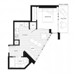
For today’s “What’s Wrong With This House?” episode, we are reviewing the “Plan 7″from the “Mark Condominium Project” – which is located in the Yaletown district of Vancouver. It is 580 sq ft and has 1 bedroom and 1 bath. We need you to study the plans and post your Slow Home Test score to the site as well as the 2 things that you think are the worst design elements of this plan.

When you are ready, click on the player below to watch John and Matthew’s analysis of this floor plan.

Join us tomorrow for another “Which House Should I Buy?” episode where we are comparing 2 different apartment/ loft projects from the Vancouver area to see which would be the best real estate choice!

  • Mid America Mom

    A new city and ***we hit a milestone*** – over 3000 residential floorplans have been evaluated for the slow home project using the slow home test for their design quality!

    What will we find in Vancouver? With a nice climate and good location on the west coast of Canada it has the highest real estate prices in the country and ranks among the same list for the world. With every foot adding to someone’s debt how well designed are Vancouver’s homes? Will we find green building to the be the norm?

    Mid America Mom

  • nicole

    Mark – plan 7
    Score of 13, but for different reasons
    1- Location 3
    2- Environmental Performance 3
    3- Siting 2
    4- Organization 0
    5- Entry 0
    6- Indoor Living 1
    7- Outdoor Living 1
    8- Kitchen 0
    9- Dining 0
    10- Bedrooms 1
    11- Bathrooms 0
    12- Study 1
    13- Laundry 0
    14- Parking 1

    _Bathroom is far from the bedroom
    _kitchen has little to no useable prep space
    _entry is large, but does not provide a closet (wasted useable space)
    _dining area is tight
    _furniture in the living area is oversized
    _washroom counter could continue to the angled wall to eliminate a dead corner
    _laundry door opens to the dining and cuts off circulation

  • Terri

    Score: 13. Marks off for Organization, Entry, Indoor Living, Outdoor Living, Dining and laundry.
    The worst two design elements:
    Organization: Angled wall which creates pie-shaped main living space and therefore bad organization (separating bed & bath; no focal for living and dining right in front of bedroom door).
    Outdoor living access through the bedroom is lousy.

    The good thing about this unit is all the windows and the building’s location and LEED gold rating (when done as planned).

  • Grace Coulter

    I love this city! I am so excited we are looking at Vancouver. Van has some of the best culture in North America and is a city with some interesting design initiatives happening at the moment. Vancouver has made it an official objective to become the world’s greenest city by 2020 which I think is a great considering the size of the city and the lack of initiates elsewhere like this in North America. Here is a link for those who may be interested. http://vancouver.ca/greenestcity/background.htm
    3/3 Location- this area in DT Van great, Yaletown is a stellar location
    3/3 Enviro performance- being a LEED building fits the city’s overall sustainable objectives. Full points
    2/2 Siting- good
    0/2 Organization- I want to give this points but there are a few too many weird things going on. Even in the floor plan used to sell units you can see the issues they are having with the shape. The coffee table and couch are positioned at different angles ever so slightly I think to try and make the space seem like it will work better.
    .5/1 Entry- I am giving this half marks because in a a small space it is really hard to make a good entry space but the didn’t point in a closet and since it rains non stop in this city I think that was a very poor design choice.
    0/1 Indoor living
    1/1 Outdoor living – you have some room out there to place furniture out there
    0/1 Kitchen- I think this is badly done but I can’t quickly visualize what could be done to fix this in such a small space
    0/1 Dining – this is not a dining space
    1/1 Bedroom – this looks like a great bedroom.
    0/1 Bathroom-
    1/1 Study default point
    1/1 Laundry
    1/1 Parking
    13.5

    I think the worst thing by far in this space is the living room with the very strange angles. It would be so hard to fit furniture in here in addition to dining. I think the best thing within the apartment is the bed room with lots of great windows while the best feature of this building is its location in yale town tied with enviro preformance.

  • Terri

    After looking at a handful of apts in Vancouver, I see that Storage or Flex space is often labelled, even in units of only 700SF. I think this is because many Vancouverites will need a space for a bike or other sports equipment (scuba gear, maybe?) or even their recycling boxes. In a tight space, the ability to access this storage easily is important. You could just throw your junk in there when company comes, and voila, the place looks like a showroom again! ;)

  • Mid America Mom

    Loc 3
    Enviro 3
    Siting 2
    Org 0
    Entry 0 (apartment therapy help! The space on the right , right inside the doorway, is a good place for a shelf with pegs or maybe a coat rack and umbrella stand combo like this – http://compare.ebay.com/like/310229899312?ltyp=AllFixedPriceItemTypes&var=sbar ).
    living 0
    Outdoor 1
    Kitchen 0 the layout is not that good.
    Dining 0 should not have one. Get a coffee table that will rise to table height and call it good.
    Bed 1 the best room in the unit!
    Bath 0 too tight with that turned toilet.
    Study 1
    Laundry 1
    Parking 1

    13/20

    The worst thing – that 45 degree wall of glass. Nothing in that space works… Kitchen/dining/living.

    Mid America Mom

  • Hilda

    Vancouver sure is getting a lot of attention this year, first the Olympics, now the slow home project :)
    gave the design 13/20, took the marks off for: organization, entry, living, kitchen, dining and study.
    Although, I have to say of all the apartment plans I have analyzed so far, this unit goes to the top of the list for the worst organization ever. True, not much choice concerning the unit shape matter, but that doesn’t excuse the lack of organization. Pretty certain that if organization was improved, then for sure there will be better turn out than this!

  • Tara

    Sustainable aspect of the building is good, going for LEED. I also like that they provide a way for potential buyers to see what the 360 views are on each floor so they get a good idea of what they will be seeing once the tower is constructed.
    As far as the unit goes, I’m not as impressed.
    I think the kitchen is one of the worst features of the unit because there is no space to work. It definately needs an island or something.
    The living/dining room are also awkward and cramped while there is quite a bit of wasted space between the living area and the kitchen.

    1)3
    2)3
    3)2
    4)0
    5)0
    6)0
    7)1 – would prefer it off of living room, but okay
    8)0
    9)0
    10)1
    11)0 – too far from bedroom
    12)1
    13)1 – though i would prefer if it opened into the bedroom, it still works.
    14)1

    total: 13/20

  • Marco

    Mark – plan 7

    1- Location 3
    2- Environmental Performance 3
    3- Siting 2
    4- Organization 0
    5- Entry .5
    6- Indoor Living 0
    7- Outdoor Living 0
    8- Kitchen 0
    9- Dining 0
    10- Bedrooms 1
    11- Bathrooms 0
    12- Study 1
    13- Laundry 1
    14- Parking 1
    The total score out of 20 is 12.5

    - I would have liked to see the deck continue a little further down the condo in order to make it accessible through the main living area for when you decide to have guests over.
    - It’s hard to place one bathroom in such as a small area but again, it needed to be accessible through the bedroom as well as the main living area.
    - I thought the entry way was large and had enough room to place an armoire for jackets and shoes.
    - The awkward shape of the exterior does cause some problems with the interior but I like the exterior look of the building and I think if there was an island in the kitchen and you remove the large sofa from the living room and place smaller love seats instead, the space would be better managed.

  • Joshua

    1- Location: 3
    2- Environmental Performance: 3
    3- Siting: 2
    4- Organization: 0
    5- Entry: .5
    6- Indoor Living: 0
    7- Outdoor Living: .5
    8- Kitchen: 0
    9- Dining: 0
    10- Bedroom: 1
    11- Bathroom: 0
    12- Study: 1
    13- Laundry: 1
    14- Parking: 1

    The total Score is 13 out of 20

    In my opinion there are two major concerns. First the lack of connection between bedroom and bathroom. Second would be the lack of connection between the kitchen and dining. (This could be as much the difficult location of the dining as anything else)

    As far as outdoor living goes, with a living room as awkward and small as this one, the outdoor space off of the living room would help make it feel larger, and more welcoming. The entry I believe is big enough for the apartment, but does lack a closet.

  • Therese

    Location: 3
    Environmental Performance: 3
    Siting: 2
    Organization: 0
    Entry: 1
    Indoor Living: 0
    Outdoor Living: 0
    Kitchen: 0
    Dining: 0
    Bedrooms: 1
    Bathroom: .5
    Study: 0
    Laundry: 0
    Parking: 1

    11.5/20

    I think it’s pretty much agreed that this apartment layout is extremely awkward and disorganized. I feel that bathroom is too far away from the bedroom and the kitchen could use a bit more counter space. The laundry area could use more space and I think the balcony needs to be larger wrap further around the front of the apartment so it can be accessible from the living room and not only the private bedroom so that guests don’t have to move through private space in order to enjoy any outdoor life ont eh balcony.

  • Terri

    I have found it interesting to note that a few of the buildings I’ve checked out don’t list a fourth floor. I seem to recall a news story some time ago that to satisfy the Asian clients, who are superstitious about the number 4, developers are avoiding this number in their addresses. It seems that maybe it has translated to building floors too! This tells you something about the Vancouver marketplace.

  • Alison G

    I gave this unit a 13. As mentioned, the awkward living room angle decreases usable space. The most egregious element in this plan is the inclusion of an AC unit, which takes up prime kitchen/storage space and is climatically unnecessary. Vancouver’s two main flaws are exorbitant real estate prices and monotonous gray drizzle; the AC unit would be welcome perhaps five days a year.

  • Kyle B

    1. Location = 3
    2. Environmental Performance = 3
    3. Siting = 2
    4. Organization = 1
    5. Entry = 0
    6. Indoor Living = 0
    7. Outdoor Living = 1
    8. Kitchen = 1
    9. Dining = 0
    10. Bedrooms = 1
    11. Bathrooms = 0
    12. Study = 0
    13. Laundry = 1
    14. Parking = 1

    Score = 14 = Moderately Slow

    My biggest concern with this apartment is the location of the bathroom. It is awkward that one would have to walk through the kitchen/living room in order to take a shower in the morning. In addition, the living room/dining room is awkward in terms of furniture placement. I find this problem to be mainly due to the angle of orientation of the exterior wall.

    On the positive side, The balcony is a good addition to the bedroom. The large number of windows is also good in providing lots of natural lighting. The laundry room is appropriately placed. The kitchen is also well designed but could have more counter space.

  • Andrew

    Total 14/20

    1. – 3, nice walkability
    2. – 3, good environmental considerations
    3. – 2, good consideration with the condo’s placement in its building
    4. – 0, the plan is a bit awkward which leads to some uneasy circulation and conflicting spaces
    5. – 0, decent entry but unfortunately there is no closet space
    6. – 1, awkward but it works
    7. – 1, good amount of balcony space for a condo this small
    8. – 1, decent kitchen
    9. – 0, i dont think that I can call this a principal space within the plan
    10. – 1, suitable bedroom with good closet space
    11. – 1, the bathroom works
    12. – 0, no study
    13. – 0, not a private or large enough laundry space
    14. – 1, building parking

    Not a horrible plan but the organization and arrangement of spaces creates clumsy circulation and some of the main spaces are in conflict with each other, such as the living and dining spaces. Sometimes when the outer edge of a plan is not a standard square and instead has a more unique shape, like in this plan, the organization has the potential to be quite interesting but unfortunately the spaces here do not work very well.

  • Dan M

    13 overall

    1-3
    2-3
    3-2
    4-0 – organization of the home is irrational
    5-0 – the entry sucks, no closet
    6-0 – no strong focal point, no real connection to outside even with the view
    7-0 – not easily accessible for guests
    8-1 -it kind of works, except it spills out into the chaos of the rest of the plan
    9-0 -poorly laid out, interferes with bedroom access
    10-1
    11-1
    12-1
    13-0 not private
    14-1

    The organizational aspects of this plan are the main issues causing the problems. The other is the architecture itself, the angles cause issues with placement and circulation, forcing the odd arrangements and circulation issues.

  • Amanda

    The two things that concern me the most with this apartment is the organization of the space, which covers outdoor/indoor living, dinning, bathrooms, entry, and laundry; and the overall shape of the apartment with its sharp angles. The reasons why are further described below.

    1. Location = 3 – I like the fact that the apartment faces east because it will receive the sun in the morning.
    2. Environmental Performance = 3 -good
    3. Siting = 2
    4. Organization = 0 – poor organization. Awkward use of space.
    5. Entry = 0 -Large entry with wasted space, and no closet.
    6. Indoor Living = 1 – I like the way the kitchen is placed beside the living area. With such a small apartment I don’t think there is a better way to organize the living area. At least the living area is open to the windows which give it natural light.
    7. Outdoor Living = 0 – The deck had enough space and it’s nice that it is attached to the bedroom, however, I think it would be better to place it next to the living area so that you don’t have to walk through your bedroom to get in and out, tracking dirt into your room.
    8. Kitchen = 1 -I don’t think there is any other place to put the kitchen and there is not enough space to separate it from the dining room because it will just make the apartment seem smaller.
    9. Dining = 0 -I don’t like the placement of the dining table right behind the living area, it is cramped and awkward.
    10. Bedrooms = 1 -the bedroom is a good size with a sufficient storage space.
    11. Bathrooms = 0 -The bathroom is too far from the bedroom.
    12. Study = 0 -no space for a study
    13. Laundry = 0 -The laundry area should be by the entry. It interferes with the kitchen and living area.
    14. Parking = 1

    Score = 12 = Moderately Fast

  • ReneP

    Marks here are 12.5 out of 20
    3/3 Location- this area very good DT Vancouver location
    2/3 Environmental Performance- being a Gold LEED building I give it 2 out of 3 (3 I will reserve for Platinum designations)
    2/2 Siting- good
    1/2 Organization- Given the constraints in the overall building design, I think this unit is not utilizing its full design potential – yes the given ‘empty’ floorplan is awkward, but I do believe better use of the space could have been made.
    0.5/1 Entry- no closet where there already exists an over-sized entry for such a small apartment.
    0.5/1 Indoor living – awkward living space – large couch (as shown in representation) does not fit – angles are skewed – yet, I wonder what else one can do given the constraints of the general layout for this unit.
    0.5/1 Outdoor living – there may be enough room for some nice furnishings, and a privacy wall, but the outdoor living area is cut off from the general living area (i.e. living and dining area), and hence, being the only outdoor space here, not ideal
    0.5/1 Kitchen- Given the size constraints, I think the kitchen is not all that bad – alas, there is a great need for kitchen counters for prep areas – perhaps a small island or bar-top counter could compensate (although again, it would cut into living space – but a counter could double as dining area, as the existing dining area is way too cramped)
    0/1 Dining – tiny – uncomfortable – unusable.
    1/1 Bedroom – nice vistas – and the private deck is ideal.
    0/1 Bathroom- way too far from the bedroom – and wasted space (dead corner by toilet)
    0/1 Study – N/A
    0.5/1 Laundry – how easily could this door have opened to the bedroom and avoided circulation problems with the main living area (especially cutting off the kitchen)- after all, would it not be nice to have laundry right next to the bedroom closet? additionally, with the use of pocket and sliding doors throughout, why did this door get the ‘regular’ swing-type design?
    1/1 Parking – I am assuming there is a stall for parking provided, although I could find nothing in my search of http://www.themarkvancouver.com to confirm this.

    René

  • JPod

    3/3 Location: This building is in a highly walkable area, and would limit the need to use a vehicle to get around.
    2.5/3 Environmental Performance: Achieved Gold LEED status, I left out 0.5 because it did not reach platinum status. Gold is still rather impressive.
    2/2 Siting: Good
    0/2 Organization: The space is very disorganized, it’s more of a broken up mosaic of cramped awkwardly shaped living spaces instead of a cohesive organized space. The apartment is an awkward shape to make the organization of the space difficult.
    0/1 Entry: The entry has no storage for shoes or coats. The lack of a closet in this space is inefficient; you’d have to go all the way to the bedroom to put away potentially wet, dirty shoes and coats. It doesn’t make sense.
    0/1 Indoor Living: There is no focal point in this space. Again, the awkward shape of the apartment creates problems for the living space.
    0.5/1 Outdoor Living: Like many of the other commenter’s, I’m going to agree that the outdoor space should be connected to the living/dining room area. Having it off of the bedroom is great, but if you want to BBQ or have drinks on the balcony, you’d have to lead guests through the bedroom to do so. I do think the fact that this floor plan does have an outdoor space, even though it is off of the bedroom is a plus, so I gave it a 0.5/1.
    0/1 Kitchen: There is not much that can be done with the kitchen, a small island could separate it from the rest of the living space, but that might impact the already small living room area making it more cramped and uncomfortable.
    0/1 Dining: This space is small, and cramped.
    1/1 Bedrooms: The bedroom is a good size, with a decent closet and the balcony off of the bedroom is a nice touch.
    0/1 Bathrooms: The bathroom is in a terrible place, and too far away from the bedroom.
    1/1 Study: There is no study space specified, but the large windows in the living/dining space allow for laptop use or reading space.
    1/1 Laundry: The laundry space is close to the bedroom, and compact.
    1/1 Parking: There is parking available for the building
    Total: 12/20
    This space could be so much more, but because of the awkward shape of the apartment and the very strange angles, it makes it difficult to have a comfortable living space.

  • Franco

    Mark – plan 7
    Score of 13, but for different reasons
    1- Location 3
    2- Environmental Performance 3
    3- Siting 2
    4- Organization 0
    5- Entry 0
    6- Indoor Living 0
    7- Outdoor Living 1
    8- Kitchen 0
    9- Dining 0
    10- Bedrooms 1
    11- Bathrooms 0
    12- Study 1
    13- Laundry 1
    14- Parking 1

    in terms of the worst design elements of this unit, I would have to say:
    A) the organization of the plan. First the distance between the bathroom and bedroom is too vast and just doesn’t work, similarly the lack of a break between kitchen and dining/living area makes this plan hard to live and work in. All in all it makes this space feel smaller than it is and makes it difficult to arrange furniture within.
    B) the second design limitation of this plan is the small kitchen with a lack of counter space; from the plan it looks so cramped and forced.

  • Tayler

    3/3 Location: The building is in a great area consisting of amenities within walking distance. Also, this is a highly desirable area in Vancouver.
    2.5/3 Environmental Performance: I’ll give 2.5 with .5 of a mark off for not obtaining Platinum. However, comparatively speaking, Gold is still very good compared to most.
    2/2 Siting: Seems to be good in comparison to the rest of building.
    0/2 Organization: First off, as others mentioned, the living/dining room is an awkward angle– how would one furnish properly? It looks messy on the layout with the couch/coffee table at an angle. The bathroom is far from the bedroom. And you will constantly be walking through the kitchen to get to the bedroom/laundry.
    0/1 Entry: Entry is large which is nice, but where is a place to put shoes and coats away?
    0/1 Indoor Living: I feel like they just tried to jam every room/amenity they could into 580 sq ft. This just makes it really awkward. The angles also make it hard to place furniture. The bathroom to the bedroom distance is too far.
    0.5/1 Outdoor Living: The space is a decent size but it would make more sense of the living area.
    0/1 Kitchen: There is not a lot of counter space. A small island would separate the living room from the kitchen a lot better, these two rooms really blend together. An island would make it seem more cut off.
    0/1 Dining: This space is rather small for even a small kitchen table. Would make it difficult to have guests over.
    1/1 Bedrooms: The bedroom is a decent size, complete with closet space.
    0.5/1 Bathrooms: Bathroom is way too far from bedroom, however, it’s a good size.
    0/1 Study: There is no study space and no other room to put a desk. The kitchen table would become one.
    0.5/1 Laundry: The laundry space is close to the bedroom but too close to the kitchen.
    1/1 Parking: There is parking available for the building
    Total: 11/20

    I feel like it had so much potential but the awkward angles and shape of the unit are poorly designed making it really difficult put furniture in. The kitchen is doesn’t have enough counter space and the balcony is ill-placed.

  • Kcull

    Vancouver is a great city and it is nice to evaluate somewhere that I am somewhat familiar with. This particular plan is very awkward due to the angles of all of the rooms except for the bedroom and outdoor living space. It would be very hard to furnish and create a ‘divide’ as to where the kitchen and living space begins and ends. Again, the exterior angles creates a difficult shape to create adequate rooms and features.

    Location-3
    Environmental Perf- 3 (as it achieved a gold Leed)
    Siting-2 Seems adequate
    Organization-0
    Entry-No closet in a variable climate
    Indoor Living-0
    Outdoor Living-1 (poor entry off of bedroom however the physical space is good)
    Kitchen-0
    Dining-0 (it seems to be in left-over space)
    Bedrooms-1
    Bathrooms-0 (Odd shape adds to its awkwardness)
    Study-0
    Laundry-1 Small however it is usable
    Parking-1
    Total Score= 12/20

  • JessicaC

    I gave this project a 13. Space planning in this unit is challenging given the overall geometry of the project, but two things that I think are significant issues regardless of this are the laundry opening to the kitchen area and the overall lack of closet space.

  • Jamie L

    Location: 3
    Environmental Performance: 3
    Siting: 2
    Organization: 0
    Entry: 1
    Indoor Living: 0
    Outdoor Living: 0
    Kitchen: 0
    Dining: 0
    Bedrooms: 3
    Bathroom: 0
    Study: 0
    Laundry: 0
    Parking: 1

    13/20

    First of all, with that awkward geometry, it sure does hard to furnishing. Also the location of the bathroom, it is too far from the bedroom and it also located in the enterence. The enterence seems big for such a small unit. The other thing is the dining table is too close to the bedroom. The lack of organiztion of space, also the L shape kitchen without island seems there’s not enough space for prep.

  • Ashley P

    1 Location 3
    2 Environmental Performance 3
    3 Sitting 2
    4 Organization 0
    5 Entry 0
    6 Indoor Living 1
    7 Outdoor Living 1
    8 Kitchen 0
    9 Dining 0
    10 Bedrooms 1
    11 Bathrooms 0
    12 Study 0
    13 Laundry 1
    14 Parking 1

    What came to my attention first was just how oddly shaped this place is. The angles create a kind of dead space in the kitchen area and make for an extremely awkward sitting area. Even though this place is tiny, having the bathroom and the bedroom on opposite ends of the apartment doesn’t seem appropriate. Although the bedroom’s layout seems alright the bathroom seems extremely choppy and unorganized. The odd angles also play a role in the chaotic bathroom. It also seems like the ‘dining’ area is just kind of crammed in there in an odd location.

  • Daniela M

    Location: 3
    Environmental Performance: 3
    Siting: 2
    Organization: 0
    Entry: 0
    Indoor Living: 0
    Outdoor Living: 0
    Kitchen: 0
    Dining: 0
    Bedrooms: 3
    Bathroom: 0
    Study: 1
    Laundry: 1
    Parking: 1

    Total score: 14

    Worst design elements of the plan:

    1. In my opinion, the overall layout of the plan is quite poor and lacks a focal point. While the condo is very oddly shaped which presents difficulties initially, the layout isn’t convenient for the homeowner. For instance, the bathroom is placed very far from the bedroom and although the entry way is a good size, it simply does not provide any use by including a closet, sitting area, etc.

    2. I would identify the kitchen overall as the second worst design element. The layout of the elements of the kitchen is quite poor and limits the utiliy of the area, especially in regards to counter space. The preparation space is extremely limited, yet the kitchen’s close proximity to the living room restricts the addition of an island as the chesterfield interjects the kitchen. As well, although the kitchen and sink are close to each other due to the restricted size of the kitchen, they could be more conveniently placed directly beside each other. In the current arrangement, the door of the dishwasher would likely restrict the movement of anyone at the sink, meaning the two areas could not be used simultaneously although in practice, this is typically how individuals wash dishes.