Evaluating Single Family Homes In Atlanta

This is Day 202 of the Slow Home Project and we need you to join us in our quest to evaluate the design quality of houses in nine North American cities in nine months.
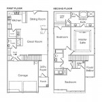
Happy Monday, August 9, 2010! Today on the Slow Home site, we are doing a “What’s Wrong With This House?” exercise! We need you to analyze the floor plan of the “Edgewater”, a 2,035 sq ft, 3 bedroom, 2.5 bathroom single family house located in the “Lakeside Preserve” development in South Fulton, which is a suburb of Atlanta.

Use the “Slow Home Test” to score this floor plan out of 20 and then post your score and your comments about what you think is wrong with this house to the blog. We look forward to your comments!

When you are ready, click on the player below to watch John and Matthew’s tutorial about what they think are the main things that are wrong with this house design.

See you tomorrow for our “Which House Should I Buy?” episode where we will be comparing 2 single family houses from the Atlanta area to see which would be the best real estate purchase!

  • Franco

    Location-0
    Environmental Performance-0
    Siting-2
    Organization-0 Circulation is a major concern in this home. There is poor flow, many rooms on both levels have windows facing the side (between homes) yard. Another boeuf of mine is the long entry and the open foyer it creates on the second level. It’s tucked behind everything, ultimately losing the effect/purpose.
    Entry-0 it opens into a long skinny hallway, with no closet
    Indoor Living-0 Although the size of the space is appropriate, the great room is in a poor location, causing circulation issues on the main floor.
    Outdoor Living-1
    Kitchen-1 Generally it is proportionate for the house and well laid out
    Dining-1 I really like the dining in this house, it’s off to a corner, with great natural lighting and privacy
    Bedrooms-0 At first glance the bedrooms seem a good size, but upon closer review 2/3 bedrooms have windows facing the narrow side yards. The bedroom in the front of the house, although it has great natural lighting, the room is too big.
    Bathrooms- 1 Main floor powder and upstairs full bath are well laid out. The Master suite may be a little awkward and the closet off the end of the bathroom could pose practicality concerns, but on the whole they work.
    Study-0 Although there is nice desk space off the great room, I wonder about the practicality of the location. From single family home, I would have preferred to see the study space on the second floor in a more private location
    Laundry-1 Great location and size
    Parking-1 2 car garage with no clear obstruction

    Total score: 8/20

  • Grace Coulter

    Location – 0
    Enviro – 0
    Siting – 1/2
    Organization – 0, The garage ensures the great room has only side views and everything is shoved to the back of the house.
    Entry- 0, This is a hallway not an entry
    Indoor Living- 0, Side yard views as mentioned above
    Outdoor Living – 0 Nothing is shown in terms of a deck or planned space and furthermore the exit to the back yard is centred in the middle of the dining room.
    Kitchen – 1
    Dining – 1 good outdoor connection and light
    Bedrooms – 0 The master suite is in the middle of the home while the back views are taken up by the closet and bathroom
    Bathrooms- 0 poor location of the master bath.
    Study -1, this is a default point
    Laundry -1
    Parking- 0 The garage is overwhelming the front facade of the home.

    Total 4.5

    The worst part of this home is the location of key spaces in the plan (the living room and the master suite) in the centre of the home with poor views. I think fundamentally these primary spaces should be seen as having the premier locations in the ground and second level plans.

    The best part of this house is sadly the laundry. Good location and a decent size. Everything else for me was lacklustre.

  • sdokter

    1. Location = 3/3
    2. Environmental Performance = 1/3
    3. Siting = 2/3
    4. Organization = 1/3
    5. Entry = 0/1 – I found it too narrow and crowded
    6. Indoor Living = 1/1
    7. Outdoor Living = 0/1 –
    8. Kitchen = 0/1 – No triangular effect
    10. Bedrooms = 0/1 – Enjoy placement of bedrooms
    11. Bathrooms = 1/1 – Great Room across from the powder room is poor planning.
    12. Study = 0/1 –
    13. Laundry = 1/1 –
    14. Parking = 1/1

    Total Score = 11/20

  • MollyK

    John & Matthew,
    Can’t figure why you gave the garage a point when you stated at the beginning of the segment that it dominated the front of the house?
    Also, I don’t know how you can give full points to Siting. In the segment you point out that only 8-10 feet exist between houses which reduces the amount of interior light. Wouldn’t that problem directly affect the Siting category; specifically, “the impact of neighboring houses…” I could see giving partial points for the space allocated in the back of each house but the side yard condition is directly related to the impact of neighboring houses.

    My score: 7/20
    1. Location 0
    2. Env. Perf. 0
    3. Siting 1 (partial) Poor side yard condition is a direct result of neighboring houses built too close
    4. Organization 0
    5. Entry 0
    6. Indoor 0 Living Room is Grand Central Station
    7. Outdoor 1
    8. Kitchen 1
    9. Dining 1 w/reservation (Don’t like position of door to outside)
    10. Bedrooms .5 (partial) bed placement/closets ok but 2 out of 3 rooms have side yard windows only.
    11. Bathrooms .5 (partial) Shared bathroom sink has no counter space and master would probably be considered supersized.
    12. Study 1
    13. Laundry 1
    14. Garage 0 Dominates the front of the house and interferes with light into first floor.

    At first glance I immediately saw the garage dominating the house front and no windows on one entire side of the first floor. I knew this was going to be bad. Sure enough, the site plan shows a high density neighborhood with narrow lots. (LOTS of lots.) The floorplan is at the mercy of the lot configuration, and narrow lots rarely produce simple & light homes.

  • Steve in Van

    Worst feature – organization of the living space. Even given the narrow entry hall and ‘pride of place’ given to the garage, there’s plenty of room here for a well-ordered open plan with significant connection to the outdoors. As-is, all opportunities squandered.

  • Grace Coulter

    Molly K,

    I agree with your garage comment. I was confused by that as well. Since the size and placement of the garage dictates the awkward placement of the living room I did not give it the point.

  • Matthew North

    Molly K and Grace – thanks for the comments regrading the garage and siting – I have re-looked at the plans and agree with you that to be consistent withe the Slow Home principles I need to adjust my score – so therefore siting 0/2 and parking 0/1. Rigor and consistency is what it is need to be about!

  • MollyK

    Grace Coulter,
    I have to admit I’m warming up to the concept of partial points. Tried it today and felt pretty good about giving credit where credit is due. Glad you decided to think outside the box.;)

    Matthew,
    I’ve said it before and I’ll say it again…Siting is a tough category. It is hard to stay consistent with it sometimes. I think the Garage score was just an oversight. ;)

  • Kyle B

    1. Location = 0
    2. Environmental Performance = 0
    3. Siting = 2
    4. Organization = 0
    5. Entry = 0
    6. Indoor Living = 0
    7. Outdoor Living = 1
    8. Kitchen = 1
    9. Dining = 1
    10. Bedrooms = 1
    11. Bathrooms = 1
    12. Study = 1
    13. Laundry = 1
    14. Parking = 1

    Total Score = 10

    I think there are two major problems with this home: the first is the lack of a coat closet at the entry. However, I think it wouldn’t be too much trouble to build one in beside the stairs. Second is that all transit to and from the kitchen/dining is directly through the center of the living room. Not only is this a poorly located space, but I think it would also be hard to furnish.
    On the positive side, the mud hall is quite nice!

  • Connie

    This floor plan suggested an interesting feature that I’d never considered. When I was reviewing the plan, at first I thought that the two bedrooms actually shared the walk-in closet at the top left.

    It could work as a neat way to streamline clothes storage and door openings in adjacent bedrooms in smaller homes.

  • Andrew

    Total 5/20

    1. 0/3 – not walkable
    2. 0/3 – no mention of environmental features
    3. 0/2 – the houses in this area are all very close to each other, it looks almost like a townhouse from the floorplan with very little windows along the sides. i’d imagine that very little sunlight would reach the sides of this house or the neighbouring houses
    4. 0/2 – I don’t think this is very good organization – the great room is ill-defined and it appears that the circulation would conflict with many of the spaces on the 1st floor
    5. 0/1 – no closet at the front entrance and it really bothers me how the stairs extend into the foyer space
    6. 0/1 – the great room has a fireplace but it looks like circulation would consume a good chunk of this space and the view through the window would probably just be of the neighbours siding
    7. 0/1 – no outdoor living detailed
    8. 1/1 – decent layout for the kitchen
    9. 1/1 – though half-heartedly defined, and the back door opens right into the middle of the dining space, I will still give the point
    10. 1/1 – the one bedroom has a tiny window and the master suite isn’t much better in terms of receiving natural light & ventilation, so this category just barely gets a point from me
    11. 1/1 – good number of bathrooms with appropriate sizing
    12. 0/1 – I really think this is an awful study space since it has no privacy, it’s location is right in the middle of the plan at the intersection of dining/kitchen/living spaces and it just feels like something that was added without much consideration. i feel this should have the label of ‘computer desk’ at best.
    13. 1/1 – good laundry space
    14. 0/1 – yet another suburban home where the garage dominates the front facade. this is another problem that reminds me of a townhouse.

    With all of its flaws, this house surprising has a good laundry room!

  • ReneP

    1. Location = 0
    2. Environmental Performance = 0
    3. Siting = 0
    4. Organization = 0
    5. Entry = 0
    6. Indoor Living = 0 – The Great Room looks ok at first glance – with that fireplace, and those 3 nice big windows looking at the side of the house next door 8-10ft away (which probably has a similar design with no windows on the left side of the first level as this has).
    7. Outdoor Living = 1
    8. Kitchen = 1 -I really like this kitchen – economical and functional
    9. Dining = 1 -pity point here – 10″ column (doing nothing structurally) and 30″ wall as separator between living and dining is imo lame.
    10. Bedrooms = 0 -MB beside another bedroom is not ideal – MB’s should be secluded for increased privacy if possible – maybe at the front of the house? with more of a view than the next house 8-10ft away? bedroom at the front is huge and has better windows i.e. better MB.
    11. Bathrooms = 1
    12. Study = 1
    13. Laundry = 1 -Great!
    14. Parking = 0

    Total Score = 6

    I guess that massive garage in the front limits better window placement on the first floor, but I cannot get over how many windows open to the sides of the house, when the next house is purportedly so close.

  • nicole

    Grace – I think that the kitchen and the living could be swaped to create a better living area. I agree with your comment about the dining door to the exterior – yikes!

    Lakeside Preserve
    Score of 4
    1-Location 0
    2-Environmental Performance 0
    3-Siting 0 very close to adjacent houses (fire hazard)
    4-Organization 0 location of the fireplace fights with the traffic pattern
    5-Entry 0
    6-Indoor Living 0
    7-Outdoor Living 0 – not shown on plan; therefore no point
    8-Kitchen 1
    9-Dining 1 – but watch the door swing into the table
    10-Bedrooms 0 – location is not good – windows on the sides of the home
    11-Bathrooms 0 – no storage in the 2nd floor bath
    12-Study 1
    13-Laundry 1
    14-Parking 0
    Worst part = organization as a whole
    Best part = little wasted corridor space on the 2nd floor

  • Jamie L

    1. Location = 0
    2. Environmental Performance = 0
    3. Siting = 1
    4. Organization = 0
    5. Entry = 0
    6. Indoor Living = 0
    7. Outdoor Living = 1
    8. Kitchen = 1
    9. Dining = 1
    10. Bedrooms = 1
    11. Bathrooms = 1
    12. Study = 1
    13. Laundry = 1
    14. Parking = 1

    Total Score = 9

    there are enough space between other houses
    organization entry just got hallway since the garage takes up the space
    although it got windows the neighbor blind the lights
    entry is not functional and it is hard to furnishing
    window and fireplace

  • frazer

    Total 7/20

    Location-0
    Environmental Performance-0
    Siting-0
    Organization-0 how could the furniture even work with circulation?
    Entry-0
    Indoor Living-0
    Outdoor Living-0
    Kitchen-1 good proportion and location
    Dining-1
    Bedrooms-1
    Bathrooms- 1
    Study-1
    Laundry-1
    Parking-1 The parking is good and it already has 0/2 for siting.

    The worst part about this house is its general relationship with the street with a large garage resulting in a poor transition from going outdoors to indoors as seen by the hallway entry and living room which acts more as an obstruction than anything.

    There is no really great things to compliment this house on. I just feel sorry for whoever buys it….

  • Mid America Mom

    Location 0
    Environmental Performance 0
    Siting 2
    Organization 0 Just look at flow in living room- great hallway

    Entry 0 Too narrow and no closet at front
    Indoor Living 0 The living space is horrible! The fireplace should at least be on the outside wall. Gazing by the fire while the kids pass in front of it to the kitchen?

    Outdoor Living 1
    Kitchen 1 Passable. The pantry is excessive
    Dining 1 Best space on the first floor
    Bedrooms 0 This should be 4 bed. Odd shape on front. Less than desirable side yard condition on the other 2
    Bathrooms 0 Supersize me master. NOT!
    Study 1
    Laundry 1
    Parking 0 Takes up way too much of the facade.

    7/20. No excuse for that living space. At least flip the fireplace to the outside wall.

    *****
    MAM mantra…a family room is a destination- not a stop to one.
    *****

    Mid America Mom

  • JPod

    4. 1. Location = 0: terrible walk score, totally car dependent
    2. Environmental Performance = 0: No information on environmental factors that I could find
    3. Siting = 0: The homes are built very close together
    4. Organization = 0: poor circulation
    5. Entry = 0: No entry closet
    6. Indoor Living = 1: Not great, but not bad either
    7. Outdoor Living = 0.5: I assume this home has some sort of backyard
    8. Kitchen = 1: Decent kitchen layout
    9. Dining = 0.5: mediocre at best
    10. Bedrooms = 0: poor natural light and small windows.
    11. Bathrooms = 1: good size for number of bedrooms and size of house
    12. Study = 0.5: it HAS a study, this is more of a pity point her
    13. Laundry = 1: awesome laundry space
    14. Parking = 0
    Total: 5.5/20

  • Tara

    1. Location 0 – Bad, bad walkscore
    2. Environmental Performance 0 – None that I could find
    3. Siting 0 – I didn’t like the siting – I think it just another typical subruban community with lots squeezed upon one another.
    4. Organization 2 – I think it makes sense and there is not a lot of wasted space dedicated to ciruclation
    5. Entry 0 – Front entry has no closet, and is essentially a glorified hallway. Back entry has a closet but is ill-defined and much too open to the main living space. There is also way too much going on in this area.
    6. Indoor Living 0 – I think the indoor living space is awkward and circualtion from the front and back doors into the ktichen and dining spaces would be very complicated. I also don’t think the fireplace is in as good place to act as a focal point for the furniture arrangement. I also don’t like when living rooms have a sideyard condition.
    7. Outdoor Living 0 – I wish there would have been some aknowledgement of an outdoor “living” space, such as a deck, rather than just assuming a yard would serve this purpose.
    8. Kitchen 0 – Kitchen isn’t horrrible, but there is too much floorspace and the work triangle is awkward. The pantry is very large and I think I would enjoy it greatly if it was in my house.
    9. Dining 1 – Good space overall. Would have definately preferred it without the useless, small half-wall.
    10. Bedrooms 0 – Majority of bedrooms have sideyard conditions (with closets and bathrooms occupying the prime windows) and the other is awkwardly shaped and too large for a secondary bedroom
    11. Bathrooms 1 – I think they’re okay
    12. Study 1
    13. Laundry 1 – Really nice laundry room
    14. Parking 0 – I hate how much the garage dominates the front of the house
    Total: 6/20

  • Joshua

    I am only going to mention what got points in this house (since there is very little): :Laundry, Dining and kitchen.

    To me this is a 3/20 house.

    Notables: The bathrooms could have received a point, but the master definitely has an odd design. The Bedrooms do not receive a point because of the small size of the third bedroom and the overly large and awkward size of the second bedroom. It takes up the entire front of the house and is made with plenty of room for a separate study (which I believe the house is missing). I agree with the revising the points for siting and parking, as to me the two car garage is the first element placed in the design and everything else has to work around it. This seems like backward thinking.

  • Terri

    I won’t bother with more dissection of the plan since everyone else covered it so well. I think the worst thing in this house is the mud room being open to the living room. The best is the laundry room.

  • Ashley P

    Location 0 – walk score of 9
    Environmental Performance 0 – either have green space or bigger back yard
    Siting 2
    Organization 1 – not ideal location of garage but like rooms all together
    Entry 0 – no storage, opens into long narrow hallway, not a true entrance
    Indoor Living 0 – extremely odd placement of fireplace
    Outdoor Living 1 – good sized backyards
    Kitchen 1 – good organization and size
    Bedrooms 0 – faces other house rather than true natural light, 2nd bedroom too small
    Bathrooms 1 – good organization and size
    Study 1
    Laundry 1 – great location and size
    Parking 1

    Total: 9

  • Amanda

    Location – 0
    Environment – 0
    Siting – 2
    Organization – 0
    Entry- 0, Long hallway with no closet, just circulation space
    Indoor Living- 0, Side yard views
    Outdoor Living – 0 Too small
    Kitchen – 1
    Dining – 1 good outdoor connection and light
    Bedrooms – 0 The master suite is in the middle of the home while the back views are taken up by the closet and bathroom
    Bathrooms- 0 poor location of the bath tub and the sinks are split.
    Study -1
    Laundry -1
    Parking- 1
    Total 7
    Best part is the dining room. It is close to the kitchen and has lost of natural light and a back facing view.
    The worst part is the organisation. Many important spaces are limited by side facing views.