Evaluating Single Family Homes In Chicago

This is Day 223 of the Slow Home Project and we need you to join us in our quest to evaluate the design quality of houses in nine North American cities in nine months.
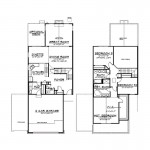

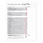
It’s Monday, August 30, 2010 and today we are doing a “What’s Wrong With This House?” episode. This is our last week for the Slow Home Project! Today, we need you to study the floor plans of the “Hampton”, a 2,063 sq ft 3 bedroom, 2.5 bath home in suburban Chicago and let us know what you think are the worst design elements in this home. Use the “Slow Home Test” to score this plan and then post your results as well as a comment and let’s have a discussion!

When you are ready, click on the player below to watch John and Matthew’s analysis of this floor plan.

Make sure to watch tomorrow where we will be doing a “Which House Should I Buy?” segment where we will be comparing two single family homes from the Chicago area to determine which would be the better real estate purchase!

  • nicole

    Score of 6
    1- Location 0
    2- Environmental Performance 0
    3- Siting 0
    4- Organization 1
    5- Entry 0
    6- Indoor Living 1
    7- Outdoor Living 1
    8- Kitchen 0
    9- Dining 0
    10- Bedrooms 1
    11- Bathrooms 0
    12- Study 1
    13- Laundry 1
    14- Parking 0
    _gave it a point for organization, because I think the location of rooms is somewhat good, but took the point away for each room . (ie. circulation in kitchen can be improved, but the location is ok.)
    _entry is very large (becomes a waste of space) with a very narrow corridor to the back of the house
    _kitchen has a large work triangle but not a lot of counter space (= wasted space)
    _don’t like the angles on the 2nd floor (= wasted space)
    _formal dining + eating nook are right beside each other – Yikes! Rows of chairs the whole width of the house! Can the dinette be the dining, and the great room moves to the dining and then you can get rid of the ‘added’ portion of the house. (don’t need it on the 2nd floor)
    _parking dominates the front façade of the house
    _ bathrooms:
    1.where do you stand to close the door of the powder room – should not be on an angle
    2. ensuite has wasted space
    3. other bathroom has a closet, but 2 sinks are not required (too small a space- no u/c storage)

  • Catherine Taney

    My top 3 things wrong with this house are:

    1) The garage. Stuck on the front like a mask, this house is all garage from the street, meaning that all of the functions of the house (save for the master suite on the upper level) turn away from the rest of the neighborhood. If we are talking Jane Jacobs, then there are basically no eyes on the street (I guess the assumption is that nothing bad ever happens out in these communities).

    2) The dining room. The dinette is directly adjacent with no spatial separation, meaning that you will be putting 2 tables right next to eachother. Imagine how silly that would look/be to use. The dinette gets great light and could open onto the outdoor space, so I don’t see why you would even want to eat at the proper dining table in the dim corner by the stairs. An enlarged dinette would take the place of the dining room, and leave the remaining space to be pared from the plan or incorporated somehow into the living room.

    3) The master bedroom. Why does it need to be so big? It’s 3/4 the size of the 2 car garage! With no clear space to put a sitting area, this bedroom will likely feature a bed centered on the wall and a whole heck of a lot of wasted space on either side. Maybe this is where the clothes are supposed to pile up. Further, a really unfortunate door swing doesn’t allow you to walk into your walk-in closet! That’s just a silly mistake on behalf of the company. I think a much better solution would be to create a walk-in that is more modest, and allow for space near the windows to create the desired sitting area feature that so many of these Chicago homes seem to want. Alternatively, 2 standard wall-length closets would provide better access and ultimately better storage than what’s offered here.

  • leavaiday

    Hi Everybody, i would just like to make an introduce myself to everyone at theslowhome.com

    Your forum is brilliant! Often, when I visit forums, I just come across shit, but this time I was really surprised, finding a informative forum containing brilliant information.

    Thanks people at theslowhome.com and keep the sensational effort up!

    interior designer bradford designer coffee tables designer sculptures Puppets contemporary furnishings

  • Tiffany

    Score of 5
    1- Location 0
    2- Environmental Performance 0
    3- Siting 0
    4- Organization 0
    5- Entry 0
    6- Indoor Living 1
    7- Outdoor Living 1
    8- Kitchen 0
    9- Dining 0
    10- Bedrooms 1
    11- Bathrooms 0
    12- Study 1
    13- Laundry 1
    14- Parking 0

    The worst parts of the house are numerous. If I had to indicate just one thing I would say the entry. It is much to large and in turn causes many of the other problems with the house.
    I would say that the bedrooms are probaly the best part, but even then I have a real problem with the closet in the master bedroom.
    Overall not a house I would ever recommend to anyone.

  • Steve in Van

    The only thing I might score this house differently on would be “outdoor living” since there’s no evidence — on the floorplan or website — that the developer has given any thought to it whatsoever. Yes, there’s a patio door from the dinette to the “optional deck,” but the outdoor space seems not intended for use. If it were, the principal rooms would be connected to the yard (bigger windows, doors) and the mudroom would be accessible from outdoors, not just through the garage.

    Catherine is right — this development is a typical bedroom “community” in which commuters have no connection to their yard or neighbours. The Homeowners Association even takes care of the landscaping. Sorry for being grumpy, but I just can’t give them a point for outdoor living.

  • Mid America Mom

    No to the following slow home test questions: Kitchen is not a good design. Dining is placed poorly. Front entry is way too big. Garage dominates the home. Master bath is supersized- NO bath. Organization is poor on first floor.

    Worst part to me is the front entry. It is way too large for this home. It makes me wonder if the size was determined by having that front facing bedroom over it.

    Not a slow home.
    Mid America Mom

  • Andrew

    Total: 6/20

    1. – 0/3
    2. – 0/3
    3. – 0/2
    4. – 1/2
    5. – 0/1
    6. – 1/1
    7. – 1/1
    8. – 0/1
    9. – 0/1
    10. – 1/1
    11. – 1/1
    12. – 0/1
    13. – 1/1
    14. – 0/1

    I think the biggest problems are found at the front of this house. First of all, the garage completely takes over the front facade and blocks off nearly all of the incoming natural light at this side of the first floor. And the optional 3-car attachment feels very excessive and does not look good in light of environmental considerations. In addition, the front entry/foyer is far too big for its own good. The space in the center of the foyer is pretty much wasted floor area and as you go beyond the foyer into the rest of the house you might feel a sense of constriction as you pass through tight openings. I think the organization in this house is ok so I only gave 1 point since the rooms have fairly appropriate locations and the connections between them is ok, but I think there is over-sizing in this house and some of the space could have been used a little more effectively (the foyer!).