Evaluating Single Family Homes In Philadelphia

This is Day 160 of the Slow Home Project and we need you to join us in our quest to evaluate the design quality of houses in nine North American cities in nine months. This week we are analyzing single family homes in Philly, and today’s exercise is another edition of “What’s Wrong With This House?”

Welcome to our Monday episode of “What’s Wrong With This House?” Today, our test property is the “Southport“, a 4,310 sq ft, 4 bedroom, 3.5 bathroom home located in the Estates of Garnet Valley in Glenn Mills, Pennsylvania.
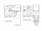
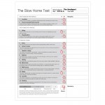
We need you to study the floor plan of this house and then use the “Slow Home Test” to rate its design quality. When you are finished reviewing the plans, post your Slow Home Test score as well as your comments about what you feel are the two biggest design problems with this project. We can give you a bit of a hint……this is really about as far from a Slow Home as one could get!

To see what John and Matthew think about this house, watch on the player below! You can also see their Slow Home Test results by clicking the link below.

Join us tomorrow for our “Which House Should I Buy?” episode where we will be comparing two single family house projects from the Philadelphia area to see which one is the better real estate purchase!

  • Mid America Mom

    Good morning everyone! Here is our last week in Philly and I admit before I put my first plan out – I am skeptical.

    As we have seen from our numerous stops in the project, the single family new developments tend to be the least Slow Home worthy. Will we find green construction or walkable locations?

    Before I jump into the exercise and project I wanted to share with you a blog from the folks that brought us a finalist from last week, the 2 point 5 home, about city planning. I am watching with interest as some of us contend planning plays a large part in the present state of the housing industry. http://www.100khouse.com/2010/06/23/the-entrepreneurial-planner-a-series-on-effective-sustainable-city-planning/#comments

    Mid America Mom

    Mid America Mom

  • Mid America Mom

    Two biggest issues- Feels like an Alice in Wonderland experience. The angles! Where do I put furniture and what kind would work best? The stairs. Stair 1 or Stair 2 today?

    Test:
    Location 0
    Environment 0
    Siting 2
    Organization 0
    Entry 1
    Living 0
    Outdoor Living 0
    Kitchen 0
    Dining 0
    Bedroom 0
    Bath 0
    Study 0
    Laundry 1
    Parking 0

    4/20 FAST
    Mid America Mom

  • Murray

    Really awful. I couldn’t be bothered, but did watch John and Matthew and I agree with their analysis (though the 2 points for siting is up for grabs depending on which building lot is selected).

    I think the “designer” was inspired by a baseball field for the concept of the floor plan – home plate is the foyer.

    That odd space in the living room would accommodate a grand piano very nicely.

  • Terri

    M.A.M.,
    I like your Alice in Wonderland analogy. How can you give this house a point for the laundry, though? Don’t you find it ridiculously placed at the garage entry when there was so much space devoted to nothing but closets on either floor?

    As for my scoring, I came up with 5/20.
    2 for Siting (these lots should be large enough to place these monster homes without impinging on neighbouring lots)
    1 for indoor living (offers focal point)
    1 for outdoor living (large lot)
    1 for dining (“adequate for everyday use”–according to Test, though what a crazy shape for furniture placement)

  • Tara

    1)0
    2)0
    3)2 – it looks like the lots are huge so neighboring houses will not be problematic. I also like that they provide neighborhood information on the website.
    4)0 – circulation is complex and occupies a lot of square footage
    5)0 – huge amount of wasted space, and doesn’t even have a closet in all that space
    6)0 – living room is a very odd shape and will be hard to furnish, family room is too large and will inevitably have wasted space.
    7)1 – outdoor living doesn’t seem to be considered in the plans but with the lots the size they are, outdoor living seems to be of importance
    8)0 – work triangle too large, weird circulation
    9)0 – dining area much too large
    10)0 – bedrooms 3 and 4 aren’t too bad, strange shape to the princess suite and master is excessive with its den and 4 walk-in closets.
    11)0 – most of the bathrooms aren’t bad but the master is supersized
    12)1 – though the one wall has a strange angle, the other 2 walls can house furniture well and the room has access to lots of light
    13)0 – pass through from garage, much too small considering size of house
    14)1 – considering the size of the house, a three car garage is expected. it also does not interfear with light reaching principle rooms of the house. the storage area is also nice.
    5/20

    I think the foyer and central staircase really mess up the quality of many of the spaces on both floors. The result is rooms with angled walls that are difficult to furnish and there is a ton of wasted space.

  • Mid America Mom

    Thank You Terri- after I watched the player and looked at it again I realized it should NOT have had the point for laundry. I thought the laundry was away from the door and the closet next too. But with this size home second floor would make sense.

    Mid America Mom

  • Terri

    Finally got the chance to watch John’s and Matthew’s analysis. All very good points. I’m not sure the family room is all that “removed,” given all the space throughout the house, but it is affected by traffic, so perhaps I shouldn’t have awarded a point to indoor living. (I tend to do the test interpreting the text literally whereas commonsense is the better approach to take.)

    I couldn’t believe that master suite when I saw it. Or the dog’s hind leg of a kitchen. What is very sad, though, is that someone will probably buy such a house in this subdivision.

  • Grace Coulter

    Location 0/3
    Enviro Performance 0/3
    Siting ½- its looks green in the plan but its a typical suburban layout with only houses as next door neighbours
    Organization 0/2 – this is an odd house….does this seem functional to anyone?
    Entry 0/1 – the entry seems bizarre in this house, in both the front and back
    Indoor Living 0/1
    Outdoor Living 1/1
    Kitchen 0/1 –this house is quickly becoming one of the lowest I have ever scored. The layout again in this room is bizarre. You have counter space but the room layout is so odd it seems very inefficent
    Dining- I hate the little partition wall at an angle. I think this room would be very hard to furnish
    Bedrooms -0/1
    Bathrooms -0/1
    Study 1
    Laundry -0/1
    Parking – 0/1 This size of a house…..at the front! This is my pet peeve in housing. Garages at the front. One this size is brutal especially when you take in the shape of the bathroom above on the second level. Augh

    Pretty close to what John and Matthew scored it. The garage, master bath and dining/living space where be issues for me in this one

    my total is…. 3? pretty speedy house.

  • MollyK

    Didn’t bother scoring it…pictures say a thousand words.

    With so much garage the “storage” area could easily been made into a nice laundry room off the back entry.

    Finally, I like one feature of the house alot…the second set of stairs off the family room. I have never liked the idea of walking to the foyer to go upstairs though my own house has that configuration. I prefer the privacy and convenience of the second staircase strictly for family use.

    Murray…
    which box seats would you like best for the game? the study or living room?

  • nicole

    Looks like the developer was trying to be ‘creative’ and design rooms with angles. Seems to have back fired… becomes awkward to place furniture in an ordered manner, and creates wasted space.

    I would feel guilty for having such a large house – is it really necessary to heat a house that large?

    Score of 4

    1-Location 0

    2-Environmental Performance 0

    3-Siting 0

    4-Organization 0 appears to have a lot of circulation

    5-Entry 1 Very large entry (over sized) and little closet space for the rear entry)

    6-Indoor Living 0 But where is the focal point in the living, the view, the fireplace, or the entertainment space? Feels like the rooms are very closed in, with lots or circulation

    7-Outdoor Living 1 – such a large house, and very little connection to the outdoors from the kitchen

    8-Kitchen 0 very large – way too much storage!

    9-Dining 0 Would most likely not be used every day. Not too keen on the angle that is created by the corner of the house. It is not quite symmetrical, and seems to be mistakenly off center

    10-Bedrooms 0 Bedrooms are over sized, and feel like the master den is ‘left over space’

    11-Bathrooms 0 Mbr ensuite is enormous. Enough said.

    12-Study 1 –but weird shape

    13-Laundry 1

    14-Parking 0 – 3 cars + storage is a little excessive

  • BradW

    Sure, this is a poorly designed house but I am going to argue that parking, specifically the three car garage, should be awarded a point. Given the location (suburban), the site (estate lot subdivision) and the size (4000 sq ft) how can you not build a three car garage? If this house had anything less than a two car garage + storage I would have taken off points. You have to evaluate these homes in context which I am sorry to say is to quickly forgotten here. If you want to argue that estate lot subdivisions should not be build I’ll listen but given they exist ask yourself what is good design given the context. In this case, the garage presents at right angles to the street showing a hopefully attractive gable end rather than three garage doors. Guest parking is near the front entry. Given the context, this is reasonable design. To simplistically state all three car garages are bad is just wrong.

  • MollyK

    BradW…
    Thank you for the words of reason. A 3-car garage doesn’t automatically warrant a penalty. If someone dislikes the concept of 3 cars so be it, but let’s be honest and agree that is an opinion. The garage category specifically calls for the garage to be appropriate to the house. An objective look at the criteria (something I think is lacking at times in the scoring) would reveal that a 3-car garage for a 4000+ sq ft house is not out of the question, even if the scorer might not like it personally. One might argue that it dominates the front of the house, and I would appreciate that logic as it follows the criteria set forth in the test. Sadly I think logic is often lost among the personal likes and dislikes that invariably accompany this type of “test”. I guess that’s why I’m not engaging much in the discussions anymore.

  • Mid America Mom

    Oh- 3 car was not the issue when I looked at it. It was the large storage area.

  • Tiffany

    This is just so very large it is hard to know where to begin in indicating what is wrong. For me the kitchen is a major problem, and I think that the master bedroom with its 4 walk in closets is just over the top.

  • jim baer

    i agree with brad that a 3 car garage does not automatically equal bad. but for a different reason. i day dream about my country weekend house with the multiple stall garage. one daily car and several vintage ones for the occasional errand or romantic get away.

    i am an urban dweller that does not own a car, takes public transportation and walks when i can. and yet i dream of multiple, beautiful, classic cars….

    mollyk, the test by its nature involves opinion. the slow home philosophy has stated a point of view and then constructed the test to determine how well the housing fits that view. the question becomes…how tightly does one hold to that view? and how does it guide ones choices?

    the slow home philosophy does have an urban bias. but there are many reasons to live in suburban and rural settings. family, schools, jobs… if we buy into the philosophy, we still have the right chose when we adhere to it and when we don’t.

  • Jessica

    Southport

    Location …0
    Envi. P. …0
    Siting …0 (not indicated… 12 wooded sites)
    Organization …1 (sure, like spaces are grouped)
    Entry …0 (no closet)
    Indoor living …0 (wacky geometry abounds)
    Outdoor living …1 (indication of natural landscaping around sites)
    Kitchen …1 (strange angled inclination, but it is open to the family living space)
    Dining …0 (bow-like focus… I don’t think it lends itself to a satisfactory furniture lay out)
    BR …1 (in spite of some wacky angles defining spaces, interesting terminology–”princess suite”–I think the bedrooms are all right… lots of space devoted to closets in the master bedroom, however… this makes me question the point)
    BATH …1
    Study …1
    Laundry …0 (with this footprint, I think it should be close to the bedrooms)
    Parking …1 (equal to potential occupancy)

    Slow score: 7

  • frazer

    The sad reality is that there are some people who will buy and live in a house such as this one. We live with a lot of excess and what this house has is space. Perhaps the purpose with this house was to flaunt that extra space. Obviously it could have been more efficiently designed but that is exactly what makes this house so easy to pick on…

    Considering this I scored the house at a 6, giving it points for site, entry, outdoor living, dining, laundry and parking. For the size of the house and the lifestyle of its intended occupant these things seems to meet their purpose. Now if we could only change the lifestyle and values of those intended occupants…..

  • Andrew

    7/20 total score

    1. 0 – not walkable
    2. 0 – no mention of environmentally friendly features
    3. 0 – not really much to respond here, but I can’t say it has a positive impact on the community
    4. 0 – the off-axis floorplan layout is not at all effective and has created a whole series of problems
    5. 0 – interesting entry but unfortunately it’s not very functional
    6. 1 – decent living spaces with a fireplace as a focal point
    7. 0 – no outdoor living space shown in the plan
    8. 1 – kitchen island is quite awkward but it looks like the kitchen works
    9. 1 awkward orientation but the dining space is big enough
    10. 1 – functional bedrooms with good natural lighting
    11. 1 – good amount of bathrooms
    12. 1 – functional study space
    13. 0 – laundry access right in the bath of the garage entrance
    14. 1 – garage is huge and dominates the front facade a bit but it’s functional

    The biggest problem i find with this house is the organization. The off-axis first-floor plan feels like a poorly considered attempt to make the house more interesting and have the spaces more dynamic, but unfortunately many negative consequences have formed out of this, in particular the wasted spaces that have developed between interior walls.

  • Neogi

    i scored the house 6/20, its a very grand house and its a shame that its been done so poorly, the angles are terrible with, with the luxury of so much sq..footage i think the designed wanted the angles to give more dimension to the house, but i really think that it worked against the design. The foyer is massive and just the whole plan is very opulent and excessive.