Evaluating Townhomes In Miami

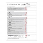
This is Day 132 of the Slow Home Project and we need you to join us in our quest to evaluate the design quality of houses in nine North American cities in nine months. This week we are analyzing townhomes in Miami and today we will be evaluating a townhome using the Slow Home Test.

Its the start of a new week and we are excited to be looking at townhouse design in Miami, Florida. It will be interesting to see if the townhouse projects in Miami will be better designed than either the single family homes or the apartment/ lofts, which so far have been scoring the worst in Miami out of the five cities we have visited.

For today’s Design Exercise, we are going to do a group analysis of one townhouse to see how everyone as a group scores the same unit using the Slow Home Test.

The unit we have chosen is called the “St. Tropez” and it is in the “Mizner on the Green” development in Boca Raton, Florida. It is 1,216 sq ft with 2 bedrooms, 2 bathrooms and 1 parking space on three levels.

Follow the links below and use the Slow Home Test to rate this unit. Post your results to the comments section as well as a description about what you liked and what you did not like about this floor plan. We are using these group exercises to help calibrate our scoring for the Slow Home Project.

When you have finished posting your results, click on the player below to watch how John and Matthew scored the “St. Tropez” and compare your results to ours.

See you tomorrow where we will be doing a “Which House Should I Buy?” episode where we will be comparing two townhouse units from the same development to see which one would be the better real estate purchase.

  • MarisaM

    Here are my thoughts on the today’s townhouse.

    1) 3
    2) 0
    3) 1
    4) 1
    5) 1
    6) 1
    7) 1
    8) 1
    9) 1
    10) 1
    11) 0
    12) 0
    12) 1
    14) 1

    Score 13/20

    The positive aspects of this home is the kitchen I really enjoyed the horse shoe lay out and seemed to be an effective use of space. I feel like the house overall had good flow to it, that furniture could easily be set up with each room has sufficient natural light. Although the dining room window is off centered, so the table would have to be centered according to the room instead of the window.

    I did not like the bathrooms upstairs, there was little counter space and it was cramped with the two bathrooms separated. The house bathrooms may be better suited if combined.

    I have a question to throw out there, is the laundry upstairs or in the garage?

  • nicole

    Score of 11

    2 biggest concerns is the kitchen (feels so squished) and guest access of washrooms through the bedrooms.

    1- Location 3, Walkable
    2- Environmental Performance 0
    3- Siting 0 , backs onto golf course, but tight squeeze for the inner townhomes and vehicular traffic (see lots of cars in front of the house)
    4- Organization 1 – feel the kitchen chops off the space
    5- Entry 0 only 1 entry for the home, no closets
    6- Indoor Living 1- no focal point but rear living connects to rear yard
    7- Outdoor Living 1 – small patio shown
    8- Kitchen 0 small and compact, but feels too tight. Don’t like the u-shape
    9- Dining 1
    10- Bedrooms 1
    11- Bathrooms 0 – Do guests access the washrooms from the bedrooms?
    12- Study 1 – no study
    13- Laundry 1
    14- Parking 1

  • Allie G

    I was pretty close in the scoring with the rest of you – I gave it an 11.

    I agreed with everything Matthew and John said about the house, it was actually kind of funny when you pointed out everything I had thought of. My biggest pet peeve of the house is definitely the kitchen. In apartments with no space I understood why they needed to be so cramped, but I feel as though the space could have been better managed to accomodate a larger kitchen.

    The entrance was also another failing point. Although I realize it’s difficult with the size of the garage and the stairs, obviously something needed to be changed. I think the first floor was shafted with the poor design and just throwing in everything that was missed.

    Other than that I think it’s all pretty good. I like the organization and all the rooms aside from the kitchen, so not too bad.

  • Murray

    I came up with 12

    Location, yes – 3
    EP, no – 0
    Siting, no, unless you are overlooking the golf course – 0
    Org, yes, not bad for such a narrow unit – 2
    Entry, no – 0
    Indoor Living, yes – 1
    Outdoor living, no, small balcony, most likely looking over the next set of units and parking, or the road – 0
    Kitchen, NO, much too cramped, eating bar gets in the way of the narrow circulation path to the dining room, the kitchen could have been wider if they had eliminated that feature – 0
    Dining, a hesitant yes, it seems a bit narrow – 1
    Bedrooms, yes, I suppose, but you are either going to be suggled up to the closet on one side of the bed, or the closet is going to be your view from the bed – 1
    Bathrooms, yes, quite functional – 1
    Study, one room could be a study – 1
    Laundry, yes, a bit cramped like the entire unit, but it is good that it is across from the linen closet – 1
    Parking, yes, what else are you going to do, where else can it go? It will probably be used for storage anyway, and the car will be out in the driveway – 1

  • Murray

    MarisaM

    I think the laundry is upstairs, I think that must be AC, hot water, etc. in the garage.

    Re: your scoring – did you take the initiative to only give partial points in Siting and Organization? I think that is fine, but typically the scoring is all or nothing, i.e. 2 or 0 for each of these rather than 1.

    Nicole

    You can get into the bathroom from the hall as well as the second bedroom.

  • autobrad

    Well, it looks like the things are slowing down in the Florida heat. This project is one of the best yet. I scored it a 13 on the SHT. It did well in all areas with the exception of walkability, environmental performance and laundry. The walkability was questionable as it has a lot of green space (golfcourse) nearby but the nature of the business nearby does not seem that practical for daily living, unless you are a fan of the ‘Funky Nutz Duelling Piano Bar’. Environmentally there is nothing exceptional about the townhouse as it is jammed into a complex of a number of other similar units. Unless you are into getting fit in your home and having your clothes smell like car exhaust having the laundry in the basement/garage is a bad idea. On the positive side…I really liked the use of space. The kitchen has a lot of counter space and is nicely proportioned. Each room has great places for furniture. It is organized well but the second closet is big enough to be a study and just sticks out. Strange and disproportionate. Having two bedrooms and two bathrooms is great. The are well proportioned. The dining room is close to the kitchen and has a good amount of space for dinner parties. The master bedroom has good natural light. Lots of storage and the single car garage is soooo much better than an outdoor stall. I thought the main entry was a little tight with two opposing doors and the idea of stairs to the main will be hindrance to many. Overall, pretty good, especially if you like dueling pianos.

  • autobrad

    After listening to what John and Matthew had to say about the townhouse it expanded my understanding of what slow means. I liked the kitchen because it seemed to provide more kitchen than the Miami condos, but I do see how the density contributes to it being poor. I misunderstood that where the laundry is- a good way to learn more about how the drawings work.

    I didn’t think it was that walkable because when I went into Google and had a closer look at the area it has a lot of food and entertainment but not things like dentists and doctors and large grocery and day to day service retail like stationary, etc. to run a small business in between golf games. I didn’t like that the only real green space is golf course. Does not allow for a place to walk the dog or lay on the grass and read a book or even jog. I guess it is designed for seniors and snowbirds.

  • Tiffany

    13/20
    1.Location – 3
    2.Enviro – 0 (Nothing listed.)
    3.Siting – 0 (To many interior units looking onto each other.)
    4.Organization – 2
    5.Entry – 0 (Way to small and no closet.)
    6.Indoor – 1
    7.Outdoor – 1
    8.Kitchen – 1 (Small but usable, I do not see a huge problem with it.)
    9.Dining – 0 (To small both in width and depth once you take into account circulation from the stairs, it would be really tight for a decent sized table.)
    10.Bedrooms – 1
    11.Bathrooms – 1 (Hesitant though as there is no bathroom on the living level so any guests are forced to go upstairs. The ones provided though are very well laid out.)
    12.Study – 1 (Does not include one.)
    13.Laundry – 1 (Can not clearly determine if it is upstairs or down. I originally thought on the lower level, if so it is not ideal, but provides a lot of space. If upstairs, it is better located, but very tight.)
    14.Parking – 1 (Though it would be tight I think it is doable as a parking space.)

  • Tara

    1) 3
    2) 0 – nothing on the website
    3) 0 – no site plan for unit locations
    4) 2 – ciculation is overall simple and effectively runs the length of the house
    5) 0 – entry too small, no closet
    6) 1
    7) 1 – gave it the point – thought it could have maybe been a bit larger
    8) 0 – I think the layout of the kitchen would be much betted as a walkthrough kitchen with an island. I think the u-shape is very unnecessary for the space and limits circulation when there is a better solution
    9) 1 – gave it the point. It is quite a large space but I think it could be used for multiple purposes such as a study or library area as well. It could also make better use of the wallspace by having a larger window at the front
    10) 1 – bedrooms are good size and laid out well. The master closet bump-out is a bit wierd (I wonder how it works with the elevation compared to below) but still works
    11) 0 – bathrooms are a good use of space but I didn’t give them the point because of the lack of storage.
    12) 1
    13) 0 – I think you have to go through the garage to do laundry. horrible.
    14) 1 – makes sense for the townhouse style and size.

    11/20

    Overall not so bad. My biggest problems are with the laundry and the kitchen.

  • JPHH

    I scored this with 11 points. I would have liked to see one of the bathrooms moved downstairs for guest access. But I do think the bathrooms are well done. I do like that the living spaces and the sleeping spaces are separated by floor. I am really interested as to how the walk in closet works in the master bedroom. On the second level I don’t like how the kitchen and dining are separated by stairs. To me this makes the kitchen seem even smaller. Autobrad makes a good point about the type of store around it. I think that grocery and day to day services are needed.

  • Terri

    Back from a little va-cay. Looks like Miami apts/lofts were just as bad as houses. The million-dollar question: How will the townhouses fare?

    I gave this townhouse 13, with the same points as John and Matthew, except for garage. I use a narrow garage now; it’s not perfect but manageable. And the Slow Home Test questions only if the space is “appropriate” and does not “dominate or interfere with the rest of the house.” It satisfies all but the interference factor, and since I’m not sure how much it will interfere, I gave it the point.

    Generally, I have no major issues with the house except for the pokey kitchen and the access to the outdoors being so far from the kitchen (thinking BBQ). Of course, if you lived in the centre of the complex, you might not use the balcony all that often anyway. I do like the way they managed a little window beside the master bathroom counter.

  • Matthew North

    Welcome back Terri – hope you enjoyed your vacation – we missed your comments on the site!

  • bbhorner

    1. 3
    2. 0 – not mentioned
    3. 0 – the houses on the south side of the development have nice views over the golf course but the rest of the homes are looking into each other and onto the driveways
    4. 2
    5. 0 – what entry? all there is is two doors that lead to a stairway
    6. 1 – seems small but it does have to focal points the view and a possible television position
    7. 1 – the balcony seems an alright size
    8. 0 – to tight! and the U-shapes inhibits the flow on the main floor
    9. 1
    10. 1 – both are well laid out and have good closets
    11. 1 – functional but would really of loved to have a bathroom on the main floor.
    12. 1
    13. 0 – like others i can’t determine if the laundry is upstairs or down but both are terrible positions.
    14. 1 – it works

    Score : 12/20

    This townhouse is ok. I am not the biggest fan of townhouses in general though. No green space, too much stairs, poor views, etc. Perhaps my opinion will change by the end of the week.

  • Grace Coulter

    3/3 Location/ Walkability- 79 out of 100 – This is pretty good so it gets the points

    0/3 Enviro Performance-importing materials like “Italian porcelain tile flooring in kitchen and bathrooms & foyer,” makes this project unsustainable. Furthermore besides the walkablity (to which points were already given) there are no other eco features obviously advertized on the website. Poor marketing stategy if you ask me. I wouldn’t buy in a residence in an project that gave no thought to the environmental impacts of building.

    0/2 Siting –it looks like any aerial of suburbia

    2/2 Organization- For the size of the space, I think it is very well organized. I like that each level is geared towards a different aspect of living. The lower level is really storage, the second level public living and the top is private. Good deal.

    0/1 Entry…what entry? I hope those are the most beautiful stairs in the world to make up for the tall closet you essential walk into. Bad first impression.

    1/1 Indoor Living-full points. I really like the way this second levels is set up. Its great that the dining and living spaces are separated (no watching tv while eating) and both have great natural light coming in with the large windows.

    1/1 Outdoor living- the balcony is a good size and it connected to the living area well. It oucl open up and be an extension of the house.

    1/1 Kitchen- I like this kitchen although I am willing to bet other have an issue with the stove and dishwasher being adjacent to each other and conflicting. I think it has ample counter space, it open to both rooms and simply adjusting the location of the appliances would resolve issues

    1/1 dining- great dining space. Nice separation while maintaining an open feel to make a small space feel large

    1/1 Bedrooms- both have windows-good

    1/1 Bathrooms-these are not spectacular and seem a bit tight

    1/1 Study-1 for default point

    0/1 Laundry- i would not give this point. It seems way to tight and there is no space to put anything down unless you pull out the ironing board to set stuff on….

    0/1 Parking-I strongly dislike garages in the front of the house. I want to give this the point because otherwise it seems fine but i can’t because i never do when i think parking is a dominant visual at the front of a home.

    So my total today is 12! I think i could get a little slack for the kitchen point especially after watching John and Matthew…so maybe I am giving it 11? Lol sometimes its so hard to do this without being in the space or having a virtual walk through.

  • Catherine Taney

    1 – Yes, walkscore 78, lots of restaurants nearby!
    2 – No, nothing to speak of
    3 – Yes, I don’t have a problem with the interior units, I think that there are much worse conditions, and
    besides, if you want to live in the city you’re not going to get that picture perfect view anyways!
    4 – Yes, all of the main rooms that need light get it, proportions are decent, and there are no
    circulation issues
    5 – No, it’s a tight squeeze, closets anyone?
    6 – Yes, good connection to outdoor space and nice light, close to kitchen
    7 – No, I just don’t think that it’s deep enough to fit a good place for more than one person to sit comfy
    8 – Yes, It’s a kitchen built for one and is a bit small and I know how Matthew and John feel about
    chamfers, but I do think that it will work and not cause a lot of problems.
    9 – Yes, there’s a bit of wasted space near the stair, but there’s just one well sized and well lit dining area
    10 – Yes, well proportioned and the beds have their spots – doesn’t that closet affect the next door unit?
    11 – No, I think that the master is really crammed; also, no bathroom on the main level? I think this would
    have been much better if there was a way to get a powder room on the second level and turn the
    upper into a shared, larger bathroom.
    12 – Yes, there isn’t one
    13 – Yes, I think that it’s that space near the master and not in the garage
    14 – Yes, one car with necessary storage works for me

    Overall, a 14.

  • Bell604

    11/20
    1) 3
    2) 0
    3) 0
    4) 2
    5) 0
    6) 1
    7) 1
    8) 0
    9) 1
    10) 1
    11) 1
    12) 1
    13) 0
    14) 0

    I generally agree with a lot of what John and Matt had pointed out. The entry is non-existant, the garage is to slim, the siting is mostly bad. I personally don’t like the placement of the laundry, if someone is doing a load they block off the entry to the master bedroom and closet. But I do like it being near the bedrooms.

  • Kadoman

    15/20

    I gave it points for most things obviously, but I decided not to give points for Environmental Performance, Study, or Laundry. There is nothing listed anywhere about efforts to be green. The study is non-existant, unless a bedroom is appropriated and the laundry is on the bottom floor in the garage.

  • Terri

    Matthew,
    Thanks for the welcome back. I saw an odd little cornerwise toilet in the cottage I rented and I thought of you and John with all your advice about angles!

  • Terri

    Maybe I should clarify my last line–your advice about AVOIDING angles–is what I saw in action while away. This was a separate little toilet room, and having the fixture angled made access even more awkward into such a small room.

  • Hilda

    Hey All!

    I gave this house a 12/20, with the general agreement on what most people said. Kitchen can use serious improvements for sure, but I’m a bit iffy on whether giving a point to laundry location was a good idea. Especially after confirming that the laundry is located upstairs.
    Since… does anyone know how sturdy the townhouses in Miami are? I used to live in one, and whenever there’s a huge movements in the house or the ones next door, our own house will feel it too. Not to mention, there’s the question of how much weight the floor can hold…Of course, some might think that my question is more of architecture related, but if the designer plans on putting the laundry on third floor…I would be concerned about the structure stability of the house…

    Cheers!

  • PeterB

    1- Location 3, Walkable
    2- Environmental Performance 0
    3- Siting 0, is right on golf course, like others said previously, looks to be a small area and would be highly congested.
    4- Organization 0, Kitchen is awkwardly positioned
    5- Entry 0, nothing of value here
    6- Indoor Living 1, nice sized living and dining rooms
    7- Outdoor Living 1, little patio
    8- Kitchen 0, awkward design and seems to have improper placement
    9- Dining 1
    10- Bedrooms 1
    11- Bathrooms 1
    12- Study 1, no study
    13- Laundry 1
    14- Parking 1

    Gave it an 11

    Seriously, what were the designers thinking with that kitchen, it really takes away from the entire townhome. The rest of the place is designed adequately but the kitchen should be a focal point for the right reasons and in this complex its a focal point for all the wrong reasons.

  • Neogi

    I gave the house 11/20, and its clear that this is one of the best plans we have come across thus far in Miami. I also am not a big fan of the kitchen, it almost seems like if you open the oven door you cant get out of the kitchen area and to the fridge. i think i would have preferred a more linear design that doesn’t close the kitchen in and really keeps the space open and airy. The narrow garage doesn’t really bother me so much cause the amount of storage you have somewhat outweighs the tight space. I think they did a great job to include so much storage even in a small space. I am also fond of the layout of the home, the middle floor is all for entertainment and the upstairs is more of a private space. However there is no bathroom in the second level meaning your guest must go up the stairs to the private space to use the bathroom. Lastly the entry is pretty much pointless, i wish they could have tried to widen it a bit and include a entry closet or cubbies to make more of an statement. So the lessen here today was if your planing on moving to buy a house in Miami you should invest in a townhouse.

  • autobrad

    One of the questions that has been born looking at all these designs is how much of the design is influenced by the demographics or are the demographics of the homes location ever taken into consideration?

  • autobrad

    Matthew

    can you please elaborate more about why the fridge is poorly placed outside the U? I am trying to understand where it would be better placed and why it is such a problem where it is?

    thanks much

    brad

  • Matthew North

    Hi autobrad – yes I can comment on the problems with a U-shaped kitchen when the fridge is outside of the “U”. In this condition the back side kitchen is against the party wall. First, there is no framed drywall wall to the right of the fridge. This will make the fridge look like it is just sitting up against the party wall – an eyesore from the dining room as the fridge stick out more than the counter. If you look carefully at the plan, there is a framed wall denoted by the black line to the right of the sink. This will make the kitchen feel contained at this point – a condition that is actually really needed next to the fridge. The second problem is the tightness at the fridge as the alley of this kitchen is only about 3 feet wide in front of the range and will be only 2 foot 6 at the fridge (as this appliance is wider) – which is very tight. The designer is squeezing this kitchen into the space and by pulling the fridge out of the “U” they are forcing it to work when there really is not enough space. Imagine opening the fridge door. The true fact of the matter is there is not enough room given the width of this unit for the stairwell, a circulation route and a “U” shaped kitchen.

  • Cnick

    Hey everyone!

    I gave this house a 12/20, but had a few overall concerns. Didn’t like the laundry in the garage. I also thought there might have been a bit of wasted space where the counter is in a horseshoe shape and creates a narrow passage way along the counter as you head to the dining area. This hall space is wasted area in my opinion.

    Living area and dining room area are adequately sized for that size of a unit and the kitchen does has plenty of counter space. The bedrooms and bathrooms are also properly sized and efficient in this unit.

  • Hawerchuk#10

    St. Tropez, Mizner on the Green, Boca Raton, Florida, property.

    1- Location – 3 – very walkable and close to many amenities
    2- Environmental Performance – 0 – Like everyone else nothing to write home about
    3- Sitting – 0 – looks like most complexes around a golf course that is the focal point
    4- Organization – 2 – the second level has access to outside and level three windows look large in proportion to allow light in.
    5- Entry – 0 – not a functional entry
    6- Indoor Living – 1 – living area in back does allow for connection to outside
    7- Outdoor Living – 1 – very nice size balcony that appears to enclosed ( I could be wrong and the brochure doesn’t state)
    8- Kitchen – 0 – if we could hand out half point then perhaps. I do agree about the circulation issue and I agree a walk through with an island would be better suited. However, I do think the kitchen has functionality.
    9- Dining – 1 – well sized, small window so little connection though
    10- Bedrooms – 1 – windows good and size of room good. Two bedrooms I would argue is limiting. Don’t like the walk-in closet placement or continue the build to add to the overall sq ft of room.
    11- Bathrooms – 0 – ordinary and the swing on the door effects flow.
    12- Study – 0 – no study.
    13- Laundry – 1 – in right spot in garage, but carrying the laundry from third level have some potential buyers complaining.
    14- Parking – 1- far size garage.

    11/20 so moderately fast.

  • Murray

    re:laundry

    typically the washer and dryer are 30″ square, similar to a basic fridge. The unit upstairs near the master is the laundry within a standard 36″ closet.
    Whatever is in the basement is rectangular, rather than square, and so, I would suggest, this is not the laundry.
    Also, I cannot imagine that a contemporary developer, no matter how bad, would put the laundry on the lowest floor of a three floor unit, in the garage, no one would accept that.

  • Deng

    1.Location – 3, quote: “You won’t ever need your car to go to the theater, the movies, international restaurants or browse fine shops and boutiques because Mizner Park and the Royal Palm Plaza are just a stroll away.”
    2.Environmental – N/A or zero
    3.Siting – 0, golf course view
    4.Organization – 1, narrowness causes some circulation issues
    5.Entry – 0, tight and no closet
    6.Indoor – 1, open to balcony
    7.Outdoor – 0, townhouses have narrow lots= tight outdoor space
    8.Kitchen – 0, the stairs squish the kitchen
    9.Dining – 1, great lighting
    10.Bedrooms – 1, well sized
    11.Bathrooms – 1, bathroom has a dual entrance- verstile
    12.Study – NA or Zerio
    13.Laundry – 0, not convenient location (garage)- must walk up 2 flights of stairs
    14.Parking – 1, long!

    Total: 9/20

  • Andrew

    1. 3 – clearly good walkability
    2. 0 – no mention
    3. 0 – can’t tell where this unit is in relation to the golf course
    4. 2 – not perfect, but floors are generally organized according to function
    5. 0 – not much of an entry space and a but of a door-swing issue
    6. 1 – appropriate focus on the balcony with the indoor living
    7. 1 – good sized balcony
    8. 1 – kitchen has plenty of countertop space
    9. 1
    10. 1 – good natural lighting
    11. 1 – appropriate number of bathrooms, good sizing
    12. 0
    13. 0 laundry not its own defined space
    14. 1

    Total: 12

    A decent home but it is clearly not an example of creative design. Also, there are a couple of aspects of the 3rd level floor plan that are a real mystery to me – the right wall is not a continuous straight line like in the other levels and the walk-in-closet sticks WAY out from the building edge that’s defined in floors 1 and 2. I’m curious to see if the WIC is a visible part of the building exterior.

  • Athena

    I gave it 7/20.
    The entry is not great with no closet and such a small space to enter since the stairs are immediately there.
    It’s good how they kept the main rooms by the windows.
    I don’t enjoy the kitchen and how it’s walled in.
    The balcony looks like a good size which is nice.

  • Jessica

    Mizner on the Green’s St. Tropez:

    location_3
    (walkable)
    env perf_0
    (no indication)
    siting_1
    (considered it’s walkability score and the community which, according to the site plan, is surrounded by green space)
    organization_2
    (like spaces are grouped)
    entry_0
    (a flight of stairs immediate)
    indoor living_1
    (due to organizational clarity… kitchen placement troubles me though)
    outdoor living_1
    (could conceive of an outdoor patio set placed there)
    kitchen_0
    (functional space seems tight)
    dining_1
    (nice sized space–could perhaps be better integrated with kitchen or vice versa)
    BR_1
    (bedrooms are well-sized and furniture groupings conceivable)
    BA_1
    (bathrooms functional)
    study_0
    (non-existent)
    laundry_1
    (good proximity to BRs)
    parking_1
    (reasonable size considering occupancy)

    SH SCORE: 13/20

  • SangeetaG

    My scores for the town home totaled 11/20:

    3 – Location (Great walk-ability score of 78/100)
    0 – EP (Not much information is given)
    0 – Siting (If the homes are overlooking the roads, that would create acoustic problems and also they would be overlooking the parking lots, not pretty)

    2 – Organization (I like the division of the private/public spaces as well as that the services/utilities are centrally located. Good space provided for living rooms and bedrooms. Some issues with space in hallways and bathrooms though
    0 – Entry ( I really don’t like the entry at all. Firstly, its small and narrow. The flight of stairs right upon entry is a put off and a little intimidating the entry space. Wouldn’t be so welcoming for visitors)
    1 – Indoor Living (Great space provided for the living room. Easy organization of furniture is possible using either side walls as a focal point. Good access to light as well.)
    1 – Outdoor Living (Good space for a small furniture grouping. Sliding doors help a lot in making the outdoor area usable.

    0 – Kitchen (It’s nice that it is centrally located, but the U-shaped counters block access from the living area. Secondly, that circulation space is constricted. If they had simply made an L-shaped or even just an island condition, would’ve provided for more easier circulation through the kitchen)

    1 – Dining (Good space allotted to dining area and great access to light)
    1 – Bedrooms (good size for both bedrooms, no chance of increased wasted space. Organization allows for great light. Decent closet size)
    0 – Bathrooms (Oh boy, the bathrooms are decent, however it has too many doors. The shower door opening against the toilet is awkward. A little tub would’ve kept the space clean instead of the standing shower)

    1 – Study
    1 – Laundry (Access from bedrooms is convenient.)
    0 – Parking (Don’t like that the parking is taking up the whole first level as well that its in front of the house)

    Overall, I think the house is too long and narrow, just a little more width would have made a difference in circulation, especially in the hallways and kitchen. I personally would not prefer this home, simply because of the claustrophobic entry space.

  • Dan M

    [img]mainfloor.jpg[/img][img]secondfloor.jpg[/img][img]thirdfloor.jpg[/img][img]fourthfloor.jpg[/img]

    12 overall
    breakdown:
    location 3 – walkscore of the development came up as 78 for me, so it fits the top 25%, point given, plus they do talk up the walk-ability of the development
    environmental – 0 not even mentioned…
    siting- 0 – I agree, those on the golf course are the only ones with any benefit
    organization – 2, well laid out
    entry – 0 not really there, nothing pulling me in
    indoor living – 1 the organization helps here, the living room floor is done the best
    outdoor living- 1 the balcony provides nice covered space with room for a little furnishing
    kitchen – 0 seems cramped, the horseshoe is a nice idea, but implementation is weak
    dining – 1 the dining room is ample and spacious
    bedrooms – 1 both bedrooms are essentially the same size, the closet in the top (I’m not convinced it is north) bedroom seems odd though, like an afterthought or building wart
    bathrooms – 0 there should be at least a powder room available for guests and visitors without having to travel all the eay to the third floor.
    study – 1 default point
    laundry – 1 being in the storage area it has sufficient workspace and area to work, even if you have to haul it up the stairs (exercise right?)
    Parking 1 – garage works, nice that it is on a separate level.

    I agree that the narrowness of the house contributes to some of the issues, it makes it feel like some things are to far away and make one question some of the placements and design. The entry going straight into a stair is not necessarily ideal either, in this plan the levels separate function it seems so one would be constantly climbing or descending stairs, maybe there was a better way to do this, maybe a split level or..? It kind of looks like they looked at a canal house plan from Amsterdam as inspiration; the layout is really quite similar in concept to the architects houses of Borneo, although not as effective in their execution. I’ve attached the architects house plan I have from Borneo for comparison. You can see that the Borneo plan is also playing with a long narrow ‘townhouse’, but it finds a way to balance placement and function with circulation in a more natural flow.

  • Dan M

    ok the overall score didn’t show up… it was 12
    (maybe it just moved off to a corner now that I look at it).

  • autobrad

    Thanks much Matthew!

  • DJS

    I got a score of 11

    The location got the points, enironmental and siting didn’t though. also the kitchen is much to squished and their is no entry. surprisingly it has good organization and nice living spaces along with good outdoor spaces.