Evaluating Townhomes in Philadelphia

This is Day 153 of the Slow Home Project and we need you to join us in our quest to evaluate the design quality of houses in nine North American cities in nine months. In today’s What’s Wrong With This House, we are analyzing a townhome to determine its best and worst design elements.
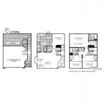
Welcome to the Slow Home site on this Monday, the 21st day of June! Today’s design exercise is titled “What’s Wrong With This Town House in Philly?” We need you open the links and study the plans for the “Broadmore” which is a 3 bedroom, 2.5 bathroom, double attached garage townhouse built just across the river from downtown Philadelphia in New Jersey. We can tell you right from the start that this plan is not very well designed and there are some significant issues!

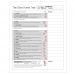
Use the “Slow Home Test” to evaluate this plan and then post your results as well as a comment about what you think are the two worst things about this project. We really want to know what you think!

When you are ready, click on the player below to watch John and Matthew’s tutorial on what they think of the “Broadmore” project as well as how they scored it on the “Slow Home Test”

To see John and Matthew’s Slow Home Test results, click below.

Make sure to join us tomorrow for a new “Which House Should I Buy?” episode where we will be comparing two town homes from Philadelphia to see which would be the better real estate purchase.

  • Paul C

    Quick suggestion, I would encourage all to go to the project’s website for there is a virtual walk through that is quite good. The VR tour is not exactly the same as the floor plan (end unit vs. interior) but very close.

    http://www.motion-vr.net/ryan/ryan_tours.aspx?tn=864&CID=9760120070815

  • autobrad

    I gave the Broadmore a 7. I thought it was very week in circulation. For example the second floor has awkward, narrow walk spaces and the master bathroom is very small with little counter space- a bit tough for couples. I thought the kitchen was badly designed as it has too much open space that is not of use, as there is a dining room next door. I would like to have seen a breakfast nook or better counter space. The fridge door opens into an doorway. The second bathroom on the second floor has no counter space- same for the main floor bathroom. The laundry is located in a noisy place. There is no formal storage space and the optional recreation room seems as an afterthought on how to use up space that required design. Lazy.

  • autobrad

    John and Matthew

    Very interesting listening to your review of the Broadmore. Thanks for the education about stairs! Does the place come with a complimentary Leisure Suit for dining in the Dinette? :)

  • Cnick

    Location-0: Sattelite community that services Philadelphia will make residents way to car-reliant having to shuttle there for all their big city needs and for work.

    Environmental Performance-0

    Siting-1: The living room, dining room and all 3 bedrooms have ample windows and light with views so this aspect is well planned.

    Organization-1: Principal rooms do have a good connection to the outdoors and there is minimal space lost in long hallways etc.

    Entry-1: There is a specific entry. If only it had a front closet though.

    Indoor living-1

    Outdoor living-0: No deck, yard not easily accessed from principal rooms

    Kitchen-0:Wasted space in the form of the dinette

    Dining-0: Why is there a formal dining room and a casual dinette?

    Bedrooms-1

    Bathrooms-1

    Study-0: Formal dining space could have been used for a study by reworking the plan a bit.

    Laundry-1. It is near the bedrooms

    Parking-0: Garage dominates the front

  • Grace Coulter

    0/3 Location-bad walk score
    0/3 Enviro performance- ??
    2/2 Siting-There is a nice park nearby and alot of green space.
    1 / 2 Organization- If I am reading this correctly there is an angled turn to get into the second level living space? Poor Circulation to get to the main spaces. Otherwise i think the dining and living have good connections to outside
    0/1 Entry- I appreciate the height in this space but overall entering a home in this fashion is not appealing or well designed. You need to go up stairs to a landing, go up more stairs…. It clearly doesn’t work. And this climate does call for immediate closet space.
    1/1 Indoor living- Living room is nice and big in this space
    0/1 Outdoor living-what space?
    0/1 Kitchen-very strange layout. I like that the powder room is turned out from the kitchen. But the space usage seems bizare
    1/1 Dining- It seems like a tight space but I like that it is clearly a dining space. You could fit a small round table in here and seat 4 people for sure
    1/1 Bedrooms-Bedrooms seem fine to me. I like the access to light.
    1/1 Bathrooms-They seem small but fine.
    1/1 Study-point be default
    1/1 Laundry-near the bedrooms
    0/1 Parking- This is just bad. If you need to have a garage it should never become a dominate part of the facade! The entry is clearly being sacrificed to meet the needs of the parking.

    Total 9
    Pretty close to what Matthew and John gave out but I did give half points for organization because i thought the space planning on the second level and third was good while the circulation on the first was horrible. Parking was my biggest issue in this place. It made a good entry impossible and crowds the living space to the back of the house on the first floor.
    Cheers!

    Paul C thanks for the link!

  • Murray

    I believe they should get at least partial marks for environmental performance – they are working towards a national EnergyStar standard.

    http://www.ryanhomes.com/energystar/index.htm

  • MarisaM

    My score is 7/20 but I think there should be consideration after viewing Murray’s article.

    Overall the townhome lacked any real flow and organization. The rooms all seemed just a tad to small. The 3rd floor bedrooms were awkwardly shaped with closets thrown in each corner, cutting the spaces. Onto the 2nd floor the kitchen was long and narrow with little workable space between the stove, sink and fridge. Also the kitchen could have been easily opened up to the dining room. On that note I believe the dining room is a good size for the home. Lastly the 1st floor was lacking a proper entrance, it is mostly a hallway with stairs.

    Lastly the home had zero outdoor living space which even in Philly is still needed.

  • Hilda

    Gave this one a 8/20, the organization overall is just a mess, had a pretty bad time just trying to figure how move about the house! :(
    So, Paul C, thanks for the link!!
    Personally, I think this townhome embodies most of the worst design segments that should never have been part of the townhome. Doors running into each other, awkward ways of moving about the house. It just seem sad, since after Miami’s long and narrow townhomes, I was pretty happy to see a square one….that is till a closer look at their floor plans…

  • Hilda

    John & Matthew,
    Thanks for pointing out the flaw of the stairways design! I can understand why designer might want to seperate the garage and downstair living space, but they did a pretty bad job of it!
    Also, after some thought of the video, does anyone know the target population this particular neighbourhood of townhomes are focusing on?? I just can’t seem to visualize this place for a retired couple…

  • JPHH

    I gave this unit 8/20. I think that the stairs are really bad. You would probably need a small car to park on the right side of the garage. I am also surprised that there is no outdoor living space. With the green space at the back there should be room to have a backyard with a patio or deck. When looking at the house all of the bottom floor is going to be a row of garage doors.

  • D.Eng

    SH score of 8/20.
    No points for location, environment or organization.
    I have yet to see a good entry for a townhouse- although some of the other basement options for the Broadmore have a better entry (Rec area in the front; parking in the back).
    No points for kitchen- enclosed: would have taken out the wall separating the dining room and install a breakfast nook.
    Zero points for bathroom and laundry- did not like the location of either of them. Having the laundry on the top floor is a good idea however, in this design, the upstairs is too tight!

  • SangeetaG

    Broadmore scored an 8/20 for me as well.
    The plan lacks efficient circulation to and from floors. The parking garage really interferes with the design. The stairs itself on the two floors take up 20% of the floor plan. The kitchen is over over over sized, and the optional island that they gave (pdf), is a joke, if you have that much space, either have a big island or reduce the space.
    This home has a good potential to be a open layout. I do like the minimal circulation on the top floor though.

  • Mid America Mom

    Loc. 0
    Enviro 0
    Siting 2
    Organization 0 – The lower stair with two going up — you have to go up one and down the other to get to the room on the other side of the lower level ????

    Entry 0

    living 1

    Dining 1 I like the option with island and the decorated model picture that shows a table in the other area.

    Outdoor 0

    Kitchen 0 – the Triangle is too far.

    Bedrooms 0 – odd placement of closets in the second rooms. I do like the master layout (with doors and function on one side) and size.

    Bathrooms 1. Like how they tucked the master bath to the inner wall. Limits view from bedroom to fixtures in there.

    Study 1

    Laundry 0 sorry but het hall is not big enough to handle a families needs.

    Parking 1

    7/10. I like the second floor living best.

    Mid America Mom

  • hawerchuk#10

    Loc. – 1 – bad walk score but I will give it a single point for the transit access not too far off.

    Enviro – 1 – as some of the fellow poster’s have stated there are some environmental awareness aspects being considered.

    Siting- 2 – park and green space close.

    Organization – 0 – not sure what to say here, i agree with some other members, but wonder how this plan could be better organized as the existing structure is situated.

    Entry – 0 poor space

    living – 1 – prop

    Dining – 0 – looked as though the designer was confused on what or how many dining spaces to have

    Outdoor 0 – if outdoor patio was not an option perhaps a point.

    Kitchen -0 – at first look good size and work space, but the kitchen is just disconnected from the rest of the areas around it.

    Bedrooms 1 – bedrooms have good light, thanks for the virtual tour link.

    Bathrooms – 1 – decent in size and layout

    Study – 0 – an option for a study is one of the bedrooms.

    Laundry – 0 – seems to be placed in the only spot possible.

    Parking – 0 – garage takes over the front of the house

    Overall score = 7
    Some positives and many negatives….

  • bbhorner

    I scored this townhouse a 9/20 deducting marks for location, environmental performance, entry, organization, parking, kitchen and outdoor living space. The location scored quite low in the walk score which makes it car dependent. Originally, gave it zero for environmental performance but in light of the article found by Murray I gave it 1/2 (if that is allowed). The entry is a through back to the nightmare known as Miami and the lack of closets. Also it is really small and the door swings appear to cause some conflict. The organization is terrible with the back recreation room in the basement and the numerous stairs needed within the unit. The garage dominates the front facade of the house. The kitchen was no work triangle and like mentioned by others wasted a lot of floor space. Outdoor Living isn’t shown or mentioned in the plan therefore it is hard to give it a mark (so i didn’t).

    On side note, the optional configurations for this unit solve some of the problems of this particular design. For example the “country kitchen” option helps reduce the wasted floor space in the kitchen by including an island but does not address the work triangle. Also the optional design with the garage in the back and the rec room in the front makes that downstairs space more livable and solves the problem of the ugly garage door taking over the front of the house.

  • Mid America Mom

    Sorry- was in a rush 7/20.

    Worst things are the stair in that lower level and the kitchen.

    The kitchen can be worked on: – Make it a galley. Put a butler’s pantry to the living space. Move the stove and refrigerator down. Add the washer and sink to an eat at island that is open to the dining area (without wall).

    Mid America Mom

  • PeterB

    I like the minimalist stairs on the main floor but realize they do interfere with the garage space.

    The kitchen though is a bit of a mess, being enclosed and quite large all at the same time spells disaster.

  • Kadoman

    I gave the home a 7/20.

    I docked points for:
    Location
    Env Perf
    Organization: The large stair construction in the middle presents a lot of wasted space and there is very little to no light in the center of the plan.
    Outdoor Living: Non – Existant
    Kitchen: There is no real work triangle here and the flow of foot traffic through the space could be awkward.
    Bedrooms: There are some awkward angles in the two “minor” bedrooms. Especially with the closets extending out of the walls rather than being flush.
    Bathrooms: There is no counterspace in these bathrooms, and they would mostly feel cramped.
    Parking: The garage in this unit dominates the bottom floor and leaves no natural lighting.

  • Bell604

    This is a terrible design. The stairs and kitchen are all wrong. But perhaps the worst part of this plan is the dungeon behind the garage. It just doesn’t make logical sense why it is there, or why you get to it through a half staircase. Boggles my mind.
    I really dislike seeing double garages in townhomes no matter what, so this plan was behind in the count early on for me. The staircase is unnecessarily complex for a simple area, and the amount of wasted floor space is tragic in an environment where you are supposed to maximize the potential of your space. Maybe some type of mad scientist could transform this place into his maniacal lair, but I would deter people from this plan.

  • Alison G

    0/3 Location
    0/3 Enviro performance
    2/2 Siting (nearby park)
    0/2 Organization – Despite the exercise requirement in hauling groceries up a steep flight of stairs
    0/1 Entry
    1/1 Living Room
    0/1 Outdoor Living (non-existent)
    0/1 Kitchen – so much poorly used space
    1/1 Dining
    1/1 Bedrooms
    1/1 Bathrooms
    1/1 Study (default)
    1/1 Laundry – Perfect location by the bedrooms
    0/1 Parking – what a waste of the main floor

    Total 8 (Not a place I’d like to live)

  • Allie G

    I also gave the unit an 8/20. Obviously the circulation issue is the most devastating factor in the home. It pretty much destroys every aspect of the lowest floor and is a horrible design overall.

    I also agree that the second largest issue is the kitchen, but unlike the circulation on the first floor, it could be dealt with. I’d really love to know what the designers were thinking when they made the stairways the way that they did.

  • Jessica

    I gave this plan a 7/20. Entry is compromised and dominated by parking which ultimately contributes to awkward circulation. The kitchen is egregiously large, and could be open to the dining living space were it not for a wacky powder room with door opening into a tight circulation space. Laundry on the second floor also opens to circulation.

    I agree with Bell604 that the “dungeon lair” adjacent to the garage is far too accommodating for sociopathic inclinations.

  • nicole

    scored 7/ 20
    _Too many options – options that do not improve the design quality of the home. Becomes quite confusing.
    _kitchen layout is too large
    _lots of stairs – circulation becomes confusing
    _no outdoor living space shown

  • frazer

    9 out of 20. It looked promising at first with the efficient second floor bedroom layout. Very practical laundry situated in the centre of the plan. The stairs are a very complicated solution where the intent was to create a simple and practical design. Perhaps they were tacked on later after the principal rooms were already established. The larger kitchen is interesting since it provides an opportunity for the kitchen to become something more while it is occupied. It could use some rearranging however… Overall definitely a place someone would want to move out of after a few years.

  • Andrew

    Total score: 7/20

    1. 0 – not at all walkable location
    2. 0 – could not find any mention of environmental features
    3. 1 – relates to the street and there is a decent amount of park space
    4. 1 – floors contain like spaces but the organization on each floor isn’t very well considered
    5. 0 – entry has no closet and you must immediately walk up a set of stairs to get into the house
    6. 1 – plenty of space in the living room, good natural light
    7. 0 – optional patio but it looks like it really hasnt been thoroughly considered
    8. 1 – relatively nice kitchen, plenty of space (maybe too much as it could probably benefit from an island in the middle of it or breakfast table)
    9. 0 – almost looks like the dining space is merely an option and has not been well-integrated
    10. 1 – bedrooms in the upper level are neatly and efficiently arranged
    11. 1 – good number of bathrooms
    12. 0 – no study
    13. 0 – yet another space that looks like it’s just an option, not very much space for the w/d on the upper level
    14. 1 – good amount of garage space

    I think the worst part of this home is it’s location, unless you are very reclusive and want to live far away from an urban environment. The area is not at all walkable with no access to important services. It looks like this community is just the beginning of sprawling suburban development that will happen in this part of the city.

  • Neogi

    i gave the house around 8, the entry is terrible, its dark with just the staircase to lead you upstairs and into the garage. Also for such a large space the kitchen could have been properly designed to take full advantage of the larger width. All the stairs in the side of the unit was slightly confusing and really didn’t work well in term of circulation. The bedroom floor was well designed, and i especially like how they incorporated the washer and dryer in that floor as it is more useful. The living space is appropriate considering the square footage. Another aspect that i am not to fond of is the exterior of he units, they all look the same and not to mention that over 50% of the face is taken over by the garage door.