Evaluating Townhomes In Vancouver

This is Day 174 of the Slow Home Project and we need you to join us in our quest to evaluate the design quality of houses in nine North American cities in nine months.
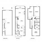

It’s Monday, July 12, 2010 on the Slow Home site and today we are analyzing townhouse projects in Vancouver. In today’s “What’s Wrong With This House?” exercise, we need you to review the floor plans for “Unit D” in the Navigator’s Cove project in Richmond, BC. This unit is 1,300 sq ft and has 3 bedrooms and 2.5 bathrooms as well as an attached 2 car tandem garage.

Use the Slow Home Test to analyze the floor plans and then post your score to the site as well as the 2 worst things that you think are wrong with this unit.

When you are ready, you can click on the player below to see how John and Matthew have scored this unit.

To see John and Matthew’s Slow Home Test score for this project, click on the link below.

Make sure to visit the site tomorrow because we will be doing another “Which House Should I Buy?” episode where we will be choosing between two different town house properties to see which is the better real estate choice!

  • Mid America Mom

    Good morning! How is the weather in Vancouver? Speaking of which- what will we find to be the norm for maximizing the often dreamed of and fleeting Vancouver sunlight in their townhomes?

    ******PLEASE CORRECT! the posted link is to Unit A and not the D Unit as you show and I assumed scored in the blog… ****

    Mid America Mom

  • Mid America Mom

    Did not find location ,enviro, or siting info.

    Loc 0
    Enviro 0
    Siting 0
    Org 0- the straight stair gives circulation through the kitchen and the use of the landing for laundry is odd.

    Entry – 0 No closet, light, and too narrow with too many doors.

    living 1 BEST thing in this unit. Light, access to outside and dining, no stair or weird angles.

    Outdoor 1

    Kitchen 0 wasted space

    Dining 1 this one was hard for me. It is long and if you keep the table to the right this could work.

    Bed 0 small ones are too narrow and the master is too small as well. we need at least 11 by 10.
    Bath 0 feel tight
    Study 1
    Laundry 0 on the stair landing? I think that is a first for my eyes during this project.
    Parking 1

    5/20

    Worst things. Too narrow to fit three bed and 2 baths upstairs as this should have 2 bed and 2 bath. Organization on the main floor.

    Mid America Mom

  • Terri

    M.A.M.,
    Weather is sunny and moderately warm in Vancouver today (20C). No more heat wave for this week.

    I agree with your assessment of Unit D, though I don’t want to give the dining space because it’s so much in the middle of traffic zone, and there’s no window near to the table.
    I’ll give living a point, though the living room patio doors are hardly enough to light all this space, especially on a rainy day. I live in a less rainy climate, with windows on east, south and west with a south-facing patio door in a shallow living space, and it’s still gloomy on the rainiest days.
    The kitchen has no work triangle and very little counter space.
    Laundry is located in a very awkward location–with a different stair run, it could have been where the powder room is, and closer to bedrooms.
    So…I give it 4/20.

    Worst thing about the plan is the long, narrow footprint, which causes all the other problems.

  • Grace Coulter

    0/3 Location – car dependant
    0/3 Environmental performance –Richmond has set out to be “ the most appealing, livable
    and well managed community in Canada”
    here is a link to the sustainability plan for the city of Richmond overall. Interesting initiative and I think some good things came out of the Olympic action in the area.
    http://www.richmond.ca/__shared/assets/Charting_our_Path21831.pdf
    Clearly this building is falling short of these goals.
    0/2 Siting
    0/2 Organization – I don’t like that the entry bottom is given up to the garage thus you must immediately take the stairs to get to the main space. Once you summit the stairs you are deposited in the dining room in the middle of the house which I think is problematic. In such a narrow layout the space needs to be organized better.
    0/1 Entry – This is an extremely poorly designed entry. The door swing from the garage blocks the hall completely when opned. There is no closet (except the washer dryer at the top of the stairs).
    1/1 Indoor Living – This is a fairly good space. Fireplace and open to the back with lots of light.
    1/1 Outdoor Living- a bit small but still could fit a small table out back
    0/1 Kitchen-much too much wasted space in the kitchen. The odd angles in here make the space much less functional and the floor area given to the kitchen could be better used with a different layout.
    0/1 Dining – This is in the middle of the house and is really not a defined space with access to light.
    1/1 Bedrooms-The angles are odd but overall the bedrooms are fine. Not exceptional but they are laid out with access to light and reasonable closets so I will give the points despite the weird door angles.
    0/1 Bathrooms – I think having a view on the outdoor porch straight into the bathroom is an issue.
    1/1 Study – default point
    0/1 Laundry- This is very poorly designed. At the top of the stairs? Personally I would trip and break my neck as i tried to carry a bunch of baskets full of clothes into this space.
    0/ 1 Parking- The space on this main level is devoted entirely to parking. The space could be better utilized and broken up so it was not merely all ambiguous parking down there. Why do you need two parking stalls???
    I guess because the area is so auto dependant….

    Total score is 4/20
    seems I am going with the crowd today. Although I may have to reevaulate my inital assement of the bedrooms. I think not having furniture in the rooms often trips me up because the spaces can look deceivingly large or small.

  • Kyle B

    Here is my Slow Home Test Score:

    1. Location = 1
    2. Environmental Performance = 1
    3. Siting = 2
    4. Organization = 2
    5. Entry = 0
    6. Indoor Living = 1
    7. Outdoor Living = 1
    8. Kitchen = 0
    9. Dining = 1
    10. Bedrooms = 1
    11. Bathrooms = 1
    12. Study = 1
    13. Laundry = 0
    14. Parking = 1

    Total Score = 13

    First, the home received a walk score of 35. Though this is very low I gave it the benefit of the doubt because the Navigator’s Cove Project website did say it was location near recreation and shopping.

    If this home is anything like new “cookie cutter” homes I know, there is no environmental performance. Again, I gave it the benefit of the doubt because the website said it had a “nice bright and sunny kitchen”.

    Other bad qualities: the entry has no closet to speak of, the kitchen has no work triangle, and the laundry work space is quite precarious at the top of the stairs.

    I was hesitant to give bathrooms the point because the powder room is really small with very little storage. However, I find it serves its purpose given there are private bathrooms upstairs. I’m not much of a fan of the garage. However, given that the family only has one car, the garage is good.

  • Kyle B

    After looking at the above comments it seems I am being too nice! If I did lean a little bit the other way (on those points I was wavering, that is, dining, bathrooms, and parking) I would give this home a score of 10.

    Where is the line drawn between giving a point and not giving a point?

  • Tara

    I couldn’t find a developer’s website for the development that would provide information about environmental features and siting considerations so it did not get the points on that.

    Location 0 – not walkable.
    Environmental 0 – no information.
    Siting 0 – no information.
    Organization 2 – circulation is typical of townhouse design and is not wasteful or overly complex.
    Entry 0 – horrible entry for both residents and guests. there is not enough space at the base of the stairs to remove coat and shoes and the only closet to put them in is up the stairs.
    Indoor living 1 – living space is a good size and shape to accomodate furniture grouping well.
    Outdoor living 0 – decks are much too small or narrow to be very useful.
    Kitchen 0 – kitchen is not great with all the appliances in a row and there is very little workable counter space.
    Dining 0 – the space is too large and would inevitably have a lot of wasted space.
    Bedrooms 0 – master is a good size and shape, though I don;t like the placement of the closet. the secondary bedrooms are very narrow and the bumpout in bedroom 2 would make it difficult to furnish.
    Bathrooms 0 – not enough storage, though the bathrooms are modest.
    Study 1
    Laundry 0 – having the laundry at the top of a flight of stairs seems very hazardous to me, especially considering there is not much room there.
    Parking 0 – Parking dominates the main level of the house which contributes to the horrible way guests and the residents enter the house.

    4/20

  • Grace Coulter

    Kyle B,
    I struggle with this myself but I have learned from watching Jonh and Matthew as well as others on the site that with homes that are “border line” it doesn’t serve best to give them the point more often than not. Trust you design sense and if you seem something amiss make note of it. I think the point of this social experiment should be in part to stop accepting poorly designed houses all together not letting things slip by. I began grading houses quite easily when i started on this site and over time have toughened up significantly. The reason why we would consider the small details like angles, kitchen “triangles” and closet space is because the little details often define the spaces and determine their sucess or failure overall. My advice would be to be citical. If you initially think something is amiss and look at it closer, usually you will find it leads to larger problems in the overall design. This way only the very best designs will make it into the slow category.

  • Franco

    Good morning from the Okanagan everyone, hope we all had a good weekend.
    Here is my review of Unit A.

    Plan A-Navigator’s cove
    Square footage 1300

    Location-0
    Environmental performance-0
    Sitting-2 although the design could be improved, I found that there was a decent amount of siting space and that it could hold a good number of guests comfortably
    Organization-0 I found the layout of the main level difficult to move in, with many impediments to natural traffic flow. I also found the bathroom so far from the living area was another strike against the plan’s organization
    Entry-0 also zero here, the entry from the basement/garage level seemed cramped and awkward. This entry had no closest and the access to the garage seems in the way. Overall I found this space to be too small.
    Indoor living-1 although it may be a bit difficult to place furniture in e living area, I thought that with an appropriate corner tv unit, one could have a fairly usage indoor living space
    Outdoor living-0 I don’t like the 2 decks, I find both are too small to do much with. I would have preferred to see one larger deck
    Kitchen-0 I gave the kitchen a zero, as the appliance layout seems awkward and too linear. 
    Dinning-1 although one enters the main floor into the dinning area, overall i found the space to be a good size and proportion for the space
    Bedrooms-1 overall I thought the bedrooms were of a good size, with adequate closet space. That one bedroom in the rear of the unit with the jog may provide some difficulty in terms of organization, but does provide a nice location for a bedroom desk/work station
    Bathrooms-0 although the unit has 3 bathrooms, only the full bath on the upper level is well laid out. The powder room on the main floor is in a poor location. In the ensuite, the door opens onto the tub, and the sink is near the tub and could possibly be a problem
    Study-0 I gave this unit a zero as there is no specific study area, albeit one if the bedrooms may be utilized as a study/ office
    Laundry-0 the washer/dryer is in a poor location, with a lot of traffic and there is not enough room in front of the washer/dryer to work. Having laundry at the top of a set of stairs is an accident waiting to happen
    Parking-1 although I am not personally a fan of single tandem garages, I gave this unit a 1 as it dies have parking for 2 vehicles

    This gives be unit a score of 6

    My two largest complaints with this unit are organizational issues of the main floor:

    1) I strongly dislike the entry from the basement as I mentioned earlier I find it is too small and too cluttered on the garage level. Compounding to that the main floor entry near the dinning area, makes for a townhouse that will be difficult to entertain in and functionally awkward.

    2) The location of the bathroom in relevance to the living area on the main level is the second problem spot I noted when reviewing the plan. Considering the size of the kitchen and the poor traffic flow to begin with within the unit, I think accessing the bathroom off the kitchen will make for awkward visits. I also dislike that the bathroom is up 2 stairs, everything else on the main floor is without height transitions, so going up two stairs for the washroom seems as if the powder room was an after thought in planning.

  • ReneP

    1. 0/3 Location – walk score 35 = car dependent
    2. 0/3 Environmental- nothing listed
    3. 0/2 – Siting – siting plan not so nice. Some of the units have almost no space behind.
    4. 0/2 Organization – In general, the ‘like’ spaces are laid out as usual, but the living room seems to be the only space that was well designed. Things could have been done quite a bit better with slow design.
    5. 0/1 Entry – No closet and garage entry door interferes with and already tight space.
    6. 1/1 Indoor Living – Light and access to the deck and the focal point fireplace make this a good design.
    7. 1/1 Outdoor Living- narrow, but workable.
    8. 0/1 Kitchen-wasted space and no appliance triangle.
    9. 0/1 Dining – No light and not clearly defined space at all.
    10. 0/1 Bedrooms- the two back bedrooms really got squeezed in. Perhaps on nice bedroom and a nice study would have worked better.
    11. 1/1 Bathrooms – Although the powder room is really poorly placed, the bathrooms on the upper floor make good use of space in my opinion, so 2 out of 3 made me give this a point.
    12. 0/11 Study – n/a
    13. 0/1 Laundry- Poor placement. This should have perhaps been better suited to be the entrance closet, and the laundry put on the top floor where all the bedrooms are.
    14. 1/ 1 Parking- Poor walkability means two cars may be needed, and given the long narrow space, tandem garage is the only solution.
    Total 4/20
    For me, the two worst design elements were the laundry location, and the kitchen design. Again, I think the laundry could have been much better situated on the level that contains the bedrooms (and all the clothing and bed linen); and the kitchen, as mentioned, suffers from wasted space and no appliance triangle.

  • sdokter

    1. Location = 0/3 – car dependable
    2. Environmental Performance = 0/3
    3. Siting = 2/3
    4. Organization 1/2 – I like the space between the living room, kitchen, and dining room. The upstairs could be better organized better.
    5. Entry = 0/1 – Barely a closet in front and has very little space
    6. Indoor Living = 0/1
    7. Outdoor Living = 1/1 – The use of 2 decks is excellent.
    8. Kitchen = 0/1 – It does not follow the triangle format.
    9. Dining = 1/1
    10. Bedrooms = 1/1 – like the en-suite feature for the master bedroom
    11. Bathrooms = 0/1 – find them too close together for the upstairs layout
    12. Study = 0/1 – no study
    13. Laundry = 1/1 – like the position of the washer/dryer. It is out of the way and maintains space between living and dining room
    14. Parking = 1/1

    Total Score = 8/20

    The bad qualities I recognized involved the kitchen and lack of environmental performance aspects. I though the kitchen could have utilized the triangle method and put in a island to assist with that. Also, in this present time, it is necessary to have environmental aspects within a new home. Since this is absent in Unit A, it is a negative home and is hurting the environment.

  • Tayler

    I would just like to point out that floorplan image from this site is different than the one in the link provided.

  • Tayler

    So… I’m assuming we are evaluating Unit A as said, and as shown on the link.

    First off, thanks to Grace’s advice to Kyle B, I think I’m going to maintain a more rigid grading when it comes to the rest of the weeks.

    1. Location: 0.5/3. A decent place to be in general, but not walkable.
    2. Environmental performance: 0/3. I can’t find anything upon which to evaluate this. If they were making efforts to be sustainable it would have been available information.
    3. Siting: 0/3. Looking at photos of the complex makes me cringe.
    4. Organization: 0/2. Seems very cut up. The bathroom is really far from the rest of the house. I wouldn’t like to walk that far.
    5. Entry: .5/1. Removed from the rest of the house but rather small.
    6. Indoor Living: 0/1. Just way too choppy of a floor plan.
    7. Outdoor Living: 1/1. Deck size is nice.
    8. Kitchen: 0/1 Seems like they could have used this space in a more effective manner.
    9. Dining: 1/1. Gets some nice natural light.
    10. Bedrooms: 1/1 Nice that the master bedroom is removed from the rest of the bedrooms
    11. Bathrooms: 0/1 The main floor bathroom is just too far from the rest of the space.
    12. Study. 0/1 no study unless you use a bedroom as one.
    13. Laundry: 0/1. Speaking from experience, a washer and dryer should never be on the upstairs floor in case of a flood. I will ALWAYS make sure it is not on the top floor from now on.
    14. Parking: 1/1. Ample room for parking.

    Total Score: 5/20.

    This is just way too cut up with too many stairs. The bathroom location is awful and the laundry room really gets to me.

  • Grace Coulter

    Tayler, interesting comment about not putting Laundry on the top floor. In a condo with bedrooms on the top I had always considered it desirable to have the units as close to the bedrooms as possible to avoid climbing with baskets but this comment makes alot of sense. Our apartment flooded from the washer and ruined some hardwood and leaked downstaris which really sucked. Perhaps the basement is best for these types of things given that flooding is a good probablity at some point. I would be interested to hear what Matthew and John and everyone else have to say about this?

  • Mid America Mom

    FYI the unit to be scored is D (not A) which is NOT linked as of this moment.

    Mid America Mom

  • Tayler

    Alright… sorry for reviewing A. Here’s my score for D:

    1. Location: 0.5/3. A decent place to be in general, but not walkable.
    2. Environmental performance: 0/3. I can’t find anything upon which to evaluate this. If they were making efforts to be sustainable it would have been available information.
    3. Siting: 0/3. Looking at photos of the complex makes me cringe.
    4. Organization: 1/2. I like that the living room is at the back of the house, but this floor plan is (like A) very cut up because of the many levels. I’ve lived in a condo like this and I will speak from experience that I didn’t like it. Also, it seems tedious to walk through every room of the house on the main floor to get to the stairs.
    5. Entry: .5/1. Removed from the rest of the house but rather small.
    6. Indoor Living: 0/1. Just way too choppy of a floor plan, and their is a lack of natural light.
    7. Outdoor Living: .5/1. Deck size is nice. But will you really use two different decks on the same floor? It would be different if the front deck was off the master bedroom.
    8. Kitchen: 0/1. I feel like the kitchen wouldn’t be used as much because it is so removed/cut off from the living area. Maybe that is just me though? Also, all the appliances are in a line, not the “triangle”.
    9. Dining: 0/1.
    10. Bedrooms: 1/1 I like the location at the front of the house but it could have had more windows.
    11. Bathrooms: 0/1.
    12. Study. 0/1 no study (unless you use a bedroom as one).
    13. Laundry: 0/1. Right at the foot of the stairs?
    14. Parking: 1/1. Ample room for parking.

    Final Score: 4.5/20
    I really don’t like the idea of walking around the entire main floor to go up the stairs (if I am reading the floor plan correctly, still new at this). Also the kitchen isn’t laid out in a triangle.

  • Tayler

    Grace,
    I may be biased because most of the time my laundry room has flooded (three times) it was because of the freezing temperatures in Calgary. In Vancouver, I doubt this would be an issue but I personally really wouldn’t take the chance again. I have also had a laundry room in a basement before too, and it was a bit of pain in the butt to carry it upstairs. However, I’d rather that than a flood ruining two separate floors. I’m interested in knowing what John and Matt and others think about this too.

  • Ashley P

    Location – 0
    Environmental Performance – 0
    Sitting – 0
    Organization – 0
    Entry – 0
    Indoor Living – 1
    Outdoor Living – 1
    Kitchen – 0
    Dining – 0
    Bedrooms – 0
    Bathrooms – 1
    Study – 1
    Laundry – 0
    Parking – 0

    I am not too sure if I was too critical on this floor plan but it only scored a 4 on the Slow Home Test of me. The only points it received were for a study (that didn’t exist), indoor living, outdoor living (very cramped) and bathrooms (which was stretching it due to the odd location of the main floor bathroom but other two had good location and organization so I gave it to them). The first issue I noticed was with the entry. It was not only extremely cramped but also there was no closet. Also the layout of the kitchen doesn’t allow for very much counter space and kind of creates a dead space near to the back. The master bedroom seems to be sufficient but the other two bedrooms are more like one bedroom forced into two separate rooms. Also the washer and dryer location doesn’t seem to be very functional. Overall I think this layout is pretty poorly planned and not in the greatest location (car dependent).

  • Andrew

    6/20

    1. 0 – car dependent
    2. 0 – no mention of environmentally friendly features
    3. 1 – this house doesn’t really respond to much, it’s merely a part of a uniformly segmented building with a street in the front and a small green space in the back. the site map and the rendering on the Navigator’s Cove website look alright and it appears that the decks have good privacy from one another.
    4. 1 – there are certainly issues with individual spaces but overall like-rooms are grouped together by floor and the circulation is straight forward. connections with the outdoors is lacking, though.
    5. 0 – not a good entry, no closet space and you immediately have to walk up the stairs
    6. 1 – living space has an ok connection with the outdoors, could definitely benefit from a couple more windows.
    7. 1 – narrow deck but usable
    8. 1 – good kitchen size
    9. 0 – dining space is poorly defined and a table in this area could interfere with circulation
    10. 0 – for their size, all the bedrooms have poor natural lighting
    11. 1 – good number of bathrooms, even though there is no storage
    12. 0 – no study
    13. 0 – this is probably the worst location for a laundry space that I have ever seen in a floor plan.
    14. 0 – the garage completely consumes the ground floor.

    One of the biggest issues I have with this house is the total lack of window area. You’d think that the designers would try and utilize the biggest windows possible here since the units are so long and windows are not a possibility along the shared walls. Every floor of this house would be almost entirely dependent on artificial lighting. Maybe there was a privacy concern since these units are so close to one another but I still think there could have been much larger windows along the front and back.

    Also, another major problem is that the garage takes up essentially the entire ground floor. This space could have surely been used more effectively.

  • Therese

    1) Location: 0
    2) Environmental: 0
    3) Siting: 0
    4) Organization: 1- Some parts are decent such as the main floor but I’m not a huge fan of the second floor. The entries for the 2 bedrooms look incredibly awkward.
    5) Entry: .5- There is a defined entry, but I don’t like how the jacket closet is all the way up the stairs in the kitchen and thus completely removed from the entryway. It is also a bit small for in proportion to the townhouse in my opinion.
    6) Indoor Living: .5- The organization is again decent on the main floor, but there isn’t too much natural light that can get in there.
    7) Outdoor Living: .5- Two decks provide the opportunity for much outdoor living and are easily accessible but both would not be large enough to accommodate any sort of furniture grouping.
    8) Kitchen: .5- Doesn’t have much work space and the work triangle is actually a line.
    9) Dining: .5- It can, but it’s so jammed up with everything else it’d be down right unpleasant to use.
    10) Bedrooms: 1
    11) Bathrooms: 1
    12) Study: 0
    13) Laundry: 0- Wouldn’t it be annoying if you were trying to leave and someone was doing laundry at the same time. It’d take some acrobatics to work out how to get around each other.
    14) Parking: 1

  • Therese

    Oops, forgot to tally everything up. My total was 6.5 out of 20.

  • frazer

    Unit D: total 4/20

    1. Location: 0/3.
    2. Environmental performance: 0/3.
    3. Siting: 0/3.
    4. Organization: 0.5/2 They crammed a lot of stuff in for the space and orientation of the building, its hard to work with narrow units like this…
    5. Entry: 0/1. Door swing issues, also very small and disconnected
    6. Indoor Living: 0/1. Too spread out, not very original/creative
    7. Outdoor Living: 1/1.
    8. Kitchen: 0/1 tight circulation and spread out
    9. Dining: 1/1.
    10. Bedrooms: 0.5/1 Both secondary bedrooms are cramped
    11. Bathrooms: 0/1
    12. Study. 1/1
    13. Laundry: 0/1. Isolated laundry and hard to access
    14. Parking: 0/1. Not enough clearance on sides for parking

    Just a quick note on laundry. I feel that mechanical failure should not determine the location of appliances if it sacrifices its utility. Build in preventative measures even if they are non-conventional…eg. water catch basin under the washer, linolium with built up wall edges and a sloped floor with a drain, etc.)After all, shouldn’t our appliances be close to the areas where they are needed?

  • Jamie L

    1. Location = 1
    2. Environmental Performance = 1
    3. Siting = 1
    4. Organization = 0
    5. Entry = 0
    6. Indoor Living = 0
    7. Outdoor Living = 1
    8. Kitchen = 0
    9. Dining = 1
    10. Bedrooms = 0
    11. Bathrooms = 1
    12. Study = 0
    13. Laundry = 0
    14. Parking = 1

    Total Score = 7

    -First of all the house is located in the tight space in the back also in the front
    -Long narrow unit hallway and organiation is not good
    -entry is too small and there are no closet
    -Kitchen is not bad, but it has large used space
    -Dining is too big and since there are no window it could be dark
    -The worst part was the upststair’s two bedroom and the two bathroom, I dont like they put the room right beside each other and how the two bathrooms are located it’s awkward. Also the lond-narrow rooms are hard to furnishing.
    -on the ground floor, the garage is too tight, not enough room to get into the car.
    -house needs more windows get light

  • BradW

    Grace – having the laundry on the top floor is not a problem as long as it is installed correctly – usually this means having a least floor drain under the unit – better would be also include a pan to contain the flood while it drains

    Improving housing design (the Slow Home mantra) is very important but build quality can greatly influence the livability of a space. Think about things like drafts, water leaks, cracking tiles, mold, etc. These can be serious and expensive problems in even the best designed homes. On a positive note, I do believe that good design leads to good build quality.

  • nicole

    Score of 4, but for a different reason.
    1- Location 0
    2- Environmental Performance 0
    3- Siting 0
    4- Organization 0
    5- Entry 0
    6- Indoor Living 1
    7- Outdoor Living 1
    8- Kitchen 0
    9- Dining 0
    10- Bedrooms 0
    11- Bathrooms 1
    12- Study 1
    13- Laundry 0
    14- Parking 0

  • JPod

    1. 0.5/3 Location – with a walk score of 35, you are basically car dependent, but it does say that there will be some shops close-by, and I think that even if you are able to walk to a local corner store to get milk, it does deserve a half of a point
    2. 0/3 Environmental – There is no information on the environmental aspects of this project

    3. 1/2 – Siting – Though some units do have some space outside, many of them have virtually none, with most backing into other units, and looking out to the garages of the neighboring units. It’s not the greatest but it isn’t the worst either

    4. 0.5/2 Organization – The organization in generally OK, however, as mentioned in the clip, the living room is the only room that has been well designed, so I have given it a half point for that.

    5. 0/1 Entry – The entry is lacking a closet and has the door going from the house into the garage swinging into the entrance way.

    6. 0.5/1 Indoor Living – Decent.

    7. 0.5/1 Outdoor Living – Decent

    8. 0/1 Kitchen – A lot of wasted dead space and it lacks an appliance triangle.
    9. 0/1 Dining – No natural light, and acts more as a traffic space between the kitchen and living room.

    10. 0.5/1 Bedrooms – The two bedrooms in the back are seriously lacking, how would you squeeze in furniture to make these spaces livable?

    11. 0.5/1 Bathrooms – Decent.

    12. 0/1 Study – There is no study, but I’m sure one of the small bedrooms could be used as one if not needed for a bedroom space

    13. 0/1 Laundry- Poor placement.

    14. 1/ 1 Parking – with a large garage there is space for parking and storage as well.

    Total 5/20

  • Amanda

    1. Location = N
    2. Environmental Performance = N
    3. Siting = N
    4. Organization = N
    5. Entry = N
    6. Indoor Living = Y
    7. Outdoor Living = Y
    8. Kitchen = N
    9. Dining = Y
    10. Bedrooms = N
    11. Bathrooms = N
    12. Study = N
    13. Laundry Y N
    14. Parking = N

    Total Score = 4 = Fast

    The worst thing about this town home is the shape of it. The home is too narrow and this makes the placing of the bedrooms and everything else awkward and cramped. The second thing that I hate is the garage. I do not like having two cars parked in line with each other, they should be beside each other. If the car at the back needs to get out first there is only one ext and so the car behind needs to be moved.

  • bstone52

    Here’s my evaluation:

    Location: 0 – poor walkscore and highly auto-dependent
    Environmental performance: 1
    Siting: 1
    Organization: 2 – Rooms and space are defined clearly
    Entry: 0 – Just a door, uncomfortable alienating feeling, no integration with the rest of the townhouse
    Indoor Living: 1 – good natural light, hard to not give the point but easily critiqued
    Outdoor Living: 0 – might not be able to fit furniture there, very cramped space and discourages use.
    Kitchen: 0 – Lots of wasted space and the number of seats at the breakfast bar is too limited.
    Dining Room: 0 – Could be much smaller, confusing as to which area should be used for which with the living room and dining room
    Bedrooms: 1 – enough natural light, decent size minus the diagonal door which can hit the bed almost
    Bathrooms: 0 – Bedroom bathrooms are alright, but the kitchen bathroom is in the most odd place, right where you are cooking food and entertaining guests! seclusion and privacy are lacking.
    Study: 1 – not mis-labelled
    Laundry: 0 – Conflicts with hallway use; would be uncomfortable and borderline dangerous with proximity to staircase
    Parking: 1 – I like the amount of space, but don’t like the amount of natural light; much more is needed.

  • ReneP

    frazer. I could not have said it better:
    i.e.Just a quick note on laundry. I feel that mechanical failure should not determine the location of appliances if it sacrifices its utility. Build in preventative measures even if they are non-conventional…eg. water catch basin under the washer, linolium with built up wall edges and a sloped floor with a drain, etc.)After all, shouldn’t our appliances be close to the areas where they are needed?

    Why not have the dishwasher in the basement then also? Appliances should be in the proximity where they are most convenient!

  • Grace Coulter

    Thanks everyone,
    I agree with the comments about the washer/dryer in general. Taylor and I are clearly biased because of experience but it does make the most sense achieve peace of mind through good design and located the facilities in the most logical place (near the largest source of laundry). cheers

  • Kcull

    1. Location = 1
    2. Environmental Performance = 0 Nothing mentioned on the web site
    3. Siting = 2
    4. Organization = 1 The long and narrow layout create problems with organization
    5. Entry = 0
    6. Indoor Living = 1 best space in the house, defined with good natural light
    7. Outdoor Living = 1 It is somewhat small however it does serve its purpose
    8. Kitchen = 0
    9. Dining = 1
    10. Bedrooms = 1
    11. Bathrooms = 1
    12. Study = 0 Not adequate for anything longer then a half hour or so
    13. Laundry = 0 On the landing, very odd!
    14. Parking = 1 good space but add entrance into the house

    Total Score = 10

    The developer simply tried to put the most amount of real estate onto the available land. It created odd shaped houses with inadequate outdoor living spaces. A more thought out development plan would have gone a long way towards slow houses.

  • Daniela M

    Location – 0
    Environmental Performance – 0
    Sitting – 0
    Organization – 0
    Entry – 0
    Indoor Living – 1
    Outdoor Living – 0.5
    Kitchen – 0
    Dining – 0
    Bedrooms – 0
    Bathrooms – 1
    Study – 1
    Laundry – 0
    Parking – 1

    Score: 4.5/20

    In my opinion, the two worst things with this unit are:

    1. The entry way. Although it seems as though the large majority of the issues with this design can be traced back to its orientation (very long and narrow), I found this to be one of the biggest design elements. The entry way doesn’t have any utility at all as it lacks a closet, but it also doesn’t provide a welcoming feel to the townhouse. It’s far too crowded and simply isn’t appropriately scaled to the house.

    2. Additionally, I would rank Bedroom #1 and Bedroom #2 as the second worst design element as I believe trying to fit two bedrooms in that space harmed the design more than the incremental benefit of having an additional bedroom. Not only is the layout quite awkward with the 45 degree entries and the notch on Bedroom #2, but the extremely long and narrow dimensions vastly decrease the utility of the spaces. The rooms, especially Bedroom #2, wouldn’t be able to comfortably fit the basic bedroom furniture (bed, dresser, and night tables).

    Also, I only gave the design half a point for outdoor living space as although they made the effort, I think the overall design of this complex renders this space much less useful than it could be as the outdoor living space would be less likely to be enjoyed in such close proximity to neighbours and views looking onto other townhouses.

  • Joshua

    Due to it’s poor design I will comment only on the aspects that got points, followed by the 2 worst elements.

    Indoor living: The living room has plenty of space for different furniture arrangements as well as access to the balcony, without being a major thorough fair.

    Outdoor living: The deck off of the living room is nice enough and although the one off the kitchen is small it is better than nothing.

    Bathroom: Both bathrooms upstairs are proportional size and good access. The powder room does have a few issues but overall the bathrooms are decent.

    Study: Gets the point for being honest.

    Parking: Often if town houses it is difficult to have parking for two vehicles, if the family needs this room then it is possible to use it. However with a large window at the back of the garage, it could also be used for one car, with a rather nice, work area. (I guess that is the builder in me)

  • Joshua

    The two worst parts:

    The kitchen is terrible, not enough counter space and no working triangle. These are the two most important aspects of kitchens along with storage which is decent.

    Laundry: I agree with most everyone that at a landing with no room to hang closes, or use the space at all, it is miss placed and would be difficult to use.