Examining Townhomes In Chicago

This is Day 216 of the Slow Home Project and we need you to join us in our quest to evaluate the design quality of houses in nine North American cities in nine months.

Today is Monday, August 23, 2010 and we are starting our second week in Chicago – this week focusing on town house design!
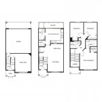
For today’s “What’s Wrong With This House?” episode, we need you to study the floor plan and website of the “Camden 7142“, a 1,728 sq ft townhome in the Chicago Ridge community. Developed by the Lennar Corporation, this unit has 3 bedrooms, 2.5 baths and a double attached garage.

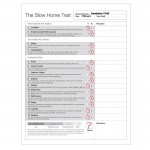
We do not think this unit is very well designed – in fact, we think it has a lot of significant problems. We need you to use the “Slow Home Test” to score this unit and then post a comment to the site telling us what you think is the worst design element of this plan!

When you are ready, click on the player below to watch John and Matthew’s review of the “Camden 7142″.

Join us tomorrow for our “Which House Should I Buy?” episode where we are comparing two different townhomes to see which would be the better real estate purchase!

  • Mid America Mom

    I am not familiar with Chicago Ridge but considering its distance to the city I can guarantee this is infill development. This is not farm country.

    Loc 0 (60 walkscore – 70 is what I think is a threshold)
    Enviro 0
    Siting 0 (if you look not at the address but the cross streets – this backs to the local rail commuter line! – those in Toronto can think they are GO trains).
    Org 0
    Entry 0
    Living 1
    Outdoor Living 0
    Kitchen 0
    Dining 1
    Bedroom 0
    Bathroom 0
    Study 1
    Laundry 1
    Parking 1

    Total 5

    Worst part of the plan is that top floor. The zig zag hall, tight second bath, and angled bedroom walls/entries. Surprise! I know this plan from years back. The usually offer a two bedroom version of this plan and it has a better bedroom floor design.

    Mid America Mom
    As of Sept 1 living in Chicagoland again.

  • Terri

    I came up with the same score as John and Matthew with one slight difference. I gave the dining 0. I feel that eating in the kitchen is too tight and the dining room too dark, and though the space is adjacent to the kitchen, it seems too cut off.

    I feel the angled hallway and doorways upstairs is the major design flaw in the plan. It causes too many problems with all the rooms up there. As John says, the angled doorways are illusions to space (especially the way those door swings are shown). The family bathroom could have used the wasted space from that bedroom behind it.

  • Terri

    M.A.M.,
    What synchronicity that you’re planning a move to Chicago right as we analyze the city for the Slow Home Project. Will any of the Slow Home research be helpful in finding your next home?

  • Terri

    I want to change my mind…
    There are several problems with this plan, but now I’m saying the outdoor living is the very worst element because people buy townhouses to have a little bit of space, and here we have a balcony facing the parking and everyone else’s balcony across the parking lot when–with a reversal of elements in plan–they could have been facing into green space. (Well, maybe not the outside units on the street sides). In this plan it’s difficult to access the balcony; the balcony is cut off from the living space; and the entries which face the green space are not big enough to sit on. This seems like terrible planning, IMHO.

  • Mid America Mom

    HI Terri. Thanks for bringing that up. I am looking forward to using the slow home test for my next space! We had offers stay at two places and it is furnished (YEAH!).

    It should be temporary. BUT the builder is still offers that model of home and I will post it later.

    Mid America Mom

  • Steve in Van

    [img]camdenkitch.jpg[/img]

    This developer special deserves a very low SH score, though I’d give it a point for the kitchen — it’s workable despite it’s deficiencies. A free-standing island / breakfast bar (rather than a table) would help.

    Biggest problem: organization of entire top floor. Yes, it’s the angled hallway, tiny bathrooms, and small bedrooms at back. Also note the swinging door into the master WIC and the wasted open space overlooking the stairs. The entire floor is design-challenged.

    And if the plan itself isn’t enough to take you back, here’s the low-tech sales video: http://www.youtube.com/watch?v=d1v0jj_0LHY

  • Grace Coulter

    Location – 1.5 close to transit but poor walkscore
    Enviro performance – 0
    Siting- 0 the parking in the back consumes all the space. Normally I advocate for driveways not dominating the front however I think this is true for the back space as well.
    Organization- 0 the townhouse is always tricky but this home could be drastically improve by reorganizing the location of uses on the main floor.
    Entry- 0 we have seen a lot of these sorts of entries in various cities
    Indoor living- 1 good outdoor connection and I think the family room would be a very suitable office space as well.
    Outdoor living- 0 way too small and the ground level back space is taken up by the garage.
    Kitchen-0 I think it would b hard to put a table in this space because the left needs to be preserved for circulation
    Dining— 0 very poor location with not connection to a window.
    Bedroom 1 while I dislike the angled entrances there is enough space to put beds and there is sufficient closet space. In addition there is a connection to an outdoor view in each to the back or front.
    Bathroom 0 –the powder room opens to the kitchen and dining room while the upstairs main is very awkward because of the angled wall
    Study- 1
    Laundry 1 bit odd for allocation but it works here
    Parking -0 the back space is essentially a parking lot¬

    5.5

    worst part of this home is the washrooms while the best is probably the living room.

  • MollyK

    Been away a while but glad I stopped in today.

    Steve in Van,
    The video is worth a thousand words…where’s the disco ball? It really helps to put the design in perspective. As soon as I saw the picture of the kitchen you provided I noticed the lack of lights. Did you notice there are only 2 overhead lights? I know from experience that they will not provide adequate task lighting that is so essential when prepping and cooking. There doesn’t appear to be any undercabinet lighting either. Depending on the siting of the unit there may be little to no natural light to help out the kitchen. Thanks for finding the video.

    Terri,
    The dining room is frustrating. It appears to meet the test criteria but when you consider its use in everyday life the space falls flat. It’s uninviting, tucked away in the corner. I have a feeling the dining table will be a catch-all for books, magazines, keys, etc. This space is a good example of how something may “score” on paper but not “score” in real life application.

  • frazer

    Location 3
    Environment 0
    Siting 0
    Organization 0
    Entry 1
    Indoor living 0
    Outdoor living 1
    Kitchen 0
    Dining 0
    Bedrooms 0
    Bathrooms 1
    Study 1
    Laundry 0
    Parking 1

    Total 8

    The deceiving angles and wasted space make this a poor design but most of all the placement of the kitchen and the way it kills the overall living quality of the interior of the house. It’s very disappointing to see how the designer completely missed out on the opportunity to connect the principal living spaces by having a more open concept. In my opinion the design as it stands would seriously negatively affect its inhabitant’s quality of life.

  • Andrew

    Total 13/20

    1. 3/3 – Somewhat walkable
    2. 0/3 – no mention of environmental features
    3. 0/2
    4. 2/2 – not sure why this house isn’t getting points for organization. the odd angles in the top floor seem a bit unnecessary and there is a bit of wasted space on this floor but the rest of the layout in the townhouse seems entirely functional, like spaces are grouped together and nearly all of the principal spaces have a good connection with the outdoors. I’m at work right now and can’t watch today’s video so I will have to watch it when I get home.
    5. 0/1 – better than a lot of townhomes but still not a very good entry
    6. 1/1
    7. 1/1
    8. 1/1
    9. 1/1
    10. 1/1
    11. 1/1
    12. 0/1
    13. 1/1 – nice to see a private yet accessible laundry space in a townhouse
    14. 1/1

    It’s nice to see the garage at the back of the house and the entrance isn’t nearly as bad as we have seen in many North American townhomes. Also, the family room on the first floor gets plenty of natural light and doesn’t look as desolate as similar rooms in the bottom floor (often labels ‘flex space’ or ‘rec room’).

  • nicole

    Score of 7 but for different reasons
    1- Location 0
    2- Environmental Performance 0
    3- Siting 2
    4- Organization 0
    5- Entry 1
    6- Indoor Living 1
    7- Outdoor Living 0
    8- Kitchen 0
    9- Dining 1
    10- Bedrooms 0
    11- Bathrooms 0
    12- Study 1
    13- Laundry 0
    14- Parking 1

    _gave it points for siting, but not for location
    _laundry location is terrible
    _utility should be near the garage
    _kitchen is in prime location, but not utilized efficiently
    _best part of the town home is that it is located in the developed area of the city, the worst part is the under utilization of the ‘rear’ of the house. (where the mbr and the living area should be).

    Steve – thanks for the link – just confirms that this is not a place for me.

  • Andrew

    Well today’s video made the low scores a lot more convincing. I can see how the kitchen is problematic and how it really breaks up the second floor.

  • Andy B.

    Total: 7
    Location, Environmental, & Siting: I’ll go with John and Matthew on these, since I can’t add much.
    Organization: 0. The top floor twists and the utility room off of the kitchen are the big problems here.
    Entry: 0. Contrary to the video, the plan does have closets – one under the stairs (rarely makes a good coat closet) and one at the top of the stairs facing the dining room (too far away and oddly deep – I see why, but it’s very weird). They’re still bad entries though. (Aside: It might just be the way the plan is drawn, but won’t the one closet door fold directly against the wall and scrape it?)
    Indoor Living: 1. The best part. (Aside: Why’s there that cut-out in the upper right corner of the family room? I assume there’s pipes or ductwork there, but why *there* and not the garage?)
    Outdoor Living: 0. Small and has a terrible view. And why’s that one end sectioned off? Is there an AC unit there we’re not being shown?
    Kitchen: 0. Terrible. If you put a table there and leave room to get to the porch, it’s too crowded, but if you don’t it’ll be too empty.
    Dining: 0. Iffy, but I’ll say bad. What do you line up the table against? The kitchen pass-through? That’ll leave that wall corner in the way. The alcove that the doorway creates? That’s better, but still leaves the pass-through off-center, which may annoy some people (including me).
    Bedrooms: 0. The 45-degree angles are the problem here. The door swing in the master closet also interferes with using the rack.
    Bathrooms: 0. The powder room and master bath are fine (the master bath is pleasantly average, rather than supersized), but the point goes out the (nonexistent) window (Aside: Can’t we put a tiny window in bathrooms please?) with the useless family bath. The designer *could* have taken a full chunk out of the master bedroom (which wouldn’t have reduced the usable floor space any) and moved the hall a bit to make a usable bathroom, but NOOOO!!!
    Study: 1. This plan doesn’t need it. It’s cramped enough already.
    Laundry: 1. The room is fine where it is. It’s the utility part that’s the problem.
    Parking: 1. No issues here.

    Worst part: Probably the family bath. The location of the outdoor living space and the kitchen are definite contenders though.
    Best part: The indoor living. It’s the one thing they could easily have messed up and didn’t, so I’ll congratulate then on that at least.

  • Terri

    MollyK,
    Nice to see you return to the site! When I saw Steve in Van’s video of this unit with that pass-through I thought it allowed a little more connection between dining and kitchen; but as Andy B. points out, it may still be inadequate as a dining space.

    AndyB.,
    You make many good points in your post. I just wanted to address the one about windows in bathrooms. This is a townhouse, so these bathrooms adjoin other units.

  • Andy B.

    Terri,
    Thanks. Yeah, I kind of got too focused on the plan and forgot some of the context. I still hold on to the lack of bathroom windows in general as a pet peeve though, as irrelevant as it is to this week’s theme.

  • Tiffany

    1 – 3; okay walk score and reuse of site
    2 – 0
    3 – 0; green spaces are not well laid out
    4 – 0; worst part
    5 – 0; no closet
    6 – 1; good connections
    7 – 0; over parking area not green space
    8 – 0; disconnected
    9 – 0; bad connection to light and to kitchen
    10 – 0; door angles are a magor problem
    11 – 0; angled wall is a problem
    12 – 1; default
    13- 1; speaking from experience it is a convient location to do laundry while you are doing other daily tasks
    14 – 1; 2 cars is reasonable and the other side of the lowest floor is still functional

    total:7

    The worst part is the organization of the upper space, way to much wasted space by attempting to fit in too much.

  • Tara

    1. Location 3 – I think its pretty good for a suburban community.
    2. Environmental Performance 0
    3. Siting 0 – I’m not convinced by the site plan – I think the roadways would be dominant around the units, rather than the green spaces they have tried to make dominant in the site plan.
    4. Organization 0 – Main floor is basic, but the top floor’s angles and long hallway wreck it.
    5. Entry 0 – Garage entry
    6. Indoor Living 1 – I think the living spaces are okay – good, basic shapes and easy to furnish.
    7. Outdoor Living 0 – Balcony is very narrow and I don’t think it would be that functional. It’s also looking over a parking lot which is obviously not ideal.
    8. Kitchen 0 – I think the kitchen would work much better with a centre island with seating. I don’t think that this townhouse is really well suited for dual dining table areas.
    9. Dining 0 – Didn’t give it the point because I don’t like the inherent second dining space
    10. Bedrooms 0 – Awkward angles, master closet is very cramped.
    11. Bathrooms 0 – Angled entrance to second bath upstairs is so dumb and would leave very little space to get in and shut the door behind you. Powder room is also not well placed on the main.
    12. Study 1
    13. Laundry 0 – not a fan
    14. Parking 1

    6/20