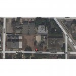
Fort Worth Home Analysis

It’s Tuesday, September 20, 2010 and today at Slow Home Studio we are answering at a question from Cynthia from Fort Worth, Texas. She really likes how we use the Slow Home Test to analyze floor plans and was hoping that our Slow Home community could help her review a floor plan she is considering.
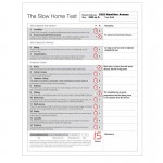
We need you to help Cynthia and score this project using the Slow Home Test and then post it to the site along with your comments about what you like or don’t like about this house. To have a closer look at the floor plans and web site for this project, click on the links below.

Also, don’t for get to watch tonight at 5pm Pacific/ 6pm Mountain/ 8pm Eastern for our LIVE workshop where John and Matthew will be working through a housebrand kitchen renovation project of a 1970′s west coast style home. We would love to get your questions and comments through our chat window during the LIVE program so tune in and talk to us!

And, we have been receiving some great suggestions about our Kitchen Design Challenge from yesterday. If you have not submitted anything for this yet, please either post your suggestions to the blog or send us an email to john@slowhomestudio.com! We will be reviewing all the best suggestions on Thursday during our LIVE broadcast at 8am Pacific/ 9am Mountain/ 11am Eastern and awarding a prize for the best suggestion!

  • BradW

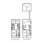
    Regarding the Fort Worth house…organizationally a couple of things bothered me: 1) the back entry relationship with the kitchen – be better if the entry aligned with the kitchen; 2) the master bedroom/bathroom design could have allowed more direct access into the master closet; and 3) to a lesser extent, the dining room/kitchen access through the main hall.

    The so-called breakfast area is mislabeled as there really is not enough space for it.

    So the house loses points for environmental performance (2 as I gave 1 point for infill site), organization, entry and dining. The house scores 14.

  • BradW

    If I was more generous I would give half points for organization because it really is quite livable. It is disappointing because with a little more thought and no extra cost things could have been much better.

  • Terri

    I also gave this house a score of 14. It lost the two points for environmental performance (I didn’t think of partial scoring for infill situation); entry lost a point due to the oversized front entry and no back entry whatsoever. In my opinion this is a major drawback to the home. The placement of the door beside the fireplace really messes up the focal point of the room, because the furniture facing the fireplace is also looking at a door–a door that might get frequent use too. Even if people in Texas don’t remove their footwear or have jackets to remove, they do have other stuff to carry into the house all done in front of the focal point. I imagine walking in with groceries and having to trek across the family room, or toting garbage outside using that same route. This makes no sense in a house this large.
    I also marked down for the dining because of awkward trek from the kitchen; there absolutely should be a direct route between these rooms since they’re right side by side! Even if one wanted to use that dining room for an office instead, a glass door could be installed in the required doorway to allow privacy.

    No mark for bathrooms because I feel the master bathroom wastes space and has an awkward layout. I also think closets being accessed only through the bathroom can be problematic, especially if a shower or tub is right in front of the doorway (thinking water on floor). As both John & Matthew (and Brad as well) have said, this part of the home could be designed better without much difficulty. The space is there.

    The upstairs hallway seems awfully wide to me, though I can see that if it were more narrow, it would seem too much line a bowling alley.

  • Terri

    edit: “too much LIKE a bowling alley.”

  • Mid America Mom

    Hello!
    Nice to see inner city work! Though I liked the plan at first glance it falls short. Feels like they planned this home from the outside dimensions to in. The footage feels wasted in many spots.

    Here is the breakdown I came up with when I ran the slow home test .

    Location 3/3
    Walkable.
    Environmental 0/3
    Reuse old site great but any water conservation measures at least?
    Siting 2/2
    Decent
    Organization 0/2
    Sorry but the back entry from the garage allows flow to be in front of the fireplace. The main hall on the first floor is too big by at least 1 to 1.5 feet. The upper is worse being a foot wider. Up there that footage should have been used at least a toward something.
    Entry 1/1
    Front is ok. Issues with back addressed in org. points.
    Living 1/1
    Nice placement in the plan, at the not so hot back.
    Outdoor Living 1/1
    Covered front porch has room for a few chairs!
    Kitchen 1/1
    Here is an L with non-appliance island. The stove to refrigerator is about 10 which is a bit long (should be 9 or less). The aisle between sink and island is a bit narrow (with this size you can do 4 or a little more). Good placement on the refrigerator. I am feeling generous today. It is almost there. (Usually I say No to kitchens much more than my cohorts.)
    Dining 1/1
    I like that the space is in front. It could make a nice study or living room.
    Bedrooms 0/1
    The master bedroom is big (I know as I grew up in a room about that size). And though I do not think closet access like this is negative when scored – many do not care for it. I would have had it out since you have all that wall space.
    Bathrooms 0/1
    Master bath I see so much space in the center… feels supersized.
    Study 1/1
    At 2400 is it required? No but we could have one if they planned for it.
    Laundry 1/1
    With all the space upstairs they could have had the recommended 4 feet in front of both machines instead of 3/2.5 over half.
    Parking 1/1
    Nice to see it not overtaking the yard or home.

    13/20. I would pass.

    Good luck!
    Mid America Mom

  • Steve in Van

    [img]3332hamiltonbackyard.jpg[/img]

    I’d score this house at 13 as-is, differing from J&M in that I’d subtract points for organization and outdoor living.

    The problem is the rear of the living area and its relation to the backyard and garage. Terri provides a vivid description of the organanization problem, centering on the placement of the door. And as for outdoor living, the spaces are not currently usable. The front porch is nice to look at but will be too hot to use most of the day, and you can see what they’ve provided for the backyard … nothing.

    That said, Cynthia could add 2 pts to the score and make it 10 times more livable by putting french doors across the back of the house opening to a patio. The primary rear entry could be on the west, closer to the kitchen and away from the fireplace.

    Here’s the virtual tour of this spacious (but poorly staged) house:
    http://www.cpgtours.com/tour.php?id=11369

  • Karli

    Steve in Van: Thanks for the virtual tour.

    Location 2/3
    Ok…
    Environmental 1/3
    Property reuse is good, but not exactly 100% environmental (MAM talked about water conservation)
    Siting 2/2
    Decent
    Organization 0/2
    Not a fan of guest bath location. Too much stress to keep the mud room clean when company is over. Already talked about dining room/kitchen access – huge problem. Breakfast nook isn’t really a breakfast nook… wasted space. Perhaps convert into study? Rear entrance right into family room another huge problem. Since the garage is in the back, most of the traffic will be through the rear. Master bedroom is too big, and access to the closet is inconvenient.
    Entry 1/1
    Foyer is good.
    Living 1/1
    Good placement, hot sun won’t be streaming in.
    Outdoor Living 1/1
    Love the porch, and yard size seems decent.
    Kitchen 1/1
    Love the kitchen!
    Dining 1/1
    Very nice dining room, attractive space to have for first impression. Already addressed kitchen/dining room traffic issue.
    Bedrooms 1/1
    Master bdrm and closet issue already addressed. Other than this, it’s good. Like the placement of windows and the walk-in closets in the other two.
    Bathrooms 0/1
    Master bath is spacious. Maybe too big. Main bath is kind of small. Guest bath on main floor in bad location.
    Study 1/1
    Would be room in this size of house. Maybe convert ‘breakfast nook’?
    Laundry 0/1
    Like location, being on the same floor as bedrooms, but its TOO SMALL. No room for ironing board, hang dry, etc.
    Parking 1/1
    Nice to have a porch on the front of the house instead of garage. In Texas you don’t have to worry about the not-attached garage; no -40 degree weather to carry groceries in!

    13/20 Definitely could be better. The biggest problem I had was the space usage and how close the house was to a commercial center. (potentially an increase in traffic)