1100 sqft 2 Bedroom Condo, Ontario

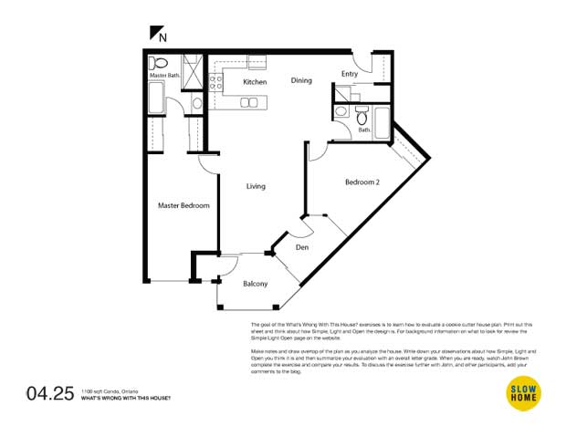
1100 sqft 2 Bedroom Condo, Ontario (PDF) | 1100 sqft 2 Bedroom Condo (JPEG)

  • Ailish Johnson

    The Canadian summer is short-lived and we love to make the most of it. The element of this plan that I find the lesat attractive is the balcony. What’s better than a glass of wine outside, the BBQ on, sitting on the deck with family and friends? It’s hard to see how even a table for four + chairs + BBQ would fit on the oddly shaped balcony. I have seen 1960s aparatments with better/bigger outdoor space. Where the dining table is would be so far away from any natural light source, even brunch would be a dark affair. I would definitely get the feeling of being “cooped up” in this space given lack of natual light. The lack of space for laundry facilities is also a negative. This condo developer may have a deal with a local dry-cleaner — you’ll end up taking most of your laundry out!

  • Alexx Coelho

    Hi John,
    As a realtor, i go in to a lot of condos just like this one. There are two underlying issues with this particular layout (and most condo layouts out there). 1. Not enough access to natural light. 2. trying to pack too much in too little square footage.
    The unit is deep, away from light, which can never be mitigated. You’ll always lack light throughout the condo. the location of this unit in the building would better suit a 1br plus den layout. place the kitchen where the second bedroom is, get rid of the existing den, place the den (half-walls or glass walls) where the kitchen is. master bedroom gets light, main living space makes the most of small amount of windows.

  • CL

    I live in TO in an old neighbourhood where the lots are narrow and the houses are very close together. The benefits are: 1. higher density living with all required services and amenities including subway at short walking distance; 2. vibrant community where people know each other; 3. smaller environmental footprint. The negatives are: 1. the small size of our yards (but we are very close to wonderful public parks including public pool, tennis courts and walking/running/bicycle paths in summer and outdoor ice rink in winter); 2. long narrow homes with windows on the narrow ends only. The limited amount of light in our house is the only thing that I would change if I could but not at the expense of the positives of living in a high density neighbourhood. So for the condo, I think that the lack of natural light in the space is the biggest issue. I think that if it were my unit and that I could redesign the inside I would forgo the balcony and add it to my living space to eliminate shading from the above balcony and move kitchen, dining and living areas toward the windows (eliminating den) and the bedrooms and bathrooms at the back of the unit with some method of allowing light to filter into the rear rooms.

  • John Marshall

    The big issue is with the light. I assume that the double window in the den is to allow natural light to the bedroom 2 (which is a building regulation requirement in the UK. Its an awful layout to do anything with. The aircon unit is misplaced taking up valuable window space. The second bathroom and cupboards (where no light is required) should have been placed on the rear wall.

  • James Scott

    Good afternoon John.

    When condos are being offered (pre-construction) at the sales offices, do the buyers have any real influence on the design or construction of the unit other than paint colour or cabinetry, etc?

    I have noticed a trend the past decade or so where house builders are creating flexible designs so the buyer can influence some features such as finished basements, size and layout of bathrooms, kitchens, or the placement of partition walls. Obviously this comes at a premium cost but is available.

    Regarding this particular design, I’m at a loss. It’s probably more suited to two students who spend most of their time in lectures, study halls or the local pub. A place to dump your stuff and crash is really all this offers.

    Could you imagine how dreary this place must be in the dead of winter?

  • James Scott

    Ok, comment number two today.

    My home, a small bungalow, approx 1000 square feet (25′ x 40′) on the main floor. I have 3 bedrooms and a full bath on the back half. A small kitchen, dining and living space on the front half. The house is split length ways by the stairs to the basement and the hallway.

    I know it’s far from perfect but I must ask how is it that our home which is 60 years old can have all of this in less space? I’m astonished.

  • Paul C

    John,
    A few “wrong things” from my perspective. Maybe the size of the unit is not appropriate for its’ location within the overall building footprint. A smaller unit in this location(inside corner of building) might have resulted in a better plan. I would suggest what tends to happen with buildings/developments such as these is that the design process is maybe completed in reverse as compared to the design process for a single family home. The overall building/development footprint and maybe to some extent the exterior is conceptualized and then whatever falls out as far as interior units is what falls out. A sort of outside/in approach. Not sure if that approach can be changed but of times it can result in some odd shapes dependent on what the overall building and quite possibly the parkade form takes. Secondly, the mechanical items are positioned poorly.

    All that said, my number one concern with this unit would be, the lack of creative thought given to addressing the limited natural light available. For example, detailed appropriately, interior bedroom spaces can work which could free up the limited natural light source for the living areas. Those areas where the homeowners would spend the majority of their time, excepting of course the pub going students.

    Thanks for the Saturday post.

  • Grace

    #1. lack of light.
    #2. entering to face into the kichen.

  • John K

    Definitely a need for radical replanning. There are too many compromises and the unit would be much more successful as a spacious one bedroom and den although the developer would probably have fought that. The air conditioning ‘closet’ must be moved out of the severely constrained frontage. An inboard den could be created with french doors and glazed wall panels to give full benefit of the frontage to the master suite and living/dining room area. If it was critical to keep this as a two bedroom unit, the second bedroom could be inboard instead of a den – think more loft than conventional condo interior.

    The single biggest flaw is that the design attempts to cram too much into one of the worst locations on the floor plate.

  • Terri

    This condo is a great example of terrible layout design with extremely poor space planning, making a large space absurdly awful to use. The suggestions to revamp into one bedroom with den and mechanicals using the back, non-lit space is the best solution. I’d also make sure that the central bathroom’s door does not open onto the dining space–perhaps around the corner–to address one of my pet peeves (after lack of natural light and ventilation). How sad that people have to live there. I’d be depressed in days!

  • Belle, Toronto

    The worse thing for me is the lack of natural light. I find the second bedroom with its “window” into the den which then has a window absurd. No building code should allow this.

  • Louis Pereira

    John – We should come up with our own version of “The Razzie Awards” for the Worst of the What’s Wrong With This House series!…I would nominate this one

    I think the worst aspect of this design is that it is essentially “left-over” space, sandwiched between the 2 other condo units on each side. The angle kills it with its funnel-like form, resulting in a pie-shape version of a suburban lot -almost no frontage – and in this case, almost no light. You can make some improvements (attached) to the entry, the kitchen and Dining room (if you want to get creative), but it’s impossible to improve any other aspect of this plan.

    [img]090425a.jpg[/img]

  • John Brown

    When I first saw this plan I was, like James, astonished. I have come across a lot of bad design over the years but this plan rates as one of the worst.

    As Paul commented, the unit is the product of its location within the overall building. As you can see from the attached image of the entire floor plate, the unit is located at the inside corner of the building. The decision to have a diagonal dividing wall coming off the corner doomed this unit (and the one next to it) right from the start because, as Louis says, it creates a funnel of space reaching for a diminishing amount of light.

    I think that this exercise is a good illustration of how valuable a floor plan analysis can be. Walking into this unit as a potential buyer we might be captivated by a view, fooled by the “large” living space, excited by 2 bedrooms AND a den, or fail to notice the lack of light because it was cloudy or dark outside. We might not notice the flaws until we moved in. By then it is too late. When looking at the plan, however, and thinking like a designer rather than a consumer, the problems jump right off the page.

    Good work to all of you for recognizing the fundamental problem with natural light in this house.

    My conclusions:

    #3 – I am going to go with Terri about the bathroom opening into the dining room (it is one of my pet peeves as well).

    #2 – No light. The lack of a real window in the second bedroom (it is not only preposterous it should be against code), the lack of light in the living area, and the obstruction of the a/c unit in the master bedroom.

    #1, That someone had the nerve to build 24 of these units (2/floor in a 12 story building) and sell them at an undoubtedly expensive purchase price.

    Simply put – disgraceful.

    [img]floorplan.jpg[/img]

  • Louis Pereira

    Good grief! Couldn’t they have at least planned it so that the balcony was separate from the adjoining unit? What a hack job!

  • James Scott

    That’s amazing, do you see how the units get progressively deeper as you reach the end of each wing? Other than the 5 corner units each of the other spaces is in the shadow of its neighbour.

    Is this a relatively new project? If it is I bet this building looks beautiful from the outside. I agree with Paul C, they seem to have designed the shell and filled it later.

    Let’s hear from a condo project designer or team rep. Their thoughts would be of interest.

  • John Kuharchuk

    Having been involved in the development and/or design of dozens of multifamily projects, I can speak to that.

    The inside corner is the most problematic of all the units on the floorplate in this building configuration. Privacy, outlooks and natural light are all severely constrained. In addition, the proportion of interior space to frontage usually results in ill-conceived layouts with overly large units that need to be sold at a significant discount from the surrounding units.

    From the developer’s perspective, the choices seem limited.

    There are significant risks in making the units on either side of the inside corner units larger since they are also in a somewhat compromised location (price per sf goes down). Spreading the square footage out along more units results in larger units at higher prices which may not be what the market can bear. Selling the inside corner units as 1,100 sf one bedroom + den can also be problematic because of the end price and general perception that a higher priced 1,100 sf unit with only one bedroom is of limited utility, which potentially impacts resale.

    Inexperience, lack of skill, time constraints…all contribute to a less than desirable result and in the end, the developer usually tries to solve the problem through price.

  • John Brown

    John,
    Thank you for your insight into the issues surrounding the relationship between value, cost, and quality in the typical cookie cutter development formula. I agree that the developer solution of reducing the price is common and also problematic.

  • Phyllis McCord

    After seeing the position of the condo in the building, I wish the developers had taken both inside corner units and made one, large unit with a window and/or balcony running diagonally from outside wall to outside wall. Having seen some amazing conversions like that, I believe they could have made as much money as pitching two bad units. Working with that unit alone, and assuming 2 bedrooms, I would remove the den, shrink the disproportionate size of the ensuite and play with switching the second bedroom with the kitchen/dining room. There is only so much window to go around this way we could remove those interior walls.

  • Lisa

    Here again is a unit that disguises bad design with lots of space. I will admit I didn’t see anything wrong with the unit when I first looked at it–seduced by diagonal walls and open living space (too big, actually).
    I agree with James about how older houses find ways to fit more into the same space–and newer places rarely try. Just try to find a new 3 bedroom home in 1000sf or less!!
    A smaller unit with the same window space would result in less parts of the house that are dark. In this unit, I would probably lengthen the balcony to be in front of the master bedroom also. Who really spends all day in their bedroom to enjoy the big window anyway?

  • John Brown

    Lisa,
    Your observation that you didn’t see anything wrong with the unit at first is very telling.

    Never did I.

    The diagonal wall and open living space IS visually seductive. It catches your attention and makes you think that it must be special… I think this is like the seductive image on a packaged frozen dinner. It is until we take off the wrapping that we discover how bland the reality actually is.