1450 sqft Townhouse, Virginia

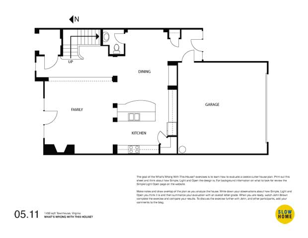
1450 sqft Townhouse, Virginia (PDF) | 1450 sqft Townhouse, Virginia (JPEG)

  • James Scott

    Yikes!

    OK, so am I to believe that there is no back yard?

    To me that would be a huge problem, all of the property is used for the footprint and the road access to the home. What an absolute waste of energy and materials just to suit the pleasure of having your garage right there.

    You can’t skip stewardship when designing a house or a community. But because the developer has been given what I perceive to be carte blanche this is the junk the buyer is left with.

    You can redesign the floor plan of this property until the cows come home, but there is no justification for this type of development. To all parties involved, government, developers, buyers, this is completely inexcusable.

    To take this just a little further, there is a story in Toronto where the condo fees have more than doubled in the past 2 years since a complex was built because of the poor quality materials used during construction. The second a developer commits to a project a condo board must be set up to monitor all aspects of the construction of the project. Only this way can the future inhabitants have any way to protect themselves from problems resulting from poor developer practices. Accountability has to be in place right from the start.

  • Jim Argeropoulos

    Lack of daylight. I pondered other things. But Daylight takes it here.

  • Brian

    The orientation bothers me the most.

    Though, the kitchen is just awful. Why the corner pantry when next to the fridge there is a nice long wall that could accommodate millwork for a pantry. Also, where do I eat?

  • Doug Roberts

    Lack of access to natural light and fresh air is definitely the biggest thing wrong with the main floor of this townhouse. In a typical townhouse you are limited to having windows at the front and back, which is bad enough, but in this case the rear attached garage means you only really have windows at the front, much like a condominium. In fact, this floorplan arguably has even less access to natural light than most condominiums as the need to accommodate the main entry at the front limits both the amount of glazing and the ability to use the full width of the front wall for living areas. This townhouse clearly has no basement, so consideration should have been given to putting the parking area for this development underground.

    Another concern is that furniture placement in the family room could be a bit of a challenge given only 1 useable corner and the need to accommodate access from/to the kitchen, dining area and front terrace. It would have been easier if the fireplace was centered on the west wall and the kitchen access was closed off, as this would give you 2 more corners to work with.

    It should be possible to add a front hall closet in the notch created by the L-shaped stairs and the powder room. Although this would result in the stairwell being less open, it may be possible to make up for that by adding a window between the stairs and the front porch to bring more natural light into the stairwell.

  • David Pease

    Please forgive the rough drawing. Thought I would like to open the view to the south so placed the kitchen in the centre leaving a breakfast area cum computer desk with open counter to the kitchen. I would probably place a built in oven on the mill work on the garage wall leaving an area by the fridge for the cook top. Thought a sliding door, can’t think of the correct name, to close off the kitchen area from the dinning area might be better than a swinging door. Although I have drawn a light line in the dinning area wall, I think two floor to ceiling walls defining a fairly large opening to the family room would be nice to define the two spaces.

    At the entrance I think a built in bench by the window would be a nice feature for the foyer. Now, I know how you dislike angled doors, but I thought doing so would aid in the flow through the hallway and into the family room. The cupboard in the foyer should provide sufficient storage while only blocking off half of the view to the family room. A Mirror placed on the wall opposite the foyer window might also be appropriate.

    [img]1_wwwth12-1.jpg[/img]

  • Terri

    The biggest problem with this townhome is that double attached garage taking up so much wall space on the brightest side of the home. This element is unchangeable in a townhouse complex, which basically dooms the renovator/designer from the start. Possibly by reversing the dining and kitchen areas and then having the opening to that garage on the south wall of the unit instead of next to the exterior back door might allow a way to sit near that back entry (would want a french glass door in that case). However, the space is limited.

    I see that David Pease’s plan (above) tries to do this, but unfortunately access to the kitchen is badly hampered by closing off that back hallway. If you are approaching from the upstairs of the home, you must travel through the family room. Similarly, coming in from the back, you must travel all through the kitchen and family room to get upstairs. Even though a person may not do this every day, the closing in of the space still presents a “shut-off” feeling for those using the space.

  • Thea

    Why do people even have garages?! You can use them for storage, but you could also use a shed or basement for this purpose. You can uses them to park your car, but what is wrong with parking it outside? The way I see it is that you spend ALOT of money so that you don’t have to shovel around the car in the winter. It doesn’t make any sense to me. Can any one shed some light on where the value of a garage lies???

  • Volker

    So many things already mentioned before:

    I agree with Thea about the “need” of such a huge garage – a single sized with some additional outside parking space would do the same and leave more space to design the rear of the house and get more light in it.

    I understand Brian about the orientation but then since we have no plan of the street layout we can’t judge about the overall – perhaps the backalley is rather crowded and not a place you actually wanna spend most of the time. Unfortunately there are usually two sides on a street – so if on side is facing south the other will face north – but still both sides will have their “front” facing to this street.

    Although I agree about the poor layout, the lack of daylight as Jim pointed out I wonder what the upper floor looks like. Are they using the roof ontop of the garage? It would make just a fantastic balcony – facing south and not possible to get bothered by passing cars.

    I did a quick sketch about an alternative layout – switching the position of the garage and the back entrance (sorry about the rough work and the poor layout of the kitchen and dining area – but it is just about the idea!) This way we get some light from the rear of the house all the way to the living room. When entering the house, going down the corridor you end up infront of the kitchen – usually most time of the day something is going on there and therefore it is a nice place to head for. I added the neighboring houses to point out that together with your next door neighbor you might get a nice outside place to sit and enjoy the southside.

    [img]wwwth12-1a.JPG[/img]

  • Louis Pereira

    3. Lack of natural light
    2. Lack of private outdoor space
    1. Garage location (I would also argue that it should be a single car garage)

    I would be inclined to choosing a unit with the garage on the east side of the floor plan and keeping the Kitchen where it is so that there is a visual connection to a small private garden space.

    [img]090511_a.jpg[/img]

  • Brad W

    Yesterday John provided a touching anecdote about deriving the most satisfaction from small accomplishments.

    With that sentiment in mind I approach today’s question. You can look at this and other designs say the site is wrong, the garage is awful, the layout is inefficient, etc. These are valid points but what are some small changes that can be made here to improve this townhouse.

    Some small changes:
    1. The entry door from the garage should swing in not out.
    2. Put a large mirror on the side wall by the back entry to reflect more light into the space.
    3. Replace the builder pantry door with panels matching the existing kitchen to unify the look.

    Some structural changes:
    1. Move the back hall closet adjacent to the tiolet with doors opening toward the side wall. Creates privacy for the washroom, hides clutter, opens up the back entry and better defines the dining room.
    2. Consider removing the columns that divide the space. If possible, this will provide more flexibility to utilize the space. Especially remove the column between the dining and living room (the knee wall between the hall and living room must go as well).

    So to answer the original question “What’s wrong with this house?” – It is the small things like the number of doors at the back, the ugly pantry, the awkward columns, etc. which get in the way of easily using the space .

    [img]wwwth12-2.JPG[/img]

  • Adam G

    I discovered this site a short while ago, and am fascinated. I look forward to more of these!

    To my mind the things that irritate me the most are:

    The clutter at the back, with the garage door, rear door and mudroom all sharing space. I wonder: is that bulge a load bearing element? Is the mudroom supposed to be disguising it? [note: I like Brad's solution, but I'm a bit worried about removing those columns. I can see how it opens up the space; I'm twitchy on load grounds only. If I knew what the floor above was like it might be a different story.]

    The tiny powder room. I know clients like them, but they just seem so very small.

    The two car garage. I wish it could be shrunk, but I suppose that’s a pipe dream.

  • Bruce

    Unlike others in this dialogue the garage is a necessary feature of a home. It is a shame that it blocks much of the light and if there was room a detached garage with a covered connection would be an improvement. The worst features as I see it are the placement of the fireplace and the small bathroom. I enjoy sitting by a fire in the colder months and find it hard to imagine how to position furniture to take advantage of the fire without essentially sitting next to the windows which is not particularly inviting. The placement of the bathroom close to the centre of the house means that one would need to walk through the dining area to clean up after working outside (in the garage!) dragging dirt into the centre of the home.

  • Brad W

    An interesting point about garages – in NA the entry door from the garage into the house is better located on the left if possible – the driver’s side of the car. If the door is on the right, as in this example, the driver will have to cross in front of possibly two cars to get to the entry door.

    Just a thought…another small detail.

  • Paul C

    A brief note about garages. Sometimes it is not by designer’s or even homeowners choice that they are the size they are. For example, in this locale there are some very prescriptive,some word say overly prescriptive, rules that are established and regulated by the municipality. Depending on the type of “use”,(i.e. residential, commercial, etc) these rules determine minimum number of stalls per unit, their arrangement and minimum sizes. So reducing the garage to a single may not even be permissible. As the density of a development increases so does the challenge of dealing with the parking requirements, as they tend to increase.

    In some respects, how this plan addresses the reality of an attached garages on a narrow width (I am assuming there is no driveway here) is more “truthful”. We have all seen the front attached double car garage, with driveway, on narrow lots with the remaining sliver of front green space and the token tree. That sliver is more akin to the landscaped median at the Costco parking lot than a front yard. Who are they kidding?Garages and parking…we could talk for days.

    What’s wrong with this house?
    Absolute no no …direct entry into half bath from dining or near dining area and the abysmal lack of storage.

    P.S.
    Just noticed the ability to scroll through posted images…hat tip to your IT John!

  • Tina

    Lack of light is the single worst aspect of this house. One would hope that the south door is all glass!

    The pony wall between the family room and entry hall is also a problem – it really restricts movement in the house.

  • John Brown

    Thanks to all for keeping the conversation growing while I was away. It is nice to be back on the site.

    Based on the comments so far here is my hit list for the 3 worst things wrong with this house.

    3. The big things – like developer responsibility mentioned by James Scott and the lack of an outdoor living space by Louis and Paul C.

    2. All the little things that Brad W noted (too many doors, the ugly pantry, and the silly columns) as well as Bruce (the proximity of the fireplace and windows).

    1. The lack of natural light that Jim, Brian, Doug, Louis, and Tina (and others) mentioned.

  • Elva

    What’s wrong?
    1. The design should have made better use of natural light. With the original footprint, placing the kitchen on the north wall with back entry makes sense to me. I would also relocate the back entry closet. I liked revised plans with the entries on the diagonal.

    2. The pony wall at the front entry to delignate the family room. Since there is no entry closet, it seems to me that this may end up being a place to set things down on or to drape coats and jackets over.

    3. The lack of attention to traffic patterns wrt using the space. For example, walking around the pony wall to enter the family room. Traffic is routed through the dinning area to access the bathroom and back entry.

    4. I think I would perfer an east-west orientation to the kitchen island so that sight lines into the kitchen from the family room are at counter level.

  • Tony

    I think the fridge door will hit the pantry door so that is a problem. Also, it looks to me like the dining room is supposed to be closer to the kitchen because there is a space for a hutch next to the kitchen counter which makes the space by the powder room door more unusual and wasted. i also can imagine how terrible those big columns will look right against the kitchen island.