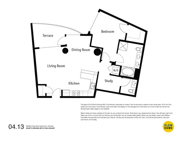
920 sqft High Rise Apartment, Nevada

920 sqft High Rise Condo, Nevada (PDF) | 920 sqft High Rise Condo, Nevada (JPEG)

  • James Scott

    Almost every aspect of this layout is poorly designed. The terrace as an example has that little alcove in front of the dining room. It’s really of little use. Unfortunately being part of the exterior structure I doubt anything can be done to incorporate that wasted footage.

    In the kitchen I like the idea of extending the counter but I’m concerned that it may interfere with the living room. If even another 3 or 4 feet can be added, the kitchen could be reconfigured to allow for a better work triangle.

    The fact that this is a one bedroom unit I see little use for a second bathroom. The study, the half bath, and part of the master bath can become storage, laundry and a master bath. This would open up more space in the bedroom.

    Both of the posts should be walled or boxed in. These could become features for display, storage, etc. You often refer to the use of built-in millwork.

  • Paul C

    John,
    I think the single worst part of this plan is the kitchen layout. It is far too open. It would feel like part of the living room. As well, the exterior outline of this unit would suggest that an iconic building form was sought with little regard for interior spaces. Whatever “fell” out as far as interior unit layouts, is what fell out. Very constraining outline to work with.

  • Rhonda

    I don’t if this is the worst thing about the plan but I don’t like the way the master bathtub seems to be squished into a small alcove when there seems to be a lot of wasted floor space. I also don’t understand why the shower is just sitting in the corner.

  • Louis Pereira

    Typically i don’t mind this type of geometry in design when it is skillfully deployed – as in the Rue Street project by Hurt Partners Architects (featured 03.13) But in this case the geometry has many ill-effects, therefore causing problems with layout of rooms and furniture.

    I think the worst thing about this house (condo) was that they didn’t stick to SIMPLE.

  • james mckenna

    Maybe I’m missing something, but why do we have a guest bathroom in a 920 SF condo? Eliminate that and the “study” sorta kinda becomes usable as maybe a study and/or guest sleeping room: a little privacy and quiet.

    The kitchen wrecks the entire public space, but more counter doesn’t feel right, unless you’re totally into cooking. I’d rather pull the fridge over next to where the sink is now, then pull the sink into the corner (better workflow). Now swing a counter out from where the fridge is now to divide kitchen from the rest of the space.

    Those columns are a freaking disaster, but maybe we just eliminate the wall between the bedroom and the public space and recognize that privacy isn’t going to be a strong suit in a weird space like this. I prefer freestanding beds anyway: an inefficient use of space, but one that uses open space well from a visual/emotional perspective.

    Finally, make better use of the smaller column by extending the living space out on to some of the deck. Make the divider between deck and living space a curved wall with a sliding door of curved glass. The arc of the wall runs through the the post that currently latches the flat hinged door. We lose some deck, but we gain an echoing curve and move the column into the living space, where we can start to work with it visually.

    Finally-finally, let’s squeeze the remaining bathroom to gain some space. Maybe put the toilet in its own closet next to the closet, pull the vanity around to where the door is, put the shower where the vanity is now, and divide the bath space from living space either with a glass wall or simply a flooring change.

    That’s not a coherent plan, but it beats the current train wreck, offers some opportunities for beauty, and allows light to penetrate into almost the entire apartment.

  • Uno

    I agree with James’ comment about the need for the guest bath in such a small unit but I still don’t like the so called study – even if it is bigger. It seems like it is just a marketing feature instead of a real space. Why not shift the bathroom down and make the bedroom bigger.

  • Jason

    I think the little space in between the two big columns (and beside the terrace door) is the worst thing about this house. It is a complete waste of space.

  • james mckenna

    Jason: The space between the columns, as is: yes. But remove the master bedroom wall and push the deck wall away from the smaller column, and suddenly they are featured elements that create a portal between the kitchen/living space and the bedroom and deck spaces. Since they’re clearly major structural elements, change is not possible, and, since you can’t fix it, feature it.

  • Robert Timber

    I agree with a lot of James’ comments. Rearranging the kitchen and putting a peninsula where the refrigerator now is would separate the space better from the living room and also be a convenient spot to drop grocery bags.
    I guess my vote for worst thing about the plan is the door to the balcony from the dining area. Switch to sliding doors off the living area and eliminate the door from the dining area. That would at least create a nicer dining space and take it out of the circulation to the balcony.

  • John Brown

    Thanks to everyone who commented today on this little condo unit that looks quite interesting at first glance but quickly breaks down into a number of problems. I appreciate Louis’ comment that it is not very SIMPLE.

    Based on the discussion my top 3 worst things are:

    3. The wonky dining room with the huge column in the corner. This space is almost impossible to furnish.

    2. The kitchen that opens into the living area. The suggestions for reconfiguration of the peninsula are appropriate.

    1. The too small, too dark study. I think Uno’s suggestion of shifting the bathroom down and giving that space to the master bedroom would have been better. However, that would result in a reduction in sale price as the unit could not be sold as a one bedroom plus den. A clear problem from a marketing point of view. Similarly, James’ suggestion to reduce the impact of the colliding geometries by removing the bedroom wall would result in a further reduction in sale price because now it is a studio unit.

    In the end, the biggest problem with this house is that it is designed for a marketing brochure not for someone to live in.

  • james mckenna

    I’m confused. How is designing for maximum sale price of a high-rise condo a “slow” exercise. Isn’t slow about building space around real activities of life? If so, then slow design must always be a little weird, because it must fit individual styles. And if this is a blue-sky exercise, then budget doesn’t matter; if budget matters, then what’s the budget?

    But budget and sale price apart, as an opportunity to reconfigure an unusual space to make it more enjoyable to live in, this was a fun exercise.

  • James Scott

    I agree with both John Brown and James McKenna, therefore I see property values and the Slow Home ideal seem to be in conflict.

    Buyers need to know that they have choices and that depending on their priorities they can control this process more than they think.

  • John Brown

    James and James,
    Sorry for the confusion but you bring up a really important issue.

    Developer driven cookie cutter housing is like fast food. It uses sophisticated marketing techniques to create desire for a mass produced low quality product that is actually bad for us (and the environment). As such, fast houses incorporate deign features that make them easier to sell (at a higher profit margin) instead of easier, and better, to live in.

    This condo is a very good example of this. The poor quality den space is there because it looks good on the feature sheet and allows the developer to command a higher price (even though it is a degradation in the overall quality of the unit). I believe this is very wrong and not consistent at all with the slow home principles of creating a simple, light and open home that fits the way you want to live. While there is nothing wrong with someone making a profit from selling something, I believe that we need to raise the bar substantially in terms of the quality of design and construction that the housing industry should deliver. This comes down to more informed consumers.

    In the same way that increased public awareness about the health risks of fast, overly processed, food is beginning to change purchasing choices, increasing public awareness about how and why these cookie cutter homes go off track, and what some better design options might be, will empower people to demand more from the housing industry.

    I believe that the simple lessons provided in our daily design exercises are a first step towards accomplishing this goal.

  • Paul C

    A little late to this conversation but I will post anyways. I feel I might be in the minority here or maybe putting a finer point on things.

    To me, utilizing space in an efficient manner makes a lot of sense. Subject to actually furnishing the bedroom were maybe a little more space would have helped, but if there is excess space in a corridor what is wrong with making something from it? Detailed correctly, internal spaces without windows are
    not “anti-spaces” either. Ironically, the project from last week exercises included a built in desk in one end of the dining space. Granted the desk was exposed to outdoor
    light and views but moreover, in my opinion, it was good utilization of excess space.

    The finer point… I think what is at issue here is the appearance of or the selling of a study. Using fast food as the comparison, the packaging always looks better than
    the contents. Therefore in my opinion, the HYPE is the issue not so much the space again subject to furnishing the odd shaped bedroom.

    Had the marketing spin omitted the term study, would there be a concern with the inclusion of millwork in the oversized back hall?

  • John Brown

    Paul,
    An excellent contribution to the discussion. I agree that it is possible (and indeed is one of the indications of a good designer) to use odd spaces like this in inventive ways. As you say the problem resides more in the hype of the study when in fact it is just an oversized hall. To go back to the food example it reminds me of the no fat no dairy “real” cheese cake or pre-packaged “fresh squeezed” orange juice.

    If, on the other hand, that very same space had been designed with a great piece of built in millwork, sensitive lighting, and an appropriate relationship to the guest bath then by all means the feature of study should be shouted from the rooftops and an appropriate value placed on it.