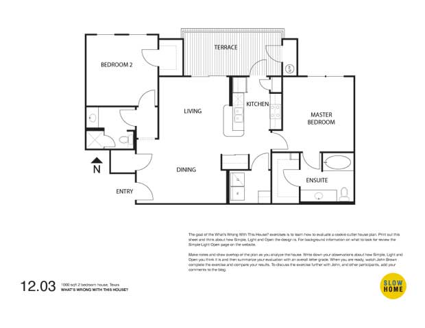
Part 1 – 1000 sqft 2 bedroom condo, Texas

1000 sqft 2 bedroom condo, Texas (PDF)
1000 sqft 2 bedroom condo, Texas (JPEG)

  • David P

    SHAPE/SIZE: feels good to me – overall space is well used with little wasted space – dining room has limited light stuck in the back – overall rating 4

    ORGANIZATION: rooms well grouped – the two bedrooms are separated by the main living area which does not completely conform – good balance and no unnecessary or supersized spaces – kitchen and dining room should be swapped however in order to improve livability of primary rooms and access to outdoors – overall rating 6

    FRONT/BACK ENTRY: pretty week entry – has a closet but dumps straight into the dining room – overall rating 9

    INDOOR/OUTDOOR LIVING: good natural light and access to the balcony – the living room feels tight and conflicts with the eating bar and circulation to access the balcony – not sure access from the kitchen to the balcony makes any sense – only light into the unit will be indirect given orientation, however in San Antonio the summer can be stifling – overall rating 7

    KITCHEN: very efficient kitchen although a little tight perhaps re storage – circulation is an issue re the access to the balcony – the kitchen would be better exchanged with the dining room allowing better access to the balcony – overall rating 5

    DINING/STUDY: as stated in the wrong location re the kitchen – overall rating 6

    BEDROOMS: probably the best rooms in the house- good size and shape – located in private areas – well proportioned – the closet in the master is difficult to access through the bathroom – overall rating 3

    BATHROOMS: also good rooms in appropriate locations with good counter space especially in the master – overall rating 3

    GARAGE/LAUNDRY: laundry well positioned in the house and well proportioned – some issue if you have a load going and you are entertaining guests for dinner re noise levels – another reason to flip the dining room and kitchen – overall rating 2

    CONCLUSION: HOW FAST OR SLOW? 5.0

    I found the process quite enlightening John. At first glance this project seemed to be slow to me, but as I worked through each section the weaknesses of the design started to appear. I went chronologically through the steps as you had them laid out and found I went back to the first 2 or 3 steps and re-evaluated my initial response based on the issues raised in subsequent sections. An interesting experience for me.

    David

  • BradW

    SHAPE/SIZE – 2

    ORGANIZATION – 4

    FRONT/BACK ENTRY- 7

    INDOOR/OUTDOOR LIVING – 4

    KITCHEN – 5

    DINING/STUDY – 7

    BEDROOMS – 2

    BATHROOMS – 2

    GARAGE/LAUNDRY – 1

    CONCLUSION: HOW FAST OR SLOW? – 3

    The front entry is really the largest disappointment opening directly into the dining room. It is redeemed by close access to a closet and a bathroom. The bedrooms, bathrooms, laundry and storage are strong points. The kitchen is efficient and could be fine depending on the level of finish. The living room is small but furniture location is reasonable and it has access to a decent balcony. The dining room is another weak spot as it is directly in view of the front entry and away from any natural light. The northern orientation of the apartment might not be a problem in hot Texas. For me, it would depend on the view.

    As DavidP has suggested, I would consider swapping the kitchen and dining room. This could address the front entry problems and improve the connection to the outdoor balcony and view beyond.

    As it is, the apartment is quite good and qualifies as slow.

  • BradW

    John,

    Regarding the process, like DavidP I went through the steps in order of presentation and assigned numeric values only. When writing the following summary, I revised some of the values slightly notably organization, kitchen and entry. My overall rating is based on the average of the values assigned and really did not change much from my initial impression that the apartment was quite good.

  • JimG

    SHAPE/SIZE 5 I like that is a nice compact size, rectangular to minimize the unlit areas inside, but with windows only on one side…

    ORGANIZATION 10 I first gave this an 8 instead of a 10 is because at first look there appears to be minimal hallway space. Although that recessed door into the laundry room… And there is a hallway into the second bedroom and bath… So I changed it to 10

    FRONT/BACK ENTRY 8 Nice to have a closet in the entry, but it looks pretty deep. But not deep enough for extra storage. And the extra door from the kitchen to the terrace, when there is a slider from the living room right next to it?

    INDOOR/OUTDOOR LIVING 8 the terrace looks to be a nice size, but without knowing whats happening outside facing south like that to me it seems like it will be an oven.

    KITCHEN 8 that door to the terrace is a waste of space and could have been used for counterspace. The sink could go there and get out of the sit up to counter space. Last thing your guests want to see while sitting there visiting while your doing somthing is a pile of soiled dishes.

    DINING/STUDY 9 even though it is just kitty corner from the kitchen the dining space seems disconnected from the kitchen. Plus it’s the first thing people see when entering the house.

    BEDROOMS 9 The bedrooms seem awfully large. Including closet and bath it looks like the Master bedroom uses a 3rd of the space.

    BATHROOMS 9. What does a place this size need 2 full bathrooms for?

    GARAGE/LAUNDRY 8 at first the Laundry seems nice. But on closer inspection, the room seems too big for just the washer and dryer, but too small for a folding/ ironing space. I can not picture shaking out a bed sheet, and trying to fold it in that space

    CONCLUSION: HOW FAST OR SLOW? Average score 8.2,

  • BradW

    JimG – I guess you didn’t like the apartment then. BTW, the terrace faces north and, because it is part of a condo complex, it is not likely to have windows except on the only exterior wall.

  • JimG

    BradW, thanks for pointing out the direction of the terrace. I misread the directional thing. At the time I thought it was odd that north wasn’t to the top of the page…
    Your right, I didn’t like the apartment, but it was only after going though the exercise that I noticed that. My first reaction to the plan was “nice, not much wrong here”. So for me at least the exercise does work.

  • Elizabeth

    SHAPE/SIZE: 3. Looks well-proportioned. Nothing too enormous except the ensuite, which combined with the closet is larger than the kitchen.

    ORGANIZATION: 7. Front entry and Dining combo will make for extra steps around the table, either way. Patio doors to the terrace, plus the breakfast bar will make furnishing the living room tough. Laundry near kitchen is good and bdrms are in relatively private areas.

    FRONT/BACK ENTRY: 8. Pretty bad. Conflict with Dining, plus a guest hanging up his/her own jacket is faced with entering a walk-in closet, presumably filled with “storage-y” stuff like sports equipment, etc.

    INDOOR/OUTDOOR LIVING: 6. Terrace looks a good size. Again, furnishing the Living room will be difficult. Too bad bedroom 2 needs all that closet space right there where it’s the only access to sunlight.

    KITCHEN: 5. OK, work triangle OK, no weird angles. It’s a bit tiny, though, without much counter space and the door to Terrace may not be used much because of circulation conflict.

    DINING/STUDY: 8. Amorphous. Can’t tell whether it’s right-sized or not because it’s all blobbed in with the front door, circulation and living area.

    BEDROOMS: 3. A place for a bed, windows, private area. Master is a little close to kitchen, but not too bad…

    BATHROOMS: 4. Bathroom 2 seems fine. My only beef is the ensuite and walk-in closet which are too beefy!

    GARAGE/LAUNDRY: 2. Laundry positioned and proportioned well.

    CONCLUSION: HOW FAST OR SLOW?

    I’d give this a 3 to 4. The checklist was useful, especially when it came to circulation, which is easy to overlook on an unfurnished plan.

    John and Matthew,

    Should there be something in the checklist that mentions that the Dining Room should be close to the Kitchen? i.e. should be the next room over in any direction, without other rooms in between.

    Also, Dining Room Livability says that it should be a multi-functional space. Not entirely sure what this means. If this means projects should happen on the dining table, it is much less likely to be used every day, for eating on anyway.

    Also, when the two of you spoke together on Friday, you were both horrified that a bathroom door faced the tub. I hadn’t picked up on that before. Is this a big no no? Might you think of including something about at least trying to have the bathroom face the most inocuous thing, the vanity.

    Thanks.

  • Doug Roberts

    SHAPE/SIZE — Overall size seems fine for a 2-bedroom condo. General rectangular shape is also reasonably good, as the window wall is one of the long walls of the rectangle, although unfortunately the windows all face north, which will limit the amount of natural light they can bring in. There also seem to be a lot of “jogs” in the outer walls — almost like most of the closets were stuck on later as afterthoughts. However, as this is a condo, not a standalone house, the jogs may not matter. Ranking — 5.

    ORGANIZATION — Seems generally good, as the kitchen, dining and living areas are together, the laundry/utility room is off the kitchen and the bedrooms are at opposite ends of the unit for maximum privacy. My concerns would include the conflict between the entry and dining areas, the ability to see directly into the second bedroom from the entry and the breakfast bar intruding into the living area. Ranking — 4.

    FRONT/BACK ENTRY — Entry opens directly into dining area, and although it does have a closet nearby, it does not have its own defined space. Ranking — 8.

    INDOOR/OUTDOOR LIVING — Living room is small and furniture placement would be limited by need for circulation space along breakfast bar and to sliding doors out to terrace. TV would likely need to be a flat screen mounted on the wall next to the breakfast bar, but location is not great as the adjacent sliding doors would cause reflections. Terrace is not a bad size, but would mostly be circulation space due to having 3 doors opening onto it. Both indoor and outdoor living spaces are hampered by the second bedroom’s walk-in closet, which limits both the size of the terrace and the amount of living room windows. Ranking — 8.

    KITCHEN — A relative compact galley kitchen. Storage space seems okay, but not much counter space. The raised breakfast bar exacerbates the counter space problem, as it divides the counter space around the sink into two levels, making it much less usable. Having direct access to the terrace could be handy when BBQing, but use should be limited to whoever is cooking or fixing drinks to avoid creating traffic jams in the kitchen. Ranking — 6.

    DINING/STUDY — The dining area is a decent size but it conflicts with the entry and is a long way away from the living room’s north-facing window, so it would get very little fresh air or natural light. The pantry closet also intrudes into the dining area, so you might want to fill the resulting wall indent with a buffet or built-in shelving. Ranking — 8.

    BEDROOMS — Both bedrooms appear to be of a good size and shape, with large closets, good windows and good wall space for furniture placement. Ranking — 2.

    BATHROOMS — The ensuite is good — decent size vanity, neither the toilet nor the tub is visible from the bedroom — only concerns are that the walk-in closet is off the bathroom and no window. The guest bathroom is not bad, although I might be inclined to have the toilet and shower swap places to get a slightly larger vanity and so that the shower is less prominent when guests enter the bathroom. Ranking — 4.

    GARAGE/LAUNDRY — The laundry room is a good size and is well located. Ranking — 4.

    CONCLUSION: HOW FAST OR SLOW? — I would give this condo an overall ranking of 6.

    Now to see how I compare to everyone else!

  • James Scott

    SHAPE/SIZE 4 I think the square footage should be more than adequate for a 2 bedroom space. Bathrooms are reasonable, closet space is ample. I would prefer more balcony, but that’s my preference.

    ORGANIZATION 7 A lot of valuable Texas space used to get from a to b. The dining space will be crammed into the bottom right of the space and the living will be crammed into the upper left, all for circulation. The galley style kitchen is a problem as well.

    FRONT/BACK ENTRY 10 Opens right into the dining space. It will be very dark as well.

    INDOOR/OUTDOOR LIVING 8 All of the light comes from the north, this would be a very dark space. I’m concerned that the second bedroom closet impedes access to the balcony and possibly more light.

    KITCHEN 6 Silly having access to the balcony this way, could rotate the kitchen 90 degrees, provided more glazing, improve the counter space and eliminate the counter seating. It’s a very tight space and with the doorway it becomes a passage way to the balcony, I could see a lot of culinary battles developing from this bottleneck. Silly since there is a door right beside it.

    DINING/STUDY 9 There is no way that you could be comfortable eating so close to the front door. You would hear everything from the hallway. And let’s be realistic, why do we need a breakfast counter and a dining space basically in the same room?

    BEDROOMS 5 Not bad, could use more windows. Adequate storage.

    BATHROOMS 5 Again, not too bad. Guest bath could benefit from more counter space.

    GARAGE/LAUNDRY 5 Could the laundry and closet work better together?

    CONCLUSION: HOW FAST OR SLOW? Over all my feeling is that this house is very fast, 7 or 8, and can be improved by a rethinking of some wasteful features.

  • Terri

    SHAPE/SIZE Score:7 The dining room is larger than living room; must travel across circulation zone from kitchen to dining; space between dining and living is circulation; no light in dining room and limited light for all rooms due to north exposure.

    ORGANIZATION Score:7 Entry space isn’t defined; eating bar juts into hall/traffic zone; good separation of bathrooms from living but also near bedrooms; bedrooms have privacy from public rooms (except one corner of bedrm 2)

    FRONT/BACK ENTRY Score:9 No defined entry space, though there is a deep closet

    INDOOR/OUTDOOR LIVING Score:3 Access to terrace from two rooms, though one must go past “busy” zones in both cases (through kitchen or past breakfast bar/TV?)

    KITCHEN Score:8 Not enough counter space; also acts as hall to terrace; wasted counter on hall edge of breakfast bar; too removed from dining room

    DINING/STUDY Score:10 Perfectly awful dining area; entry conflict, traffic conflict and too far from windows or kitchen

    BEDROOMS Score:3 The bedrooms are both a good size and have obvious places for the beds; however, the walk-in closet in the Master is off the ensuite, which is not good for moisture concerns and reduces privacy for the one using the bathroom if another wants to access the closet. Bedroom 2 has a corner exposed to living room noise transfer.

    BATHROOMS Score:5 The family/guest bath is private, but the shower looks like a 30-in unit and the vanity doesn’t offer much storage. The ensuite looks okay for vanity size but it looks like the tub doesn’t include shower. Also major conflict with closet coming off bathroom.

    GARAGE/LAUNDRY Score:1 For an apartment this is a roomy laundry area, located in a fairly private spot, close to main bedroom. Looks like the plumbing wall might have been insulated for sound?

    CONCLUSION: HOW FAST OR SLOW? Total score is 59%, so I’d have to say FAST.

  • Sherry

    SHAPE/SIZE
    The size is moderate. The shape is wider than long, giving windows to more rooms. I really do not understand the gratuitous extra corners in the overall shape of this and many plans though. Perhaps it is to add interest to the building facade and would make more sense in relation to other units and the total building, but it is not the most economical approach either in building or for heating/cooling. Rating 4. (With slow=0 and fast=10)

    ORGANIZATION
    The organization is not awful overall. The main pitfalls are the dining space not being immediately adjacent to the kitchen and the way that the entry is placed means that the dining area is in large part taken up by traffic. The living area is smaller than the master bedroom and just looking at this plan, I would guess that the living area would feel cramped. Rating 7.

    FRONT/BACK ENTRY
    Front entry has a closet, but opens directly into dining area. Back entry to the terrace potentially makes the kitchen into a traffic corridor, but would be convenient for terrace dining. There is also a sliding glass door from the living area to the terrace, so the kitchen traffic would probably be ok. There is a closet/pantry at the back entry. Rating 5.

    INDOOR/OUTDOOR LIVING
    The connection between the kitchen and terrace and living room and terrace are workable. The door swings from the kitchen and the terrace storage/mechanical space reduce the usable area. North orientation could be ok since this is Texas. The living space is however very cramped and the kitchen eating counter makes it impossible to furnish. Rating 8.

    KITCHEN
    Kitchen is small but the size is fine in proportion to the plan. Placement does not really take advantage of the natural light. Placement of the kitchen seems to contribute to the cramped feel of the layout. Eating bar projecting into living area is silly when space is this tight and would make furniture layout really difficult. Rating 6.

    DINING/STUDY
    The dining area is dark, removed from the kitchen and all entry traffic would pass through the space. Rating 10.

    BEDROOMS
    The bedrooms are the nicest part of the plan. They both are relatively large but not supersized, have natural light and have closets. The walkin closet of the master bedroom uses a lot of space that might be better used as slightly larger living space. Rating 2.

    BATHROOMS
    The bathrooms are ok. They’ve been tucked into the dark side of the plan and there isn’t a lot of wasted space in their layouts. I can’t tell but that looks like it might be a big soaker tub in the master bath. Rating 2.

    GARAGE/LAUNDRY
    No garage shown. Laundry is ok and appropriately placed on the windowless side of the plan, near the central work area of the house, but central placement of the door into the laundry room could make more space available for folding/hanging/storage on the wall opposite the machines. That said, this is an awful lot of space to devote to laundry in a plan this small. This contributes to the cramped feel of the main living area. Rating 5.

    CONCLUSION: HOW FAST OR SLOW?
    Average of my ratings for the sections is 5.5, which is just tipped toward fast. The cramped and awkward layout of the main living area though would make this plan unlivable for me.

  • Sherry

    [img]wwwth411sc.jpg[/img]

    A fast minimal reworking of the plan. I sacrificed the laundry room and moved the kitchen. This gives a more defined front entry and makes the living area feel less cramped and more open. I also removed the swinging door that led from the kitchen to the terrace and turned that into a window, leaving only the sliding doors.

  • Murray

    For now I will only add that the door to the terrace through the kitchen is for easy access to the ubiquitous BBQ so you don’t have to carry a plate of bloody meat through the living room – this is the South we are talking about, and Texas to boot, so it makes perfect sense to me.

  • Murray

    SHAPE/SIZE
    good, 2

    ORGANIZATION
    not so good, 8

    FRONT/BACK ENTRY
    not so good, 8

    INDOOR/OUTDOOR LIVING
    not bad, 5

    KITCHEN
    not bad, a bit small, counter dining unnecessary in this unit, 5

    DINING/STUDY
    the size is good, but that’s about it, location is the primary issue but that is the main concern with organization, so it is a bit like double-dipping, 8

    BEDROOMS
    OK, my main beef is the large closet in bedroom 2, if it was downsized and relocated then there could be a lot more window frontage for the rest of the unit, I really dislike the master closet within the master bath, 7

    BATHROOMS
    fine, 4

    GARAGE/LAUNDRY
    laundry seems too large for this unit, 5

    CONCLUSION: HOW FAST OR SLOW? I guess each of these gets equal weighting(?), so 5.2 – a bit over the speed limit

  • BradW

    Sherry – nice reno!

  • James Scott

    Sherry – Agreed, nice re-do on the plan.

    Murray – I grew up North of Toronto attached to the BBQ 12 months of the year, bitterly cold some January days. Had my MB or Master Broiler Certificate from Ponderosa as well, good times. Anyway, would they allow a BBQ on the balcony?

  • Sherry

    I don’t know about the laws in Texas, but in the town where I live in the midwest U.S., gas grills are allowed on balconies, but charcoal grills are not.

  • Doug Roberts

    [img]wwwth20091203sherry.jpeg[/img]

    Sherry — I really liked where you were going with your revised plan and it inspired me. I hope you won’t mind, but I took the liberty of making a few changes to your plan, including:
    1) replacing the wall between the dining area and the master bedroom with a millwork piece with shelving/cabinets on both sides and pocket doors at each end, to further open up the window wall and give the unit more of a loft feel;
    2) rejigging the ensuite door and closet door so that you can access the closet without going through the ensuite;
    3) moving the second bedroom closet to enlarge the terrace and living room windows;
    4) reversing the toilet and shower locations in the guest bathroom;
    5) moving the laundry out of the kitchen and into the old front hall closet (I show the washer & dryer side by side, but they may need to be stacked); and
    6) further opening up the kitchen by putting the fridge against the back wall and replacing the peninsula with a large island.

  • Sherry

    I like the changes Doug. One of the things that I enjoy most about reading this site is watching plans evolve in a collaborative way. Two heads (or more) really do appear to be better than one at things like this.

    One of my pet peeves is bedroom closets accessed through the bathroom. Keen solution. I also like the laundry in that front closet and opening up the kitchen.

  • jim baer

    [img]09120301.jpg[/img]

    my typical scribbles

    i have only scanned the comments, but sherry and doug seem to be headed in a good direction!

    unfortunately i need to step out soon, here goes…..

    SHAPE/SIZE – pretty good

    ORGANIZATION – pretty good, though circulation really cuts down on the living room.

    FRONT/BACK ENTRY – front entry is terrible. no back entry.

    INDOOR/OUTDOOR LIVING – indoor living is too small for the size of the house, connection to the outside is good at the living room, but non-existent at the master. outdoor living looks pretty good.

    KITCHEN fair. not enough counter space.

    DINING/STUDY dining is too big and part of the entry. counter seating is in the way.

    BEDROOMS too big. second bedroom closet is better where doug suggests.

    BATHROOMS not bad. second bath needs more counter. don’t like going through the master bath to get to the closet.

    GARAGE/LAUNDRY laundry is a good size and well located. could be resized / shaped to provide more

    CONCLUSION: HOW FAST OR SLOW? i’m going to give it 7.

  • BradW

    It looks like the Slow Home ninjas have me in the minority this week…we will have to wait and see the what the zen master says tomorrow, although, I am not sure we can trust his judgement now that he is in Barcelona under the influence of Gaudi’s curves and Spanish wine.

    I will not go down without a fight by saying, while the unit is not perfect, I think with some minor modifications and proper furnishing you could have a nice slow place. I like jim’s changes and doug’s master bath/closet door changes. I think adding a 3′ long screen or display wall between the entry and the dining room might also help.

  • Cat

    My first thoughts on this plan were that it was designed for 2 unrelated roommates: two students, or perhaps a single parent with a teenager; two separate people who do not do a lot of cooking or entertaining, but have a lot of dirty clothes. The kitchen layout makes it look like it was built in the 80′s.

    I love Sherry & Doug’s remodels, but did note that Doug’s eliminating the master walls then makes the condo inappropriate for roommates.

    SHAPE/SIZE 3

    ORGANIZATION 4

    FRONT/BACK ENTRY What entry? Do you mean that door in the dining room that leads outside? 10

    INDOOR/OUTDOOR LIVING The terrace seems a nice size, but here context is all important. Is it covered? Does it overlook a parking lot or something more scenic? Where is it in relation to the neighbor’s terraces? Living room OK, but furniture placement may be difficult with the kitchen peninsula occupying so much space. 6

    KITCHEN small but adequate. Not a lot of counter space. 5

    DINING/STUDY What dining room? Do you mean that table covered with old mail, book bags and few old sweaters next to the front door? Or do you mean the coffee table in the living room covered in old pizza boxes and beer cans? 10

    BEDROOMS 2 If they had only put a window in the closet of bedroom 2 or moved the door of the master closet per Doug, they could have scored that elusive 1. (That was just my way of wondering why a closet is on the only wall with access to light.)

    BATHROOMS 2 Both look good to me. Though if there really are old pizza boxes and beer cans on the coffee table, I’m just going to hold it.

    GARAGE/LAUNDRY 3 Perhaps a little large for a condo this size, but what easier place to hide all the dirty laundry and other trash when your date comes over?

    CONCLUSION: HOW FAST OR SLOW? When I first looked at this place, I would have rated it a 4 or 5. It looked good for roommates. The bedrooms and bathrooms were great. The public spaces were not entirely horrible and it had lots of good storage. After looking at Terry and Doug’s remodels, I realized how easy it would have been to turn it into something really nice. So, final answer: 7.

  • Ron Murray

    Hi, everyone, I’m new to the site. I was so amazed at the quality of your thoughts and comments re: 1000 sf Texas Condo, that I thought I would add mine as well.
    John, I’m delighted with your design concept, it forces one to really question all elements individually and than as a whole.

    SHAPE/SIZE: 3
    Plan looks generally ok – overall space is fairly well balanced for 1 to 3 occupants. This design is based on the choice of dining on the terrace frequently (slow), if one’s choice is to dine often at the dining room table this plan is not for them (fast), Sherry’s plan would be much better.

    ORGANIZATION:3
    The kitchen – dining is unusual, but with the Terrace access from kitchen in a generally warm climate, located on the north side of condo, I feel it works well. I could imagine only one, with maximum of 3 occupants, primarily eating at the kitchen bar and/or out on the terrace. The dining room my be used primarily for living activities with occasional formal dining, in a condo this size. The flow from space to space and privacy separation (bdrms and baths) are adequate.

    FRONT/BACK ENTRY:4
    Front entry is a poor location, move as far north as possible. Flip entry with proposed entry closet, relocate entry closet to in front of newly relocated entry door, making coat and storage closets east and south. There is no back entry, unless the terrace is so considered, if so than access is adequate.

    INDOOR/OUTDOOR LIVING:3
    I would extend the Terrace west to Bdrm 2′s eastern wall, filling the vacated Bdrm 2 walk-in closet. I than would label ‘Terrace/ Dining’ leaving the kitchen as is, since It provides for easy access to outside dining. With the new arrangement of entry and closet, the dining space extends the living space, north and south.

    KITCHEN:3
    I feel the kitchen is tad small, but for limited number of occupants adequate. I also believe that its proximity to the Terrace is very good, especially for the server, and clean up person.

    DINING/STUDY:4
    Dining is in an unusual location, but if spatially defined, will serve occupants very well, serving as a study and occasionally as a formal dining space. Also bdrm 2, may also serve adequately as an office/study space.

    BEDROOMS:3
    Master bdrm and bdrm 2 seems to be adequate size and shape, the adjacent walk-in closet and en-suite needs a little tweak. Except bdrm 2′s (study, guest or Child) walk-in closet, remove it and add a terrace window or door, offers more light and ventilation. Than add double standard 26″ depth closet along family bath wall. Good spatially separation (privacy) between the two bedrooms.

    BATHROOMS:3
    Both baths need some space reallocation and some reduction. En-suite or Mstr Bath and walk-in closet could be better arranged, remove some space, slide laundry and closet over 2′ to east (enlarges dining by 2′).

    GARAGE/LAUNDRY:4
    The laundry’s location is ok, it just needs to be rearranged as recommended. Laundry needs to be rearranged, by removing hall closet, sliding north wall to align with en-suite north wall, flip W/D to east wall, add folding-cloths counter and cabinets to west wall and finally move ‘w/h’ form outside closet, closer to source, plus locate HACV in central laundry area. All mechanicals located along new plumbing wall, along walkin closet wall (easy repair access and sound separation).

    CONCLUSION: HOW FAST OR SLOW? 3
    Total = 30, Average, 3.33 or 3, therefore slow.
    Basically a good 1000 sf condo design, if the proposed occupants choose is to dine outdoors frequently.

  • John Brown

    Elizabeth,

    Good questions.

    Your suggestion about the proximity of the dining room to the kitchen is a good one. I would tend to consider it in the organization section or perhaps circulation rather than in either of the individual rooms.

    My sense of a multi-functional dining space is that it can be used for more activities than just eating – it could be a place to study, read, work, play games, etc. You are correct that this would mean moving the things associated with these activities out of the way when it is time to eat, but is that a bad thing? It is the way our house works – I write this blog at my dining table which sits in the same space as the kitchen and living area because I like to be with my family while I work. When it is time for dinner, I move my laptop and set the table. Personally, I think the density of activity makes the spaces work and feel better. I can also understand how this might not be to everyone’s taste.

    In terms of the bathroom, good design practice is to have the vanity face the door, ideally with the sink centered on the doorway. This puts the mirror in front of the door. It also puts what is usually the most carefully designed elevation, and most ordered (as well as the least private) part of the bathroom in a more public view.

  • John Brown

    As I am commenting on this segment on the beginning of Friday I am going to post the rest of my comments in tomorrow’s segment.

  • Elizabeth

    Hi John,

    Thank you for your reply.

    re multi-functional dining space: Sure, my daughter always did her homework on the kitchen table while I was making supper. Then it got cleared away, like at your house. We also have a separate dining space (fast, I know), which I took over for a large art project for months. Then we couldn’t eat on it.

    The point of my comment, which I realize I never quite arrived at, was about how to design a dining area for multi-use. With no extraneous furniture or space, the dining room or area is a space to contain a table with chairs. A generous table with chairs is obviously a useful set up for lots of things: work, games, projects, etc. but what is it about the design of the room that makes it multi-functional? I guess it’s the “not cut off from other principal areas” ROT.

    Sorry for what seems to be a tiny quibble. I’m just trying to get at the design principle underneath the concept.