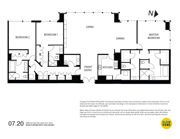
Part 1 – 2800 sqft High Rise Apartment, Texas

2800 sqft High Rise Apartment, Texas (PDF)
2800 sqft High Rise Apartment, Texas (JPEG)

  • Meg

    1. Kitchen too enclosed, and too far to travel over to stove.
    2. Too many bathrooms. Particularly the arrangement adjacent to the area marked as bedroom 2 on the plan (on the right of the apartment).
    3. Wrap around glass in the bedrooms makes it hard to put the bed in a nice position. Privacy would also be a concern.
    4. The pillars in the bedrooms make the space hard to use. I haven’t tried putting a bed in but it seems to me that the pillar would mean that there wouldn’t be room for two bedside tables, or would interfere with circulation depending on where the bed was placed.
    5. One thing I like about this apartment is the amount of storage at the entry and by the laundry.

  • Brian

    First thing, how many bathrooms do you need, I could possibly see one bathroom per bedroom if you plan to have roommates, but all the extra silly toilet and vanity baths are redundant.

    In the pdf, it shows glass wrapping all three side of the unit, is this correct? If so the bathrooms proceed to use the outside wall and block all of the view and light.

    I like all the glass, and it’s the 17th floor so no real concern for privacy.

    The closed of kitchen is just plain awful.

    A positive is the great amount of storage and most likely great amounts of lights but the orientation to the west is a bit of a concern, especially in Houston.

    I could keep going but I’ll stop. Though, the developer had a great opportunity to create a great space and threw it away.

  • Belle, Toronto

    Bathroom overkill! If bedroom marked Master and Bedroom 1 shared a bathroom both rooms could be larger. Bedroom 2 should be the master and could have a large ensuite plus a large walk-in closet and again the actual bedroom could be larger.

    Kitchen poorly planned and closed. All the granite and stainless appliances won’t improve this.

    I think the door to the bedroom/laundry area should be moved further into corridor so that you don’t have to open an extra door before the closet or to use the guest powder room.

  • Daniel Fernandez, Spain

    Personaly I think there are far too may bathrooms. The two bedrooms on the left could have their own private toilets instead of bathrooms, providng more space for storage or for even a small room (office? laundry room?). The toilet near the entrance could then become a bathroom for the bedrooms.
    A kitchen without a window? Unforgivable, at least here in Spain. This is worse knowing that there’s a bathroom next to aan exterior wall without any windows!!!!! And the master bedroom accessed by the dinning room? No hallway or wall? Again, unforgivable in Spain. If I had to design this I would put the kitchen next to the dinning area in the corner where the master bedroom is currently located. Shift the master bathroom to left where the kitchen and make it smaller. And finally place the master bedroom on the bottom right corner accessed by a small corridor and extend the glass through all of the outside walls.
    Anyway, thats my humble opinion as an Architect student on his 1st year. I just discovered this site, looks awesome!!!!!!!!!!!!!

  • John Brown

    Hi Daniel,
    Welcome to the site. You are the first person to comment from Spain. Where are you studying?

  • Adam G

    I’m a little puzzled, as there seems to be differences (eg. more external doors) between the .pdf, .jpeg and the drawing as shown originally. [I also just spotted that on the .pdf at least the southernmost bedroom is labelled the master bed; not sure why, but it does have wraparound glazing in the .pdf whereas the original drawing has it as walled to the south.]

    That said: it’s almost as if the southern portion of the house is broadly ok, and the northern portion was designed with square footage rather than usefulness in mind. I can imagine the brochure dwells on the amount of space devoted to bathrooms.

    I’m not sure I like the storage situation. There’s rather a lot of it. It’s useful to have some storage, but I’m beginning to wonder if they’re expecting an owner with at least two skeletons per closet.

    The kitchen’s already been mentioned, but I’d add that if you’re going to wall it in, you might at least have an entrance via the hall. Otherwise the groceries could only be delivered by walking into the living room. [NB: that does assume no external access.]

    I also don’t like the location of the washer/dryer. Yes, the secondary bedrooms will have good access, but what about the poor souls exiled to the master bed? Do they have to schlep across the apartment each week? Why not devote some of the excess bathroom space to a second washer/dryer?

    Entrance to the master bed straight from the dining room seems ridiculous. Why no hall? There was enough space for one.

    I notice the .pdf has glazing all along the southern and northern walls, inclusive of the bathrooms. Please tell me that’s not what actually happened. Imagine taking a shower or bath with the whole world watching! Though IIRC there was an exhibit not dissimilar at the Tate Modern relatively recently, with the toilet in a glass room suspended on the outside of the building . . .

  • John Brown

    Hi Adam,
    Sorry for the confusion – the drawings have been corrected.

    Although there isn’t curtain wall in the bathroom of this house there could be in a high rise structure like this. That doesn’t necessarily mean that it is clear glass. There are also a lot of opaque glass panels in a high rise wall system but from the outside they look the same as the windows.

  • Terri

    Another example of a wasted opportunity through wasting the space is found here. Five toilets? Even as a former IBD sufferer, I find this absurd. Obviously this element must be one of the top three picks for what’s wrong with this house.
    The other obvious problem is the badly designed, closed-off kitchen. Who would ever want to be banned to that place?

    What I’d like to mention that hasn’t been pointed out yet is the HUGE living room. These showcase spaces don’t lend themselves very readily to comfortable or cozy seating arrangements. Most likely the room will have to be decorated in zones or just look like a showroom with extra pieces of mostly unnecessary furniture just to fill up the space.

    I also don’t like the access to the master bedroom through the dining room and the lack of laundry on that side of the suite. It seems to me that there are lots of alternatives available here. What were the architects thinking?

  • Volker

    [img]wwwth221.jpg[/img]

    ..wow, the first thing that came up my mind when looking at this apartment was: Well, they got sponsors in the restroom business…perhaps it is a restroom testing range! Or maybe it is more of a youthhostel, boarding house or hotel – the living room as the main gathering place with the front desk.
    Tehn I started looking closer at the layout, do we know anything additional about the people living there? Looking at the “odd” restoom configuration for the masterbedroom one idea came up my mind: is this place layouted for a handcapped person? The huge WC perfectly accessible from one side, the huge shower, even the tub seems to be special in size – if this is the truth, I assume most of the layout issues do have a reason and are ok, but if not…

    Then this people spend too much money on wasted space for restrooms! There is a lot of closet space (guess that is ok) but then the bedrooms are oddly shaped, the front entry is too big and missing a proper closet, the kitchen is too dark…

    I did some fuzzing around with the layout and came up with some quick ideas about straightening things out, make the rooms bigger, getting rid of some of the bathrooms… it is just a quick and dirty sketch about what might be possible, not really happy about the kitchen layout at this stage, and not positive about the additional small room next to the entry but I tried to get a closet for the entry, make the entry smaller and this way the living space will get even more space…

    Never the less, the main problem is the amount of bathrooms, too much “backrooms”, a very strange ensuite masterroom layout.

  • Adam G

    Cheers, John.

    I just wanted to say one quick word in defense of that poor kitchen. It’s not that I love the thing – far from it – but I can see why it’d be tempting to wall it. If you assume that the kitchen has to stay in that location, then it really ought to be walled at least on the southern side. Otherwise your grand entrance hall becomes skivvy lane, with the first thing vistors see being your dishes in the sink.

    Of course, it doesn’t have to stay in that location, but that’s another issue altogether.

  • Kevin W

    Hi everyone,

    I think variations of most of what I’ve found has been covered in previous comments:

    1. 4.5 baths for a 3 bedroom unit is inefficient and downright wasteful;
    2. The unstructured living area is too large;
    3. Access to the Master Bedroom off the dining area is confusing and lacks privacy;
    4. The closed-off kitchen is too small in comparison to the overall size of the suite;
    5. There is no pantry/broom closet in the kitchen.

    Looking forward to John’s comments!

  • Grace

    Hi, all! I think the enclosed and windowless kitchen is the worst thing about this house. I, too, would put it where the master bedroom is.

    I would then either rearrange the kitchen/double master bath spaces for the master bedroom/bath or use bedroom 2 as the master bed/bath (rearranging some of the closet space to serve the master bedroom). Then I would use some of the original master bath space as either a playroom off the kitchen or as a cozy library retreat from all that open western-lit space of the living room. In a plan this large, I would need an alcove of some sort. (Or maybe I’m just not liking that living room.) The rest of the former kitchen/master bath can become bedroom #3.

    I agree that there are too many bathrooms, but I do appreciate all the closets/

  • John Brown

    Volker,
    Thanks for the quick sketch revision. It makes much more sense and I think that one could quite easily overcome the issues with the kitchen and the left over space by the entry.

    You bring up a good question regarding the double master bathroom. You may be right about accessibility but this plan is a developer built unit in a new condo building and I would be very surprised (pleasantly I should add) if a cookie cutter developer introduced accessible elements into their product.

  • Brad W

    From our perspective there are many things wrong with this condo. Too many bathrooms, closed off kitchen, the relative scale of the rooms, master bedroom entrance etc..

    But, this week, I am going to play the devil’s advocate. This is an expensive condo probably marketed at an older couple downsizing from a large single family home. They can afford to eat out and do so frequently. Catering is a well used option. So the closed off kitchen is not a problem. The lady of the house has many clothes and enjoys privacy when getting ready to go out. The big closets and master bathroom are easily required. This couple frequently entertain and require a grand living and dining space. They also have two children, not living at home mind you, but they will require their own room and bathroom when they visit. This condo could be perfect depending on who you are marketing it to.

    I really think we need to be careful about context when we happily and easily criticize a floor plan.

    BTW, Volker nice rework of the plan.

  • John Brown

    Brad,
    You make some good points and if this plan was the result of a designer (maybe not a really good one) carefully listening to the specific needs of a particular family I could also agree with your conclusion, (although I still think that there are some elements that are out of whack). However, that is not the case here. This is a standard cookie cutter condo plan that has been repeated on each floor of the building. I think that it is more the result of a marketing agenda intended to impress and seduce homebuyers when they first walk in the door than it is the result of someone trying to actually create a good place to live.

  • Tony

    I think for the size, the enclosed kitchen is too small and doesnt make a lot of sense. I get the feeling the kitchen is for servants and not for the people who live in the apartment. I think the size of the guest bathroom and the toilet rooms in the master suite are wasting space. I also hate how the entry to the master bedroom is from the dining room.

    All in all, this plan seems really strange. I really think it is meant to keep the live in servants or the children away from the “owners”.

  • Robert Bierma

    First off wow this condo acctually makes me a little angry just looking at it. I wont go in to whats all wrong since thats been fairly well worked over. Instead i would like to question what type of life style and values a home like this promotes? What type of impacts might a place like this have on the why people live there lives and how aware are they of these impacts?

    I think it would be really interesting to acctually follow some of the people moving into this place and compair there lives before and after. If anyone knows of studies like this i would love to know about them

  • John Brown

    Robert,
    Excellent point. What kind of values does this plan imply? I think there are two ways to go. First, it implies a culture of consumption in which the home has been reduced to just another commodity to purchase. In this world, bigger is always better and design is reduced to marketing.

    The second implication is for the people who buy it. In my experience this is the sad part because the marketing strategies used to entice people to buy do not usually create very good places in which to live. Like fast food, the satisfaction is fleeting and shallow and before too long the urge to move becomes too strong and the process begins again.

    One of the objectives of the slow home design school is to raise awareness about these issues so that people can make smarter choices and avoid places like this.

  • James Scott

    A three bedroom, five bath condo like this must be very expensive. If you feel this is the way to live or you have more money than brains, it’s all yours.

  • Contstructability

    Greetings from Houston!

    I read your blog daily, and am happy that you are examining a floor plan in my home city. Welcome! We in Houston welcome your inputs to this design and anything being constructed in the southern United States.

    I’ll hold back my suggestions to this particular design, but I will indulge in a few points that may not be totally obvious to those from outside the Houston area:
    - This unit is in a very high-end building with matching finishes and price; expect the target user to have a maid and/or live-in. With that in mind, maid’s quarters may be necessary, and the kitchen may actually want to be closed off for entertaining.
    - Their is a push here to live in the inner city, to cut down on carbon footprint, commute time, etc. The suburban competition will have a bathroom for each bedroom, plus a powder room off the main entry. Right, wrong, or indifferent, that is the competition, and to entice potential buyers to buy in the inner city, numerous bathrooms are a marketing plus. Is it better to not offer amenities, and have the potential buyer move 30 miles out and drive every day / add to congestion and an ‘Un-SlowHome’ wasteful lifestyle?
    - I believe I know which building this is, and believe that the balconies were inadvertently left off. But, I could be incorrect…
    - I am fully aware of the author’s like for entry hall coat closets. Having lived all over the world, I understand and appreciate that in certain climates. However, for Houstonians, a hall closet is not necessary. Coats are not usually used, as it is too warm here. Even a light sweater is out of the question most months of the year. So, the hall of storage and closest leading to the guest quarters, in my opinion, are more than adequate.

    Best of luck and thanks for examining a building in Texas!

  • Brad W

    Constructability – just as I thought…

    John – I agree the plan could be better. I am just trying to add perspective to the discussion. Especially in the wwwth segment, the same complaints are repeated and with increasing disgust.

  • John Brown

    Brad,
    As always I appreciate your point of view. There is nothing better than proposing an alternate opinion (even as the devil) to get the discussion moving along. Thanks.

  • John Brown

    Constructability,

    Welcome to the site. Thanks for participating.

    You make a good point about suburban competition. Living in a dense downtown situation in which you don’t have to commute is certainly better than living in a far off new community. Without a doubt.

    I also understand that a developer would need to offer a housing situation that offers the same kind of amenities if they are to attract buyers. At the same time I think that it is legitimate to offer criticism of both types of supersized plans (urban and suburban) and ask the questions about appropriateness etc. I also think it is important to talk about the craft of good design. Good design can be big and it can be small. It can be expensive and it can be modest. So can bad design. I think that this project, like most cookie cutter houses, is an example of poor design.