Part 1 – Stein Residence, Alberta

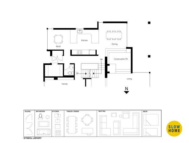
Part 1 – Stein Residence, Alberta (PDF) | Part 1 – Stein Residence, Alberta (JPEG)

  • Rhonda

    Although I don’t know how to draw the plans, I think that the kitchen should be moved into the nook area so that it is not so internally focused. From what you say in the design brief this house has a really nice backyard and I think that you should be able to enjoy it while in the kitchen.

  • Uno

    Please excuse the quality of this drawing – this is the first time I have ever drawn a plan. It was surprisingly easy to learn how to draw with Microsoft Paint when I followed along with John’s instructions from last week’s slow home report. A tutorial sure would be nice however!

    I tried to make a small seating area at the front window in the dining space because I like the idea of combining living, dining and kitchen all together. But it may make the kitchen a bit too small.

    [img]shdp9-1a.JPG[/img]

  • John Brown

    Rhonda and Uno,

    It is interesting that you both had the same inclination to put the kitchen near the rear window. Normally I would agree about placing the kitchen at the end of a room rather than in the middle as it was originally. The concern is what to do with the central space that used to hold the kitchen. Uno, your plan addresses this somewhat by moving the table over because of the two chairs. Do you think it is now too tight?

    Also, Uno, congratulations on drawing your first plan. You did a good job. I know it can be a bit intimidating at first but it isn’t really very difficult to use either Microsoft Paint or Paintbrush.

  • Stanley

    Help – How do get the jpeg into Paint?

  • John Brown

    Stanley,
    When you click on the jpeg link a window will open with the drawing in it. Right click the image and choose “save image as” to save it to your computer. Start up Microsoft Paint (it is located in the accessories folder) or Paintbrush. Under file choose “open” and select the file you just saved.

    When you are finished, simply save the file to your computer. You can then upload it to the site by clicking on the browse button.

    Let me know if you have any other questions and I look forward to seeing your ideas for the project.

  • Joshua

    I also considered placing the kitchen in the front or back, but decided to leave it generally the same place (decreased cost). I removed the walls to the corridor and created an island with seating, and a small seating area with a view to the backyard.

    [img]1_shdp9-1.jpg[/img]

  • John Brown

    Joshua,
    That is one big island! What a great place for a party. I like the idea of a small seating space at the rear. What kind of seating would you envisage being appropriate?

    I have two comments for you to consider:
    1. Do you think that having a galley style end to the kitchen where it opens onto the dining space is the best thing to do? It means you would be able to look down the length of the kitchen while sitting at the table.

    2. Do you have any suggestion for the back entry? At this point the door opens right into the kitchen. Even though there is a big walk in closet, my sense is that there would still be a lot of “dropped stuff” – backpacks, boots, etc. that would clutter up the kitchen.

  • Louis Pereira

    I’m working against the grain so far. I came up with a number of options but like this version most.

    I sought to expand the Kitchen where it is currently located and proposed taking advantage of the South light by introducing New Patio Doors off the Kitchen into a small side Courtyard. The kitchen design allows for 2 working areas with each zone dedicated to Cooking and Cleaning.

    I propose to maintain the Dining Room due to the ‘lovely’ views into the front garden. Since the client didn’t have a convenient and quiet place to work, according to the brief, i dedicated the space facing the backyard for this activity.

    [img]shdp9-1d.JPG[/img]

  • Louis Pereira

    Oy Va – Poor graphic! Allow me to post again…

    (John – What’s the max. allowable file to upload?…I’m assuming 800×600?)…

    [img]090421_a.jpg[/img]

  • John Brown

    Louis,
    What an interesting idea. I had not considered adding a study space into the mix. I do like the way that pushes the kitchen over towards the front of the house and changes the proportion of the space.

    Everyone, notice how Louis’ scheme reorients the kitchen so that it now faces the dining area instead of the hallway. Very nice.

    What about the double island? I have never worked in one so I am up in the air about it.

  • James Scott

    Louis Pereira,

    I like the additional light coming from the south and the added ‘quiet space’. I also like how the wc is easily available but does not intrude into the kitchen. Your plan provides a nice flow to the main floor, it really ties much of the public space together quite nicely.

    The only thing I would hope is that the refrigerator is blended into the cabinets so it doesn’t become a feature or distraction seen from the dining table.

    Nice job!

  • Louis Pereira

    John | James – Thanks! I value your comments…

    I struggled with the generous amount of room we had to work with. As a result, i felt there was enough room to have a study at the back. To make up for the minimal view to the back yard, i thought it was necessary to open up views to the south instead, which i don’t think would be a major undertaking structurally or cost wise.

    i designed a similar Kitchen for a client of mine and and it works very well. In the Stein’s layout however, it is essentially one island Galley Kitchen since the one to the right is full-height – The client has the option of closing off the right side so that there is no pass-through at counter height.

    [img]090421_b.jpg[/img]

  • Louis Pereira

    Clarification on the millwork separating Kitchen and Dining Room…

    [img]090421_c.jpg[/img]

  • Joshua

    John… thanks for the comments. The seating space at the rear would be for small but comfortable chairs for reading or enjoying your morning coffee. I also struggled with the dining room placement in relation to the galley style kitchen. As for the back entry, once again I saw the big closet and didn’t even consider a millwork piece, but I think that would be really nice. I will try and rework my plan tomorrow with your suggestions in mind.

  • Grace

    Louis–this is a wonderful plan. At first I thought that I might not like the two aisles separated by the central island, but it works because of where you have placed the fridge and prep sink. My husband and I both cook and move around our kitchen at the same time; it works because it was carefully planned–two sinks, two dishwashers, two triangles with easy access to the fridge, lots of counter space. And it’s not huge.

    The little garden is inspired!

  • David Pease

    Louis, you have suggested an option of closing the cleaning island with a full wall. Would you consider sliding panels that could isolate the kitchen during formal entertaining while still providing a more open working area at other times or during informal entertaining? A nice quarter sawn cherry surface might be appropriate.

    Still not so sure about yet another sitting room as it would be the 4th in the house on the first floor. Would it be outrageous to make that room a laundry room? We love windows in kitchens but always put the laundry in the darkest part of the house with little or no tables for folding etc.

  • Brad Waters

    Is there such a thing as too much space for a kitchen?! Unlike Louis, I wanted to keep the kitchen open to the views in the backyard. Because the space is generous, two areas for eating are defined. The island provides an informal space and is a good place to gather during meal prep. The dining room is divided from the kitchen to provide a more formal experience. Cabinets provide display and storage on the dining room side. The fridge, oven, mirowave and pantry are on the kitchen side. Access to the bathroom is now from the mud room.

    [img]2_shdp9-1.jpg[/img]

  • Tony

    hey John, do they use the door by the powder room as their mudroom? Do you know if they still need that closet?

  • Frank

    Here is my version of a open kitchen dining plan with a desk looking out to back yard. I would suggest a quality millwork and stainless appliances similar to those I used in my kitchen. Two sinks allow one to be used for food prep and the other for cleanup. The openness and connection to the great room (kitchen, living, family and dining rooms) are a part of our contemporary and casual life style.

    [img]KitchenPlan.jpg[/img][img]IMG_4126.JPG[/img]

  • Frank

    Here is a closer look at the cooktop area. Framing around cooktop vent stack was painted to match wall color.

    [img]IMG_0388.JPG[/img]

  • John Brown

    Brad,
    Your scheme is simple and bold. I do have a question about the back entry. Do you anticipate relocating it now that there is a sliding door?

  • John Brown

    Tony,

    I think that in the existing condition it is more of a walk in closet than a mudroom. In the design brief the clients mentioned that they would like a better, more effective back entry.

  • John Brown

    Frank,
    I particularly like the desk overlooking the back garden. It is a nice addition to the standard parts of a kitchen when there is enough room.

  • Louis Pereira

    Grace – Thanks for the feedback. Though i haven’t mentioned on the plan i would also have a wall mounted pot filler at the stove so that you’re not having to fill pots with water at the island. This also means it isn’t necessary to have two large sinks, but ratehr 1 main sink in the cleaning zone and another small to medium size for the cook.

    ———-

    David – The sliding panles for the millwork facing the Dining Room is an excellent suggestion. I think it would work very well, giving us added flexibility. It reminds me of Splyce Design’s Mantel Residence where they used the sliding frosted panels in the kitchen…

    http://theslowhome.com/case-study/mantel-residence-vancouver-by-splyce-design/

  • Doug Roberts

    I apologize in advance for the quality of my plan, assuming that it even shows up (I don’t have Paintbrush yet, so I thought I would try using the limited drawing capabilities of Word).

    I like Louis’ concepts of creating a home office in the nook area, opening up the south wall to bring more light into the kitchen, and having two working areas in the kitchen, a cooking area and a cleaning area. However, I am concerned that having a full height wall between the kitchen and the dining room would create too much of a visual barrier, even with a pass-through. Accordingly, I went with a fairly conventional L-shaped kitchen with a large island.

    I also chose to relocate the powder room and rear entry closet into what used to be the walk-in closet to make the kitchen more open to the family room, as the Design Brief mentions that they would like to increase the connection between these two areas.

  • Doug Roberts

    As I feared my plan did not even show up. Here is again in a different format.

    [img]SteinKitchen_0001.png[/img]

  • Louis Pereira

    Doug – The images size you posted is 566 wide x 800 pixels high. The upload feature allows a max of 800 x 600 pixels high so it will automatically resample the image if its any bigger than that, resulting in a lower resolution…

    Try zooming in on your drawing and do a screen capture making sure its no higher than 600 px

    BTW, I like how you’ve reorganised the back entry…

  • Doug Roberts

    Louis – Thanks for the advice. I have resaved the image in 800 x 500 size, so hopefully it will display better this time.

    [img]SteinKitchen_0001copy.jpg[/img]

  • Joshua

    I revised my plan with John’s suggestions in mind. By adding the wall of cabinets with a pass throught (similar to what Louis proposed) it creates the seperation for the dining room. Also, I relocated the bathroom door and added millwork to the large closet, which would allow it to remain open to the kitchen, and hopefully lead to more use.

    [img]shdp9-2.JPG[/img]

  • Jim Argeropoulos

    Louis
    I like your approach the best, more than John’s in fact.
    One thing that nags me about this house in general is the duplication of space. Conversation pit, living room, family room, office. Just feels to me like you are going to furnish and condition at least one room and never really use it.

  • Brad Waters

    John,

    I had not thought about relocating the back entry but that could allow use of that space for the kitchen. You could then change the back window into a door.

  • John Brown

    Doug,
    Congratulations on drawing the plan in Word!

    If you are on a Mac you can download a free version of Paintbrush from a variety of sites. There is a pro version that you can buy but we haven’t found any significant limitations with the free version. If you on a PC, Paint is a free program found by going to start > all programs > accessories.

    The one question I would have of your proposal is the corner stove. In my research on kitchen design, I have found that although this looks like you are using up a “wasted” corner the impact of the diagonal on the usability of the two adjacent counters can be compromised. I have seen it used effectively in really small kitchens but my sense is that your design is big enough to accommodate a more conventional stove location.

  • John Brown

    Joshua,
    Thanks for taking the time to revise the drawing for us all to see. I think this works much better.

  • John Brown

    Jim,
    I agree with the duplication of space in this house – particularly the conversation pit. It is interesting as a kind of historical relic but it is so small and who really wants to talk to someone in a pit? Like most houses, I think you could trim 15% off the floor area and it would work better and feel nicer. Tough thing to do on a reno but a great way to start thinking about all those obese new house plans