Option 1: with reconfigured Kitchen (same location)
Option 2: with Kitchen relocated to the front.
In each case I would keep the Dining Room in its original location. It seems to work better with either Option 1 or 2. I do think there is an issue with the stairs at the front window, but there are ways around this. For Option 2, some may recall back in March of 2009, the case study feature of the Mantel Residence by Splyce Design, where the architect’s solution was to provide a frosted glass sliding panels directly in front of the main sink.
Similarily, if we kept the Living Room at the front, then i would propose installing 2 full-height frosted glass doors rather than curtains.
jim baer
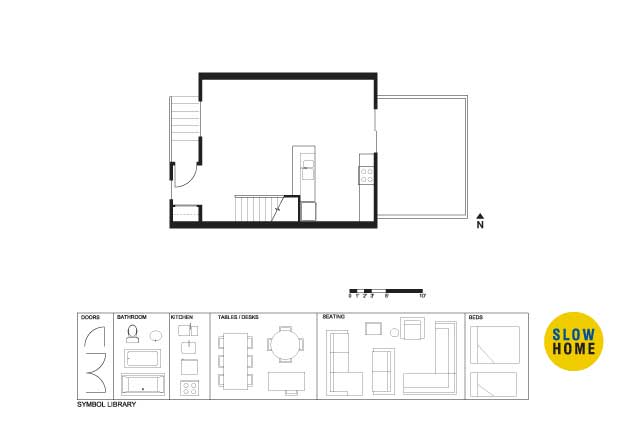
[img]wwwth100127.jpg[/img]
my thoughts.
i know you guys are ok with going upstairs to use the bathroom…but i am not… so i created a challenge by trying to get a 1/2 bath onto the living floor….how did i do??
Terri
[img]lath.jpg[/img]
Louis,
I like option 2 better. I decided to try and reverse living and dining, but the dining seemed closed off a bit in the corner so I installed a window along that east wall.
Jim,
I see you’ve pretty much put the three elements in the same zones as I did, though I really like your powder room idea. The opening into it seems private, but maybe it makes for less connection between the kitchen and dining. Maybe it could be shifted against the west wall–it would be more convenient to the entrance and would create an even more private location without detracting from the kitchen/dining connection…
jim baer
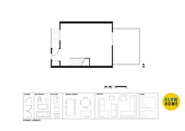
[img]wwwth10012701.jpg[/img]
terri
kinda like this?
i my have had it like this at one point…but thought it had a ripple affect (i had to move the kitchen counter a foot to the east) that mad the the living a little tight.
jim baer
[img]wwwth10012702.jpg[/img]
HELP ME!! i can’t stop!
Corey
[img]townhomesolution.jpg[/img]
it’s a little late, but here is my solution.
Mid America Mom
[img]latown4.jpg[/img][img]latown5.jpg[/img]
Tried a few things!
I really wanted to put a banquet seating in the dining area for that outside wall but not sure it was considered slow (is a built in ok?) What would be nice is if the stair was open underneath.
I did not like how the entry view was to a closet door highlighted by a window. SO in one of these plans (I call it plan 5) I moved the entry door and put a wall in that place. I thought a nice piece of art or mirror or thin shelving would work there to establish this space. Added a 1/2 bath to that front window. I choose swing this way to min. view of others from the living space into that room when exiting it.
Thanks!
John Brown
Louis,
Thanks for making the connection with Splyce Design’s Mantel Residence. That is a good precedent. For anyone looking for the old Design School content, it is still available through the link at the very bottom of the page.
John Brown
Jim,
Trying to add a 1/2 bath on this floor is an admirable task. You did a good job. I would say that the first option is the best although I would try to shift the bathroom closer to the stair to make the kitchen a little bigger. It would also be nice to move the peninsula counter in a bit so that there could be room for counter seating.
John Brown
M.A.M,
Opening up the space under the stair is a really nice idea. Having an open riser stair would really open up the dining space. I think a built in banquette would be quite nice underneath.
This floorplan creates a convenient yet separate relationship between the kitchen and dining room, and a cozy living area with a focal point.
Mid America Mom
[img]latown6.jpg[/img]
Open stair and banquet.
Molly K
[img]shdp491rev3.jpg[/img]
My first attempt to modify a PDF… My floorplan was similar to Louis’ Option 2. I was unsure about the inclusion of several features including washer/dryer, powder room, and fireplace. I chose to place a flat screen t.v. in the living area instead of a fireplace. My main objective was to insure good circulation across the room, moving from the kitchen through the living and dining and finally outdoors where I took the liberty of adding a cooking area just for fun.
I felt the living area needed connection to the outdoor area and the dining needed connection to the kitchen resulting in the final plan. I’m not a fan of dining areas such as those presented by Jim simply because I envision myself traveling across the room with a turkey on a platter and somehow it ending up on the floor before I get to the table. I like a closer connection between kitchen and dining both for functional and aesthetic reasons.
Dominique
[img]townhousereno.jpg[/img]
The kitchen was placed next to the large outdoor patio to create an outdoor entertaining/dining area, while remaining adjacent to the interior dining room.
Dominique
[img]1_townhousereno.jpg[/img]
REVISED
Molly K
Dominique,
I like your plan and had actually thought about the same setup. My concern is having to cut between the kitchen and dining to go outside. I worry about a traffic jam in that area if it gets busy. Otherwise the kitchen makes a good connection to the outside area for eating.
Jenny
Hi John,
I have the dumbest of dumb questions. I have seen the alternative layouts done by everyone and there are some fantastic ideas here. As a relative newbie here, how does everyone do it? Is it just a matter of opening the .jpeg or the .pdf and then cutting and pasting the symbols? I am thinking I could do this in Photoshop and that’s the only real thing I can think of. Is there some other whiz bang function on the site that I am not aware of? I’d love to get in on the act but need a little assistance.
Thanks,
Jenny.
Terri
Jim,
I think your revision is good, though I now notice that you could actually use the space under the kitchen window and behind your powder room as counter area and thereby open up the eastern side more–maybe even an island?
M.A.M.,
I originally drew a banquette seating in the dining (I’ve got a penchant for banquettes), but it felt a little shut in still. Your idea of opening the staircase though, would offer more openness.
Matthew,
I like the open space by your island on the north end of the kitchen. I ended up closing mine off to create more cupboards.
Mid America Mom
Jenny I am using microsoft PAINT (see accessories folder if non mac user). Opening the JPEG file there. I cannot seem to be able to ANGLE the furniture with rotation… anyone know how to do that with paint?
Wayne
[img]2_redesignedfloorplanweek2.jpg[/img]
Sorry my first image did not load. Let’s try this one. Redesigned floor plan.
Vickie
[img]1_planexer2.jpg[/img]
ooops. sorry. Here’s a smaller file
John Brown
Matt,
A nice simple plan. I am not sure if you need the wall on the end of the island. Even though it is similar to the strategy I suggested in last week’s project, I don’t think it is necessary here because the entry is already sufficiently defined.
John Brown
Margo,
A good attempt at adding in a guest bath. My concern is that in its current form it creates a rather awkward diagonal circulation path beside the island. Also, the living room seems cramped while the dining area is overly generous.
John Brown
Molly,
Congratulations on your first design project post. Well done! I appreciate the fact that you considered how to furnish the terrace. Like Margo’s plan I am a little concerned about the size of the living space in comparison to the dining area.
John Brown
Jenny,
Welcome to the site. It would be great if you started to submit to the design project. The best way to learn is by doing. If you have Photoshop, and know how to use it, that is probably the best way to go. If not, then Mid America Mom is correct about Microsoft Paint. I will ask Eric our webmaster to see if he can find the segment we did on how to use the program and repost it.
John Brown
M.A.M
To rotate an image in Paint simply go to the image pull down menu and select flip/rotate. You can’t rotate to any degree but it does give you some limited options.
John Brown
Wayne and Vickie,
Your design proposals make sense of the space. I think that, like Matthew’s scheme, your dining areas are more appropriately scaled.
The solid line encompassing the kitchen is supposed to be lowered ceiling to define the kitchen. I couldn’t figure out how to change it to a dotted line. The black rectangles along the living room wall are intended to represent a fireplace (centre) and surrounding built-in cabinetry/shelving.
P.S. – It was SUPER difficult to not look at the website solution first (in fact, I still haven’t, as I’m waiting until after I post)!
Mid America Mom
[img]latown7.jpg[/img]
Ok worked the existing entry with door as is. Built in cabinent instead of closet.
This week’s space was challenging in that it was solely a principal space. I had an urge to try to make the space more interesting by defining various boundaries, but limited myself to making the sliding doors larger (if that’s even allowed?) I would like to learn more about how to illustrate ceilings to define spaces as well, as I think that may have been a method to employ for this floor plan revision. (?)
Sarah Williams
[img]williamsweek2.jpg[/img]
I kept it fairly simple, but added a powder room so that guests don’t have to go upstairs. I left ample room to move around in all areas, and tried to connect the living space with the outdoor space more directly. The wall of the bathroom allows the dining space to be more defined as well.
Murray
To play the devil’s advocate – is there a Slow Home hegemony in the works? The plans, all great, everyone, are also mostly the same. Sharpen your cookie-cutters.
John Brown
Murray,
I think the similarity might arise from the relative simplicity of this week’s project. Given the number of new viewers I wanted to offer something that wasn’t too difficult. The flip side, as you can see, is a certain uniformity. I will crank up the challenge next week.
Louis Pereira
[img]10012703.jpg[/img]
I wasn’t completely satisfied with my first two options, but after I saw Dominique’s Kitchen off the patio doors, I thought i would try a variation of that layout.
I reconfigured the Kitchen as a galley with the Living Room at the front and the Dining at the south-east corner. I also found extra room to place full-height millwork along the stairs for additional storage or display.
I’m not sure how this would affect the upstairs layout, but I wondered about mirroring the stairs horizontally so that the base of the stair run starts near the Dining Room. This would also allow you to extend the front entry closet space.
Wtgrating WayTong A nice looking project. I have same feel that a minimum dimension of about 5 feet by 3 feet is required - cabinetry has to... An In Depth Look At Apt/Lofts In Denver
Kurt Grosse As a former Nevada building engineer and 25-year Realtor, I love Beazer Homes Las Vegas. Their home construction is generally good. Every home will have... 05/04/10 - Dallas/Fort Worth - Single Family
Dale Edmonton I was glad to read that In the first segment of a three-part series on the LG House by Louis Pereira of third stone inc.... LG House by thirdstone inc. [^] Part 1


