Remodelling Apartments/Lofts In Miami

This is Day 127 of the Slow Home Project and we need you to join us in our quest to evaluate the design quality of houses in nine North American cities in nine months. This week we are analyzing apartment/lofts in Miami and for today’s design exercise we are going to be redesigning a 620 sq ft apartment.

It’s time for another “Design Project!” We need you to re-design this 620 sq ft apartment/ loft plan from a new building in Miami, Florida.

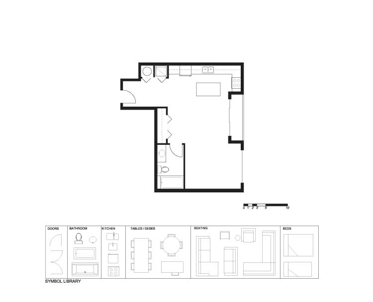
The unit we have chosen is “Unit A1″ in the “Loft2” project located in downtown Miami. There are numerous problems that need to be addressed. First, it is located on an inside corner of a 35 storey high rise and although we cannot re-design the entire building, we do feel that special attention needs to be paid to the fact that there will be some overlooking concerns from the adjacent unit. Second, for a 620 sq ft unit, the kitchen and bathroom are too large – space is at a premium – so try to make them as efficient as possible. The third, and probably worst design feature, is that the closets for the “sleeping area” are in the living space. This needs to change as it makes no sense!

The ground rules for today’s design are as follows:

  1. You need to put back a kitchen that is more appropriately scaled for the unit.
  2. You need to put back a bathroom that is more appropriately scaled for the unit.
  3. Try to fit in a modest dining space and a front entry closet.
  4. Please leave the hot water tank where it is.
  5. You will need to find a new spot for the laundry.
  6. Try to get more “enclosure” for the bedroom with good closet space. It does not need to be a closed off room but there should be some form of separation from the main space.
  7. Think about where the focal point for the living room would be and where you would have a TV.
  8. Try to come up with an idea to address the possible over looking from the other unit.

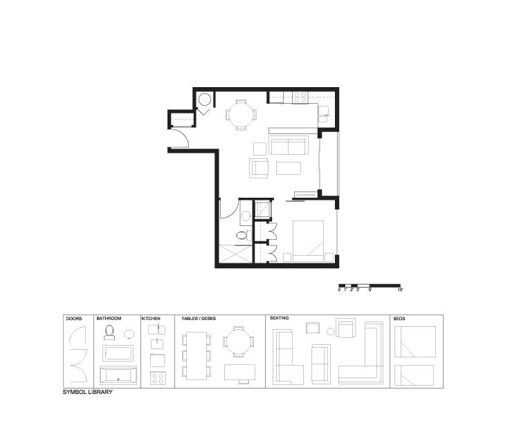
This is a tight space and will be a real challenge! When you are ready, click on the link below and see how Matthew has designed the space. Good luck!

Remodelling Apartments/Lofts In Miami (PDF)
Remodelling Apartments/Lofts In Miami (Existing)
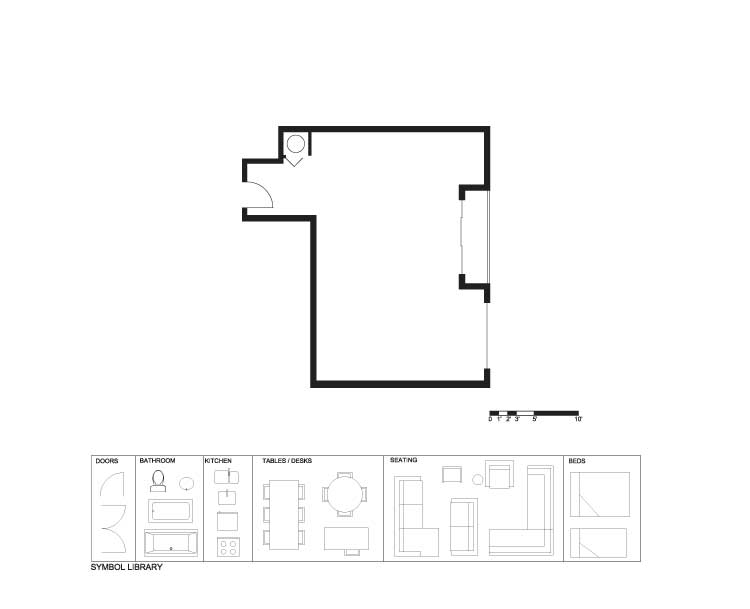
Remodelling Apartments/Lofts In Miami (Demo)
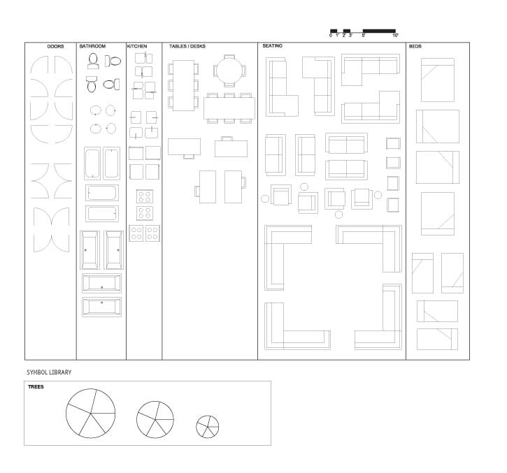
Remodelling Apartments/Lofts In Miami (Full Symbol Library)

See Matthew’s final design

Tomorrow we will be doing an “In Detail” segment and we will focus on Organization in apartment/ loft projects.

  • nicole

    [img]pp1.jpg[/img][img]pp2.jpg[/img]

    All the original components are in the right spot, they just need some tweeks.
    The scale of furniture is key!
    One option shows a bedrorom, the other is open.

  • BradW

    [img]shdp651.jpg[/img]

    Kitchen shares entry hall. Inspired by earlier NY loft.

  • BradW

    [img]shdp652.jpg[/img]

    alternate furniture configuration

  • BradW

    [img]2_shdp652.jpg[/img]

    Alternate furniture arrangement for better view…

  • MollyK

    [img]shmiamiaptr1jpage002.jpg[/img]

    –Entry has closet.
    –W/D space is large enough to stand in and open a front-end loader. The space also serves to break up a direct view into the kitchen from the entry. The narrow pantry is placed beside the laundry space to store detergents and hangers, as well as other items.
    –Kitchen has ample storage and counter space, but no bar seating…the space is so small I couldn’t justify having extra seating, so the dining table is where you must eat.
    –The dining table is modest and grounded by two walls. It still has a view of the outside.
    –The living room has a wall with tv.
    –The living room wall also serves to block the view from the neighboring apartment into the bedroom.
    –The shared bathroom is smaller and connects to the bedroom, which can become a private suite when the pocket door is closed.
    –A reasonable solution (though not perfect) to the siting problem is to place a grouping of large potted plants at the end of the terrace closest to the neighboring apartment. The terrace isn’t very wide so you might opt to strategically locate additional pots with tall plants along the railing. This would allow a “filtered” view beyond the terrace.

  • JessicaD

    [img]jessicadesignproj2.jpg[/img]

    I may have not left enough space for a tv in the living area, but I wanted to leave the patio doors open to the rest of the space. I wanted the kitchen by a window to make the most of the sunlight although due to the odd shape of the building there may be shadowing effects from the other wing.

  • MarisaM

    [img]1_gnst301.jpg[/img]

    I did give the front entry a hall way closet, but also extra room in there for the kitchen items not often used and for what ever else storage is needed for. The washer and dryer got put into the bathroom and door when open nicely covers it up. The bedroom does not have the door but when sitting in the living room or coming into that area, you will most likely see the closet end wall before the bed. The couch area is facing away from neighboring window, so you are not looking into their apartment. Lastly I closed off the kitchen, but now it lacks any natural light. After watching Matt’s redesign I would most likely but in a raised counter space as he did for more natural light into the kitchen area. Everyone likes to see what makes it into the pot!

    Also I feel like the couch is far away from the TV and I am considering other possibilities right now.

  • Kadoman

    [img]unita1redesign.jpg[/img]

    Well, I had a tough time with this one for sure. I re-organized some things to try to take advantage of the natural light from the windows, and yet privatize those areas you want to be more private. The furniture grouping in the small living area could be organized better, but I believe the space is ok, small for sure, but the whole apartment is small. Maybe smaller modular chairs and tables are the best solution for the living room.

  • Kadoman

    Oops, forgot to draw in the kitchen cupboards.

  • Kadoman

    Molly K
    I like your kitchen design. Though I fear it might be a bit cramped. Also, a very clever bathroom, bedroom, living and dining arrangement. The entrance to bathroom/bedroom might be a smidge tight as well though.

    Marissa,
    Also a very clever use of space for sure. Though maybe there is a bit of space wasted in the circulation of the home? Perhaps some of that could be reclaimed to make the dining space large enough to sit down comfortably at.

    Nice work so far. :)

  • Kadoman

    [img]1_unita1redesign.jpg[/img]

    3 Comments in a row… sorry all.

    Just finished watching the video. Glad to see I implemented some of the same design ideas. :)

    Also, added in the cupboards.

  • Cnick

    Hey guys,

    For anybody using a mac, could you tell me how you are moving images from the full symbol library to the paintbrush floorplan that you are working on? I open up two paintbrush documents, one of the blank plan and the other of the symbols, but I cant drag them from one image to another like I thought. This is really a pain as last time I had to work around only using what worked with the positions of the furniture given on the first download.

    Thanks for your help!

    Cnick

  • MollyK

    [img]shmiamiaptr2jpage002.jpg[/img]

    Revision 2:

    Reworked entry: moved entry door down slightly to put in a closet which allowed me to redesign the laundry area.

    Laundry area: still able to stand at front-end loader with washer door open. Empty space to right of W/D can store a vacuum with mop & broom hung on the wall. The open shelves to the left of the water heater store detergent and cleaners as well as pet food, bug spray, etc.

    Added a 41″ wall behind the sink to denote a better separation between the kitchen counter and living room (and to avoid spilling anything on the couch).

    Left everything else the same as in Revision 1.

  • Manolo

    Cnick,

    With the one paint file open, select the area of the symbol library you want with the dotted square tool (window select tool), then copy it (control-C) and paste it (control-P) into the other paint file open in the other window. As long as you don’t click away, you can position that symbol wherever you want. I suggest selecting and copy-pasting the entire symbol library into the file you’re working on, over on the side. When you’re done you can select your finished drawing and crop out the stuff left over on the side.

    Does that help?

  • Allie G

    [img]floorplan2.jpg[/img]

    Here’s my floor plan. I’ve come to realize that it is incredibly difficult to cram everything into a tiny space. I now understand why all the apartments in Miami usually have small kitchens! Good work on the floor plan, everyone else, they’re all great.

  • Manolo

    [img]1_mytry.jpg[/img]

    I did a plan similar to MollyK’s with a table off to the one side.
    At the front door I have a sliding door accessing the closet, which helps create enclosure for the entry, and a shoe-tying bench adjacent to the front door. In the main living are, there is a built-in wall with a bookshelf on the dining area side and storage and room for the tv on the living area side. I tried to simplify and separate the private spaces better from the public areas, yet leaving enough room for a good kitchen and living/dining space.

  • Bell604

    [img]gnstfloorplan2.jpg[/img]

    I attempted to keep the concept as open as possible. Shrinking the bathroom, and kitchen allows for more room, and I added an island to allow for more useable counter space.

  • Cnick

    Thanks Manolo! That definetely helped me out. I appreciate it.

  • Cnick

    [img]loft2.png[/img]

    In my plan, I moved the washer/dryer closer to the bedroom where the clothes will be coming from. I used the patio doors as a focal point for the living area. They are all glass so they can function as windows and doors at the same time there. I added the tv to the side so it can be viewed while someone is working in the kitchen or at the dining table.

    I added a closet inside the bedroom as well as one near the front entrance. Because I had some space beside the relocated Washer/dryer, I added a small desk since there needs to be a place for work to be done and to store bills etc.

  • MollyK

    Kadoman,
    Yes, I can see your point about the kitchen. Rest assured that it meets all minimum dimensions. Revision 2 is slightly longer at just under 12’5″. It is 7’3″ from the back of the stove to the back of the sink counter. And the area between the counters is 3’1″. It certainly is not a 2-person kitchen.

    As for the “smidge tight” entrance to the bed/bath area…the pocket door measures 2″7′…1 inch more than the standard 2’6″ door opening.

    Sometimes its hard to “eyeball” dimensions from the JPEG.

  • MollyK

    Manolo,
    I had to do a “double-take” when I saw your plan…the similarities are uncanny.

  • bbhorner

    [img]demo.jpg[/img]

    I included extra wide closets because storage is always a problem in these small units. Like Mathew I created a focal point that is directed away from potential neighbors and included pocket doors to save space and allow the area to flow better. Not totally happy with my dinning area but it works. Everyones plans look great and it is always interesting to see others creativity at work.

  • Frances Grant-Feriancek

    Hello Slow Homers,

    I’ve done two layouts. I can’t wait to post so I can see what you all have done with this weeks design dilemma. I think I like my first plan best.
    The kitchen has a built in banquet seating and I left the bedroom open so the television can be swiveled and viewed from both rooms.
    My second plan has an eating bar and I tried to turn the focus away from the “terrace without a veiw”. I think my second kitchen is too large for this square footage.

  • Frances Grant-Feriancek

    [img]1_shdp65demo.jpg[/img][img]shdp65demo2.jpg[/img]

    How about I include the images!

  • Hawerchuk#10

    [img]redesignunit1a.jpg[/img][img]1_redesignunit1a.jpg[/img]

    I can get over the difficulty of this design. It was tough due to the amount of space (sq ft) that makes every placement questionable or prone to second-guessing. I wanted the bedroom to be closed off but wanted to keep an open concept by placing double french doors on a diagonal. The focal point is situated in the open area with a view to the outside. I am not completely satisfied with this layout but as I mentioned before tough with a tight space and a novice planner.

  • PeterB

    [img]peter.jpg[/img]

    This was a doozy this week for sure. I thought i would close off the bedroom and as well semi close off the kitchen but i fear i havn’t left a big enough opening between the living room and the kitchen table.

    Molly, you must be a seasoned veteran because your layout looks great. definately like the closed off entry and the shared door for the washroom and bedroom.

  • Hawerchuk#10

    Sorry some spelling / grammatical errors on my last post… It was supposed to state how difficult I found trying to layout this small space with the limited knowledge I have. Some additional description of my space, the bathroom is tight but the stand up shower I believe works rather than a tub/shower style. The sink is in the corner with fridge on the end of the counter space. Well another attempt, another notch in the learning board.

  • Murray

    [img]miamiloft.jpg[/img]

    I really struggled with this one, and am not satisfied. I also really struggled with last week’s design. Maybe I don’t want to live in Miami!

    I haven’t looked closely at the other plans yet – but a number of them look really good for this small space. I shall study and learn from them.

    I did want to point out that this unit has similar problems to yesterday’s exercise – mystery spaces flanking the W wall and the elevators on the N.

  • Deng

    [img]3_maimiloft.jpg[/img]

    I found that the size of the apartment can accommodate all the essentials of a apartment.
    I left my bedroom open but there is a hint of privacy as I placed a wall to separate it from the living room. There is no door to close it off as I wanted to have natural light streaming through the living room window. It is also placed in the NE corner for maximum privacy from the next door neighbors.
    I struggled with the laundry closet- I forgot about it until the end of my design. I do not particularly like where I put it and I did not want to change the layout of everything else.
    The front entrance does not have closet space but that can be remedy with a coat rack and hooks.

  • Neogi

    [img]1_neogi.png[/img]

    Since this is such a small space i wanted to go with an open plan bedroom, the decorative screen separates the living space with the private. In the bathroom i focus on counter space so i decided to enlarge the counter tops to go over the toilet as it frames the space a little better. I also decided to put in a breakfast bar in the kitchen, this allows a nice view as you enter into the space. I also moved the door in the entry to make room for a closet, the built-ins wrap all the way around the corner where the TV is mounted on the wall with cabinetry all around to utilize every inch of space available. The washer and dryer are staked across the closet space in the entry. The bedroom also features a wall to wall of cabinetry that allows for maximizing storage space in the house.

  • MollyK

    PeterB,
    You are too kind. I must confess I am not that creative and “steal” ideas from other people…like BradW. I love his clean lines and attention to detail such as line-of-sight issues where you want to avoid looking directly into a powder room from the dining table. His use of built-in cabinetry makes his living areas flow seamlessly together. (I know his design today is unusual, but you owe it to yourself to look at his past designs for inspiration.)

    I also draw on personal experiences (I am the foreman in my home), and I love puzzles…the redesign exercise is a puzzle with technical challenges (how can I make the pieces fit AND have them functional for the occupants).

    You will get better…and, if you see a design you like, save it in a file folder on your computer. I just started a “Slow Home” folder myself with several redesigns. Oh, and I mess up sometimes too. Not every design works out well for me.;)

  • Athena

    [img]1_myapartmentmiami2.jpg[/img]

    For my design, I decided to move the kitchen to the middle of the appartment. I found it easier to sneak in the Dining Room infront of the very limited window space. Also for the washer/dryer I decided to put it in an oversized closet in the bedroom (stacked). I guess it would make the laundry experience easier! As long as they don’t run them during the night of course…

    Thanks!

    Athena

  • Grace Coulter

    [img]designprojectaptloftmiamistudengracetforjohn.jpg[/img]

    Well here is my effort this week. After playing around with some ideas that were somewhat similar to Matthew I decided to go rogue. I was trying to go against the stream and relocate the washroom. Obviously there are fundamental issues with where I have placed it such as the very public entrance however it did free up a lot of space in that other corner. Perhaps a bit too much space. The dinning space is defined but a bit cut off from the rest of the space. I think because it is so small this is still acceptable.
    I think having light in a bedroom is critical so I attempted to maintain the connection with the outdoor in the sleeping space as well as providing a larger degree of privacy for the occupant in the bedroom.

  • BradW

    MollyK – thanks for the kind words – unfortunately someone is using my id to post comments (see earlier comment about removal of furniture etc.) – the early design posts are mine. Very upsetting turn of events leaves me no choice but to take a break from the site until this unfortunate problem can be solved :( – I’ll be watching from time to time – take care

  • Tara

    [img]miamiloftv2.jpg[/img]

    For my design, I wanted to keep the space as open as possible while still having an inherent distinction between cooking/eating spaces, living spaces and sleeping space. I kept the spaces basically where they were with a few modifications.

  • JPHH

    [img]redesigncondo11.jpg[/img]

    The tv is located above the eating bar on a swivel with tilt on the wall. It can be watched from the living room or the kitchen. The reading area with chair could be used as a study or hold a stereo system. Made the kitchen smaller and added an eating bar and pantry beside the fridge. I left the washer and dryer where it was but extended the room and put a pocket door. I noticed that the elevators are located along the top wall therefore I didn’t want to move the bedroom along that wall. I wasn’t sure what could be done to give some privacy from the other units.

  • Alison G

    [img]miamiloftredesign.jpg[/img]

    For my redesign I tried to maximize the kitchen/cooking area and orient the main living space towards the outdoors. The outdoor space may not be ideal with it’s close proximity and exposure to the neighbouring balconies, but it’s the only outdoor area for this unit. I also relocated the laundry in between the bathroom and the bedroom – the main producers of dirty laundry.

    Now I can look at everyone else’s designs and slap my head over items I’ve overlooked.

  • John Brown

    BradW,

    My sincere apologies for the imposter. It is very inappropriate and totally unacceptable. This is the first time something like this has ever happened. I believe that we can spam the IP address of anyone who does this and it will be taken care of as soon as possible.

    On behalf of Matthew, Carina, and all of the loyal and legitimate users of the site I am sorry. I hope you won’t stay away too long.

  • Alison G

    [img]1_miamiloftredesign.jpg[/img]

    Ooops. Here is my plan with hatched walls.

  • Hilda

    [img]week2design.jpg[/img]

    Hey All!

    Have to be honest, the redesign of the spaces is a struggle, but downsizing the bathroom and the kitchen helped out alot. Toyed with the idea of walk-in closet, but couldn’t work that out, my hat off to whomever pulled that off! Probably like some, I placed the washing and dryers in the bedroom, allowing privacy to the bedroom by adding a wall and sliding door.

    Moved the front door a bit so there will be room for a coat closet. Made the sofa facing away from the other unit with a TV on low-height self. Also used the bit of extra wall space to put a book self there.

    For the kitchen, it was easy enough to place the counter, storage spots. Decided to open up that bit of wall on the side of the sink to let in some more light, if I read the site plan and John’s rundown properly, if that doesn’t work then it can stay as the wall. Althought the hardest part here is the dining table, I was going for either a round or square table, but it looked weird. It was really frustrating till I remember that there are dining tables that can change sizes. That’s that the dotted line stretching out from the island meant, that part of the table will be folded up. When there’s company, than it can be folded out to fit more people.

    Can’t wait for Friday!
    Cheers!

  • Tiffany

    [img]designprojectaptloftmiamistudentforjohn1.jpg[/img]

    I agree that this was a very interesting and at time frustrating exercise. You have to admire the designers of cruise ships and such; how they can fit everything in so compactly.
    I located the w/d in the bedroom closet, as this seem a logical place for it to go. The bedroom is divided by a screen allowing for the duality of connected/separate. The living room is a bit small, something that I struggled with a lot. I included an eat up bar instead of a table as it is not the kind of apartment that you would do a lot of entertaining in anyways. As usual all comments as completely appreciated.

  • Tiffany

    Great plans everyone. Even in a small area it is interesting to see all the variations that people come up with. I also think that it says a lot about the character of each of the designers.

  • Dan M

    [img]designprojectaptloftmiamimay27forjohn.jpg[/img]

    I agree this was a tricky one… I hope this is ok, first one for me. I tried to keep everything logical with the limited space. Tried to keep a real space for privacy in the bedroom and strike a balance between the living/dining/kitchen area

  • Dan M

    [img]may27resized[/img][img]1_may27resized[/img]

    trying again, thanks for your patience…

  • Jessica

    [img]designprojectaptloftmiamicullenforjohn.jpg[/img]

    This exercise was surprisingly challenging given the relatively small space with which to work. I’ve little energy to revise now, but I’m troubled with the proportion of entry and kitchen in my plan. In attempting to resolve spaces to window enclosures, the bedroom and living room space are as a result, quite small. Nonetheless, living and dining are given window proximity priority which was also limiting given the restricted footprint.

    A challenge!

  • Andrew

    [img]designprojectaptloftmiamimcconnell.jpg[/img]

    Since this was such a small apartment, I really wanted to keep things as open as possible and not obstruct flow. The kitchen clearly had to be scaled down, which helped make room for an entrance closet as well as a more defined dining space. In addition, in order to deal with the immediacy of the neighbour’s windows and outdoor terrace, I oriented the living space inwards with the couch and television. I also added a closet in the bedroom.

  • SangeetaG

    [img]1_redesign5.jpg[/img]

    My main focus was making all parts of the home easily accessible to the resident as well as visitors. The bathroom is placed so that access can be made easy from the bedroom as well as from the main living areas. I kept the kitchen central as a means to divide the spaces rather than placing just a wall. Since the adjacent apartment can view through the deck glazing, the kitchen is a nice feature. It is also not private so that they are not viewing say into a bedroom.

    Storage is essential in a small apartment, therefore I provided three storage closets, one for entry another for the bedroom and another in the main living/dining/kitchen area to serve as a multipurpose closet or a pantry if needed.

    I placed the kitchen as such so that part of the natural light may filter into the bedroom as well as far into the entrance area. I kept the entry area spacious so that it does not seem crammed upon entry.

    Overall, this was a challenging exercise. I found some proposed designs extremely efficient.

    Molly – I really like your bath and bedroom connection, works really well in keeping things private.

  • DJS

    [img]redesigned.png[/img]

    There were several changes that I felt had to be made; the location of the kitchen, the random closet in the principle room, the position of the washing/drying machine, and finally the open bedroom.

    In my redesign the kitchen is small but I feel appropriately scaled to the size of the room. I needed to move the kitchen because the idea of having a kitchen with no natural light was definitely not even a choice for me.

    The dining room is in a good location because it has enough space and I put a window where the patio wall was in order to let in some light.

    I don’t like open bedrooms because the walls don’t take up that much room and this way if you have company people can enjoy the living room or dining room without looking into a bedroom. So the bedroom is now walled off and has a nice sized closet along with the washer/dryer in the room because in a one bedroom apartment the bedroom is generally the only place where clothes will be.

    The Living room furniture is oriented so you can either watch tv or look out the patio window at a nice view and not the neighbors.

  • Paul C

    [img]miami.jpg[/img]

    I know this is painfully late but what the heck.

    I find that in small spaces utilizing built-ins/millwork can be very effective. I also wanted to see what could happen if a Murphy bed was utilized.

    Noteworthy items: notwithstanding the plumbing acrobatics involved I placed translucent glazing behind the vanity, (could have been glass block, this is Miami after all), the home’s millwork extends from the entry to the corner by the bed which would help create the sense of one large space, clothes storage albeit modest is on either side of the bed, the dining table would be an integral part of the bottom of the murphy bed which when the bed is up the table can be lowered into position and lastly I would suggest replacing the icky patio doors et al with a fully glazed overhead door. (the door curb would need to be removed as well) This would permit the living room to flow out onto the balcony.

    p.s.
    Two thumbs up on the book John & Matthew. I trust Tom and Sarah made out ok :-)

  • John Brown

    Paul C,
    Always better late than never. The combination dining table/Murphy bed reminds me of the efficiencies of a boat interior. I have seen similar strategies in the micro-houses of Japan.

    http://www.resourcesforlife.com/docs/item1920

    http://images.businessweek.com/ss/07/03/0314_microhomes/index_01.htm

    Glad you enjoyed the book and I am happy to report that Tom and Sarah are doing just fine.