Remodelling Apt/Lofts In Denver

This is Day 92 of the Slow Home Project, and we need you to join us in our quest to evaluate the design quality of houses in nine North American cities in nine months. This week we are analyzing apartment/lofts in Denver, Colorado, and today we are going to be working on a design exercise to rework one of the apartment/lofts that was posted on the Slow Home Project earlier in the week.

It’s time for a Design Project! This is your chance to release your “inner architect” and try your hand at redesigning an apartment/ loft unit that is currently for sale in Denver, Colorado.

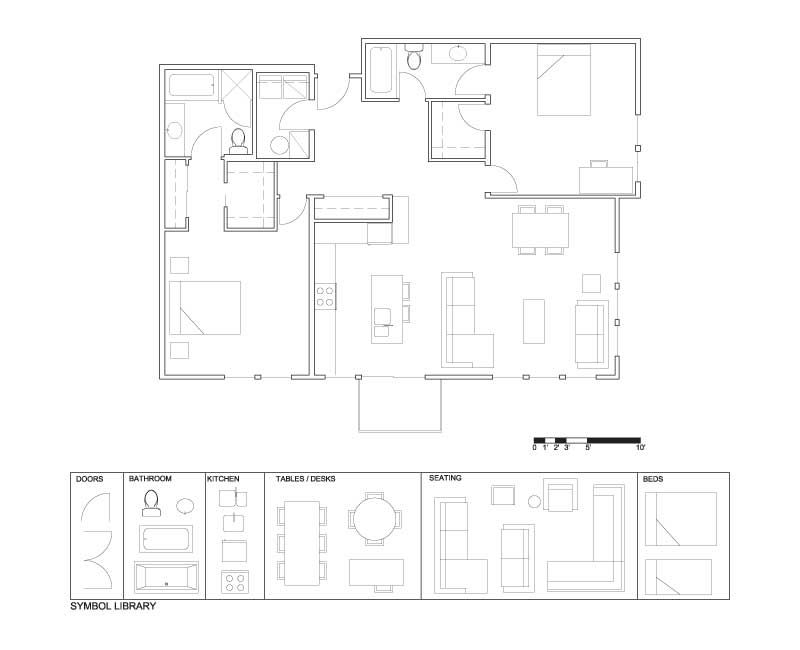
The unit is located in the Flats at Vantage Pointe development and is 1,399 sq ft with two bedroom and two baths. This plan is full of problems and is really poorly designed. We want the Slow Home viewers to re-work this plan and prove to the world that with a little more thought, it is possible to vastly improve the design quality of a developer floor plan.

The biggest problem with this plan is the introduction of 45 degree angle because it basically wrecks the whole layout and compromises a lot of the spaces. This is a real shame because this a corner unit, with a good proportion and a very workable amount of square footage. With the 45 degree angle, both walk in closets are compromised, the kitchen has an odd relationship to the main bathroom and the furniture placement in both the living space and guest bedroom become awkward.

So, the task at hand is for you to re-design this floor plan! For the demolition plan, we have removed everything in the center of the unit, and you need to put back the kitchen, living and dining spaces. It is best to leave the current locations of the bedrooms and bathrooms and focus on designing a better kitchen space and a better way to circulate to the bedrooms without traveling through the main spaces. Also, one of the bathrooms must be accessible for guests from the public spaces without going through a bedroom.

Your work is cut out for you! You’ll find links to all the graphic tools you need to complete this design below and when you are done, post your plan to the site and Matthew will comment throughout the day and can offer help or suggestions as required. Please feel free to hand draw your scheme and post it if that is easier for you than using the drawing software.

Remodelling Apt/Lofts In Denver (PDF)
Remodelling an Apt/Loft in Denver (JPG)
Remodelling an Apt/Loft in Denver (Demo)
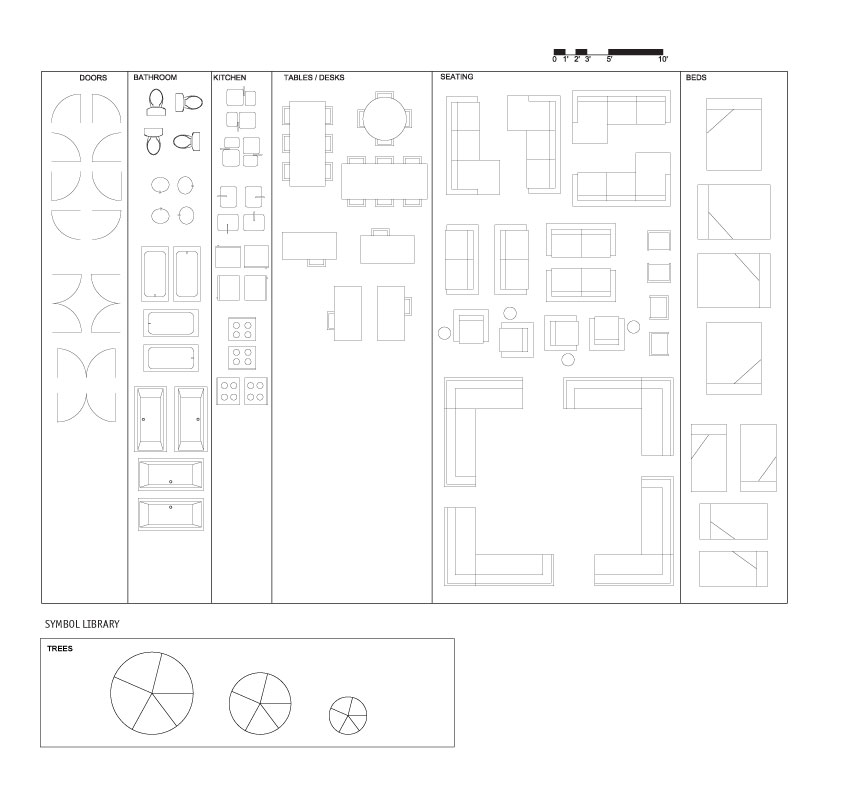
Remodelling an Apt/Loft in Denver (Full Symbol Library)

Once you have had a try at the re-design have a look at John’s tutorial on how he worked through this design problem by watching the player below.

View John’s Completed Design

Tomorrow, Matthew will be doing an “In Detail” episode on apartment/ loft kitchens and how to use the Slow Home test to discern between good and bad kitchen designs.

  • BradW

    Regarding yesterdays discussion…

    Matthew – Not at all, I just noticed a statistically significant trend in the posts…

    MollyK – Of course, in Unit C you will enjoy a nice view of not only the highway but the industrial waste land to the south, well, that is until a new building is constructed giving you a nice view of a brick wall…

    Now if you will excuse me, I have to get my orange Gremlin started so I can go to work.

  • Elizabeth

    Was it the Gremlins whose gas tanks were exploding? Be careful out there, Brad!

    John, Matthew, Eric and team: Wow, this new site format is great! Back when you started doing the city-by-city project, I’d lost the fact that there were still weekly design exercises. It just looked like plan submissions. Cottoned on to the exercises again a few weeks ago, but I’d missed it. Now it’s very clear and I’m glad to be seeing again what everyone else had been seeing all along. Thanks for that change!

  • BradW

    [img]1_shdp591.jpg[/img][img]2_shdp591.jpg[/img]

    Here is my design submission…

    Elizabeth, thanks for the advice…

  • Mid America Mom

    Good morning!

    I am happy to see a split bedroom plan. I had this feeling Matthew that you disliked this type of arrangement. As the target buyer for most of these we could probably agree is single – they probably have a roommate in a 2 bed and the privacy is appreciated.
    *
    Oh BradW I have a plan I came across just for you- this one is without closets and a little more … this is the floorplan for unit 204 – http://www.northcreekdenver.com/pdf/NC_Courtyard_204.pdf
    *
    Mid America Mom

  • Terri

    Elizabeth,
    Not the Gremlin with the gas tank issue–that was the Ford Pinto. At about the same time Firestone 500 tires had exploding problems too, and a popular cartoonist made hay with the situation: His cartoon depicted man (with sly grin on face) handing keys to a car to his wife and she (clearly excited) says, “Oh, honey! A Ford Pinto with Firestone 500s!!!”

  • Terri

    Matthew,
    Can we change the door location into the laundry room and move the tank and HVAC unit?

  • Matthew North

    Terri – yes, you can change the door location for the laundry and the HWT location.

  • BradW

    MAM – great location, fully customizable but at close to a $1000/sqft – no thanks – still interesting that you would find unfinished space available

  • Elizabeth

    Oh, thanks Terri. Brad, smoke ‘em if you’ve got ‘em.

  • BradW

    I think I smoked John this week on the redesign. I don’t get the entry, the bathroom door location, no focus or TV location in the living room, tight dining room. I really think John rushed this one because, normally, I look at his work and go damn why didn’t I think of that – not this week.

  • Mid America Mom

    ****
    Anyone looking for a plan to contribute to the project? I have at least one or two URLs that I can pass on (one is an apartment complex- I know we want new construction but it is new construction rental apartments…).******

    Mid America Mom

  • Terri

    [img]denverapt1.jpg[/img]

    I’m hoping this comes out right. Tried a couple of different layouts and then got my files mixed up… I wasn’t happy with the central circulation space and decided to pop a desk in there (guess I’m getting influenced by those condo developers–yikes!). I wanted to try and not do the same thing as BradW, who did a good revision. (I haven’t looked at John’s yet, so I can’t comment on it.)

  • Matthew North

    Brad – your plan looks great. Really clean and simple design – well done.

  • Terri

    John has done a good plan too. I like the larger bedroom closets (BTW, BradW, I’m not sure where your 2nd bdrm closet is). I also think he’s made a nice kitchen with a connection to that balcony for BBQs (not much else is going to fit out there anyway!), and instead of using the prime window space for the dining, he tucked it behind the living area. I agree with his assessment of the larger entry–it is a central traffic area that benefits from the extra space.

    BTW, I find it kind of amusing that after my tirade about separate laundry rooms yesterday (one of the main differences between the two units we discussed), I created a larger laundry room space today, whereas neither BradW or John (who both chose Unit D yesterday) did anything to make the laundry room less cramped and therefore easier to use.

  • John Brown

    Terri,
    Nice plan. I like the way you reconfigured the door into the laundry room. Moving it away from the front door makes the entry space much nicer.

  • MollyK

    [img]shdenveraptr1j.jpg[/img]

    Hey everyone,
    Here’s my redesign. Hope everything is self-explanatory.
    I’ll look over others momentarily.

  • BradW

    [img]shdp592.jpg[/img]

    Terri, the closet in the 2nd bedroom is the builtin cabinet along the bathroom wall. This change is labelled on the image. Also, I did elongate the laundry room by about a foot to lineup the end wall with the kitchen wall. This change are shown in red on the attached image.

  • MollyK

    Terri,
    I didn’t change any of the doors or walls, but your modification to the laundry room entry is right on. That is the first thing I would change outside the parameters set today. And I think the relocation of the water heater was crafty as well. Your plan feels good. I think Matthew would have reservations about the couch…depending on where you sit your back is to the door. But I think it’s fine.
    ***
    BradW,
    I like your entry closet better than mine. I’m floored at how similar our K/L/D areas are…I’m sure you didn’t spend as much time as I did. I got sidetracked trying to make 2 smaller living areas but finally admitted that there wasn’t enough room.
    With regards to your commentary on John’s redesign, my son also asked where the tv was. It was a bit unusual to see him “snake” the kitchen counter around the wall as he did. I did like his closet location in bedroom 2. I was trying not to move or open wall spaces so I didn’t think to put the closet there. I chose to reconfigure that space as a linen closet for the bathroom.

  • BradW

    MollyK, judging by your design, I see you are coming around to my way of thinking this week.

    Terri, interesting idea to breakup the utility space. Is the kitchen/dining area a little cramped? Does the island need to have seating?

    I see really good design concepts but more care needs to be given to proper dimension. Closets, kitchen cabinets, space around kitchen islands, hallways and sometimes doors, all tend to be too narrow. If you are using Paint one easy way to do this is to place the cursor on the scale. This will tell you how big the cursor is and you can use this information to correctly estimate dimension. You can also draw lines of known size using the scale and place them temporarily on the drawing to act as a guide.

  • Catherine Taney

    [img]scan1.jpg[/img]

    I decided to draw this by hand. Sorry that it is a bit messy. I decided to put the dining area in the back of the unit so that the kitchen and living area had the most light. Unfortunately there still seems to be a lot of wasted space. I added in a study desk by the bathroom but it still needs work.

  • BradW

    [img]anislandasdiningedited1.jpg[/img]

    Catherine love the hand drawn plan! I think you have enough room that you could enlarge the size of your kitchen island to incorporate a dining space. See the attached image. Also, I wish the bathroom door did not open onto the toilet.

  • MollyK

    Brad,
    I’m not sure what to do with you lately…are you suffering from megalomania? ;-)
    Actually, my redesign is all my own…no peeking at others. Perhaps you are coming around to MY way of thinking. And if I’m not mistaken we both shared the honors on the final redesign in Dallas.:-)
    BTW, the picture you offered Catherine is wonderful. Is the table an extension of the small island behind it? If so, I’ve used that design before…I really love the combination of form and function. It does double duty in small floorplans by acting as a “bar” and a dining table. The light fixture is really cool too.

  • Terri

    BradW,
    Sorry I didn’t see the closet the first time–guess I assumed it was furniture since you drew it a little differently. Regarding my plan, yes, the island/dining is pretty tight. Maybe I could use one of those island/tables you posted.

    MollyK,
    I see what you mean about the couch. I guess it should have its back to the dining area instead. I like your three-sided fireplace, giving some separation between dining and living. I like the way the kitchen cupboards and 2nd bedroom cupboards are blocked too. You could easily do my laundry arrangement by moving the tank/etc into that big bathroom cupboard (of course it’d be close to the bedroom then, which wouldn’t be great…)

    Catherine,
    I like your hand-drawn plan too. It seems that you have a very spacious living room, whereas the dining gets pushed back a little far. I tried to put my living room along that side too, but I ran into the same problem as you did, trying to configure the dining and kitchen into the remaining space across the bottom of the plan. I gave up, but I still think there must be some way to put the kitchen between dining and living. In my dreams maybe. :)

  • Terri

    MollyK,
    I think we’ll be seeing more of these island/table combos in small spaces. When the table height eating bar started being used more, it was only a matter of time before we’d see it morph into a proper table. And nowadays countertops are often in such rich material, we may as well use them for dining and get full use of it. Or maybe the table part is made of another material for contrast? I haven’t seen one in person, and Brad’s photo doesn’t show.

  • BradW

    MollyK – Never thought you peeked…perhaps I should have said great minds think alike, well, except for yesterday and, truth be told, based on the location and site I wouldn’t buy either of those units…yes the island in the picture above doubles as a dining table…the picture is from the Fluent Lofts project in Denver. As for megalomania, not to my knowledge so no. :) My intentions are to be helpful not hurtful, if it appears otherwise then my apologies…

  • Mid America Mom

    [img]1_denvercondo1.jpg[/img][img]2_denvercondo1.jpg[/img]

    My plan.

    I will take a look at everyone else’s and the comments in a minute… I have a pocket door for the second bath. There is a walk in closet off that entry with a built in cupboard/cabinet on one side for clean storage. The kitchen is a U without the corners as one is the linen closet and the other side is a fireplace.

    Mid America Mom

  • Mid America Mom

    [img]3_denvercondo1.jpg[/img]

    Opps it is the second one – this one…

  • BradW

    Matthew – thanks for the nice comments on the redesign

  • MollyK

    Brad,
    1.Yes, great minds do think alike…
    2.I wouldn’t have either of those units unless absolutely forced…
    3.Glad to hear you’re not suffering from megalomania…
    4.No need to apologize…I love the banter…and I appreciate all of your contributions.:-)

    Terri,
    I hadn’t thought about the connection between rich countertop materials and their use on island/table combos. I get goosebumps just thinking about the cool surfaces (combined with great lighting) that can be achieved. Thanks for the Ah-Ha moment…but than a senior moment.

  • MollyK

    MAM,
    Very interesting and creative way to fit in a linen closet and fireplace. For me, it actually highlights the stove in the alcove. You could do nice things with tile and a hood in that alcove. I’m kinda on the fence with the walk-in closet/pantry. Part of me likes the double-duty aspect, but part of me can’t see coats mixed in with dry pasta. I’m gonna ponder that element for a while.

  • Mid America Mom

    Liked the constraints today! This feels more real.
    *
    Observations:

    John I like the wrap around on the kitchen cabinents. The living space feels tight (the kitchen table would have to butt the bedroom wall ).

    MollyK love the tv placement with the fireplace (I thought of a fireplace there too but never thought to put TV here). On the kitchen I would move the stove a touch farther away from the refrigerator and flip the sink and dishwasher (as I am right handed).

    Catherine I like the entry closet and great thinking of moving that dining table. It just feels like it needs to be more grounded.

    BradW Oh those entrances for the second bath and bedroom area was nice for privacy. I think you forgot to add a dishwasher or is that just a way to encourage green?

    Terri the dual entry for laundry and bedroom with a closet – that was a neat trick. I would move the refrigerator over a touch so the couch could be moved a bit more into the back of the plan for comfort?

    Mine: I dislike the narrowness of that hall from the entry to the living. I love the stove nestled between walls with about 18 inches on each side and would add a great hood/vent (a design feature I never was able to use myself).

    :)
    Mid America Mom

  • Mid America Mom

    LOL thank you MollyK. Yep I thought about that closet issue to so the cabs were my solution.
    *oh… I probably should have reversed the swing so you can see the nice cabs and not coats when you go to grab the pasta.

    Mid America Mom

  • MollyK

    Catherine,
    I think everyone appreciates a hand-drawn design. When I started doing the redesign project I couldn’t seem to get my ideas going without a pencil in my hand. I knew I had to convert to the mouse at some point…I still keep my pencil handy. (Today, I drew out my fireplace on paper before attempting it the computer.)
    I think your plan has good “bones”. I would play around with your dining table. I think a wall is needed to separate it from the entries to bedroom 2 and the shared bathroom. But you have to watch your dimensions.

    Terri,
    I realize I had a senior moment while I was trying not to have a senior moment. I used the word ‘but’ instead of ‘better’. What can I say.

  • Mid America Mom

    Oh talking about island as table… My mothers latest kitchen. The eat in area of the kitchen well she had the island extended , at same height, the granite and has seating for 5. It has a center post and under structure for support. Above is a large tiffany type glass chandelier. There is a large separate dining room if need more seating.

  • MollyK

    MAM,
    I tried SO hard to put a 360 fireplace in that area. To the right I attempted a dining table and a small tv area next to the kitchen. Then to the left on the sliding door to the balcony I put in another small siting area. I just couldn’t make the dimensions work well. The dining table felt fine in the front corner but I didn’t have adequate room for seating in front of the tv (which was on the same wall as the kitchen cabinets). I could have tried to justify the cramped space but I just knew it wasn’t right…I needed about 3-4 more feet to make the combo work. Not to be dramatic but I was heart-broken. I could see that 360 fireplace so clearly in my mind. Well, maybe in the townhouse redesign…

  • MollyK

    MAM,
    Your mother’s island/table combo sounds very elegant.
    BTW, I just read your comment about the cabinets in the walk-in…yes, that makes sense. I think I could handle that.:-)

  • Manolo

    [img]mytry.jpg[/img]

    It took me a while, since this was my first crack at one of these, but I think I made it (mostly) work. The front hall closet doubles as a piece of millwork for the vacuum, mop, etc on one side, and pantry on the other. The low bookshelf allows you to still hang a lovely picture on the wall as well as store your books. You could put a table lamp on it and perhaps the printer and other computer stuff. But then it is tucked awayish behind the sitting area so that your guests don’t feel like they have to talk about your collection when they come over.

  • Matthew North

    Manolo – Wow! Pretty good for a first timer! I like the idea of the millwork entry closet and I like how you have organized your doors to the bedrooms. I would try to pull that kitchen counter back a bit at the master bedroom doorway – I wonder if that area could be re-detailed or simplified some what? Maybe some of the other Slow Homers would be up for a crack at a re-design of this area on your plan?

  • MollyK

    Manolo & Matthew,
    I might shorten the counter some, but then I extend the existing kitchen wall to the end of the cabinets and wrap it around the 90 degree angle. The wall defines the master bedroom entry and the front entry hallway. Frankly, I love the front hall closet and shoe bench…it’s brilliant. But then there is the issue of bedroom 2′s jaunt to the bathroom…I’d feel pretty exposed coming and going. I’d have to think more about how to resolve that issue without loosing the cool circulation path produced by the millwork/closet feature.

  • BradW

    [img]manolorev.jpeg[/img]

    Manolo – Definitely one of the best redesigns, nice work! I like how you borrowed space from the bedroom to accommodate the kitchen. And the floating hall closet solves the entry problems. In response to Matthew’s request I simply left the kitchen as is and extended the bedroom. See what you think…

  • BradW

    Manolo – one other thing, consider no upper cabinets in the kitchen and use the millwork behind the hall closet to store dishes, etc. then the extended kitchen wall could display art/other to integrate the kitchen with the rest of the living space…

    MAM – I typically only draw the sink, stove and fridge in the kitchen to indicate the main work triangle. My intention is always to include a dishwasher so usually the sink will have at least 2′ on one side or another, preferably both.

  • Terri

    Maybe a simple “fix” to MollyK’s point on Manolo’s plan–that exposed route between bedroom doorway and the bathroom–would be to split the closets and put the door closer to the bathroom, making a faster and slightly less exposed route between the two.

  • MollyK

    Brad,
    Ohh, yes…I see the difference between my suggestion and yours for Manolo’s cabinet dilemma. It hit me like a ton of bricks. My resolution leaves the door taking up valuable circulation space in the bedroom. Your idea to move the door back opens up more floor space in the room. Genius…there is still adequate space in the small alcove from which to enter the bedroom. I’m gonna have to remember that for future designs.:-)

    Terri,
    I actually thought about splitting the closet in Manolo’s floorplan. I still prefer direct access from the bedroom. However, I think that would take rearranging the living/dining spaces to adjust for changes in dimensions inside the bedroom. Oh well,…can’t have everything.

  • MollyK

    [img]shdenveraptr2j.jpg[/img]

    Just had to try moving the doors into both bedrooms to see what it looked like…the rooms definitely open up. Wow.

  • Lacey

    [img]2_aptloftdenver.jpg[/img]

    Here is my floor plan revision. I haven’t yet looked at the revised plan John did, but I’m thinking that by leaving the bathrooms and bedrooms where they are, a lot of the plans i see already posted may be similarly revised.
    I wasn’t sure about having the kitchen counter run up against the window, so if there are any suggestions?
    I also didn’t include any tv’s, possibly because my mind is in senior’s complex mode, and I guess I assume seniors don’t really have tv’s in their houses?? I’m actually not sure why I left them out.

    Thanks!
    Lacey

  • Terri

    MollyK,
    Entries into rooms are one of those details we don’t always think about much but can make a huge difference. When I looked at your second plan I noticed how nice the entry into the bathroom is from your hall. I like that a person can actually move into the room without being immediately faced by the fixtures. Small detail, but it makes a big difference.

  • Paul C

    [img]denvr.jpg[/img]

    Been awhile since I have been able to post. Sorry Matthew I cheated a wee bit. I moved one bathroom ever so slightly. This plan would require some very very nice living room furniture for it would be front and center. I did not mind so much the access into the left bedroom being off the living for it freed up some space for the main entry and the bedroom closet. And with the bedroom panel door left open, what a terrific extension of the window wall on a sunny morning.

  • Matthew North

    Paul C – I appreciate your post – we have missed you! I have been thinking about your idea of the sliding door against the curtain wall as access to the second bedroom and I think if it is detailed well, this could be really cool. I will take you furniture shopping to pick out the ideal pieces for that living room!

  • Wayne

    [img]redesigneddenvertownhouse.jpg[/img]

    Here is my redesign. I still think that the bedrooms are too large but I like the location of the kitchen and living space. The addition of the study just made sense. I do wish the transition space between the study and the living room was a bit smaller, which could have been accomplished by making the second bathroom larger.

  • BradW

    Paul C – Nice to have you back and with a really great redesign – moving the bathroom up in the plan really helped with the entry and second bedroom. You haven’t lost your touch…

  • Paul C

    Thank you very much Brad. As a frequent viewer and I am always itching to contribute however I have yet to figure out how to add 2 hours to a day. A work in progress…

  • Jodi J

    [img]week12desprojtostudents.jpg[/img]

    A few notes:
    - added small bench and closet to entryway
    - tried to reconcile the circulation pathways so that they become axial
    - now the access to the “main bath” is on the left side of the plan, with a linen closet at the end of the hall
    - kept access to that main bath from the 2nd bedroom direct and semi-private by placing it at the end of the hallway
    - tried to take advantage of windows by placing living space in that far lower right hand side
    - kitchen counter does not extend all the way to exterior wall –> due to location of windows, counter is pulled back to 12” deep –> cabinets at end of kitchen now help to define a circulation path along the back side of the unit, and also serve as a display area, bookshelves, etc