
This is Day 148 of the Slow Home Project and we need you to join us in our quest to evaluate the design quality of houses in nine North American cities in nine months. This week we are analyzing apartment/lofts in Philadelphia. For today’s design exercise we are going to redesign a 978 sq.ft. loft conversion.
It’s Wednesday on the Slow Home site and that means it’s time for another Design Project! So many of the apartment/ loft projects in Philadelphia are renovations to existing heritage buildings – which is a brilliant idea – however, we have seen a lot of examples of poorly designed loft conversions that are currently on the market.
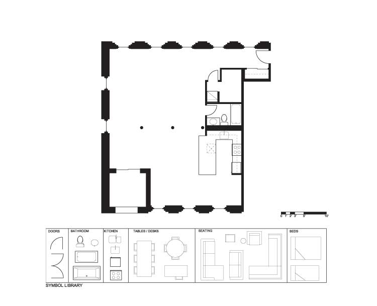
For today’s exercise, we have selected a 978 sq ft loft conversion in the old city district of Philadelphia. It is unit 301 in the “Lofts @ 209” and has a lot of potential, but the current design has several problems. The design does not have a clear indication of how it would be furnished and where the bed would be placed. It lacks storage and has an odd location for the kitchen. In addition, the bathroom open up directly into the principal living space.
We need you to re-design this plan and post it to the site along with your comments and reasoning as to how you made your design decisions. Please make sure to pay attention to the following parameters:
- The 3 structural columns in the middle of the space need to remain.
- The kitchen and bathroom must be adjacent to the plumbing wall – which must remain in place.
- You must put back a more functional kitchen, a bedroom or loft bedroom area as well as some storage.
- Please add a place for laundry and a place for a study desk.
Good luck and we look forward to your creative solutions!
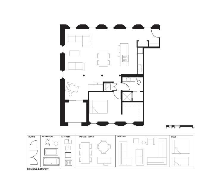
When you have completed your design, click on the player below to see how John has redesigned this space. We will be reviewing all the design projects on Friday’s post.
Day 148 – PDF
Day 148 – Existing
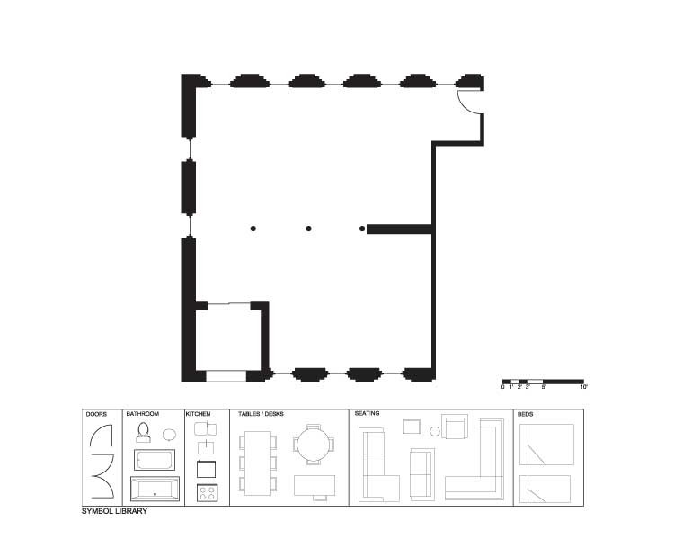
Day 148 – Demo
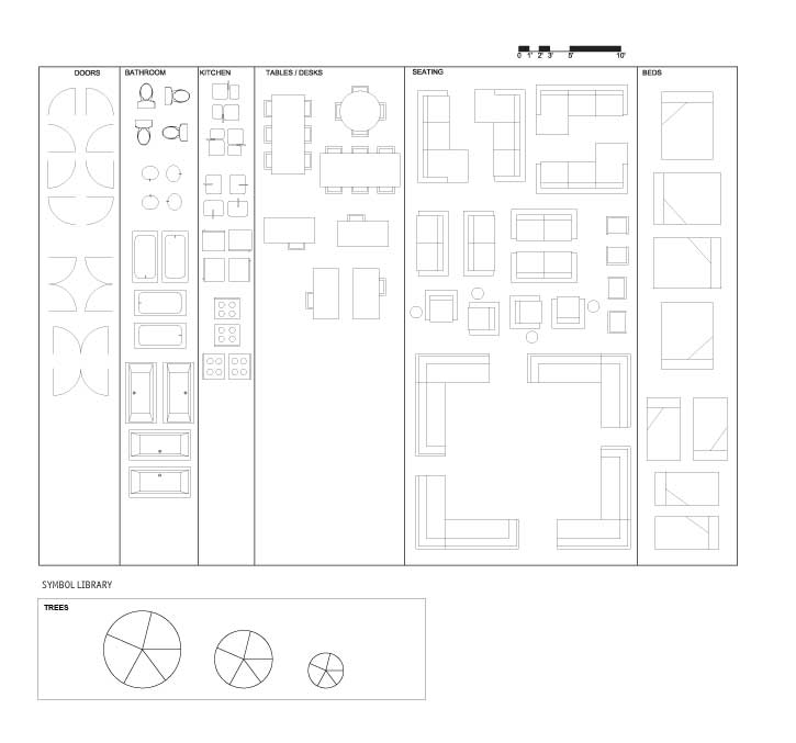
Day 148 – Full Symbol Library
Make sure to join us tomorrow for a new “In Detail” episode where we will be looking at examples of good and bad laundry spaces in apartment/ loft projects in Philadelphia.


