
This is Day 204 of the Slow Home Project and we need you to join us in our quest to evaluate the design quality of houses in nine North American cities in nine months.
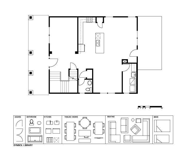
It’s Wednesday on the Slow Home site and that means its time for another Design Project! We need you to re-work the second floor plan of this three storey, single family home located in “Habershal at West Highlands” – which is about 12 minutes by car north-west of downtown Atlanta.
The plan is us the “Veranda B” and it has an under-drive rear garage, so the balcony at the back of the house is one floor above grade. There are some
problems with the design of this floor that we need you to fix.
1. The laundry is poorly located in plan as it takes up potential valuable window space at the back of the house.
2. There is a poorly defined entry with no closet.
3. The kitchen divides the floor plan into three very uninteresting spaces – the dining room has a poor and enclosed side yard condition.
4. The powder room could be better located in plan.
5. There is a redundancy in living spaces with a formal living room and a family room.
So, we need you to re-design this floor plan – but keep the stairs where they are. If you can, try to get one living space, one dining space, the
kitchen, a laundry, the powder room, kitchen and a study without any wasted space. It will be a challenge!
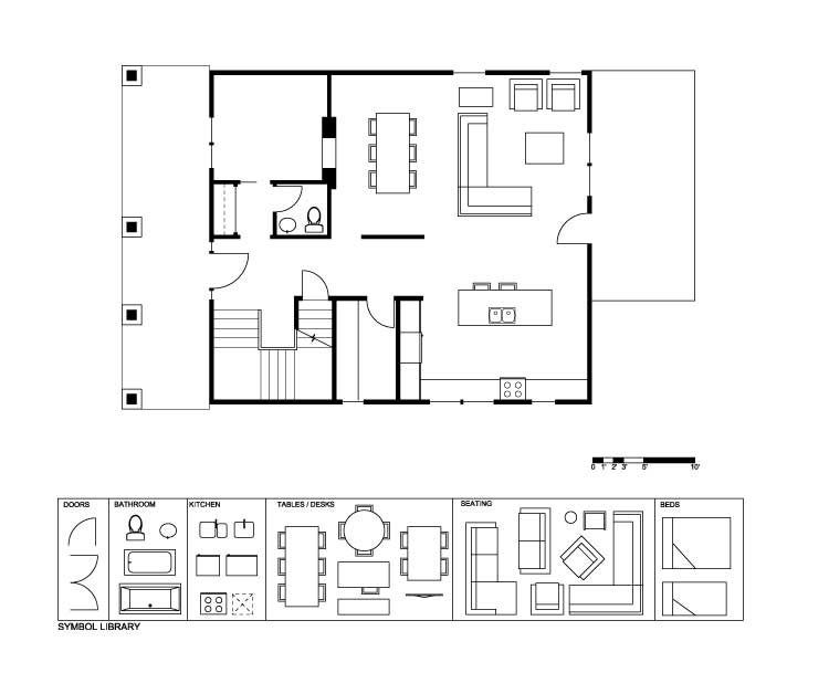
We look forward to your schemes! We will be reviewing and posting the best plans in our Friday post.
Day 204 – PDF
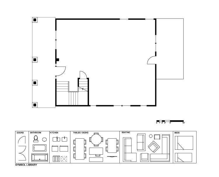
Day 204 -Existing
Day 204 – Demo
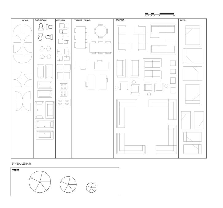
Day 204 – Full Symbol Library
Make sure to join us tomorrow for our “In Detail” episode where we will be reviewing bedroom spaces in single family homes in Atlanta. You’ll be surprised at some of the strange designs for master suites that we have come across in this city!


