
This is Day 183 of the Slow Home Project and we need you to join us in our quest to evaluate the design quality of houses in nine North American cities in nine months.
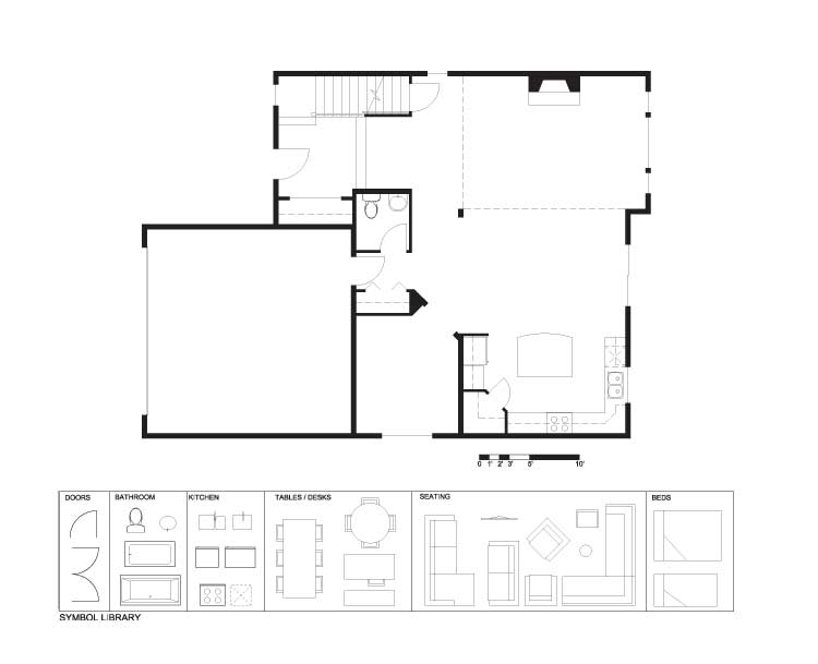
Today is Wednesday, July 21, 2010 and its time for a Design Project! We need everyone’s help to re-work the floor plan of the “Garibaldi” which is a 2,170 sq ft, two storey home located in the “Stoneleigh at Silver Ridge” development in Maple Ridge, British Columbia – which is about 48 miles from downtown Vancouver.
The plan has a marginally acceptable open concept layout, but there is definitely some room for improvement. We need you to improve the following things:
1. The entry from the garage to the house is too small and there is not enough storage.
2. The dining space has too much left over space around it and looks directly into the garage.
3. The kitchen layout and location in plan could be greatly improved.
4. There is a lot of excess circulation space around the stairwell.
5. The side yard study condition is not ideal.
We think that the front entry is good and the general location of the living room is good so we are suggesting you leave them as they are and focus your design skills on the other areas. However, feel free to re-locate the fireplace if you want.
In your re-design, please note the column location in the living room. You will get bonus points if you are able to leave it intact as it is. However, you have the ability to move it, but you must put some sort of solid structural element in this general area.
We look forward to seeing your designs! We will review the projects that you submit on our Friday edition of Slow Home.
Day 183 – PDF
Day 183 – Existing
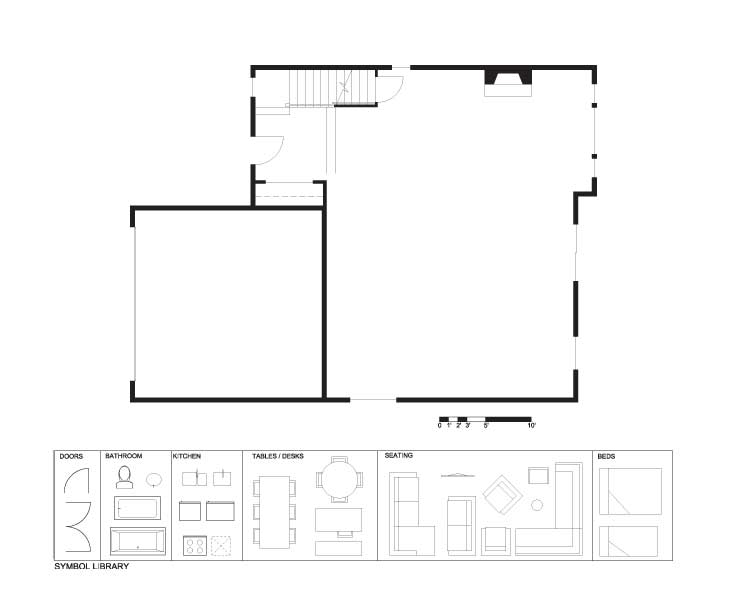
Day 183 – Demo
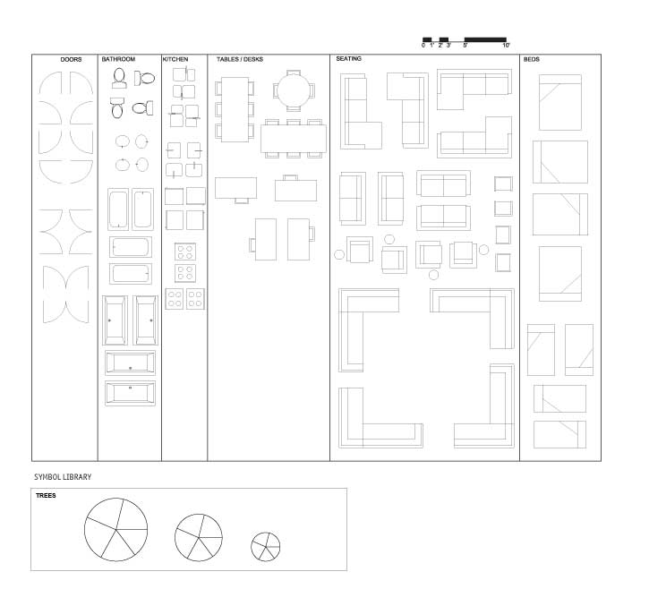
Day 183 – Full Symbol Library
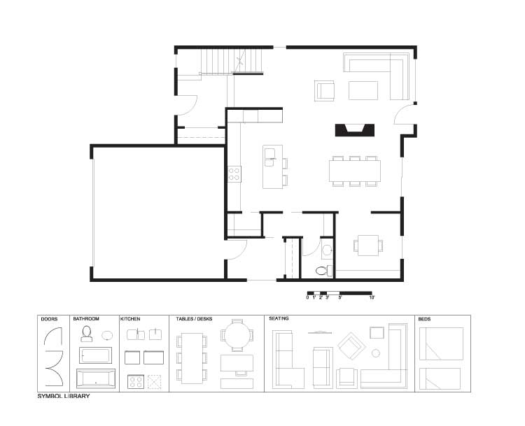
When you are ready, you can click on the player below and watch John’s tutorial on how he has transformed this space into a Slow Home.
See you tomorrow for our “In Detail” episode where we will be reviewing dining spaces in single family houses.


