Remodelling Single Family Houses In Miami

This is Day 120 of the Slow Home Project and we need you to join us in our quest to evaluate the design quality of houses in nine North American cities in nine months. This week we are analyzing single family houses in Miami, and for today’s design exercise we are going to be redesigning the main floor of a single family house.

It’s time for another “Design Project”! This is everyone’s favorite design exercise of the week. If you are new to the site, our goal is to re-design the floor plan of a badly designed single family house and prove to the world the that the Slow Home viewers can produce a more livable home than what is typically provided by most developers.

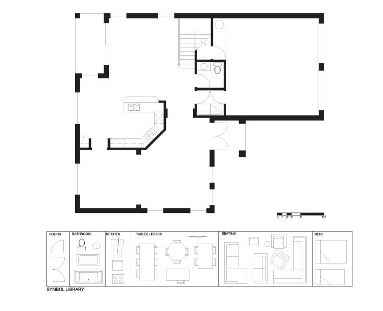
Today’s floor plan is by Century Homebuilders LLC and the actual plan is called the “Montreal”. It is 2,984 sq ft and has 3 bedrooms and 2.5 baths. Today we are focusing on the main floor.

This house has many poorly designed elements. The enclosed kitchen in the middle of the space disrupts the flow of the main floor and effectively divides the house into two halves – neither of which is very well proportioned or designed. There is no defined front entry and the back entry is shared with the laundry. The formal side of the house is on the small size and we will argue that it will rarely get used in its current configuration.

We need you to re-work this plan and address the following points:

1. New kitchen in a better location
2. New front entry space with a coat closet
3. New laundry room
4. New back entry space with a coat closet
5. Please try to relocate the mechanical equipment so it is not in the garage – this is something that LEED for homes does not allow
6. Try to design the plan so that there are no redundant spaces – one dining space and one living space – maybe adding a study
7. Try to take advantage of the potential corner window situation at the front of the house.

Remodelling Single Family Houses In Miami (Existing)
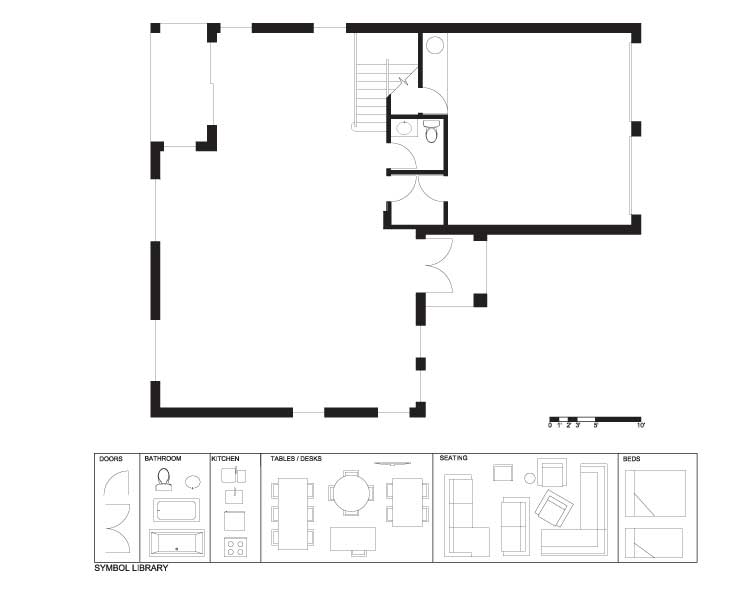
Remodelling Single Family Houses In Miami (Demo)
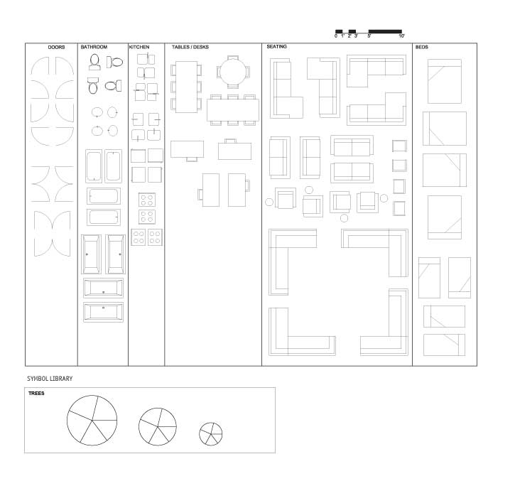
Remodelling Single Family Houses In Miami (Full Symbol Library)
Remodelling Single Family Houses In Miami (PDF)

We look forward to seeing your results! Post your floor plan ideas to the site. Remember, you can hand sketch the plans if you like!

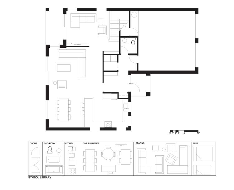
When you are ready, you can click on the link below to see what design strategy John has come up with to vastly improve the quality of this floor plan.

Remodelling Single Family Houses In Miami (John’s Design)

See you tomorrow where we will be doing an “In Detail” episode that will look at “Indoor Living” for single family homes.

  • BradW

    [img]shdp641.jpg[/img]

    Kitchen services and storage are located in a central block.

  • BradW

    Nice plan this week John. Amazing how much better this house could have been with only a few minutes of thought…

  • Kadoman

    [img]montrealfinal.jpg[/img]

    Here is my re-design. I tried to minimize hallways and unnecessary circulation, though I did end up with some wasted space between the kitchen, staircase and dining room. It was almost as if we had too much room to play with. ;)

  • MollyK

    [img]shmiamisfr1jpage002.jpg[/img]

    John once responded to one of my design questions with the word “longevity”. He said a design should have longetivity. So I decided not to wall off a study which would reduce the size and flexibility of the living room. Instead, I opted for a carved folding screen to “separate” a study area from the tv area. This would allow the homeowner more options for arranging the area for different uses. The screen also allows natural light to flood the length of the room…front to back.

  • Kadoman

    Interesting take brad. I like that kitchen design, almost like a Deli Bar. :) And the living room has a lounge type feel just off the kitchen like that.

    John, wow. I am kind of floored by how organized and good your design is. Very impressive indeed.

  • MollyK

    John,
    My area of concern in your plan is the back entry:

    - Although I like the laundry room’s proximity to the garage entry, it isn’t ideal to haul your dirty clothes through the front entry to get there. Perhaps an additional pocket door on the left-hand wall would allow easier access from the stairs leading from the second floor.

    - The powder room has pros and cons. It is nice to have it convenient for people coming in from the garage. But this means it probably takes alot more abuse (dirt, sand, water drips, grease, motor oil, etc.). When your guests need to use the bathroom they will have to travel through a potentially dirty area at the garage door. Plus, who knows what mess awaits them when they turn on the bathroom light.

  • MollyK

    BradW,
    As usual I think your design is great. The kitchen wall is brilliant and I like the openness of your study.

    Just don’t let it go to your head.;)

  • MollyK

    I just realized I neglected to change my front door swing to the interior wall. Shot…

  • Grace Coulter

    BradW,
    The study set up in your design in great. I wonder about entering to look directly at a closet though, but then again with some imaginative panels you could make this into a great feature wall in the enrty and a closet.

    Molly K,
    good work on your design. My major critique would be that the occpuant is greeted by a strong visual directly into the kitchen. Is there maybe a way you could screen it like BradW?

    Kadoman,
    I find a couple spaces a bit confusing like in the top left off the porch, is that outdoor storage? I like having a pantry in the kitchen. Its interesting you choose to locate the main family space away from the outdoor living space.

    Way to set the bar high everyone.
    I look forward to posting my design later tonight.
    Cheers

  • Kadoman

    Looking at my plans I realized I put cupboards over top of the fridge, didn’t mean that. I also forgot to deal with the double doors from the garage.

    Grace, I tried to have the patio and patio doors have their own rear entry with closet. On rainy or cooler days, I find it nice to be able to have a place to grab a jacket for when I’m out back, without having to go to the front closet.

    The lines at the front and rear entry are supposed to denote a break between the carpet/flooring of the main house and the tile that would be at the entry.

    Having an entry at the patio doors, I always find it awkward if there is a main living space there. Though I thought it would be nice to cook and have breakfast with a bit of the backyard view. Quick access to the kitchen for when entertaining outside. And it also presents opportunity, having the bathroom located there, for easy access from the back yard. There is also still a straight shot from the front door to the bathroom. For those long days in traffic. ;)

    Thanks for the comments Grace. :)

    Molly,
    I like the way you arranged your kitchen and dining room.

  • Allie G

    [img]allieg.jpg[/img]

    Phew… this is my first shot at doing this, and it proved to be much more difficult than I had anticipated!

    All of your designs are absolutely stellar, hopefully with a little more practice I’ll be in the same league as the rest of you.

    I found myself not knowing what to do with the excessive space. It’s actually quite funny that originally I thought I might not have enough space, but once some walls were knocked down, I had quite the opposite issue.

  • Allie G

    Oh dear – that’s quite embarassing that it attached another file without my even noticing it! Please ignore the first attachment everyone (I don’t think I can delete it?).

  • Terri

    [img]miamihse.jpg[/img]

    I added another patio door where there was a window (same width). There was room for a private front den. The pantry floats to allow light transfer. The same millwork as bookshelves would be used on this unit.
    Everything else is self-explanatory, I think. Looks like there are quite a few to check out now!

  • Terri

    Just noticed that you can’t read the couple of words on my plan, sorry. They indicate the pantry/broom closet, BBQ patio and the wraparound bookselves. I also neglected to mark the two blocks in the kitchen as a fridge and wall oven (from top of plan to bottom, respectively).
    Thanks!

  • Tiffany

    [img]whitnackmiamimay20.jpg[/img]

    I created a study at the front with a more formal entrance. Used the centre of the house for utilities, with the kitchen backed onto it. The kitchen at the centre divides the space a bit, but I think it works okay by using the kitchen to connect the living and dining spaces.

  • Tara

    [img]miamisinglefam.jpg[/img]

    Here’s my redesign.
    I wanted to make the main living areas more functional and keep them fairly open to one another. I added a study which makes good use of the light at the windows at the front of the house and offers a private, quiet space within the main floor. I also combined the two entrances to create an entry space with a closet and laundry facilities.

  • MollyK

    [img]shmiamisfr2jpage002.jpg[/img]

    Grace,
    I noticed the view from the entry also. Here’s a redesign of that area plus a twist on the study space.

  • MollyK

    Terri,
    You are the queen of “floating” areas…I like it again.:)
    ****
    All the plans have great features. They are really interesting to look at. Each one has a unique element.

  • PeterB

    [img]demoprelim.jpg[/img]

    I’m a big fan of open concept so thought this house could use a nice open concept first floor. The laundry situation was not as bad as i thought and decided to leave it beside the bathroom. With a little tinkering at the door to the patio and adding an extra side window to the living room, i think this is greatly improved.

  • MollyK

    [img]shmiamisfr3jpage002.jpg[/img]

    Since the view from windows is so important I thought I’d add some greenery to get a better sense of what one would see from the front window of this house.

  • MollyK

    Kadoman,
    Being a gardener myself, your concept for the patio entry with closet and nearby powder room is certainly legitimate. You’ve looked at that space with a ‘functional’ eye…that may be a first since I’ve been visiting this site. I always enjoy pondering a new perspective and wondering where I could incorporate it in a design. :)

  • MollyK

    Terri,
    I keep jumping around today…never finishing one comment section before glacing to another. That’s why I didn’t read your clarification about the frig and wall-oven until now.
    I think your triangle is good…frig just steps from stove and sink AND the wall oven within reach of the stove. Very nice work.
    (I secretly yearn for wall ovens…2).:)

  • Terri

    MollyK,

    I’d like any of the kitchens I put in my plans! I’m living with a badly designed one (though I use the word “designed” loosely here–my husband designed it with a little assistance from a builder, long before me).

    Glad to see others like us put a study in that lovely front corner (I’d like that too!). I wanted to put the kitchen in the middle as you and some others did, but something in Matthew’s instructions to “move the kitchen” made me think I’d better come up with something else. Being an editor can be a curse sometimes, second guessing the meaning behind words…

  • bbhorner

    [img]bbhorner.jpg[/img][img]1_bbhorner.jpg[/img][img]2_bbhorner.jpg[/img][img]3_bbhorner.jpg[/img]

    All the plans look great. Here is my attempt. Pretty happy with it for my first time.

  • Bell604

    [img]3_slowhome.jpg[/img]

    I wanted to make sure that the corner windows were used of highest priority. Therefore, I chose to place an office in that section of the home. I didn’t like the placement of the powder room, so I moved it to a new place. I chose to extend the front porch, as it was nearly useless before. However, after I moved some stuff around, I attempted to place a formal dinning area, but had some issues with it.

  • Murray

    [img]miamihouseplan.jpg[/img]

    The muse deserted me today.
    I was all set to submit earlier, looked at other’s plans, and realized I had forgot to put in a laundry area. I did wonder why there was so much room in my plan (I even had a sizable study in the front corner), and contemplated grand pianos, wet bars, and tropical aquaria top fill up the space. Alas.
    So, I had a glass of wine, said “to heck with it” and started a more substantial reno.
    My initial concept was to keep all the family area to one side and the more public areas to the other.
    Lots of good work with all the previous submissions.

  • MarisaM

    [img]gnst301.jpg[/img]

    Everyone’s floor plan look great! This is my first time changing a floor plan, so please be kind.

    I enjoy the more open floor plan more specifically for the kitchen, living/family room and dining area. This floor plan already included great window locations that would provide a lot of natural light. The garage and laundry area i found difficult to lay out, but I do appreciate others whom put the garage door and laundry room as a hallway and mud room.

    There was so much space in this house, a lot could have been added but I believe I kept a practical flow. Let me know any thoughts for improvement!

  • Hawerchuk#10

    [img]montrealredesign.jpg[/img]

    Hi everyone,
    This was tough. Or at least I found it. Maybe that was because I was using a free pseudo version of paintbrush for a MAC. It made this challenging. But it was fun and for the first time laying down a floor plan I quite enjoyed myself.
    As for the floor plan, more open space was the goal. I will hopefully be adapt to the program next time and the plan will turn out better.

  • Athena

    [img]myhouse.jpg[/img]

    So I decided to do more of an open concept design.
    I left the bathroom.
    I created a study/laundry space with an oversized closet for storage.
    Where the laundry room was, I decided to create a walk-in closet instead for the front entrace.
    I got rid of walls and made A LOT of windows.
    It’s simple, and hopefully it would be functional!

    Thank you!

    Athena

  • Athena

    Murray, love the design! I really like your entrance how it also connects to the garage – clever!

  • Mid America Mom

    [img]miamisingle2.jpg[/img]

    Good evening from vacation in Florida! Love seeing so many new posters for our design project. WELCOME and Thank You!

    Here is one of two designs.

    Mid America Mom

  • Neogi

    [img]neogi.png[/img]

    My main focus was enlarging the outdoor living space and incorporating more of an outdoor living and dinning space. The floor plan is open and the light in the room has more than doubled after the addition of the sliding glass walls in the kitchen and formal dinning area. The kitchen features professional grade appliances with a huge island that accommodates 4 bar stools to create an eat in kitchen. Its fully equipped with a all around fireplace creating a focal point near the center of the home and is flanked with staked stone and featuring a disappearing LCD television set on both sided of the kitchen and the family room. The stair case is still open, as the cabinets are only lower after the built in fridge. The island of he kitchen also houses a large farm house sink. The washer and drier are in the powder room cleverly hidden with paneled walls which essentially make them disappear. The entry also houses a closet of one side and a inviting bench on the other. Overall the plan features tons of built ins, like masterfully milled bookshelves, buffets, etc. And as soon as you enter the home, you are directly focusing on the openness of the home and the wonderful view outside.

  • Neogi

    i just realized that i uploaded an older version of my design, but the only difference is that there is a door by the water heater, that also being the entrance from the garage to the house

  • Neogi

    i just realized that i uploaded an older version of my design, but the only difference is that there is a door by the water heater, that also being the entrance from the garage to the house

  • cnick

    [img]1_plan.jpg[/img]

    My main focus for my plan was to open up the design and provide plenty of counter space in the kitchen and plenty of other handy features. I added a large island to the kitchen with room for 4 stools around it. (Excuse the drawing, I had a heck of a time with the mac paint program). I also added a walk-in pantry to the kitchen which will provide plenty of food storage. The island was facing the dining and living room area so they are one central part of the house and people can interact between rooms. I moved the patio doors from the far wall of the house into the dining area so the deck can be easily accessed from the kitchen if the occupants want to dine out there. In the dining area, I added a small desk where kids could do homework or for bills and other household tasks.

    The entrance from the garage was expanded and the door pushed to the right to allow for a larger room to do laundry in and with ample room for a closet and people to take off their shoes and coats from the garage. I kept the laundry in the same location as it is conveniently near the stairs and the bedrooms.

    I added a study that could be accessed from the entrance area of the house and it takes full advantage of the corner window for light.

  • Neogi

    i agree with cnick, using paintbrush on mac was really difficult, i could not figure out how to rotate the items at all, which caused major headaches. I love all these plans, they are so different and each one has its own strengths.

  • Deng

    [img]themontrealmay19.bmp[/img]

    I really like the idea of a kitchen at the front of the house. I saw another design in this blog that had the same idea. I rarely see the kitchen like this in newer suburbian homes. I can see how it is awkward placing a private space as the window into your home but it creates a much more welcoming vibe and stonger connection with the neighbourhood. The entrance into the kitchen is an arched open doorway. The connection between the kitchen and formal dining room is a pair of sliding doors.
    I placed a very large living room in the middle of the home and a bookcase (Blue) and a closet (brown) separating it from the front entrance. The entrance is also designed very large and open.
    I added a study on the main floor but I find that the area is way to big for it, so I added a bookcase (blue).
    I tried not to duplicate rooms but found it hard not too due to the size of this floor.

  • BradW

    I was busy all day so I did not get a chance to comment on any of the designs. I thought John really did a terrific redesign this week. I am always keen to see how John comes up with the overall strategy or approach to the design. Finally, it is really great to see so many new posters with so many interesting design ideas.

  • Deng

    [img]themontrealmay19.jpg[/img]

    Sorry, photo did not load properly. This is a retry.

  • Hilda

    [img]1_mynew1stfloor.jpg[/img]

    Good Evening All,

    This is my first time doing this, so please let me know where I can improve! Also, I really like all the designs that have been posted so far!

    I decided to have the kitchen located at the back and near the patio, easier for BBQ. As a book lover, anywhere with good lighting is considered to be a good place to read. So the front of the house, with it’s lighting will be the living/family space. Was thinking about doing a study, but leaving the first floor of the house to be more opened seemed like a better idea. The hardest part when doing this is probably deciding where to put the laundry room, although if the two-car garage can be reduced to a one car…possibility could be endless.

    Cheers!

  • nicole

    [img]may19opt1r1.jpg[/img]

    _powder room and closet creates a ‘center core’ that allows for circulation around this.
    _moved hot water tank + furnace to be located inside the house, not in the garage
    _dotted lines indicate line of ceiling + possible interiors consideration, maybe?

  • SangeetaG

    [img]design1san.jpg[/img]

    Firstly, I tackled the entrance doors. Commonly single family homes have doors that open to the inside (least as far as the floor-plans I’ve come across).

    Tried to maintain an open layout with minimum space taken up by the utility/service zones. I was able to move the heater/hvac indoors as well.

    Functionally, I think it is nice to let homeowners have ease of access to laundry, therefore I placed the laundry beside the stairs in a contained space. I provided only one closet (sort of central), thinking it would serve for both the back and front entrance.

    Instead of making a nook area, a large central island serves as casual dining/breakfast/bar area.

  • SangeetaG

    Hello everyone,

    Very interesting to see the different perspectives. Some comments on the plans so far.

    John, you did a great job with your design. I really like the idea of having the kitchen overlooking the front of the house. The only concern for me would be having to walk a fair bit from the living (social areas) to the powder room.

    Molly/Tara – You have really made the kitchen the main focus of the home. Being located centrally and to the back, makes it connect well to the dining and the living spaces.

    Terri – I like the way you have organized your social areas. Especially, I like the association of the kitchen and living space. The only concern might be the centrally located w/d/hvac area. This might increase the circulation around that walled space as well as disrupt the flow of the indoor areas.

    Looking forward to what John/Matthew have to say about our designs :)

  • Mid America Mom

    [img]miamisingle1.jpg[/img]

    The living room with a built in and dining area are in back. Also in the back is a study with its own closet and bookcase.

    The back and front entries have their own closet. The laundry is 5*6 off the back entry. Placed a 1/2 bath in the center.

    The kitchen moved forward and is a G. I thought to put a pantry toward the main hall but could go with a solid wall instead.

    Mid America Mom

  • JPHH

    [img]1_design1.jpg[/img]

    I decided to make the kitchen the main focus of the home as you can see. I also focused on taking advantage of the natural lighting in each of the rooms. I chose to put the living room so you could access the patio easily to create an indoor/outdoor living feel. I added a front closet at the entrance and moved the mechanical and laundry into where the old bathroom was. This took the hotwater tank out of the garage and created more room for the washer and dryer while making easily accessible.

  • Jessica

    [img]designprojectcullenmiamimay20forjohn.jpg[/img]

    My intent in this redesign was first to give the entrance significance by supplying a sense of arrival and orientation. Entry is on axis with the hearth feature wall–a fixture recalling its symbolic significance and also serving to organize space within the main floor plan by dividing formal and informal living. The entrance here also serves to orient occupants/guests by providing a view to either space once coats are stored.

    Interior clerestory windows over the private office space adjacent to the sitting area in the dining room provides additional daylighting while still maintaining study privacy. I also slightly adjusted the garage entry to provide additional space for laundry.

  • Jessica

    [img]designprojectcullenmiamimay20forjohn.jpg[/img]

    Smaller image file.

  • Hilda

    Tiffany,

    I really like your design, the center for the utility space is functional and it is really awesome how you used the kitchen as a connecter for the living room and dining room.

    Cheers!

  • Grace Coulter

    [img]gracecoultermiamiforjohn.jpg[/img][img]1_gracecoultermiamiforjohn.jpg[/img]

    Looking at everyone else’s designs there is some good stuff out there today. I am going to throw mine out into the mix. Thanks everyone.

  • Grace Coulter

    [img]gracecoultermiamiforjohn.jpg[/img]

  • Grace Coulter

    [img]3_gracecoultermiamiforjohn.jpg[/img]

    hopefully this one works

  • Grace Coulter

    [img]4_gracecoultermiamiforjohn.jpg[/img]

    This one should be less blurry…

  • JessicaD

    [img]jessicadesignproj1.jpg[/img]

    Hey all!

    This is my very first attempt at a redesign project so I found it a little challenging to create an image that looked semi-professional using paint, but had lots of fun doing it. Really like what others have done so far…lots of great ideas!

  • Jessica

    [img]1_designprojectcullenmiamimay20forjohn.jpg[/img]

    Hopefully this will work??

  • Jessica

    [img]designprojectcullen6miamimay20forjohn.jpg[/img]

    Once again, sorry for cluttering up the page.

  • Jessica

    [img]designprojectcullen6miamimay20forjohn.jpg[/img]

    And one last try…

  • Alison G

    [img]designprojectstudentmiamimay20forjohn.jpg[/img]

    Here is my contribution to the mix. I attempted to maintain the the kitchen’s central location and visual connection to the main living spaces.

  • Andrew

    [img]miamimay20mcconnell.jpg[/img]

    My main goal here was to create an entrance that would have a connection with most of the floor. Both the front entrance and the back entrance connect with the foyer and each have their own closet space. The foyer is then oriented towards the inside of the house and is also connected to a study. I have also moved the bathroom to a more central location and placed the furnace, hot water tank and laundry equipment in its own room.

  • DJS

    [img]firstfloorredesign.jpg[/img]

    Sorry for the late upload had internet issues.
    This is my first redesign and I wanted to have the dining room and kitchen next to eachother and also wanted the dining room to be in a more private part of the house while not being cut off from the rest of the house. The Kitchen has a large corner window along with sufficient counter space. living room is central because it is where most time is spent and is easily accessible along with having access to the patio. I included a study which has many small windows to let light in but remain private. The entrance now has a closet and bench. Laundry room is private and water heater is no longer in garage. Back entrance is now more open and allows better flow. Patio is now central and is much more accessible along with letting in lots of light into living room. The only thing I couldn’t manage to do was add a closet to the back entrance but I’m pretty happy with the overall result.

  • Murray

    Hello anybody still looking at “yesterday’s” post = it is so great to see so many new contributors. Matthew will have his hands full.

    A number of folks commented on problems creating their designs – I can’t help much as I don’t use Paint, but, in case you were not aware there is a file with the design exercises titled “full symbol library” – this has most furniture rotated in all 4 orientations (except the 45 degree chair),

  • Terri

    I want to echo Murray’s and BradW’s comments regarding all the newcomers to post this week–great to see so many ideas being presented here!

    Those of you having trouble with Paint have my sincere sympathy. It took me a while to get used to it on a PC and I seem to remember that those trying to use it on Mac found it frustrating. The quality seemed good enough to me–some dimensions need adjusting, but otherwise, good work!