
This is Day 197 of the Slow Home Project and we need you to join us in our quest to evaluate the design quality of houses in nine North American cities in nine months.
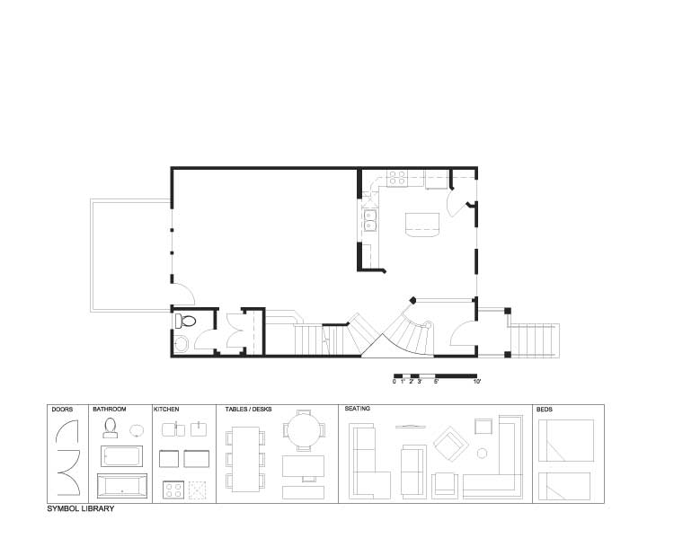
It’s Wednesday on the the Slow Home site and that means it’s time for another Design Project! This week we need your help to re-design the main floor of the “Chadsworth II” townhouse in the “Overlook at Claremont” development in North Druid Hills – about 15 minutes north east of Atlanta.
The “Chadworth II” is 2,221 sq ft on three floors and has 2 bedrooms and 2.5 bathrooms. There are some significant design flaws on the main floor which need to be addressed – so, here are the guidelines for this exercise:
1. The kitchen, living and dining spaces need to be re-located and re-designed – the living room really needs a focal point.
2. The windows to the front and back are precious and should be utilized for the principal living spaces – not for the inside of a pantry as in the current design!
3. Although not well designed – let’s leave the stairs as they are. Let’s imagine that this is outside of the project budget.
4. Although they are in an odd location in-plan – let’s also leave the powder room and back closet – again, think budget constraints.
5. There will be bonus points if anyone can figure out a way to get a coat closet at the front entry without changing the stairs! Remember there is a level change between the front door and the kitchen level that has to be addressed.
Day 197 – PDF
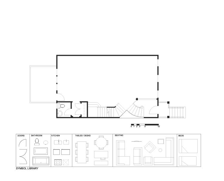
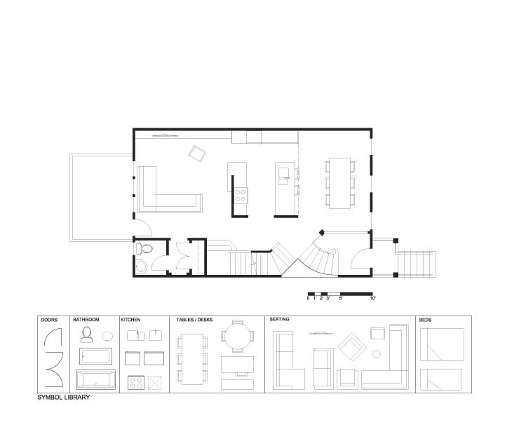
Day 197 – Existing
Day 197 – Demo
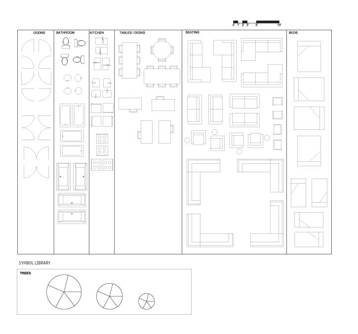
Day 197 – Full Symbol Library
Good luck everyone and we look forward to seeing your finished designs – we will be posting the results on Friday!
See you tomorrow for our “In Detail” episode looking at entry spaces in town homes!


