
This is Day 155 of the Slow Home Project and we need you to join us in our quest to evaluate the design quality of houses in nine North American cities in nine months. This week we are analyzing townhomes in Philadelphia and for today’s design project we are redesigning a townhome.
It’s Wednesday on the Slow Home site and that means it is time for another Design Project!
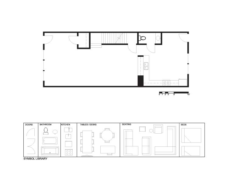
We need your help to re-work the main floor plan of this 2,000 sq ft town home from the Philadelphia area. The plan we have chosen to work on is from the Fishtown district in central Philadelphia and is a four bedroom unit with detached parking.
The unit is not a terrible design, unlike many others that we have seen, but there is definitely some room for improvement.
The challenge for today is to redesign the space and incorporate the following changes:
- Better front and back entry spaces with a closet at the back entry.
- New location and design for the guest bathroom.
- New location and design for the kitchen – try to reduce the amount of floor space in the kitchen.
- New living room space with a focal point.
- New dining space with a natural place for the table.
- You will most likely have some left over space, so try to come up with an idea for a study space – remember it does not have to be a room – just a good place to work.
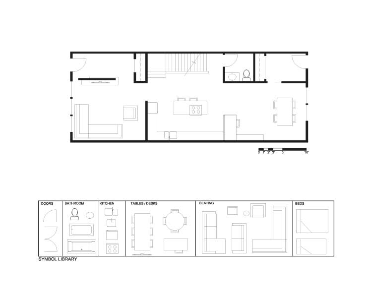
Good luck everyone. After you have tried the project and submitted your plans and comments to the site, you can click on the link below to see how John has designed this space. Remember, we love hand drawn plans and we also love to see posts from first timers!
Day 155 – Existing
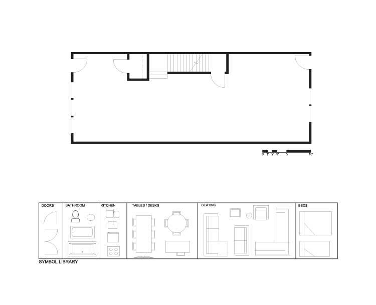
Day 155 – Demo
Day 155 – PDF
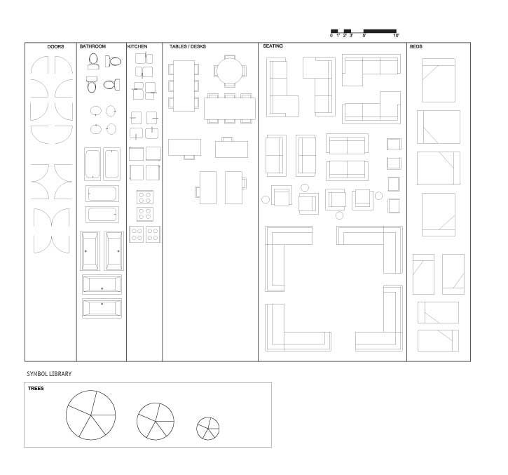
Day 155 – Full Symbol Library
Join us tomorrow where we will be doing an “In Detail” segment focusing on parking in townhomes!


