Week In Review Apt/Lofts In Atlanta


This is Day 192 of the Slow Home Project and we need you to join us in our quest to evaluate the design quality of houses in nine North American cities in nine months.

It’s the end of the week on the Slow Home site, and like every Friday, we have lot’s to do today!

First, we need you to vote for who think should win the Slow Home Awards for Best Apartment/ Loft project in Atlanta. We have posted images and links to the websites of the three short listed nominees. Take a moment to study the plans and cast your vote for who you think deserves this award. Also, take a moment to post a comment as to who you voted for and why!


Castleberry Point – Unit A


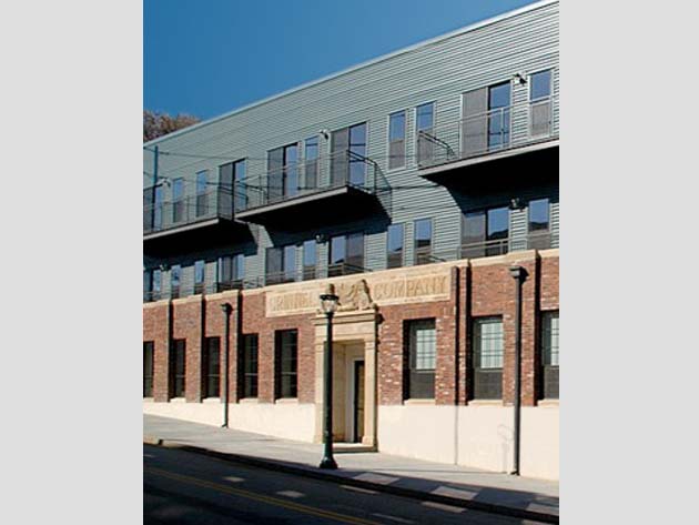
Grinnell Lofts – Plan 304


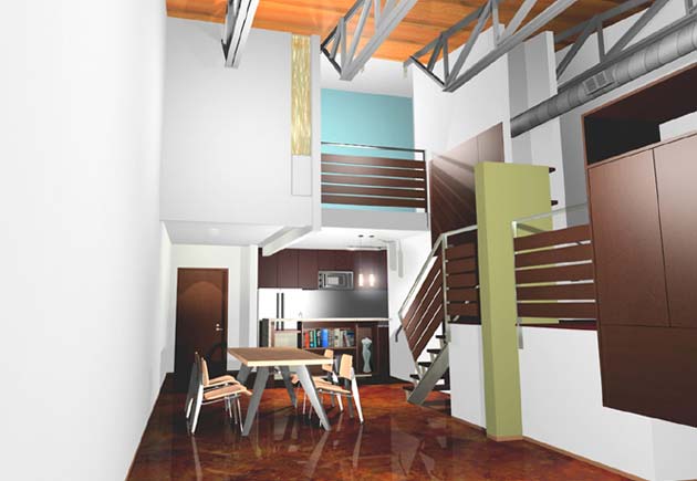
Marble Lofts – Glasswing

Loading ... Loading ...

As for the Design Project, we really appreciated all the submissions this week! It was great to see that it is possible to covert a “What’s Wrong With This House?” floor plan into a Slow Home!

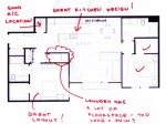
The original floor plan scored a lousy 7 out of 20 on the Sow Home Test. To see the original floor plan, click on the link below.
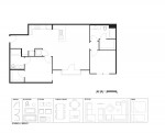
Although, it is not possible to add any points for Environmental Performance, Outdoor Living or Siting, it is possible to improve the other categories to reach a maximum revised score of 14 out of 20. We are happy to report that Nicole and Jim Baer’s revised plans both scored 14 points so they are our winners this week!
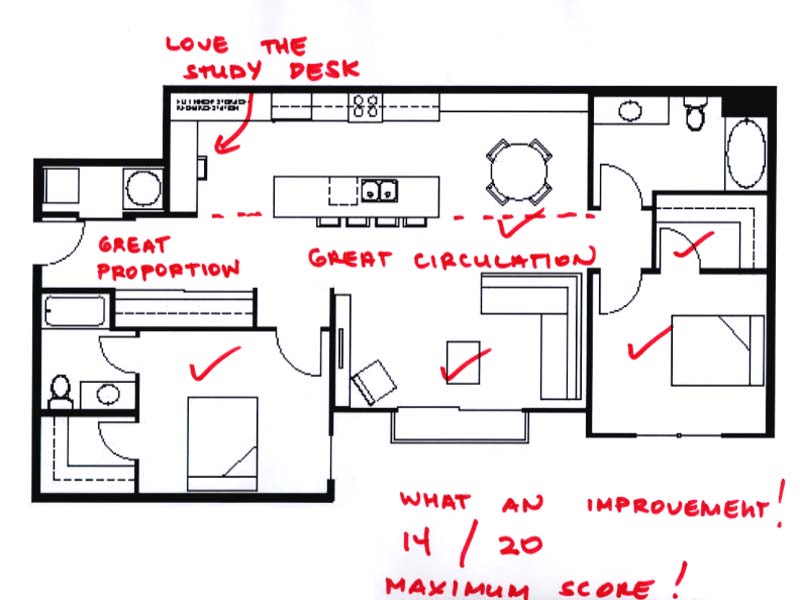
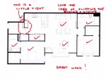
1. This is Nicole’s plan. We love the proportion of her kitchen, the inclusion of a built in study desk (we wish we could give bonus points!) the idea of millwork behind the dining table and the layout of the living room. Also note the proportion of the entry, which is appropriate given the scale of the unit. Great work Nicole!
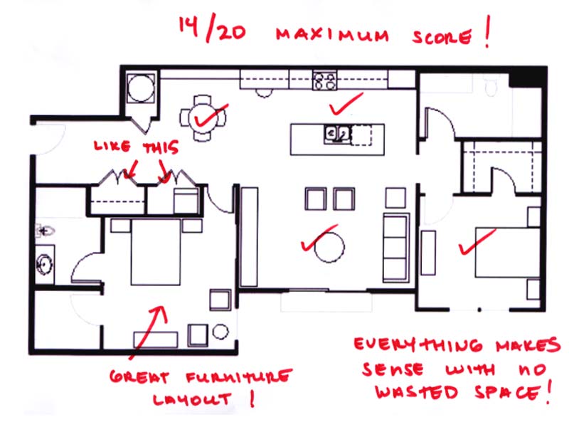
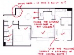
2. This project is from Jim Baer. We love the consolidated laundry and entry closet idea, the master bedroom furniture layout is exceptional (note the bed location oriented to the view) and the kitchen (which also includes a study desk – did you and Nicole work together on this?) has a very efficient and appropriately scaled layout. We’d definitely buy this unit!

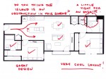
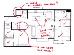
We are also posting six other submissions that made excellent improvements to the design quality of the floor plan along with our comments how we would make them even better. Good work everyone!
We are also very happy to be releasing the video of the Slow Home Award Winner in the Single Family House category from Denver! As decided by your votes, the winner was the Washpark Green project. Click on the player below to watch John and Matthew’s interview with architect Peter Carnicelli of insitu Design and builder Sean Smith of Sean Smith & Co. We also look forward to your comments about this video!

And finally, to reveal the Slow Homer of the Week for July 29, 2010, click on the player below. See you Monday for our look at townhouse design in Atlanta!

  • BradW

    http://www.theglobeandmail.com/real-estate/the-doctor-is-in-house/article1655881/ – Shows a suburban home renovation by Charles Gane recent SlowHome award winner for the Portland condo in Toronto. Slow Home award mentioned in the Dave LeBlanc Enjoy.

  • BradW

    Congrats to MAM on your well deserved SHW award!

  • Franco

    Congrats to MAM! Fabulous job!
    Nicole great job with the plan as well:)

    For the vote today, I went with the Grinnell Lofts-Plan 304. What swung my vote was the fabulous organization and space found in that unit. I found Castleberry Point-Unit had limiting features: the angled wall and unique living space would make it difficult to place furniture in that plan.
    Marble Lofts-Glasswing is a great unit, but I personally prefer everything on one floor.

  • Terri

    It’s great to see Mid America Mom recognized for her undying support of the Slow Home project. Her enthusiasm and helpfulness have made this site even better for the last 7 months. Thanks, M.A.M.!

  • Catherine Taney

    I liked the Grinnell best. Although there are issues with all of the plans – none I would award 20/20 to – I think that the Grinnell offers the best living/kitchen/dining space. Perhaps the corner condition helps with that! A close second to the Castleberry.

  • JPod

    I really like the Grinnel of the three. The kitchen and living space seem to be very well organized and layed out. The den/study space leaves a bit to be desired, but at least it has such a space, even though I probably wouldn’t give it a point for having one, it still has one.

    I do really like the actual loft in the glasswing, it gives it more of an industrial feel, which is kind of interesting.

    The odd angle of the Castleberry is what turned me off, although one benefit of having this layout is that everything is very open and bright.

    My vote definitely goes to the Grinnell.

  • Manolo

    My choice was the Castleberry – JPod: what is this odd angle you speak of?
    The other 2 had bedroom issues with light access. If you look again at the Grinnell, the one bedroom has no window. The den in the Grinnell is also unfortunate (though it’s nice to have that space at all). The Castleberry has no study space but I think that might be ok depending. The location is much better for the other 2, but the Castleberry’s light and layout really spoke to me so I wouldn’t mind having to bike a bit further to get to the coffee shop.

  • Kyle B

    I was quick to dismiss the Grinnell Lofts design because of the windowless bedroom and study and entry/closet door swings (you have to be picky with these ones otherwise you’ll end of liking them all!). It was close for the Castleberry Point design but the balcony style bedroom from the Marble Lofts design won me over.

  • Manolo

    Oh, and great job to Mid America Mom, nicole and Jim Baer!!

  • Andrew

    Some really nice designs again!

    As for the slow home of the week, my vote goes for Grinnell Lofts, Unit 304. I think the organization works well here and I believe this is a rare example of when an office/den space works in an apartment. It’s also nice to see a closet right at the entrance as well as a good laundry space. The circulation is effective, the living space has a nice connection with the balcony and the bathrooms are nicely proportioned with a good amount of storage. I also thought the Marble Lofts Glasswing apartment was nice, especially in the way multiple levels was dealt with, but the den space looks a bit desolate and I’m not sure how well the landing would be used.

  • Joshua

    I actually voted for the marble lofts, but I think the castleberry scores better on the slow home test. What I liked about the Marble lofts, was the loft of corse. I am a sucker for vaulted cellings and a very open air feeling in he house. It recieves no points for entry, and for dining only if the funiture arrangement was changed.

  • Amanda

    I voted for the Marble Lofts-Glasswing. It is classy and I like the layout. I also love open houses where the top level looks down to the lower level. This makes the house seem bigger.

    Grinnell-Plan 304: The loft was too narrow for me and I didn’t like how the windows where all on the one side so that the one bedroom and fake den have no light. I also didn’t like the look of the building or its relationship to the outside.

    Castleberry Point-Unit A: The only thing I didn’t like about this loft was that the guests must walk through the laundry room to get to the bathroom. A laundry room is a personal space.

  • Terri

    I’m really hesitant to vote this time, because I don’t find these very inspiring. All three of these units don’t offer very good outdoor living situations. Grinnell has the most accessible balcony, but it’s small and very exposed, so I doubt anyone would have a seating arrangement out there. Glasswing relies on a communal rooftop deck, and the Castleberry has that silly bedroom access.

    That said, I really can’t call that master bedroom/bathroom layout in Grinnell (the non-private entry and that closet at the far end of a huge bathroom) slow, and I want to counterbalance all those votes for it. :D
    So that leaves the other two. The extra bathroom in the Glasswing is not designed well (view of toilet from sink when door ajar) and the mechanicals are oddly placed in the kitchen. The Castleberry seems to have the most simple and open design, and its location is probably the most “light,” IMO, so I vote for it (with reservations about that access to the balcony).

  • Terri

    John & Matthew,
    Is the camera at fault for the low light levels in the interior of the Wash Park Green home that won the Slow Home Award? The stills from In Situ Design show a bright place, flooded with light, but your video seems to prove otherwise. It looked like a simple and open home though–a good choice for an award.

  • frazer

    I placed my vote for Grinnel 304. It is very open and all the principle living areas have great light. Very clear organization as well. That bedroom with no window is odd. Is there a mistake in the plan because by code every bedroom must have 2 means of egress?

    have a good weekend all, cheers.

  • ReneP

    I voted for the Marble Loft – the floorplan for Castleberry Point would not load for me – so I had to pick between Grinnel and Marble.
    I like the openness of the Marble plan and the den on the split level – very inventive IMO. Grinnel’s bedroom so close to the entrance, and the other bedroom’s lack of a window were strikes against it – as was the dark and unusable study area.

  • Matthew North

    Terri – I think it must be the camera – when John and I were there it was as bright as day inside! I actually held the camera for this tour – looks like I need some lighting tips from Steve!

  • Mid America Mom

    I choose a classic slow condo for my vote
    - the castleberry.

    We have seen this design frequently as a finalist with entry being the problem space.

    Grinnell lost on den and the second non windowed bedroom.

    Marble dining and kitchen and entry were not the best. The bedroom layout was off and I wonder if the bed can be done facing the stair.

    ****
    Thanks for the award! We are doing something unique, having fun doing it, and it is SOOOOO necessary!

    Good job Nicole and Jim.

    Mid America Mom

  • Mid America Mom

    Oh – on my design project. The desk is not built in. If I was a builder I would plan for it there in the plans and show the model home with it there. The dining space can handle a table for 6. The kitchen. I opted out of the double galley so I could have bar seating out of circulation and with a better view. The corners would be the 36″ easy access type. The one near the fridge is for pantry items while the other would be for pots and pans (been there and done that more than once :) and it worked ). I meant to design that middle floorspace as 7 feet. 9 is the max allowed on any one leg of a kitchen triangle with the NKBA (national kitchen and bath assoc.) guidelines. **If I recall Matthew advocates 5 feet or less for that space. So I wonder what he has to say….***

    Mid America Mom

  • Tiffany

    I voted for the castleberry. the exteriors played a big role for me and I just love the effecive reuse of the building. Each of the plans had minor problems, but I think that this one just had the most effectivw layout for the size of it.
    Congata MAM, nichole and Jim. You all did great work.

  • nicole

    Good work to all who submitted plans this week! They all keep getting better + better!

    my vote went to Grinnelle. It was a tough choice between castleberry + grinnelle, but I am intrigued with the history / story behind this building.

  • Tayler

    My vote went to Marble Lofts. I like the open concept but also that the bedroom is semi private and away from the other living spaces. But I guess I’m a sucker for a loft.