Week In Review For Apartments/Lofts In Miami

This is Day 129 of the Slow Home Project and we need you to join us in our quest to evaluate the design quality of house in 9 North American cities in 9 months. This week we are analyzing apartments/lofts in Miami and today we are going to be reviewing the work that has been done on the site.

Happy Friday everyone! For this week’s wrap up, we have a lot to do!

First, click on the link below to reveal the name of the Slow Homer of the Week!

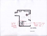
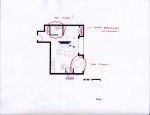
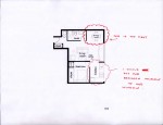
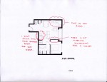
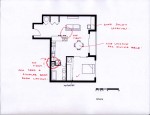
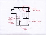
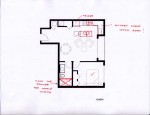
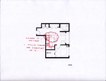
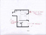
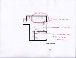
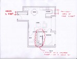
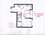
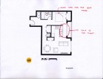
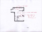
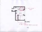
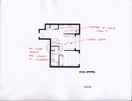
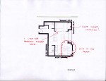
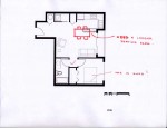
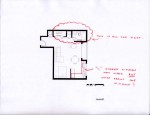
We had a tremendous response to our Design Project this week! The challenge was to re-work a 620 sq ft apartment/ loft unit in Miami and try to improve some of the obvious flaws. This particular project was difficult due to the limited space we all had to work with. In addition to the projects we discussed in our episode today, we have posted more of your schemes below with some constructive mark ups on them. Take a few minutes to review the plans and let us know what you think of the suggestions!

We also need you to vote for which project you think should win the Slow Home Award for best apartment/ loft in Miami. After you vote, take a few minutes to write a comment and tell everyone which project you voted for and why.
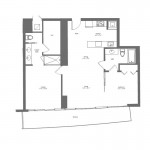
The first project to be nominated is “Unit 2″ in the “Mint at Riverfront” project. It is 1,307 sq ft and has 2 bedrooms and 2 baths. It scored 16 out of 20 on the Slow Home Test and was first posted by Braden. It was built by Key International and designed by RVL Architects.
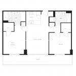
The second project is “Unit C1” in the “Axis” building. It is 1,075 sq ft and is 2 bedrooms and 2 baths. It was built by BRCE Brickell LLC and designed by Arquitectonica. It scored 16 out 20 on the Slow Home Test and was first posted to the site by Scott.

Thank you for voting.

Loading ... Loading ...

See you on Monday where we will be analyzing townhomes, our last housing type in the Miami area!

  • scott

    [img]miamiloftfinal.jpg[/img][img]1_miamiloft.jpg[/img]

    day late and a dollar short…..but will try again for next week.

  • Murray

    I voted for the Axis – I gave it a 16 on the SH test. I would prefer to be in the S tower, facing S. The broad proportion is good and the organization is good. The bedrooms are a bit large, but this looks like a unit for roommates rather than a family; the bedrooms would be the only private spaces so their size is justifiable. The bathrooms are a bit off – the master doesn’t need two sinks, especially since the toilet is too close to the one and it interferes with the shower, and the laundry is in the other bathroom which becomes a problem for my ficticious roommates.

    I gave only 12 to the Mint, not the 16 that Braden scored. The kitchen is a bit large and not laid out well. There is really no functional dining room because of ciruclation corridors needed from the front entry and into the bedrooms/bathroom. I am not a fan of having to go through the ensuite to get to the clothes closet, and apparently the shower in the ensuite has a peek-a-boo view into the master bedroom, not particularly fun in the long run. Though, I did read a review where a more family-orientated person was complaining that the complex was catering more and more to a “South Beach” party crowd.

  • PeterB

    I chose the Mint for a few reason. First the unobstructed laundry is important and with the axis suite its right beside the front entry door.

    As well i feel the hidden kitchen in the mint unit works nicer than the other which is completely open and in view from most areas of the unit.

  • nicole

    Axis …
    Better plan due to the washroom entry is separated from the main living space (not being off the dining)
    Laundry is in a better location
    Storage (washrooms) is lacking

    Mint…
    Better interior finishes and details
    Storage (washrooms) is lacking

    Both are missing environmental features which I think should be a big part of the selection process.
    Overall, Miami is way behind in the environmental band wagon, it is time they got on. I vote neither.

  • MollyK

    Mint scored 11
    Axis scored 13

    Neither unit is deserving of a Slow Home award…so I voted “Neither.”

    The absence of environmental features is more than noteworthy. The developers & architects obviously take pride in their creations and the amenities offered…the websites make every effort to show off these features. So it stands to reason that if there were significant environmental features, the “teams” would certainly put such information on the websites as well. I believe nothing is mentioned for a reason…either the features aren’t noteworthy or they simply do not exist. Either way, it is a sad commentary on the practice of “Green” in Miami.

    As for the units themselves…
    -Mint suffers from poor circulation which results in a dining location that might rival the traffic pattern in Time Square; a small, potentially dark kitchen, and an outdoor living space made up mostly of sliding doors (which means lots of circulation impeding on furniture placement). Incidently, there is a picture on the Axis website that shows the balconies and they are very narrow.
    -Axis has much better circulation but an even smaller kitchen and no place for a dining table. It too has a terrace with 3 sliding doors that reduce its functional space. And, as Murray indicated, the master bath looks crowded with the toilet very close to the sink.

  • Bell604

    I voted for the Mint at Riverfront. It is by no means perfect, with its circulation problems around the dinning and bathroom area, or the length of the unit, making the kitchen short changed for natural light. But the unit shows good organization, proper balcony space, and moderately scaled rooms.

  • Robert Bierma

    I think that the axis is the better unit. It achieves that say program with less ft2, has a larger proportion of exterior wall to surface area, and and is far more adaptable for future renovations/remodels. That being said they are fairly comparable and I think the ultimate choice would be all about context. All that stuff you cant really tell till you walk around a place. Like what the rest of the building and adjacent land are like. Does the architecture form quality places that you can incorporate into you home territory and take a level of pride and ownership in. High rises are nutritious for neglecting the design of there public spaces as we saw in the which house exercise. So finally if either of these condos have a ground floor like the icon brickell DON’T BUY IT!

  • JPHH

    I voted for neither. The Mint has poor circulation. I don’t think you could fit a dining table in the area because of the bathroom door. In the master bath I would agree that the double sink is not required. The same goes for the Axis the double sink would be better as counter space. This unit also would be tight for dining area. And I think that environmental features should be there but they aren’t. So I don’t think either of these should win the slowest home.

  • Robert Bierma

    Bell, I am unsure why you went with the mint? you positive attributes appear to me to be comparably true for the axis. As well some of the negatives seem to be less of and issue with the axis, i.e. unit length and natural light.

  • Murray

    I am spending my day at the computer, so I keep checking back. I am also not interested in what I should be doing, so I am going to make a few comments.

    Firstly – the moment I voted for Axis I wished, instead, that I had voted “Neither” – mostly because of a growing concern about the apparent lack of interest shown by designers in integrating more green technologies and sustainability into these massive developments. There seems to be an issue of style over substance in Miami. You would think in a competitive market such as in Miami that developers would be flaunting their environmental consciousness to stand out as something “new and exciting” to attract buyers.

    However, strictly logically and suspending reality for the time it takes you to read this paragraph, I think that when responsible environmental performance is non-existent in either complex then it becomes a non-factor and can’t be used in the decision making process. In the same way that we give a gratuitous point for “Study” even when it is not there in a dwelling, why penalize environmental performance when they are not there in the first place – it is the equivalent of giving a negative 3 to one’s score. Again, this is a logical argument, not a socially responsible one.

    I also think solar orientation should be a quality of “Siting” and not of “Environmental Performance” – the sun is not a choice we are given, but how we choose to orientate our home is (or should be). Only after the home is located do we have the added responsibility to incorporate all things green – which may include having to deal with a less-than-desirable solar orientation in the case of a multi-storey building when some units cannot be ideally so orientated.

    I did vote for Axis because I think it is, for the most part, a really workable unit (what if it had all the green technology in the world?). Unlike others I think there is sufficient room for dining and living in the large central area and still allow for good circulation to the bedrooms.

    Further investigation of the Axis floor plans indicates that they all are, more or less, symmetrical, as is the entire building layout, which is obviously a play on the name of the building complex.

    PeterB – the space at the entrance houses the AC unit (I think), the laundry is in the bathroom (I know).

  • Allie G

    I am inclined to vote that neither are deserving of the slow home award. Although both have their pro’s and con’s, I still score them well below the slow home threshold on the test.

    The Mint lacks the minimum requirements for an entry space, the kitchen is crammed where there is no light, and the bathroom seems to be larger than what is needed.

    The Axis has similar issues with not having an entry space, but I find the kitchen even less desirable than the one in the Mint. I also find that the bathrooms use up excessive space and could be cut down and used more efficiently.

    If I was forced to choose, I would vote for the Mint, but because both do not score very highly, I’m going to vote neither.

  • MollyK

    Murray,
    I might agree with your argument that the environmental performance be treated as a “non-factor” when it doesn’t exist…sounds logical to me. However, the category is weighted at 3 points which indicates its tremendous impact on the simplicity and lightness of a slow home. The study is merely an optional space and carries just 1 point, which tells me that its impact isn’t nearly as far-reaching as the environmental performance.

    I’ll get back to you on the solar orientation issue…have to formulate my thoughts. Boy, I wonder what BradW would have to say about all this. You know he can be a firecracker sometimes…wonder if he’s watching us. (Hey Brad)

  • MarisaM

    I choose Unit C1 as my pick. I liked the indoor living space and flow of the home more. There is space is pretty well equally distributed between the bedrooms and the living room. You have just as much room where you sleep and the common areas. The kitchen is an appropriate size for the apartment with good functionality. I believe there is good minimal wasted space in the hallways into the bathrooms and bedrooms. Also the apartment’s layout the bathroom is out of sight from the living room areas.

    The two downfalls of the apartment I can see off the bat is there is no real entry marked off. Also the kitchen is a light far from the window and natural light.

  • Murray

    Hi MarisaM

    I do agree that kitchens can be darkish places in apts. and this is a frequent observation, and can be a reason not to score the kitchen its point on the test, but I think it makes good sense to have the kitchen near the entry for convenience. Unfortunately in an apt. this may mean it will be at the back of the unit, especially if it a long narrow one. I think better this than traversing other living spaces to get to the kitchen counter with your environmentally-friendly, reuseable, cloth grocery bags laden with locally-grown produce.

    This goes the same for a house or any other type of dwelling – there should be easy access to the kitchen from an entry space or at least the bare minimum of unimpeded circulation.

  • MollyK

    Murray,
    Solar orientation… I think the criteria’s importance has slippe into the background ever since it was combined with Environmental Performance. Don’t misunderstand…its relationship with environmental features is sensible so why not combine the 2 elements and streamline the test. However, originally this criteria was important enough to have its own category with a score of 3. (Please correct me if I’m wrong…Los Angeles was a long time ago.) Now it really takes a back seat to other environmental features, yet its impact on the livability of a home has never changed. Solar orientation doesn’t simply indicate that the sun will shine into a window; it provides much more information. It tells us what kind of light will enter the home and from what direction (passive?/from the East?); how much of it will be transferred throughout the floorplan (what areas will or will not receive light); and at what time of day and for how long.
    In the past, a home could score higher even without environmental features if we knew the solar orientation (and it was good). Things have changed…I don’t know that the change is good or bad, but there is a definite impact on how the homes are now scored.
    Perhaps moving solar orientation into Siting would bring its importance back to the forefront and level the playing field with Environmental Performance.

  • bbhorner

    Axis

    The kitchen seems brighter then the Mint. The entry to the bedroom and bathroom is really nice with the little vestibule. Also the mint had an angled wall of windows which may look nice but could potentially cause some problems with furniture arrangements.

  • Frances Grant-Feriancek

    I’ve been thinking this over all day, and looking at both plans. My vote has to go to the Axis unit.

    I think the bathroom door is just too close to where the dining table would be in the Mint unit. I also dislike the closet location, within the bathroom, in this unit. This is a deal breaker, so my vote has to go to Axis.

    Interesting that I am voting not for what I found appealing in a plan but rather for what I couldn’t vote for.

  • Alison G

    I voted neither. If I had to pick one I’d go for the Mint, but the usable space in the dining/living areas in both are compromised by the circulation, especially in the Axis. Both units lack kitchen counter space, but the Axis has a particularly miniscule kitchen for the size of the unit.

  • autobrad (bradw2)

    I voted for the Axis as the best of the two. I chose the Axis because the overall use of space is more efficient and the organization more pragmatic. Although I think the main entrance opening into the kitchen, essentially blending food making with guest greeting takes away from the prestige, was the same for both units, I thought the layout of the Axis kitchen was better because it utilized the space better and did not like the counter hanging out in space. I did not like the way the bedroom and living room of the Mint had a fake wall as a divider and open concept, it seemed like a waste of space. Although the entryway to the bedroom in the Axis was a waste of space, an empty hall, it was still better than the Mint bedroom. I agree with Frances that it seems to be debating which is less worse than which is better.

  • Grace Coulter

    Hi everyone,
    I choose axis. I agree that both spaces had some drawbacks but overall the quality of the spaces is significantly better than what we have been seeing in Miami on the whole. Overall Axis had better storage and a better guest bath. Each room had good access to views and light which i appreciated. The kitchen in Axis is compact but works for the small space. I agree with others that the entry space is lacking. cheers.

  • Cnick

    I would have to go with the Mint plan because it offers more counter space in the kitchen and eliminates what is often the unused tub in the master bathroom to conserve space. I do think however that the WIC closet is a bit large still.

    I like how the dining table wont be blocking a doorway like in the axis plan, but rather is slightly seperate from the rest of the areas.

  • Andrew

    My vote is for Mint at Riverfront. The entrance is a bit better and the kitchen has more space. And while the circulation is quite similar in both apartments, I like the layout a bit better in Mint, including the bathrooms. Plus, Mint has a slightly more ‘open’ feel to the overall plan.

  • Tiffany

    I could not vote for either. The fact that they do not have one of the major components (environmental performance) is a real problem for me. This is extremely important in design for today. I just could not give my vote for an award were this element was so blatantly absent.

    If I was just looking at the plan design I would go with the Axis as it seem to be better laid out and proportioned, though both plans have flaws as has been brought up by the various posts.

  • Hilda

    My vote goes to Axis, for despite rooms for improvement, the organization of the space gives the unit more open to the flow of things. Not to mention, it looks like the unit will have more access to light.

  • Deng

    Murray made a comment on how relevant the environmental performances are in this situation (both scored zero). I read several comments on choosing neither because they did not full fill the environment specifications but should that be the most influencing factor? If they both scored 0? (I am against ‘neither’ choices- I like to see the best of the worst).
    With that being said, I choose the Axis Unit C1. In the Mint, I do not like the entrance of the bedroom. I would place the door near parallel with the master bed room door. The bedroom also does not need an entrance into the washroom. I do not like the Master bath. It seems like they opted for a large WIC for a functional bath room. I also do not like the nook in the kitchen, the circulation in this apartment is most positive out of the entire design.
    The Axis is not perfect either but the pros far outweigh the cons: good master bath, separate washroom from bedroom and the balcony is more versatile than Mint’s. Although, I do not like the direct visibility of the dining room into the master bedroom or the smaller kitchen.

  • Kadoman

    Nice to see everyone’s projects again, and the comments too.

    I voted for the Axis C1. With the Kitchen being a little more in direct view of sunlight, the master closet having more respectable dimensions and location, and finally a more respectable bathroom design (for both bathrooms.).

  • Neogi

    This is re-design was really difficult because we had to work in such a small space. And as for the designs i am going to have to go with “Unit C1” in the “Axis” building as it scored 13 while unit 2 scored 11. Both plans had their negatives as both had large bathroom that were unnecessary. Unit C1 has a rectangular terrace however it is littered with sliding doors so making the placement of furniture difficult. The Kitchen however is really far from the outdoor space. I don’t think any of these plans deserve the slow home award but unit C1 wins my vote.

  • Dan M

    I would say neither are slow, (they are close, but not quite there). The issues I see are primarily in proportions and kitchen design. Both units do have great outdoor living space, and a focus on the indoor living room space. however, each of the kitchens are more darker narrow u shaped areas, and the refrigerator even blocks access if opened (note the swing directions, not terribly convenient unless you are in the kitchen space). the living/dining areas are not really defined, and larger furniture would create issues with circulation really quickly. The separation of rooms off to the side is a nice touch, but they both seem a little large, the space devoted to them could have been better spent elsewhere.
    I also agree with what was said earlier, that this does not seem like the kind of condo/apartment for a family situation, more like a single with guest/study or roommates. Overall as I stated, they are close, but still not quite there yet.

  • Jessica

    My vote went to Unit C1–Axis. I looked primarily at dining–which had been Matthew’s objective this week–and kitchens. Unit C1′s kitchen has presence and connection to the primary living space. I think this is a key slow feature. Unit 2′s kitchen does have some connection, but this is less pronounced than in Unit C1. It is worthwhile to note that neither C1 or 2 have a dining space that is oriented towards a feature. In both cases dining space sits amidst circulation space; this is unfortunate. Nonetheless, in Unit C1 there is more space afforded proportionally to principle living. Thus, AXIS gets my vote.

  • Tara

    I votes for Axis. The main living space was the section that swayed me. In Mint, the kitchen is staggered from the windows causing for light to be limited to the area. The kitchen is straight on in axis, allowing light to penetrate into that area. I also have a problem with the dining space in Mint because of the bathroom access that would conflict with the dining room table. Though I think the living/dining area in Axis may be cramped, I think it will be more successful overall as the ciruclation into bathrooms and bedrooms does not interupt it.