Week In Review For Apt/Lofts In Chicago


This is Day 213 of the Slow Home Project and we need you to join us in our quest to evaluate the design quality of houses in nine North American cities in nine months.

It’s Friday, August 20, 2010 and there is a lot going on in Chicago!

First of all, thanks to Mid America Mom for pointing out our site to yochicago.com – we got a comment back from Joseph Askins, editor at yochicago.com who wanted to clarify some facts about the apartment/loft buildings we reviewed this week. His comment to us reads:

“MAM pointed me toward this site earlier this week after finding our website (YoChicago.com), and I’ve been watching with great interest as everyone chimes in on our city’s floor plans.

I did want to chime in with a couple of corrections/clarifications about 235 Van Buren, since it’s a building we’re quite familiar with, both through our own editorial coverage and through our current advertising partnership with the development.

First, 235 is hardly a “proposed” building at this point — closings began in the building in June 2009. It’s very much a finished building.

Second (and this has been addressed briefly already, but is worth reiterating), partial height walls like the one between the kitchen and bedroom are indeed mandated by code for bedrooms without other sources of natural light, and are quite common throughout the city. A lot of people associate them with true timber or concrete lofts, but you can find them in many new-construction developments, especially ones that feature “soft loft” design elements. (I wouldn’t call 235′s condos “soft lofts,” but many of the units do feature exposed concrete on the ceilings and some walls.)”

Joseph, thanks for these comments and clarifications and also thanks for the write up about Slow Home on yochicago.com about the “In Detail” episode on bathroom design from yesterday!

You can read the write up at

http://yochicago.com/slow-home-breaks-down-our-bathrooms/16432/

Now, onto our Design Project submissions this week – we had a lot of “late night” posts! Thanks for taking the time to submit a scheme everyone!

This week, we would like to draw your attention to three outstanding designs and four runners up. To see what the floor plan of this apartment/loft looked like before it was re-worked by our Slow Homers, click on the link below.
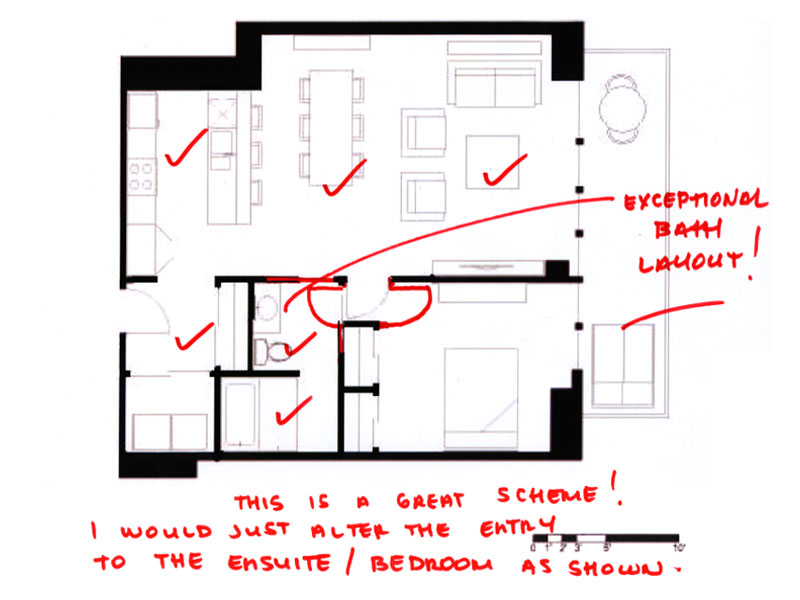

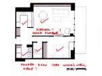
1. Frances GF has the best design project this week! Her layout is simple, yet spacious and the entry space combined with laundry works well and is of a proportion that is appropriate for the size of the unit. We would suggest a vestibule entry to the bathroom and bedroom area, but were really impressed with the layout of the bathroom which works as both guest bath and master ensuite in a really elegant way.
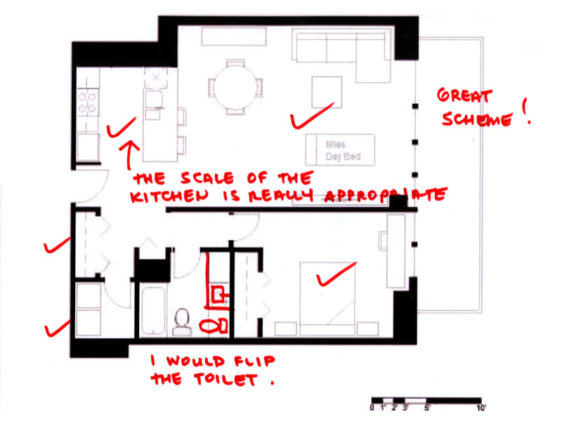

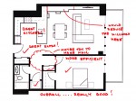
2. Brad W has the best scaled kitchen layout of all the schemes – it is the perfect size and proportion for the square footage of this unit. We would suggest a minor revision to the bath layout – but other than that – the plan is great. Again, like Frances, we are impressed with the way the entry and laundry has been handles – makes a lot of sense to us!
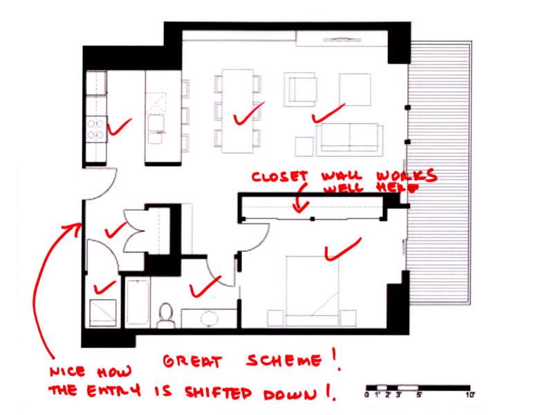

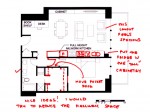
3. Manolo – a long time Slow Home Project contributor (and occasional Design Project participant) has nailed this week’s assignment! Again, what is with all the exceptional entry designs this week? Our top three all combined the laundry with the entry but did so in a really efficient and elegant way! The bath feels spacious, yet simple and the closet wall is a effective use of storage. The living and dining furniture layout is also really well done.

We are also posting the schemes of our four runners up this week, along with our comments about their designs. Thanks to everyone who submitted a plan – only two more Design Project weeks to go!
We need you to vote for who you think should win the Slow Home Award for Best Apartment/ Loft Project in Chicago. Study the floor plans and websites of our nominees below and then cast your votes! We would also like you to post a comment to the site about who you picked to win and why. We look forward to the discussion!

Solstice on the Park – Unit 1803
The Lofts at 1800 – Timber – Units 207-307
565 Quincy – Tower Unit 8

And finally, to reveal the winner of the Slow Homer of the Week, click on the link below:

  • Franco

    Great job everyone on the redesigns! Looking over the plans, I really like the laundry off the entry.

    Onto this week’s vote. It was a tough call, all the plans are really well done and offer unique features.

    The lofts at 1800 is a nice plan, my concern with dining. With the structural column near the kitchen, it’s going to be hard to fit a table and living furniture in that space. Otherwise the plan is great, nice bathrooms, good sized kitchen and great bedrooms with ample storage.

    The Solstice is a great unit, lots of space. Ironically that’s where my concerns begin. I’m not sure what all the space to the left of the kitchen (above the living area) is for. It would be nice to see this space better utilized in the furniture plan. The bedrooms in this unit both have long hallways, it would be nice to see a streamlined look and more efficient use of the space.

    565 Quincy-Tower Unit 8, is a great design, except that there is no space for dining! Otherwise it’s a simple and well organized unit.

    I was torn for quite some time between the Solstice on the Park and 565 Quincy. Reviewing both plans, I finally decided on Solstice on the Park, as I’d rather have extra space to work with, then to be lacking a dining area (as in the other two plans).

  • BradW

    Frances – I saw your submission late Wednesday and really liked it – I am glad John and Matthew agreed – well done

    No dining at 565 Quincy = no vote (13.11×17.9 for dining/living in 1104 sqft is too cosy – the apartment just is not deep enough to allow for proper living space unless a bedroom is sacrificed)

    Unfortunately placed columns and circulation directly through the presumed dining space at The Lofts at 1800 = no vote (here the living/dining space is 3 ft deeper than at Quincy but a column is conveniently located right in the middle so again this would make a great one bedroom…)

    With 2000+ sq.ft. at the Solstice on the Park you had better be able to design a nice apartment = vote (I think the smallest suite in the building is 1400 sq.ft. and most are well done, the view to the north improves dramatically on the upper floors, a fair distance to downtown, silver LEED, for the record I would buy 1903 for the 500+ sq.ft. terrace)

  • Andrew

    My vote is for Solstice on the Park – Unit 1803. I really like how much privacy the balcony has and how it is integrated with the rest of the apartment. The dedicated laundry room is also a welcome feature and the principal spaces in the middle of the plan are nice and large. But as Franco mentioned, this apartment feels a bit too large in places and maybe not the most efficient use of space – for example, I’m not sure if 2 walk-in-closets off of bedroom 3 are necessary and perhaps the kitchen could have benefited from the addition of a pantry. But other than those issues, I still think Unit 1803 is the best of the 3 plans, especially since the other 2 do not have dedicated dining spaces.

  • Mid America Mom

    Thank you for the award! It is great to be recognized for the passion I have for Slow Homes and what we are trying to accomplish with the project.

    As we have seen with the tweet box on the right there seems to be a growing movement in being more slow in design (interior as well as architectural) and living. Maybe the economy in the US has led some reevaluate their goals and past choices. With our love of credit and consumerism there is a price. Are we willing to still pay for it? Some are not.

    ******
    As for YoChicago make sure to check out the videos. Those who are doing the project you may want to check out their sister site, new home notebook – http://newhomenotebook.net/

    Mid America Mom

  • BradW

    MAM – well deserved!

  • Steve in Van

    [img]7_untitled.jpg[/img]

    The Solstice is a VERY spacious, nicely designed appartment. I’d combine the extra hallway and closet in the master bedroom into a dressing room, but otherwise it’s quite stunning. If price and space efficiency were no concern, it would have my vote.

    Apparently they were unable to avoid putting the post in the middle of the living area of 1800 Grace, which makes me avoid that unit altogether.

    Quincy, on the otherhand, is workable. As drawn, it has no dining area. But with some rearrangement of the bedroom entry, I’ve put a 4′ table in the space without too much disruption. And it’s less than half the footprint of the Solstice — as the developer, I could sell two of these units for every one in the Solstice.

    So, assuming the price per square foot is similar, I’d have to go with the Quincy.

  • BradW

    [img]235vbftier13kitchen.jpg[/img][img]1513.gif[/img]

    My take on 235 Van Buren – the location is great and the building elevation is distinctive – I can see why it would be popular for young singles and couples – but simply because 235 and many other developments use the partial kitchen wall trick does not make it right – the developers are simply exploiting a loop hole to build so-called two bedroom units in one bedroom square footage which equals more profit for the developer, more density for Chicago and ultimately questionable living space for the residents

    I have posted images of a representative 35th floor 2 bedroom – you decide…

  • BradW

    And BTW, the first I would do if I owned the above unit at 235 would be to enclose the space at the top of the kitchen cabinets – really who is fooling who here…

  • Manolo

    Great job MAM! Thanks for the cudos on the design, John and Matthew!

    I had a tough time choosing this one. While the Solstice clearly has the best floorplan of the 3, it’s also the biggest and likely most expensive. That said, for the long run, it also seems like the most livable. The other 2 basically lack dining space, with the 565 Quincy lacking that ability more so than the Lofts at 1800. The location of the Quincy is the best in terms of walkability, access to transit and so on, but will likely be a busy place with a lot more noise at all hours of the day. The Solstice has a quasi-suburban condition facing the Museum as it does which gives it great access to transit with a MetraElectric Orange line stop a block away, and a much, much quieter spot overall. The Lofts at 1800 are sandwiched between the CTA Brown line, which runs N-S just W of the site, and the Union Pacific North line just E of the site. The UP-N line does not have a station nearby, and will be a nuisance for noise as the unit faces toward it. Alternatively, this could be something to put up with since the community of North Center is rather vibrant and up-and-coming. The Lofts at 1800 also can boast that they are making the most of an otherwise challenging site condition. By reusing the existing building – this goes as well for the 565 Quincy – the integrity of the neighborhood fabric is maintained better, and the environmental impact of doing so has much less embodied energy than the LEED Silver new build of the Solstice. Oh the dilemma!

    So after much internal debate, I settled my vote on the 565 Quincy. My main reasoning is that the plan is good enough, even without the dining space, given how amazing the location is in terms of urbanism. I like how the building takes advantage of the existing condition – a building that was overbuilt for its height – to reuse a handsome former office and keep embodied energy costs down. Yes it will be noisy but you don’t live in Chicago to hear the crickets!

  • Tara

    Though I feel like I want to pick Soltice on the park, I feel that there will be too much excessive, wasted space in the unit once it is furnished. The website provides an option to show with furniture, and when this is turned on, the furniture seems dwarfed by the amount of empty floorspace around it. I’m not sure if this is their way of showing how spacious the unit is, a possible selling feature to vulnerable buyers.
    The columns in the Lofts at 1800 really bother me. Especially the one in the main living space which I think would really interupt the quality of the space.
    Therefore, with some reservations, I’m left to pick 565 Quincy. I think there are definate issues with the entry and how open it is to the kitchen, and the dining space which is basically non-existent. I also think the unit could benefit from more storage as there is not much to speak of, especially in the bathrooms.

    I have to say, I’m a bit disapointed with the picks for this week’s slow home of the week. I feel there are quite significant issues with each of the plans this week as far as the slow home test goes. Considering the amount of apartment/lofts in Chicago that were classified as “slow”, and especially the shear number of units which recieved 20/20, I would have thought there would have been some better picks for the award than these.

  • Steve

    Hey Slowhomers!

    We just threw up a bunch of pictures and video of our latest Slow Home Award Nominees on the Facebook fan page.

    You can check them out here:

    http://www.facebook.com/slowhome

    Enjoy!

  • Mid America Mom

    Hi Folks!

    Choices… All of these are split two bedroom with living and kitchen in the middle plans. * This type of plan would fall into a future? slow home stock plan book (MAYBE? why not supplement the book?) on two bed condos. * The issue with this plan is always the entry.

    So with that in mind I looked at all three and found that the entry on solstice could really be called an entry with that extra notched footage and in this gets my vote.

    Wish I could follow the thread more today but now I am off to Windsor!

    Mid America Mom
    ___________

    Thanks! Manulo and BradW.

  • Terri

    Congrats, Frances, for having the number one pick plan today!

    (I noticed the top three picks either didn’t include a desk or put it in the bedroom…perhaps this was the key to a simple, clean space.)

    As for the vote, Tara took the words from my fingertips, so I ditto her post (above).

  • Frances GF

    Thanks for all the kind words Slow Homers. I immediately emailed a link to my Dad this morning!

    Brad- I agree with your comments on 235 Van Buren. I would suggest the second bedroom could qualify as a mislabeled space.

    My vote this week goes to Solstice on the Park. As previously noted the other two units lack a dining area.

    I would have sooth my discomfort with the perhaps too large space, with the knowledge that the development has a Silver Leeds Certification.

  • JessicaC

    Haven’t posted in some time, but I thought this was interesting:

    http://www.abcddesign.com/archives/2010/08/10/a-smaller-life-signs-of-a-slow-home-movement/

    Came across this on my twitter feed… thought it was interesting and relevant, and at the very least presents rather poignant images of what “slow living” is…

    Cameron Sinclair (Architecture for Humanity) says slow design is community-based design… I think these images reflect that. Thoughts?

  • Terri

    JessicaC.,
    I tried to read your link to “Signs of a Smaller Life” at ABCDesigns, but it wouldn’t open. Is this because I’m using a computer? (I restored my system yesterday and the kinks aren’t worked out yet.)

  • JessicaC

    Hmm… I haven’t any idea why that link wouldn’t work for you. Try the source: http://www.abcddesign.com and navigate to “Signs of a Smaller Life” through the article titles in white on the right side of the web page.

  • Frances GF

    I checked out the first link (on my computer) it worked fine.

    It was an interesting read, thanks for the post Jessica.

  • nicole

    Even though solstice in the park has lots of extra space, the benefits are: outdoor living is substantial, good dining area, + sustainability. But for 2300 sq ft and only 2 bedrooms (and 3! baths) there is way too much space. (where is the sustainability in that?!?)
    Lofts at 1800 are also very intriguing, but feel that the dining space is lacking.
    My vote is for none.