Week In Review for Apt/Lofts in Philadelphia


This is Day 150 of the Slow Home Project and we need you to join us in our quest to evaluate the design quality of houses in nine North American cities in nine months.

It’s Friday and that means we have our weekly wrap up! Our first week in Philadelphia has been like a breath of fresh air – we are happy to have found a large number of well designed apartment/ loft plans that represent the Slow Home philosophy. We would like to thank everyone who worked hard on the Slow Home Project this week and posted their reviews of apartment/ loft projects onto our site. Our Google map of Philadelphia is starting to fill up!

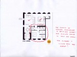
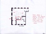
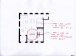
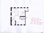
The Design Project this week was to re-work a 978 sq ft loft conversion in central Philadelphia. We would also like to thank everyone who submitted a plan and we were very pleased with the results. This project proved to be a challenge as everyone had to work with a plumbing wall that could not be moved and had to deal with 3 structural columns in the middle of the space.

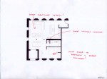
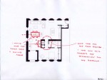
The projects could basically be divide into two camps – one group kept the space very open concept and “lofty” by using a minimum of partition walls. The second group made a more walled enclosure to define the bedroom and bathroom areas. We would like to take a closer look at the best of the two camps.
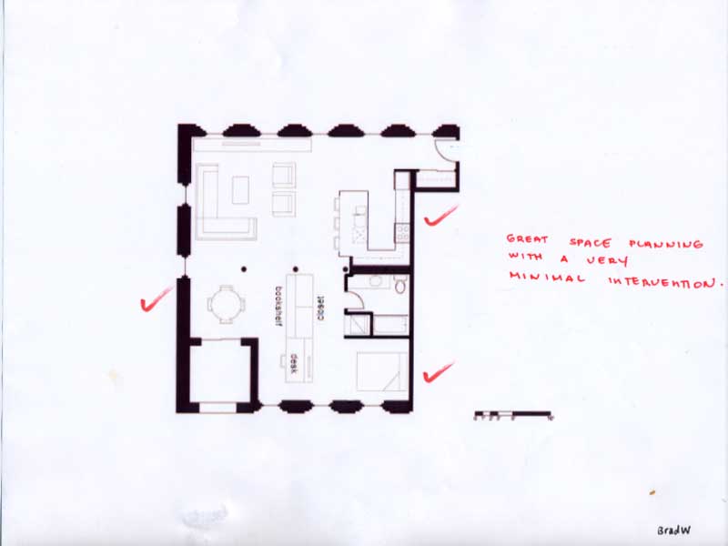
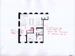
This project is from Brad W. His plan is very successful because he has created a logical place for all the functions of this home with the bare minimum of actual walls. We particularly like how the bed area was dealt with because in an open concept loft plan the bed still needs to be private, but a large amount of room is not required. The clever addition of a millwork piece that contains storage, bookshelves and a desk create privacy and storage while maintaining the continuity of the ceiling (we are assuming this piece does not touch the ceiling).
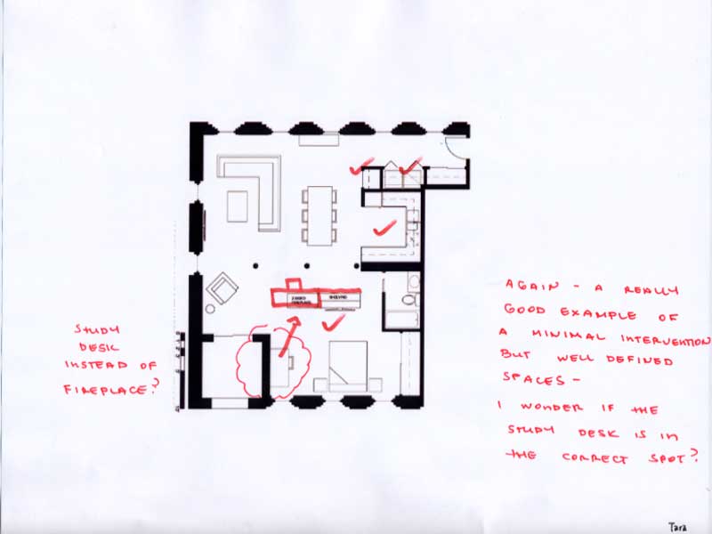
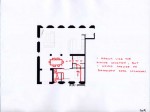
This project is by Tara. We thought this was an interesting take on the loft idea as the kitchen is combined with the laundry and coat closets to create a block of function by the front entry. The simple bathroom is tucked away into the side of the plan while a millwork object separates the bedroom from the living/ dining space. We thought this plan could be improved even more if the study desk was incorporated into that central millwork block as well.

We have posted 10 other plans below with mark ups to show further examples of who we thought had the most interesting ideas and well resolved spaces.
Also, we need you to vote on who you think should win the Slow Home Award for Best Apartment/ Loft Project in Philadelphia! Unlike Miami, we think there are some great projects and there will be some competition this week! Follow the links below to review the floor plans, cast your vote for who you think should win the award and post a comment to the site telling us who you voted for and why.

Thank you for voting.

Loading ... Loading ...

Our final bit of Friday business is to announce the name of the Slow Homer of the Week – click on the link below to reveal who it is!

Join us on Monday for our “What’s Wrong With This House?” segment where we will be reviewing a townhouse floor plan from Philadelphia. Have a great weekend!

  • BradW

    John, Matthew – thanks for the design nod and the Slow Home award…really appreciate it.

  • MollyK

    Well, this is the best group of nominees in some time. Refreshing.

    I have one major concern with Western Union…the floorplan itself. The K/L/D area is deep & narrow, resulting in 2 of the 3 principle living spaces with zero natural light. The kitchen is tucked around the corner and the appliances are all crammed on one wall; while the dining area seems a bit oversized and is located in a corner with no window. Even the living space has only a small bank of South-facing windows which allow only minimal light considering the depth the room. The bedrooms take up prime real estate with West-facing windows which means you can sleep with a good view and natural light but cook & dine in the dark.

    My concern with Duck Flats is the location of Unit 208 in relation to the surrounding buildings. An indepth review of the site map shows a narrow walkway separating the building with Unit 208 from another Duck Flat building just to the north. The north side of Unit 208 looks directly onto the exterior wall of Unit 207 in that adjacent building. This view extends the entire length of Unit 208. On the south side of Unit 208 (its front entry) is another building butted directly against the walkway to the front door. This is seen in several renderings on the website…the most compelling being the picture following the Table of Contents page. It shows a small brick building with blue trim (directly to the left of Duck Flats) blocking the view of Unit 208. Both sides of the unit are hemmed in by other buildings. This is an unfortunate and serious siting problem given all the great things about this plan.

    The IceHouse has some issues…mainly the too-small space dedicated to dining and lack of counter space in the bathroom. The siting for this development is much better. The units are built around an inner courtyard which allows for better light penetration into the units and less siting problems with other buildings. Its location next to a park is an added plus.

  • PeterB

    I chose duck flats simply because i think they have done everything better and more appropriately than the icehouse. Like Molly has said, the dining area and lack of bathroom counter space are concerning, even though it is in a great location. For myself, space wins out over location in this instance.

  • nicole

    Duck Flats –
    close call between this and Ice house. Refreshing to see environmental benefits in both.
    Unique how the cars are stored in duck flats. The plan also seems to work better in this option.

  • Bell604

    I chose the Duck Flats plan, it scored 17/20 only loosing points in siting (issues discussed in MollyK’s post), and outdoor living (the balcony’s seemed very narrow). Overall a very nicely designed plan, with good use of natural light.

  • SangeetaG

    Duck Flats scored the highest for me as well – 17/20. SO that’s my choice. There is definitely a siting issue, the decks overlook the exterior of the north building. The Ice House was another consideration, however, when I looked closely at the surrounding got a clean layout and has good use of space.

  • autobrad

    I agree that Duck Flats is overall a good unit but I am going to go against the grain and vote Icehouse because I like the kitchen designs and the way the kitchen fuses with the dining and living space.

  • MarisaM

    I choose the Duck Flats since I found it to be the most sensible with the best flow, natural lighting and location of the laundry space.

    The dining and living room had good distinct areas within the one large room by the flow of the hallway. Also the Duck Flats has two outdoor living areas, small but can be used.

  • Matthew North

    Brad W – You are welcome and thanks for your continued support of the Slow Home site! We value your input immensely.

  • Eric S.

    While not to diverge from the above discussion, I’d like to mention that if any visitors to Slow Home are on either Twitter of Facebook, please follow us there:

    Twitter – http://twitter.com/slowhome

    Facebook – http://facebook.com/slowhome

    This helps us spread the word about the Slow Home Movement and makes the Project better and better.

    Also, congrats to Brad W for winning Slow Homer of the Week.

    See you next week when we talk about townhomes.

    -Eric S.
    webmaster

  • Paul C

    Congratulations Brad W! Is that two SHOTW now!?!

    My choice is the Duck due to its better overall connection to the outdoors. I did not delve as much as desired into the projects themselves just due to time pressure but floor plan to floor plan I think the Duck is better.

    Completely aside, something else did catch my eye strolling through the websites, the circular stairs seen in the interior courtyard rendering for the Ice House reminded me of the Waterfall building by Arthur Erickson. ( I tried to post images but no luck)

    Have a nice weekend everybody. Happy Father’s Day to all the dad’s out there.

  • Cnick

    I chose Duck Flats as well due to the openness and the strong circulation in the home. After completing the slow home test for Duck Flats, I gave it a 16/20

  • JPHH

    I picked the Duck Flats as well. It scored the lowest and have the same comments as everyone else.

  • BradW

    MollyK – good analysis

    It is very important that a multi-unit project offer consistent design throughout all units in the building. These project all deliver.

    In both the WUB and IceHouse units I kept wishing the public and private spaces could be reversed. In WUB, I wish the living room could have been on the west wall with a downtown view. In IceHouse I wish the living room occupied the corner instead of the bedroom.

    I voted for the Duck Flats project despite the identified siting issue and narrow balconies. Most urban low-rise projects will have compromised views and anything less than a rooftop or penthouse terrace is usually not useful as an outdoor space in an apt/loft.

    Any of these projects would certainly be deserving of a Slow Home award. Well done Philly!

  • Tara

    I also voted for Duck Flats.

  • Tara

    Sorry, premature post.
    Even though I nominated the other two projects, I thought Duck Flats was the most successful. Love the simplicity, flow and little details – like the mudroom and acctual laundry room- that make this space so enjoyable.
    Finally, thanks for recognizing my plan as well John and Matthew. Have a great weekend everyone!

  • D.Eng

    I also vote for Duck flats but it was a tough contender with Ice House. I like how the entire apartment has is surrounded with windows and the location of the kitchen. I do feel that the living space is smaller than usual and the balconies can be larger.

  • Hilda

    Hey All!
    what a wonderful week!! There was the usual debate within my head on picking a slow home, but not from which house is less worse off this time! This time it was all about which one would work with me best!! XD
    Thus, my vote goes to Duck Flats!
    Love the simple yet open design, and the little detail of curving the front entrance. That way, when people come in, they won’t see the living room right way or the view of it will be somewhat blocked.

  • Allie G

    I’m going to vote for the Ice House. Overall, I just like it better. It scored pretty much the same as the other two, and I love the kitchen design better. I also like how it revolves around a courtyard, it’s just really somewhere that I would love to live and would suggest to others to consider.

  • Kadoman

    I voted for the Duck Flats. The IceHouse was a very impressive development itself, but Duck Flats overwhelmed me. The whole development, ontop of the single unit, seems to have such intelligent design, from floorplan to master plan. Bravo.

  • Kadoman

    Also, the mechanical parking in Duck Flats is a huge boon. We need to see more of that in North America!

  • autobrad

    Hi All

    Just watching a very interesting show on BBC television about gentrification and home building ecology. It is called ‘Heritage Heroes’

    I suspect it will air again.

    brad

  • Neogi

    i choose duck flats, it scored a 17 on the slow home test. i love the circulation of the unit and how open and airy it is.

  • Mid America Mom

    HI- Had a comment that I had worked out earlier today but I changed my mind.

    I could not get myself to vote for Western Union Building mainly due to light concerns. I wonder if there is enough in that living space.

    Other two project fail the test on entry and outdoor space.

    ***
    Icehouse I have issues with the

    dining room – too small

    and the bath – wasted space, too small of a vanity, and I can see the toilet while seated at the dining table.

    ***
    Duck flats I have issue with the

    kitchen . Too many appliances. A single bowl sink – why give that to a family? this is not a studio with a galley.
    The dishwasher is located BEHIND that – lets do the twist!
    May not pass the BUTT TEST … space between standing at sink and the cooktop.

    the laundry (if this is for a family of 3/4 members — that middle of the hall location could be quite an issue on laundry day– I think the hall is only 3 feet which is so tight).

    So what is my final choice?
    Icehouse.

    It is designed well for a single or couple. The courtyard outdoor space outside their door looks welcoming. If I was their realtor I would encourage them to place a desk in the dining area, eat at the counter or try the table near the entry.

    Mid America Mom

  • frazer

    Definitely Duck Flats, overall it is the slowest home. There are some very narrrow units however that raise some concerns about the overall design of the building unit. But overall the floorplans seem to be quite resolved even in the narrower units. A good example of how it is the small details that make the design great.

  • DJS

    I guess i’m the only one but I liked the WUB. it seemed to have the best flow with minimal circulation so all the living and dining space could be utilized. there weren’t doors coming from all the rooms so it really cut down on wasted space.