Week In Review For Apt/Lofts In Vancouver


This is Day 171 of the Slow Home Project and we need you to join us in our quest to evaluate the design quality of houses in nine North American cities in nine months.

We love Friday’s on the Slow Home site because it is our chance to review the Design Projects that were posted on Wednesday! This week, we will be posting the projects that we think did the best job at re-working this small apartment/ loft space from Vancouver.

To see what the plan looked like before it was given the Slow Home treatment from our viewers – click on the link below.
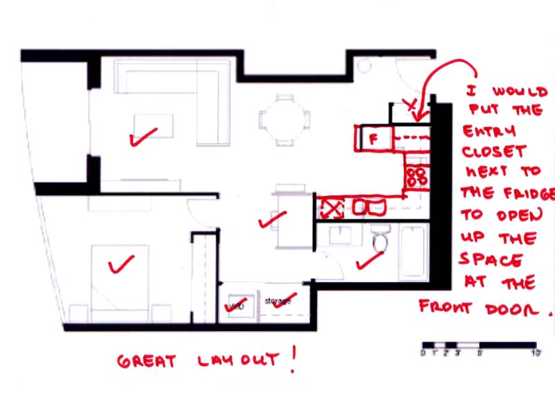
1. This plan is from Terri. We think she did the best job on the project this week! Her layout was innovative by placing the bathroom in the back of the unit – something we had not previously considered. We would recommend moving the entry closet to align with the fridge cabinet to open up the space by the front door and make the plan even better – and she gets bonus points for creating a study space in an appropriate location.
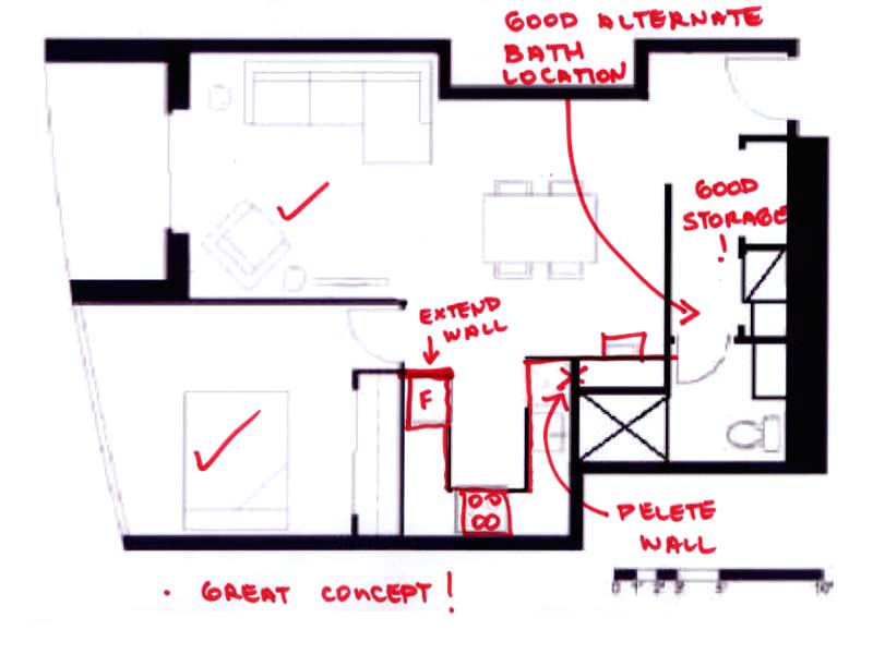
2. This plan is by Mid American Mom – good work as well! Again, the bathroom is in the back of the unit and combined with storage – this makes good use of the darkest part of the plan. We would recommend some adjustment to the kitchen detailing to make everything fit well.
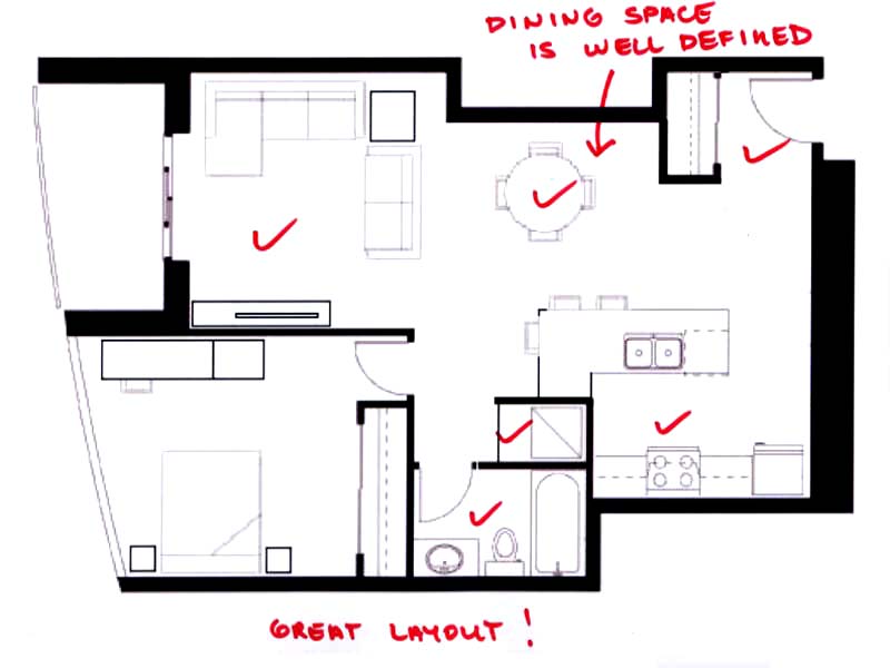
3. Brad W has also submitted a great plan – we are happy he took the extra time to bump the closet into the dining space because that really works well to create both and entry and a dining room in a minimal way. The kitchen layout is also the best we have seen today!
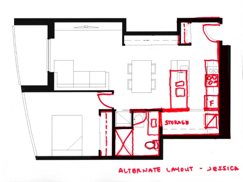
4. Jessica had a good idea with her plan – and, we are offering an alternate layout that changes the location of the bathroom door and creates a laundry/ storage space opposite the kitchen instead of the study desk. What do you think?

Here are some other plans that we feel deserve some recognition and we are also offering some suggestions to improve them even more:
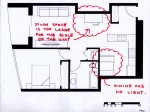
5. Tiffany had a good idea for the study – but this space is proportionately too large for the scale of the unit and the dining banquette is in the darkest part of the floor plan. In this case, a dining table would be great instead of the study space.
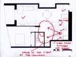
6. Hilda had a good kitchen layout, but the distance between the counter and island is too tight – remember to have at least 42 inches (40 in a pinch). Also, it is important to remember what the cook will be looking at as they are standing at the stove – in this case the view is obscured. We would try to stretch the kitchen a little bit and re-locate the cook top.
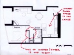
7. Rene P is a first time contributor and we are happy to have this plan! Just be careful with the hallways you create – the laundry is in a logical spot but try not to create long hallways when space is at such a premium.
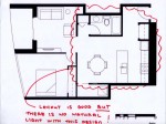
8. Andrew has a great layout – but we wish this was a corner unit as there will be no natural light for most of the unit – remember that access to sunlight and ventilation trumps all other design decisions! Can you ask the developer if we can punch a window through the side of the building!
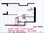
9. Finally Franco gave us a great plan, but we caution against placing the study desk in the darkest part of the unit and adjacent to the the bathroom door – we would like to know you think there is anywhere else you think this could go?

Overall, great work everyone and we have had lots to talk about!

To reveal the Slow Homer of the Week – click on the link below.

Also, don’t forget to vote for who you think should win the Slow Home Award for Best Apartment/ Loft in Vancouver. Follow the links below and cast your vote! Leave us a comment as to who you voted for and why. Have a great weekend – next week we are looking at townhouse design!

  • Steve in Vanc

    [img]1_steve08jul10.jpg[/img]

    After an 8 month SH hiatus I’m drawn back by this exercise. I like both Terri and BradW’s plans, but I’m not sure anyone has adequately addressed what I consider the #1 problem with this plan — not enough natural light. A 5′ patio door is inadequate for a living space this long and large. It’s a sure recipe for depression during Vancouver’s long, gray winters.

    So I think we need to open this up and put that wonderful window wall in the bedroom to better use. I flipped the sleeping and living areas (using Andrew’s inventive plan as a base) and created a longer, diagonal view from the entry. I also removed as many walls as possible, playing on our loft exercises with a freestanding millwork closet. Light now flows from both windows all the way to the back.

    Thanks, John and Matthew! The site has really developed in the last months. I love the new features!

  • Terri

    John & Matthew;
    Thanks so much for the double nod this week! I’m amazed that I reviewed 28 apts., but if you say so… Living across the pond from Vancouver, but never going into the downtown when I’m on the mainland, I found it very interesting to see how many new condo projects that have been built recently. I’d heard about the building boom prior to the Olympics, of course, but I hadn’t actually “seen” the extent until I did this week’s project. I enjoyed the research, even if the finds weren’t always so great.

    I like how you fixed my entry in the plan–looks much simpler. I might also claim partial credit for Franco’s plan, as I recognized my original in his take (which I made mention of on Wednesday evening). I don’t mind the derivative use of my plan, just thought that it needed to be said that we posters on Slow Home usually give credit to the post that we “take off” from.

  • Tayler

    I really am glad Terri’s won. It was the best design in my opinion.

    As for the Slowest Home award, the second floorplan (Exchange) won’t load for me whatsoever, so I’m going to have to award it to Millenium. However, first it is necessary to comment on Woodward. My goodness– the design is so visually busy if I was looking for a home I would initially write it off just based on that. It really seems like everything jam-packed into such a small space. For such tiny bedrooms is it necessary to have two washrooms? Why is the closet space so awkwardly placed in the master bedroom?

    The problem I have with Millenium is the placement of the dining room. It is right in the middle of a high traffic area. However, I like the kitchen design a lot and the location of this complex (for what I like in Vancouver).

  • Mid America Mom

    Hi! Thanks for the nod this week on design. I felt it was a gamble not having the bath entry near the bedroom.

    *Terri so interesting we ended up with U kitchens on the exercise :) It’s fantastic you posted so many plans for the project.

    *Steve in Vanc. Welcome back! I also felt that the light in the bedroom was better and devised a plan but the entry location was problematic for me. Your large studio is a great take. I would add bookshelves against the bathroom wall.

    Mid America Mom

  • Paul C

    [img]1_vanapt.jpg[/img]

    Congratulations Terri and to all who managed to complete their homework on time! My dog ate my computer.

    My initial reaction to this exercise was what is with the convoluted shape? It would seem this home was being impacted by the “fastness” of its neighboring units and so, bending the rules slightly (again) and short of re-designing the entire building floor plate, I took the approach of slowing down the shared walls. It was not much of a stretch for looking at the neighboring units, it did not seem these convolutions had any measurable benefit anyway.

    The home itself. The laundry and bedroom closet requires some additional thought. There is a key shelf/millwork piece in the entry echoing the buildings iconic shape that is intended to address the extended journey from the front door to the natural light. It also helps to hide the entry into the bath a bit. Diagonal views between spaces are used to open up the space. Spaces that one would likely spend the majority of time in, are closest to the natural light/views.

    Running late today so I hope to place my votes over the weekend.

    Have a nice weekend everyone.

  • Terri

    Steve in Vanc,
    Thanks for your nod too. I like your open loft idea as well. What I’d add to your plan, since there’s lots of room in that living room, is an in-opening door to the balcony, so we have a little easier access to it (not required to walk past the bed then).

    M.A.M.
    Galleys or U kitchens seem to work best in these small spaces, I think. I was thinking that your plan would work nicely with the bedroom and living room switched. Had you tried that with this plan that you posted?

    Tayler,
    Thanks again.

  • Grace Coulter

    Hi everyone,
    Terri good work this week! I agree there are some very interesting things happening in van right now. When i visited last summer I was shocked at the number of cranes in the sky it looked like they were buidling a whole new city (with matching glass ;)) .

    i also cannot open the second file so I am going to have to go with millennium. I must admit being allured by the lovely vertical green walls in woodward but with good outdoor space to enjoy them its becomes just part of the facade. Millennium in contrast is simpler to read and clearly well laid out.
    have a great weekend everyone!

  • Mid America Mom

    [img]vancondo5.jpg[/img]

    *Terri – Posted is the switch plan I made originally but YUCK the kitchen is not good. I may rework with your suggestion today.

    _____________________
    Why is it that all these homes face North? With drizzle most of the year I would love to capitalize on any South or West sun when it shows up.

    The millenum faces north and east. I have issues with the bedroom closet and view to bath, the dining room really is a hall… laundry is right there. Living is wonderful though. I would switch the bedroom to the kitchen area.

    The exchange faces north and west. This reminds me of adaptive reuse of an old building…. is that the case? I cannot check since the link to the plan is gone now that I have voted. It feels like it and has no outdoor space.

    Though the dining is tight we can place a banquette or like I do now- a bench on one side and chairs on the other. Living is great space. The nook is unnecessary and I would put a desk there. Entry is long. The kitchen does not pass the butt test. They need to move the sink. I do like the master bath and closet location.

    Woodward. Faces North only. What green will grow on the side of the building with little light? Invasive ivy? The dining room area is too small and the eating at the counter is overkill. Living is not as nice as other two units. The bedrooms could be better. Master has view to the toilet and the second bedroom is tight at 8 feet to that support wall.

    Exchange gets my vote! The open living area is nice and airy and the master suite design sealed the deal.

    Mid America Mom

  • Manolo

    Great job everyone on the design projects. While Terri managed to fit in a great study, I really like Brad W’s as well. He managed to reorganize the unit in the most minimal way.

    As for the vote, I had a tough time choosing between Millenium Water and Woodward’s. The environmental agenda of the Millenium Water is very very impressive, and a the location is fantastic in terms of proximity to work, places to play and eat, and walkability. I’m a bit concerned about the view, with neighboring buildings somewhat close-by, and given this density, how light-filled can a northeast facing unit be (especially if its on the 4th or 5th floor? Alternatively, the Woodward’s unit’s northeast orientation will provide spectacular views of the harbour. The location isn’t ideal, especially considering the neighborhood’s reputation (though I’m sure gentrification spurred by projects like this will improve that situation). The environmental performance of this project is less obvious, and isn’t part of LEED. This was not as big a factor for me since the project aims for a different kind of sustainability – one that doesn’t just focus on the natural environment in terms of carbon footprints and whatnot – that focuses on economic (affordable) and social (inclusive) sustainability. Creating a good urban environment is important.

    I ended up choosing the Woodward’s for 2 reasons: its multivalent definition of sustainability, its view, and its dining room (hah!). After all, the home needs to work well as a home. The dining room in the Millenium Water unit doesn’t work as well, getting in the way of circulation.

  • Amanda

    I think that Terri did an awesome job with her design, before I saw it I had never thought about having an open study. I always thought that studies must be in their own room. I also liked the design by Brad W, the placement of the kitchen and bathroom made the apartment seem bigger; there was more space in the dining area. I also liked how the study was incorporated into the bedroom which saved space and allowed for contact to the natural light.

  • Terri

    I voted for Woodward project because it seems the most straightforward design (simple). The space for the living room and dining is a little tight (about 15 x 12, I figured), but at least the components are in the right spot. The balcony faces east and north. And although north is less than ideal in Vancouver, with that whole wall of windows (which I presume it to be), it could be all right.

    In the Millenium Water unit, the dining table is smack dab beside the bathroom door. It’s also in the way to get to the bedroom, adjacent to that room too. Overall, I was disappointed with this space.

    As for the Exchange, it doesn’t offer outdoor living, so I can’t really vote for it. I also find the zigzag hall to get into the suite a little too long.

    Another reason to back up my choice was the pricing. The Millenium Water project is on premium waterfront and has a price tag to match. The City of Vancouver needs to make money on this development after taking over the financing of it. The Woodward project is priced more fairly, and seems also to have thought a lot about a mixed-use neighbourhood when the redevelopment of this Vancouver landmark was undertaken. (I also have memories of Woodward’s $1.49 day as a child and shopping there with my family, so I may have also voted for sentimental reasons too.)

  • Matthew North

    Hello all Slow Homers – please make sure to check the site tomorrow for a special Saturday edition where we have some exciting things to share with you!

  • JPod

    Congratulations to Terri for winning this weeks design challenge!

    Like Terri, I voted for the Woodward project. I like the simple layout of the spaces, though some were a bit tight.

    The location is nice, because with the mixed use of the neighborhood not only provides great access to restaurants, shopping, entertainment and cultural spaces, with a walk score of 94. Though urban renewal is often seen as a negative aspect of older areas, if there is a lack of urban renewal, it would be difficult for a lot of areas in the city of Vancouver to recover from urban decay.

    The windows are also a very nice feature of the Woodward floor plan.

  • BradW

    John – another nice solution this week – thanks for the inspiration

    Steve, PaulC, MAM – good idea to completely reverse the unit and take advantage of the large window in the existing bedroom

    I voted for Woodward but Millenium Water and the Exchange are also terrific projects. I felt Exchange could nave done more with the 1600+ sq ft and some outdoor living would have been nice. While Woodward and Exchange were similar in many respects, I favoured the organization of Woodward.

  • nicole

    I like the historical renovations, but I have to vote millenium.

    check this vancouver site out http://www.crackshackormansion.com in response to the high cost of housing

  • Mid America Mom

    [img]vancondo6.jpg[/img]

    Terri et all. Here is another plan with the bedroom and living switched. Built in shelf at entry and that is a desk space or place for a buffet in the dining. I could switch the refrigerator and open up the wall to the entry but. That leaves a great view into the bathroom.

    Thank you BradW for applauding our efforts. I LOVE the 90 degree on your plan’s island and making the seating on both legs of it. The typical straight line up reminds me of eating at the lunch counter at a quick food place and not so desirable.

  • Ashley P

    I loved looking at everyone’s designs and noticing great features that I never would have thought of! Mid American Mom I can tell that you appreciate a good kitchen because yours looks beautiful.

    I also noticed that several people actually had an extended counter in the kitchen that was used as a dining room table. I thought that was very creative and effective for small floor plans which are so common in Vancouver.

    I learned a lot from this and after reading your comments I can tell that you all did too! I definitely learned that using paint for this was extremely difficult! I think I might actually redo this assingment at the end of the two months and see how much my plan changes.

  • Mid America Mom

    Ashley thanks for the compliment. Kitchen design is an area that intrigues me. Now if I could go back in time I would buy a hard loft and install a European kitchen from Warendorf – http://www.warendorf.eu/core/cms/english/welcome-page/starck-by-warendorf/primary/ oh to dream.

    Matthew and John looking forward to tomorrow!

    Mid America Mom

  • Tara

    This week my vote was for thw Woodwards project.

    I didn’t vote for the Millenium Waters unit because of the awkward dining space which opens to both the laundry and the bathroom. However, I did analyze and post other plans from this development that I though were much more well laid out. Perhaps the small size of this unit was the difference.

    Though I thought the other units were both good, I decided to vote for Woodwards. The difference for me was that the Woodwards unit had only one wall of windows where Exchange had the advantage of the corner unit layout. I loved how well the Woodwards plan uses the single wall of light to its best advantage, with light being able to penetrate into all the important living spaces.

  • Franco

    Hi everyone,

    Lively discussion! I appreciate some of the more dramatic rearrangements, particularly the living room – bedroom switch seems to work very well, allowing for fluid traffic flow within those living areas.

    Terri – congrats on your success this week! My apologies for the delay in my response. I understand your concern, and I’m sorry for any misunderstanding, but you must appreciate that I am completing these assignments remotely (from a campground in interior BC) where internet access is sporadic and unreliable at best! I completed the assignment entirely offline since the internet is so unreliable, and thus never had a chance to investigate other people’s postings before submitting my own!! You can imagine my dismay when I realized afterwards that our designs were comparable, even though I completed mine through an entirely independent process of analysis and experimentation, with neither the desire nor intent to mimic or recapitulate yours.

    John and Matthew – thank you for the nod as well!! It’s much appreciated. In general, regarding the placement of the study area, I understand exactly what you mean about the lack of natural light! However, I believe that the location I selected was appropriate because (a) it allowed for more extensive bookshelf space, a must for anyone who includes reference material in their study area (b) it permitted an appropriately sized desk for a computer, printer, and writing space without intruding upon the living area (c) it is sufficiently secluded from the living/dining/kitchen areas that the occupant could actually study without being impacted by anyone else cooking/eating/watching TV. As you can appreciate, the area more closely recapitulates a study, rather than simply a desk located in a common area.

    Thanks for the great comments and discussion everyone!!!

  • bstone52

    For this week’s slow home award I voted for Woodward, mainly based on the integration of kitchen and living spaces. I like the open air design of the communal areas and the privacy that the bedrooms and bathrooms maintain.

  • Franco

    Hi again!

    Regarding the voting, I would have to salute the Millenium Waterfront project! To speak first to the Woodward project: I thought it was a terrific layout, excellent kitchen and great traffic flow, but a few possible draw-backs, most notably that the second bathroom is very awkward to reach from its corresponding second bedroom!! I thought the 5th chair on the island was excessive and would impede traffic flow from the kitchen, but the island itself was highly functional and well-designed. Lastly I would suggest that the living area could benefit from more seating, and perhaps reconfigured so some seating directly faced the TV.

    Next, the Exchange Style layout made me cringe – I’d agree with Terri that the awkward cramped Z-shaped entrance is very counter-productive, perhaps claustrophobic. Furthermore, the W/D is in a difficult, fairly uncomfortable position being crammed in by the entrance hallway. The entrance to the master bedroom is awkward (perhaps would benefit from sliding closet doors instead). Furthermore, the purpose of the double set of closets in the second bedroom is slightly questionable…Lastly, the main bathroom entrance is nestled in the middle of a series of short corridors and not easily accessible from any of the high use areas (kitchen, dining, living area) and can only be conveniently reached from the door.

    After seeing that layout, the Millenium project appeared a breath of fresh air. The relationship of the roomy outdoor living area to both the bedroom and living area is ideal and unobtrusive. The dual-entrance bathroom is easily accessible from both the bedroom and the main living areas. Although the placement of the closet in the bedroom is arguably not ideal, there are few alternative options that still acoomodate the outdoor living access point. The living area is cozy and well laid out, with adequate seating. The kitchen is well designed and efficient, with a tight work triangle and functional island. Overall, the place has excellent natural lighting, which is a substantial benefit. Though the location of the dining table is not ideal, their appears to be sufficient clearance around it (3′ at minimum) to allow traffic to flow. Alternatively, the island could be moved down, and the dining table moved to the other end of the island near the windows.

    That’s my two cents on the voting! Have a good night everybody.

  • Amanda

    I voted for Woodward because I liked the layout the best. However, the bedrooms are a bit too small; the deck is also too small. In addition, I would redesign the front entrance, it needs to be sectioned off from the kitchen because it is interfering with the kitchen area.

    The Millennium was my second choice. I also liked its layout and it had a bigger deck, however, the dining area needs some attention, because the space is to crowded. The laundry area is also too close to the dining table. Also the bathroom opens into the dining area which is not appealing.

    The Exchange was not too bad of a design either, but it had no deck which is enough to lose a sale. Also the closet that’s connected to the master bedroom cuts into the dining room space, which I don’t like. The hallway at the entrance also creates wasted space. Otherwise I like the layout and the fact that it’s a corner lot would increase its value.

  • Terri

    M.A.M.
    I don’t know if you’re lurking here still, but I wanted to say Congrats on trying so hard to make that reversed layout work. It seems that if only the overall shape didn’t jog, your second plan would have worked the best. Last year we looked at a condo reno in New York where the designers chose to use a walk-through kitchen like that, and it was better than you might imagine.

    Re: the condo/loft vote:
    I’ve noticed a couple of people talking about two bedrooms in the Woodward’s project and I didn’t see two bedrooms when I checked it out, so I’m wondering if there was some confusion on that one.

    Franco,
    I don’t question your design idea at all, and I wasn’t concerned about the similarity in our plans. I just recognized my the exact furniture, sink and a couple of other drawing glitches that I’d made had shown up in your plan too, so I figured to you’d just used mine as a download to save time. I know this is a collaborative exchange on the site too.