Week In Review For Townhomes In Chicago


This is Day 220 of the Slow Home Project and we need you to join us in our quest to evaluate the design quality of houses in nine North American cities in nine months.

It’s Friday, August 27, 2010 and today we are reviewing the floor plans that were submitted on Wednesday. Thanks to everyone who submitted a scheme this week! We had a lot of last minute entries, so hopefully we have captured all of the best ones to review!

To see what the floor plan of this townhome in Chicago looked like before the Slow Home renovation, click on the link below.

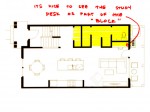
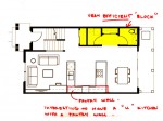
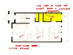
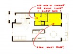
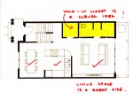
With the stairs fixed in place, a design trend emerged. All of the plans we have chosen to look at today have consolidated the “closed”, “service” or “mechanical” spaces into a “block” that is located in the top right corner of the plan. This allows the rest of the spaces to be open concept. We have highlighted this “block” on all the plans in yellow. Some people had the “block” align exactly with the stairs, others had it step slightly forward or slightly back.
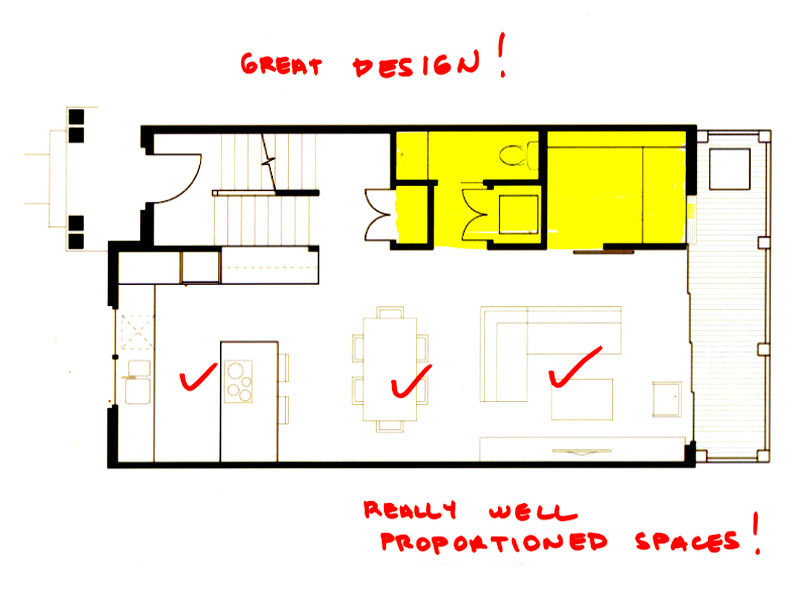

1. This plan is by Manolo. He had the clearest scheme this week. The kitchen is a great peninsula design with lots of counter and storage.The study is also the perfect proportion for the size of this unit and is ideally located in the “block”.
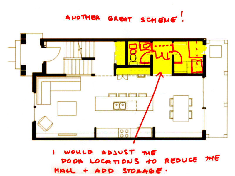

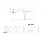
2. This plan is by Nicole – her “block” integrates a study desk, but not an entire study space – very clever. We recommend that the hallway is shortened by adding some storage at the end and moving the doors to the guest bath and laundry further forward.
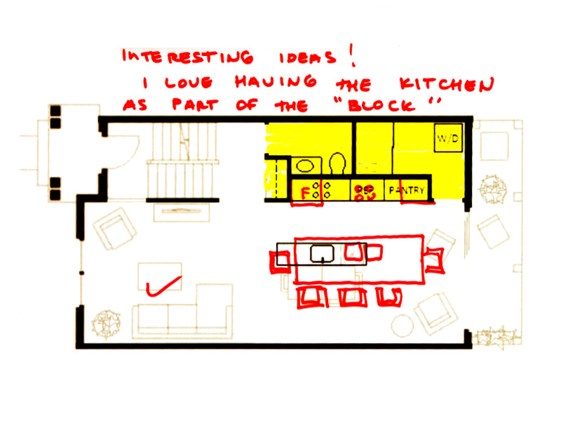

3. Steve in Van was the only person to include the back wall of the kitchen within his “block”. With this type of scheme, we would recommend that he forgoes the typical dining table and integrates the dining into the island either as an attached, lower table (think Poliform) or an oversized island with counter chairs. All in all, this is quite a creative solution.
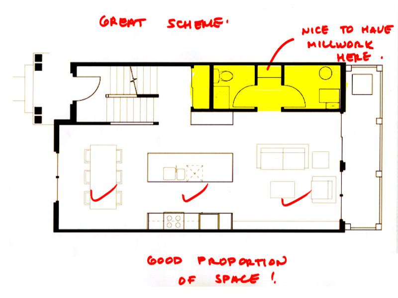

4. Catherine Taney had the simplest scheme this week. Her “block” was slightly more narrow than the width of the stair case which allows a little more room in the living area for circulation behind the furniture.

We are also posting five other schemes that treated this idea of a “block” in interesting ways. Overall, good work everyone!
We need you to vote for who you think should win the Award for Best Townhouse Design in Chicago! Have a look at the links to the nominees below and then cast your vote. We would also love for you to leave us a comment telling everyone who you voted for and why.

Aqua Parkhomes – Typical
Wrightwood Crossing – Unit 101
500 Hyacinth Place – Type C

Loading ... Loading ...

And it wouldn’t be Friday without revealing the name of the “Slow Homer of the Week”. Click on the link below to find out who it is.

Make sure to join us on Monday for our last week in Chicago and our last week on the Slow Home Project! Can you believe it? Our nine cities in nine months is coming to an end!

  • Terri

    Congratulations, Manolo, on your design being chosen #1 and for being Slow Homer of the week. I liked how your design had the laundry closer to the staircase but still allowed a nice-sized study.

    Can anyone tell me how to actually see Plan C from the Hyacinth Place project? The project website as linked doesn’t offer the floorplan option. Thanks!

  • Tara

    Terri:
    There’s an image on the left-hand side of the floorplan. When you click on it, it’s a bit small so I saved it to my computer and zoomed in to see it better. Hope that helps!

  • Terri

    Hi Tara,
    I tried to magnify that and it looked like it said Type A, but I’ll take another look. Thanks!

  • Grace Coulter

    Manolo
    congrats, I really like your kitchen design in the plan you have created.

    As for my vote this week,
    I am finding this decision tricky because there are things about each plan that are not desirable.

    Aqua – 4 bathrooms and a very odd master bath layout.
    wrightwood- great yard space and upper level but the lower level seems subterranean perhaps and has a strange large media space.
    hyacinth – oddly shaped master bedroom and a sub par entry. however good flow of spaces and overall good use of space

    I am going to choose the hyacinth because overall the space is used most efficiently.

  • Tara

    Manolo – loved the simplicity of your design and how well it works for this townhome. Great job.

    As for the Slow Home of the week, I chose Wrightwood Crossing by process of elimination.

    There are a few things I didn’t like in the Aqua. On the main floor, I’m not a fan of how the closets do not face either of the entrances, how the garage entrance is so open to the kitchen and the size of the kitchen work triangle and the useless island that’s in its way. There are also windows only on one side of the unit, which I think would make for a dark dining area and and even darker kitchen. The master bedroom and its 3 walk-in closet and sitting area take up the entire second floor – in a house over 3000 sq ft, this master bedrooms could incorperate an entire apartment comfortably which is really not slow. Finally, I am not a fan of the dual ensuite bathrooms for the second and third bedrooms.

    Hyacinth Place also has some substantial issues for me. Firstly, the downstairs entrance is non existant, it is simply a landing between two sets of staircases. The mainfloor entry also faces a staircase and is too open to the living area. The breakfast area in the kitchen is completely useless. The kitchen should have been better designed to stretch across the back wall with an island for seating, which would make it much more comfortable in size and eliminate this wasted space. The dining room has a strangely shaped bumpout with a window which is completely useless. The living room is also not well designed once you condider ciruclation around it and how you would furnish around the bumpout on the front. In the upstairs, the natural placement for the bed in the master would recieve no natural light as the window services the walk-in closet and circulation space only. The bathrooms also seem very tight.

    I think that Wrightwood Crossing is a very well designed unit. There are a number of entrances in this unit but each has been well placed and considered with either benches or closets. The kitchen has a nice nook feeling and is well designed with a good work triangle. I also love the dining and living spaces in this unit. Bedrooms are good and I like the shared bathroom between the second and third bedrooms. The way they have defined two spaces with built-ins on the bottom floor allows for dual functions within that open space. Finally, it has a private fenced yard! This is rare and awesome to see in a townhouse complex.

  • Terri

    Aqua–too many supersized rooms and bathrooms, plus the laundry is on the top floor and not in the middle (it could have gone in that 3rd walk-in closet on floor 2).

    Highland–generally good layout but I don’t think the large entry closet facing into the dining area is good. Also the sink and d/w would be better reversed; however, the galley is probably too narrow for that so instead there’s no space on one side of the sink. Also, where is the laundry? I guess you have to go down three flights of stairs to get to it.

    Wrightwood–I have two issues with this one: no entry closet for owners, just a bench (though a closet could be installed instead). And I don’t like the way the master closet is accessed through the bathroom, especially with a steam shower right beside the closet door (possibly problems with humidity in the closet). I like the way the laundry is accessed by steps right outside the master bedroom door. Also that master bedroom is a nice size–not too large like the other two. The kitchen in this unit was my favourite from yesterday’s exercise. Obviously, this was my choice. ;)

  • Tara

    [img]1_picture2.jpg[/img]

    Hey Terri,
    If it’s still not working for you, try viewing it here, or saving and magnifying it.

  • Terri

    Tara, You pointed out the yard that I forgot to mention in Wrightwood–a definite plus. I agree with your other assessments of these units too.

  • Terri

    Thanks, Tara, I followed your earlier directions, but that image will save someone else going through the process.:)

  • Mid America Mom

    Happy Friday!

    I wanted to vote for Wrightwood but I am worried about the lower level. Per the outside renderings I wonder how big the windows are and how much light would get in. The Hyacinth place, while not as open, has less issues with the design than Aqua and gets my vote

    Mid America Mom

  • BradW

    Normally, I would comment on the relative merits of these nominees…today I am simply going to pick the home I would most like to live in – Aqua.

  • Mid America Mom

    Congrats Manolo! I do like your study space and the closet.

    **********
    As the slow home project is moving onto single family homes in Chicago I am moving into a furnished home in the Chicago area :)

    The builder still offers a version of the plan in other developments. http://www.plotehomes.com/ebrochure.php?modelid=1913&buildid=3227 The home had some alterations from what is shown.

    3car. The toilet and shower(with a built in bench) flipped places in the master bathroom. The toilet was placed in its own room with stealing a little space from the niche and closet.

    In the kitchen there is no bump out. The stove is a few feet off the sink on the left wall. The island is much larger as it extends to the eating area. The end is built like a table that can seat 5.

    The fireplace is on the outside wall not the inner wall. The front does not have a stoop that comes in front of bedroom 3 but ends before it.

    The plan could still be better… wonder how this would stand up to the test.

    Mid America Mom

  • Steve in Van

    Aqua: Dark, tunnel-like living area with odd closet and 1/2 bath (with toilet visible from front window). Over-sized, oddly shaped master suite with closets filling awkward spaces; well lit sitting area. Upstairs, nice front bedroom.

    Hyacinth: Creative arrangement of floors to accommodate 12′ ceiling in living room, though all opportunties to leverage light and internal openness are wasted (stairs and dining should be open to the living room with more windows on the side). Front door opens directly into living room. Kitchen is small, despite being in a large space. Bedroom floor not bad, though WIC in master is curious — window but no door.

    Wrightwood: Spacious, light-filled living space, well-designed aside from front entry. I don’t like the open stairwell to the lower level, which is half below grade (read ‘dark’). Awkward master bath/closet arrangement. “900 sf private fenced yard” is nearly inaccessible. Contrary to the website map, this unit looks north over the street and east over an abandoned trolley line turned loft complex parking lot.

    So, I wouldn’t pay good money for any of them. But the Wrightwood’s LEED Platinum intention wins my nod.

  • nicole

    Good Plan Manolo!

    Nice to see wider townhomes!
    For a LEED Platinum project, the wrightwood has a lot space (2500 sq ft) – each bedroom has its own bath, oversized ensuite. A little excessive in my mind.

    My vote goes towards the hyacinth:
    +LEED gold
    +good use of space,
    +no oversized features
    +bedrooms are on the same level.
    +stairs are somewhat hidden away.
    +Nice to see the community pitching in to build nice sustainable, yet affordable housing
    (don’t think that the wic in the mbr needs a closet – sorry Steve)