Week In Review For Townhomes in Philadelphia


This is Day 157 of the Slow Home Project and we need you to join us in our quest to evaluate the design quality of houses in nine North American cities in nine months.

It’s Friday and that means it is time to look at the Design Projects submitted by the Slow Home viewers from earlier in the week. We have chosen to discuss the 4 that we feel best demonstrate the Slow Home principles. In addition, we are posting 6 other outstanding schemes with some helpful comments. Overall, the quality of the work is getting better every week!

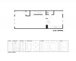
As you remember, the task was to re-design the main floor of a 2,250 sq ft town home from the Philadelphia are. To see the original plan everyone had to work with, click on the link below.
Now, for the 4 best schemes.
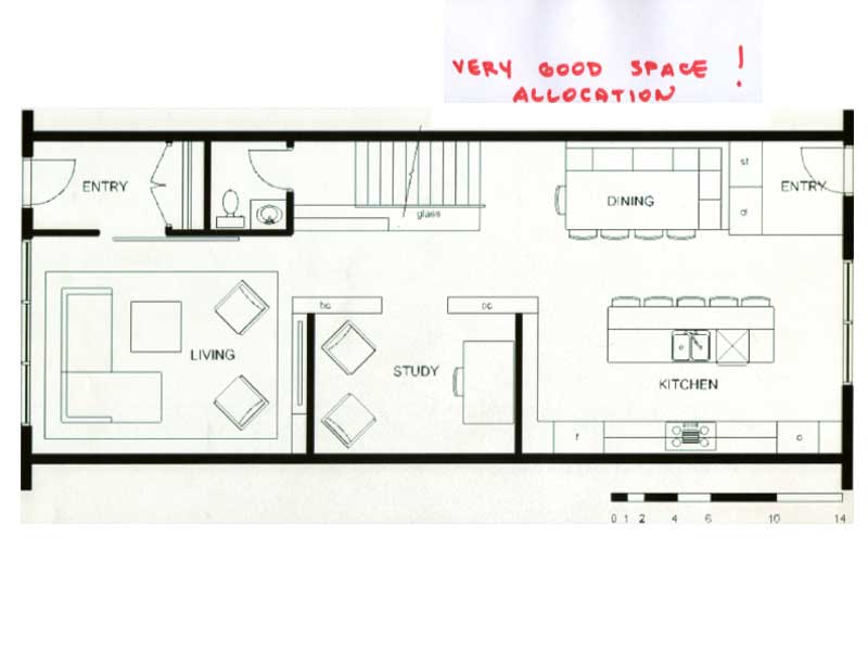
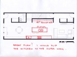
1. This plan is from Paul C. He is one of the few to place the kitchen at the back of the unit. This makes sense as it is close to the mudroom and has a direct connection to the outside. The proportion of the kitchen is great and the banquette seating is a very efficient way to create a dining space. The circulation is clear and the study space in the center of the plan with the built in bookshelves is a great detail.
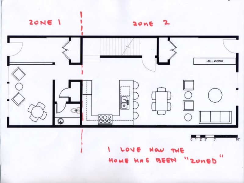
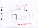
2. This plan is from Jim Baer. It has been zoned in an interesting way, with the back 2/3 of the house being devoted to kitchen, living and dining while the front 1/3 being utilized for the study and guest bath. This really helps to reduce the perceived length of this townhouse plan and will create two very different types of spaces.
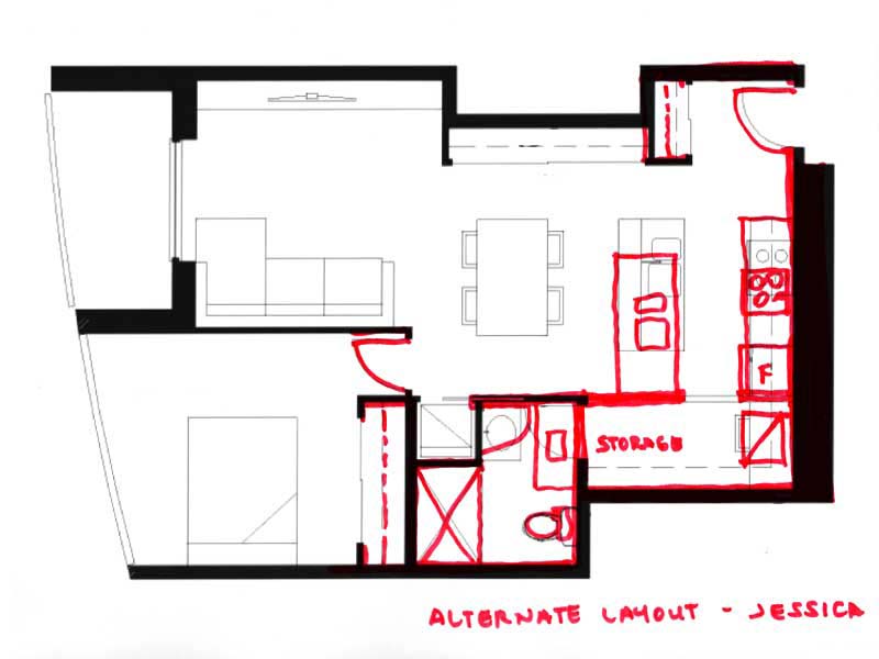
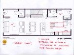
3. This plan is from Jessica and what we really liked about this scheme is the use of built ins to help define the dining, study and living spaces. Also, the scale of both the front and back entries are really appropriate for the size of the unit.
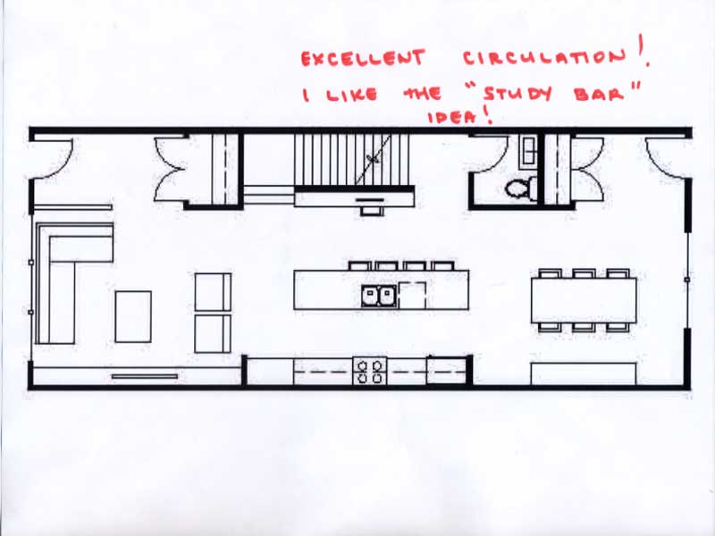
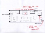
4. This is the plan submitted is from Nicole and without a doubt has the clearest circulation idea out of any of the projects from this week. The furniture is very clearly placed and there is a minimum number of walls that have been built to achieve this effect, so the overall scheme has a really light touch.

To see six other schemes that we felt deserve special recognition, click on the links below.
Now, onto our other Friday activities – we need you to vote for who you think should win the Slow Home Award for best town house design in Philadelphia. Open the links to the project below, study the plans and then cast your vote! After you have voted, post a comment letting all the other Slow Homers know who you think should win the award and why.

Thank you for voting.

Loading ... Loading ...

And finally, click on the link below to reveal who is the Slow Homer of the Week for June 24, 2010. Have a great weekend everyone! See you on Monday where we will be analyzing the design quality of single family homes from the Philadelphia area!

  • BradW

    Couple of thoughts…

    PaulC – congrats on the SHW and your design, just like riding a bike for us veterans

    Nicole – also really liked your design…

    Must also echo John and Matthew thoughts that the design quality is getting much better.

    One difficulty here was keeping the kitchen in proportion. It was easy and natural to align the kitchen with the full length of the staircase – this generally resulted in a long linear kitchen and some compromise in either the living or dining space.

    Finally, the main floor guest bath. In this case, there was plenty of space and most people handling it well. For me, when the space is wide open the guest bath creates a privacy issue. Indirect access is a must and build quality should be high be minimize plumbing and other sounds. Frankly, in typically sized open concept main floors I would omit the guest bath.

  • autobrad

    Congratulation Paul!

    Jessica and Nicole, I really like your designs, specifically the placement of the kitchens.

    Jessica, I learned a lot from you about how to make efficient use of entry space and making great closets:)

    Nicole, I like the placement and size of your bathroom. Taught me a lot about what is possible with bathrooms. I like how it is kind of tucked away and not too big yet, big enough.

  • Mid America Mom

    Congrats on the exercises everyone!

    ***Where is the vote for best townhome?***

  • Kadoman

    Jim, very nice layout. Feels very organized and useable. I just wonder if the dining space is big enough and not a little squeezed?

  • Steve

    Hey Slowhomers’

    We just put up a new gallery on our Facebook page featuring pics from our three townhome nominees.

    Check it out at:

    http://www.facebook.com/slowhome

    Enjoy!

  • Neogi

    congratulation to everyone, i really like Nicole’s design, its open and i think it has great circulation. I especially like the study area, it makes good use of that space.

  • Bell604

    Congrats to everyone on a good week,
    As for the best design, I chose to pick Thin Flats. All the plans were well put together this week, which is nice to see. However, with LEED-platnium certification on its way, a nice creative design, roof top deck and great circulation it stands out as the best plan of the three.

  • Murray

    PaulC, it’s great that you are back actively partidipating, you always have a lot to offer.

    Good work everyone – I think the width of the unit helped to make all the plans really workable.

  • Mid America Mom

    TGIF Slow Homers!

    You may want to check out this Huffington Post article from yesterday – http://www.huffingtonpost.com/lee-schneider/michelle-kaufmann-an-arch_b_621803.html on architect Michelle Kaufmann, a pioneer in prefabricated housing.

    For those of you wondering about the ARIA development.. Wayne scored the townhome design( http://www.ariadenver.com/) during our time with the slow home project in Denver. With a walkscore of 65 this unit is moderately slow.

    Mid America Mom

  • Kadoman

    I voted for the PostGreen 2.5. The unit’s design itself left some things to be desired, such as bedroom size, entry issues and a kitchen I wasn’t super fond of. However, overall I found it scored well. As well, the many green aspects they incorporated, including 2 different types of solar panels, were quite impressive. In the end, all 3 units had appeal for me, but the Two point Five I liked the most.

    This quote from their website also caught my fancy. “These units won’t necessarily be all in a neat row and might even include scattered sites throughout a given neighborhood. Homes in the same project will, however, often share a common theme or style.”

  • bbhorner

    My Vote goes to the Artisan Avenue of the Arts. I really like the width of this unit, i doesn’t look as long and dark compared to the others. It is also an LEED certified community. The main living space is also an example of excellent design in my opinion.

  • Paul C

    Congratulations to all for the excellent submissions and thank you very much John and Matthew and to the kind words from fellow slowhomers. It is very much appreciated. The quality of work is a great testament to the Slow Home advocacy. Matthew, I’m glad you enjoyed the video. Demonstrates the ingenuity of the human mind.

    As far as project vote, my choice would be Thin Flats. I liked the fact that it is a “stacked” townhome, imo the floor plans are very well done, in particular I liked the positioning of the main entry and how that helps shorten would could be perceived as a very long narrow home. The interior finishing is great and I like the extent to which a connection is provided to the outdoors. I like the use of casement (swing out) windows such that the homeowners can interact more freely with the street. I would however, caution that with the window sills being so low to the floor, it can be dangerous for small children. The Artisan was a close second however, for such a large home I thought the laundry (oddly enough) could have been much better.

    Have a great weekend everyone.

  • PeterB

    Thin Flats gets my vote in terms of which townhome is best. The plans are very well constructed rather than those of the artisan and especially the two point five. For myself, the artisan has way too many outswinging doors, nevermind the doors overlapping on the first floor.

    Onto Thin Flats, all the rooms are very well proportioned and I found it very difficult to point out any flaws with this design. The private decks are nicely placed throughout as well all over the place and the green roof just add another bit of class and tranquility to an already nice unit design.

  • Kadoman

    MAM, it’s funny you pointed out that article, I just read it on Lee Schneider’s blog.
    http://sheltermovie.wordpress.com/
    I think I am a fan of Pre-Fab in the way Kaufmann is doing it. Design tailored to the environment with low cost in mind.

  • BradW

    Three great projects again this week with my vote going to ThinFlats on the strength of the floor plan – especially liked the entry location at the side and the skylighted hallway. Honourable mention to PostGreen for customizable options and affordable design.

  • SangeetaG

    Paul C congrats. Great job on the designs everyone.

    My vote goes out for Thin Flats. I really like the organization the best from all three town homes. For the long narrow plans, the spaces are well defined and the circulation doe not interfere with principle spaces. I agree with PeterB on the doors in the artisan, a little much. Who’s not a fan of green roofs, great outdoor living space.

  • nicole

    my vote is for Thin Flats.
    Would switch the location of the washroom and laundry on the second floor. More detail on environmental features than the others.

    2.5 is not too far behind.

    Good work on all the great plans this week!

  • Allie G

    Good job on all the designs, everyone. I also would vote for the Thin Flats. The organization and the environmental features really won me over – I think it’s a pretty impressive design.

  • Hilda

    Love the redesigns everyone! My vote goes to the Artisan Townhome since the design of these townhouse just clicks with me.
    The other two feels like they’re forcing it and there’s too much going on in the units. Not to mention the organization and flow of the house is just the best I’ve seen. :)

  • Andrew

    My vote is for the Artisan Avenue of the Arts. I like how the circulation is handled and how it has been fairly effectively organized over 4 floors. The ‘eco’ features for the Thin Flats is quite impressive but I don’t like the layout of the plan quite as much and it doesn’t have an occupiable roof. Also, with Two Point Five, many of the primary spaces are ill-defined and I don’t think the Flex space is living up to it’s potential – they say the flex space could be a bedroom but then one has to pass through this room every time they want to reach the floor above. The Artisan Avenue of the Arts is also LEED certified and it has some great standout features that are lacking in the other 2.

  • Neogi

    my vote is with thin flats, the exterior was just won me over and the environmental bonuses are a plus. The unit is well designed with unique features. The kitchen is compact but at the same time it is open to the entertaining space. I also love the layout of the unit it has good circulation.

  • frazer

    Here’s my quick review, the artisan got my vote.

    1. Two point Five: feels like a lot of corridors, galley kitchen seems awkward, not enough space for circulation, odd storage spaces. Quite a “green” unit though…

    2. Artisan: Other than the overlapping door swings a very nice unit. Very considered organization, a lot of options and overall the best unit.

    3 bad entry but it has a simple and straightforward layout. Bedrooms are a little small.

  • Mid America Mom

    *Kadoman*
    Prefab is intriguing.

    What are your thoughts on shipping containers?

    Mid America Mom

  • Murray

    MAM – thanks for the links to the article and Aria site.

  • Mid America Mom

    You are welcome Murray!